Matplotlib 图表的基本参数设置
1.图名,图例,轴标签,轴边界,轴刻度,轴刻度标签
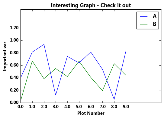
- # 图名,图例,轴标签,轴边界,轴刻度,轴刻度标签等
- df = pd.DataFrame(np.random.rand(10,2),columns=['A','B'])
- fig = df.plot(figsize=(6,4))
- # figsize:创建图表窗口,设置窗口大小
- # 创建图表对象,并赋值与fig
- plt.title('Interesting Graph - Check it out') # 图名
- plt.xlabel('Plot Number') # x轴标签
- plt.ylabel('Important var') # y轴标签
- plt.legend(loc = 'upper right')
- # 显示图例,loc表示位置
- # 'best' : 0, (only implemented for axes legends)(自适应方式)
- # 'upper right' : 1,
- # 'upper left' : 2,
- # 'lower left' : 3,
- # 'lower right' : 4,
- # 'right' : 5,
- # 'center left' : 6,
- # 'center right' : 7,
- # 'lower center' : 8,
- # 'upper center' : 9,
- # 'center' : 10,
- plt.xlim([0,12]) # x轴边界
- plt.ylim([0,1.5]) # y轴边界
- plt.xticks(range(10)) # 设置x刻度
- plt.yticks([0,0.2,0.4,0.6,0.8,1.0,1.2]) # 设置y刻度
- fig.set_xticklabels("%.1f" %i for i in range(10)) # x轴刻度标签 保留小数点后一位小数
- fig.set_yticklabels("%.2f" %i for i in [0,0.2,0.4,0.6,0.8,1.0,1.2]) # y轴刻度标签 #保留小数点后2位小数
- # 范围只限定图表的长度,刻度则是决定显示的标尺 → 这里x轴范围是0-12,但刻度只是0-9,刻度标签使得其显示1位小数 # 轴标签则是显示刻度的标签 print(fig,type(fig)) # 查看表格本身的显示方式,以及类别
输出结果:
- Axes(0.125,0.125;0.775x0.775) <class 'matplotlib.axes._subplots.AxesSubplot'>
2.
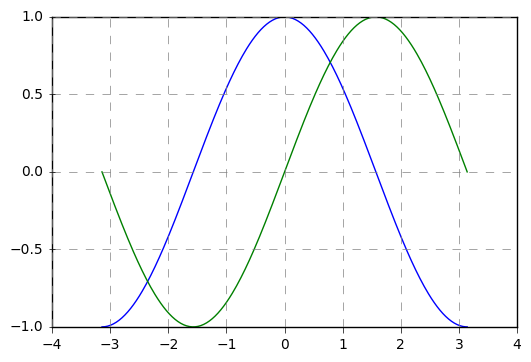
- # 其他元素可视性
- x = np.linspace(-np.pi,np.pi,256,endpoint = True) #linspace()通过指定开始值、终值和元素个数创建表示等差数列的一维数组,可以通过endpoint参数指定是否包含终值,默认值为True,即包含终值。
- c, s = np.cos(x), np.sin(x)
- plt.plot(x, c)
- plt.plot(x, s)
- # 通过ndarry创建图表
- plt.grid(True, linestyle = "--",color = "gray", linewidth = "0.5",axis = 'both')
- # 显示网格
- # linestyle:线型
- # color:颜色
- # linewidth:宽度
- # axis:x,y,both,显示x/y/两者的格网
- plt.tick_params(bottom='on',top='off',left='on',right='off')
- # 显示刻度的那根轴线,凸出来的地方。设置为off时都不显示。默认为全显示
- import matplotlib
- matplotlib.rcParams['xtick.direction'] = 'out'
- matplotlib.rcParams['ytick.direction'] = 'inout'
- # 设置刻度的方向,in,out,inout 设置为in,刻度突出的部分在里面显示,out在外面显示,inout在中间显示
- # 这里需要导入matploltib,而不仅仅导入matplotlib.pyplot
- frame = plt.gca()
- #plt.axis('off')
- # 关闭坐标轴
- #frame.axes.get_xaxis().set_visible(False)
- #frame.axes.get_yaxis().set_visible(False)
- # x/y 轴不可见
3.
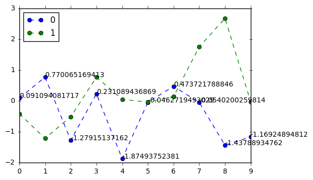
- # 注解
- df = pd.DataFrame(np.random.randn(10,2))
- print(df)
- df.plot(style = '--o')
- # plt.text(5,0.5,'hahaha',fontsize=10)
- # 注解 → 横坐标,纵坐标,注解字符串
- for i in range(10):
- plt.text(i,df[0].iloc[i],df[0].iloc[i],fontsize=10) #对0列的元素来说,标注y点的坐标。
输出:
- 0 1
- 0 0.091094 -0.417407
- 1 0.770065 -1.215896
- 2 -1.279151 -0.512889
- 3 0.231089 0.768293
- 4 -1.874938 0.051870
- 5 -0.046272 -0.041660
- 6 0.473722 0.144373
- 7 -0.054020 1.756313
- 8 -1.437889 2.679062
- 9 -1.169249 -0.029428
4. 图片保存
- # 图表输出
- df = pd.DataFrame(np.random.randn(1000, 4), columns=list('ABCD'))
- df = df.cumsum()
- df.plot(style = '--.',alpha = 0.5)
- plt.legend(loc = 'upper left')
- plt.savefig('C:/Users/Desktop/pdd.png',
- dpi=400,
- bbox_inches = 'tight',
- facecolor = 'g',
- edgecolor = 'b')
- # 可支持png,pdf,svg,ps,eps…等,以后缀名来指定
- # dpi是分辨率
- # bbox_inches:图表需要保存的部分。如果设置为‘tight’,则尝试剪除图表周围的空白部分。
- # facecolor,edgecolor: 图像的背景色,默认为‘w’(白色)

Matplotlib 图表的基本参数设置的更多相关文章
- matplotlib 中的一些参数设置
首先:在pycharm 中要使图显示出来,最后一定要加上 plt.show(),如: plt.bar(x, y) plt.show() 下面就是我使用 matplotlib 遇到的一些常用参数设置: ...
- Matplotlib 图表的样式参数
1. import numpy as np import pandas as pd import matplotlib.pyplot as plt % matplotlib inline # 导入相关 ...
- 05. Matplotlib 1 |图表基本元素| 样式参数| 刻度 注释| 子图
1.Matplotlib简介及图表窗口 Matplotlib → 一个python版的matlab绘图接口,以2D为主,支持python.numpy.pandas基本数据结构,运营高效且有较丰富的图表 ...
- python matplotlib 中文显示参数设置
python matplotlib 中文显示参数设置 方法一:每次编写代码时进行参数设置 #coding:utf-8import matplotlib.pyplot as pltplt.rcParam ...
- Fusioncharts图表常用参数设置
1.1 <chart>参数设置: 图表和轴的标题* caption=”String” : 图表上方的标题* subCaption=”String” : 图表上方的副标题* xAxisNam ...
- 一行代码让matplotlib图表变高大上
1 简介 matplotlib作为Python生态中最流行的数据可视化框架,虽然功能非常强大,但默认样式比较简陋,想要制作具有简洁商务风格的图表往往需要编写众多的代码来调整各种参数. 而今天要为大家介 ...
- Direcshow中视频捕捉和参数设置报告
Direcshow中视频捕捉和参数设置报告 1. 关于视频捕捉(About Video Capture in Dshow) 1视频捕捉Graph的构建 一个能够捕捉音频或者视频的graph图 ...
- 手把手教从零开始在GitHub上使用Hexo搭建博客教程(二)-Hexo参数设置
前言 前文手把手教从零开始在GitHub上使用Hexo搭建博客教程(一)-附GitHub注册及配置介绍了github注册.git相关设置以及hexo基本操作. 本文主要介绍一下hexo的常用参数设置. ...
- jqGrid的autoencode参数设置为true在客户端可能引发的编码问题
不久前使用jqGrid+MVC做过一段时间开发. 一开始,分页参数几乎都是默认值,jqGrid的分页功能很好用. 考虑到each input is evil,我们的系统对安全性又有较高要求,所以,为了 ...
随机推荐
- mybatis VS hibernate
转自:http://blog.csdn.net/firejuly/article/details/81902 第一章 Hibernate与MyBatis Hibernate 是当前最流行的O/ ...
- 即将要被淘汰的兼容之--CSS Hack
css hack 条件注释法只在IE下生效<!--[if IE]>这段文字只在IE浏览器显示<![endif]-->只在IE6下生效<!--[if IE 6]>这段 ...
- Myeclipse与tomcat的运行问题
在myeclipse中修改自己servlet后,在次运行时,可能会没有变化,这时需要重启tomcat,重新加载servlet
- tnagios - query handler
启动日志 [root@bjyh-48-86 nagios]# cat nagios.log [1433471109] Nagios 4.1.0rc1 starting... (PID=5136) [1 ...
- 【[USACO17DEC]Standing Out from the Herd】
题目 不会广义\(SAM\)啊 但信仰插入特殊字符就可以搞定一切了 我们先把所有的串搞在一起建出一个\(SAM\),记得在中间插入特殊字符 对于\(parent\)树上的一个节点,只有当其\(endp ...
- PHP APC安装与使用
先要解决一下httpd-devel依赖库问题 yum install cyrus-sasl-devel db4-devel openldap apr apr-util apr-util-devel p ...
- C#浏览器中在线操作文档
源码地址:https://github.com/SeaLee02/FunctionModule 文件夹 UploadFiles/WebDemo/COM/OnlineEdit.aspx 就是源码 用 ...
- 根据值设置select的选中项
$('.selector').attr("checked", true); <s:iterator value="jobSelect" id=" ...
- pooling
转自:http://www.gageet.com/2014/09182.php 本文部分参考了:http://www.zhihu.com/question/23437871 卷积层是对图像的一个邻域进 ...
- C#获取包括一二级汉字的拼音 首字母
C#获取包括一二级汉字的拼音 首字母 声母 汉字拼音转换 using System; using System.Collections.Generic; using System.Linq; usin ...