14、响应式布局和BootStrap 全局CSS样式知识点总结-part1
1、什么是响应式布局
响应式布局是Ethan Marcotte在2010年5月份提出的一个概念,这个概念是为解决移动互联网浏览而诞生的。
简而言之,就是一个网站能够兼容多个终端——而不是为每个终端做一个特定的版本。
响应式网络设计 ( RWD / AWD)的出现,目的是为移动设备提供更好的体验,并且整合从桌面到手机的各种屏幕尺寸和分辨率,用技术来使网页适应从小到大(现在到超大)的不同分辨率的屏幕。
2、bootstrap简介
Bootstrap 是最受欢迎的 HTML、CSS 和 JS 框架,用于开发响应式布局、移动设备优先的 WEB 项目。
* 一套完整的基础css模块,但不如compass丰富和强大
* 一套预定义样式表,包括一个格子布局系统,和blueprint提供的差不多,只是设计风格不一样
* 一组基于Jquery的js交互插件,这是Bootstrap真正强大的地方,也是她严格意义上可以取代Blueprint的原因所在,这些非常不错的小插件,包括对话框,下拉导航等等,不但功能完善,而且十分精致,正在成为众多jquery项目的默认设计标准。

user-scalable=no 可以禁用其缩放(zooming)功能。这样禁用缩放功能后,用户只能滚动屏幕,就能让你的网站看上去更像原生应用的感觉<meta name="viewport" content="width=device-width, initial-scale=1, maximum-scale=1, user-scalable=no">
.container 类用于固定宽度并支持响应式布局的容器.container-fluid 类用于 100% 宽度,占据全部视口(viewport)的容器。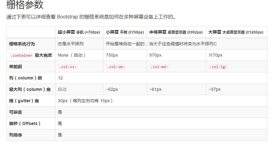
 <div class="container" style="background-color: #e6e6e6;color: #ff0000;">

     <div class="row">

         <div class="col-lg-4">hello 大 </div>

         <div class="col-md-4">hello 中 </div>

         <div class="col-sm-4">hello 小 </div>

         <div class="col-xs-4">hello 超小 </div>

     </div>

 <div class="row">

     <div class="col-md-8">.col-md-8</div>

     <div class="col-md-4">.col-md-4</div>

 </div>

 <div class="row">

     <div class="col-md-4">.col-md-4</div>

     <div class="col-md-4">.col-md-4</div>

     <div class="col-md-4">.col-md-4</div>

 </div>

 </div>

 <div class="container-fluid">

     <div class="row">

         <div class="col-lg-4">4</div>

         <div class="col-lg-8"> 8 </div>

     </div>

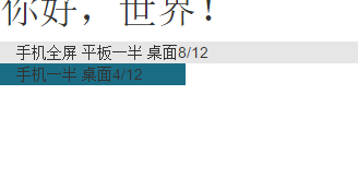
 <h1>你好,世界!</h1>

 <div class="container">

     <div class="row">

         <div class="col-xs-12 col-sm-6 col-md-8" style="background-color: #e6e6e6;">手机全屏 平板一半 桌面8/12</div>

         <div class="col-xs-6 col-md-4 " style="background-color: #1b6d85;">手机一半 桌面4/12</div>

     </div>

 </div>
下图为最小状态:

 <div >

        <h1>h1. Bootstrap heading</h1>

        <h2>h2. Bootstrap heading</h2>

        <h4>h4. Bootstrap heading <small>Secondary text</small></h4>

        <h5>h5. Bootstrap heading <small>Secondary text</small></h5>

        <h6>h6. Bootstrap heading <small>Secondary text</small></h6>

    </div>

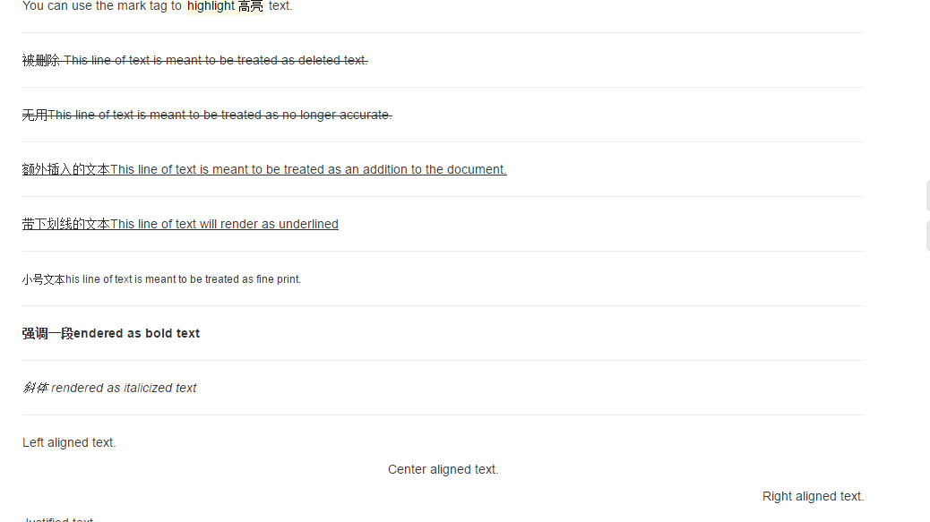
<div >
You can use the mark tag to <mark>highlight 高亮</mark> text.
<hr/>
<del>被删除 This line of text is meant to be treated as deleted text.</del>
<hr/>
<s>无用This line of text is meant to be treated as no longer accurate.</s>
<hr/>
<ins>额外插入的文本This line of text is meant to be treated as an addition to the document.</ins>
<hr/>
<u>带下划线的文本This line of text will render as underlined</u>
<hr/>
<small>小号文本his line of text is meant to be treated as fine print.</small>
<hr/>
<strong>强调一段endered as bold text</strong>
<hr/>
<em> 斜体 rendered as italicized text</em>
<hr/>
<p class="text-left">Left aligned text.</p>
<p class="text-center">Center aligned text.</p>
<p class="text-right">Right aligned text.</p>
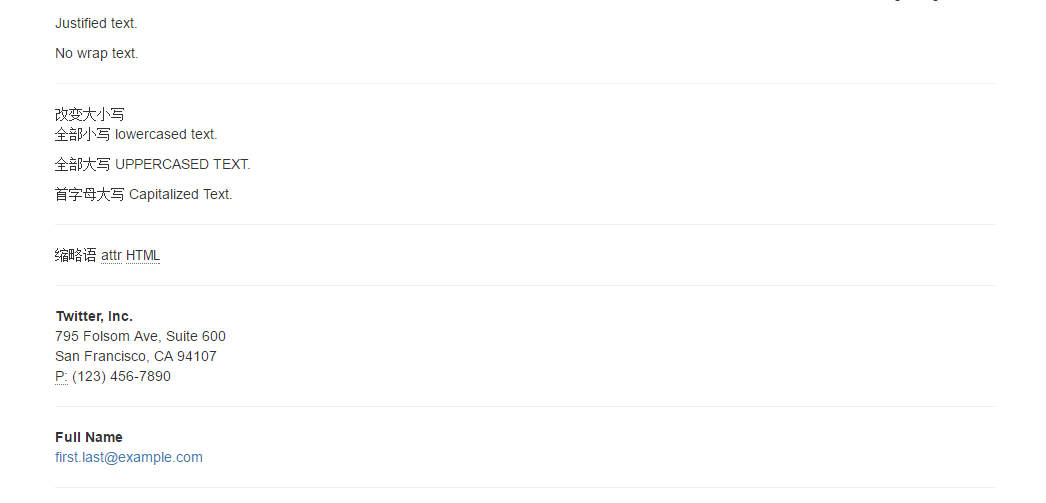
<p class="text-justify">Justified text.</p>
<p class="text-nowrap">No wrap text.</p> <hr/>
改变大小写
<p class="text-capitalize">
<p class="text-lowercase">全部小写 Lowercased text.</p>
<p class="text-uppercase">全部大写 Uppercased text.</p>
<p class="text-capitalize">首字母大写 capitalized text.</p> <hr/>
缩略语
<abbr title="attribute">attr</abbr>
<abbr title="HyperText Markup Language" class="initialism">HTML</abbr>
<hr/>
<address>
<strong>Twitter, Inc.</strong><br>
795 Folsom Ave, Suite 600<br>
San Francisco, CA 94107<br>
<abbr title="Phone">P:</abbr> (123) 456-7890
</address> <hr/>
<address>
<strong>Full Name</strong><br>
<a href="mailto:#">first.last@example.com</a>
</address> <hr/>
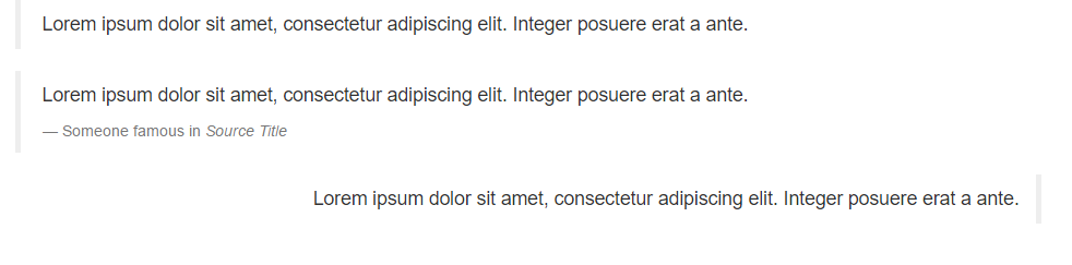
<blockquote>
<p>Lorem ipsum dolor sit amet, consectetur adipiscing elit. Integer posuere erat a ante.</p>
</blockquote>
</div>
 <div class="container">

     <blockquote>

         <p>Lorem ipsum dolor sit amet, consectetur adipiscing elit. Integer posuere erat a ante.</p>

     </blockquote>

     <blockquote>

         <p>Lorem ipsum dolor sit amet, consectetur adipiscing elit. Integer posuere erat a ante.</p>

         <footer>Someone famous in <cite title="Source Title">Source Title</cite></footer>

     </blockquote>

     <blockquote class="blockquote-reverse">

         Lorem ipsum dolor sit amet, consectetur adipiscing elit. Integer posuere erat a ante.

     </blockquote>

 </div>
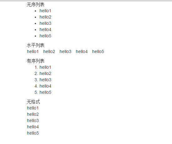
     无序列表

     <ul>

         <li>hello1</li>

         <li>hello2</li>

         <li>hello3</li>

         <li>hello4</li>

         <li>hello5</li>

     </ul>

     水平列表

     <ul class="list-inline">

         <li>hello1</li>

         <li>hello2</li>

         <li>hello3</li>

         <li>hello4</li>

         <li>hello5</li>

     </ul>

     有序列表

     <ol >

         <li>hello1</li>

         <li>hello2</li>

         <li>hello3</li>

         <li>hello4</li>

         <li>hello5</li>

     </ol>

     无格式

     <ol class="list-unstyled">

         <li>hello1</li>

         <li>hello2</li>

         <li>hello3</li>

         <li>hello4</li>

         <li>hello5</li>

     </ol>
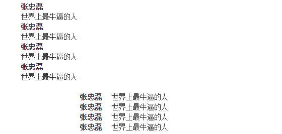
     <dl>

         <dt>张忠磊</dt>

         <dd>世界上最牛逼的人</dd>

         <dt>张忠磊</dt>

         <dd>世界上最牛逼的人</dd>

         <dt>张忠磊</dt>

         <dd>世界上最牛逼的人</dd>

         <dt>张忠磊</dt>

         <dd>世界上最牛逼的人</dd>

     </dl>

     <dl class="dl-horizontal">

         <dt>张忠磊</dt>

         <dd>世界上最牛逼的人</dd>

         <dt>张忠磊</dt>

         <dd>世界上最牛逼的人</dd>

         <dt>张忠磊</dt>

         <dd>世界上最牛逼的人</dd>

         <dt>张忠磊</dt>

         <dd>世界上最牛逼的人</dd>

     </dl>
4、代码
通过 code 标签包裹内联样式的代码片段
For example, <code><section></code> should be wrapped as inline.
<hr/>
通过 kbd 标签标记用户通过键盘输入的内容。=
To switch directories, type <kbd>cd</kbd> followed by the name of the directory.<br>
To edit settings, press <kbd><kbd>ctrl</kbd> + <kbd>,</kbd></kbd> <hr/>
多行代码可以使用 pre 标签。为了正确的展示代码,注意将尖括号做转义处理。
<pre><p>Sample text here...</p></pre> <hr/>
通过 var 标签标记变量
<var>y</var> = <var>m</var><var>x</var> + <var>b</var> <hr/>
通过 samp 标签来标记程序输出的内容。
<samp>This text is meant to be treated as sample output from a computer program.</samp>

14、响应式布局和BootStrap 全局CSS样式知识点总结-part1的更多相关文章
- 15、响应式布局和BootStrap 全局CSS样式知识点总结-part2
1.表格 <div class="container"> <table class="table "> <thead> &l ...
- 16、响应式布局和BootStrap 全局CSS样式知识点总结-part3
1.响应式工具 ①可用的类 <div class="container"> <a href="#" class="visible-x ...
- 响应式布局和BootStrap 全局CSS样式
1.什么是响应式布局 响应式布局是Ethan Marcotte在2010年5月份提出的一个概念,这个概念是为解决移动互联网浏览而诞生的. 简而言之,就是一个网站能够兼容多个终端——而不是为每个终端做一 ...
- bootstrap全局CSS样式学习
参考http://v3.bootcss.com/css/,根据自己的记忆进行的复述,加深记忆. 首先介绍bootstrap全局CSS样式 只通过使用bootstrap.css,即可获得统一的样式设置. ...
- 响应式开发(四)-----Bootstrap CSS----------Bootstrap CSS概览和相关注意事项
本章先记录一些与Bootstrap CSS相关的一些特点和注意事项以及兼容性. HTML 5 文档类型(Doctype) Bootstrap 使用了一些 HTML5 元素和 CSS 属性.为了让这些正 ...
- 响应式布局与bootstrap框架
原文 网页布局方式 1.固定宽度布局:为网页设置一个固定的宽度,通常以px做为长度单位,常见于PC端网页. 2.流式布局:为网页设置一个相对的宽度,通常以百分比做为长度单位. 3.栅格化布局:将网页宽 ...
- 响应式布局及bootstrap(实例)
说明: 这几天公司要求网站实现响应式布局,所以对响应式布局进行了相对全面的了解,并做了几个实例. 转载请注明源地址,谢谢^_^,http://www.cnblogs.com/liu-zhen/p/44 ...
- 响应式布局之BootStrap
本文在于巩固基础 学习bootStrap官网http://getbootstrap.com/ 响应式布局是Ethan Marcotte在2010年5月份提出的一个概念,简而言之,就是一个网站能够兼容多 ...
- bootstrap 全局 CSS 样式
http://v3.bootcss.com/css/#less-mixins-utility 深入了解 Bootstrap 底层结构的关键部分,包括我们让 web 开发变得更好.更快.更强壮的最佳实践 ...
随机推荐
- pixhawk原生固件在Windows下环境搭建笔记
首先参考了以下几篇博客 博客1:https://zhuanlan.zhihu.com/p/25198079 博客2:http://blog.csdn.net/oqqenvy12/article/det ...
- 【extjs6学习笔记】1.12 初始: Working with DOM
http://www.extjs-tutorial.com/extjs/working-with-dom Ext JS是一个DHTML库. 它通过使用JavaScript创建或操作DOM元素来创建UI ...
- zabbix文档3.4
zabbix 文档 3.4 5.zabbix 快速入门 1 登录和配置用户 用户名 : Admin 密 码 : zabbix 防止暴力袭击 在连续五次失败登录尝试的情况下,Zabbix界面将暂停30秒 ...
- ionic文本颜色
需添加"ion-text"使"color='light'"生效 <div text-center ion-text color="light&q ...
- 聊聊javascript的事件
javascript事件1.点击事件 onclick obtn.click=function(){};2.移入/移出事件 onmouseover/onmouseout 注意:在父级中移入移出,进 ...
- 3204: 数组做函数参数--排序函数2--C语言
3204: 数组做函数参数--排序函数2--C语言 时间限制: 1 Sec 内存限制: 128 MB提交: 211 解决: 143[提交][状态][讨论版][命题人:smallgyy] 题目描述 ...
- python_34_文件操作3
f=open('yesterday',encoding='utf-8') print(f.tell())#文件句柄所在指针指向的位置,即光标在哪里(按字符计数) f.readline()#读一行 pr ...
- 重温 JSP 与 Servlet
Java Web使用SSH框架多了,很多基础的 JSP 与 Servlet 的东西都忘记了.最近在 JSP 标签 和 Struts2 包装的 Session 对象的混合使用时弄晕了,就翻书温习下. J ...
- SQL小知识_长期总结
1. 左联接右联接区别 left join(左联接) 返回包括左表中的所有记录和右表中联结字段相等的记录 right join(右联接) 返回包括右表中的所有记录和左表中联结字段相等的记录inner ...
- Java代码工具箱之链接Oracle
1. 需要oracle的 odbc jar包 2. 代码 3. 注意:ps对象和statement对象最好用完立即释放,尤其是读写数据库代码出现在 for 循环语句中时. 否则会出现游标不够的情况, ...