Android-做个性化的进度条
1.案例效果图

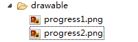
2.准备素材

progress1.png(78*78) progress2.png(78*78)

3.原理
采用一张图片作为ProgressBar的背景图片(一般采用颜色比较浅的)。另一张是进度条的图片(一般采用颜色比较深的图片)。进度在滚动时:进度图片逐步显示,背景图片逐步隐藏,达到上面的效果。
4.灵感来自Android控件提供的源码
4.1 默认带进度的进度条,如下图
- <ProgressBar
- android:id="@+id/progressBar2"
- style="@android:style/Widget.ProgressBar.Horizontal"
- android:layout_width="268dp"
- android:layout_height="wrap_content"
- android:progress="45" />
 <ProgressBar

    android:id="@+id/progressBar2"

    style="@android:style/Widget.ProgressBar.Horizontal"

    android:layout_width="268dp"

     android:layout_height="wrap_content"

    android:progress="45" />
注意:关键是style属性在起作用
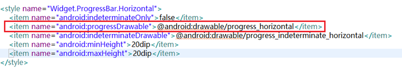
4.2 找到样式定义的位置
鼠标放在style属性值上,按下Ctrl键,出现超链接,点击超链接跳转到样式的定义位置
样式定义的内容如下
重点研究:
android:progressDrawable:进度条的样式
@android:drawable/progress_horizontal:样式定义的文件
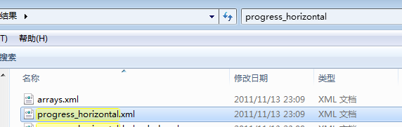
在android-sdk-windows\platforms\android-14\data\res目下搜索progress_horizontal.xml文件,搜索结果如下:
打开progress_horizontal.xml文件,内容如下
- <layer-listxmlns:androidlayer-listxmlns:android="http://schemas.android.com/apk/res/android">
- <itemandroid:iditemandroid:id="@android:id/background">
- <shape>
- <cornersandroid:radiuscornersandroid:radius="5dip"/>
- <gradient
- android:startColor="#ff9d9e9d"
- android:centerColor="#ff5a5d5a"
- android:centerY="0.75"
- android:endColor="#ff747674"
- android:angle="270"
- />
- </shape>
- </item>
- <itemandroid:iditemandroid:id="@android:id/secondaryProgress">
- <clip>
- <shape>
- <cornersandroid:radiuscornersandroid:radius="5dip"/>
- <gradient
- android:startColor="#80ffd300"
- android:centerColor="#80ffb600"
- android:centerY="0.75"
- android:endColor="#a0ffcb00"
- android:angle="270"
- />
- </shape>
- </clip>
- </item>
- <itemandroid:iditemandroid:id="@android:id/progress">
- <clip>
- <shape>
- <cornersandroid:radiuscornersandroid:radius="5dip"/>
- <gradient
- android:startColor="#ffffd300"
- android:centerColor="#ffffb600"
- android:centerY="0.75"
- android:endColor="#ffffcb00"
- android:angle="270"
- />
- </shape>
- </clip>
- </item>
- </layer-list>
<layer-listxmlns:android="http://schemas.android.com/apk/res/android">

     <itemandroid:id="@android:id/background">

        <shape>

             <cornersandroid:radius="5dip"/>

             <gradient

                     android:startColor="#ff9d9e9d"

                     android:centerColor="#ff5a5d5a"

                     android:centerY="0.75"

                    android:endColor="#ff747674"

                     android:angle="270"

            />

         </shape>

    </item>

     <itemandroid:id="@android:id/secondaryProgress">

         <clip>

             <shape>

                 <cornersandroid:radius="5dip"/>

                 <gradient

                         android:startColor="#80ffd300"

                        android:centerColor="#80ffb600"

                         android:centerY="0.75"

                        android:endColor="#a0ffcb00"

                         android:angle="270"

                 />

            </shape>

        </clip>

    </item>

    <itemandroid:id="@android:id/progress">

         <clip>

             <shape>

                 <cornersandroid:radius="5dip"/>

                 <gradient

                         android:startColor="#ffffd300"

                         android:centerColor="#ffffb600"

                         android:centerY="0.75"

                        android:endColor="#ffffcb00"

                         android:angle="270"

                 />

             </shape>

         </clip>

     </item>

 </layer-list>
释义:
<item android:id="@android:id/background">:定义进度条的背景样式
<item android:id="@android:id/secondaryProgress">:辅助进度条的样式
<item android:id="@android:id/progress">:进度条的样式
思考:如果我想做垂直进度条,怎么办了?
关键在clip元素的属性上做修改
<clip

    android:clipOrientation="vertical"    定义滚动的方向 vertical为垂直方向

    android:drawable="@drawable/progress1"  定义进度的图片

    android:gravity="bottom" >  定义进度的开始位置

</clip>


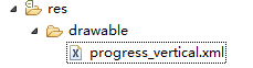
5.定义样式文件progress_vertical.xml
progress_vertical.xml文件代码如下
- <?xmlversionxmlversion="1.0"encoding="utf-8"?>
- <layer-listxmlns:androidlayer-listxmlns:android="http://schemas.android.com/apk/res/android">
- <itemandroid:iditemandroid:id="@android:id/progress">
- <clip
- android:clipOrientation="vertical"
- android:drawable="@drawable/progress1"
- android:gravity="bottom">
- </clip>
- </item>
- </layer-list>
<?xmlversion="1.0"encoding="utf-8"?>

<layer-listxmlns:android="http://schemas.android.com/apk/res/android">

     <itemandroid:id="@android:id/progress">

        <clip

            android:clipOrientation="vertical"

        android:drawable="@drawable/progress1"

         android:gravity="bottom">

      </clip>

 </item>

</layer-list>
6.应用自定义的样式
- <Button
- android:id="@+id/btStart"
- android:layout_width="fill_parent"
- android:layout_height="wrap_content"
- android:layout_marginTop="150dp"
- android:text="开始"/>
- <ProgressBar
- android:id="@+id/pbPic"
- style="@android:style/Widget.ProgressBar.Horizontal"
- android:layout_width="50dp"
- android:layout_height="68dp"
- android:background="@drawable/progress2"
- android:max="100"
- android:progress="0"
- android:progressDrawable="@drawable/progress_vertical" /> <!-- 在此属性上应用 -->
- <TextView
- android:id="@+id/txtProgress"
- android:layout_width="wrap_content"
- android:layout_height="wrap_content"/>
<Button

        android:id="@+id/btStart"

        android:layout_width="fill_parent"

        android:layout_height="wrap_content"

        android:layout_marginTop="150dp"

        android:text="开始"/>

    <ProgressBar

        android:id="@+id/pbPic"

        style="@android:style/Widget.ProgressBar.Horizontal"

        android:layout_width="50dp"

        android:layout_height="68dp"

        android:background="@drawable/progress2"

        android:max="100"

        android:progress="0"

        android:progressDrawable="@drawable/progress_vertical" />    <!-- 在此属性上应用 -->

    <TextView

        android:id="@+id/txtProgress"

        android:layout_width="wrap_content"

        android:layout_height="wrap_content"/>
7.点击按钮模拟进度滚动的效果
- <span style="color:#333333;">public class ProgressActivity extends Activity {
- ProgressBar pb = null;
- TextView txtProgress;
- Handler handler = new Handler();
- @Override
- publicvoid onCreate(Bundle savedInstanceState) {
- super.onCreate(savedInstanceState);
- setContentView(R.layout.main);
- System.out.println("主题=" + getTheme() + "");
- pb = (ProgressBar) findViewById(R.id.pbPic);
- Button btnStart = (Button) findViewById(R.id.btStart);//按钮
- txtProgress = (TextView) findViewById(R.id.txtProgress);//显示进度
- btnStart.setOnClickListener(new OnClickListener() {//按钮点击事件
- publicvoid onClick(View v) {
- new Thread(new Runnable() {//创建并启动线程,使用线程执行模拟的任务
- publicvoid run() {
- for (inti = 0; i < 100; i++) { //循环100遍
- try {
- handler.post(new Runnable() { //更新界面的数据
- publicvoid run() {
- pb.incrementProgressBy(1);//增加进度
- txtProgress.setText(pb.getProgress() + "%");//显示完成的进度
- }
- });
- Thread.sleep(100);
- } catch (InterruptedException e) {
- }
- }
- }
- }).start();
- }
- });
- }</span>
- }
<span style="color:#333333;">public class  ProgressActivity extends Activity {

      ProgressBar pb = null;

      TextView txtProgress;

      Handler handler = new Handler();

      @Override

      publicvoid onCreate(Bundle savedInstanceState) {

           super.onCreate(savedInstanceState);

           setContentView(R.layout.main);

           System.out.println("主题=" + getTheme() + "");

           pb = (ProgressBar) findViewById(R.id.pbPic);

           Button btnStart = (Button) findViewById(R.id.btStart);//按钮

           txtProgress = (TextView) findViewById(R.id.txtProgress);//显示进度

           btnStart.setOnClickListener(new OnClickListener() {//按钮点击事件

                 publicvoid onClick(View v) {

                      new Thread(new Runnable() {//创建并启动线程,使用线程执行模拟的任务

                                       publicvoid run() {

                                             for (inti = 0; i < 100; i++) { //循环100遍

                                                  try {

                                                        handler.post(new Runnable() { //更新界面的数据

                                                              publicvoid run() {

                                                                   pb.incrementProgressBy(1);//增加进度

                                                                   txtProgress.setText(pb.getProgress() + "%");//显示完成的进度

                                                              }

                                                        });

                                                        Thread.sleep(100);

                                                  } catch (InterruptedException e) {

                                                  }

                                             }

                                       }

                                  }).start();

                 }

           });

      }</span>

}
Android-做个性化的进度条的更多相关文章
- Android学习笔记- ProgressBar(进度条)
本节引言: 本节给大家带来的是Android基本UI控件中的ProgressBar(进度条),ProgressBar的应用场景很多,比如 用户登录时,后台在发请求,以及等待服务器返回信息,这个时候会用 ...
- Android 使用ProgressBar实现进度条
ProgressBar简介ProgressBar是进度条组件,通常用于向用户展示某个耗时操作完成的进度,而不让用户感觉是程序失去了响应,从而更好地提升用户界面的友好型. 课程目标(1)制定Progre ...
- android 对话框中的进度条 (ProgressDialog)
from:http://byandby.iteye.com/blog/817214 显然要定义对话框进度条就要用ProgressDialog,首先我们需要创建ProgressDialog对象,当然这里 ...
- Android学习笔记(24):进度条组件ProgressBar及其子类
ProgressBar作为进度条组件使用,它还派生了SeekBar(拖动条)和RatingBar(星级评分条). ProgressBar支持的XML属性: Attribute Name Related ...
- android中SeekBar拖动进度条的使用及事件监听
下面和大家分享一下android中SeekBar拖动进度条的使用,以及事件监听.拖动进度条的事件监听需要实现SeekBar.OnSeekBarChangeListener接口,调用SeekBar的se ...
- Android开发 PorgressBar(进度条)的使用
圆环进度条(默认)和水平进度条: <?xml version="1.0" encoding="utf-8"?> <LinearLayout x ...
- Android 自定义 View 圆形进度条总结
Android 自定义圆形进度条总结 版权声明:本文为博主原创文章,未经博主允许不得转载. 微博:厉圣杰 微信公众号:牙锅子 源码:CircleProgress 文中如有纰漏,欢迎大家留言指出. 最近 ...
- Android 自定义圆形旋转进度条,仿微博头像加载效果
微博 App 的用户头像有一个圆形旋转进度条的加载效果,看上去效果非常不错,如图所示: 据说 Instagram 也采用了这种效果.最近抽空研究了一下,最后实现的效果是这样: 基本上能模拟出个大概,代 ...
- Android 打造形形色色的进度条 实现可以如此简单
转载请标明出处:http://blog.csdn.net/lmj623565791/article/details/43371299 ,本文出自:[张鸿洋的博客] 1.概述 最近需要用进度条,秉着不重 ...
随机推荐
- 嵌入式Linux驱动学习之路(十六)输入子系统
以前写的一些输入设备的驱动都是采用字符设备处理的.问题由此而来,Linux开源社区的大神们看到了这大量输入设备如此分散不堪,有木有可以实现一种机制,可以对分散的.不同类别的输入设备进行统一的驱动,所以 ...
- Cacti -- Advance Ping
一.搭建Cacti 1. 安装epel扩展源:yum install -y epel-release 2. 安装lamp环境:yum install -y httpd php php-mysql my ...
- Python-04-基础
一.装饰器(decorator) 装饰器本质上也是函数,目的是为其他函数添加附加功能(装饰其他函数) Python通过使用装饰器来达到代码的开放与封闭. 原则: 不能修改被装饰函数的源代码. 不能修改 ...
- Swift学习(二):自定义扩展方法(Extensions)
扩展就是向一个已有的类.结构体或枚举类型添加新功能(functionality) 扩展可以 添加计算型属性和计算静态属性 定义实例方法和类型方法 提供新的构造器 定义下标 定义和使用新的嵌套类型 使一 ...
- 在Linux中如何使用命令进行RS-232串口通信和数据包解析
文章首发于浩瀚先森博客 1. 获取串口号 在Linux系统中一切皆为文件,所以串口端口号也不例外,都是以设备文件的形式出现.也就是说我们可以用访问文本文件的命令来访问它们. a. 一般串口都是以/de ...
- VMware三种上网模型
今天捣鼓了一会虚拟机,对上网方式又学习了一遍,之前摆弄过,现在又捡起来了,主要自己整理一下,方面后面复习.主要有三种网络模型:桥接.仅主机(Host-Only).NAT.自己亲测了这三种方式,都可以上 ...
- 您还在招聘网上海量投简历然后等面试机会吗?那你已经OUT了。
工作也可以来找我们.不行看完这篇. 从毕业到现在,换了2次工作.每次都在为招工组烦恼.找工作这个问题,不管是应届生还是职场老手.都面临一个问题就是找工作的平台.纵观目前的找工作的形式,主流的不外乎就两 ...
- java 内部类与外部类的区别
最近在看Java相关知识的时候发现Java中同时存在内部类以及非公有类概念,而且这两个类都可以不需要单独的文件编写,可以与其他类共用一个文件.现根据个人总结将两者的异同点总结如下,如有什么不当地方,欢 ...
- [React] 多组件生命周期转换关系
前段时间一直在基于React做开发,最近得空做一些总结,防止以后踩坑. 言归正传,React生命周期是React组件运行的基础,本文主要是归纳多组件平行.嵌套时,生命周期转换关系. 生命周期 Reac ...
- Leetcode 230. Kth Smallest Element in a BST
Given a binary search tree, write a function kthSmallest to find the kth smallest element in it. Not ...