使用CSS3画出一个叮当猫
刚学习了这个案例,然后觉得比较好玩,就练习了一下。然后发现其实也不难,如果你经常使用PS或者Flash的话,应该就会知道画个叮当猫是很容易的事,至少我是这么觉得。但是,用CSS3画出来确实是第一次接触,所以很乐意去尝试一下,对于我这种菜鸟,确实是帮助不少,至少懂得如何去画一个简单的人物形象出来,再加上一些动画效果,就活了,那就更好玩了!OK,开始之前,先把效果图晒一下:

PS:说实话,我觉得挺可爱的,小时候经常看多啦A梦,突然感觉很亲切,很童真,瞬间年轻了好多,哈哈!
首先,先把HTML结构搭建好:
<div class="wrapper">

    <!--叮当猫整体-->

    <div class="doraemon">

        <!--头部-->

        <div class="head">

            <!--眼睛-->

            <div class="eyes">

                <div class="eye left">

                    <!--眼珠-->

                    <div class="black bleft"></div>

                </div>

                <div class="eye right">

                    <div class="black bright"></div>

                </div>

            </div>

            <!--脸部-->

            <div class="face">

                <!--白色脸底-->

                <div class="white"></div>

                <!--鼻子-->

                <div class="nose">

                    <!--鼻子高光部分-->

                    <div class="light"></div>

                </div>

                <!--鼻子的竖线-->

                <div class="nose_line"></div>

                <!--嘴巴-->

                <div class="mouth"></div>

                <!--胡须-->

                <div class="whiskers">

                    <div class="whisker rTop r160"></div>

                    <div class="whisker rMiddle"></div>

                    <div class="whisker rBottom r20"></div>

                    <div class="whisker lTop r20"></div>

                    <div class="whisker lMiddle"></div>

                    <div class="whisker lBottom r160"></div>

                </div>

            </div>

        </div>

        <!--脖子和铃铛-->

        <div class="choker">

            <!--铃铛-->

            <div class="bell">

                <div class="bell_line"></div>

                <div class="bell_circle"></div>

                <div class="bell_under"></div>

                <div class="bell_light"></div>

            </div>

        </div>

        <!--身体-->

        <div class="bodys">

            <!--肚子-->

            <div class="body"></div>

            <!--肚兜-->

            <div class="wraps"></div>

            <!--口袋-->

            <div class="pocket"></div>

            <!--遮住一半口袋,使其呈现半圆-->

            <div class="pocket_mask"></div>

        </div>

        <!--右手-->

        <div class="hand_right">

            <!--手臂-->

            <div class="arm"></div>

            <!--手掌-->

            <div class="circle"></div>

            <!--遮住手臂和身子交接处的线-->

            <div class="arm_rewrite"></div>

        </div>

        <!--左手-->

        <div class="hand_left">

            <div class="arm"></div>

            <div class="circle"></div>

            <div class="arm_rewrite"></div>

        </div>

        <!--脚-->

        <div class="foot">

            <div class="left"></div>

            <div class="right"></div>

             <!--双脚之间的缝隙-->

            <div class="foot_rewrite"></div>

        </div>

    </div>

</div>
最好先把叮当猫的整体结构仔细研究一下,这对以后想要自己动手画别的人物形象很有帮助,思路会比较明朗。
接下来,我们按照头部,脖子,身体,脚部分别进行演示。首先将容器wrapper和叮当猫整体做一些基本的样式,叮当猫整体doraemon 设置position为relative,主要是为了便于 子元素/后代元素进行定位。
.wrapper{

    margin: 50px 0 0 500px;

}

.doraemon{

    position: relative;

}
头部head的样式,因为叮当猫的头部不是正圆,所以宽高有一点偏差,然后使用border-radius将头部从矩形变成椭圆形,然后再使用径向渐变从右上角给背景来个放射性渐变,然后在加个阴影,使其更有立体感,background:#07bbee;是为了兼容低版本浏览器:
.doraemon .head {

            position:relative;

            width: 320px;

            height: 300px;

            border-radius: 150px;

            background: #07bbee;

            background: -webkit-radial-gradient(right top,#fff 10%,#07bbee 20%,#10a6ce 75%,#000);

            background: -moz-radial-gradient(right top,#fff 10%,#07bbee 20%,#10a6ce 75%,#000);

            background: -ms-radial-gradient(right top,#fff 10%,#07bbee 20%,#10a6ce 75%,#000);
            border:2px solid #555;

            box-shadow:-5px 10px 15px rgba(0,0,0,0.45);

}
看看效果到底怎么样:
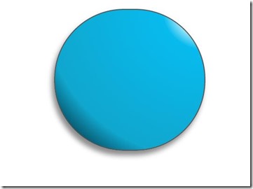
 shenmgui ,这么丑,别急,慢慢让它活过来:
/*脸部*/

         .doraemon .face {

             position: relative; /*让所有脸部元素可自由定位*/

             z-index:;    /*脸在头部背景上面*/

         }

        /*白色脸底*/

        .doraemon .face .white {

            width: 265px;       /*设置宽高*/

            height: 195px;

            border-radius: 150px;

            position: absolute; /*进行绝对定位*/

            top: 75px;

            left: 25px;

            background: #fff;

            /*此放射渐变也是使脸的左下角暗一些,看上去更真实*/

            background: -webkit-radial-gradient(right top,#fff 75%,#eee 80%,#999 90%,#444);

            background: -moz-radial-gradient(right top,#fff 75%,#eee 80%,#999 90%,#444);

            background: –ms-radial-gradient(right top,#fff 75%,#eee 80%,#999 90%,#444);
         }

        /*鼻子*/

         .doraemon .face .nose{

             width:30px;

             height:30px;

             border-radius:15px;

             background:#c93300;

             border:2px solid #000;

             position:absolute;

             top:110px;

             left:140px;

             z-index:;   /*鼻子在白色脸底下面*/

         }

        /*鼻子上的高光*/

        .doraemon .face .nose .light {

            width:10px;

            height:10px;

            border-radius: 5px;

            box-shadow: 19px 8px 5px #fff;  /*通过阴影实现高光*/

        }

         /*鼻子下的线*/

         .doraemon .face .nose_line{

             width:3px;

             height:100px;

             background:#333;

             position:absolute;

             top:143px;

             left:155px;

             z-index:;

         }

         /*嘴巴*/

         .doraemon .face .mouth{

             width:220px;

             height:400px;

             /*通过底边框加上圆角模拟微笑嘴巴*/

             border-bottom:3px solid #333;

             border-radius:120px;

             position:absolute;

             top:-160px;

             left:45px;

         }

         /*眼睛*/

        .doraemon .eyes {

            position: relative;

            z-index:; /*眼睛在白色脸底下面*/

        }

        /*眼睛共同的样式*/

        .doraemon .eyes .eye{

            width:72px;

            height:82px;

            background:#fff;

            border:2px solid #000;

            border-radius:35px 35px;

            position:absolute;

            top:40px;

        }

        /*眼珠*/

        .doraemon .eyes .eye .black{

            width:14px;

            height:14px;

            background:#000;

            border-radius:7px;

            position:absolute;

            top:40px;

        }

        .doraemon .eyes .left{

            left:82px;

        }

        .doraemon .eyes .right {

            left: 156px;

        }

        .doraemon .eyes .eye .bleft {

            left: 50px;

        }

        .doraemon .eyes .eye .bright {

            left: 7px;

        }
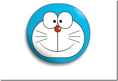
写了这么多样式,结果是怎么样的呢:

 怎么看都觉得别扭,哦!还差胡须须和白色脸底的边框呢,咱给补上:
/*胡须背景,主要用于挡住嘴巴的一部分,不要显得太长*/

        .doraemon .whiskers{

            width:220px;

            height:80px;

            background:#fff;

            border-radius:15px;

            position:absolute;

            top:120px;

            left:45px;

            z-index:;   /*在鼻子和眼睛下面*/

        }

        /*所有胡子的公用样式*/

        .doraemon .whiskers .whisker {

            width: 60px;

            height: 2px;

            background: #333;

            position: absolute;

            z-index:;

        }

        /*右上胡子*/

        .doraemon .whiskers .rTop {

            left: 165px;

            top: 25px;

        }

        /*右中胡子*/

        .doraemon .whiskers .rMiddle {

            left: 167px;

            top: 45px;

        }

        /*右下胡子*/

        .doraemon .whiskers .rBottom {

            left: 165px;

            top: 65px;

        }

        /*左上胡子*/

        .doraemon .whiskers .lTop {

            left:;

            top: 25px;

        }

        /*左中胡子*/

        .doraemon .whiskers .lMiddle {

            left: -2px;

            top: 45px;

        }

        /*左下胡子*/

        .doraemon .whiskers .lBottom {

            left:;

            top: 65px;

        }

        /*胡子旋转角度*/

        .doraemon .whiskers .r160 {

            -webkit-transform: rotate(160deg);

            -moz-transform: rotate(160deg);

            -ms-transform: rotate(160deg);

            -o-transform: rotate(160deg);

            transform: rotate(160deg);

        }

        .doraemon .whiskers .r20 {

            -webkit-transform: rotate(200deg);

            -moz-transform: rotate(200deg);

            -ms-transform: rotate(200deg);

            -o-transform: rotate(200deg);

            transform: rotate(200deg);

        }
 这样就对了,看着多舒服啊!趁热打铁,做脖子和身体:
/*围脖*/

        .doraemon .choker {

            width: 230px;

            height: 20px;

            background: #c40;

            /*线性渐变 让围巾看上去更自然*/

            background: -webkit-gradient(linear,left top,left bottom,from(#c40),to(#800400));

            background: -moz-linear-gradient(center top,#c40,#800400);

            background: -ms-linear-gradient(center top,#c40,#800400);

            border: 2px solid #000;

            border-radius: 10px;

            position: relative;

            top: -40px;

            left: 45px;

            z-index:;

        }

        /*铃铛*/

        .doraemon .choker .bell {

            width: 40px;

            height: 40px;

            _overflow: hidden; /*IE6 hack*/

            border: 2px solid #000;

            border-radius: 50px;

            background: #f9f12a;

            background: -webkit-gradient(linear, left top, left bottom, from(#f9f12a),color-stop(0.5, #e9e11a), to(#a9a100));

            background: -moz-linear-gradient(top, #f9f12a, #e9e11a 75%,#a9a100);

            background: -ms-linear-gradient(top, #f9f12a, #e9e11a 75%,#a9a100);

            box-shadow: -5px 5px 10px rgba(0,0,0,0.25);

            position: absolute;

            top: 5px;

            left: 90px;

        }

        /*双横线*/

        .doraemon .choker .bell_line {

            width: 36px;

            height: 2px;

            background: #f9f12a;

            border: 2px solid #333;

            border-radius: 3px 3px 0 0;

            position: absolute;

            top: 10px;

        }

        /*黑点*/

        .doraemon .choker .bell_circle{

            width:12px;

            height:10px;

            background:#000;

            border-radius:5px;

            position:absolute;

            top:20px;

            left:14px;

        }

        /*黑点下的线*/

        .doraemon .choker .bell_under{

            width: 3px;

            height:15px;

            background:#000;

            position:absolute;

            left: 18px;

            top:27px;

        }

        /*铃铛高光*/

        .doraemon .choker .bell_light{

            width:12px;

            height:12px;

            border-radius:10px;

            box-shadow:19px 8px 5px #fff;

            position:absolute;

            top:-5px;

            left:5px;

            opacity:0.7;

        }

        /*身子*/

        .doraemon .bodys {

            position: relative;

            top: -310px;

        }

        /*肚子*/

        .doraemon .bodys .body {

            width: 220px;

            height: 165px;

            background: #07beea;

            background: -webkit-gradient(linear,right top,left top,from(#07beea),color-stop(0.5, #0073b3),color-stop(0.75,#00b0e0), to(#0096be));

            background: -moz-linear-gradient(right center,#07beea,#0073b3 50%,#00b0e0 75%,#0096be 100%);

            background: -ms-linear-gradient(right center,#07beea,#0073b3 50%,#00b0e0 75%,#0096be 100%);

            border:2px solid #333;

            position:absolute;

            top:265px;

            left:50px;

        }

        /*白色肚兜*/

            .doraemon .bodys .wraps {

                width: 170px;

                height: 170px;

                background: #fff;

                background: -webkit-gradient(linear, right top, left bottom, from(#fff),color-stop(0.75,#fff),color-stop(0.83,#eee),color-stop(0.90,#999),color-stop(0.95,#444), to(#000));

                background: -moz-linear-gradient(right top,#fff,#fff 75%,#eee 83%,#999 90%,#444 95%,#000);

                background: -ms-linear-gradient(right top,#fff,#fff 75%,#eee 83%,#999 90%,#444 95%,#000);

                border: 2px solid #000;

                border-radius: 85px;

                position: absolute;

                left: 72px;

                top: 230px;

            }

            /*口袋*/

            .doraemon .bodys .pocket {

                width: 130px;

                height: 130px;

                border-radius: 65px;

                background: #fff;

                background: -webkit-gradient(linear, right top, left bottom, from(#fff),color-stop(0.70,#fff),color-stop(0.75,#f8f8f8),color-stop(0.80,#eee),color-stop(0.88,#ddd), to(#fff));

                background: -moz-linear-gradient(right top, #fff, #fff 70%,#f8f8f8 75%,#eee 80%,#ddd 88%, #fff);

                background: -ms-linear-gradient(right top, #fff, #fff 70%,#f8f8f8 75%,#eee 80%,#ddd 88%, #fff);

                border: 2px solid #000;

                position:absolute;

                top: 250px;

                left: 92px;

            }

            /*挡住口袋一半*/

            .doraemon .bodys .pocket_mask {

                width: 134px;

                height: 60px;

                background:#fff;

                border-bottom: 2px solid #000;

                position:absolute;

                top: 259px;

                left: 92px;

           }
好吧,脖子和身子都有啦!上图:
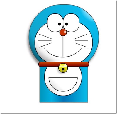
现在看起来有点像摆设品,不过笑容还是那么单纯,好了,赶紧把手脚做出来:
/*左右手*/

            .doraemon .hand_right, .doraemon .hand_left {

                height: 100px;

                width: 100px;

                position: absolute;

                top: 272px;

                left: 248px;

            }

            /*左手*/

            .doraemon .hand_left {

                left: -10px;

            }

            /*手臂公共部分*/

            .doraemon .arm {

                width:80px;

                height:50px;

                background: #07beea;

                background: -webkit-gradient(linear, left top, left bottom, from(#07beea),color-stop(0.85,#07beea), to(#555));

                background: -moz-linear-gradient(center top, #07BEEA, #07BEEA 85%, #555);

                background: -ms-linear-gradient(center top, #07BEEA, #07BEEA 85%, #555);

                border: 1px solid #000000;

                box-shadow: -10px 7px 10px rgba(0, 0, 0, 0.35);

                z-index: -1;

                position: relative;

            }

            /*右手手臂*/

            .doraemon .hand_right .arm {

                top: 17px;

                -webkit-transform: rotate(35deg);

                -moz-transform: rotate(35deg);

                -ms-transform: rotate(35deg);

                -o-transform: rotate(35deg);

                transform: rotate(35deg);

            }

            /*左手手臂*/

            .doraemon .hand_left .arm {

                top: 17px;

                background: #0096be;   /*背光一面使用纯色,使其有立体感*/

                box-shadow: 5px -7px 10px rgba(0, 0, 0, 0.25);

                -webkit-transform: rotate(145deg);

                -moz-transform: rotate(145deg);

                -ms-transform: rotate(145deg);

                -o-transform: rotate(145deg);

                transform: rotate(145deg);

            }

            /*圆形手掌公共部分*/

            .doraemon .circle {

                width: 60px;

                height: 60px;

                border-radius: 30px;

                border: 2px solid #000;

                background: #fff;

                background: -webkit-gradient(linear, right top, left bottom, from(#fff),color-stop(0.5,#fff),color-stop(0.70,#eee),color-stop(0.8,#ddd), to(#999));

                background: -moz-linear-gradient(right top, #fff, #fff 50%, #eee 70%, #ddd 80%,#999);

                background: -ms-linear-gradient(right top, #fff, #fff 50%, #eee 70%, #ddd 80%,#999);

                position: absolute;

            }

            /*右手手掌*/

            .doraemon .hand_right .circle {

                left: 40px;

                top: 32px;

            }

            /*左手手掌*/

            .doraemon .hand_left .circle {

                left: -20px;

                top: 32px;

            }

            /*手臂和身体结合处,使用背景遮住边框*/

            .doraemon .arm_rewrite {

                height: 45px;

                width: 5px;

                background: #07beea;

                position: relative;

            }

            /*右手结合处*/

            .doraemon .hand_right .arm_rewrite {

                top: -45px;

                left: 22px;

            }

            /*左手结合处*/

            .doraemon .hand_left .arm_rewrite {

                top: -45px;

                left: 60px;

                background: #0096be; /*同理,背光一面使用纯色,使其有立体感*/

            }

            /*脚部*/

            .doraemon .foot {

                width: 280px;

                height: 40px;

                position: relative;

                top: 55px;

                left: 20px;

            }

            /*左右脚共同样式*/

            .doraemon .foot .left, .doraemon .foot .right {

                width: 125px;

                height: 30px;

                background: #fff;

                background: -webkit-gradient(linear, right top, left bottom, from(#fff),color-stop(0.75,#fff),color-stop(0.85,#eee), to(#999));

                background: -moz-linear-gradient(right top, #fff, #fff 75%, #eee 85%, #999);

                background: -ms-linear-gradient(right top, #fff, #fff 75%, #eee 85%, #999);

                border: 2px solid #333;

                border-radius: 80px 60px 60px 40px;

                box-shadow: -6px 0 10px rgba(0, 0, 0, 0.35);

                position: relative;

            }

            .doraemon .foot .left {

                left: 8px;

                top: 65px;

            }

            .doraemon .foot .right {

                top: 31px;

                left: 141px;

            }

            /*双脚之间的缝隙,加阴影使用立体感*/

            .doraemon .foot .foot_rewrite {

                width: 20px;

                height: 10px;

                background: #fff;

                background: -webkit-gradient(linear, right top, left bottom, from(#666),color-stop(0.83,#fff), to(#fff));

                background: -moz-linear-gradient(right top, #666, #fff 83%, #fff);

                background: -ms-linear-gradient(right top, #666, #fff 83%, #fff);

                /*制作半圆效果*/

                border: 2px solid #000;

                border-bottom: none;

                border-radius: 40px 40px 0 0;

                position: relative;

                top: -11px;

                left: 130px;

                _left: 127px;

            }
好了,最后完整结果:
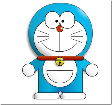
看一下,效果是不是和一开始的一样呢  ,虽然做好了,但是还是可以让它动起来的,比如眼睛,我们可以给它加个动画效果,让眼睛转动起来:
/*眼珠*/

        .doraemon .eyes .eye .black {

            width: 14px;

            height: 14px;

            background: #000;

            border-radius: 7px;

            position: absolute;

            top: 40px;

            -webkit-animation: eyemove 3s linear infinite;

            -moz-animation: eyemove 3s linear infinite;

            -ms-animation: eyemove 3s linear infinite;

            -o-animation: eyemove 3s linear infinite;

            animation: eyemove 3s linear infinite;

        }

        /*让眼睛动起来*/

        @-webkit-keyframes eyemove {

            70%{

                margin:0 0 0 0;

            }

            80% {

                margin: -22px 0 0 0;

            }

            85% {

                margin: -22px 0 0 5px;

            }

            90% {

                margin: -22px 10px 0 0;

            }

            93% {

                margin: -22px 0 0 0;

            }

            96% {

                margin: 0 0 0 0;

            }

        }

        @-moz-keyframes eyemove {

            70% {

                margin: 0 0 0 0;

            }

            80% {

                margin: -22px 0 0 0;

            }

            85% {

                margin: -22px 0 0 5px;

            }

            90% {

                margin: -22px 10px 0 0;

            }

            93% {

                margin: -22px 0 0 0;

            }

            96% {

                margin: 0 0 0 0;

            }

        }

        @-o-keyframes eyemove {

            70% {

                margin: 0 0 0 0;

            }

            80% {

                margin: -22px 0 0 0;

            }

            85% {

                margin: -22px 0 0 5px;

            }

            90% {

                margin: -22px 10px 0 0;

            }

            93% {

                margin: -22px 0 0 0;

            }

            96% {

                margin: 0 0 0 0;

            }

        }

        @keyframes eyemove {

            70% {

                margin: 0 0 0 0;

            }

            80% {

                margin: -22px 0 0 0;

            }

            85% {

                margin: -22px 0 0 5px;

            }

            90% {

                margin: -22px 10px 0 0;

            }

            93% {

                margin: -22px 0 0 0;

            }

            96% {

                margin: 0 0 0 0;

            }

        }
OK,这样,眼睛就会动了,有兴趣的可以试一下,这里就无法展示了。但是如果你有什么更好的动画效果也可以尝试,那么这个案例就结束了。
PS:虽然这只是一个案例,不过确实帮助我开阔思维,而且其实做一个这样的效果,可能会花费很多时间,至少对我来说目前确实是这样子,主要难点还是布局定位和颜色的合理搭配,才能使形象更加逼真生动!可能也有人对PS或者Flash等图形处理软件不是很熟,对用CSS3画出一些人物或者其他效果比较没有头绪,那么就可以去一些网站参考设计师们的设计构图,图形分解等相关设计知识,帮助我们更好地理解,这里推荐几个网站:
网页设计师联盟:http://www.68design.net/
使用CSS3画出一个叮当猫的更多相关文章
- 如何使用CSS3画出一个叮当猫
刚学习了这个案例,然后觉得比较好玩,就练习了一下.然后发现其实也不难,如果你经常使用PS或者Flash的话,应该就会知道画个叮当猫是很容易 的事,至少我是这么觉得.但是,用CSS3画出来确实是第一次接 ...
- 如何用CSS3画出一个立体魔方?
前言 最近在写<动画点点系列>文章,上一期分享了< 手把手教你如何绘制一辆会跑车 >,本期给大家带来是结合CSS3画出来的一个立体3d魔方,结合了js让你随心所欲想怎么转,就怎 ...
- 用CSS3画出一个立方体---转
css3实践—创建3D立方体 要想实现3D的效果,其实非常简单,只需指定一个元素为容器并设置transform-style:preserve-3d,那么它的后代元素便会有3D效果.不过有很多需要注意的 ...
- 纯CSS3画出小黄人并实现动画效果
前言 前两天我刚发布了一篇CSS3实现小黄人动画的博客,但是实现的CSS3动画是基于我在站酷网找到的一张小黄人的jpg格式图片,并自己用PS抠出需要实现动画的部分,最后才完成的动画效果.但是,其实我的 ...
- WPF Blend 脑洞大开的问题:如何用Blend得到或画出一个凹槽、曲面。
原文:WPF Blend 脑洞大开的问题:如何用Blend得到或画出一个凹槽.曲面. 目标图: 步骤一(放置一个矩形,填充蓝色): 步骤二(复制该矩形,并调整边角,填充粉红色): 第三部:让图形部分重 ...
- 用HTML+CSS画出一个同心圆
参加web前端校招的同学们经常会遇到这样的面试题:用HTML+CSS画出一个同心圆. 例如: 这道题主要考验的是基础盒模型布局能力和倒圆角属性的巧用. 1.html代码 <body> &l ...
- 如何在canvas中画出一个太极图
先放一个效果图: 代码如下 <!DOCTYPE html> <html> <head> <meta charset="utf-8" /&g ...
- 利用LineRenderer画出一个圆,类似于lol中的攻击范围
http://www.unity蛮牛.com/blog-5945-1409.html 本人大四狗,学unity半年有余,写此文章纯粹记录自己的心得. 废话不多说,进入主题.... 效果如图: 首先要理 ...
- 如何用CSS3画出懂你的3D魔方?
作者:首席填坑官∙苏南公众号:honeyBadger8,群:912594095,本文原创,著作权归作者所有,转载请注明原链接及出处. 前言 最近在写<每周动画点点系列>文章,上一期分享了& ...
随机推荐
- Engine中如何更改lyr文件数据源的相对路径
以下是使用relativebase存储layerfile的代码,如果需要修改数据源只要修改ILayer即可: string folderpath = @E:相对路径; string layerfile ...
- [ javascript New Image() ] New Image() 对象讲解
创建一个Image对象:var a=new Image(); 定义Image对象的src: a.src="xxx.gif"; 这样做就相当于给浏览器缓存了一张图片. 图 ...
- How-to: disable the web-security-check in Chrome for Mac
When I try to test one web app in coperate intranet, there is always some error like "Failed to ...
- ubuntu修改源列表sourcelist的方法
1.备份源列表 sudo cp /etc/apt/sources.list /etc/apt/sources.list_backup 2.找到对应版本的源,可以在以下界面当中找到,主要版本要对.htt ...
- android AsyncTask 只能在线程池里单个运行的问题
android 的AysncTask直接调用Execute会在在一个线程池里按调用的先后顺序依次执行. 如果应用的所有网络获取都依赖这个来做,当有一个网络请求柱塞,就导致其它请求也柱塞了. 在3.0 ...
- 配置JDK环境变量
•配置JDK环境变量<Windows系统下> 点击我的电脑右键----->属性------>高级------>环境变量-------> 新建(建议在系统变量中新建 ...
- Stronger (What Doesn't Kill You)
今天听一个歌曲,挺不错的.以前一直不知道意思.这次把歌词摘抄下来. 试听音乐: 原版MV: You know the bed feels warmer 你知道被窝里的温暖 Sleeping here ...
- spring mvc4.1.6 + spring4.1.6 + hibernate4.3.11 + mysql5.5.25 开发环境搭建及相关说明
一.准备工作 开始之前,先参考上一篇: struts2.3.24 + spring4.1.6 + hibernate4.3.11 + mysql5.5.25 开发环境搭建及相关说明 struts2.3 ...
- [Derby]数据库操作说明
1. 创建新数据库 connect 'jdbc:derby:mydb;create=true'; ij> connect 'jdbc:derby:mydb;create=true'; ij> ...
- 《大话移动APP测试:Android与iOS应用测试指南》
<大话移动app测试:android与ios应用测试指南> 基本信息 作者: 陈晔 出版社:清华大学出版社 ISBN:9787302368793 上架时间:2014-7-7 出版日期:20 ...