css3图形绘制
以下几个例子主要是运用了css3中border、bordr-radius、transform、伪元素等属性来完成的,我们先了解下它们的基本原理。
border:简单的来说border语法主要包含(border-width、border-style、border-color)三个属性。
- border-top(上边框):border-width border-style border-color
- border-right(右边框):border-width border-style border-color
- border-bottom(下边框):border-width border-style border-color
- border-left(左边框):border-width border-style border-color
border-radius:border-radius 的语法比我们想像中灵活得多。你可能会惊讶地发现 border-radius 原来是一个简写属性。它所对应的各个展开式属性:
- border-top-left-radius(左上圆角半径)
- border-top-right-radius (右上圆角半径)
- border-bottom-right-radius (右下圆角半径)
- border-bottom-left-radius(左下圆角半径)
border-image:共有三个属性,分别是图片(border-image-source)、剪裁位置(border-image-slice)、重复性(border-image-repeat)。
图片:使用URL调用
剪裁位置:共有1~4个参数,没有单位(默认是像素),也可以用百分比
- 第一个参数a:距离上边相应长度进行裁剪
- 第二个参数b:距离右边相应长度进行裁剪
- 第三个参数c:距离下边相应长度进行裁剪
- 第四个参数d:距离左边相应长度进行裁剪
重复性:有三个参数 stretch(默认值),round,repeat
- 默认值是stretch,拉伸的意思,可以看到上面的效果图中,“2”是垂直拉伸的,“>”是水平拉伸的,而中间的格子是水平垂直一起拉伸的。
- round是平铺
- repeat是重复
话不多说,来直接看下效果:
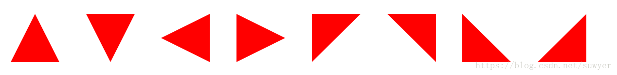
1、三角形系列(三角形、倒三角、左三角、右三角、左上三角、右上三角、左下三角、右下三角)
主要用到的是:宽度高度设置为0, border的各个边的设置(各个边的透明或不透明);
- .triangle-up {
- /* 三角形 */
- width: 0;
- height: 0;
- border-left: 50px solid transparent;
- border-right: 50px solid transparent;
- border-bottom: 100px solid #f00;
- }
- .triangle-down {
- /* 倒三角 */
- width: 0;
- height: 0;
- border-left: 50px solid transparent;
- border-right: 50px solid transparent;
- border-top: 100px solid #f00;
- }
- .triangle-left {
- /* 左三角 */
- width: 0;
- height: 0;
- border-top: 50px solid transparent;
- border-bottom: 50px solid transparent;
- border-right: 100px solid #f00;
- }
- .triangle-right {
- /* 右三角 */
- width: 0;
- height: 0;
- border-top: 50px solid transparent;
- border-bottom: 50px solid transparent;
- border-left: 100px solid #f00;
- }
- .triangle-topleft {
- /* 左上三角 */
- width: 0;
- height: 0;
- border-right: 100px solid transparent;
- border-top: 100px solid #f00;
- }
- .triangle-topright {
- /* 右上三角 */
- width: 0;
- height: 0;
- border-left: 100px solid transparent;
- border-top: 100px solid #f00;
- }
- .triangle-downleft {
- /* 左下三角 */
- width: 0;
- height: 0;
- border-right: 100px solid transparent;
- border-bottom: 100px solid #f00;
- }
- .triangle-downright {
- /* 右下三角 */
- width: 0;
- height: 0;
- border-left: 100px solid transparent;
- border-bottom: 100px solid #f00;
- }
2、梯形(三角形的变体,设置左右两条边相等,并且给它设置一个宽度)

- .Trapezium {
- height: 0;
- width: 100px;
- border-bottom: 100px solid #dc2500;
- border-left: 50px solid transparent;
- border-right: 50px solid transparent;
- }
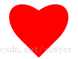
3、爱心(心形的制作是非常复杂的,可以使用伪元素来制作,分别将伪元素旋转不同的角度,并修改transform-origin属性来元素的旋转中心点)
- .love {
- /* 爱心 */
- position: relative;
- }
- .love:before {
- content: "";
- width: 70px;
- height: 110px;
- background: #f00;
- position: absolute;
- border-top-left-radius: 50%;
- border-top-right-radius: 50%;
- transform: rotate(45deg);
- }
- .love:after {
- content: "";
- width: 70px;
- height: 110px;
- background: #f00;
- position: absolute;
- border-top-left-radius: 50%;
- border-top-right-radius: 50%;
- transform: rotate(-45deg);
- left: -30px;
- }
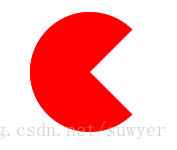
4、 食人豆(吃豆人的制作方法是先在一个圆形里面制作一个透明的三角形)
- .pacman {
- /* 食人豆 */
- width: 0;
- height: 0;
- border: 60px solid #f00;
- border-right: 60px solid transparent;
- border-radius: 100%;
- }
5、对话框(消息提示框可以先制作一个圆角矩形,然后在需要的地方放置一个三角形)

- .alertDialog {
- /* 对话框:一个圆角矩形和一个小三角形 */
- width: 150px;
- height: 100px;
- background: #f00;
- border-radius: 10px;
- position: relative;
- }
- .alertDialog:before {
- content: "";
- width: 0;
- height: 0;
- position: absolute;
- left: -20px;
- top: 40px;
- border-top: 10px solid transparent;
- border-bottom: 10px solid transparent;
- border-right: 20px solid #f00;
- }
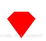
6、钻石(首先画一个直角梯形,再通过伪类元素在其下方画一个三角形)
- .diamond {
- /* 钻石:梯形和三角形组成 */
- width: 50px;
- height: 0;
- position: relative;
- border-bottom: 25px solid #f00;
- border-left: 25px solid transparent;
- border-right: 25px solid transparent;
- }
- .diamond:before {
- content: "";
- width: 0;
- height: 0;
- position: absolute;
- border-left: 50px solid transparent;
- border-right: 50px solid transparent;
- border-top: 70px solid #f00;
- left: -25px;
- top: 25px;
- }
7、五角星(星形的实现方式比较复杂,主要是使用transform属性来旋转不同的边)
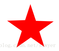
- .starFive {
- /* 五角星: */
- width: 0;
- height: 0;
- position: relative;
- border-left: 80px solid transparent;
- border-right: 80px solid transparent;
- border-bottom: 60px solid #f00;
- transform: rotate(35deg);
- }
- .starFive:before {
- content: "";
- position: absolute;
- width: 0;
- height: 0;
- border-left: 80px solid transparent;
- border-right: 80px solid transparent;
- border-bottom: 60px solid #f00;
- transform: rotate(-70deg);
- top: 3px;
- left: -80px;
- }
- .starFive:after {
- content: "";
- position: absolute;
- width: 0;
- height: 0;
- border-bottom: 60px solid #f00;
- border-right: 20px solid transparent;
- border-left: 20px solid transparent;
- transform: rotate(-35deg);
- top: -40px;
- left: -49px;
- }
8、菜单(结合::before和::after两个伪元素)

- .btn-hamburger i {
- /* position: relative; */
- display: -moz-inline-stack;
- display: inline-block;
- zoom: 1;
- width: 22px;
- height: 3px;
- color: #fff;
- font: bold .24rem/0.4 Helvetica;
- text-transform: uppercase;
- text-indent: -55px;
- background: #fff;
- transition: all 0.2s ease-out;
- }
- .btn-hamburger i::before, .btn-hamburger i::after {
- content: '';
- width: 22px;
- height: 3px;
- background: #fff;
- position: absolute;
- left: 0;
- transition: 0.2s;
- }
- .btn-hamburger i::before {
- top: -7px;
- }
- .btn-hamburger i::after {
- bottom: -7px;
- }
css3图形绘制的更多相关文章
- css3之图形绘制
由于近期的项目中出现了不规则的边框和图形, 所以重新温习一下CSS3的图形绘制...样式绘制的图形比图片的性能要好,体验更佳,关键一点是更加有趣! 以下几个例子主要是运用了css3中border.bo ...
- 推荐12个最好的 JavaScript 图形绘制库
众多周知,图形和图表要比文本更具表现力和说服力.图表是数据图形化的表示,通过形象的图表来展示数据,比如条形图,折线图,饼图等等.可视化图表可以帮助开发者更容易理解复杂的数据,提高生产的效率和 Web ...
- 【Windows编程】系列第五篇:GDI图形绘制
上两篇我们学习了文本字符输出以及Unicode编写程序,知道如何用常见Win32输出文本字符串,这一篇我们来学习Windows编程中另一个非常重要的部分GDI图形绘图.Windows的GDI函数包含数 ...
- 13个JavaScript图表(JS图表)图形绘制插件【转】
现在网络上又有越来越多的免费的(JS 图表)JavaScript图表图形绘制插件.我之前给一家网站做过复杂的图形,我们用的是 highchart.在那段时间,没有很多可供选择的插件.但现在不同了,很容 ...
- C#中的GDI+图形绘制方法
GDI+图形绘制方法 1.首先对于绘制图形,必须的先将命名空间导入:using System.Drawing.Drawing2D; 2.然后在一个事件中写入程序 首先先将Graphics这个对象实例化 ...
- cocos2d-x 图形绘制
转自:http://blog.csdn.net/zhy_cheng/article/details/8480048 图形绘制的话,在cocos2d-x自带的TestCpp里有,包括绘制点,直线,多边形 ...
- 图形绘制 Canvas Paint Path 详解
图形绘制简介 Android中使用图形处理引擎,2D部分是android SDK内部自己提供,3D部分是用Open GL ES 1.0.大部分2D使用的api都在android.grap ...
- HTML5图形绘制学习(1)-- Canvas 元素简介
Canvas元素是HTML5中新增的一个专门用来进行图形绘制的元素.和其名称Canvas一样,它就相当于一个画布,我们可以在其上描绘各种图形. 这里所说的绘制图型,不是指我们可以进行可视化的图形绘制, ...
- 【D3.V3.js系列教程】--(十五)SVG基本图形绘制
[D3.V3.js系列教程]--(十五)SVG基本图形绘制 1.path <!DOCTYPE html> <html> <head> <meta charse ...
随机推荐
- html设置背景图片并自适应
<style> html{ height:100%; } body{ padding: 0; margin: 0; background: url(images/2.jpg); backg ...
- 多人聊天室(Java)
第1部分 TCP和UDP TCP:是一种可靠地传输协议,是把消息按一个个小包传递并确认消息接收成功和正确才发送下一个包,速度相对于UDP慢,但是信息准确安全:常用于一般不要求速度和需要准确发送消息的场 ...
- jpa @onetomany 级联查询时会有重复数据,去重问题
自己是直接查出来然后利用set去重(自己感觉不是太好,不过能达到目的) List<CampaignDashboardDimensionDo> list = query.getResultL ...
- PHP数组——数组正则表达式、数组、预定义数组
正则表达式 1.替换 $s = "hello5world"; $s = preg_replace("/\d/","#",$s); echo ...
- redis更多
应用场景 存放频繁操作的数据,以及一些无须保存到数据库的中间值 应用: - 配合django做缓存,常用且不易修改的数据放进来(博客) - 购物车信息 - Session - 缓存配置文件 - ses ...
- CIA402状态转换图
CIA402状态转换如下图所示: 要想改变参数并使其生效,需要先将状态转换到ready,然后修改要配置的参数,再使其运行(operation enabled). 要发送的报文顺序基本如下: 1) ...
- 【easy】202. Happy Number
happy number Write an algorithm to determine if a number is "happy". A happy number is a n ...
- web富文本编辑器收集
1.UEditor 百度的. 优点:插件多,基本满足各种需求,类似贴吧中的回复界面. 缺点:不再维护,文档极少,使用并不普遍,图片只能上传到本地服务器,如果需要上传到其他服务器需要改动源码,较为难办, ...
- 【原创】大叔经验分享(26)hive通过外部表读写elasticsearch数据
hive通过外部表读写elasticsearch数据,和读写hbase数据差不多,差别是需要下载elasticsearch-hadoop-hive-6.6.2.jar,然后使用其中的EsStorage ...
- Python-爬虫-Beautifulsoup解析
简介 Beautiful Soup 是一个可以从HTML或XML文件中提取数据的Python库.它能够通过你喜欢的转换器实现惯用的文档导航,查找,修改文档的方式.Beautiful Soup会帮你节省 ...