python科学计算和可视化学习报告
一丶numpy和matplotlib学习笔记
1.

NumPy是Python语言的一个扩充程序库。支持高级大量的维度数组与矩阵运算,此外也针对数组运算提供大量的数学函数库。Numpy内部解除了Python的PIL(全局解释器锁),运算效率极好,是大量机器学习框架的基础库!
接下来让我们看看Numpy的简单应用
Numpy简单创建数组
import numpy as np# 创建简单的列表a = [1, 2, 3, 4]# 将列表转换为数组b = np.array(b)
Numpy查看数组属性
数组元素个数
b.size
数组形状
b.shape
数组维度
b.ndim
数组元素类型
b.dtype
快速创建N维数组的api函数
- 创建10行10列的数值为浮点1的矩阵
array_one = np.ones([10, 10])
- 创建10行10列的数值为浮点0的矩阵
array_zero = np.zeros([10, 10])
- 从现有的数据创建数组
- array(深拷贝)
- asarray(浅拷贝)
Numpy创建随机数组np.random
均匀分布
np.random.rand(10, 10)创建指定形状(示例为10行10列)的数组(范围在0至1之间)np.random.uniform(0, 100)创建指定范围内的一个数np.random.randint(0, 100)创建指定范围内的一个整数
正态分布
给定均值/标准差/维度的正态分布
np.random.normal(1.75, 0.1, (2, 3))
- 数组的索引, 切片
# 正态生成4行5列的二维数组arr = np.random.normal(1.75, 0.1, (4, 5))print(arr)# 截取第1至2行的第2至3列(从第0行算起)after_arr = arr[1:3, 2:4]print(after_arr)
数组索引

- 改变数组形状(要求前后元素个数匹配)
改变数组形状

print("reshape函数的使用!")one_20 = np.ones([20])print("-->1行20列<--")print (one_20)one_4_5 = one_20.reshape([4, 5])print("-->4行5列<--")print (one_4_5)
Numpy计算(重要)
条件运算
原始数据

条件判断

import numpy as npstus_score = np.array([[80, 88], [82, 81], [84, 75], [86, 83], [75, 81]])stus_score > 80
三目运算

import numpy as npstus_score = np.array([[80, 88], [82, 81], [84, 75], [86, 83], [75, 81]])np.where(stus_score < 80, 0, 90)
统计运算
指定轴最大值
amax(参数1: 数组; 参数2: axis=0/1; 0表示列1表示行)
求最大值

stus_score = np.array([[80, 88], [82, 81], [84, 75], [86, 83], [75, 81]])# 求每一列的最大值(0表示列)print("每一列的最大值为:")result = np.amax(stus_score, axis=0)print(result)print("每一行的最大值为:")result = np.amax(stus_score, axis=1)print(result)
指定轴最小值
amin
求最小值

stus_score = np.array([[80, 88], [82, 81], [84, 75], [86, 83], [75, 81]])# 求每一行的最小值(0表示列)print("每一列的最小值为:")result = np.amin(stus_score, axis=0)print(result)# 求每一行的最小值(1表示行)print("每一行的最小值为:")result = np.amin(stus_score, axis=1)print(result)
指定轴平均值
mean
求平均值

stus_score = np.array([[80, 88], [82, 81], [84, 75], [86, 83], [75, 81]])# 求每一行的平均值(0表示列)print("每一列的平均值:")result = np.mean(stus_score, axis=0)print(result)# 求每一行的平均值(1表示行)print("每一行的平均值:")result = np.mean(stus_score, axis=1)print(result)
方差
std
求方差

stus_score = np.array([[80, 88], [82, 81], [84, 75], [86, 83], [75, 81]])# 求每一行的方差(0表示列)print("每一列的方差:")result = np.std(stus_score, axis=0)print(result)# 求每一行的方差(1表示行)print("每一行的方差:")result = np.std(stus_score, axis=1)print(result)
数组运算
数组与数的运算
加法

stus_score = np.array([[80, 88], [82, 81], [84, 75], [86, 83], [75, 81]])print("加分前:")print(stus_score)# 为所有平时成绩都加5分stus_score[:, 0] = stus_score[:, 0]+5print("加分后:")print(stus_score)
乘法

stus_score = np.array([[80, 88], [82, 81], [84, 75], [86, 83], [75, 81]])print("减半前:")print(stus_score)# 平时成绩减半stus_score[:, 0] = stus_score[:, 0]*0.5print("减半后:")print(stus_score)
数组间也支持加减乘除运算,但基本用不到
image.png

a = np.array([1, 2, 3, 4])b = np.array([10, 20, 30, 40])c = a + bd = a - be = a * bf = a / bprint("a+b为", c)print("a-b为", d)print("a*b为", e)print("a/b为", f)
矩阵运算np.dot()(非常重要)
根据权重计算成绩

计算规则
(M行, N列) * (N行, Z列) = (M行, Z列)
矩阵计算总成绩

stus_score = np.array([[80, 88], [82, 81], [84, 75], [86, 83], [75, 81]])# 平时成绩占40% 期末成绩占60%, 计算结果q = np.array([[0.4], [0.6]])result = np.dot(stus_score, q)print("最终结果为:")print(result)
矩阵拼接
- 矩阵垂直拼接
垂直拼接

print("v1为:")v1 = [[0, 1, 2, 3, 4, 5],[6, 7, 8, 9, 10, 11]]print(v1)print("v2为:")v2 = [[12, 13, 14, 15, 16, 17],[18, 19, 20, 21, 22, 23]]print(v2)# 垂直拼接result = np.vstack((v1, v2))print("v1和v2垂直拼接的结果为")print(result)
- 矩阵水平拼接
水平拼接

print("v1为:")v1 = [[0, 1, 2, 3, 4, 5],[6, 7, 8, 9, 10, 11]]print(v1)print("v2为:")v2 = [[12, 13, 14, 15, 16, 17],[18, 19, 20, 21, 22, 23]]print(v2)# 垂直拼接result = np.hstack((v1, v2))print("v1和v2水平拼接的结果为")print(result)
Numpy读取数据np.genfromtxt
csv文件以逗号分隔数据

读取csv格式的文件

如果数值据有无法识别的值出现,会以
nan显示,nan相当于np.nan,为float类型.
2.Matplotlib
Matplotlib 是Python中类似 MATLAB 的绘图工具,熟悉 MATLAB 也可以很快的上手 Matplotlib。
1. 认识Matploblib
1.1 Figure
在任何绘图之前,我们需要一个Figure对象,可以理解成我们需要一张画板才能开始绘图。
import matplotlib.pyplot as plt
fig = plt.figure()
1.2 Axes
在拥有Figure对象之后,在作画前我们还需要轴,没有轴的话就没有绘图基准,所以需要添加Axes。也可以理解成为真正可以作画的纸。
fig = plt.figure()
ax = fig.add_subplot(111)
ax.set(xlim=[0.5, 4.5], ylim=[-2, 8], title='An Example Axes',
ylabel='Y-Axis', xlabel='X-Axis')
plt.show()
上的代码,在一幅图上添加了一个Axes,然后设置了这个Axes的X轴以及Y轴的取值范围(这些设置并不是强制的,后面会再谈到关于这些设置),效果如下图:
对于上面的fig.add_subplot(111)就是添加Axes的,参数的解释的在画板的第1行第1列的第一个位置生成一个Axes对象来准备作画。也可以通过fig.add_subplot(2, 2, 1)的方式生成Axes,前面两个参数确定了面板的划分,例如 2, 2会将整个面板划分成 2 * 2 的方格,第三个参数取值范围是 [1, 2*2] 表示第几个Axes。如下面的例子:
fig = plt.figure()
ax1 = fig.add_subplot(221)
ax2 = fig.add_subplot(222)
ax3 = fig.add_subplot(224)
1.3 Multiple Axes
可以发现我们上面添加 Axes 似乎有点弱鸡,所以提供了下面的方式一次性生成所有 Axes:
fig, axes = plt.subplots(nrows=2, ncols=2)
axes[0,0].set(title='Upper Left')
axes[0,1].set(title='Upper Right')
axes[1,0].set(title='Lower Left')
axes[1,1].set(title='Lower Right')
fig 还是我们熟悉的画板, axes 成了我们常用二维数组的形式访问,这在循环绘图时,额外好用。
1.4 Axes Vs .pyplot
相信不少人看过下面的代码,很简单并易懂,但是下面的作画方式只适合简单的绘图,快速的将图绘出。在处理复杂的绘图工作时,我们还是需要使用 Axes 来完成作画的。
plt.plot([1, 2, 3, 4], [10, 20, 25, 30], color='lightblue', linewidth=3)
plt.xlim(0.5, 4.5)
plt.show()
2. 基本绘图2D
2.1 线
plot()函数画出一系列的点,并且用线将它们连接起来。看下例子:
x = np.linspace(0, np.pi)
y_sin = np.sin(x)
y_cos = np.cos(x)
ax1.plot(x, y_sin)
ax2.plot(x, y_sin, 'go--', linewidth=2, markersize=12)
ax3.plot(x, y_cos, color='red', marker='+', linestyle='dashed')
在上面的三个Axes上作画。plot,前面两个参数为x轴、y轴数据。ax2的第三个参数是 MATLAB风格的绘图,对应ax3上的颜色,marker,线型。
另外,我们可以通过关键字参数的方式绘图,如下例:
x = np.linspace(0, 10, 200)
data_obj = {'x': x,
'y1': 2 * x + 1,
'y2': 3 * x + 1.2,
'mean': 0.5 * x * np.cos(2*x) + 2.5 * x + 1.1}
fig, ax = plt.subplots()
#填充两条线之间的颜色
ax.fill_between('x', 'y1', 'y2', color='yellow', data=data_obj)
# Plot the "centerline" with `plot`
ax.plot('x', 'mean', color='black', data=data_obj)
plt.show()
发现上面的作图,在数据部分只传入了字符串,这些字符串对一个这 data_obj 中的关键字,当以这种方式作画时,将会在传入给 data 中寻找对应关键字的数据来绘图。
2.2 散点图
只画点,但是不用线连接起来。
x = np.arange(10)
y = np.random.randn(10)
plt.scatter(x, y, color='red', marker='+')
plt.show()
2.3 条形图
条形图分两种,一种是水平的,一种是垂直的,见下例子:
np.random.seed(1)
x = np.arange(5)
y = np.random.randn(5)
fig, axes = plt.subplots(ncols=2, figsize=plt.figaspect(1./2))
vert_bars = axes[0].bar(x, y, color='lightblue', align='center')
horiz_bars = axes[1].barh(x, y, color='lightblue', align='center')
#在水平或者垂直方向上画线
axes[0].axhline(0, color='gray', linewidth=2)
axes[1].axvline(0, color='gray', linewidth=2)
plt.show()
条形图还返回了一个Artists 数组,对应着每个条形,例如上图 Artists 数组的大小为5,我们可以通过这些 Artists 对条形图的样式进行更改,如下例:
fig, ax = plt.subplots()
vert_bars = ax.bar(x, y, color='lightblue', align='center')
# We could have also done this with two separate calls to `ax.bar` and numpy boolean indexing.
for bar, height in zip(vert_bars, y):
if height < 0:
bar.set(edgecolor='darkred', color='salmon', linewidth=3)
plt.show()
2.4 直方图
直方图用于统计数据出现的次数或者频率,有多种参数可以调整,见下例:
np.random.seed(19680801)
n_bins = 10
x = np.random.randn(1000, 3)
fig, axes = plt.subplots(nrows=2, ncols=2)
ax0, ax1, ax2, ax3 = axes.flatten()
colors = ['red', 'tan', 'lime']
ax0.hist(x, n_bins, density=True, histtype='bar', color=colors, label=colors)
ax0.legend(prop={'size': 10})
ax0.set_title('bars with legend')
ax1.hist(x, n_bins, density=True, histtype='barstacked')
ax1.set_title('stacked bar')
ax2.hist(x, histtype='barstacked', rwidth=0.9)
ax3.hist(x[:, 0], rwidth=0.9)
ax3.set_title('different sample sizes')
fig.tight_layout()
plt.show()
参数中density控制Y轴是概率还是数量,与返回的第一个的变量对应。histtype控制着直方图的样式,默认是 ‘bar’,对于多个条形时就相邻的方式呈现如子图1, ‘barstacked’ 就是叠在一起,如子图2、3。 rwidth 控制着宽度,这样可以空出一些间隙,比较图2、3. 图4是只有一条数据时。
2.5 饼图
labels = 'Frogs', 'Hogs', 'Dogs', 'Logs'
sizes = [15, 30, 45, 10]
explode = (0, 0.1, 0, 0) # only "explode" the 2nd slice (i.e. 'Hogs')
fig1, (ax1, ax2) = plt.subplots(2)
ax1.pie(sizes, labels=labels, autopct='%1.1f%%', shadow=True)
ax1.axis('equal')
ax2.pie(sizes, autopct='%1.2f%%', shadow=True, startangle=90, explode=explode,
pctdistance=1.12)
ax2.axis('equal')
ax2.legend(labels=labels, loc='upper right')
plt.show()
饼图自动根据数据的百分比画饼.。labels是各个块的标签,如子图一。autopct=%1.1f%%表示格式化百分比精确输出,explode,突出某些块,不同的值突出的效果不一样。pctdistance=1.12百分比距离圆心的距离,默认是0.6.
2.6 箱形图
为了专注于如何画图,省去数据的处理部分。 data 的 shape 为 (n, ), data2 的 shape 为 (n, 3)。
fig, (ax1, ax2) = plt.subplots(2)
ax1.boxplot(data)
ax2.boxplot(data2, vert=False) #控制方向
2.7 泡泡图
散点图的一种,加入了第三个值 s 可以理解成普通散点,画的是二维,泡泡图体现了Z的大小,如下例:
np.random.seed(19680801)
N = 50
x = np.random.rand(N)
y = np.random.rand(N)
colors = np.random.rand(N)
area = (30 * np.random.rand(N))**2 # 0 to 15 point radii
plt.scatter(x, y, s=area, c=colors, alpha=0.5)
plt.show()
2.8 等高线(轮廓图)
有时候需要描绘边界的时候,就会用到轮廓图,机器学习用的决策边界也常用轮廓图来绘画,见下例:
fig, (ax1, ax2) = plt.subplots(2)
x = np.arange(-5, 5, 0.1)
y = np.arange(-5, 5, 0.1)
xx, yy = np.meshgrid(x, y, sparse=True)
z = np.sin(xx**2 + yy**2) / (xx**2 + yy**2)
ax1.contourf(x, y, z)
ax2.contour(x, y, z)
上面画了两个一样的轮廓图,contourf会填充轮廓线之间的颜色。数据x, y, z通常是具有相同 shape 的二维矩阵。x, y 可以为一维向量,但是必需有 z.shape = (y.n, x.n) ,这里 y.n 和 x.n 分别表示x、y的长度。Z通常表示的是距离X-Y平面的距离,传入X、Y则是控制了绘制等高线的范围。
3 布局、图例说明、边界等
3.1区间上下限
当绘画完成后,会发现X、Y轴的区间是会自动调整的,并不是跟我们传入的X、Y轴数据中的最值相同。为了调整区间我们使用下面的方式:
ax.set_xlim([xmin, xmax]) #设置X轴的区间
ax.set_ylim([ymin, ymax]) #Y轴区间
ax.axis([xmin, xmax, ymin, ymax]) #X、Y轴区间
ax.set_ylim(bottom=-10) #Y轴下限
ax.set_xlim(right=25) #X轴上限
具体效果见下例:
x = np.linspace(0, 2*np.pi)
y = np.sin(x)
fig, (ax1, ax2) = plt.subplots(2)
ax1.plot(x, y)
ax2.plot(x, y)
ax2.set_xlim([-1, 6])
ax2.set_ylim([-1, 3])
plt.show()
可以看出修改了区间之后影响了图片显示的效果。
3.2 图例说明
我们如果我们在一个Axes上做多次绘画,那么可能出现分不清哪条线或点所代表的意思。这个时间添加图例说明,就可以解决这个问题了,见下例:
fig, ax = plt.subplots()
ax.plot([1, 2, 3, 4], [10, 20, 25, 30], label='Philadelphia')
ax.plot([1, 2, 3, 4], [30, 23, 13, 4], label='Boston')
ax.scatter([1, 2, 3, 4], [20, 10, 30, 15], label='Point')
ax.set(ylabel='Temperature (deg C)', xlabel='Time', title='A tale of two cities')
ax.legend()
plt.show()
在绘图时传入 label 参数,并最后调用ax.legend()显示体力说明,对于 legend 还是传入参数,控制图例说明显示的位置:
Location String Location Code
‘best’ 0
‘upper right’ 1
‘upper left’ 2
‘lower left’ 3
‘lower right’ 4
‘right’ 5
‘center left’ 6
‘center right’ 7
‘lower center’ 8
‘upper center’ 9
‘center’ 10
3.3 区间分段
默认情况下,绘图结束之后,Axes 会自动的控制区间的分段。见下例:
data = [('apples', 2), ('oranges', 3), ('peaches', 1)]
fruit, value = zip(*data)
fig, (ax1, ax2) = plt.subplots(2)
x = np.arange(len(fruit))
ax1.bar(x, value, align='center', color='gray')
ax2.bar(x, value, align='center', color='gray')
ax2.set(xticks=x, xticklabels=fruit)
#ax.tick_params(axis='y', direction='inout', length=10) #修改 ticks 的方向以及长度
plt.show()
上面不仅修改了X轴的区间段,并且修改了显示的信息为文本。
3.4 布局
当我们绘画多个子图时,就会有一些美观的问题存在,例如子图之间的间隔,子图与画板的外边间距以及子图的内边距,下面说明这个问题:
fig, axes = plt.subplots(2, 2, figsize=(9, 9))
fig.subplots_adjust(wspace=0.5, hspace=0.3,
left=0.125, right=0.9,
top=0.9, bottom=0.1)
#fig.tight_layout() #自动调整布局,使标题之间不重叠
plt.show()
通过fig.subplots_adjust()我们修改了子图水平之间的间隔wspace=0.5,垂直方向上的间距hspace=0.3,左边距left=0.125 等等,这里数值都是百分比的。以 [0, 1] 为区间,选择left、right、bottom、top 注意 top 和 right 是 0.9 表示上、右边距为百分之10。不确定如果调整的时候,fig.tight_layout()是一个很好的选择。之前说到了内边距,内边距是子图的,也就是 Axes 对象,所以这样使用 ax.margins(x=0.1, y=0.1),当值传入一个值时,表示同时修改水平和垂直方向的内边距。
观察上面的四个子图,可以发现他们的X、Y的区间是一致的,而且这样显示并不美观,所以可以调整使他们使用一样的X、Y轴:
fig, (ax1, ax2) = plt.subplots(1, 2, sharex=True, sharey=True)
ax1.plot([1, 2, 3, 4], [1, 2, 3, 4])
ax2.plot([3, 4, 5, 6], [6, 5, 4, 3])
plt.show()
3.5 轴相关
改变边界的位置,去掉四周的边框:
fig, ax = plt.subplots()
ax.plot([-2, 2, 3, 4], [-10, 20, 25, 5])
ax.spines['top'].set_visible(False) #顶边界不可见
ax.xaxis.set_ticks_position('bottom') # ticks 的位置为下方,分上下的。
ax.spines['right'].set_visible(False) #右边界不可见
ax.yaxis.set_ticks_position('left')
# "outward"
# 移动左、下边界离 Axes 10 个距离
#ax.spines['bottom'].set_position(('outward', 10))
#ax.spines['left'].set_position(('outward', 10))
# "data"
# 移动左、下边界到 (0, 0) 处相交
ax.spines['bottom'].set_position(('data', 0))
ax.spines['left'].set_position(('data', 0))
# "axes"
# 移动边界,按 Axes 的百分比位置
#ax.spines['bottom'].set_position(('axes', 0.75))
#ax.spines['left'].set_position(('axes', 0.3))
plt.show()
-
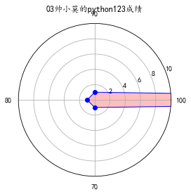
二.pands,numpy,matplotlib的应用(雷达图)
- # encoding: utf-8
- import pandas as pd
- import numpy as np
- import matplotlib.pyplot as plt
- plt.rcParams['font.sans-serif'] = ['KaiTi'] # 显示中文
- labels = np.array([u'', u'', u'',u'']) # 标签
- dataLenth = 4 # 数据长度
- data_radar = np.array([70, 1, 1, 1]) # 数据
- angles = np.linspace(0, 2*np.pi, dataLenth, endpoint=False) # 分割圆周长
- data_radar = np.concatenate((data_radar, [data_radar[0]])) # 闭合
- angles = np.concatenate((angles, [angles[0]])) # 闭合
- plt.polar(angles, data_radar, 'bo-', linewidth=1) # 做极坐标系
- plt.thetagrids(angles * 180/np.pi, labels) # 做标签
- plt.fill(angles, data_radar, facecolor='r', alpha=0.25)# 填充
- plt.ylim(0, 10)
- plt.title(u'03帅小莫的python123成绩')
- plt.show()
效果如下
三.Python自定义手绘风
1.在命令行安装Pillow及numpy库
- pip install Pillow
- pip install numpy
2.代码
- # encoding: utf-8
- from PIL import Image
- import numpy as np
- a = np.asarray(Image.open(r'C:\Users\wg-2\Desktop\timg.jpg').convert('L')).astype('float')
- depth = 10. # (0-100)
- grad = np.gradient(a) # 取图像灰度的梯度值
- grad_x, grad_y = grad # 分别取横纵图像梯度值
- grad_x = grad_x * depth / 100.
- grad_y = grad_y * depth / 100.
- A = np.sqrt(grad_x ** 2 + grad_y ** 2 + 1.)
- uni_x = grad_x / A
- uni_y = grad_y / A
- uni_z = 1. / A
- vec_el = np.pi / 2.2 # 光源的俯视角度,弧度值
- vec_az = np.pi / 4. # 光源的方位角度,弧度值
- dx = np.cos(vec_el) * np.cos(vec_az) # 光源对x 轴的影响
- dy = np.cos(vec_el) * np.sin(vec_az) # 光源对y 轴的影响
- dz = np.sin(vec_el) # 光源对z 轴的影响
- b = 255 * (dx * uni_x + dy * uni_y + dz * uni_z) # 光源归一化
- b = b.clip(0, 255)
- im = Image.fromarray(b.astype('uint8')) # 重构图像
- im.save(r'C:\Users\wg-2\Desktop\1.jpg')
3.效果如下
原图:

手绘图:

ps :是不是很美呢?你还可以根据自己爱好修改各种数值使手绘风更加贴近个人哦~
四.Python绘制数学或物理规律曲线
我们大家都学过正弦余弦的公式,也画过它的图像,现在我们通过python的numpy以及matplotlib库将它画出来,
直接上代码,不懂的往回翻。
代码:
- import numpy as np
- import pylab as pl
- import matplotlib.font_manager as fm
- import matplotlib
- t=np.arange(0.0,2.0*np.pi,0.01)
- s=np.sin(t)
- z=np.cos(t)
- pl.plot(t,s,label='正弦')
- pl.plot(t,z,label='余弦')
- pl.xlabel('x-变量',fontproperties='SimHei',fontsize=18)
- pl.ylabel('y-正弦余弦函数值',fontproperties='SimHei',fontsize=18)
- pl.title('sin-cos函数图像',fontproperties='SimHei',fontsize=24)
- pl.show()
效果如下:
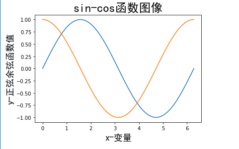
当然利用这个可以画其他的更多的更复杂数学公式及物理公式,这就要看你们是否想要去实现了~
python科学计算和可视化学习报告的更多相关文章
- Python科学计算三维可视化(整理完结)
中国MOOC<Pyhton计算计算三维可视化>总结 课程url:here ,教师:黄天宇,嵩天 下文的图片和问题,答案都是从eclipse和上完课后总结的,转载请声明. Python数据三 ...
- Python科学计算和可视化
一.Numpy NumPy(Numeric Python)系统是 Python 的一种开源的数值计算扩展.这种工具可用来存储和处理大型矩阵,比 Python 自身的嵌套列表(nested list s ...
- python科学计算与可视化视频教程
目录: 下载链接:https://www.yinxiangit.com/616.html 第一单元TVTK入门-1.mp4第一单元TVTK入门-2.mp4第一单元TVTK入门-3.mp4 第一单元TV ...
- python 科学计算与可视化
一.Numpy 库 NumPy(Numerical Python) 是 Python 语言的一个扩展程序库,支持大量的维度数组与矩阵运算,此外也针对数组运算提供大量的数学函数库. 引用: import ...
- python科学计算与可视化
一.Numpy 库 NumPy(Numerical Python) 是 Python 语言的一个扩展程序库,支持大量的维度数组与矩阵运算,此外也针对数组运算提供大量的数学函数库. 引用: import ...
- python 科学计算及数据可视化
第一步:利用python,画散点图. 第二步:需要用到的库有numpy,matplotlib的子库matplotlib.pyplot numpy(Numerical Python extensions ...
- Python 科学计算-介绍
Python 科学计算 作者 J.R. Johansson (robert@riken.jp) http://dml.riken.jp/~rob/ 最新版本的 IPython notebook 课程文 ...
- Python科学计算库
Python科学计算库 一.numpy库和matplotlib库的学习 (1)numpy库介绍:科学计算包,支持N维数组运算.处理大型矩阵.成熟的广播函数库.矢量运算.线性代数.傅里叶变换.随机数生成 ...
- Python科学计算PDF
Python科学计算(高清版)PDF 百度网盘 链接:https://pan.baidu.com/s/1VYs9BamMhCnu4rfN6TG5bg 提取码:2zzk 复制这段内容后打开百度网盘手机A ...
随机推荐
- 3.HTML颜色
一,HTML 颜色采用的是 RGB 颜色,是通过对红(R).绿(G).蓝(B)三个颜色通道的变化以及它们相互之间的叠加来得到各式各样的颜色的,RGB即是代表红.绿.蓝三个通道的颜色. <p st ...
- 记开发个人图书收藏清单小程序开发(七)DB设计
前面的书房初始化的前端信息已经完善,所以现在开始实现DB的Script部分. 新增Action:Shelf_Init.sql svc.sql CREATE SCHEMA [svc] AUTHORIZA ...
- 转:java 委托
委托模式是软件设计模式中的一项基本技巧.在委托模式中,有两个对象参与处理同一个请求,接受请求的对象将请求委托给另一个对象来处理.委托模式是一项基本技巧,许多其他的模式,如状态模式.策略模式.访问者模式 ...
- javascript版format函数,方便实现复杂字串连接
javascript版format函数,方便实现复杂字串连接 String.prototype.format = function () { var args = arguments; console ...
- 使用截图工具FastStone Capture
使用截图工具FastStone Capture -谨以此教程献给某位上进的测试人员- FastStone Capture是本人用过的windows平台上最好用的截图工具,界面简洁,功能强大,还支持屏幕 ...
- 更改SQL实例端口
为SQL Server使用非标准的端口 你正在使用标准的端口号1433来连接SQL Server 2005吗?你考虑过设置SQL Server来监听一个不同于1433的端口号吗?我曾经就是这样.在这篇 ...
- php面试题2018
一 .PHP基础部分 1.PHP语言的一大优势是跨平台,什么是跨平台? PHP的运行环境最优搭配为Apache+MySQL+PHP,此运行环境可以在不同操作系统(例如windows.Linux等)上配 ...
- layer的alert图
layer.alert("xxx",1); 1 2 3 4 5 6 7 8 9 10 11 12 13 14 15 16 17 及以后
- ZT 内地20年经典电视剧大全
内地20年经典电视剧大全 片尾曲:<故事就是故事> 演唱:戴娆 我听爷爷讲了一个故事 故事里的事是那昨天的事 故事里有好人也有坏人 故事里有好事也有坏事 故事里有多少是是非非 故事 ...
- 第二次作业:找Bug
引子 我真的想了一个小时,上哪里去找bug.我昨天还留意到一个bug,今天就不见了.灵光不断,我想起来了.我就要找大公司的产品的bug... 第一部分 调研, 评测 体验. <腾讯桌球>是 ...