KRBTabControl
Introduction
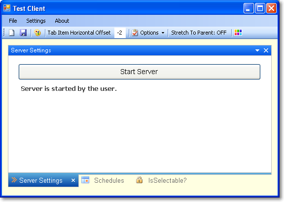
This article discusses how to make a custom tab control for the Windows Forms Application using the .NET Framework. A sample application is available within the demo and source project zip files.
- Mnemonic support
- Supports keyboard navigation
- Supports drag and drop tab pages from one container to another and also tab changing in the same container
- Adds tab page show/hide capability by the drop-down menu
- Gradient the selected tab item and its background
- Colorizer support for the control caption (RGBA Changer)
- Supports dynamic properties for end-users
- Shows how you can add design-time support so your custom controls behave properly at design time
- Custom msctls_updown32 scroller. Supports 6 different styles
- Provides keyboard support to the user for the KRBTabControl operations
- Supports transparent background for the control caption and the selected tab item
- Serialization support(Loads previous settings or save current settings.)
- Event Notifications (Drawing changes, drop-down menu changes, tab page selecting and closing actions)
Contents at a Glance
Anyway, what I am going to cover in this article is as follows:
- To Begin
- Class Table
- Control Border Styles
- Special Control Properties
- Tab Page Styles
- Control Events
- Transparent Background Support
- The ExpandableObjectConverter
- The UITypeEditor
- A Modal Type Editor
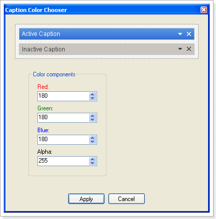
- Create a modal dialog form for changing the color components of the control caption
- Painting a Thumbnail
- RGBA Colorizer
- Keyboard shortcuts for user interaction
- Advanced Design-Time Support
- Drag and Drop Support
- Tab Header Styles
- Drop Down Menu Customizing
- Prevents tab page selecting or tab page closing from the user action
Class Table
The KRBTabControl class provides a basic implementation of its base control class but we need to create specific classes, properties, methods and a few events for our control. To do this, I have implemented custom classes.
Here you can review the class descriptions.
| Class Name | Description |
GradientTab |
We fill the selected tab item rectangle and its borders with a specific gradient by using this class member. It includes several kinds of properties for drawing operations. |
GradientTabConverter |
Normally, there's no way to set the subproperties of the GradientTab class at design time. To solve this problem, we need to create a custom type converter which is a specialized class that derives from the ExpandableObjectConverter. |
GradientTabEditor |
To support a thumbnail view, we need to create a custom type editor. Type editors give you the change to get a little fancy by creating a custom thumbnail of the gradient in the properties window. |
Hatcher |
With this class, we fill the tab pages header area with various patterns. It contains four properties for painting operations. |
HatcherConverter |
A custom type converter for a live Hatcher object that derives from the ExpandableObjectConverter. |
HatcherEditor |
We define a thumbnail view for our BackgroundHatcher property in the properties window. |
HatchStyleConverter |
Bug! enumeration of HatchStyle, multiple values at the result while calling the HatchStyle enumeration. Therefore we provide the list of HatchStyle standard values. |
CaptionGradient |
You can determine a new caption gradient style for your tab control by using these class members. |
CaptionGradientConverter |
A custom type converter class for CaptionGradient members. |
CaptionGradientEditor |
A custom type editor class. For creating a custom thumbnail of the gradient in the properties window. |
ButtonsCaption |
You can change your active or inactive caption buttons's color by using these class members. |
ButtonsCaptionConverter |
A custom type converter class for ButtonsCaption members. |
ButtonsCaptionEditor |
A custom type editor class. For creating a custom thumbnail of the gradient in the properties window. |
RandomizerCaption |
RGBA (Red, Green, Blue and Alpha) colorizer for our control caption. You can easily change your caption appearance by using this class members. |
RandomizerCaptionConverter |
A simple ExpandableObjectConverter for CaptionRandomizerproperty. |
CaptionColorChooserEditor |
To add a modal dialog box capability to the CaptionRandomizerproperty, we need to create a new UITypeEditor. |
TabpageExCollectionEditor |
We need to create a custom collection editor for creating a new instance of TabPageEx class or destroying existing TabPageEx in our TabPages collection editor. |
TabPageExPool |
This collection class holds our hidden tab pages. You cannot hide a tab page at design-time. It only works in runtime mode. |
Custom3DBorder |
Our separator drawer class. It draws a vertical line connecting the two points specified by the coordinate pairs. |
ArrowWindow |
It appears only while we're dragging a tab item on the another tab item. |
UpDown32 |
To hide or destroy system "msctls-updown32" scroller button from the container, we need to create a native window class that derives from the NativeWindow. |
Scroller |
The scroller class includes left and right RolloverUpDown control. You can change scroller style from the properties dialog. |
RolloverUpDown |
With the rollover updown control, very little work is performed with GDI+. Instead, updown images for all the four states are prepared in a separate program, and imported into the application as resources. These images are then assigned to the control which switches between them seamlessly (by deriving a class from UpDownBase). |
UpDownBase |
To make a custom updown button scroller, it makes most sense to derive directly from the Control class, because you need to implement all the drawing operations on your own. The UpDownBase control is declared as an abstract class so it cannot be instantiated directly. |
KRBTabControlDesigner |
To add design-time conveniences, like designer verbs or smart tags and also remove inappropriate events or properties from view (or add design-time-only events, properties and to create dynamic properties for our custom control). To create a basic control designer, begin by deriving a class from ParentControlDesigner. |
KRBTabControlActionList |
This class has two roles-it configures the collection of DesignerActionItem instances for the smart tag and when a command or change is made, it performs the corresponding operation on the linked control. |
TabPageEx |
Our custom tab page class. We need to change and add some properties on it. |
CaptionColorChooser |
To change RGBA values on the caption bitmap. We need to use a modal dialog box for changing color attributes. |
ContextMenuShownEventArgs |
This class holds our drop-down menu item parameters. |
SelectedIndexChangingEventArgs |
To prevent tab page selection or close, we need to create a custom EventArgs class. |
Control Border Styles
| Border Style | Preview |
Solid |
 |
Dotted |
 |
Dashed |
 |
Control Properties Table
| Property | Description |
|
Gets or Sets the selected tab page style. |
|
Gets or Sets the border color of the control. |
|
Gets or Sets the icon color of the selected tab item. |
|
Gets or Sets the distance in pixels, between the left edge of the first tab page and the left edge of its container's client area, the value must be in the range of -2 to 5 pixel size. |
|
Gets or Sets the background style of the tab page header. |
|
Gets or Sets the gradient colors of the selected tab page item. |
|
You can determine a new caption gradient style and colors for your tab control. |
|
You can change your active or inactive caption buttons's color. |
|
You can change your active and inactive caption color components (Red, Green, Blue, Alpha). |
|
Gets or Sets the scroller(up/down) style of the tab control. |
|
Determines whether the active tab is stretched to its parent container or not. |
|
Determines whether the tab header background is draw or not. |
|
Determines whether the tab control caption is visible or not. |
|
Determines whether the tab control's edge border is draw or not, you must set the IsCaptionVisible's value to false for this change to take effect. |
|
Provides keyboard support to the user for tab control operations. |
|
Determines whether the tab separator line is visible or not between the tab pages. |
|
Determines whether the tab control like as document tab style or not. |
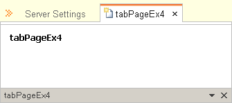
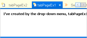
Tab Page Styles
| Tab Page Style | Preview |
KRBStyle |
 |
OfficeXP |
 |
VS2010 |
 |
Control Events
I have implemented a few events for control design and end-user notification.
| Event Name | Description |
|
Event raised when the value of the IsDrawHeader property is changed. |
|
Event raised when the value of the IsCaptionVisible property is changed. |
|
Event raised when the value of the HeaderVisibility(StretchToParent) property is changed. |
|
Occurs when a tab page is being closed. |
|
Occurs when a tab page is being selected. |
|
Occurs when a user clicks the drop-down icon on the caption if it's visible. |
Transparent Background Support
| Preview | |
CaptionBar |
|
TabPages |
|
Empty Container |
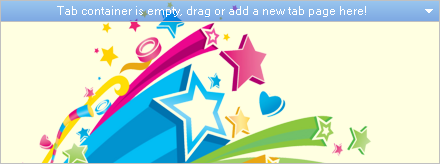
If your tab pages count is less than one, you'll see a empty tab container like the following.
|
The ExpandableObjectConverter
Unfortunately, there’s no way to set a custom object subproperties at design time.To solve this problem, you need to create a custom type converter, which is a specialized class that can convert a custom object to a string, and then convert the string back to a live custom object. If you don't use a type converter and look in the Properties window, you’ll see a piece of static text that shows the result of calling ToString() on the custom object.
A number of object properties are supported by Windows Forms controls. The best example is Font, which refers to a full-fledged Font object with properties like Bold, Italic, Name, and so on. When you set the Fontproperty in the Properties window, you don’t need to type all this information in a single, correctly formatted string. Instead, you can expand the Font property by clicking the plus (+) box and editing all of the Fontsubproperties individually.
You can enable the same type of editing with your own custom object types. You actually have two choices—you can use the ExpandableObjectConverter directly, or you can create a custom type converter that derives from the ExpandableObjectConverter. If you use this approach, you’ll have the benefit of the stringrepresentation and the ability to expand the property to see subproperties.
The first step is to create a custom class that derives from the base class System.ComponentModel.ExpandableObjectConverter, as shown here:
- class RandomizerCaptionConverter : ExpandableObjectConverter
- {
- // To do something.
- }
After than, we override the required methods for our use.
| Method | Description |
CanConvertFrom() |
This method examines a data type, and returns true if the type converter can make the conversion from this data type to the custom data type. |
ConvertFrom() |
This method performs the conversion from the supplied data type to the custom data type. |
CanConvertTo() |
This method examines a data type, and returns true if the type converter can make the conversion from the custom object to this data type. |
ConvertTo() |
This method performs the conversion from the custom data type to the requested data type. |
- #region Override Methods
- //All the CanConvertTo() method needs to is check that the target type is a string.
- public override bool CanConvertTo
- (ITypeDescriptorContext context, Type destinationType)
- {
- if (destinationType == typeof(string))
- return true;
- else
- return base.CanConvertTo(context, destinationType);
- }
- //ConvertTo() simply checks that it can indeed convert to the desired type.
- public override object ConvertTo(ITypeDescriptorContext context,
- System.Globalization.CultureInfo culture, object value, Type destinationType)
- {
- if (destinationType == typeof(string))
- return ToString(value);
- else
- return base.ConvertTo(context, culture, value, destinationType);
- }
- /* The exact same process occurs in reverse
- when converting a RandomizerCaption object to a string.
- First the Properties window calls CanConvertFrom().
- If it returns true, the next step is to call
- the ConvertFrom() method. */
- public override bool CanConvertFrom(ITypeDescriptorContext context, Type sourceType)
- {
- if (sourceType == typeof(string))
- return true;
- else
- return base.CanConvertFrom(context, sourceType);
- }
- public override object ConvertFrom(ITypeDescriptorContext context,
- System.Globalization.CultureInfo culture, object value)
- {
- if (value is string)
- return FromString(value);
- else
- return base.ConvertFrom(context, culture, value);
- }
- #endregion
Attaching a Type Converter
There are two ways to attach a type converter. The approach you should use in most cases is to link the custom type to the type converter by adding the TypeConverter attribute to the class declaration.
- [TypeConverter(typeof(RandomizerCaptionConverter))]
- public class RandomizerCaption : ICaptionRandomizer
- { ... }
And another option is to apply the TypeConverter attribute to the property in your custom control.
- /// <summary>
- /// You can change your active and inactive caption color components
- /// (Red, Green, Blue, Alpha).
- /// </summary>
- [Description("You can change your active and inactive caption color components (Red, Green, Blue, Alpha)")]
- [TypeConverter(typeof(RandomizerCaptionConverter))]
- [DesignerSerializationVisibility(DesignerSerializationVisibility.Content)]
- [Browsable(true)]
- public RandomizerCaption CaptionRandomizer
- {
- get { return _captionRandomizer; }
- set
- {
- try
- {
- if (!value.Equals(_captionRandomizer))
- {
- _captionRandomizer.CaptionRandomizerChanged -=
- CONTROL_INVALIDATE_UPDATE;
- _captionRandomizer = value;
- _captionRandomizer.CaptionRandomizerChanged +=
- new EventHandler(CONTROL_INVALIDATE_UPDATE);
- Invalidate();
- Update();
- }
- }
- catch (NullReferenceException)
- {
- MessageBox.Show("Value cannot be null!, please enter a valid value.");
- }
- }
- }

The UITypeEditor
The base UITypeEditor class is found in the System.Drawing.Design namespace. You can inherit from this class to create your custom type editors.
You associate a property with a type editor using the Editor attribute. As with type converters, you can apply the Editor attribute to a class declaration or a property declaration.
To create a custom type editor, you must first create a class that derives from System.Drawing.Design.UITypeEditor. You can then override the four methods shown in the below table.
| ClassMethod | Description |
EditValue() |
Invoked when the property is edited. Generally, this is where you would create a special dialog box for property editing. |
GetEditStyle() |
Specifies whether the type editor is a Drop-Down (provides a list of specially drawn choices), Modal (provides a dialog box for property selection), or None(no editing supported). |
GetPaintValueSupported() |
Use this to return true if you are providing a PaintValue()implementation. |
PaintValue() |
Invoked to paint a graphical thumbnail that represents the value in the Properties window. |
A Modal Type Editor
A modal type editor shows an ellipsis (...) button next to the property value. When this button is clicked, a dialog box appears that allows the developer to change the property value.
CaptionColorChooser
The CaptionColorChooser is a modal form. It makes sense to keep it out of the code editor. You can accomplish this by adding the internal keyword to the class declaration.
- internal partial class CaptionColorChooser : Form
- {
- // To do something.
- }
The real trick in this example is that the modal form you create for editing the property needs a way to receive information from the custom control object. To do this, you should create a few public instance to your editing control that accepts all the information it needs.
Here’s the details for storing the instance-supplied information:
- #region Instance Members
- public KRBTabControl contextInstance;
- public ICaptionRandomizer Randomizer;
- #endregion
Each NumericUpDown value can be changed by the user in the modal dialog box. So we need to create an event handler for each NumericUpDown control and then we should be updated current view on the form.
- private void numeric_ValueChanged(object sender, EventArgs e)
- {
- // Update current view on the control.
- Captions.Invalidate();
- Captions.Update();
- }
The next step is to develop the type editor that uses this modal form. Here’s the class declaration:
- class CaptionColorChooserEditor : UITypeEditor
- {
- // To do something.
- }
After than, we need to connect this type editor to the RandomizerCaption class using the Editor attribute. The following code snippet shows that how you can add this attribute to your appropriate class declaration. As mentioned above, you can also attach this type editor to the appropriate property using the same attribute.
- [Editor(typeof(CaptionColorChooserEditor), typeof(UITypeEditor))]
- public class RandomizerCaption : ICaptionRandomizer
- { ... }
All you need to do now is fill in the type editor code. First, we choose the modal style for our UITypeEditor. After than, We turn down thumbnails. Because; our worker class(RandomizerCaption) does not implement the drawing behaviour for design-time. And finally, in the EditValue() method you create an instance of the CaptionColorChooser form, and set its initial properties in the using scope, as shown here:
- #region Override Methods
- public override object EditValue
- (ITypeDescriptorContext context, IServiceProvider provider, object value)
- {
- ICaptionRandomizer current;
- using (CaptionColorChooser frm = new CaptionColorChooser())
- {
- // Set currently objects to the form.
- frm.Randomizer = (ICaptionRandomizer)value;
- frm.contextInstance = context.Instance as KRBTabControl;
- if (frm.ShowDialog() == DialogResult.OK)
- current = frm.Randomizer;
- else
- current = (ICaptionRandomizer)value;
- }
- return current;
- }
- public override UITypeEditorEditStyle GetEditStyle(ITypeDescriptorContext context)
- {
- // We will use a window for property editing.
- return UITypeEditorEditStyle.Modal;
- }
- public override bool GetPaintValueSupported(ITypeDescriptorContext context)
- {
- // No special thumbnail will be shown for the grid.
- return false;
- }
- #endregion
Painting a Thumbnail
Type editors also give you the chance to get a little fancy by creating a custom thumbnail of the gradient in the Properties window. To add this extra bit of finesse, all you need to do is create a type editor and override the PaintValue() method. Here’s the complete example from the GradientTabEditor class:
- #region Override Methods
- public override bool GetPaintValueSupported(ITypeDescriptorContext context)
- {
- return true;
- }
- public override void PaintValue(PaintValueEventArgs e)
- {
- GradientTab gradient = e.Value as GradientTab;
- using (LinearGradientBrush brush = new LinearGradientBrush(e.Bounds, gradient.ColorStart,
- gradient.ColorEnd, gradient.GradientStyle))
- {
- e.Graphics.FillRectangle(brush, e.Bounds);
- }
- }
- #endregion

RGBA Colorizer
I've created the RandomizerCaption class to change your caption bar appearance by using these class members. It implements the ICaptionRandomizer interface.
- public interface ICaptionRandomizer : IDisposable
- {
- /// <summary>
- /// Determines whether the randomizer effect is enable or not for tab control caption.
- /// </summary>
- bool IsRandomizerEnabled { get; set; }
- /// <summary>
- /// Determines whether the transparency effect is visible or not
- /// for tab control caption.
- /// </summary>
- bool IsTransparencyEnabled { get; set; }
- /// <summary>
- /// Gets or Sets, the red color component value of the caption bitmap.
- /// </summary>
- byte Red { get; set; }
- /// <summary>
- /// Gets or Sets, the green color component value of the caption bitmap.
- /// </summary>
- byte Green { get; set; }
- /// <summary>
- /// Gets or Sets, the blue color component value of the caption bitmap.
- /// </summary>
- byte Blue { get; set; }
- /// <summary>
- /// Gets or Sets, the alpha color component value of the caption bitmap.
- /// </summary>
- byte Transparency { get; set; }
- }
For more details on the subject, please look at my EasyProgressBar for Windows Forms Application article. You can manipulate your caption bar appearance if it is visible, as shown in the below examples:
| Color Manipulations Table - in inactive mode | ||||||||
|
Shortcut Keys
If IsUserInteraction property is enabled, provides keyboard support to the user for tab control operations.
| Keys | Description |
End |
Selects last tab page in the container. |
Home |
Selects first tab page in the container. |
Left |
Selects the tab on the left side of the currently selected tab page in the container. |
Right |
Selects the tab on the right side of the currently selected tab page in the container. |
Insert |
When a user is pressed to "Insert" key, a question dialog box appears that allows the developer to insert a new tab page. As shown in the below picture;
|
Delete |
Removes the selected tab page from the container. When this key is pressed, a dialog box appears that allows the developer to remove currently selected tab page from the container as shown here.
|
The KRBTabControlDesigner
Control designers allow you to manage the design-time behavior and the design-time interface (properties and events) exposed by your control. Although control designers are quite complex pieces of the Windows Forms infrastructure, it’s not difficult to customize an existing control designer to add new features.
You can derive a custom control designer to use with your custom controls. Why would you create your own designer?
- To add design-time conveniences, like context menu options and smart tags.
- To remove inappropriate events or properties from view (or add design-time-only events, properties and to create dynamic properties).
- To tailor the design-time appearance of the control so that it differs from the runtime appearance (for example, adding a border around an empty panel).
- To add support for controls that contain other controls (like the toolbar) or controls with special design-time needs (like menus).
At design time, the designer infrastructure attaches a designer to each component as it is sited on a form. (If more than one instance of the same component is added to a form, Visual Studio will reuse the same designer for all instances.) Once this connection is established, the control designer has the ability to take part in the interaction between the developer and the control.
To create a custom designer for your container like control, begin by deriving a class from ParentControlDesigner. The following code snippet shows how you can create a control designer for your controls.
- public class KRBTabControlDesigner : System.Windows.Forms.Design.ParentControlDesigner
- {
- // To do something.
- }
You can then add functionality to your control designer by overriding the built-in methods. When you’re finished, you need to link the custom control designer to the appropriate control. To do this, you apply the Designerattribute to the control declaration and specify the appropriate designer type. Here’s an example that links the KRBTabControlDesigner to the KRBTabControl control:
- [Designer(typeof(KRBTabControlDesigner))]
- public partial class KRBTabControl : TabControl
- { ... }
Designers provide six methods from the IDesignerFilter interface that you can override to filter properties, events, and attributes. These methods are listed in the below table.
| Method | Description |
PostFilterAttributes |
Override this method to remove unused or inappropriate attributes. |
PostFilterEvents |
Override this method to remove unused or inappropriate events. |
PostFilterProperties |
Override this method to remove unused or inappropriate properties. |
PreFilterAttributes |
Override this method to add attributes. |
PreFilterEvents |
Override this method to add events. |
PreFilterProperties |
Override this method to add properties. |
Technically, the filtering methods allow you to modify a System.ComponentModel.TypeDescriptor object that stores the property, attribute, and event information for your custom control. Visual Studio uses the information from this TypeDescriptor to determine what it makes available in the design-time environment.
Here’s an example that removes the inappropriate properties specified in the following code dump.
- protected override void PostFilterProperties
- (System.Collections.IDictionary properties)
- {
- properties.Remove("Margin");
- properties.Remove("ImeMode");
- properties.Remove("Padding");
- properties.Remove("Enabled");
- properties.Remove("RightToLeft");
- properties.Remove("RightToLeftLayout");
- properties.Remove("ApplicationSettings");
- properties.Remove("DataBindings");
- base.PostFilterProperties(properties);
- }
Important Note: As a general rule, always call the base method first in the PreFilterXxx() methods and last in the PostFilterXxx() methods. This way, all designer classes are given the proper opportunity to apply their changes. The ControlDesigner and ComponentDesigner use these methods to add properties like Visible, Enabled, Name, and Locked.
Dynamic Properties
To create dynamic properties for our custom controls. We need to override the PreFilterProperties method. In addition that, we need to change the properties attributes by using the TypeDescriptor.CreateProperty() in the same method. The following code snippet shows how you can apply this behaviour to your custom controls.
- /// <summary>
- /// Override this method to add some properties
- /// to the control or change the properties attributes for a dynamic user interface.
- /// </summary>
- /// <param name="properties">Properties collection of the control
- /// before than add a new property to the collection by user.</param>
- protected override void PreFilterProperties(System.Collections.IDictionary properties)
- {
- base.PreFilterProperties(properties);
- // We don't want to show the "Location" and "ShowToolTips" properties for our control at the design-time.
- properties["Location"] = TypeDescriptor.CreateProperty(typeof(KRBTabControl),
- (PropertyDescriptor)properties["Location"], BrowsableAttribute.No);
- properties["ShowToolTips"] = TypeDescriptor.CreateProperty(typeof(KRBTabControl),
- (PropertyDescriptor)properties["ShowToolTips"], BrowsableAttribute.No);
- /* After than, we don't want to see some properties at design-time for general reasons
- (Dynamic property attributes). */
- KRBTabControl parentControl = Control as KRBTabControl;
- if (parentControl != null)
- {
- if (parentControl.HeaderVisibility)
- {
- properties["ItemSize"] = TypeDescriptor.CreateProperty(typeof(KRBTabControl),
- (PropertyDescriptor)properties["ItemSize"], BrowsableAttribute.No);
- properties["TabStyles"] = TypeDescriptor.CreateProperty(typeof(KRBTabControl),
- (PropertyDescriptor)properties["TabStyles"], BrowsableAttribute.No);
- properties["Alignments"] = TypeDescriptor.CreateProperty(typeof(KRBTabControl),
- (PropertyDescriptor)properties["Alignments"], BrowsableAttribute.No);
- properties["UpDownStyle"] = TypeDescriptor.CreateProperty(typeof(KRBTabControl),
- (PropertyDescriptor)properties["UpDownStyle"], BrowsableAttribute.No);
- properties["HeaderStyle"] = TypeDescriptor.CreateProperty(typeof(KRBTabControl),
- (PropertyDescriptor)properties["HeaderStyle"], BrowsableAttribute.No);
- properties["TabGradient"] = TypeDescriptor.CreateProperty(typeof(KRBTabControl),
- (PropertyDescriptor)properties["TabGradient"], BrowsableAttribute.No);
- properties["IsDrawHeader"] = TypeDescriptor.CreateProperty(typeof(KRBTabControl),
- (PropertyDescriptor)properties["IsDrawHeader"], BrowsableAttribute.No);
- properties["CaptionButtons"] = TypeDescriptor.CreateProperty(typeof(KRBTabControl),
- (PropertyDescriptor)properties["CaptionButtons"], BrowsableAttribute.No);
- properties["TabBorderColor"] = TypeDescriptor.CreateProperty(typeof(KRBTabControl),
- (PropertyDescriptor)properties["TabBorderColor"], BrowsableAttribute.No);
- properties["GradientCaption"] = TypeDescriptor.CreateProperty(typeof(KRBTabControl),
- (PropertyDescriptor)properties["GradientCaption"], BrowsableAttribute.No);
- properties["BackgroundColor"] = TypeDescriptor.CreateProperty(typeof(KRBTabControl),
- (PropertyDescriptor)properties["BackgroundColor"], BrowsableAttribute.No);
- properties["BackgroundImage"] = TypeDescriptor.CreateProperty(typeof(KRBTabControl),
- (PropertyDescriptor)properties["BackgroundImage"], BrowsableAttribute.No);
- properties["BackgroundHatcher"] = TypeDescriptor.CreateProperty(typeof(KRBTabControl),
- (PropertyDescriptor)properties["BackgroundHatcher"], BrowsableAttribute.No);
- properties["CaptionRandomizer"] = TypeDescriptor.CreateProperty(typeof(KRBTabControl),
- (PropertyDescriptor)properties["CaptionRandomizer"], BrowsableAttribute.No);
- properties["IsDrawTabSeparator"] = TypeDescriptor.CreateProperty(typeof(KRBTabControl),
- (PropertyDescriptor)properties["IsDrawTabSeparator"], BrowsableAttribute.No);
- return;
- }
- if (!parentControl.IsCaptionVisible)
- {
- properties["CaptionButtons"] = TypeDescriptor.CreateProperty(typeof(KRBTabControl),
- (PropertyDescriptor)properties["CaptionButtons"], BrowsableAttribute.No);
- properties["CaptionRandomizer"] = TypeDescriptor.CreateProperty(typeof(KRBTabControl),
- (PropertyDescriptor)properties["CaptionRandomizer"], BrowsableAttribute.No);
- properties["GradientCaption"] = TypeDescriptor.CreateProperty(typeof(KRBTabControl),
- (PropertyDescriptor)properties["GradientCaption"], BrowsableAttribute.No);
- }
- if (parentControl.IsDrawHeader)
- {
- switch (parentControl.HeaderStyle)
- {
- case KRBTabControl.TabHeaderStyle.Hatch:
- properties["BackgroundColor"] = TypeDescriptor.CreateProperty(typeof(KRBTabControl),
- (PropertyDescriptor)properties["BackgroundColor"], BrowsableAttribute.No);
- properties["BackgroundImage"] = TypeDescriptor.CreateProperty(typeof(KRBTabControl),
- (PropertyDescriptor)properties["BackgroundImage"], BrowsableAttribute.No);
- break;
- case KRBTabControl.TabHeaderStyle.Solid:
- properties["BackgroundImage"] = TypeDescriptor.CreateProperty(typeof(KRBTabControl),
- (PropertyDescriptor)properties["BackgroundImage"], BrowsableAttribute.No);
- properties["BackgroundHatcher"] = TypeDescriptor.CreateProperty(typeof(KRBTabControl),
- (PropertyDescriptor)properties["BackgroundHatcher"], BrowsableAttribute.No);
- break;
- default:
- properties["BackgroundColor"] = TypeDescriptor.CreateProperty(typeof(KRBTabControl),
- (PropertyDescriptor)properties["BackgroundColor"], BrowsableAttribute.No);
- properties["BackgroundHatcher"] = TypeDescriptor.CreateProperty(typeof(KRBTabControl),
- (PropertyDescriptor)properties["BackgroundHatcher"], BrowsableAttribute.No);
- break;
- }
- }
- else
- {
- properties["HeaderStyle"] = TypeDescriptor.CreateProperty(typeof(KRBTabControl),
- (PropertyDescriptor)properties["HeaderStyle"], BrowsableAttribute.No);
- properties["BackgroundColor"] = TypeDescriptor.CreateProperty(typeof(KRBTabControl),
- (PropertyDescriptor)properties["BackgroundColor"], BrowsableAttribute.No);
- properties["BackgroundImage"] = TypeDescriptor.CreateProperty(typeof(KRBTabControl),
- (PropertyDescriptor)properties["BackgroundImage"], BrowsableAttribute.No);
- properties["BackgroundHatcher"] = TypeDescriptor.CreateProperty(typeof(KRBTabControl),
- (PropertyDescriptor)properties["BackgroundHatcher"], BrowsableAttribute.No);
- }
- }
- }
You still need to link each custom attribute to the appropriate property using the System.ComponentModel.RefreshProperties attribute in your custom control class. The following code snippet shows how you can add this attribute to your appropriate property declaration and specify the appropriate identifier type.
- [RefreshProperties(RefreshProperties.All)]
- public TabHeaderStyle HeaderStyle
- { get; set; }
For example, when the KRBTabControl.HeaderStyle property is changed by the user. We show or hide the BackgroundColor<code>, BackgroundImage and BackgroundHatcher properties to the end-user.
Smart Tags
The latest versions of Visual Studio include a new feature for creating a rich design-time experience—smart tags. Smart tags are the pop-up windows that appear next to a control when you click the tiny arrow in the corner.
Smart tags are similar to menus in that they have a list of items. However, these items can be commands (which are rendered like hyperlinks), or other controls like check boxes, drop-down lists, and more. They can also include static descriptive text. In this way, a smart tag can act like a mini Properties window.
The following picture shows an example of the custom smart tag. It allows the developer to set a combination of KRBTabControl properties.

To create this smart tag, you need the following ingredients:
- A collection of DesignerActionItem objects: Each
DesignerActionItemrepresents a single item in the smart tag. - An action list class: This class has two roles—it configures the collection of
DesignerActionIteminstances for the smart tag and, when a command or change is made, it performs the corresponding operation on the linked control. - A control designer: This hooks your action list up to the control so the smart tag appears at design time.
The Action List
Creating a smart tag is conceptually similar to adding designer verbs—you override a method in your control designer, and return a collection of commands you want to support. (This list of commands is called an action list.)
However, smart tags allow many more options than designer verbs, and so the associated code is likely to be more complex. To keep it all under control, it’s a good idea to separate your code by creating a custom class that encapsulates your action list. This custom class should derive from DesignerActionList (in the System.ComponentModel.Design namespace).
Here’s an example that creates an action list that’s intended for use with the KRBTabControl:
- public class KRBTabControlActionList : DesignerActionList
- {
- // To do something.
- }
You should add a single constructor to the action list that requires the matching control type. You can then store the reference to the control in a member variable. This isn’t required, because the base ActionList class does provide a Component property that provides access to your control. However, by using this approach, you gain the convenience of strongly typed access to your control.
- #region Constructor
- // The constructor associates the control to the smart tag action list.
- public KRBTabControlActionList(KRBTabControl control)
- : base(control)
- {
- _linkedControl = control;
- _host = (IDesignerHost)GetService(typeof(IDesignerHost));
- _changeService = (IComponentChangeService)GetService(typeof(IComponentChangeService));
- _designerService = (DesignerActionUIService)GetService(typeof(DesignerActionUIService));
- // When this control will be added to the design area, the smart tag panel will open automatically.
- this.AutoShow = true;
- }
- #endregion
To create your smart tag, you need to build a DesignerActionItemCollection that combines your group of DesignerActionItem objects. Order is important in this collection, because Visual Studio will add the DesignerActionItem objects to the smart tag from top to bottom in the order they appear.
To build your action list, you override the DesignerActionList.GetSortedActionItems() method, create the DesignerActionItemCollection, add each DesignerActionItem to it, and then return the collection. Depending on the complexity of your smart tag, this may take several steps.
The first step is to create the headers that divide the smart tag into separate regions. You can then add other items into these categories, as shown here:
- public override DesignerActionItemCollection GetSortedActionItems()
- {
- DesignerActionItemCollection items = new DesignerActionItemCollection();
- try
- {
- // Creating the action list static headers.
- items.Add(new DesignerActionHeaderItem("Commands"));
- items.Add(new DesignerActionHeaderItem("Appearance"));
- if (!_linkedControl.HeaderVisibility)
- {
- // Creates other action list headers.
- items.Add(new DesignerActionHeaderItem("Tab Item Appearance"));
- items.Add(new DesignerActionPropertyItem("TabStyles", "Tab Styles", "Appearance",
- "Tab Style"));
- items.Add(new DesignerActionPropertyItem("Alignments", "Tab Alignments", "Appearance",
- "Tab Alignment"));
- items.Add(new DesignerActionPropertyItem("FirstColor", "First Color", "Tab Item Appearance",
- "First TabItem Color"));
- items.Add(new DesignerActionPropertyItem("SecondColor", "Second Color", "Tab Item Appearance",
- "Second TabItem Color"));
- items.Add(new DesignerActionPropertyItem("GradientMode", "Gradient Mode", "Tab Item Appearance",
- "Gradient Style"));
- items.Add(new DesignerActionPropertyItem("IsSupportedAlphaColor", "Support Alpha Color",
- "Tab Item Appearance", "Supports alpha component for tab item background colors"));
- items.Add(new DesignerActionMethodItem(this,
- "RandomizeColors", "Randomize Colors", "Tab Item Appearance",
- "Randomize TabItem Colors", false));
- }
- items.Add(new DesignerActionMethodItem(this,
- "HeaderVisibility", "StretchToParent " + (_linkedControl.HeaderVisibility ? "ON" : "OFF"),
- "Appearance", "Determines whether the active tab is stretched to its parent container or not",
- false));
- items.Add(new DesignerActionMethodItem(this,
- "AddTab", "Add Tab", "Commands",
- "Add a new tab page to the container", false));
- if (_linkedControl.TabCount > 0)
- {
- DesignerActionMethodItem methodRemove = new DesignerActionMethodItem(this, "RemoveTab",
- "Remove Tab", "Commands", "Removes the selected tab page from the container", false);
- items.Add(methodRemove);
- }
- // Add a new static header and its items.
- items.Add(new DesignerActionHeaderItem("Information"));
- items.Add(new DesignerActionTextItem("X: " + _linkedControl.Location.X + ", " + "Y: "
- + _linkedControl.Location.Y, "Information"));
- items.Add(new DesignerActionTextItem("Width: " + _linkedControl.Size.Width + ", " + "Height: "
- + _linkedControl.Size.Height, "Information"));
- }
- catch (Exception ex)
- {
- MessageBox.Show("Exception while generating the action list panel for this KRBTabControl, " +
- ex.Message);
- }
- return items;
- }
You still need to connect it to your control. To add this action-list to your control, you need to override the ActionLists property in your custom designer, create a new DesignerActionListCollection, and add the appropriate DesignerActionList object entries. Your control designer handles the action item event, generally by updating the associated control. Notice that the action list isn’t created each time ActionList is called instead, it’s cached it as private member variable to optimize performance.
- public override DesignerActionListCollection ActionLists
- {
- get
- {
- if (_actionLists == null)
- {
- _actionLists = new DesignerActionListCollection();
- _actionLists.Add(new KRBTabControlActionList((KRBTabControl)Control));
- }
- return _actionLists;
- }
- }
Drag and Drop Support
If AllowDrop property is enable, you can drag currently selected tab page over the other tab pages. And also you can drag your tab pages from one tab container to another.

Tab Header Styles
| Header Style | Preview |
Solid |
 |
Hatch |
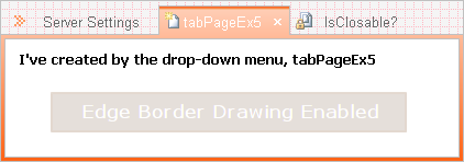 |
Texture |
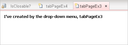 |
Drop Down Menu Customizing
There are two ways to customize your drop-down menu. The approach you should use in most cases is to handle the ContextMenuShown event. It passes an instance of ContextMenuShownEventArgs to the method for menu customizing.
- #region Customize ContextMenuStrip
- private void krbTabControl1_ContextMenuShown(object sender, ContextMenuShownEventArgs e)
- {
- ToolStripMenuItem menuItem = new ToolStripMenuItem()
- {
- Text = "Another menu item",
- ShortcutKeys = Keys.Control | Keys.N
- };
- menuItem.Click += (thrower, ea) =>
- {
- MessageBox.Show("Hello World!!!");
- };
- e.ContextMenu.Items.Insert(0, new ToolStripSeparator());
- e.ContextMenu.Items.Insert(0, menuItem);
- menuItem = new ToolStripMenuItem()
- {
- Text = "Open a new tab",
- Image = this.ımageList1.Images[2],
- ShortcutKeys = Keys.Control | Keys.O
- };
- menuItem.Click += (thrower, ea) =>
- {
- KRBTabControl.TabPageEx newTabPage = new KRBTabControl.TabPageEx();
- newTabPage.ImageIndex = 2;
- krbTabControl1.TabPages.Add(newTabPage);
- Label newLabel = new Label();
- newLabel.AutoSize = true;
- newLabel.Text = String.Format("I've created by the drop-down menu, {0}", newTabPage.Text);
- newLabel.Font = new Font("Tahoma", 9.75f, FontStyle.Bold);
- newLabel.Location = new Point(10, 10);
- newTabPage.Controls.Add(newLabel);
- };
- e.ContextMenu.Items.Insert(0, new ToolStripSeparator());
- e.ContextMenu.Items.Insert(0, menuItem);
- e.ContextMenu.Items.Add(new ToolStripSeparator());
- menuItem = new ToolStripMenuItem("My Menu Item");
- if (krbTabControl1.SelectedTab != null)
- {
- menuItem.Click += (thrower, ea) =>
- {
- MessageBox.Show(String.Format("Selected Tab Page: {0}", krbTabControl1.SelectedTab));
- };
- }
- e.ContextMenu.Items.Add(menuItem);
- }
- #endregion
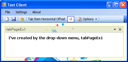
And another option is, when creating an inherited control with a different visual appearance, you must provide code to customize drop-down menu by overriding the OnContextMenuShown method. You can also hide or show your tab pages in the same menu. You'll see the available tab pages under the "Available Tab Pages" item, as shown here:
| Drop Down Menu | Preview |
Custom Menu |
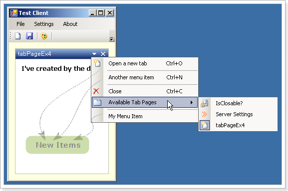 |
Prevents tab page selecting or tab page closing from the user action
| Action | Code Dump |
TabPage Selecting |
|
TabPage Closing |
|
References
For more details, please look at the following books:
- Pro .NET 2.0 Windows Forms and Custom Controls in C#, by Matthew MacDonald
- Pro .NET 2.0 Graphics Programming, by Eric White
History
- August 01, 2011 - Updated
- Fixed drag and drop operation.
- Fixed texture drawing for bottom alignment.
- Added dynamic properties support.
- Added mnemonic support.
- Added show/hide capability to the tab pages by the drop down menu.
- Added transparency support to the control caption bar and tab pages background.
- Added keyboard user interaction.
- Added serialize and deserialize support for data loading and saving(Xml and Binary serialization, you can choose one from the
DataSaverAttributeclass). - July 11, 2009 - First release
License
This article, along with any associated source code and files, is licensed under The Code Project Open License (CPOL)
KRBTabControl的更多相关文章
- KRBTabControl(中文)Windows选项卡控件
本文阐述了如何在C#使自定义Windows选项卡控件. Download demo project - 82.4 KB Download source - 252 KB 介绍 本文讨论如何使用.NET ...
随机推荐
- lr手工添加关联函数的步骤:
点击“确定”后: 如何修改已经创建好的关联规则:
- CentOS为中文显示
[sudo yum groupinstall chinese-support]命令即可安装
- 五十一 常用第三方模块virtualenv
在开发Python应用程序的时候,系统安装的Python3只有一个版本:3.4.所有第三方的包都会被pip安装到Python3的site-packages目录下. 如果我们要同时开发多个应用程序,那这 ...
- 戴尔笔记本Inspiron 7560(灵越) 加装固态硬盘从选购固态硬盘到系统迁移到设置SSD为第一启动(受不了了,网上的教程就没有完整的)
菜鸡我的笔记本为戴尔灵越Inpsiron 7560,其实Inspiron 15 7560 和Inspiron 7560是同一个型号. 电脑拆了安过内存条,换过电池,现在又加了一块固态硬盘. 因为不想安 ...
- ZOJ 3872 Beauty of Array【无重复连续子序列的贡献和/规律/DP】
Edward has an array A with N integers. He defines the beauty of an array as the summation of all dis ...
- linux 服务器之间文件传送
linux 服务器之间文件传送免密码输入传递: expect -c " set timeout 10 spawn scp ××××××.tar.bz2 root@172.16.17.34:/ ...
- MC资源整理
MC模拟简介 蒙特卡罗模拟,因摩纳哥著名的赌场而得名.它能够帮助人们从数学上表述物理.化学.工程.经济学以及环境动力学中一些非常复杂的相互作用. 蒙特卡罗(Monte Carlo)方法,又称随机抽样或 ...
- Mixins 改成使用高阶组件调用
把组件放在另外一个组件的 render 方法里面, 并且利用了 {...this.props} {...this.state} 这些 JSX 展开属性 对比下2种代码: 原始方式: <!DOC ...
- 【BFS】The New Villa
[poj1137] The New Villa Time Limit: 1000MS Memory Limit: 10000K Total Submissions: 1481 Accepted ...
- Uncaught SyntaxError: Invalid shorthand property initializer
$.ajax({ url : '../../collateralQuery/getCollateralQueryDetail', type : 'POST', data : {}, dataType ...

