WPF进阶技巧和实战06-控件模板
逻辑树和可视化树
System.Windows.LogicalTreeHelper
System.Windows.Media.VisualTreeHelper
逻辑树类(LogicalTreeHelper)的方法
| 名称 | 说明 |
|---|---|
| FindLogicalNode | 根据名称查找特定元素,从指定的元素开始并向下查找逻辑树 |
| BringIntoView | 如果元素在可滚动的容器中,并且当前不可见,就将元素滚动到视图中 |
| GetParent | 获取指定元素的父元素 |
| GetChildren | 获取指定元素的子元素 |
理解模板
每个控件都有一个内置的方法,用于确定如何渲染控件,该方法称为控件模板,是用XAML标记块来定义。WPF实际有3种模板:
ControlTemplate:控件的显示外衣,可以定制
ItemsPanelTemplate:集合控件的子项排列方式,可以定制
DataTemplate:控件中,数据的展示形式,可以定制,一般用于集合控件子项展示数据的形式
数据模板用于从对象中提取数据,并在内容控件或者列表控件的各项中显示数据。在数据绑定中,数据模板非常有效。在一定程度上,控件模板和数据模板是重叠的。这两种类型的模板都允许插入附加元素和应用格式化,然而,数据模板用于在已有控件的内部添加元素。预先构建好的控件内容不能改变。另一方面,控件模板是一种更加激进的方法,允许完全重写控件的内容模型。
面板模板用于控制列表控件中各项的布局,例如,可以使用面板模板创建列表框,从右向左然后向下平铺各项。
创建控件模板
简单按钮的模板:
<Style x:Key="ButtonBaseStyle" BasedOn="{StaticResource BaseStyle}" TargetType="{x:Type Button}">

        <Setter Property="FocusVisualStyle" Value="{x:Null}" />

        <Setter Property="Background" Value="{StaticResource Button.Static.Background}" />

        <Setter Property="BorderBrush" Value="{StaticResource Button.Static.Border}" />

        <Setter Property="Foreground" Value="{DynamicResource {x:Static SystemColors.ControlTextBrushKey}}" />

        <Setter Property="BorderThickness" Value="1" />

        <Setter Property="HorizontalContentAlignment" Value="Center" />

        <Setter Property="VerticalContentAlignment" Value="Center" />

        <Setter Property="Padding" Value="1" />

        <Setter Property="Template">

            <Setter.Value>

                <ControlTemplate TargetType="{x:Type Button}">

                    <Border x:Name="border" Background="{TemplateBinding Background}" BorderBrush="{TemplateBinding BorderBrush}" BorderThickness="{TemplateBinding BorderThickness}" SnapsToDevicePixels="true">

                        <ContentPresenter

                            x:Name="contentPresenter"

                            Margin="{TemplateBinding Padding}"

                            HorizontalAlignment="{TemplateBinding HorizontalContentAlignment}"

                            VerticalAlignment="{TemplateBinding VerticalContentAlignment}"

                            Focusable="False"

                            RecognizesAccessKey="True"

                            SnapsToDevicePixels="{TemplateBinding SnapsToDevicePixels}" />

                    </Border>

                    <ControlTemplate.Triggers>

                        <Trigger Property="IsDefaulted" Value="true">

                            <Setter TargetName="border" Property="BorderBrush" Value="{DynamicResource {x:Static SystemColors.HighlightBrushKey}}" />

                        </Trigger>

                        <Trigger Property="IsMouseOver" Value="true">

                            <Setter TargetName="border" Property="Background" Value="{StaticResource Button.MouseOver.Background}" />

                            <Setter TargetName="border" Property="BorderBrush" Value="{StaticResource Button.MouseOver.Border}" />

                        </Trigger>

                        <Trigger Property="IsPressed" Value="true">

                            <Setter TargetName="border" Property="Background" Value="{StaticResource Button.Pressed.Background}" />

                            <Setter TargetName="border" Property="BorderBrush" Value="{StaticResource Button.Pressed.Border}" />

                        </Trigger>

                        <Trigger Property="IsEnabled" Value="false">

                            <Setter TargetName="border" Property="Background" Value="{StaticResource Button.Disabled.Background}" />

                            <Setter TargetName="border" Property="BorderBrush" Value="{StaticResource Button.Disabled.Border}" />

                            <Setter TargetName="contentPresenter" Property="TextElement.Foreground" Value="{StaticResource Button.Disabled.Foreground}" />

                        </Trigger>

                    </ControlTemplate.Triggers>

                </ControlTemplate>

            </Setter.Value>

        </Setter>

    </Style>
为应用自定义控件模板,只需要设置控件的Template属性。可以定义内联模板(上述代码实现方式),也可以将模板作为资源使用。
- 控件模板的主要属性:
TargetType:明确指示该模板是为按钮设计
ContentPresenter:所有内容控件都有的元素,标识“在此插入内容”的标记器
x:Key:模板资源的名称,同一个资源文件中,键值必须唯一。不同资源文件中,后面的会覆盖前面的
- 模板绑定TemplateBinding
模板绑定和普通绑定类似,但模板绑定只有用于控件模板使用,只支持单向绑定(从控件向模板传递信息),并且不能从Freezable类的派生类的属性中提取信息。
- 改变属性的触发器
可以根据某些属性的改变,来修改控件模板的样式,
- 样式和模板
样式和模板有类似之处,通常,在应用程序中,两者都可以改变元素的外观。然而,样式被限制在一个很小的范围内。他们都可以调整控件的属性,但是不能使用全新的由不同元素组成的可视化树替代控件原有的外观。
如果在样式和控件模板中都设置了同样触发器,那么样式触发器会优先于控件模板触发器。
如果在样式或者控件模板等资源上,不加入键名,就意味着改变元素类型对应的所有控件。也可以通过设置Style="{x:Null}"来退出默认样式。
构建更复杂的模板
在控件模板和为其提供支持的代码之间有一个隐含约定。如果使用自定义控件模板替代控件的标准模板,就需要确保新模板能够满足控件的实现代码的所有需求。
在简单控件中,这个过程比较容易,因为对模板几乎没有真正的要求。对于复杂控件,因为控件的外观和实现不可能是完全相互独立的,所以,控件要求对其可视化显示做出了一些假设。
前面看到的控件模板这种需求的例子,使用占位元素(ContentPresenter和ItemsPresenter)和模板绑定。后面会出现具有特定名称(PART_开头)的元素和专门设计的用于特定控件模板的元素(比如ScrollBar控件中的Track元素)。
嵌套的模板
假设计划修改熟悉的ListBox控件,为ListBox控件设计模板:
<Style x:Key="ListBoxBaseStyle" TargetType="{x:Type ListBox}">

        <Setter Property="Background" Value="{StaticResource ListBox.Static.Background}" />

        <Setter Property="BorderBrush" Value="{StaticResource ListBox.Static.Border}" />

        <Setter Property="BorderThickness" Value="1" />

        <Setter Property="Foreground" Value="{DynamicResource {x:Static SystemColors.ControlTextBrushKey}}" />

        <Setter Property="ScrollViewer.HorizontalScrollBarVisibility" Value="Auto" />

        <Setter Property="ScrollViewer.VerticalScrollBarVisibility" Value="Auto" />

        <Setter Property="ScrollViewer.CanContentScroll" Value="true" />

        <Setter Property="ScrollViewer.PanningMode" Value="Both" />

        <Setter Property="Stylus.IsFlicksEnabled" Value="False" />

        <Setter Property="VerticalContentAlignment" Value="Center" />

        <Setter Property="Template">

            <Setter.Value>

                <ControlTemplate TargetType="{x:Type ListBox}">

                    <Border x:Name="Bd" Padding="1" Background="{TemplateBinding Background}" BorderBrush="{TemplateBinding BorderBrush}" BorderThickness="{TemplateBinding BorderThickness}" SnapsToDevicePixels="true">

                        <ScrollViewer Padding="{TemplateBinding Padding}" Focusable="false">

                            <ItemsPresenter SnapsToDevicePixels="{TemplateBinding SnapsToDevicePixels}" />

                        </ScrollViewer>

                    </Border>

                    <ControlTemplate.Triggers>

                        <Trigger Property="IsEnabled" Value="false">

                            <Setter TargetName="Bd" Property="Background" Value="{StaticResource ListBox.Disabled.Background}" />

                            <Setter TargetName="Bd" Property="BorderBrush" Value="{StaticResource ListBox.Disabled.Border}" />

                        </Trigger>

                        <MultiTrigger>

                            <MultiTrigger.Conditions>

                                <Condition Property="IsGrouping" Value="true" />

                                <Condition Property="VirtualizingPanel.IsVirtualizingWhenGrouping" Value="false" />

                            </MultiTrigger.Conditions>

                            <Setter Property="ScrollViewer.CanContentScroll" Value="false" />

                        </MultiTrigger>

                    </ControlTemplate.Triggers>

                </ControlTemplate>

            </Setter.Value>

        </Setter>

    </Style>
对于该模板,最值得注意的地方是它未提供的功能(配置列表项中各项的外观)。没有该功能,被选中的元素总是使用默认的状态显示。为了改变这种行为,需要为ListBoxItem控件增加控件模板,ListBoxItem控件是封装列表中每个单独元素内容的内容控件。
<Style x:Key="ListBoxItemContainerStyle1" TargetType="{x:Type ListBoxItem}">

        <Setter Property="SnapsToDevicePixels" Value="True" />

        <Setter Property="Padding" Value="4,1" />

        <Setter Property="HorizontalContentAlignment" Value="{Binding HorizontalContentAlignment, RelativeSource={RelativeSource AncestorType={x:Type ItemsControl}}}" />

        <Setter Property="VerticalContentAlignment" Value="{Binding VerticalContentAlignment, RelativeSource={RelativeSource AncestorType={x:Type ItemsControl}}}" />

        <Setter Property="Background" Value="Transparent" />

        <Setter Property="BorderBrush" Value="Transparent" />

        <Setter Property="BorderThickness" Value="1" />

        <Setter Property="FocusVisualStyle" Value="{StaticResource FocusVisual}" />

        <Setter Property="Template">

            <Setter.Value>

                <ControlTemplate TargetType="{x:Type ListBoxItem}">

                    <Border x:Name="Bd" Padding="{TemplateBinding Padding}" Background="{TemplateBinding Background}" BorderBrush="{TemplateBinding BorderBrush}" BorderThickness="{TemplateBinding BorderThickness}" SnapsToDevicePixels="true">

                        <ContentPresenter HorizontalAlignment="{TemplateBinding HorizontalContentAlignment}" VerticalAlignment="{TemplateBinding VerticalContentAlignment}" SnapsToDevicePixels="{TemplateBinding SnapsToDevicePixels}" />

                    </Border>

                    <ControlTemplate.Triggers>

                        <MultiTrigger>

                            <MultiTrigger.Conditions>

                                <Condition Property="IsMouseOver" Value="True" />

                            </MultiTrigger.Conditions>

                            <Setter TargetName="Bd" Property="Background" Value="{StaticResource Item.MouseOver.Background}" />

                            <Setter TargetName="Bd" Property="BorderBrush" Value="{StaticResource Item.MouseOver.Border}" />

                        </MultiTrigger>

                        <MultiTrigger>

                            <MultiTrigger.Conditions>

                                <Condition Property="Selector.IsSelectionActive" Value="False" />

                                <Condition Property="IsSelected" Value="True" />

                            </MultiTrigger.Conditions>

                            <Setter TargetName="Bd" Property="Background" Value="{StaticResource Item.SelectedInactive.Background}" />

                            <Setter TargetName="Bd" Property="BorderBrush" Value="{StaticResource Item.SelectedInactive.Border}" />

                        </MultiTrigger>

                        <MultiTrigger>

                            <MultiTrigger.Conditions>

                                <Condition Property="Selector.IsSelectionActive" Value="True" />

                                <Condition Property="IsSelected" Value="True" />

                            </MultiTrigger.Conditions>

                            <Setter TargetName="Bd" Property="Background" Value="{StaticResource Item.SelectedActive.Background}" />

                            <Setter TargetName="Bd" Property="BorderBrush" Value="{StaticResource Item.SelectedActive.Border}" />

                        </MultiTrigger>

                        <Trigger Property="IsEnabled" Value="False">

                            <Setter TargetName="Bd" Property="TextElement.Foreground" Value="{DynamicResource {x:Static SystemColors.GrayTextBrushKey}}" />

                        </Trigger>

                    </ControlTemplate.Triggers>

                </ControlTemplate>

            </Setter.Value>

        </Setter>

    </Style>
修改滚动条
ScrollBar控件是出奇的复杂。
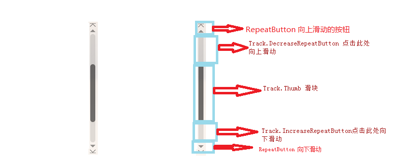
滚动条的背景是由Track类表示(实际上是一个具有阴影并且被拉伸占满整个滚动条长度的矩形)。滚动条首尾处是按钮,通过这些按钮可以向上或者向下滚动一个步长,这些按钮是RepeatButton类的实例。滚动条中间是代表滚动内容当前位置的Thumb元素。这个滑块两侧也是透明的RepeatButton组成。当单击这两个按钮任意一个时,滚动条就会滚动一页。
<Style x:Key="ScrollBarBaseStyle" TargetType="ScrollBar">

        <Setter Property="Stylus.IsPressAndHoldEnabled" Value="false" />

        <Setter Property="Stylus.IsFlicksEnabled" Value="false" />

        <Setter Property="Foreground" Value="{DynamicResource ThirdlyTextBrush}" />

        <Setter Property="Background" Value="Transparent" />

        <Setter Property="Focusable" Value="False" />

        <Setter Property="BorderThickness" Value="0" />

        <Setter Property="Width" Value="8" />

        <Setter Property="MinWidth" Value="8" />

        <Setter Property="Template">

            <Setter.Value>

                <ControlTemplate TargetType="ScrollBar">

                    <hc:SimplePanel x:Name="Bg" SnapsToDevicePixels="true">

                        <Border Background="{TemplateBinding Background}" />

                        <Track x:Name="PART_Track" IsDirectionReversed="true" IsEnabled="{TemplateBinding IsMouseOver}">

                            <Track.DecreaseRepeatButton>

                                <RepeatButton Command="{x:Static ScrollBar.PageUpCommand}" Style="{StaticResource ScrollBarBaseRepeatButton}" />

                            </Track.DecreaseRepeatButton>

                            <Track.IncreaseRepeatButton>

                                <RepeatButton Command="{x:Static ScrollBar.PageDownCommand}" Style="{StaticResource ScrollBarBaseRepeatButton}" />

                            </Track.IncreaseRepeatButton>

                            <Track.Thumb>

                                <Thumb Background="{TemplateBinding Foreground}" Style="{StaticResource ScrollBarBaseThumbVertical}" />

                            </Track.Thumb>

                        </Track>

                    </hc:SimplePanel>

                </ControlTemplate>

            </Setter.Value>

        </Setter>

        <Style.Triggers>

            <Trigger Property="Orientation" Value="Horizontal">

                <Setter Property="Width" Value="Auto" />

                <Setter Property="MinWidth" Value="0" />

                <Setter Property="Height" Value="8" />

                <Setter Property="MinHeight" Value="8" />

                <Setter Property="BorderThickness" Value="0,1" />

                <Setter Property="Template">

                    <Setter.Value>

                        <ControlTemplate TargetType="ScrollBar">

                            <hc:SimplePanel x:Name="Bg" SnapsToDevicePixels="true">

                                <Border Background="{TemplateBinding Background}" />

                                <Track x:Name="PART_Track" IsEnabled="{TemplateBinding IsMouseOver}">

                                    <Track.DecreaseRepeatButton>

                                        <RepeatButton Command="{x:Static ScrollBar.PageLeftCommand}" Style="{StaticResource ScrollBarBaseRepeatButton}" />

                                    </Track.DecreaseRepeatButton>

                                    <Track.IncreaseRepeatButton>

                                        <RepeatButton Command="{x:Static ScrollBar.PageRightCommand}" Style="{StaticResource ScrollBarBaseRepeatButton}" />

                                    </Track.IncreaseRepeatButton>

                                    <Track.Thumb>

                                        <Thumb Background="{TemplateBinding Foreground}" Style="{StaticResource ScrollBarBaseThumbHorizontal}" />

                                    </Track.Thumb>

                                </Track>

                            </hc:SimplePanel>

                        </ControlTemplate>

                    </Setter.Value>

                </Setter>

            </Trigger>

        </Style.Triggers>

    </Style>
下面列出需要注意的几个要点:
- 滚动条(垂直)由一个包含三行的网格构成。顶部和底部容纳两个按钮(箭头),固定占用18个像素,剩余部分是Track部分
- 两端的RepeatButton样式相同,分别是向上和向下的箭头
- 两个按钮链接到ScrollBar;类中的命令(LineUpCommand和LineDownCommand),这正是其工作原理,只要链接到这两个命令即可,无需关心按钮的名字、外观
- Track元素的名为PART_Track。
- Track.ViewportSize属性被设置为0,这是该模板特有的细节,可确保Thumb元素总有相同的尺寸(通常,滑块根据内容按照比例地改变尺寸,因此如果滚动的内容在窗口中基本上能够显示,这时滑块就会变长)
- Track元素封装了两个RepeatButton对象和Thumb元素,这些按钮也是通过命令连接到适当的功能。
可视化状态
最直接编写控件模板的方法:混合使用元素、绑定表达式以及触发器。使用元素创建控件的整个可视化结构。绑定用于从控件类的属性提取信息并将其应用于元素内部。而触发器创建交互功能,当控件的状态发生改变时,允许控件改变其外观。
使用具有特定名称的部件和可视化状态,控件能提供标准化的可视化协定。控件可使用TemplatePart特性指示控件模板应包含具有特定名称的元素,可使用TemplateVisualStatus特性指示他们支持的可视化状态。(在自定义元素中会有详细的例子出现)
WPF进阶技巧和实战06-控件模板的更多相关文章
- WPF进阶技巧和实战03-控件(3-文本控件及列表控件)
系列文章链接 WPF进阶技巧和实战01-小技巧 WPF进阶技巧和实战02-布局 WPF进阶技巧和实战03-控件(1-控件及内容控件) WPF进阶技巧和实战03-控件(2-特殊容器) WPF进阶技巧和实 ...
- WPF进阶技巧和实战03-控件(4-基于范围的控件及日期控件)
系列文章链接 WPF进阶技巧和实战01-小技巧 WPF进阶技巧和实战02-布局 WPF进阶技巧和实战03-控件(1-控件及内容控件) WPF进阶技巧和实战03-控件(2-特殊容器) WPF进阶技巧和实 ...
- WPF笔记(1.9 样式和控件模板)——Hello,WPF!
原文:WPF笔记(1.9 样式和控件模板)--Hello,WPF! 资源的另一个用途是样式设置: <Window > <Window.Resources> <St ...
- WPF进阶技巧和实战03-控件(5-列表、树、网格02)
数据模板 样式提供了基本的格式化能力,但是不管如何修改ListBoxItem,他都不能够展示功能更强大的元素组合,因为了每个ListBoxItem只支持单个绑定字段(通过DisplayMemberPa ...
- WPF进阶技巧和实战03-控件(5-列表、树、网格01)
列表控件 ItemsControl为列表项控件定义了基本功能,下图是ItemsControl的继承关系: 在继承自ItemsControl类的层次结构中,还显示了项封装器(MenuItem.TreeV ...
- WPF进阶技巧和实战03-控件(5-列表、树、网格04)
ListView控件 ListView继承自简单的没有特色的ListBox,增加了对基于列显示的支持,并增加了快速切换视图或显示模式的能力,而不需要重新绑定数据以重新构建列表. ListView类继承 ...
- WPF进阶技巧和实战07--自定义元素02
在01节中,研究了如何开发自定义控件,下节开始考虑更特殊的选择:派生自定义面板以及构建自定义绘图 创建自定义面板 创建自定义面板是一种比较常见的自定义控件开发子集,面板可以驻留一个或多个子元素,并且实 ...
- WPF进阶技巧和实战07--自定义元素01
完善和扩展标准控件的方法: 样式:可使用样式方便地重用控件属性的集合,甚至可以使用触发器应用效果 内容控件:所有继承自ContentControl类的控件都支持嵌套的内容.使用内容控件,可以快速创建聚 ...
- WPF进阶技巧和实战08-依赖属性与绑定02
将元素绑定在一起 数据绑定最简单的形式是:源对象是WPF元素而且源属性是依赖项属性.依赖项属性内置了更改通知支持,当源对象中改变依赖项属性时,会立即更新目标对象的绑定属性. 元素绑定到元素也是经常使用 ...
随机推荐
- 让div占据父元素剩下的所有位置
场景模拟: 现在有一个父容器,里面有俩个div,左边的要给一个固定的200px的宽度,父容器剩下的宽度都归右边的div该怎么完成?HTML代码: <div class="wrap&qu ...
- 使用VC6.0开发COM组件 - 傻瓜式,不讲理论,只讲实例
1.创建一个ATL COM AppWizard工程,如图:
- Hibernate5 入门之SessionFactory对象的创建
hibernate5创建SessionFactory不同于hibernate4和hibernate3,下面是代码示例. package top.scorpion.util; import org.hi ...
- TCP请求连接与断开
TCP连接的三次握手:
- Spring Boot +Vue 项目实战笔记(二):前后端结合测试(登录页面开发)
前言:关于开发环境 每位 Coder 都有自己偏好的开发工具,从大的方面划分主要有文本编辑器流和 IDE 流两种,我有一段时间也喜欢用编辑器(Sublime Text.Vim),但对我来说开发效率确实 ...
- redux的使用
1.redux的使用 核心概念 action 动作的对象 包含2个属性 type:标识属性, 值为字符串, 唯一, 必要属性 data:数据属性, 值类型任意, 可选属性 例子:{ type: 'AD ...
- 第一次实战:XX漫画的XSS盲打
第一次实战:XX漫画的XSS盲打 XSS盲打 盲打是一种惯称的说法,就是不知道有没有XSS漏洞存在的情况下,不顾一切的输入XSS代码在留言啊投诉窗口啊之类的地方,尽可能多的尝试XSS的语句,就叫盲打. ...
- Servlet 之文件下载
Servlet 之文件下载 import javax.servlet.ServletException; import javax.servlet.ServletOutputStream; impor ...
- 从零开始实现简单 RPC 框架 9:网络通信之心跳与重连机制
一.心跳 什么是心跳 在 TPC 中,客户端和服务端建立连接之后,需要定期发送数据包,来通知对方自己还在线,以确保 TPC 连接的有效性.如果一个连接长时间没有心跳,需要及时断开,否则服务端会维护很多 ...
- java版gRPC实战之一:用proto生成代码
欢迎访问我的GitHub https://github.com/zq2599/blog_demos 内容:所有原创文章分类汇总及配套源码,涉及Java.Docker.Kubernetes.DevOPS ...