[UI] 01 - CSS
前言
一、认识
From: http://www.runoob.com/css/css-tutorial.html
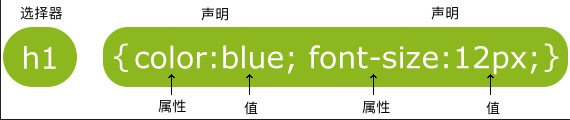
CSS 指层叠样式表 (Cascading Style Sheets)
解决内容与表现分离的问题。
二、结构
- 形式:属性-值
- class 选择器
- <style>
- body {background-color:tan;}
- h1 {color:maroon;font-size:20pt;}
- hr {color:navy;}
- p {font-size:11pt;margin-left:15px;}
- a:link {color:green;}
- a:visited {color:yellow;}
- a:hover {color:black;}
- a:active {color:blue;}
- </style>
- id 选择器
- <style>
- #para1
- {
- text-align:center;
- color:red;
- }
- </style>
- </head>
- <body>
- <p id="para1">Hello World!</p>
- </body>
- 分组 选择器
为了尽量减少代码,你可以使用分组选择器。
- h1
- {
- color:green;
- }
- h2
- {
- color:green;
- }
- p
- {
- color:green;
- }
- ----------------> 简写为如下
- h1,h2,p
- {
- color:green;
- }
- 嵌套 选择器
- <!DOCTYPE html>
- <html>
- <head>
- <meta charset="utf-8">
- <title>菜鸟教程(runoob.com)</title>
- <style>
- p
- {
- color:blue;
- text-align:center;
- }
- .marked
- {
- background-color:red;
- }
- .marked p
- {
- color:white;
- }
- p.marked{
- text-decoration:underline;
- }
- </style>
- </head>
- <body>
- <p>这个段落是蓝色文本,居中对齐。</p>
- <div class="marked">
- <p>这个段落不是蓝色文本。</p>
- </div>
- <p>所有 class="marked"元素内的 p 元素指定一个样式,但有不同的文本颜色。</p>
- <p class="marked">带下划线的 p 段落。</p>
- </body>
- </html>
- p{ }: 为所有 p 元素指定一个样式。
- .marked{ }: 为所有 class="marked" 的元素指定一个样式。
- .marked p{ }: 为所有 class="marked" 元素内的 p 元素指定一个样式。
- p.marked{ }: 为所有 class="marked" 的 p 元素指定一个样式。
设置了三个样式
- 组合选择符
Ref: http://www.runoob.com/css/css-combinators.html
(1) 后代选择器(以空格分隔)
- div p
- {
- background-color:yellow;
- }
(2) 子元素选择器【必须有父元素,也体现了 '伪类' 的效果】
- div>p
- {
- background-color:yellow;
- }
(3) 相邻兄弟选择器【既然相邻,就只能有一个】
- div+p
- {
- background-color:yellow;
- }
(4) 后续兄弟选择器
- div~p
- {
- background-color:yellow;
- }
三、样式表
- 内部样式表
上述例子。
- 外部样式表
浏览器会从文件 mystyle.css 中读到样式声明,并根据它来格式文档。
- <head>
- <link rel="stylesheet" type="text/css" href="mystyle.css">
- </head>
- 内联样式
写在html内部,有点箭头函数的意思。
- <p style="color:sienna;margin-left:20px">这是一个段落。</p>
多重样式 - 优先级
优先内部样式。
(内联样式)Inline style > (内部样式)Internal style sheet >(外部样式)External style sheet > 浏览器默认样式
属性详谈
一、背景
- 纯色背景
- body {background-color:#b0c4de;}
- h1 {background-color:#6495ed;}
- 图片背景
- body
- {
- background-image:url('gradient2.png');
# 平铺设置- background-repeat:repeat-x;
# 不平铺
background-repeat:no-repeat;
background-position:right top;
}
等价于:
为了简化这些属性的代码,我们可以将这些属性合并在同一个属性中.
- <style>
- body
- {
- background:#ffffff url('img_tree.png') no-repeat right top;
- margin-right:200px;
- }
- </style>
当使用简写属性时,属性值的顺序为:
- background-color
- background-image
- background-repeat
- background-attachment
- background-position
二、文本
- 基本属性
- #三种写法
- body {color:red;}
- h1 {color:#00ff00;}
- h2 {color:rgb(255,0,0);}
- #对齐方式
- h1 {text-align:center;}
- p.date {text-align:right;}
- p.main {text-align:justify;}
- #缩进
p {text-indent:50px;}
- 高级属性
- # 划线
- a {text-decoration:none;}
- h1 {text-decoration:overline;}
- h2 {text-decoration:line-through;}
- h3 {text-decoration:underline;}
- # 文本转换
- p.uppercase {text-transform:uppercase;}
- p.lowercase {text-transform:lowercase;}
- p.capitalize {text-transform:capitalize;}
其他详见:http://www.runoob.com/css/css-text.html
- 字体样式、大小
font-family 属性应该设置几个字体名称作为一种"后备"机制,如果浏览器不支持第一种字体,他将尝试下一种字体。
- p{font-family:"Times New Roman", Times, serif;}
- p.normal {font-style:normal;}
- p.italic {font-style:italic;}
- p.oblique {font-style:oblique;}
大小,外层body的百分比控制内部所有文字缩放比例。
- body {font-size:100%;}
- h1 {font-size:2.5em;}
- h2 {font-size:1.875em;}
- p {font-size:0.875em;}
- 链接
设置同一个链接的四个不同状态。
这里使用了 “伪类” 的概念。
- a:link {color:#000000;} /* 未访问链接*/
- a:visited {color:#00FF00;} /* 已访问链接 */
- a:hover {color:#FF00FF;} /* 鼠标移动到链接上 */
- a:active {color:#0000FF;} /* 鼠标点击时 */
- a:link {text-decoration:none;}
a:link {background-color:#B2FF99;}
- a:hover 必须跟在 a:link 和 a:visited后面
- a:active 必须跟在 a:hover后面
注意顺序
- 文字框
Goto: http://www.runoob.com/css/css-border.html
文字边框属性。
- 轮廓(outline)
Goto: http://www.runoob.com/css/css-outline.html

- <style>
- p
- {
- border:1px solid red;
- outline:green dotted thick;
- }
- </style>
- margin(外边距)与 padding(内边距)
- margin-top :100px;
- margin-bottom :100px;
- margin-right :50px;
- margin-left :50px;
- padding-top :25px;
- padding-bottom:25px;
- padding-right :50px;
- padding-left :50px;
'简写形式' 以及 '顺序' 请见:
Goto: http://www.runoob.com/css/css-margin.html
Goto: http://www.runoob.com/css/css-padding.html
- 尺寸 (Dimension)
控制元素的高度和宽度。
Goto: http://www.runoob.com/css/css-dimension.html
三、列表
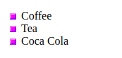
- 常规标记
每一条前加个 ‘点’。
- <head>
<style>- ul.a {list-style-type:circle;}
- </style>
- </head>
- <body>
- <p>无序列表实例:</p>
- <ul class="a">
- <li>Coffee</li>
- <li>Tea</li>
- <li>Coca Cola</li>
- </ul>
<body>
- 图片标记
- <style>
- ul #这里竟然没有考虑<li>
- {
- list-style-image:url('sqpurple.gif');
- }
- </style>
- </head>
- <body>
- <ul>
- <li>Coffee</li>
- <li>Tea</li>
- <li>Coca Cola</li>
- </ul>
- </body>
- 浏览器兼容性解决方案
其实就是不采用浏览器默认处理方式,而改为直接设置各个属性,达到显示一致的效果。
详见:http://www.runoob.com/css/css-list.html
四、表格
使用 CSS 可以使 HTML 表格更美观。
- 边框
- <!DOCTYPE html>
- <html>
- <head>
- <meta charset="utf-8">
- <title>菜鸟教程(runoob.com)</title>
- <style>
- table,th,td
- {
- border:1px solid black;
- }
- </style>
- </head>
- <body>
- <table>
- <tr>
- <th>Firstname</th> # <th>在单元格中加粗显示
- <th>Lastname</th>
- </tr>
- <tr>
- <td>Peter</td>
- <td>Griffin</td>
- </tr>
- <tr>
- <td>Lois</td>
- <td>Griffin</td>
- </tr>
- </table>
- </body>
- </html>
不要空隙:
- table
- {
- border-collapse:collapse; # 去掉边框间空隙
- }
- table,th, td
- {
- border: 1px solid black;
- }
- 宽度和高度
- table
- {
- width:100%;
- }
- th
- {
- height:50px;
- }
- 文字对齐
- td
- {
- text-align:right; # 水平对齐
height:50px;
vertical-align:bottom; # 垂直对齐
}
内部间距:
- td
- {
- padding:15px;
- }
- 颜色
- # 边框颜色
- table, td, th
- {
- border:1px solid green;
- }
- # 背景填充颜色
th- {
- background-color:green;
- color:white;
- }
五、Display(显示) 与 Visibility(可见性)
- Display
注意, 实例中的隐藏标题不占用空间。
- h1.hidden {display:none;}
- Visibility
注意, 实例中的隐藏标题仍占用空间。
- h1.hidden {visibility:hidden;}
六、内联方式
- 内联元素
Ref: HTML 内联元素
内联元素在显示时通常不会以新行开始。
例子:<b>, <td>, <a>, <img>
- HTML <div> 元素是块级元素,它是可用于组合其他 HTML 元素的容器。
- HTML <span> 元素是内联元素,可用作文本的容器。
(1) 变为内联,变得没换行。
- <style>
- li{display:inline;}
- </style>
(2) 变为block,变得有换行。
- span
- {
- display:block;
- }
空间位置
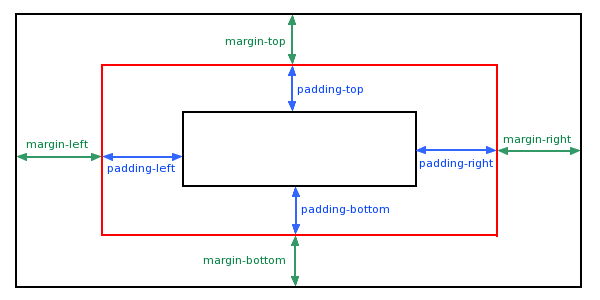
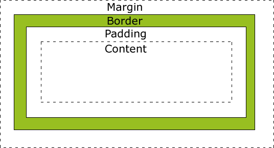
一、盒子模型 (Box Model)
- 概念
- 代码
- div {
- background-color: lightgrey;
- width: 300px;
- border: 25px solid green;
- padding: 25px;
- margin: 25px;
- }
- 效果
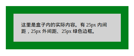
- 计算方法
- # 求显示的总宽度
- 300px (宽)
- + 50px (左 + 右填充)
- + 50px (左 + 右边框)
- + 50px (左 + 右边距)
- = 450px
二、Position 定位
- 相对位置
- <style>
- h2.pos_left
- {
- position:relative;
- left:-20px;
- }
- h2.pos_right
- {
- position:relative;
- left:20px;
- }
- </style>
- </head>
- <body>
- <h2>这是位于正常位置的标题</h2> # 注意,都是以这个作为‘位置参照’,而不是上一条。
- <h2 class="pos_left">这个标题相对于其正常位置向左移动</h2>
- <h2 class="pos_right">这个标题相对于其正常位置向右移动</h2>
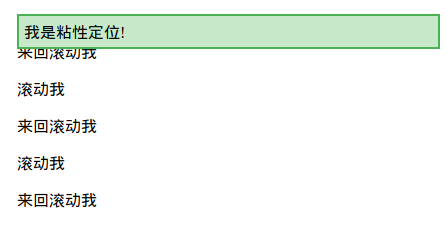
- sticky属性
三,图片位置浮动
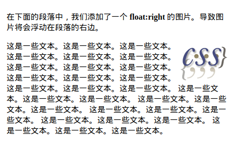
- 图片在文字中的浮动
- <style>
- img
- {
- float:right;
- }
- </style>
- <p>
- <img src="logocss.gif" width="95" height="84" />
- 这是一些文本。这是一些文本。这是一些文本。
- 这是一些文本。这是一些文本。这是一些文本。
- 这是一些文本。这是一些文本。这是一些文本。
- 这是一些文本。这是一些文本。这是一些文本。
- 这是一些文本。这是一些文本。这是一些文本。
- 这是一些文本。这是一些文本。这是一些文本。
- 这是一些文本。这是一些文本。这是一些文本。
- 这是一些文本。这是一些文本。这是一些文本。
- 这是一些文本。这是一些文本。这是一些文本。
- 这是一些文本。这是一些文本。这是一些文本。
- </p>
【效果】
- mix组件的浮动
img与string通过div构成了一个组件。浮动时作为整体处理。浮动的布局考虑同级目录即可。
- <div>
- <img src="logocss.gif" width="95" height="84" /><br>
- CSS is fun!
- </div>
- <p>
- This is some text. This is some text. This is some text.
- This is some text. This is some text. This is some text.
- This is some text. This is some text. This is some text.
- This is some text. This is some text. This is some text.
- This is some text. This is some text. This is some text.
- This is some text. This is some text. This is some text.
- This is some text. This is some text. This is some text.
- This is some text. This is some text. This is some text.
- This is some text. This is some text. This is some text.
- This is some text. This is some text. This is some text.
- This is some text. This is some text. This is some text.
- This is some text. This is some text. This is some text.
- This is some text. This is some text. This is some text.
- </p>
【效果】

- 图片们的浮动
- <style>
- .thumbnail
- {
- float:left;
- width:110px;
- height:90px;
- margin:5px;
- }
- </style>
- <body>
- <h3>图片库</h3>
- <p>试着调整窗口,看看当图片没有足够的空间会发生什么。</p>
- <img class="thumbnail" src="/images/klematis_small.jpg" width="107" height="90">
- <img class="thumbnail" src="/images/klematis2_small.jpg" width="107" height="80">
- <img class="thumbnail" src="/images/klematis3_small.jpg" width="116" height="90">
- <img class="thumbnail" src="/images/klematis4_small.jpg" width="120" height="90">
- </body>
【效果】

- 清除浮动 - 使用 clear
- .text_line
- {
- clear:both;
- }
四、对齐
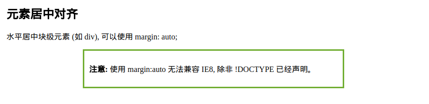
- 【元素居中】:从整体看去
- <style>
- .center { margin: auto;
- width: 60%; # 必须设置
- border: 3px solid #73AD21;
- padding: 10px;
- }
- </style>
显示效果:
- 【文本居中】:文本在元素内居中对齐
- <style>
- .center { text-align: center;
- border: 3px solid green;
- }
- </style>
- 【图片居中】:可以使用 margin: auto; 并将它放到 块 元素中
- <style>
img {- display: block;
- margin: auto;
- width: 40%;
- }
</style>
- 【左右对齐】- Position + left/right
- .right {
position: absolute;
right: 0px;- width: 300px;
- border: 3px solid #73AD21;
- padding: 10px;
- }
也可以使用下面介绍的 float 的方式。
- 【嵌套布局】- body -> container -> right
当使用 position 来对齐元素时, 通常 <body> 元素会设置 margin 和 padding 。
这样可以避免在不同的浏览器中出现可见的差异。
- body {
- margin:;
- padding:;
- }
- .container {
- position: relative;
- width: 100%;
- }
- .right {
- position: absolute;
- right: 0px;
- width: 300px;
- background-color: #b0e0e6;
- }
嵌套代码结构:
- <body>
- <div class="container">
- <div class="right">
- <p><b>注意: </b>当使用浮动属性对齐,总是包括 !DOCTYPE 声明!如果丢失,它将会在 IE 浏览器产生奇怪的结果。</p>
- </div>
- </div>
- </body>
- 【Float对齐】
- <style>
- .right { float: right;
- width: 300px;
- border: 3px solid #73AD21;
- padding: 10px;
- }
- </style>
可见,也可以使用 float 属性来对齐元素:
- float: right
-- 类似于 --- position: absolute;
- right: 0px;
- 【溢出问题】
在父元素上添加 overflow: auto; 来解决子元素溢出的问题。
- .clearfix {
- overflow: auto;
- }
- <div>
- <img class="img1" src="pineapple.jpg" alt="Pineapple" width="170" height="170">
- 菜鸟教程 - 学的不仅是技术,更是梦想!!!</div>
- <p style="clear:right">在父元素上通过添加 clearfix 类,并设置 overflow: auto; 来解决该问题:</p>
- <div class="clearfix">
- <img class="img2" src="pineapple.jpg" alt="Pineapple" width="170" height="170">
- 菜鸟教程 - 学的不仅是技术,更是梦想!!!</div>
溢出效果:

- 【垂直居中对齐】 - 使用 padding
- .center {
- padding: 70px 0;
- border: 3px solid green;
- }
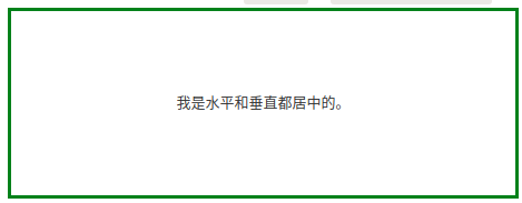
- 【水平垂直居中】
在垂直居中基础上添加水平居中即可。
- .center {
- padding: 70px 0;
- border: 3px solid green;
text-align: center;- }
- 【垂直居中 - 番外篇】
* 通过行高设置,达到垂直居中效果。
- <style>
- .center { line-height: 200px; height: 200px;
- border: 3px solid green;
- text-align: center;
- }
- /* 如果有多行文本,可以设置如下 */
- .center p {
- line-height: 1.5;
- display: inline-block;
- vertical-align: middle;
- }
- </style>
* 垂直居中 - 使用 position 和 transform
- .center {
- height: 200px;
- position: relative;
- border: 3px solid green;
- }
- .center p {
- margin:;
- position: absolute;
- top: 50%;
- left: 50%;
- transform: translate(-50%, -50%);
- }
伪类、伪元素
From: http://www.runoob.com/css/css-pseudo-classes.html
From: http://www.runoob.com/css/css-pseudo-elements.html
一、啥是伪类
- anchor伪类
- a:link {color:#FF0000;} /* 未访问的链接 */
- a:visited {color:#00FF00;} /* 已访问的链接 */
- a:hover {color:#FF00FF;} /* 鼠标划过链接 */
- a:active {color:#0000FF;} /* 已选中的链接 */
- 伪类的语法
- selector:pseudo-class {property:value;}
# CSS类也可以使用伪类- selector.class:pseudo-class {property:value;}
二、first-child 伪类
- 匹配第一个 <p> 元素
- p:first-child
- {
- color:blue;
- }
- 匹配所有<p> 元素中的第一个 <i> 元素
- <head>
- <meta charset="utf-8">
- <title>菜鸟教程(runoob.com)</title>
- <style>
- p > i:first-child
- {
- color:blue;
- }
- </style>
- </head>
- <body>
- <p>I am a <i>strong</i> man. I am a <i>strong</i> man.</p>
- <p>I am a <i>strong</i> man. I am a <i>strong</i> man.</p>
- <p><b>注意:</b> 当 :first-child 作用于 IE8 以及更早版本的浏览器, !DOCTYPE 必须已经定义.</p>
- </body>
- 匹配所有作为第一个子元素的 <p> 元素中的所有 <i> 元素
- <head>
- <meta charset="utf-8">
- <title>菜鸟教程(runoob.com)</title>
- <style>
- p:first-child i
- {
- color:blue;
- }
- </style>
- </head>
- <body>
- <p>I am a <i>strong</i> man. I am a <i>strong</i> man.</p>
- <p>I am a <i>strong</i> man. I am a <i>strong</i> man.</p>
- <p><b>注意:</b> 当:first-child 作用于 IE8 及更早版本的浏览器, DOCTYPE 必须已经定义.</p>
- </body>
Goto: 所有CSS伪类/元素,请见原链接。
三、CSS 伪元素
- 语法
CSS伪元素是用来添加一些选择器的特殊效果。
- # 伪元素的语法:
- selector:pseudo-element {property:value;}
- # CSS类也可以使用伪元素:
- selector.class:pseudo-element {property:value;}
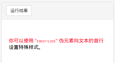
- first-line 伪元素
- <head>
- <meta charset="utf-8">
- <title>菜鸟教程(runoob.com)</title>
- <style>
- p:first-line
- {
- color:#ff0000;
- font-variant:small-caps;
- }
- </style>
- </head>
- <body>
- <p>你可以使用 "first-line" 伪元素向文本的首行设置特殊样式。</p>
- </body>
效果图:
- first-letter 伪元素
- <style>
- p:first-letter
- {
- color:#ff0000;
- font-size:xx-large;
- }
- </style>
效果图:

- 多个伪元素
- <style>
- p:first-letter
- {
- color:#ff0000;
- font-size:xx-large;
- }
- p:first-line
- {
- color:#0000ff;
- font-variant:small-caps;
- }
- </style>
- before 伪元素
- <style>
- h1:before {content:url(smiley.gif);}
- </style>
- after 伪元素
- <style>
- h1:after {content:url(smiley.gif);}
- </style>
Goto: 所有CSS伪类/元素,请见原链接。
[UI] 01 - CSS的更多相关文章
- jquery ui的css设计
jquery ui 是当前最强大的UI库之一,其两大卖点是对IE6的良好支持与换肤功能.为了构建avalon ui,今天起我将投入一部分精力来研究时下最流行的几个CSS框架.它是首当其冲. jquer ...
- AmazeUI(妹子UI)中CSS组件、JS插件、Web组件的区别
AmazeUI(妹子UI)是非常优秀的国产前端UI,现在来介绍一下AmazeUI中CSS组件.JS插件与Web组件的区别. CSS组件顾名思义就是仅使用CSS渲染而成的组件,而JS插件也很容易理解,就 ...
- amaze UI 笔记 - CSS
导航添加依据 http://amazeui.org/css/ 下面内容属学习笔记,如有理解偏差和错误请留言相告,感谢!* =(官网这块写的很详细) 一.基本样式 1.统一样式 说明了为什么使用Nor ...
- jquery ui的css设计二
上一篇见这里 本篇重点说一下其换肤功能 换肤一般是指改变控件的字体颜色,背景颜色,边框颜色,hover上去的颜色,背景图片,很少再会涉及修改其长宽,字体类型什么的. 以这个版本的CSS为观察对象,可以 ...
- (0-1)CSS 标签语法的属性
CSS text-decoration 属性 display display 属性规定元素应该生成的框的类型
- CSS学习笔记01 CSS简介
1.CSS定义 CSS 指层叠样式表 (Cascading Style Sheets),是一种样式表语言,用来描述 HTML 或 XML(包括如 SVG.XHTML 之类的 XML 分支语言)文档的呈 ...
- 01. css sprite是什么,有什么优缺点?
1.css sprite是什么,有什么优缺点? 通常被意译为“CSS图像拼合”或“CSS贴图定位” 1)CSS Sprites的优点 利用CSS Sprites能很好地减少网页的http请求,从而大大 ...
- CSS Secrets 翻译笔记 01: CSS coding tips
.firDemoButton{ padding: 6px 16px; border: 1px solid #446d88; background: #58a linear-gradient(#77a0 ...
- CRM WEB UI 01 BOL向导创建的搜索
创建BOL的步骤就不说了,自己找,学习这个之前,需要自己先找个SAP CRM资料预习一下 T-CODE:BSP_WD_CMPWB 1.创建组件:输入组件名:ZLYTEST03,点击创建按钮,回车,选择 ...
随机推荐
- Codeforces Round #532 (Div. 2)
Codeforces Round #532 (Div. 2) A - Roman and Browser #include<bits/stdc++.h> #include<iostr ...
- C++ operator重载运算符和隐式转换功能的实现
C++ operator重载运算符和隐式转换功能的实现: #include <iostream> using namespace std; class OperatorTest { pub ...
- 第一章 flex单词计数程序
学习Flex&Bison目标, 读懂SQLite中SQL解析部分代码 Flex&Bison简介Flex做词法分析Bison做语法分析 第一个Flex程序, wc.fl, 单词计数程序 ...
- 构造函数与getter和setter的区别
构造函数是用于初始化类的属性,且只有在创建对象时才会调用构造函数,用于给对象分配地址 无参的构造函数,创建对象时默认调用,当程序没有明确写出有参的构造函数,系统会默认的创建一个. 有参的构造函数,创建 ...
- [java]struts2入门
摘要 本文是struts2入门,配置教程.如何在IntelJ Idea中进行手动配置.在使用idea新建struts2web项目的时候,在下载jar包的过程中,下载失败,没办法就直接手动进行下载jar ...
- 【转】大数据分析中Redis怎么做到220万ops
原文:http://www.cnblogs.com/nnhy/archive/2018/01/16/Redis220.html 大数据时代,海量数据分析就像吃饭一样,成为了我们每天的工作.为了更好的为 ...
- 如何在Windows 10上访问NFS的share
大致过程是: 1. 开启名为"Services for NFS"的Windows Feature. 2. 如果需要拥有写权限,需要修改注册表. 3. Mount即可. 具体步骤详见 ...
- iOS开发-UIImageView高效设置Radius
圆角的设置在iOS中随处可见,开发的时候也很方便,但是有的时候如果一个页面有大量的需要设置圆角的图片,容易产生性能问题,UIImageView ios9.0之前设置圆角是会产生离屏渲染的,9.0之后不 ...
- aglio报错解决
Cannot write or read cache for themes (ENOENT on cache folder) aglio -i ./api.md -o api.html >> ...
- Java的oauth2.0 服务端与客户端的实现
oauth原理简述 oauth本身不是技术,而是一项资源授权协议,重点是协议!Apache基金会提供了针对Java的oauth封装.我们做Java web项目想要实现oauth协议进行资源授权访问,直 ...