UWP 实现Tab导航首页
先看效果:
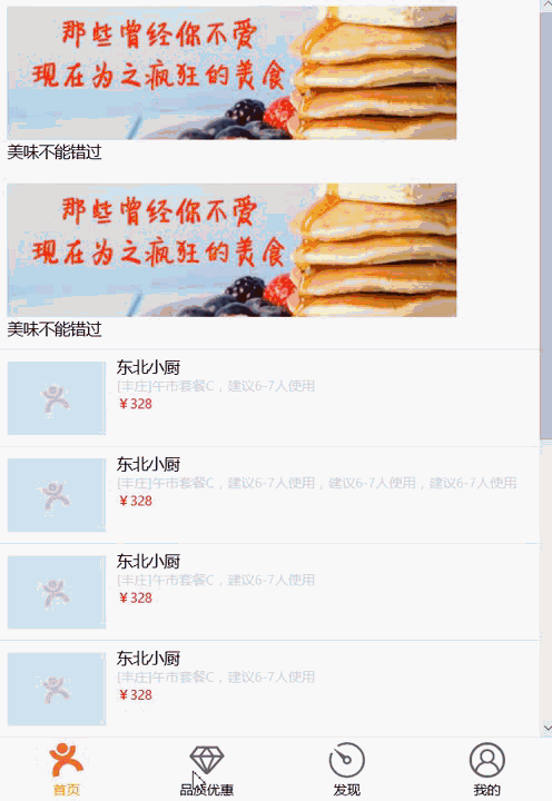
这个是用Pivot来实现
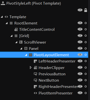
1、自定义Pivot的样式,使用Blend工具生成模板,将HeaderTemplate的布局都隐藏
1 <Style x:Key="PivotStyle1" TargetType="Pivot">
2 <Setter Property="Margin" Value="0"/>
3 <Setter Property="Padding" Value="0"/>
4 <Setter Property="Background" Value="{ThemeResource PivotBackground}"/>
5 <Setter Property="IsTabStop" Value="False"/>
6 <Setter Property="ItemsPanel">
7 <Setter.Value>
8 <ItemsPanelTemplate>
9 <Grid/>
10 </ItemsPanelTemplate>
11 </Setter.Value>
12 </Setter>
13 <Setter Property="Template">
14 <Setter.Value>
15 <ControlTemplate TargetType="Pivot">
16 <Grid x:Name="RootElement" Background="{TemplateBinding Background}" HorizontalAlignment="{TemplateBinding HorizontalAlignment}" VerticalAlignment="{TemplateBinding VerticalAlignment}">
17 <Grid.Resources>
18 <Style x:Key="BaseContentControlStyle" TargetType="ContentControl">
19 <Setter Property="FontFamily" Value="XamlAutoFontFamily"/>
20 <Setter Property="FontWeight" Value="SemiBold"/>
21 <Setter Property="FontSize" Value="15"/>
22 <Setter Property="Template">
23 <Setter.Value>
24 <ControlTemplate TargetType="ContentControl">
25 <ContentPresenter ContentTemplate="{TemplateBinding ContentTemplate}" ContentTransitions="{TemplateBinding ContentTransitions}" Content="{TemplateBinding Content}" HorizontalAlignment="{TemplateBinding HorizontalContentAlignment}" Margin="{TemplateBinding Padding}" OpticalMarginAlignment="TrimSideBearings" VerticalAlignment="{TemplateBinding VerticalContentAlignment}"/>
26 </ControlTemplate>
27 </Setter.Value>
28 </Setter>
29 </Style>
30 <Style x:Key="TitleContentControlStyle" BasedOn="{StaticResource BaseContentControlStyle}" TargetType="ContentControl">
31 <Setter Property="FontFamily" Value="{ThemeResource PivotTitleFontFamily}"/>
32 <Setter Property="FontWeight" Value="{ThemeResource PivotTitleThemeFontWeight}"/>
33 <Setter Property="FontSize" Value="{ThemeResource PivotTitleFontSize}"/>
34 </Style>
35 </Grid.Resources>
36 <Grid.RowDefinitions>
37 <RowDefinition Height="Auto"/>
38 <RowDefinition Height="*"/>
39 </Grid.RowDefinitions>
40 <VisualStateManager.VisualStateGroups>
41 <VisualStateGroup x:Name="Orientation">
42 <VisualState x:Name="Portrait">
43 <Storyboard>
44 <ObjectAnimationUsingKeyFrames Storyboard.TargetProperty="Margin" Storyboard.TargetName="TitleContentControl">
45 <DiscreteObjectKeyFrame KeyTime="0" Value="{ThemeResource PivotPortraitThemePadding}"/>
46 </ObjectAnimationUsingKeyFrames>
47 </Storyboard>
48 </VisualState>
49 <VisualState x:Name="Landscape">
50 <Storyboard>
51 <ObjectAnimationUsingKeyFrames Storyboard.TargetProperty="Margin" Storyboard.TargetName="TitleContentControl">
52 <DiscreteObjectKeyFrame KeyTime="0" Value="{ThemeResource PivotLandscapeThemePadding}"/>
53 </ObjectAnimationUsingKeyFrames>
54 </Storyboard>
55 </VisualState>
56 </VisualStateGroup>
57 <VisualStateGroup x:Name="NavigationButtonsVisibility">
58 <VisualState x:Name="NavigationButtonsHidden"/>
59 <VisualState x:Name="NavigationButtonsVisible">
60 <Storyboard>
61 <ObjectAnimationUsingKeyFrames Storyboard.TargetProperty="Opacity" Storyboard.TargetName="NextButton">
62 <DiscreteObjectKeyFrame KeyTime="0" Value="1"/>
63 </ObjectAnimationUsingKeyFrames>
64 <ObjectAnimationUsingKeyFrames Storyboard.TargetProperty="IsEnabled" Storyboard.TargetName="NextButton">
65 <DiscreteObjectKeyFrame KeyTime="0" Value="True"/>
66 </ObjectAnimationUsingKeyFrames>
67 <ObjectAnimationUsingKeyFrames Storyboard.TargetProperty="Opacity" Storyboard.TargetName="PreviousButton">
68 <DiscreteObjectKeyFrame KeyTime="0" Value="1"/>
69 </ObjectAnimationUsingKeyFrames>
70 <ObjectAnimationUsingKeyFrames Storyboard.TargetProperty="IsEnabled" Storyboard.TargetName="PreviousButton">
71 <DiscreteObjectKeyFrame KeyTime="0" Value="True"/>
72 </ObjectAnimationUsingKeyFrames>
73 </Storyboard>
74 </VisualState>
75 <VisualState x:Name="PreviousButtonVisible">
76 <Storyboard>
77 <ObjectAnimationUsingKeyFrames Storyboard.TargetProperty="Opacity" Storyboard.TargetName="PreviousButton">
78 <DiscreteObjectKeyFrame KeyTime="0" Value="1"/>
79 </ObjectAnimationUsingKeyFrames>
80 <ObjectAnimationUsingKeyFrames Storyboard.TargetProperty="IsEnabled" Storyboard.TargetName="PreviousButton">
81 <DiscreteObjectKeyFrame KeyTime="0" Value="True"/>
82 </ObjectAnimationUsingKeyFrames>
83 </Storyboard>
84 </VisualState>
85 <VisualState x:Name="NextButtonVisible">
86 <Storyboard>
87 <ObjectAnimationUsingKeyFrames Storyboard.TargetProperty="Opacity" Storyboard.TargetName="NextButton">
88 <DiscreteObjectKeyFrame KeyTime="0" Value="1"/>
89 </ObjectAnimationUsingKeyFrames>
90 <ObjectAnimationUsingKeyFrames Storyboard.TargetProperty="IsEnabled" Storyboard.TargetName="NextButton">
91 <DiscreteObjectKeyFrame KeyTime="0" Value="True"/>
92 </ObjectAnimationUsingKeyFrames>
93 </Storyboard>
94 </VisualState>
95 </VisualStateGroup>
96 <VisualStateGroup x:Name="HeaderStates">
97 <VisualState x:Name="HeaderDynamic"/>
98 <VisualState x:Name="HeaderStatic">
99 <Storyboard>
100 <ObjectAnimationUsingKeyFrames Storyboard.TargetProperty="Visibility" Storyboard.TargetName="Header">
101 <DiscreteObjectKeyFrame KeyTime="0" Value="Collapsed"/>
102 </ObjectAnimationUsingKeyFrames>
103 <ObjectAnimationUsingKeyFrames Storyboard.TargetProperty="Visibility" Storyboard.TargetName="StaticHeader">
104 <DiscreteObjectKeyFrame KeyTime="0" Value="Visible"/>
105 </ObjectAnimationUsingKeyFrames>
106 </Storyboard>
107 </VisualState>
108 </VisualStateGroup>
109 </VisualStateManager.VisualStateGroups>
110 <ContentControl x:Name="TitleContentControl" ContentTemplate="{TemplateBinding TitleTemplate}" Content="{TemplateBinding Title}" IsTabStop="False" Margin="{StaticResource PivotPortraitThemePadding}" Style="{StaticResource TitleContentControlStyle}" Visibility="Collapsed"/>
111 <Grid Grid.Row="1">
112 <Grid.Resources>
113 <ControlTemplate x:Key="NextTemplate" TargetType="Button">
114 <Border x:Name="Root" BorderBrush="{ThemeResource PivotNextButtonBorderBrush}" BorderThickness="{ThemeResource PivotNavButtonBorderThemeThickness}" Background="{ThemeResource PivotNextButtonBackground}">
115 <VisualStateManager.VisualStateGroups>
116 <VisualStateGroup x:Name="CommonStates">
117 <VisualState x:Name="Normal"/>
118 <VisualState x:Name="PointerOver">
119 <Storyboard>
120 <ObjectAnimationUsingKeyFrames Storyboard.TargetProperty="Background" Storyboard.TargetName="Root">
121 <DiscreteObjectKeyFrame KeyTime="0" Value="{ThemeResource PivotNextButtonBackgroundPointerOver}"/>
122 </ObjectAnimationUsingKeyFrames>
123 <ObjectAnimationUsingKeyFrames Storyboard.TargetProperty="BorderBrush" Storyboard.TargetName="Root">
124 <DiscreteObjectKeyFrame KeyTime="0" Value="{ThemeResource PivotNextButtonBorderBrushPointerOver}"/>
125 </ObjectAnimationUsingKeyFrames>
126 <ObjectAnimationUsingKeyFrames Storyboard.TargetProperty="Foreground" Storyboard.TargetName="Arrow">
127 <DiscreteObjectKeyFrame KeyTime="0" Value="{ThemeResource PivotNextButtonForegroundPointerOver}"/>
128 </ObjectAnimationUsingKeyFrames>
129 </Storyboard>
130 </VisualState>
131 <VisualState x:Name="Pressed">
132 <Storyboard>
133 <ObjectAnimationUsingKeyFrames Storyboard.TargetProperty="Background" Storyboard.TargetName="Root">
134 <DiscreteObjectKeyFrame KeyTime="0" Value="{ThemeResource PivotNextButtonBackgroundPressed}"/>
135 </ObjectAnimationUsingKeyFrames>
136 <ObjectAnimationUsingKeyFrames Storyboard.TargetProperty="BorderBrush" Storyboard.TargetName="Root">
137 <DiscreteObjectKeyFrame KeyTime="0" Value="{ThemeResource PivotNextButtonBorderBrushPressed}"/>
138 </ObjectAnimationUsingKeyFrames>
139 <ObjectAnimationUsingKeyFrames Storyboard.TargetProperty="Foreground" Storyboard.TargetName="Arrow">
140 <DiscreteObjectKeyFrame KeyTime="0" Value="{ThemeResource PivotNextButtonForegroundPressed}"/>
141 </ObjectAnimationUsingKeyFrames>
142 </Storyboard>
143 </VisualState>
144 </VisualStateGroup>
145 </VisualStateManager.VisualStateGroups>
146 <FontIcon x:Name="Arrow" Foreground="{ThemeResource PivotNextButtonForeground}" FontSize="12" FontFamily="{ThemeResource SymbolThemeFontFamily}" Glyph="" HorizontalAlignment="Center" MirroredWhenRightToLeft="True" UseLayoutRounding="False" VerticalAlignment="Center"/>
147 </Border>
148 </ControlTemplate>
149 <ControlTemplate x:Key="PreviousTemplate" TargetType="Button">
150 <Border x:Name="Root" BorderBrush="{ThemeResource PivotPreviousButtonBorderBrush}" BorderThickness="{ThemeResource PivotNavButtonBorderThemeThickness}" Background="{ThemeResource PivotPreviousButtonBackground}">
151 <VisualStateManager.VisualStateGroups>
152 <VisualStateGroup x:Name="CommonStates">
153 <VisualState x:Name="Normal"/>
154 <VisualState x:Name="PointerOver">
155 <Storyboard>
156 <ObjectAnimationUsingKeyFrames Storyboard.TargetProperty="Background" Storyboard.TargetName="Root">
157 <DiscreteObjectKeyFrame KeyTime="0" Value="{ThemeResource PivotPreviousButtonBackgroundPointerOver}"/>
158 </ObjectAnimationUsingKeyFrames>
159 <ObjectAnimationUsingKeyFrames Storyboard.TargetProperty="BorderBrush" Storyboard.TargetName="Root">
160 <DiscreteObjectKeyFrame KeyTime="0" Value="{ThemeResource PivotPreviousButtonBorderBrushPointerOver}"/>
161 </ObjectAnimationUsingKeyFrames>
162 <ObjectAnimationUsingKeyFrames Storyboard.TargetProperty="Foreground" Storyboard.TargetName="Arrow">
163 <DiscreteObjectKeyFrame KeyTime="0" Value="{ThemeResource PivotPreviousButtonForegroundPointerOver}"/>
164 </ObjectAnimationUsingKeyFrames>
165 </Storyboard>
166 </VisualState>
167 <VisualState x:Name="Pressed">
168 <Storyboard>
169 <ObjectAnimationUsingKeyFrames Storyboard.TargetProperty="Background" Storyboard.TargetName="Root">
170 <DiscreteObjectKeyFrame KeyTime="0" Value="{ThemeResource PivotPreviousButtonBackgroundPressed}"/>
171 </ObjectAnimationUsingKeyFrames>
172 <ObjectAnimationUsingKeyFrames Storyboard.TargetProperty="BorderBrush" Storyboard.TargetName="Root">
173 <DiscreteObjectKeyFrame KeyTime="0" Value="{ThemeResource PivotPreviousButtonBorderBrushPressed}"/>
174 </ObjectAnimationUsingKeyFrames>
175 <ObjectAnimationUsingKeyFrames Storyboard.TargetProperty="Foreground" Storyboard.TargetName="Arrow">
176 <DiscreteObjectKeyFrame KeyTime="0" Value="{ThemeResource PivotPreviousButtonForegroundPressed}"/>
177 </ObjectAnimationUsingKeyFrames>
178 </Storyboard>
179 </VisualState>
180 </VisualStateGroup>
181 </VisualStateManager.VisualStateGroups>
182 <FontIcon x:Name="Arrow" Foreground="{ThemeResource PivotPreviousButtonForeground}" FontSize="12" FontFamily="{ThemeResource SymbolThemeFontFamily}" Glyph="" HorizontalAlignment="Center" MirroredWhenRightToLeft="True" UseLayoutRounding="False" VerticalAlignment="Center"/>
183 </Border>
184 </ControlTemplate>
185 </Grid.Resources>
186 <ScrollViewer x:Name="ScrollViewer" BringIntoViewOnFocusChange="False" HorizontalSnapPointsAlignment="Center" HorizontalSnapPointsType="MandatorySingle" HorizontalScrollBarVisibility="Hidden" Margin="{TemplateBinding Padding}" Template="{StaticResource ScrollViewerScrollBarlessTemplate}" VerticalSnapPointsType="None" VerticalScrollBarVisibility="Disabled" VerticalScrollMode="Disabled" VerticalContentAlignment="Stretch" ZoomMode="Disabled">
187 <PivotPanel x:Name="Panel" VerticalAlignment="Stretch">
188 <Grid x:Name="PivotLayoutElement">
189 <Grid.ColumnDefinitions>
190 <ColumnDefinition Width="Auto"/>
191 <ColumnDefinition Width="*"/>
192 <ColumnDefinition Width="Auto"/>
193 </Grid.ColumnDefinitions>
194 <Grid.RowDefinitions>
195 <RowDefinition Height="Auto"/>
196 <RowDefinition Height="*"/>
197 </Grid.RowDefinitions>
198 <Grid.RenderTransform>
199 <CompositeTransform x:Name="PivotLayoutElementTranslateTransform"/>
200 </Grid.RenderTransform>
201 <ContentPresenter Visibility="Collapsed" x:Name="LeftHeaderPresenter" ContentTemplate="{TemplateBinding LeftHeaderTemplate}" Content="{TemplateBinding LeftHeader}" HorizontalAlignment="Stretch" VerticalAlignment="Stretch"/>
202 <ContentControl x:Name="HeaderClipper" Grid.Column="1" HorizontalContentAlignment="Stretch" UseSystemFocusVisuals="True">
203 <ContentControl.Clip>
204 <RectangleGeometry x:Name="HeaderClipperGeometry"/>
205 </ContentControl.Clip>
206 <Grid Background="{ThemeResource PivotHeaderBackground}">
207 <Grid.RenderTransform>
208 <CompositeTransform x:Name="HeaderOffsetTranslateTransform"/>
209 </Grid.RenderTransform>
210 <PivotHeaderPanel x:Name="StaticHeader">
211 <PivotHeaderPanel.RenderTransform>
212 <CompositeTransform x:Name="StaticHeaderTranslateTransform"/>
213 </PivotHeaderPanel.RenderTransform>
214 </PivotHeaderPanel>
215 <PivotHeaderPanel x:Name="Header">
216 <PivotHeaderPanel.RenderTransform>
217 <CompositeTransform x:Name="HeaderTranslateTransform"/>
218 </PivotHeaderPanel.RenderTransform>
219 </PivotHeaderPanel>
220 </Grid>
221 </ContentControl>
222 <Button Visibility="Collapsed" x:Name="PreviousButton" Background="Transparent" Grid.Column="1" HorizontalAlignment="Left" Height="36" IsTabStop="False" IsEnabled="False" Margin="{ThemeResource PivotNavButtonMargin}" Opacity="0" Template="{StaticResource PreviousTemplate}" UseSystemFocusVisuals="False" VerticalAlignment="Top" Width="20"/>
223 <Button Visibility="Collapsed" x:Name="NextButton" Background="Transparent" Grid.Column="1" HorizontalAlignment="Right" Height="36" IsTabStop="False" IsEnabled="False" Margin="{ThemeResource PivotNavButtonMargin}" Opacity="0" Template="{StaticResource NextTemplate}" UseSystemFocusVisuals="False" VerticalAlignment="Top" Width="20"/>
224 <ContentPresenter Visibility="Collapsed" x:Name="RightHeaderPresenter" ContentTemplate="{TemplateBinding RightHeaderTemplate}" Content="{TemplateBinding RightHeader}" Grid.Column="2" HorizontalAlignment="Stretch" VerticalAlignment="Stretch"/>
225 <ItemsPresenter Visibility="Collapsed" x:Name="PivotItemPresenter" Grid.ColumnSpan="3" Grid.Row="1">
226 <ItemsPresenter.RenderTransform>
227 <TransformGroup>
228 <TranslateTransform x:Name="ItemsPresenterTranslateTransform"/>
229 <CompositeTransform x:Name="ItemsPresenterCompositeTransform"/>
230 </TransformGroup>
231 </ItemsPresenter.RenderTransform>
232 </ItemsPresenter>
233 </Grid>
234 </PivotPanel>
235 </ScrollViewer>
236 </Grid>
237 </Grid>
238 </ControlTemplate>
239 </Setter.Value>
240 </Setter>
241 </Style>
2、首页TabPage.xaml布局
  1 <Page

  2     x:Class="Demo.UWP.Views.TabPage"

  3     xmlns="http://schemas.microsoft.com/winfx/2006/xaml/presentation"

  4     xmlns:x="http://schemas.microsoft.com/winfx/2006/xaml"

  5     xmlns:Core="using:Microsoft.Xaml.Interactions.Core"

  6     xmlns:Interactivity="using:Microsoft.Xaml.Interactivity"

  7     xmlns:bean="using:Demo.UWP.Models"

  8     xmlns:d="http://schemas.microsoft.com/expression/blend/2008"

  9     xmlns:dataTemplateSelectors="using:Demo.UWP.DataTemplateSelectors"

 10     xmlns:itemviews="using:Demo.UWP.ItemViews"

 11     xmlns:local="using:Demo.UWP.Views"

 12     xmlns:mc="http://schemas.openxmlformats.org/markup-compatibility/2006"

 13     xmlns:mycontrols="using:Demo.UWP.Controls"

 14     xmlns:viewmodels="using:Demo.UWP.ViewModels"

 15     mc:Ignorable="d">

 16     <Page.DataContext>

 17         <viewmodels:MainViewModel />

 18     </Page.DataContext>

 19     <Page.Resources>

 20         <ResourceDictionary>

 21             <DataTemplate x:Key="HomeTabView" x:DataType="viewmodels:HomeViewModel">

 22                 <itemviews:HomeTabView />

 23             </DataTemplate>

 24             <DataTemplate x:Key="CouponTabView" x:DataType="viewmodels:CouponTabViewModel">

 25                 <itemviews:CouponTabView />

 26             </DataTemplate>

 27             <DataTemplate x:Key="FindTabView" x:DataType="viewmodels:FindTabViewModel">

 28                 <itemviews:FindTabView />

 29             </DataTemplate>

 30             <DataTemplate x:Key="MineTabView" x:DataType="viewmodels:MineViewModel">

 31                 <itemviews:MineTabView />

 32             </DataTemplate>

 33             <dataTemplateSelectors:MainTabDataTemplateSelector

 34                 x:Key="MainTabTemplateSelector"

 35                 CouponTabTemplate="{StaticResource CouponTabView}"

 36                 FindTabTemplate="{StaticResource FindTabView}"

 37                 HomeTabTemplate="{StaticResource HomeTabView}"

 38                 MineTabTemplate="{StaticResource MineTabView}" />

 39             <DataTemplate x:Key="PivotHeaderTemplate">

 40                 <Grid>

 41                     <Grid.RowDefinitions>

 42                         <RowDefinition Height="Auto" />

 43                     </Grid.RowDefinitions>

 44                     <TextBlock FontSize="12" Text="{Binding Title}" />

 45                 </Grid>

 46             </DataTemplate>

 47         </ResourceDictionary>

 48     </Page.Resources>

 49     <Grid Background="{ThemeResource ApplicationPageBackgroundThemeBrush}">

 50         <Grid.RowDefinitions>

 51             <RowDefinition x:Name="topHeight" Height="*" />

 52             <RowDefinition x:Name="bottomHeight" Height="Auto" />

 53         </Grid.RowDefinitions>

 54         <Grid x:Name="tabLayout" Grid.Row="1">

 55             <Grid.ColumnDefinitions>

 56                 <ColumnDefinition Width="*" />

 57                 <ColumnDefinition Width="*" />

 58                 <ColumnDefinition Width="*" />

 59                 <ColumnDefinition Width="*" />

 60             </Grid.ColumnDefinitions>

 61             <Border

 62                 Grid.ColumnSpan="4"

 63                 BorderBrush="#e3e3e3"

 64                 BorderThickness="0,0.5,0,0" />

 65             <mycontrols:RadioImageButton

 66                 Grid.Column="0"

 67                 Margin="0,5,0,5"

 68                 HorizontalAlignment="Center"

 69                 Checked="{x:Bind ViewModel.RadioImageButton_Checked}"

 70                 Content="{x:Bind ViewModel.Home}"

 71                 FontSize="12"

 72                 FontWeight="Normal"

 73                 ForegroundChecked="Orange"

 74                 ImageHeight="32"

 75                 ImageMargin="0,0,0,2"

 76                 IsChecked="{x:Bind ViewModel.SelectedIndex, ConverterParameter=0, Converter={StaticResource RadioImageButtonConverter}, Mode=TwoWay}"

 77                 Source="ms-appx:///Assets/Main/main_index_home_normal.png"

 78                 SourceChecked="ms-appx:///Assets/Main/main_index_home_pressed.png"

 79                 Style="{StaticResource RadioImageButtonStyle1}"

 80                 TabIndex="0">

 81                 <!--<Interactivity:Interaction.Behaviors>

 82                             <Core:EventTriggerBehavior EventName="Checked">

 83                                 <Core:InvokeCommandAction Command="{x:Bind HomeTab_Checked}" />

 84                             </Core:EventTriggerBehavior>

 85                         </Interactivity:Interaction.Behaviors>-->

 86             </mycontrols:RadioImageButton>

 87             <mycontrols:RadioImageButton

 88                 Grid.Column="1"

 89                 Margin="0,5,0,5"

 90                 HorizontalAlignment="Center"

 91                 Checked="{x:Bind ViewModel.RadioImageButton_Checked}"

 92                 Content="品质优惠"

 93                 FontSize="12"

 94                 FontWeight="Normal"

 95                 ForegroundChecked="Orange"

 96                 ImageHeight="32"

 97                 ImageMargin="0,0,0,2"

 98                 IsChecked="{x:Bind ViewModel.SelectedIndex, ConverterParameter=1, Converter={StaticResource RadioImageButtonConverter}, Mode=TwoWay}"

 99                 Source="ms-appx:///Assets/Main/main_index_quality_normal.png"

100                 SourceChecked="ms-appx:///Assets/Main/main_index_quality_pressed.png"

101                 Style="{StaticResource RadioImageButtonStyle1}"

102                 TabIndex="1">

103                 <!--<Interactivity:Interaction.Behaviors>

104                             <Core:EventTriggerBehavior EventName="Checked">

105                                 <Core:InvokeCommandAction Command="{x:Bind HomeTab_Checked}" />

106                             </Core:EventTriggerBehavior>

107                         </Interactivity:Interaction.Behaviors>-->

108             </mycontrols:RadioImageButton>

109             <mycontrols:RadioImageButton

110                 x:Name="findRb"

111                 Grid.Column="2"

112                 Margin="0,5,0,5"

113                 HorizontalAlignment="Center"

114                 Checked="{x:Bind ViewModel.RadioImageButton_Checked}"

115                 Content="发现"

116                 FontSize="12"

117                 FontWeight="Normal"

118                 ForegroundChecked="Orange"

119                 ImageHeight="32"

120                 ImageMargin="0,0,0,2"

121                 IsChecked="{x:Bind ViewModel.SelectedIndex, ConverterParameter=2, Converter={StaticResource RadioImageButtonConverter}, Mode=TwoWay}"

122                 Source="ms-appx:///Assets/Main/main_index_search_normal.png"

123                 SourceChecked="ms-appx:///Assets/Main/main_index_search_pressed.png"

124                 Style="{StaticResource RadioImageButtonStyle1}"

125                 TabIndex="2">

126                 <!--<Interactivity:Interaction.Behaviors>

127                             <Core:EventTriggerBehavior EventName="Checked">

128                                 <Core:InvokeCommandAction Command="{x:Bind HomeTab_Checked}" />

129                             </Core:EventTriggerBehavior>

130                         </Interactivity:Interaction.Behaviors>-->

131             </mycontrols:RadioImageButton>

132             <mycontrols:RadioImageButton

133                 x:Name="mineRb"

134                 Grid.Column="3"

135                 Margin="0,5,0,5"

136                 HorizontalAlignment="Center"

137                 Checked="{x:Bind ViewModel.RadioImageButton_Checked}"

138                 Content="我的"

139                 FontSize="12"

140                 FontWeight="Normal"

141                 ForegroundChecked="Orange"

142                 ImageHeight="32"

143                 ImageMargin="0,0,0,2"

144                 IsChecked="{x:Bind ViewModel.SelectedIndex, ConverterParameter=3, Converter={StaticResource RadioImageButtonConverter}, Mode=TwoWay}"

145                 Source="ms-appx:///Assets/Main/main_index_my_normal.png"

146                 SourceChecked="ms-appx:///Assets/Main/main_index_my_pressed.png"

147                 Style="{StaticResource RadioImageButtonStyle1}"

148                 TabIndex="3">

149                 <!--<Interactivity:Interaction.Behaviors>

150                             <Core:EventTriggerBehavior EventName="Checked">

151                                 <Core:InvokeCommandAction Command="{x:Bind HomeTab_Checked}" />

152                             </Core:EventTriggerBehavior>

153                         </Interactivity:Interaction.Behaviors>-->

154             </mycontrols:RadioImageButton>

155         </Grid>

156         <Pivot

157             x:Name="pivot"

158             Grid.Row="0"

159             HeaderTemplate="{StaticResource PivotHeaderTemplate}"

160             ItemContainerStyle="{StaticResource PivotItemStyle1}"

161             ItemTemplateSelector="{StaticResource MainTabTemplateSelector}"

162             ItemsSource="{x:Bind ViewModel.Data}"

163             SelectedIndex="{x:Bind ViewModel.SelectedIndex, Mode=TwoWay}"

164             Style="{StaticResource PivotStyleLeft}" />

165     </Grid>

166 </Page>
和ListView一样,通过 ItemTemplateSelector 定制4个TabView模板
3、MainViewModel代码
 1 using GalaSoft.MvvmLight;

 2 using Demo.UWP.Models;

 3 using System;

 4 using System.Collections.Generic;

 5 using System.Collections.ObjectModel;

 6 using System.Linq;

 7 using System.Text;

 8 using System.Threading.Tasks;

 9 using Windows.UI.Xaml.Media.Imaging;

10 using GalaSoft.MvvmLight.Command;

11 using Windows.UI.Popups;

12 using Windows.UI.Xaml;

13 using Demo.UWP.Controls;

14

15 namespace Demo.UWP.ViewModels

16 {

17     public class MainViewModel : ViewModelBase

18     {

19         private int _SelectedIndex;

20

21         public int SelectedIndex

22         {

23             get { return _SelectedIndex; }

24             set

25             {

26                 Set<int>(ref _SelectedIndex, value);

27             }

28         }

29

30         public ObservableCollection<ViewModelBase> Data { get; set; }

31

32         public MainViewModel()

33         {

34             Data = new ObservableCollection<ViewModelBase>

35             {

36                 new HomeViewModel() {Type = 1, Title = "首页"},

37                 new CouponTabViewModel() {Type = 2, Title = "品质优惠"},

38                 new FindTabViewModel() {Type = 3, Title = "发现"},

39                 new MineViewModel() {Type = 4, Title = "我的"}

40             };

41             SelectedIndex = 0;

42         }

43

44         public string Home => "首页";

45

46         public RelayCommand<RoutedEventArgs> HomeTab_Checked => new RelayCommand<RoutedEventArgs>((e) =>

47         {

48             //RadioImageButton radio = e.OriginalSource as RadioImageButton;

49             //if (radio.IsChecked.Value)

50             //{

51             //    SelectedIndex = radio.TabIndex;

52             //}

53             //MessageDialog dlg = new MessageDialog("click." + SelectedIndex);

54             //var t = dlg.ShowAsync();

55         });

56

57         public void RadioImageButton_Checked(object sender, RoutedEventArgs e)

58         {

59             //RadioImageButton radio = e.OriginalSource as RadioImageButton;

60             //if (radio.IsChecked.Value)

61             //{

62             //    SelectedIndex = radio.TabIndex;

63             //}

64             //MessageDialog dlg = new MessageDialog("click." + SelectedIndex);

65             //var t = dlg.ShowAsync();

66         }

67     }

68 }

RadioImageButtonConverter 代码
 1 using System;

 2 using System.Collections.Generic;

 3 using System.Linq;

 4 using System.Text;

 5 using System.Threading.Tasks;

 6 using Windows.UI.Xaml.Data;

 7

 8 namespace Demo.UWP.Converters

 9 {

10     public class RadioImageButtonConverter : IValueConverter

11     {

12         public object Convert(object value, Type targetType, object parameter, string language)

13         {

14             if (string.Equals(value + "", parameter + ""))

15             {

16                 return true;

17             }

18             else

19                 return false;

20         }

21

22         public object ConvertBack(object value, Type targetType, object parameter, string language)

23         {

24             return Int32.Parse(parameter.ToString());

25         }

26     }

27 }
搞定!再配合微软提供的ToolKit.UWP就可以愉快的写项目了
源码地址 https://github.com/xiaocaidev/demo-uwp
转载请标明出处:http://www.cnblogs.com/xiaocaidev/p/7044206.html,本文出自:【xiaocaidev的博客】
UWP 实现Tab导航首页的更多相关文章
- 微信小程序小技巧系列《一》幻灯片,tab导航切换
作者:gou-tian 来自:github 幻灯片 使用微信小程序原生组件swiper实现. <swiper indicator-dots="{{indicatorDots}}&quo ...
- 基于sticky组件,实现带sticky效果的tab导航和滚动导航
上文提供了一个改进版的sticky组件,并将演示效果应用到了自己的博客.有了类似sticky的这种简单组件,我们就可以在利用它开发更丰富的效果,比如本文要介绍的tab导航和滚动导航.实现简单,演示效果 ...
- 重新想象 Windows 8 Store Apps (49) - 输入: 获取输入设备信息, 虚拟键盘, Tab 导航, Pointer, Tap, Drag, Drop
[源码下载] 重新想象 Windows 8 Store Apps (49) - 输入: 获取输入设备信息, 虚拟键盘, Tab 导航, Pointer, Tap, Drag, Drop 作者:weba ...
- Android tab导航的几种方法:ActionBar tab +fragment,Viewpager+pagerTitleStrip,开源框架ViewPageIndicator 和 ViewPager
action来实现tab标签 并跟fragment结合 因为要写新闻客户端这个tab导航是必须的 这里我写几个小练习,希望大家融会贯通. 1actionbar设置tab +fragment 布局是个l ...
- Android入门之ActionBar实现Tab导航
效果图: <?xml version="1.0" encoding="utf-8"?> <manifest xmlns:android=&qu ...
- 使用ActionBar实现Tab导航
ActionBar还有常用的功能,实现Tab导航.ActionBar在顶端生成多个Tab标签,当用户单击点击某个Tab标签时,系统根据用户点击事件导航指定Tab页面. 为了使用ActionBar实现T ...
- Android源码:(一) 安卓2.1到4.4操作系统通用的Actionbar实现的tab导航例子。
说一下我在完成这个例子之前的尝试吧 一,修改“actionbarsherlock”的导航例子.我在实现这个例子之前,尝试过“actionbarsherlock”,修改它的一个tab导航的例子,修改成功 ...
- 微信小程序开发之tab导航栏
实现功能: 点击不同的tab导航,筛选数据 UI: js: data:{ navbar: ['半月维保', '季度维保', '半年维保',"年度维保"], //count ...
- Android SlidingTabLayout的使用--替代ActionBar的Tab导航
最近在使用ActionBar的时候,如果使用的是最新版V7包或者最新的SDK平台,就会发现 ActionBar的导航功能已经不建议使用了.主要的原因是ActionBar自带Tab导航自定义性差(只能通 ...
随机推荐
- Guitar Pro吉他指弹入门——美式指弹
说起指弹吉他,很多身边的琴友首先反应到的是押尾桑,岸部真明,伍伍慧等等指弹艺术家的日式指弹.笔者在初涉指弹的时候,也是如此,但是随着学习的加深,首先认识到了汤米大神(Tommy Emmanuel),然 ...
- 【PUPPETEER】初探之拖拽操作(五)
一.知识点 page.mouse elementHandle.boundingBox() ignoreDefaultArgs:['--enable-automation'] waitUntil 二 ...
- appium快速入门
appium快速入门 演示官方demo 第一步:启动安卓模拟器 步骤2:启动Appium桌面 step3:准备自动化脚本与待测APK step4:运行测试代码 分析演示 分析Appium的加载流程 使 ...
- 剑指Offer_WEEK01
剑指 Offer 03. 数组中重复的数字 思路:将数组进行排序,这样数组是一个有序的序列,然后判断两个相邻的数是否相等,是则返回相同的数 class Solution { public: int f ...
- 一口气带你读懂80年IT发展史
计算机的发展历史有多长?真正意义上的计算机诞生,距今也只有80多年的时间.80年,对于每一个人来说,是很长的时间,但对于整个历史来说,只是短短的一瞬间.这八十多年只是整段历史中的一粒尘埃罢了,但却对这 ...
- CARDS主题 & 导航栏样式修改
每个人对于主题样式的感觉是不一样的,譬如字体大小,间距,高宽,距离,颜色等,我们可以一定程度内很直观地去修改主题的某些样式. 首先,在浏览器中利用开发者工具进行调试,找到我们所要改动的那部分结构,写入 ...
- vue微博回调空页面
1.vue微博回调空页面 注:微博回调空页面为:http://127.0.0.1:8888/oauth/callback/ 1.1 页面路径 components\oauth.vue <temp ...
- centos xargs
有些时候过滤后的东西需要传递给后面其它命令执行实现需求,这个时候xargs就派上用场了. 比如我想把过滤后的东东拷贝至其它目录,其实我可以进入那个目录然后执行ls,然后是过滤,接着再手工以拷贝那样也可 ...
- Windows下django项目部署 通过Apache2.4+mod_wsgi
经过几天踩坑,记录在Windows10下通过Apache2.4部署Django项目的过程 运行环境: 先说下环境,怎么安装倒是其次的,版本很重要,我是根据mod_wsgi的版本要求下载的各个版本(py ...
- 自学linux——20.Samba服务器的搭建
Samba服务器的搭建 一.Samba的认识 1.Samba是一个能让Linux系统应用Microsoft网络通讯协议的软件 2.Samba不仅用于Linux与windows系统直接的文件共享和打印共 ...