echarts系列-带图教你调整左右位置x轴样式网格虚线刻度居中双轴Y轴滚动上下移动文字旋转改分割线颜色部分字体改色折注混合,X轴的颜色,X轴字体颜色,调整柱子颜色,调整小图标图例的大小和位置,鼠标hover时候的样式,用纵向阴影
上面先说注意事项
1.如果使用show hidden控制图表显示隐藏,某些切换效果很奇怪,比如饼图,会从左上角开始放大,很丑,这个时候我们可以设置其宽高来解决问题,给其设置宽高后,切换的奇怪效果即可消失。
<!-- 饼图組件 -->

<div class="chart01" echarts #myEchart01 [options]="option01"></div>

.chart01{

  width: 23.426vw;

  height: 21.523vw;

}

import { Component, OnInit, ElementRef, ViewChild } from '@angular/core';

import { NgxEchartsService } from 'ngx-echarts';

@Component({

  selector: 'app-echart04',

  templateUrl: './echart04.component.html',

  styleUrls: ['./echart04.component.less']

})

export class Echart04Component implements OnInit {

  constructor(

    private es: NgxEchartsService,

  ) { }

  ngOnInit(): void {

  }

  ngAfterViewInit() {

    this.setEcharts01()

  }

  @ViewChild('myEchart01', { static: false }) myEchart01: ElementRef;

  option01 = {

    title: {

      text: '2323',

      textStyle: { fontSize: 26 },

      left: 'center',

      top: 'center',

    },

    tooltip: {

      trigger: 'item',

      formatter: '{b} : {c} ({d}%)',

    },

    series: [

      {

        type: 'pie',

        radius: ['34%', '57%'],

        center: ['50%', '50%'],

        selectedMode: 'single',

        data: [

          { value: 100, name: '中' },

          { value: 200, name: '高' },

          { value: 50, name: '低' },

        ],

        emphasis: {

          // 这个是鼠标放上去时候的阴影

          itemStyle: {

            shadowBlur: 10,

            shadowOffsetX: 5,

            shadowColor: 'rgba(0, 0, 0, 0.5)',

          },

        },

      },

    ],

  };

  setEcharts01() {

    this.es.getInstanceByDom(this.myEchart01.nativeElement).setOption(this.option01);

  }

}
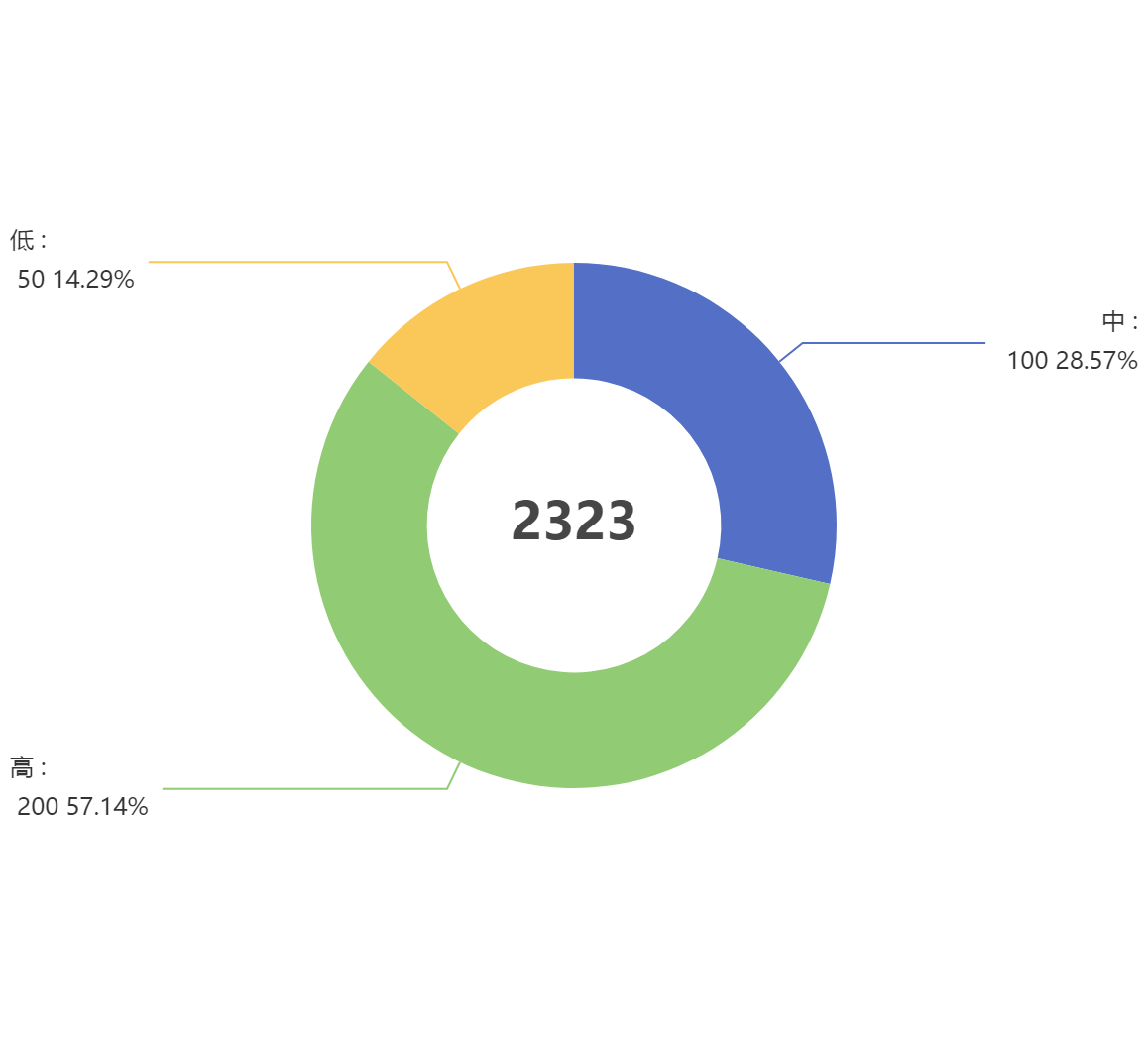
1.饼图怎么调整左右位置
只需要调整option.series里的center: ['30%', '50%']
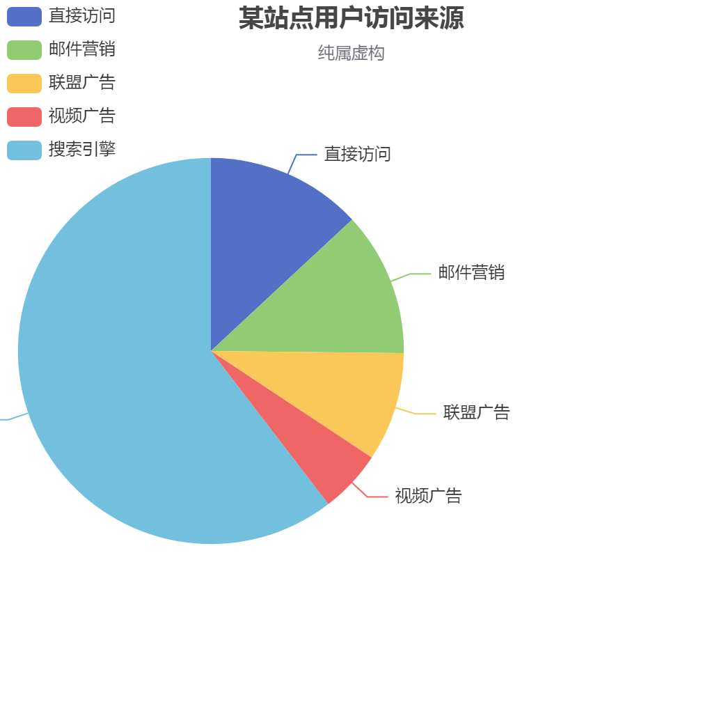
option = {

    title: {

        text: '某站点用户访问来源',

        subtext: '纯属虚构',

        left: 'center'

    },

    tooltip: {

        trigger: 'item'

    },

    legend: {

        orient: 'vertical',

        left: 'left',

    },

    series : [  // 把饼图挪到了左边

        {

            name: '访问来源',

            type: 'pie',

            radius : '55%',

            center: ['30%', '50%'],  //  这个代码~~

            data:[

                {value:335, name:'直接访问'},

                {value:310, name:'邮件营销'},

                {value:234, name:'联盟广告'},

                {value:135, name:'视频广告'},

                {value:1548, name:'搜索引擎'}

            ],

            itemStyle: {

                emphasis: {

                    shadowBlur: 10,

                    shadowOffsetX: 0,

                    shadowColor: 'rgba(0, 0, 0, 0.5)'

                }

            }

        }

    ]

};

    ]
2.更改x轴样式,控制样式里的X轴字在中间, 距离Y轴还有点距离

xAxis: {

      type: 'category',

      axisTick: { alignWithLabel: true }, // 控制样式里的X轴字在中间距离Y轴还有点距离

      data: ['5', '10', '15', '20', '25', '30'],

    },
3.echarts将网格线设置成虚线
yAxis: {

    splitLine :{    //网格线

        lineStyle:{

            type:'dashed'    //设置网格线类型 dotted:虚线   solid:实线

        },

        show:true //隐藏或显示

    }

}
4.x轴刻度居中
option = {

    tooltip: {

      trigger: 'axis',

      axisPointer: {

        // 坐标轴指示器,坐标轴触发有效

        type: 'shadow',

        // 默认为直线,可选为:'line' | 'shadow'

      },

    },

    toolbox: {

        show: true,

        feature: {

            dataView: {readOnly: false},

            restore: {},

            saveAsImage: {}

        }

    },

    grid: { top: '12%', left: '3%', right: '4%', bottom: '3%', containLabel: true },

    xAxis: [

      {

        type: 'category',

        data: ['8:30', '9:30', '10:30', '11:30', '12:30', '13:30', '14:30', '15:30', '16:30', '17:30', '18:30', '19:30', '20:30'],

        axisTick: { alignWithLabel: true }, // 刻度居中核心代码

        axisLabel: {

          textStyle: {

            // color: 'black', // 修改X轴文字的颜色

            fontSize: '9', // 修改X轴文字大小

          }

        },

      },

    ],

    // xAxis: [

    //   {

    //     data: [100, 80, 50, 120, 120, 30, 100, 100, 80, 50, 120, 120, 30, 100],

    //     show: false,

    //   },

    //   {

    //     data: ['8:30', '9:30', '10:30', '11:30', '12:30', '13:30', '14:30', '15:30', '16:30', '17:30', '18:30', '19:30', '20:30', '21:30'],

    //     position: 'bottom',

    //     boundaryGap: false,

    //     axisPointer: {

    //       show: false,

    //     },

    //     nameTextStyle: {

    //       color: '#999',

    //     },

    //     axisLine: {

    //       show: false,

    //     },

    //     axisTick: {

    //       show: false,

    //     },

    //     axisLabel: {

    //       // interval: 0,

    //       // color: '#999999',

    //       textStyle: {

    //         color: 'red', // 修改X轴文字的颜色

    //         fontSize: '9', // 修改X轴文字大小

    //       }

    //     },

    //     // splitLine: { // 背景竖着的刻度线

    //     //     show: true,

    //     //     lineStyle: {

    //     //         color: '#F1F1F1',

    //     //     },

    //     // },

    //   },

    // ],

    yAxis: [{

      type: 'value',

      splitLine: {    //网格线

        lineStyle: {

          type: 'dashed'    //设置网格线类型 dotted:虚线   solid:实线

        },

        show: true //隐藏或显示

      }

    }],

    series: [{

      name: '直接访问', type: 'bar', barWidth: '60%', data: [100, 80, 50, 120, 120, 30, 100, 100, 80, 50, 120, 120, 30, 100],

      itemStyle: {

        normal: {

          //这里是重点

          color: function (params) {

            // var colorList = ['#c23531', '#2f4554', '#61a0a8', '#d48265', '#91c7ae', '#749f83', '#ca8622'];

            // return colorList[params.dataIndex]

            return '#0eb30e'

          }

        }

      }

    }],

  }
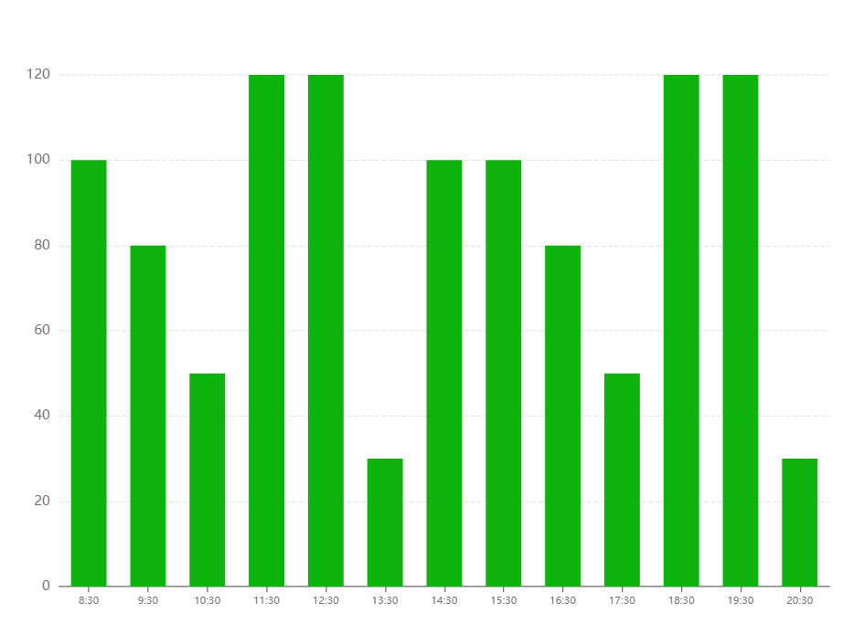
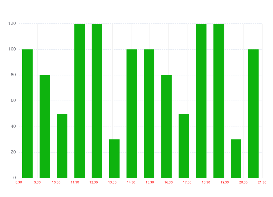
5.echarts X轴区间柱形图,X轴 刻度数组长度 比 数据数组长度 多一个
option = {

    tooltip: {

      trigger: 'axis',

      axisPointer: {

        // 坐标轴指示器,坐标轴触发有效

        type: 'shadow',

        // 默认为直线,可选为:'line' | 'shadow'

      },

    },

    toolbox: {

        show: true,

        feature: {

            dataView: {readOnly: false},

            restore: {},

            saveAsImage: {}

        }

    },

    grid: { top: '12%', left: '3%', right: '4%', bottom: '3%', containLabel: true },

    // xAxis: [

    //   {

    //     type: 'category',

    //     data: ['8:30', '9:30', '10:30', '11:30', '12:30', '13:30', '14:30', '15:30', '16:30', '17:30', '18:30', '19:30', '20:30'],

    //     axisTick: { alignWithLabel: true }, // 刻度居中核心代码

    //     axisLabel: {

    //       textStyle: {

    //         // color: 'black', // 修改X轴文字的颜色

    //         fontSize: '9', // 修改X轴文字大小

    //       }

    //     },

    //   },

    // ],

    xAxis: [  // 核心代码--双x轴刻度

      {

        data: [100, 80, 50, 120, 120, 30, 100, 100, 80, 50, 120, 120, 30, 100],

        show: false,

      },

      {

        data: ['8:30', '9:30', '10:30', '11:30', '12:30', '13:30', '14:30', '15:30', '16:30', '17:30', '18:30', '19:30', '20:30', '21:30'],

        position: 'bottom',

        boundaryGap: false,

        axisPointer: {

          show: false,

        },

        nameTextStyle: {

          color: '#999',

        },

        axisLine: {

          show: false,

        },

        axisTick: {

          show: false,

        },

        axisLabel: {

          // interval: 0,

          // color: '#999999',

          textStyle: {

            color: 'red', // 修改X轴文字的颜色

            fontSize: '9', // 修改X轴文字大小

          }

        },

        splitLine: { // 背景竖着的刻度线

            show: true,

            lineStyle: {

                color: '#F1F1F1',

            },

        },

      },

    ],

    yAxis: [{

      type: 'value',

      splitLine: {    //网格线

        lineStyle: {

          type: 'dashed'    //设置网格线类型 dotted:虚线   solid:实线

        },

        show: true //隐藏或显示

      }

    }],

    series: [{

      name: '直接访问', type: 'bar', barWidth: '60%', data: [100, 80, 50, 120, 120, 30, 100, 100, 80, 50, 120, 120, 30, 100],

      itemStyle: {

        normal: {

          //这里是重点

          color: function (params) {

            // var colorList = ['#c23531', '#2f4554', '#61a0a8', '#d48265', '#91c7ae', '#749f83', '#ca8622'];

            // return colorList[params.dataIndex]

            return '#0eb30e'

          }

        }

      }

    }],

  }
6.设置y轴区间,最大值最小值,显得数据波动很好~~~
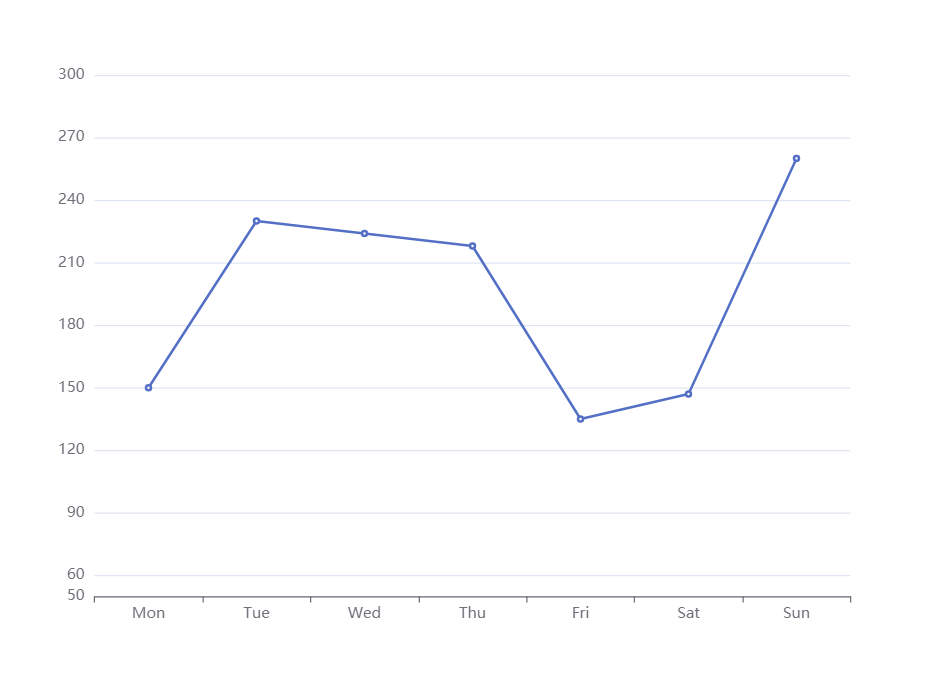
option = {

    xAxis: {

        type: 'category',

        data: ['Mon', 'Tue', 'Wed', 'Thu', 'Fri', 'Sat', 'Sun']

    },

    toolbox: {

        feature: {

            saveAsImage: {}

        }

    },

    yAxis: {

        type: 'value',

        min:50,

        max:300,

        splitNumber:10 // 好用切割成十份

    },

    series: [{

        data: [150, 230, 224, 218, 135, 147, 260],

        type: 'line'

    }]

};
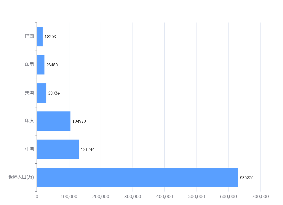
7.dataZoom控制Y轴滚动
看图
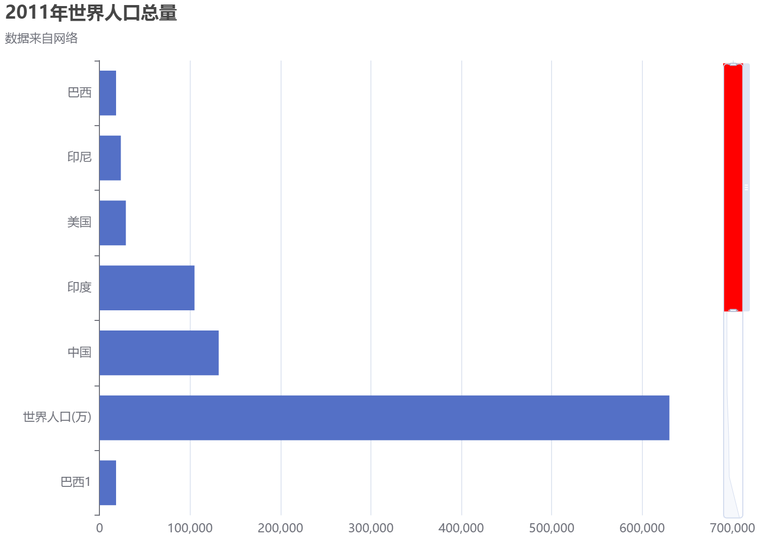
option = {

  title: {

    text: '2011年世界人口总量',

    subtext: '数据来自网络',

  },

  tooltip: {

    trigger: 'axis',

    axisPointer: {

      type: 'shadow',

    },

  },

  // legend: {

  //     data: ['2011年']

  // },

  grid: {

    left: '3%',

    right: '4%',

    bottom: '3%',

    containLabel: true,

  },

  xAxis: {

    type: 'value',

    boundaryGap: [0, 0.01],

  },

  yAxis: {

    type: 'category',

    inverse: true,

    data: [

      '巴西',

      '印尼',

      '美国',

      '印度',

      '中国',

      '世界人口(万)',

      '巴西1',

      '印1尼',

      '美1国',

      '印度1',

      '中1国',

      '世界1人口(万)',

    ],

  },

  dataZoom: [

    {

       show: false,

      zoomLock: true,

    },

    { type: 'slider',

      show: true,

      startValue: 0, // 控制显示几个数据

      endValue: 5, // 控制显示几个数据

      orient: 'vertical',

      showDetail: false, // 拖动时候滚动条上下是否显示详情

      showDataShadow: true,

      zoomLock: true,//设置为 true 则锁定选择区域的大小,也就是说,只能平移,不能缩放

      backgroundColor: 'white',

      fillerColor: 'red', // 滚动条颜色

      handleSize: '10', // 滚动条上面的那个把手大小

      x2: 20, // 滚动条距离右边的距离

      width: 20, // 滚动条的宽度

      zoomOnMouseWheel:true,  //滚轮是否触发缩放

      moveOnMouseMove:true,  //鼠标滚轮触发滚动

      moveOnMouseWheel:true

    }

  ],

  series: [

    {

      name: '2011年',

      type: 'bar',

      data: [

        18203,

        23489,

        29034,

        104970,

        131744,

        630230,

        18203,

        23489,

        29034,

        104970,

        131744,

        630230,

      ],

    },

  ],

}
鼠标滚动控制Y轴数据上下移动
option = {

  title: {

    text: '2011年世界人口总量',

    subtext: '数据来自网络',

  },

  tooltip: {

    trigger: 'axis',

    axisPointer: {

      type: 'shadow',

    },

  },

  // legend: {

  //     data: ['2011年']

  // },

  grid: {

    left: '3%',

    right: '4%',

    bottom: '3%',

    containLabel: true,

  },

  xAxis: {

    type: 'value',

    boundaryGap: [0, 0.01],

  },

  yAxis: {

    type: 'category',

    inverse: true,

    data: [

      '巴西',

      '印尼',

      '美国',

      '印度',

      '中国',

      '世界人口(万)',

      '巴西1',

      '印1尼',

      '美1国',

      '印度1',

      '中1国',

      '世界1人口(万)',

      '巴西12',

      '印12尼',

      '美12国',

      '印度12',

      '中12国',

      '世界12人口(万)',

    ],

  },

  dataZoom: [

    {

       show: false,

      zoomLock: false,

    },

    { type: 'inside', //改为slider的话就会出现滚动条,inside隐藏滚动条

      show: true,

      startValue: 0, // 控制显示几个数据

      endValue: 5, // 控制显示几个数据

      orient: 'vertical',

      showDetail: false, // 拖动时候滚动条上下是否显示详情

      showDataShadow: true,

    //   zoomLock: true,//设置为 true 则锁定选择区域的大小,也就是说,只能平移,不能缩放

      backgroundColor: 'white',

      fillerColor: 'red', // 滚动条颜色

      handleSize: '10', // 滚动条上面的那个把手大小

      x2: 20, // 滚动条距离右边的距离

      width: 20, // 滚动条的宽度

      zoomOnMouseWheel:false,  //滚轮是否触发缩放,同时要设置zoomLock: false

      moveOnMouseMove:true,  //鼠标左键拖动触发滚动,同时要设置zoomLock: false

      moveOnMouseWheel:true // 鼠标滚轮带动滚动,同时要设置zoomLock: false

    }

  ],

  series: [

    {

      name: '2011年',

      type: 'bar',

      data: [

        18203,

        23489,

        29034,

        104970,

        131744,

        630230,

        18203,

        23489,

        29034,

        104970,

        131744,

        630230,

        18203,

        23489,

        29034,

        104970,

        131744,

        630230,

      ],

    },

  ],

}
折线图+离散图
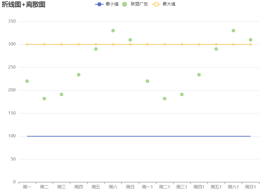
option = {

    title: {

        text: '折线图+离散图'

    },

    tooltip: {

        trigger: 'axis'

    },

    legend: {

        data: ['最小值', '联盟广告', '最大值']

    },

    grid: {

        left: '3%',

        right: '4%',

        bottom: '3%',

        containLabel: true

    },

    toolbox: {

        feature: {

            saveAsImage: {}

        }

    },

    xAxis: {

        type: 'category',

        // boundaryGap: false, // 控制折线图距离Y轴是否有距离

        data: ['周一', '周二', '周三', '周四', '周五', '周六', '周日','周一1', '周二1', '周三1', '周四1', '周五1', '周六1', '周日1']

    },

    yAxis: {

        type: 'value'

    },

    series: [

        {

            name: '最小值',

            type: 'line',

            symbol: "none", // 去掉折线上面的小圆点

            // stack: '总量', // 几个设置一样的会变成堆叠

            data: [100, 100, 100, 100, 100, 100, 100,100, 100, 100, 100, 100, 100, 100]

        },

        {

            name: '联盟广告',

            type: 'scatter',

            // stack: '总量', // 几个设置一样的会变成堆叠

            data: [220, 182, 191, 234, 290, 330, 310,220, 182, 191, 234, 290, 330, 310]

        },

        {

            name: '最大值',

            type: 'line',

            // symbol: "none", // 去掉折线上面的小圆点

            // stack: '总量', // 几个设置一样的会变成堆叠

            data: [300, 300, 300, 300, 300, 300, 300,300, 300, 300, 300, 300, 300, 300]

        },

    ]

};
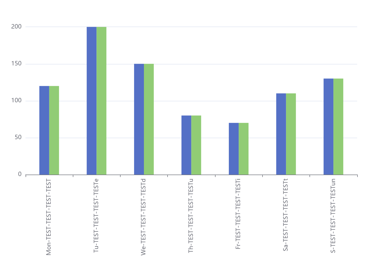
配置了横坐标旋转,同一个X轴所属柱子间距,非同一个X轴柱子间距,上下左右距离
option = {

  // 配置了横坐标旋转,同一个X轴所属柱子间距,非同一个X轴柱子间距,上下左右距离,以及横坐标部分涂色

  tooltip: {

    trigger: 'axis',

    axisPointer: {

      type: 'cross',

      crossStyle: {

        color: '#999'

      }

    }

  },

  grid: { top: '10%', left: '3%', right: '4%', bottom: '5%', containLabel: true },

  xAxis: {

    type: 'category',

    axisLabel: {

      interval: 0,

      rotate: 90

    },

    data: [

      'Mon-TEST-TEST-TEST-TEST',

      'Tu-TEST-TEST-TEST-TESTe',

      'We-TEST-TEST-TEST-TESTd',

      'Th-TEST-TEST-TEST-TESTu',

      'Fr-TEST-TEST-TEST-TESTi',

      'Sa-TEST-TEST-TEST-TESTt',

      'S-TEST-TEST-TEST-TESTun'

    ]

  },

  yAxis: {

    type: 'value'

  },

  series: [

    {

      name: '蒸发量1',

      barWidth: 20, //设置柱子的宽度

      barGap: '0%' /*控制的是单个X坐标的多个柱子的间距*/,

      //   barCategoryGap:'0%',/*控制非自己孩子之间的间距*/

      data: [120, 200, 150, 80, 70, 110, 130],

      type: 'bar'

    },

    {

      name: '蒸发量2',

      barWidth: 20, //设置柱子的宽度

      data: [120, 200, 150, 80, 70, 110, 130],

      type: 'bar'

    }

  ]

}
饼图添加中间的数字
option = {

    title: {

        text: '1024',

        left: 'center',

        top: 'center',

            // center: ['50%', '50%'],

    },

     toolbox: {

        show: true,

        feature: {

            mark: {show: true},

            dataView: {show: true, readOnly: false},

            restore: {show: true},

            saveAsImage: {show: true}

        }

    },

    tooltip: {

        trigger: 'item',

        formatter: '{a} <br/>{b} : {c} ({d}%)'

    },

    series: [

        {

            type: 'pie',

            // radius: '65%',

            radius: [50, 80],

            center: ['50%', '50%'],

            selectedMode: 'single',

            data: [

                {value: 100, name: '中'},

                {value: 200, name: '高'},

                {value: 50, name: '低'}

            ],

            emphasis: { // 这个是鼠标放上去时候的阴影

                itemStyle: {

                    shadowBlur: 10,

                    shadowOffsetX: 5,

                    shadowColor: 'rgba(0, 0, 0, 0.5)'

                }

            }

        }

    ]

};
鼠标滚轮滚动移动数据,以及添加标识字
option = {

  tooltip: {

    trigger: 'axis',

    axisPointer: {

      type: 'shadow',

    },

  },

   toolbox: {

        feature: {

            saveAsImage: {}

        }

    },

  // legend: {

  //     data: ['2011年']

  // },

  grid: {

    left: '3%',

    right: '8%',

    bottom: '3%',

    containLabel: true,

  },

  xAxis: {

    type: 'value',

    boundaryGap: [0, 0.01],

  },

  yAxis: {

    type: 'category',

    inverse: true,

    data: [

      '巴西',

      '印尼',

      '美国',

      '印度',

      '中国',

      '世界人口(万)',

      '巴西1',

      '印1尼',

      '美1国',

      '印度1',

      '中1国',

      '世界1人口(万)',

      '巴西12',

      '印12尼',

      '美12国',

      '印度12',

      '中12国',

      '世界12人口(万)',

    ],

  },

  dataZoom: [

    {

       show: false,

    backgroundColor: 'red',

      zoomLock: false,

    },

    { type: 'inside', //改为slider的话就会出现滚动条,inside隐藏滚动条

      show: true,

      startValue: 0, // 控制显示几个数据

      endValue: 5, // 控制显示几个数据

      orient: 'vertical',

      showDetail: false, // 拖动时候滚动条上下是否显示详情

      showDataShadow: true,

    //   zoomLock: true,//设置为 true 则锁定选择区域的大小,也就是说,只能平移,不能缩放

      backgroundColor: 'white',

      fillerColor: 'red', // 滚动条颜色

      handleSize: '10', // 滚动条上面的那个把手大小

      x2: 20, // 滚动条距离右边的距离

      width: 20, // 滚动条的宽度

      zoomOnMouseWheel:false,  //滚轮是否触发缩放,同时要设置zoomLock: false

      moveOnMouseMove:true,  //鼠标左键拖动触发滚动,同时要设置zoomLock: false

      moveOnMouseWheel:true // 鼠标滚轮带动滚动,同时要设置zoomLock: false

    }

  ],

  series: [

    {

      name: '2011年',

      type: 'bar',

      itemStyle: {

                color:  '#599fff' // 柱子的颜色

            },

             label: {

                show: true, // 柱子后面的字体

                precision: 1,

                position: 'right',

                valueAnimation: true,

                fontFamily: 'monospace'

            },

      data: [

        18203,

        23489,

        29034,

        104970,

        131744,

        630230,

        18203,

        23489,

        29034,

        104970,

        131744,

        630230,

        18203,

        23489,

        29034,

        104970,

        131744,

        630230,

      ],

    },

  ]

};
多种样式调节,X轴颜色Y轴颜色 、分割线颜色
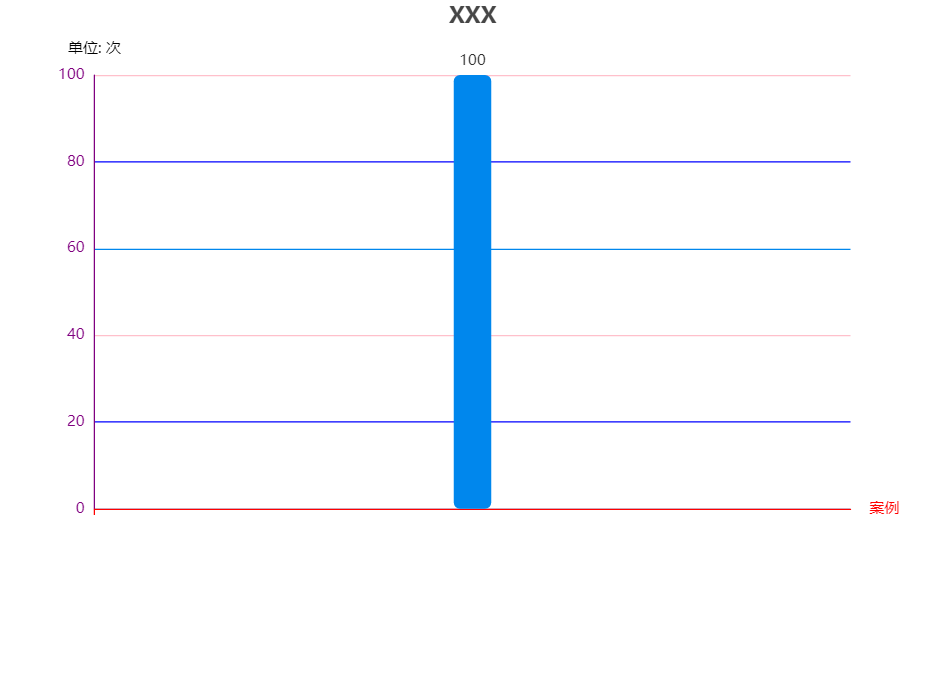
option = {

  title: {

    text: 'XXX',

    x: 'center'

  },

  //color: colorArr,

  tooltip: {

    trigger: 'axis',

    axisPointer: { // 坐标轴指示器,坐标轴触发有效

      type: 'shadow' // 默认为直线,可选为:'line' | 'shadow'

    }

  },

  toolbox: {

    feature: {

      saveAsImage: {}

    }

  },

  grid: {

    y2: 140

  },

  xAxis: {

    type: 'category',

    name: '案例',

    data: [''],

    axisLabel: {

      interval: 0,//横轴信息全部显示

      rotate: -30,//-30度角倾斜显示

    },

    axisLine: {

      lineStyle: {

        color: 'red', // x轴颜色

        width: 1,//这里是为了突出显示加上的

      }

    }

  },

  yAxis: {

    type: 'value',

    name: '单位: 次',

    splitLine: {

      lineStyle: {

        // 使用深浅的间隔色

        color: ['#0087ED', 'blue', 'pink']

      }

    },

    nameTextStyle: {

      color: ['#ddddd'] // y轴的标识字

    },

    axisLine: {

      show: true, // 控制y轴这个线是否出来

      lineStyle: {

        color: 'purple', // y轴字体颜色

        width: 1,//这里是为了突出显示加上的

      }

    }

  },

  series: [{

    name: '这里放名字',

    type: 'bar',

    stack: '次数',

    label: {

      normal: {

        show: true,

        position: 'top'

      }

    },

    data: ['100'],

    color: ['#0087ED'],

    itemStyle: {

      normal: {

        barBorderRadius: 5,

      }

    },

    barWidth: 30,

  }]

};
修改标题到中间,调整大小
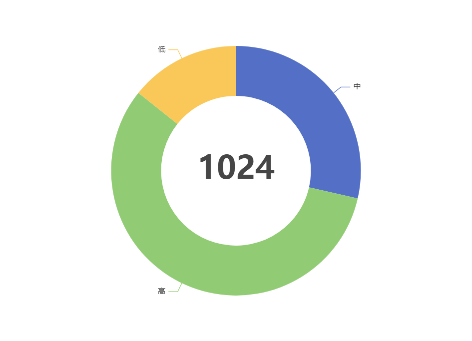
{

    title: {

      text: '1024',

      textStyle:{fontSize:50},

      left: 'center',

      top: 'center',

    },

    tooltip: {

      trigger: 'item',

      formatter: '{b} : {c} ({d}%)'

    },

    series: [

      {

        type: 'pie',

        // radius: [120, 200],

radius: ['50%', '80%'], // 这个是按比例,上面那个是按固定值

        center: ['50%', '50%'],

        selectedMode: 'single',

        data: [

          { value: 100, name: '中' },

          { value: 200, name: '高' },

          { value: 50, name: '低' }

        ],

        emphasis: { // 这个是鼠标放上去时候的阴影

          itemStyle: {

            shadowBlur: 10,

            shadowOffsetX: 5,

            shadowColor: 'rgba(0, 0, 0, 0.5)'

          }

        }

      }

    ]

  };
修改部分字体颜色
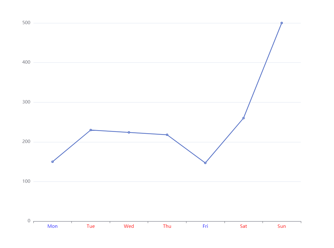
    let data1 = [150, 230, 224, 218, 147, 260, 500]

    option = {

      xAxis: {

        type: 'category',

        axisLabel: {

          color: function (value, index) {

            console.log(value, index)

            return data1[index] > 200 ? 'red' : 'blue'

          }

        },

        data: ['Mon', 'Tue', 'Wed', 'Thu', 'Fri', 'Sat', 'Sun']

      },

      yAxis: {

        type: 'value'

      },

      series: [{

        data: data1,

        type: 'line'

      }]

    };
修改柱状图每个柱子的颜色,根据数据橫坐標部分字體顏色,修改柱子間距
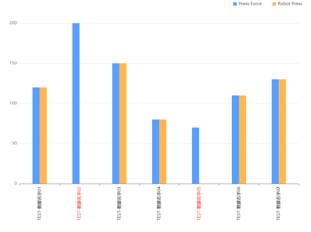
 myData = {

    nameData: [ // 橫坐標顯示的值

      'TEST-數據名字01',

      'TEST-數據名字02',

      'TEST-數據名字03',

      'TEST-數據名字04',

      'TEST-數據名字05',

      'TEST-數據名字06',

      'TEST-數據名字07'

    ],

    pData: [120, 200, 150, 80, 70, 110, 130],

    rData: [120, 0, 150, 80, 0, 110, 130]

  }

  option = {

       toolbox: {

        feature: {

            saveAsImage: {}

        }

    },

    legend: {

      data: ['Pr', 'Ro'],

      right: 20,

      itemHeight: 10,

      itemWidth: 10,

      itemGap: 30,

    },

    // 配置了横坐标旋转,同一个X轴所属柱子间距,非同一个X轴柱子间距,上下左右距离,以及横坐标部分涂色

    tooltip: {

      trigger: 'axis',

      axisPointer: {

        type: 'cross',

        crossStyle: {

          color: '#999'

        }

      }

    },

    grid: { top: '10%', left: '3%', right: '4%', bottom: '5%', containLabel: true },

    xAxis: {

      type: 'category',

      axisLabel: {

        interval: 0,

        rotate: 90,

        color: (value, index) => {

          // 柱狀圖用紅色框線標出壓力值為0的設備Station ID ,若進行壓力參數名稱的點選,紅色框線隨之改變

          return this.myData.rData[index] === 0 ? 'red' : 'black'

        }

      },

      data: this.myData.nameData

    },

    yAxis: {

      type: 'value'

    },

    series: [

      {

        name: 'Press',

        barWidth: 20, //设置柱子的宽度

        barGap: '0%' /*控制的是单个X坐标的多个柱子的间距*/,

        //   barCategoryGap:'0%',/*控制非自己孩子之间的间距*/

        data: this.myData.pData,

        itemStyle: {

          normal: {

            color: '#599fff'

          }

        },

        type: 'bar'

      },

      {

        name: 'Robot',

        barWidth: 20, //设置柱子的宽度

        data: this.myData.rData,

        itemStyle: {

          normal: {

            color: '#ffb752'

          }

        },

        type: 'bar'

      }

    ]

  }
修改echarts折线图拐点大小样式以及添加点点的边框,改变折线的样式
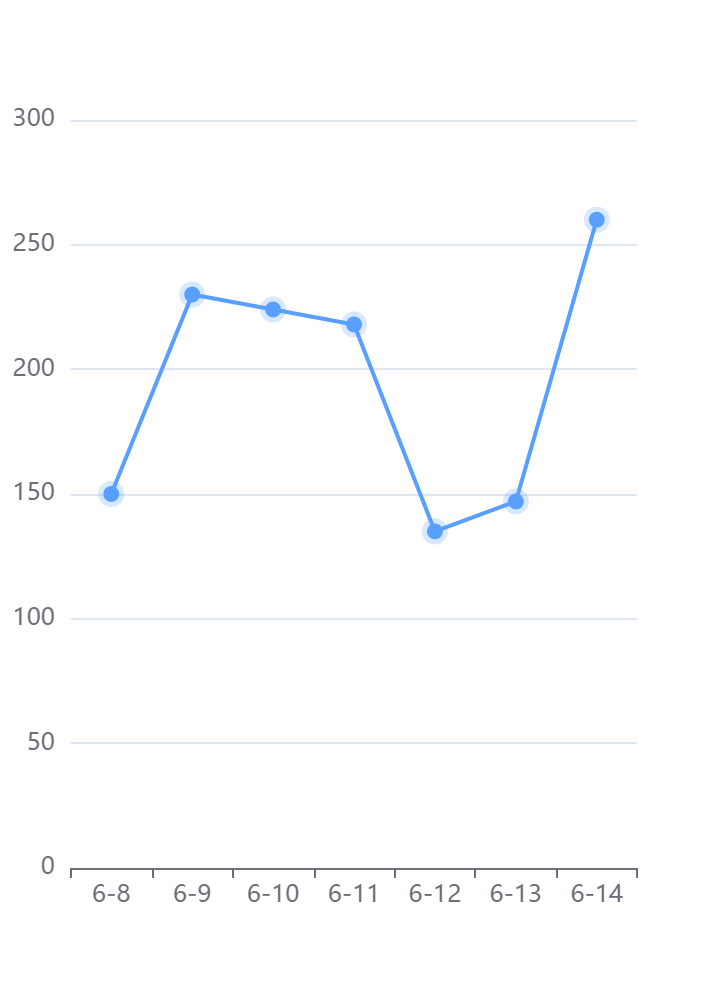
option = {

        tooltip: {

          trigger: 'axis',

        },

        xAxis: {

          type: 'category',

          data: ['6-8', '6-9', '6-10', '6-11', '6-12', '6-13', '6-14'],

        },

        yAxis: {

          type: 'value',

        },

        series: [

          {

            data: [150, 230, 224, 218, 135, 147, 260],

            type: 'line',

            symbol: 'circle', //拐点设置为实心

            symbolSize: 8, //拐点大小

            animation: true, //false: hover圆点不缩放 .true:hover圆点默认缩放

            lineStyle: {

              normal: {

                color: '#599fff', //折线的颜色

                width: '2', //折线粗细

              },

            },

            itemStyle: {

              normal: {

                color: '#599fff', //拐点颜色

                borderColor: 'rgba(89, 159, 255, 0.24)', //拐点边框颜色

                borderWidth: 5, //拐点边框大小

              },

              //   emphasis: {

              //         color: '#000000'//hover拐点颜色定义

              //     }

            },

          },

        ],

      }
折注混合,X轴的颜色,X轴字体颜色,调整柱子颜色,调整小图标图例的大小和位置,鼠标hover时候的样式,用纵向阴影
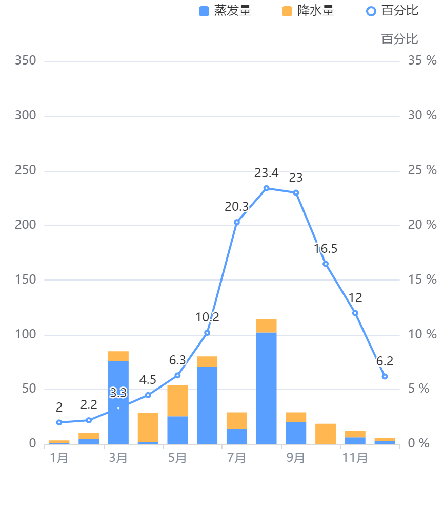
// 折注混合,X轴的颜色,X轴字体颜色,调整柱子颜色,调整小图标图例的大小和位置,鼠标hover时候的样式,用纵向阴影

      option = {

        tooltip: {

          trigger: 'axis',

          axisPointer: {

            // 坐标轴指示器,坐标轴触发有效

            type: 'shadow', // 默认为直线,可选为:'line' | 'shadow'

          },

        },

        legend: {

          // 调整小图标图例的大小和位置

          data: ['蒸发量', '降水量', '百分比'],

          right: 20,

          itemHeight: 10,

          itemWidth: 10,

          itemGap: 30,

        },

        xAxis: [

          {

            type: 'category',

            data: [

              '1月',

              '2月',

              '3月',

              '4月',

              '5月',

              '6月',

              '7月',

              '8月',

              '9月',

              '10月',

              '11月',

              '12月',

            ],

            axisPointer: {

              type: 'shadow',

            },

            axisLabel: {

              color: '#828c99', // x轴字体颜色

            },

            axisLine: {

              lineStyle: {

                color: '#d9d9d9', // x轴颜色

                width: 1, //这里是为了突出显示加上的

              },

            },

          },

        ],

        yAxis: [

          {

            type: 'value',

            // name: '水量', 左侧y轴标题

            min: 0,

            max: 350,

            interval: 50,

            // axisLabel: { 左侧y轴单位

            //     formatter: '{value} ml'

            // }

          },

          {

            type: 'value',

            name: '百分比',

            min: 0,

            max: 35,

            interval: 5,

            axisLabel: {

              formatter: '{value} %',

            },

          },

        ],

        series: [

          {

            name: '蒸发量',

            type: 'bar',

            stack: '堆叠',

            itemStyle: {

              normal: {

                // 柱子颜色--蓝色

                color: '#599fff',

              },

            },

            data: [

              1.0,

              4.9,

              76.0,

              2.2,

              25.6,

              70.7,

              13.6,

              102.2,

              20.6,

              0.0,

              6.4,

              3.3,

            ],

          },

          {

            name: '降水量',

            type: 'bar',

            stack: '堆叠',

            itemStyle: {

              normal: {

                // 柱子颜色--黄色

                color: '#ffb752',

              },

            },

            data: [

              2.6,

              5.9,

              9.0,

              26.4,

              28.7,

              9.7,

              15.6,

              12.2,

              8.7,

              18.8,

              6.0,

              2.3,

            ],

          },

          {

            name: '百分比',

            type: 'line',

            itemStyle: {

              normal: {

                // 颜色

                color: '#599fff',

              },

            },

            label: {

              show: true,

              position: 'top',

            },

            yAxisIndex: 1,

            data: [

              2.0,

              2.2,

              3.3,

              4.5,

              6.3,

              10.2,

              20.3,

              23.4,

              23.0,

              16.5,

              12.0,

              6.2,

            ],

          },

        ],

      }
去除饼图标注省略号配置
option = {

    title: {

      text: '2323',

      textStyle: { fontSize: 26 },

      left: 'center',

      top: 'center',

    },

    tooltip: {

      trigger: 'item',

      formatter: '{b} : {c} {d}%',

    },

    series: [

      {

        type: 'pie',

        radius: ['28%', '50%'],

        label: {

              alignTo: 'edge', // 去除标注省略号配置

                edgeDistance: 5, // 去除标注省略号配置

                lineHeight:20, // 去除标注省略号配置

          formatter: '{b} :\n {c} {d}%', // 去除标注省略号配置

      },

        data: [

          { value: 100, name: '中' },

          { value: 200, name: '高' },

          { value: 50, name: '低' },

        ],

        emphasis: {

          // 这个是鼠标放上去时候的阴影

          itemStyle: {

            shadowBlur: 10,

            shadowOffsetX: 5,

            shadowColor: 'rgba(0, 0, 0, 0.5)',

          },

        },

      },

    ],

  };
修改饼图颜色
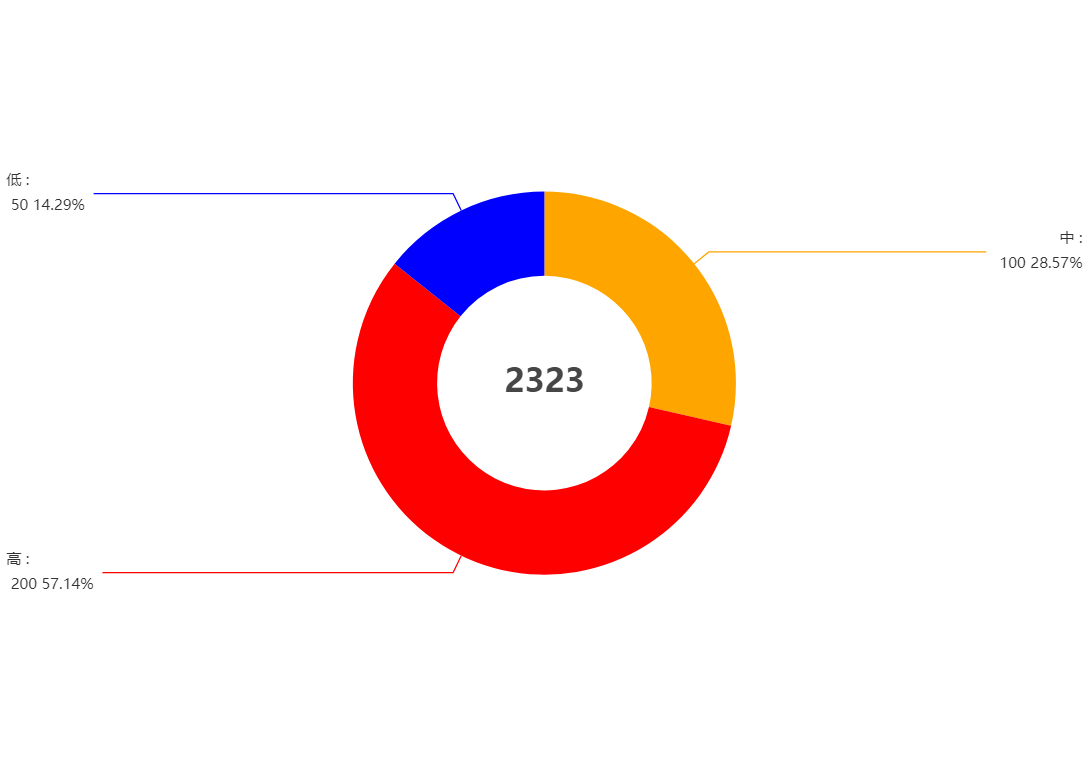
option = {

    title: {

      text: '2323',

      textStyle: { fontSize: 26 },

      left: 'center',

      top: 'center',

    },

    toolbox: {

        feature: {

            saveAsImage: {}

        }

    },

    tooltip: {

      trigger: 'item',

      formatter: '{b} : {c} {d}%',

    },

    series: [

      {

        type: 'pie',

        radius: ['28%', '50%'],

        label: {

              alignTo: 'edge', // 去除标注省略号配置

                edgeDistance: 5, // 去除标注省略号配置

                lineHeight:20, // 去除标注省略号配置

          formatter: '{b} :\n {c} {d}%', // 去除标注省略号配置

      },

        data: [

          { value: 100, name: '中',itemStyle: {color:"orange"} },

          { value: 200, name: '高' ,itemStyle: {color:"red"}},

          { value: 50, name: '低' ,itemStyle: {color:"blue"}},

        ],

        emphasis: {

          // 这个是鼠标放上去时候的阴影

          itemStyle: {

            shadowBlur: 10,

            shadowOffsetX: 5,

            shadowColor: 'rgba(0, 0, 0, 0.5)',

          },

        },

      },

    ],

  };
echarts系列-带图教你调整左右位置x轴样式网格虚线刻度居中双轴Y轴滚动上下移动文字旋转改分割线颜色部分字体改色折注混合,X轴的颜色,X轴字体颜色,调整柱子颜色,调整小图标图例的大小和位置,鼠标hover时候的样式,用纵向阴影的更多相关文章
- 深入浅出ECharts系列 (二) 折线图
深入浅出ECharts系列(二) 目标 本次教程的目标是实现“折线图堆叠”折线,实现结果如图: 2. 准备工作 a) 首先下载ECharts插件,你可以根据自己的实际需求选择你想要下载 ...
- 一起来玩echarts系列(一)------箱线图的分析与绘制
一.箱线图 Box-plot 箱线图一般被用作显示数据分散情况.具体是计算一组数据的中位数.25%分位数.75%分位数.上边界.下边界,来将数据从大到小排列,直观展示数据整体的分布情况. 大部分正常数 ...
- echarts 折柱混合图 (绑数据后)
html: <div class="flot-chart-content" id="flot-dashboard-chart"></div&g ...
- echarts系列之动态修改柱状图颜色
echarts根据某一变量动态修改柱状图颜色 1.option中参数配置项series { "name":"Android", "type" ...
- echarts 中 柱图 、折线图、柱图层叠
app.title = '折柱混合'; option = { tooltip: { trigger: 'axis', axisPointer: { type: 'cross', crossStyle: ...
- echarts展示箱型图&正态分布曲线
效果图: 直接上代码吧: <!DOCTYPE HTML> <html> <head> <style type="text/css"> ...
- echarts之折线图配置(附带图例很多做成分页效果)
<!DOCTYPE html> <html lang="en"> <head> <meta charset="utf-8&quo ...
- 百度 echarts K线图使用
看个效果图先 首先在需要插入图例的HTML中嵌入 <div id="main" style="height:400px"></div> ...
- WPF仿百度Echarts人口迁移图
GitHub地址:https://github.com/ptddqr/wpf-echarts-map/tree/master 关于大名鼎鼎的百度Echarts我就不多说了 不了解的朋友直接看官方的例子 ...
- [UML]UML系列——类图class的关联关系(聚合、组合)
关联的概念 关联用来表示两个或多个类的对象之间的结构关系,它在代码中表现为一个类以属性的形式包含对另一个类的一个或多个对象的应用. 程序演示:关联关系(code/assocation) 假设:一个公司 ...
随机推荐
- Istio(十三):Istio项目实际案例——Online Boutique
目录 一.模块概览 二.系统环境 三.创建Kubernetes(k8s)集群 3.1 创建Kubernetes(k8s)集群 3.2 Kubernetes集群环境 四.安装istio 4.1 安装Is ...
- 2流高手速成记(之六):从SpringBoot到SpringCloudAlibaba
咱们接上回 2流高手速成记(之五):Springboot整合Shiro实现安全管理 - 14号程序员 - 博客园 (cnblogs.com) 身边常有朋友说:小项目用PHP.大项目用Java(这里绝无 ...
- 打地鼠(susliks) 方法记录
[SDOI2011]打地鼠 题目描述 2020.4.29 数据更新. 打地鼠是这样的一个游戏:地面上有一些地鼠洞,地鼠们会不时从洞里探出头来很短时间后又缩回洞中.玩家的目标是在地鼠伸出头时,用锤子砸其 ...
- LoadRunner11使用代理录制脚本
一.背景 电脑安装了LoadRunner11,在进行脚本录制时发现录制的脚本为空,即录制时事件为0,也没有自动调出对应的浏览器:如下图: 问了度娘,发现LR11要成功录制脚本,对各浏览器的版本有要求! ...
- 使用SVN搭建本地版本控制仓库
使用SVN搭载本地版本控制仓库[转] 如果是在公司,都是有云服务器,项目负责人都是把项目放在服务器上,我们直接用SVN地址就可以实现更新和下载项目源码,那么如果我们自己想使用SVN在本机管理自己写的一 ...
- Vue3笔记(二)了解组合式API的应用与方法
一.组合式API(Composition API)的介绍 官方文档: https://v3.cn.vuejs.org/guide/composition-api-introduction.html 组 ...
- jdk线程池ThreadPoolExecutor优雅停止原理解析(自己动手实现线程池)(二)
jdk线程池工作原理解析(二) 本篇博客是jdk线程池ThreadPoolExecutor工作原理解析系列博客的第二篇,在第一篇博客中从源码层面分析了ThreadPoolExecutor在RUNNIN ...
- orcle恢复报错:ORA-00392: 日志 2 (用于线程 1) 正被清除, 不允许操作
遇到问题 RMAN> alter database open resetlogs; RMAN-00571: =========================================== ...
- java基础知识-lambda表达式
一.什么是lambda? 在Java中,我们可以将一个值赋值给一个Java变量. int aValue = 129; String aString = "hello world"; ...
- 关于linux mint更改资源管理器的快捷键
前言 首先要知道 linux mint 的默认资源管理器是 nemo 我很不习惯 ctrl+d 在nemo里面是 收藏到侧边栏 我习惯 ctrl+d 在windows上是删除文件 所以下面我就修改这个 ...