03_Matplotlib的基本使用
python利用Matplotlib.pyplot库绘制不同的图形,但是在显示中文时存在部分问题,一般在导入库后,添加如下代码:
# 设置中文正常显示

plt.rcParams['font.sans-serif'] = ['SimHei']

# 设置负号正常显示

plt.rcParams['axes.unicode_minus'] = False
1.折线图
一般折线图
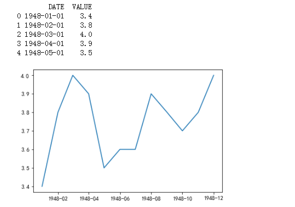
输入:
# 画出折线图

import pandas as pd

import numpy as np

import matplotlib.pyplot as plt

# 设置中文正常显示

plt.rcParams['font.sans-serif'] = ['SimHei']

# 设置负号正常显示

plt.rcParams['axes.unicode_minus'] = False

# 读取数据

unrate = pd.read_csv(r'D:\codes_jupyter\数据分析_learning\课件\03_matplotlib\UNRATE.csv', engine='python')

# 结合数据形式,将数据的日期格式进行转化

unrate['DATE'] = pd.to_datetime(unrate['DATE'])

print(unrate.head())

# 画图

First_twelve = unrate[0:12]  # 拿12个月份的数据进行画图

# plot()画折线图。函数传入两个值,左边的值作为x轴,右边的值作为y轴

plt.plot(First_twelve['DATE'], First_twelve['VALUE'])

# show()函数显示图片

plt.show()
输出:
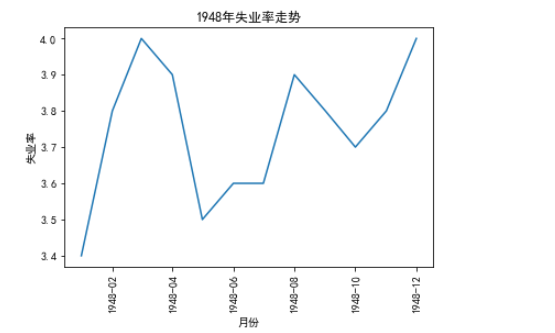
折线图设置
对折线图操作,添加标签、标题,并对坐标刻度进行设置
输入:
# 对折线图操作,添加标签、标题,并对坐标刻度进行设置

unrate['DATE'] = pd.to_datetime(unrate['DATE'])

First_12 = unrate[0:12]

plt.plot(First_12['DATE'], First_12['VALUE'])

# 对横坐标进行一定的变换

# rotation=45 表示转动45°

plt.xticks(rotation=90)

# 添加标签

plt.xlabel('月份')

plt.ylabel('失业率')

# 添加标题

plt.title('1948年失业率走势')

plt.show()
输出:
2.子图
子图概念
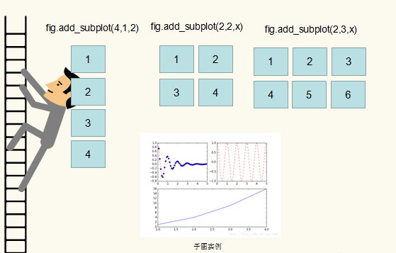
fig.add_subplot(4,1,x)函数画子图
参数表示画4行1列,共4个子图,垂直排列,每行一个图,x表示第x个子图
参数:(2,2,x)表示两行两列,4个图,每行2个图,x表示第x个子图
参数:(2,3,x)表示2行3列,每行3个子图,x表示第x个子图
绘制子图
使用add_subplot()绘制子图,并通过figsize()制定画板大小
输入:
# add_subplot()添加子图,figsize()指定画板大小

import matplotlib.pyplot as plt

# figsize=(x, y)指定画板, 不填写参数表示默认值

# fig = plt.figure()

fig = plt.figure(figsize=(10, 6))  # 通过figsize=(x, y)指定画板大小

# 对第一个子图进行操作

ax1 = fig.add_subplot(2, 2, 1)

ax1.plot(np.random.randint(1, 5, 5), np.arange(5))  # 生成随机整数

# 对第二个子图进行操作

ax2 = fig.add_subplot(2, 2, 2)

ax2.plot(np.random.randint(1, 5, 5), np.arange(5))

# 对第四个子图进行操作

ax4 = fig.add_subplot(2, 2, 4)

ax4.plot(np.random.randint(1, 5, 5), np.arange(5))

plt.show()
输出:
绘制多条折线
在一张图上画出多条折线
输入:
# 一张图上画出多条曲线

# 拿到日期的月份。

# dt.month获取datetime类型值的月份

unrate['MONTH'] = unrate['DATE'].dt.month

# 指定画板大小

fig = plt.figure(figsize=(6, 3))

# 画图  通过c='red'指定线条颜色

plt.plot(unrate[:12]['MONTH'], unrate[:12]['VALUE'], c='red')

plt.plot(unrate[12:24]['MONTH'], unrate[12:24]['VALUE'], c='blue')

plt.show()
输出: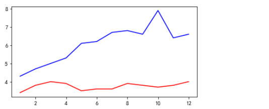
添加图例1
使用for循环绘制多条折线,并添加对应的图例说明
输入:
# for循环画出多条折线,并添加图例说明

fig = plt.figure(figsize=(10, 6))

color = ['r', 'b', 'orange', 'black', 'green']

for i in range(5):

    start_index = i * 12

    end_index = (i+1) * 12

    # 取范围

    subset = unrate[start_index: end_index]

    # 给每条线添加标签

    label = str(1948 + i)

    plt.plot(subset['MONTH'], subset['VALUE'], c=color[i], label=label)

# 将图例说明自动放置合适位置

plt.legend(loc='best', fontsize=10, ncol=2)

plt.show()

# plt.legend()函数显示图例

# loc参数设置位置

# fontsize设置图例字体大小

# ncols 设置用多少列显示图例

# loc='best':将图例说自动添加到合适位置

# loc='center':将图例放置在中心

# 通过print(help(plt.legend))查看其它参数
输出: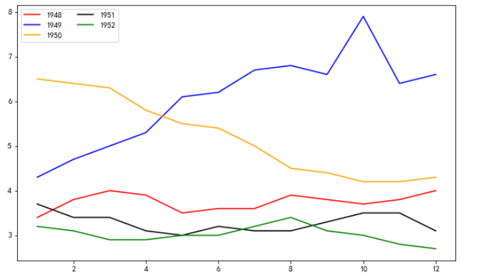
设置线条宽度
输入:
# 设置线宽度

fig = plt.figure(figsize=(10, 6))

color = ['r', 'b', 'orange', 'black', 'green']

for i in range(5):

    start_index = i * 12

    end_index = (i+1) * 12

    subset = unrate[start_index: end_index]

    label = str(1948 + i)

    # linewidth=10设置线宽度

    plt.plot(subset['MONTH'], subset['VALUE'], c=color[i], label=label, linewidth=8)

plt.legend(loc='best', fontsize=10, ncol=2)

# xticks的size设置坐标刻度字体的大小,yticks同理设置

plt.xticks(size=30)

plt.yticks(size=15)

# 添加标签和标题

plt.xlabel('月份')

plt.ylabel('失业率')

plt.title('1948-1953年失业率走势图')

plt.show()
输出: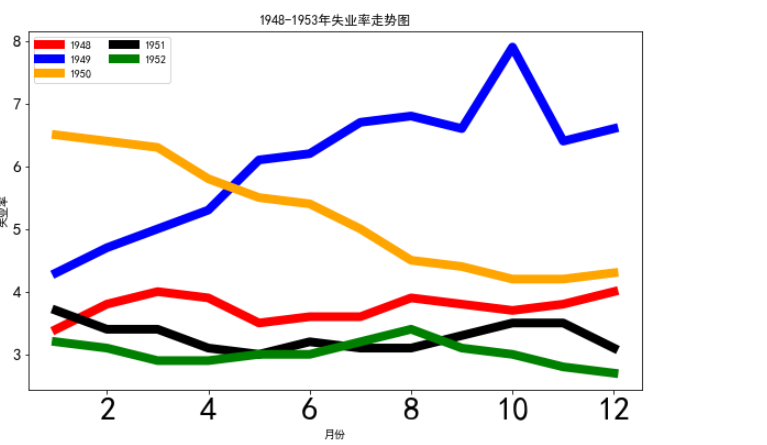
添加图例2
输入:
import pandas as pd

import matplotlib.pyplot as plt

women_degree = pd.read_csv(r'D:\codes_jupyter\数据分析_learning\课件\03_matplotlib\percent-bachelors-degrees-women-usa.csv', engine='python')

# 设置颜色,label两侧的内容,图例,线宽

plt.plot(women_degree['Year'], women_degree['Biology'], color='blue', label='Women', linewidth=10)

plt.plot(women_degree['Year'], 100-women_degree['Biology'], c='green', label='Men', linewidth=10)

# 在图中添加文本信息

plt.text(2005, 35, 'Men', size=25)  # 在(2005,35)这个点添加信息,信息内容为后面的字符串,size为字体大小

plt.text(2005, 55, 'Women')

# 设置图例

plt.legend(loc='upper right')

# 设置title

plt.title('Precentage of Biology Awarded By Gender')

# 设置是否显示网格

plt.grid(True)

plt.show()
输出:

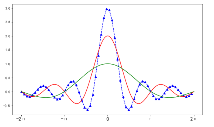
设置线型、点型及坐标轴
输入:
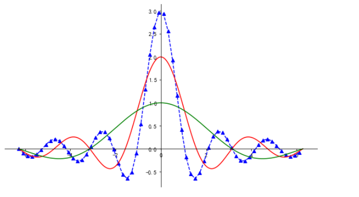
# 设置线型、点型、坐标轴

plt.figure(figsize=(10, 6))

x1 = np.arange(-2*np.pi, 2*np.pi, 0.01)

x2 = np.arange(-2*np.pi, 2*np.pi, 0.2)

y1 = np.sin(3*x2)/x2

y2 = np.sin(2*x1)/x1

y3 = np.sin(x1)/x1

# linestyle设置线条类型;marker设置线条上点的风格

plt.plot(x2, y1, c='b', linestyle='--', marker='^')

plt.plot(x1, y2, c='r', linestyle='-')

plt.plot(x1, y3, c='g')

# 获取Axes对象

ax = plt.gca()

# spines['right']获取有边框

ax.spines['right'].set_color('none')  # set_color设置颜色为none

# spines['top']获取上边框

ax.spines['top'].set_color('none')  # set_color设置颜色为none

# 设置坐标轴

ax.xaxis.set_ticks_position('bottom')  # 设置下边框为x轴

ax.spines['bottom'].set_position(('data', 0))  # 获取下边框,set_position设置坐标轴位置

ax.yaxis.set_ticks_position('left')  # 设置左边框为y轴

ax.spines['left'].set_position(('data', 0))  # 设置y轴显示在刻度范围内,0的地方

plt.show()

# set_position()传入元组

# ('data', 0) 表示将x轴放到数字0的位置

# 下面的一个表示将y轴放到数字0的位置

# 使用print(help(ax.spine['left'].set_position))查看帮助文档

# data 表示将坐标轴设置在刻度范围内部

# outwards 表示将坐标轴设置在整体刻度范围的最外面

# 第一个0 表示x轴在y轴的刻度0的地方,第二个0同理
输出:
设置刻度及坐标轴显示
输入:
# 设置刻度的显示、显示图的一部分

plt.figure(figsize=(10, 6))

x1 = np.arange(-2*np.pi, 2*np.pi, 0.01)

x2 = np.arange(-2*np.pi, 2*np.pi, 0.2)

y1 = np.sin(3*x2)/x2

y2 = np.sin(2*x1)/x1

y3 = np.sin(x1)/x1

# linestyle设置线条类型;marker设置线条上点的风格

plt.plot(x2, y1, c='b', linestyle='--', marker='^')

plt.plot(x1, y2, c='r', linestyle='-')

plt.plot(x1, y3, c='g')

# 设置要显示刻度的刻度值

# plt.xticks([-2*np.pi, -np.pi, 0, np.pi, 2*np.pi])

# 用后面的刻度,替换前面的刻度值

plt.xticks([-2*np.pi, -np.pi, 0, np.pi, 2*np.pi], ['-2π', '-π', '', 'π', '2π'], size=15)

# 设置只显示刻度范围内的值

# plt.xlim((-1 * np.pi, np.pi))

# plt.ylim((0, 3))

plt.show()
输出:
3.柱形图
# 读取数据

import pandas as pd

review = pd.read_csv(r'D:\codes_jupyter\数据分析_learning\课件\03_matplotlib\fandango_scores.csv', engine='python')

cols = ['FILM', 'RT_user_norm', 'Metacritic_user_nom', 'IMDB_norm', 'RT_norm', 'Fandango_Stars']

# 取出对应列

norm_review = review[cols]

norm_review.head()
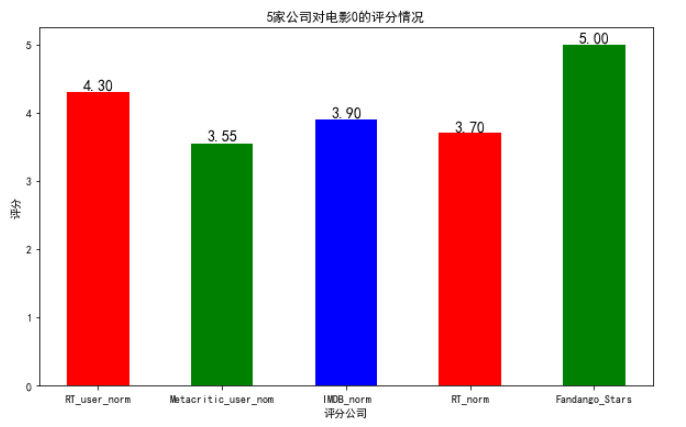
FILM    RT_user_norm    Metacritic_user_nom    IMDB_norm    RT_norm    Fandango_Stars

0    Avengers: Age of Ultron (2015)    4.3    3.55    3.90    3.70    5.0

1    Cinderella (2015)    4.0    3.75    3.55    4.25    5.0

2    Ant-Man (2015)    4.5    4.05    3.90    4.00    5.0

3    Do You Believe? (2015)    4.2    2.35    2.70    0.90    5.0

4    Hot Tub Time Machine 2 (2015)    1.4    1.70    2.55    0.70    3.5
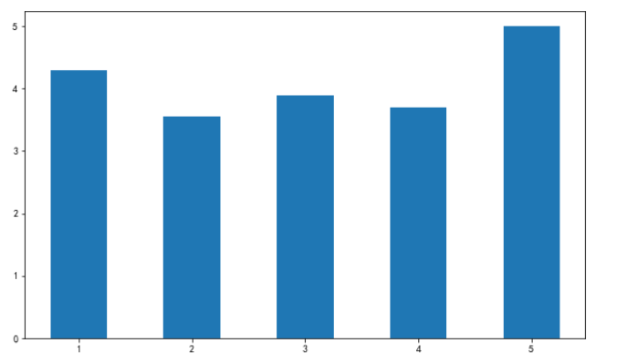
一般柱形图
输入:
# plt.bar函数,画柱形图

# 首先,指定柱的高度

bar_height = norm_review.loc[0, cols[1:]].values  # 这里就取5家媒体对0号电影的评分值

# 其次,指定柱的位置

bar_position = np.arange(5) + 1

# print(bar_position)

plt.figure(figsize=(10, 6))

# 使用plt.bar函数画柱状图

plt.bar(bar_position, bar_height, 0.5)  # 0.5是设置柱的宽度

plt.show()
输出:
设置柱状图的颜色、文本注释、坐标轴格式、标题和标签
输入:
# 设置柱状图的颜色、文本注释、坐标轴格式、标题和标签

bar_height = norm_review.loc[0, cols[1:]].values

bar_position = np.arange(5) + 1

plt.figure(figsize=(10, 6))

# color属性,设置颜色

plt.bar(bar_position, bar_height, 0.5, color=['r', 'g', 'b'])  # 设置一种颜色直接color=‘r’

# xticks替换坐标, 利用电影名替换1,2,3,。。。

plt.xticks(bar_position, cols[1:])

#设置标签和标题

plt.xlabel("评分公司")

plt.ylabel("评分")

plt.title("5家公司对电影0的评分情况")

# 利用plt.text方法,设置具体数值

for x, y in zip(bar_position, bar_height):

    plt.text(x, y, '%.2f'% y, ha='center', va='bottom', size=14)

# 说明:

# plt.text()依次传入坐标和字符串内容

# x,y 代表传入柱的位置和高度

# '%.2f' 代表传入字符串的内容

# ha='center' 设置文字水平对齐方式,其他参数查看帮助文档

# va='bottom' 设置文字垂直对齐方式,其他参数查看帮助文档

# size 设置字体大小

plt.show()
输出:
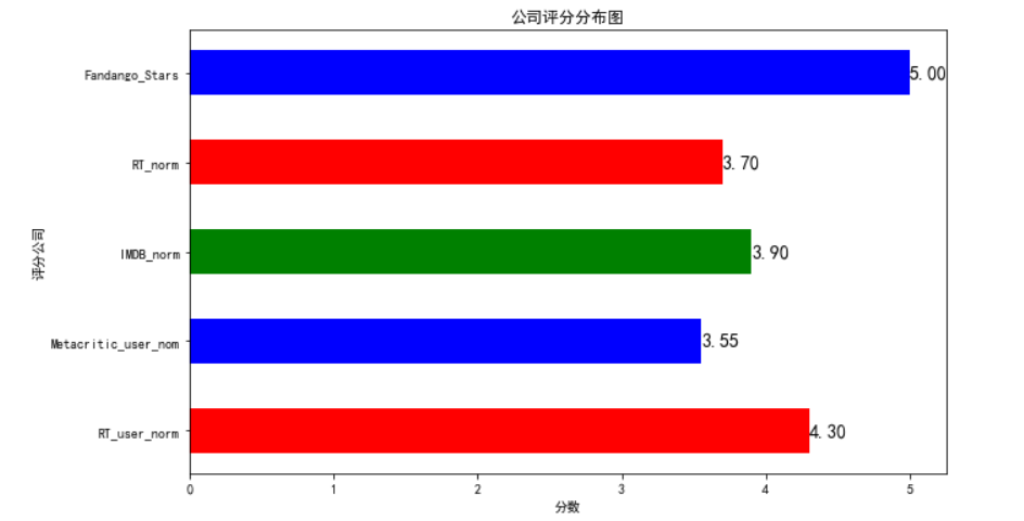
横向柱形图
输入:
# plt.barh画横向柱状图

# 设置柱的高度

bar_width = norm_review.loc[0, cols[1:]].values

# 设置柱的位置

bar_position = np.arange(5) + 1

# 设置画板大小

plt.figure(figsize=(10, 6))

# 设置标签和标题

plt.xlabel('评分公司')

plt.ylabel('分数')

plt.title('公司评分分布图')

# 设置坐标轴

plt.yticks(bar_position, cols[1:])

# 添加文本注释

for x,y in zip(bar_width, bar_position):

    plt.text(x,y, '%.2f'%x, ha='left', va='center', size=14)

# 画出柱状图

plt.barh(bar_position, bar_width, 0.5, color=['r', 'g', 'b'])

plt.show()
输出:
4.散点图
一般散点图
输入:
# plt.scatter()画出散点图

# 设置画板大小

plt.figure(figsize=(10, 6))

# 传入每个点的x,y坐标

plt.scatter(norm_review['RT_user_norm'], norm_review['Metacritic_user_nom'])

# 设置标签

plt.xlabel('RT_user_norm')

plt.ylabel('Metacritic_user_nom')

plt.title('两家媒体对同一电影的评分')

plt.show()
输出:

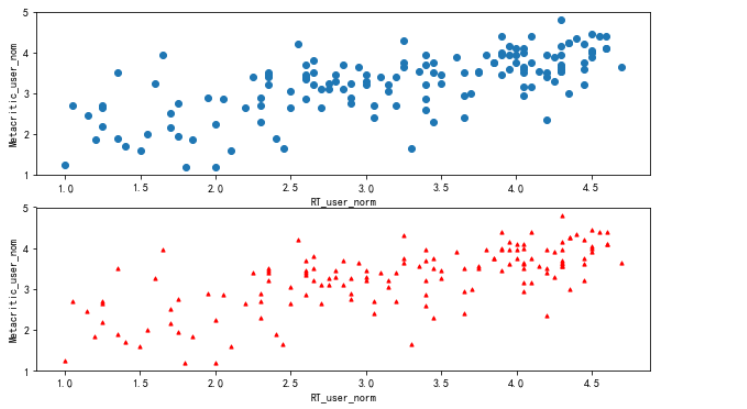
散点图加子图
输入:
# 散点图加子图

# 新建画板

fig = plt.figure(figsize=(10, 6))

# 添加子图

ax1 = fig.add_subplot(2, 1, 1)

ax2 = fig.add_subplot(2, 1, 2)

# 画出子图,并进行设置

ax1.scatter(norm_review['RT_user_norm'], norm_review['Metacritic_user_nom'])

ax1.set_xlabel('RT_user_norm')  # 添加标签

ax1.set_ylabel('Metacritic_user_nom')

ax2.scatter(norm_review['RT_user_norm'], norm_review['Metacritic_user_nom'],s=10, c='r', marker='^' )

# s=10 设置点的大小

# c='r' 设置颜色

# marker='^' 设置点的类型

ax2.set_xlabel('RT_user_norm')  # 添加标签

ax2.set_ylabel('Metacritic_user_nom')

plt.show()
输出:
输入:
"""

需求说明:

读取pandas_practice数据

一共两个科目的分数,

通过的用红色 x 表示

淘汰的用蓝色 . 表示

添加图例等相关信息

"""

import numpy as np

import pandas as pd

import matplotlib.pyplot as plt

# 数据读取

datas = pd.read_csv(r'D:\codes_jupyter\数据分析_learning\课件\03_matplotlib\pandas_practice.csv', engine='python')

# 指定画板大小

fig = plt.figure(figsize=(10,4))

# 取出所有通过的人Exam1分数和Exam2分数,添加标签,指定颜色和点型

plt.scatter(datas['Exam1'][(datas['Admitted'] == 1)], datas['Exam2'][(datas['Admitted'] == 1)], label="通过", s=14, c='r', marker='x')

# 取出所有淘汰的人的分数,添加相关内容

plt.scatter(datas['Exam1'][(datas['Admitted'] == 0)], datas['Exam2'][(datas['Admitted'] == 0)], label="淘汰", s=14, c='b')

# 添加标签

plt.xlabel('科目1分数')

plt.ylabel('科目2分数')

# 添加图例

plt.legend(loc='best')

plt.show()
输出:

5.条形图
数据展示:
import pandas as pd

import numpy as np

import matplotlib.pyplot as plt

reviews = pd.read_csv(r'D:\codes_jupyter\数据分析_learning\课件\03_matplotlib\fandango_scores.csv', engine='python')

cols = ['FILM', 'RT_user_norm', 'Metacritic_user_nom', 'IMDB_norm', 'RT_norm', 'Fandango_Stars']

norm_reviews = reviews[cols]

norm_reviews.head()
FILM    RT_user_norm    Metacritic_user_nom    IMDB_norm    RT_norm    Fandango_Stars

0    Avengers: Age of Ultron (2015)    4.3    3.55    3.90    3.70    5.0

1    Cinderella (2015)    4.0    3.75    3.55    4.25    5.0

2    Ant-Man (2015)    4.5    4.05    3.90    4.00    5.0

3    Do You Believe? (2015)    4.2    2.35    2.70    0.90    5.0

4    Hot Tub Time Machine 2 (2015)    1.4    1.70    2.55    0.70    3.5
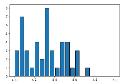
频数分布图
输入:
# 对某家媒体的评分进行统计,拿到评分的频数分布,并画出频数分布图

# 利用value_counts()函数,对不同评分进行统计,得到频数

# fandango_distribute = norm_reviews['RT_user_norm'].value_counts()

# print(fandango_distribute)

# 利用sort_index()函数,按照索引排序

# fandango_sort = fandango_distribute.sort_index()

# print(fandango_sort)

# plt.hist()函数画出频数分布图

plt.hist(norm_reviews['RT_user_norm'], bins=20, range=(4, 5), edgecolor='black', rwidth=0.8)

# bins=20 将原来数据的范围分为20份

# edgecolot 设置边框的颜色

# rwidth 设置条形的宽度

# range=(4, 5) 可选参数 设置只显示4到5之间的频数分布

plt.show()
输出:
6.三维图
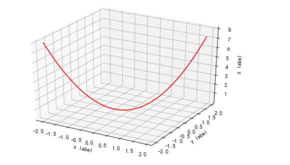
三维线图
输入:
from mpl_toolkits.mplot3d import Axes3D

import matplotlib.pyplot as plt

import numpy as np

# 构造一个3D画板

fig = plt.figure()

ax = Axes3D(fig)

x = np.arange(-2, 2, 0.1)

y = np.arange(-2, 2, 0.1)

def f(x, y):

    return (x**2 + y**2)

# 传入(x,y,z)坐标

ax.plot(x, y, f(x, y), color='r')  # 画图

# 设置标签

ax.set_xlabel('x label')

ax.set_ylabel('y label')

ax.set_zlabel('z label')

plt.show()
输出:
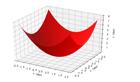
三维平面图
输入:
# 构造空间图

# 构造一个3D画板

fig = plt.figure()

ax = Axes3D(fig)

x = np.arange(-2, 2, 0.1)

y = np.arange(-2, 2, 0.1)

# 将x,y构成点矩阵

x, y = np.meshgrid(x, y)

def f(x, y):

    return (x**2 + y**2)

# 传入(x,y,z)坐标

ax.plot_surface(x, y, f(x, y), color='r')  # 画图

# 设置标签

ax.set_xlabel('x label')

ax.set_ylabel('y label')

ax.set_zlabel('z label')

plt.show()
输出:
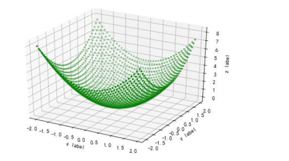
三维散点图
输入:
# 构造一个空间散点图

# 构造一个3D画板

fig = plt.figure()

ax = Axes3D(fig)

x = np.arange(-2, 2, 0.1)

y = np.arange(-2, 2, 0.1)

# 将x,y构成点矩阵

x, y = np.meshgrid(x, y)

def f(x, y):

    return (x**2 + y**2)

# 传入(x,y,z)坐标

ax.scatter3D(x, y, f(x, y), color='g', marker='*', s=10)  # 画图

# 设置标签

ax.set_xlabel('x label')

ax.set_ylabel('y label')

ax.set_zlabel('z label')

plt.show()
输出:
03_Matplotlib的基本使用的更多相关文章
随机推荐
- Linux上安装mysql,实现主从复制
MYSQL(mariadb) MariaDB数据库管理系统是MySQL的一个分支,主要由开源社区在维护,采用GPL授权许可.开发这个分支的原因之一是:甲骨文公司收购了MySQL后,有将MySQL闭源的 ...
- MySql数据库优化必须注意的四个细节(方法)
MySQL 数据库性能的优化是 MySQL 数据库发展的必经之路, MySQL 数据库性能的优化也是 MySQL 数据库前进的见证,下文中将从从4个方面给出了 MySQL 数据库性能优化的方法. 1. ...
- VB.NET 与 SAP RFC连接问题点
与SAP RFC连接,电脑上必须要安装SAP软件,否则会报错ActiveX 输入工单号,无法带出SAP内接口RFC信息. 确认原因为:RFC接口需求的工单参数需要在前面加两位00,例如:1000541 ...
- C++学习笔记2_函数.函数指针.函数模板
1. 内联函数void printAB(int a,int b){ cout<<(a)<<(b)<<endl;}int main(void){ for(int i= ...
- AD中如何插入logo(图片)
图片转成protel altium AD PCB封装 LOGO方法 1. 2. 3. 4.打开下列顺序文件夹 Examples-->Scripts-->Delphiscript Scrip ...
- F#周报2019年第45期
新闻 邀请博客主们:2019年的F# Advent日历 宣告ML.NET 1.4 .NET Core与Jupyter笔记本 在Jupyter笔记本中使用ML.NET 用于Windows桌面的.NET ...
- 基于 Jenkins Pipeline 自动化部署
最近在公司推行Docker Swarm集群的过程中,需要用到Jenkins来做自动化部署,Jenkins实现自动化部署有很多种方案,可以直接在jenkins页面写Job,把一些操作和脚本都通过页面设置 ...
- Zookeeper作为配置中心使用说明
为了保证数据高可用,那么我们采用Zookeeper作为配置中心来保存数据.SpringCloud对Zookeeper的集成官方也有说明:spring_cloud_zookeeper 这里通过实践的方式 ...
- NOIP 模拟22
这次考试真的是像教练说的真的挺难的,但是人家rank1还是100+, 但是咕咕蛊!
- 裸板中中断异常处理,linux中断异常处理 ,linux系统中断处理的API,中断处理函数的要求,内核中登记底半部的方式
1.linux系统中的中断处理 1.0裸板中中断异常是如何处理的? 以s5p6818+按键为例 1)按键中断的触发 中断源级配置 管脚功 ...