(六)HTML5立方体动画设置
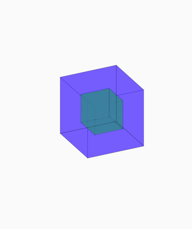
<!doctype html>

<html lang="en">

<head>

<meta charset="UTF-8">

<title>立方体动画</title>

<style type="text/css">

body,div,p,ul,ol,li,dl,dt,dd,table,tr,td,form,hr,fieldset,h1,h2,h3,h4,h5,h6,img,input{

margin:0;

padding:0;

}

html,body{

height: 100%;

}

body{

/*background: url(img/body_bg.png) repeat-x;*/

background-size: 100% 100%;

display: flex;

justify-content: center;

align-items: center;

}

.box{

width: 200px;

height: 200px;

/*background: blue;*/

transform-style: preserve-3d;

/*transform:rotateY(30deg) rotateX(-15deg);*/

animation:lft_ani 8s infinite linear;

}

.box a{

display: block;

opacity: .4;

border: 1px solid black;

transform-style:preserve-3d;

}

.box .small{

width: 100px;

height: 100px;

background: #18fa07;

position: absolute;

left: 50px;

top: 50px;

}

.box .big{

width: 200px;

height: 200px;

background:#2501fd;

position: absolute;

left: 0;

top: 0;

transition: all 1s;

}

.box .big:nth-of-type(1){

transform:translateZ(100px);

}

.box .big:nth-of-type(2){

transform:translateZ(-100px);

}

.box .big:nth-of-type(3){

transform:rotateY(-90deg) translateZ(100px);

}

.box .big:nth-of-type(4){

transform:rotateY(90deg) translateZ(100px);

}

.box .big:nth-of-type(5){

transform:rotateX(90deg) translateZ(100px);

}

.box .big:nth-of-type(6){

transform:rotateX(-90deg) translateZ(100px);

}

.box:hover .big:nth-of-type(1){

transform:translateZ(150px);

}

.box:hover .big:nth-of-type(2){

transform:translateZ(-150px);

}

.box:hover .big:nth-of-type(3){

transform:rotateY(-90deg) translateZ(150px);

}

.box:hover .big:nth-of-type(4){

transform:rotateY(90deg) translateZ(150px);

}

.box:hover .big:nth-of-type(5){

transform:rotateX(90deg) translateZ(150px);

}

.box:hover .big:nth-of-type(6){

transform:rotateX(-90deg) translateZ(150px);

}

.box:hover{

animation:lft_ani 8s infinite linear paused;

}

.box .small:nth-of-type(7){

transform:translateZ(50px);

}

.box .small:nth-of-type(8){

transform:translateZ(-50px);

}

.box .small:nth-of-type(9){

transform:rotateY(-90deg) translateZ(50px);

}

.box .small:nth-of-type(10){

transform:rotateY(90deg) translateZ(50px);

}

.box .small:nth-of-type(11){

transform:rotateX(90deg) translateZ(50px);

}

.box .small:nth-of-type(12){

transform:rotateX(-90deg) translateZ(50px);

}

@keyframes lft_ani{

0%{

transform:rotateX(0deg) rotateY(0deg);

}

100%{

transform:rotateX(360deg) rotateY(360deg);

}

}

</style>

</head>

<body>

<div class="box">

<a href="#" class="big"></a>

<a href="#" class="big"></a>

<a href="#" class="big"></a>

<a href="#" class="big"></a>

<a href="#" class="big"></a>

<a href="#" class="big"></a>

<a href="#" class="small"></a>

<a href="#" class="small"></a>

<a href="#" class="small"></a>

<a href="#" class="small"></a>

<a href="#" class="small"></a>

<a href="#" class="small"></a>

</div>

</body>

</html>
(六)HTML5立方体动画设置的更多相关文章
- HTML5 3D动画效果
对以前来讲,3D动画拿到网页上展示是一件非常奢侈的事情,第一是浏览器不够先进,第二是大部分只能用flash实现伪3D.HTML5的出现,让实现网页3D动画变得非常简单,当然前提是你不要再使用像IE67 ...
- 7款超酷HTML5 3D动画精选应用及源码
对以前来讲,3D动画拿到网页上展示是一件非常奢侈的事情,第一是浏览器不够先进,第二是大部分只能用flash实现伪3D.HTML5的出现,让实现网页3D动画变得非常简单,当然前提是你不要再使用像IE67 ...
- 超给力的HTML5 3D动画欣赏及源码下载
HTML5有着非常巨大的魅力,尤其是CSS3和Cavnas,可以帮助页面渲染得非常炫酷.值得一提的是,利用HTML5的3D特性可以帮助你更加方便地在网页上实现3D动画特效.本文分享的这些HTML5 3 ...
- 基于HTML5/CSS3可折叠的3D立方体动画
今天要给大家带来另外一款CSS3 3D立方体动画,尤其在DEMO2中可以看到,鼠标滑过立方体后,它将会被打开,从里面弹出另外一个小立方体,动画效果非常酷,非常逼真. 在线预览 源码下载 实现的代码 ...
- 【转】15个无比华丽的HTML5/CSS3动画应用
原文转自:http://www.html5cn.org/article-7089-1.html 前几天,HTML5标准已经尘埃落定,未来的Web将会是由HTML5主导,当然作为开发者对这一喜讯更为动心 ...
- 8个经典炫酷的HTML5 Canvas动画欣赏
HTML5非常强大,尤其是Canvas技术的应用,让HTML5几乎可以完成所有Flash能完成的效果.本文精选了8个经典炫酷的HTML5 Canvas动画欣赏,每一个都提供全部的源代码,希望对你有所帮 ...
- 8款效果惊艳的HTML5 3D动画
1.HTML5 WebGL水面水波荡漾特效 之前已经向各位分享过一款很逼真的HTML5水波荡漾特效,效果还算不错.今天再向大家分享一款更加给力的HTML5水波动画,画面上是一个大水池,水池底部是一颗大 ...
- 纯CSS3超酷3D旋转立方体动画特效
简要教程 这是一款神奇的纯 CSS3 立方体动画特效插件.使用CSS3来制作动画效果已经成为WEB前端开发的一种时尚,从简单的颜色和尺寸动画,到复杂的旋转.翻转动画, CSS3 展现了它无穷的魅力.使 ...
- 14款超时尚的HTML5时钟动画
时钟动画在网页应用中也非常广泛,在一些个人博客中,我们经常会看到一些相当个性化的HTML5时钟动画.今天我们向大家分享了14款形态各异的超时尚HTML5时钟动画,其中有圆盘时钟.3D时钟.个性化时钟等 ...
随机推荐
- Mysql字段属性应该尽量设置为not null
除非你有一个很特别的原因去使用 NULL 值,你应该总是让你的字段保持 NOT NULL.这看起来好像有点争议,请往下看. 所谓的NULL就是什么都没有,连\0都没有,\0在字符串中是结束符,但是在物 ...
- [CTSC2008]祭祀
题目描述 在遥远的东方,有一个神秘的民族,自称Y族.他们世代居住在水面上,奉龙王为神.每逢重大庆典, Y族都会在水面上举办盛大的祭祀活动.我们可以把Y族居住地水系看成一个由岔口和河道组成的网络.每条河 ...
- c#中的控件01
1.常用控件: 只读文本:TextBlock.文本框:TextBox.按钮:Button 事件:鼠标移到按钮上的时候显示“大爷您来了”,离开 显示“大爷常来”,Click(点击).Loaded(控件加 ...
- FAQ | 是什么导致MySQL数据库服务器磁盘I/O高(本文章来自知数堂)
FAQ | 是什么导致MySQL数据库服务器磁盘I/O高 2016-12-26 叶金荣 老叶茶馆 0.导读 有个MySQL服务器的磁盘I/O总有过高报警,怎么回事? 本文约1500字,阅读时间约10分 ...
- 用“倍增法”求最近公共祖先(LCA)
1.最近公共祖先:对于有根树T的两个结点u.v,最近公共祖先LCA(T,u,v)表示一个结点x,满足x是u.的祖先且x的深度尽可能大. 2.朴素算法:记录下每个节点的父亲,使节点u,v一步一步地向上找 ...
- LeetCode——Hamming Distance
LeetCode--Hamming Distance Question The Hamming distance between two integers is the number of posit ...
- java官网下载
安装版 http://javadl.oracle.com/webapps/download/AutoDL?BundleId=234471_96a7b8442fe848ef90c96a2fad6ed6d ...
- DevExpress 给TreeList添加右键菜单
只有在右击节点时才会触发 private void treeList1_MouseDown(object sender, MouseEventArgs e) { if (e.Button == Mou ...
- Java中sleep()与wait()的区别
第一种解释: 功能差不多,都用来进行线程控制,他们最大本质的区别是:sleep()不释放同步锁,wait()释放同步缩. 还有用法的上的不同是:sleep(milliseconds)可以用 ...
- Eclipse2013_文件编码设置
1. Eclipse --> Window --> Preferences --> General --> Workspace 其中的 "Text file enco ...