【Flutter学习】基本组件之基本按钮组件
一,概述
- 由于Flutter是跨平台的,所以有适用于Android和iOS的两种风格的组件。一套是Google极力推崇的Material,一套是iOS的Cupertino风格的组件。无论哪种风格,都是通用的。
- 概述Flutter 里有很多的 Button 组件很多,常见的按钮组件有:RaisedButton、FlatButton、IconButton、OutlineButton、ButtonBar、FloatingActionButton 等。
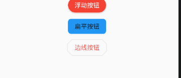
- RaisedButton :凸起的按钮,其实就是 Material Design 风格的 Button
- FlatButton : 扁平化的按钮
- OutlineButton:线框按钮
- IconButton : 图标按钮
- ButtonBar: 按钮组
- FloatingActionButton:浮动按钮
二,常用属性
在flutter中,按钮组件有以下常用属性:
- onPressed :
必填参数,按下按钮时触发的回调,接收一个方法,传 null 表示按钮禁用,会显示禁用相关样式
- child :文本控件
- textColor :文本颜色
- color :文本颜色
- disabledColor :按钮禁用时的颜色
- disabledTextColor :按钮禁用时的文本颜色
- splashColor :点击按钮时水波纹的颜色
- highlightColor :点击(长按)按钮后按钮的颜色
- elevation :阴影的范围,值越大阴影范围越大
- padding :内边距
- shape :设置按钮的形状
三,基本使用
- RaisedButton :凸起的按钮,其实就是 Material Design 风格的 Button
- 构造函数
RaisedButton({

    Key key,

  //点击按钮的回调出发事件

    @required VoidCallback onPressed,

  //水波纹高亮变化回调

    ValueChanged<bool> onHighlightChanged,

  //按钮的样式(文字颜色、按钮的最小大小,内边距以及shape)[ Used with [ButtonTheme] and [ButtonThemeData] to define a button's base

//colors, and the defaults for the button's minimum size, internal padding,and shape.]

    ButtonTextTheme textTheme,

    //文字颜色

    Color textColor,

    //按钮被禁用时的文字颜色

    Color disabledTextColor,

    //按钮的颜色

    Color color,

    //按钮被禁用时的颜色

    Color disabledColor,

    //按钮的水波纹亮起的颜色

    Color highlightColor,

    //水波纹的颜色

    Color splashColor,

    //按钮主题高亮

    Brightness colorBrightness,

    //按钮下面的阴影长度

    double elevation,

    //按钮高亮时的下面的阴影长度

    double highlightElevation,

    double disabledElevation,

    EdgeInsetsGeometry padding,

    ShapeBorder shape,

    Clip clipBehavior = Clip.none,

    MaterialTapTargetSize materialTapTargetSize,

    Duration animationDuration,

    Widget child,

} - code
RaisedButton(

            textTheme: ButtonTextTheme.accent,

            color: Colors.teal,

            highlightColor: Colors.deepPurpleAccent,

            splashColor: Colors.deepOrangeAccent,

            colorBrightness: Brightness.dark,

            elevation: 50.0,

            highlightElevation: 100.0,

            disabledElevation: 20.0,

            onPressed: () {

              //TODO

            },

            child: Text(

              'RaisedButton',

              style: TextStyle(color: Colors.white, fontSize: ),

            ),

) - 效果

- 构造函数
- FlatButton : 扁平化的Material按钮
- 构造函数
FlatButton({

    Key key,

    @required VoidCallback onPressed,

    ValueChanged<bool> onHighlightChanged,

    ButtonTextTheme textTheme,

    Color textColor,

    Color disabledTextColor,

    Color color,

    Color disabledColor,

    Color highlightColor,

    Color splashColor,

    Brightness colorBrightness,

    EdgeInsetsGeometry padding,

    ShapeBorder shape,

    Clip clipBehavior = Clip.none,

    MaterialTapTargetSize materialTapTargetSize,

    @required Widget child,

}) - code
FlatButton(

        onPressed: () {},

        child: Text(

          "FlatBtn",

          style: TextStyle(fontSize: , color: Colors.deepPurple),

)); - 效果

- 构造函数
- OutlineButton:线框按钮(OutlineButton是一个有默认边线且背景透明的按钮,也就是说我们设置其边线和颜色是无效的,其他属性跟MaterialButton中属性基本一致)
- 构造函数
const OutlineButton({

    Key key,

    @required VoidCallback onPressed,

    ButtonTextTheme textTheme,

    Color textColor,

    Color disabledTextColor,

    Color color,

    Color focusColor,

    Color hoverColor,

    Color highlightColor,

    Color splashColor,

    double highlightElevation,

    this.borderSide,

    this.disabledBorderColor,

    this.highlightedBorderColor,

    EdgeInsetsGeometry padding,

    ShapeBorder shape,

    Clip clipBehavior,

    FocusNode focusNode,

    Widget child,

  }) : assert(highlightElevation == null || highlightElevation >= 0.0),

       super(

         key: key,

         onPressed: onPressed,

         textTheme: textTheme,

         textColor: textColor,

         disabledTextColor: disabledTextColor,

         color: color,

         focusColor: focusColor,

         hoverColor: hoverColor,

         highlightColor: highlightColor,

         splashColor: splashColor,

         highlightElevation: highlightElevation,

         padding: padding,

         shape: shape,

         clipBehavior: clipBehavior,

         focusNode: focusNode,

         child: child,

); - code
/*带边线的按钮*/

class outlineBtn extends StatelessWidget {

  _log() {

    print("点击了边线按钮");

  }

  @override

  Widget build(BuildContext context) {

    // TODO: implement build

    return OutlineButton(

      onPressed: _log,

      child: Text("边线按钮"),

      textColor: Colors.red,

      splashColor: Colors.green,

      highlightColor: Colors.black,

      shape: BeveledRectangleBorder(

        side: BorderSide(

          color: Colors.red,

          width: ,

        ),

        borderRadius: BorderRadius.circular(),

      ),

    );

  }

} - 效果
- 构造函数
- IconButton : 图标按钮(图标按钮,按下时会产生水波纹效果)
- 构造函数
IconButton({

//这几个属性跟前面讲的几个差不多,这里就不再讲了。如有疑问,请留言。

    Key key,

    this.iconSize = 24.0,

    this.padding = const EdgeInsets.all(8.0),

    this.alignment = Alignment.center,

    @required this.icon,

    this.color,

    this.highlightColor,

    this.splashColor,

    this.disabledColor,

    @required this.onPressed,

    this.tooltip

}) - 示例图
- 效果

- 构造函数
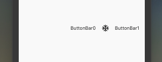
- ButtonBar: 按钮组(水平排列的按钮组)
- 构造函数
const ButtonBar({

    Key key,

//子组件的间隔样式

    this.alignment = MainAxisAlignment.end,

    this.mainAxisSize = MainAxisSize.max,

//子children

    this.children = const <Widget>[],

  })
code
class FlutterButtonBar extends StatelessWidget {

  @override

  Widget build(BuildContext context) {

    return ButtonBar(children: <Widget>[

      Text("ButtonBar0"),

      Icon(Icons.ac_unit),

      Text("ButtonBar1")

    ], );

  }

}
效果
- 构造函数
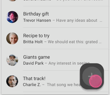
- FloatingActionButton:浮动按钮
- 构造函数
FloatingActionButton({

    Key key,

    //  按钮上的组件,可以是Text、icon, etc.

    this.child,

    //长按提示

    this.tooltip,

    // child的颜色(尽在child没有设置颜色时生效)

    this.foregroundColor,

    //背景色,也就是悬浮按键的颜色

    this.backgroundColor,

    this.heroTag = const _DefaultHeroTag(),

    //阴影长度

    this.elevation = 6.0,

    //高亮时阴影长度

    this.highlightElevation = 12.0,

    //按下事件回调

    @required this.onPressed,

    //是小图标还是大图标

    this.mini = false,

    //按钮的形状(例如:矩形Border,圆形图标CircleBorder)

    this.shape = const CircleBorder(),

    this.clipBehavior = Clip.none,

    this.materialTapTargetSize,

    this.isExtended = false,

}) - code
FloatingActionButton(

      child: Icon(Icons.access_alarm),

      tooltip: "ToolTip",

      foregroundColor: Colors.white,

      backgroundColor: Colors.deepPurple,

      shape: const Border(),

      onPressed: () {

        //click callback

      },

) - 效果
- 构造函数
【Flutter学习】基本组件之基本按钮组件的更多相关文章
- Flutter学习笔记(11)--文本组件、图标及按钮组件
如需转载,请注明出处:Flutter学习笔记(10)--容器组件.图片组件 文本组件 文本组件(text)负责显示文本和定义显示样式,下表为text常见属性 Text组件属性及描述 属性名 类型 默认 ...
- Flutter学习笔记(10)--容器组件、图片组件
如需转载,请注明出处:Flutter学习笔记(10)--容器组件.图片组件 上一篇Flutter学习笔记(9)--组件Widget我们说到了在Flutter中一个非常重要的理念"一切皆为组件 ...
- Flutter学习笔记(12)--列表组件
如需转载,请注明出处:Flutter学习笔记(12)--列表组件 在日常的产品项目需求中,经常会有列表展示类的需求,在Android中常用的做法是收集数据源,然后创建列表适配器Adapter,将数据源 ...
- 22Flutter中的常见的按钮组件 以及自定义按钮组件
/* Flutter中的常见的按钮组件 以及自定义按钮组件 一.Flutter中的按钮组件介绍 Flutter里有很多的Button组件,常见的按钮组件有:RaisedButton/FlatButto ...
- Flutter 中的常见的按钮组件 以及自定义按钮组件
Flutter 里有很多的 Button 组件很多,常见的按钮组件有:RaisedButton.FlatButton. IconButton.OutlineButton.ButtonBar.Float ...
- Flutter学习(一)之MaterialApp和Scaffold组件使用详解
一,前言: MaterialApp和Scaffold是Flutter提供的两个Widget,其中: MaterialApp是一个方便的Widget,它封装了应用程序实现Material Design所 ...
- Flutter——FloatingActionButton组件(浮动按钮组件)
FloatingActionButton 简称 FAB ,可以实现浮动按钮,也可以实现类似闲鱼 app 的地步凸起导航. 属性名称 属性值 child 子视图,一般为 Icon,不推荐使用文字 ...
- Flutter学习笔记(9)--组件Widget
如需转载,请注明出处:Flutter学习笔记(9)--组件Widget 在Flutter中,所有的显示都是Widget,Widget是一切的基础,我们可以通过修改数据,再用setState设置数据(调 ...
- 第二百零七节,jQuery EasyUI,MenuButton(菜单按钮)组件
jQuery EasyUI,MenuButton(菜单按钮)组件 学习要点: 1.加载方式 2.属性列表 3.方法列表 本节课重点了解 EasyUI 中 MenuButton(菜单按钮)组件的使用方法 ...
随机推荐
- bzoj 2364
传送门:http://www.lydsy.com/JudgeOnline/problem.php?id=2346 比较裸的最短路(' ' ) 水题又多了一道 #include <iost ...
- Python基础教程(003)--Python的设计目标
前言 了解Python的设计目标,这节是了解Python的背景,不需要掌握,但是需要你知道有这个东西.就是Python的目的是什么.作者开发这个Python语言的目的是什么. 知识点 一门简单直观的语 ...
- lnmp 一键安装详解
1.使用putty或类似的SSH工具登陆VPS或服务器: 登陆后运行:screen -S lnmp 如果提示screen: command not found 命令不存在可以执行:yum instal ...
- ThinkPHP5使用jwt进行会话验证
以往,没有做过前后端分离的项目之前,都是服务器渲染的模板,然后用cookie和session进行账号的权限验证或者是登录状态的管理.后来接触了vue和小程序之后,在进行前后端分离的时候,就会遇到权限验 ...
- CountDownLatch和CyclicBarrier区别
CountDownLatch : 一个线程(或者多个), 等待另外N个线程完成某个事情之后才能执行. CyclicBarrier : N个线程相互等待,任何一个线程完成之前,所有的线程都必须等待. 倒 ...
- ()C#打印机
System.Drawing.Printing下得用来完成打印功能 1.打印设置 2.页面设置 3.打印预览 4.打印
- 后台date类型转换为json字符串时,返回前台页面的是long类型的时间戳问题解决
学习springboot框架,写个博客系统,在后台管理的日志管理中,遇到了后台查询的日期格式的结果返回到页面变成了日期的时间戳了.然后摸索了三种方法来解决.页面的显示问题如下图. 问题页面回顾: 本案 ...
- how to convert from hex to disasm
cat ascii.hex | ascii2binary -b h -t us > ascii.bin x86dis -e 0 -s att -f ascii.bin echo "d8 ...
- UVA1595_Symmetry
给出平面上n个点,问你能不能找到一个竖线让他们对称 这道题后面发现真的不难,又不止一种方法 我当时写的很挫,死脑筋的就找一个点的对称点存不存在,用结构体存点信息,在排序用find找,,然后不知道一堆w ...
- PAT(A) 1042. Shuffling Machine (20)
Shuffling is a procedure used to randomize a deck of playing cards. Because standard shuffling techn ...