react入门之使用react-bootstrap当轮子造车(二)
react入门之使用react-bootstrap当轮子造车(二)
上一篇我们谈了谈如何配置react的webpack环境
可能很多人已经打开过官方文档学习了react的基础知识
不管有没有,在介绍react之前,我想先介绍一下react-bootstrap
先懂得使用别人造的轮子,就能更快成为老司机。
好的,源代码奉上:
git clone https://github.com/lingjiawen/react_bootstrap_demo.git

cd react_bootstrap_demo

npm install

npm run dev
打开浏览器输入:localhost:8080
现在就让我们来看看它能干什么吧!
一、Button
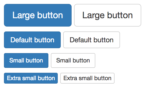
使用Button声明一个按钮,bsSize有如下四个属性,可以分别有大、中、小、超小四种大小的按钮,再用ButtonToolbar包裹起来
                <ButtonToolbar>

                    <Button bsStyle="primary" bsSize="large">Large button</Button>

                    <Button bsSize="large">Large button</Button>

                </ButtonToolbar>

                <ButtonToolbar>

                    <Button bsStyle="primary">Default button</Button>

                    <Button>Default button</Button>

                </ButtonToolbar>

                <ButtonToolbar>

                    <Button bsStyle="primary" bsSize="small">Small button</Button>

                    <Button bsSize="small">Small button</Button>

                </ButtonToolbar>

                <ButtonToolbar>

                    <Button bsStyle="primary" bsSize="xsmall">Extra small button</Button>

                    <Button bsSize="xsmall">Extra small button</Button>

                </ButtonToolbar>
使用效果如下:
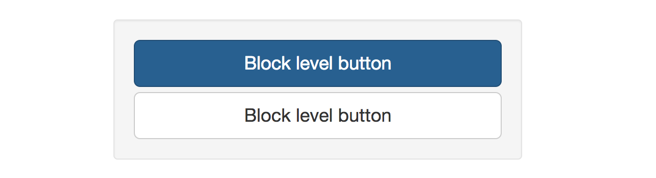
使用well将按钮包裹起来,可以实现如下效果:(well在后面介绍)
<div className="well" style={wellStyles}>

      <Button bsStyle="primary" bsSize="large" block>Block level button</Button>

      <Button bsSize="large" block>Block level button</Button>

</div>
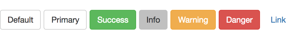
使用 bsStyle属性可以调整按钮的状态颜色:
<Button>Default</Button>
<Button s>Primary</Button>
<Button bsStyle="success">Success</Button>
下图bsStyle属性分别为:info、warning、danger、link
使用按钮实现点击loading,等待结果的功能:
class LoadingButton extends React.Component{

    constructor(props) {

        super(props);

        this.handleClick = this.handleClick.bind(this);

        this.state = { isLoading: false }

    }

    handleClick() {

        this.setState({isLoading: true});

        // This probably where you would have an `ajax` call

        setTimeout(() => {

            // Completed of async action, set loading state back

            this.setState({isLoading: false});

        }, 2000);

    }

    render() {

        let isLoading = this.state.isLoading;

        return (

            <Button

                bsStyle="primary"

                disabled={isLoading}

                onClick={!isLoading ? this.handleClick : null}>

                {isLoading ? 'Loading...' : 'Loading state'}

            </Button>

        );

    }

}
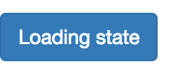
点击之后会变为loading...,可以自己点击一下
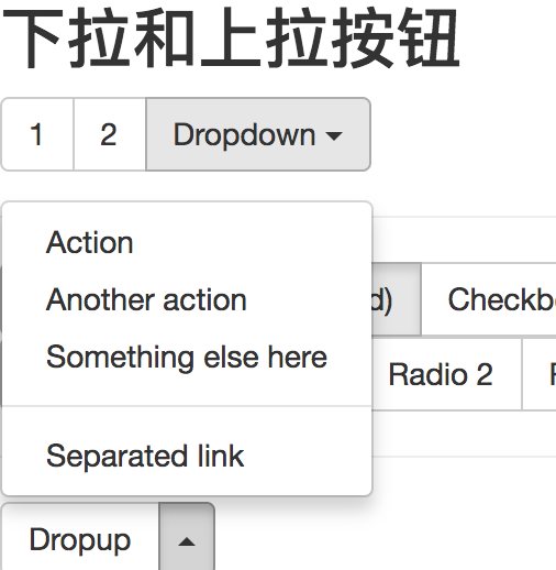
实现按钮的下拉和上拉:
在title中使用Dropdown属性,用DropdownButton包裹下拉,使用Dropup为上拉
//下拉

<ButtonGroup>

    <Button>1</Button>

    <Button>2</Button>

    <DropdownButton title="Dropdown" id="bg-nested-dropdown">

         <MenuItem eventKey="1">Dropdown link</MenuItem>

         <MenuItem eventKey="2">Dropdown link</MenuItem>

    </DropdownButton>

</ButtonGroup>

//上拉
<ButtonToolbar>
    <SplitButton title="Dropup" dropup id="split-button-dropup">
        <MenuItem eventKey="1">Action</MenuItem>
        <MenuItem eventKey="2">Another action</MenuItem>
        <MenuItem eventKey="3">Something else here</MenuItem>
        <MenuItem divider />
        <MenuItem eventKey="4">Separated link</MenuItem>
    </SplitButton>
</ButtonToolbar>
二、List
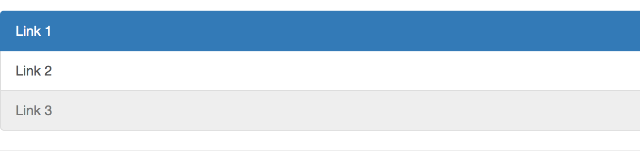
简单列表:
                <ListGroup>

                    <ListGroupItem href="#" active>Link 1</ListGroupItem>

                    <ListGroupItem href="#">Link 2</ListGroupItem>

                    <ListGroupItem href="#" disabled>Link 3</ListGroupItem>

                </ListGroup>
使用ListGroup包裹, ListGroupItem就是它的子元素
active:已选中

disable:可以取消它的点击事件
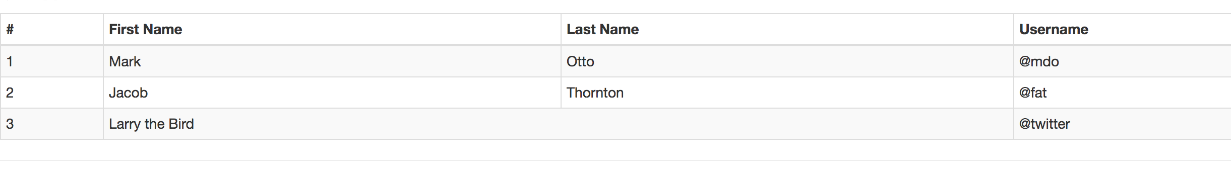
表格:
              <Table striped bordered condensed hover>

                    <thead>

                    <tr>

                        <th>#</th>

                        <th>First Name</th>

                        <th>Last Name</th>

                        <th>Username</th>

                    </tr>

                    </thead>

                    <tbody>

                    <tr>

                        <td>1</td>

                        <td>Mark</td>

                        <td>Otto</td>

                        <td>@mdo</td>

                    </tr>

                    <tr>

                        <td>2</td>

                        <td>Jacob</td>

                        <td>Thornton</td>

                        <td>@fat</td>

                    </tr>

                    <tr>

                        <td>3</td>

                        <td colSpan="2">Larry the Bird</td>

                        <td>@twitter</td>

                    </tr>

                    </tbody>

                </Table>
可以点击隐藏的面板:
class CollapsiblePanel extends React.Component {

    constructor(props) {

        super(props);

        this.state = {

            open: true

        };

    }

    render() {

        return (

            <div>

                <Button onClick={ ()=> this.setState({ open: !this.state.open })}>

                    点我隐藏/显示

                </Button>

                <Panel collapsible expanded={this.state.open}>

                    Anim pariatur cliche reprehenderit, enim eiusmod high life accusamus terry richardson ad squid.

                    Nihil anim keffiyeh helvetica, craft beer labore wes anderson cred nesciunt sapiente ea proident.

                </Panel>

            </div>

        );

    }

}

三、Overlays
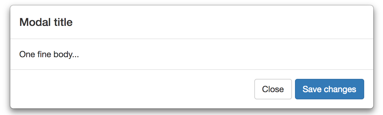
点击弹出的窗口:
class StaticMarkup extends React.Component {

    constructor(props) {

        super(props);

        this.state = {dpName:false};

        this.onDisplayOverlays = this.onDisplayOverlays.bind(this);

        this.onCloseOverlays = this.onCloseOverlays.bind(this);

    }

    onDisplayOverlays() {

        this.setState({

            dpName:true

        });

    }

    onCloseOverlays() {

        this.setState({

            dpName:false

        });

    }

    render() {

        if(this.state.dpName)

            return (

                <div>

                    <Button

                        bsStyle="primary"

                        onClick={this.onDisplayOverlays}>

                        弹出框

                    </Button>

                    <div className="static-modal" id="static_modal">

                        <Modal.Dialog>

                            <Modal.Header>

                                <Modal.Title>Modal title</Modal.Title>

                            </Modal.Header>

                            <Modal.Body>

                                One fine body...

                            </Modal.Body>

                            <Modal.Footer>

                                <Button onClick={this.onCloseOverlays}>Close</Button>

                                <Button bsStyle="primary">Save changes</Button>

                            </Modal.Footer>

                        </Modal.Dialog>

                    </div>

                </div>

            );

        else

            return (

                <div>

                    <Button

                        bsStyle="primary"

                        onClick={this.onDisplayOverlays}>

                        弹出框

                    </Button>

                </div>

            );

    }

}
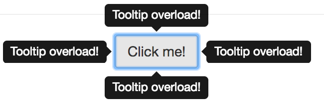
以及点击显示、隐藏的overload
class CustomOverlays extends React.Component{

    constructor(props) {

        super(props);

        this.state = {show: true};

        this.toggle = this.toggle.bind(this);

    }

    toggle() {

        this.setState({ show: !this.state.show });

    }

    render() {

        const sharedProps = {

            show: this.state.show,

            container: this,

            target: () => ReactDOM.findDOMNode(this.refs.target)

        };

        return (

            <div style={{ height: 100, paddingLeft: 150, position: 'relative' }}>

                <Button ref="target" onClick={this.toggle}>

                    Click me!

                </Button>

                <Overlay {...sharedProps} placement="left">

                    <Tooltip id="overload-left">Tooltip overload!</Tooltip>

                </Overlay>

                <Overlay {...sharedProps} placement="top">

                    <Tooltip id="overload-top">Tooltip overload!</Tooltip>

                </Overlay>

                <Overlay {...sharedProps} placement="right">

                    <Tooltip id="overload-right">Tooltip overload!</Tooltip>

                </Overlay>

                <Overlay {...sharedProps} placement="bottom">

                    <Tooltip id="overload-bottom">Tooltip overload!</Tooltip>

                </Overlay>

            </div>

        );

    }

}
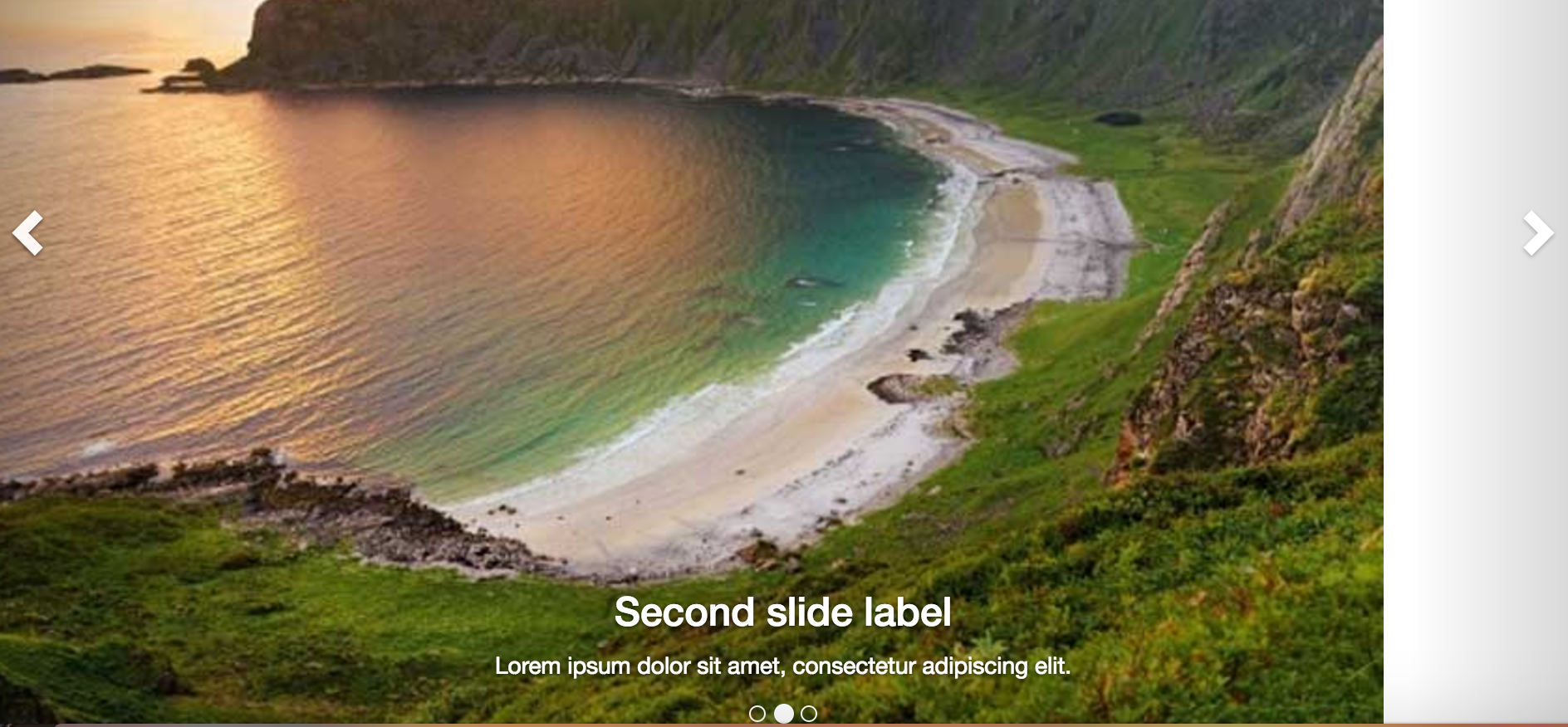
四、轮播
class CarouselInstance extends React.Component {

    constructor(props) {

        super(props);

    }

    render() {

        return (

            <Carousel>

                <Carousel.Item>

                    <img width={900} height={500} alt="900x500" src="http://123.207.238.196/bridge.jpg"/>

                    <Carousel.Caption>

                        <h3>First slide label</h3>

                        <p>Nulla vitae elit libero, a pharetra augue mollis interdum.</p>

                    </Carousel.Caption>

                </Carousel.Item>

                <Carousel.Item>

                    <img width={900} height={500} alt="900x500" src="http://123.207.238.196/bridge.jpg"/>

                    <Carousel.Caption>

                        <h3>Second slide label</h3>

                        <p>Lorem ipsum dolor sit amet, consectetur adipiscing elit.</p>

                    </Carousel.Caption>

                </Carousel.Item>

                <Carousel.Item>

                    <img width={900} height={500} alt="900x500" src="http://123.207.238.196/bridge.jpg"/>

                    <Carousel.Caption>

                        <h3>Third slide label</h3>

                        <p>Praesent commodo cursus magna, vel scelerisque nisl consectetur.</p>

                    </Carousel.Caption>

                </Carousel.Item>

            </Carousel>

        );

    }

}
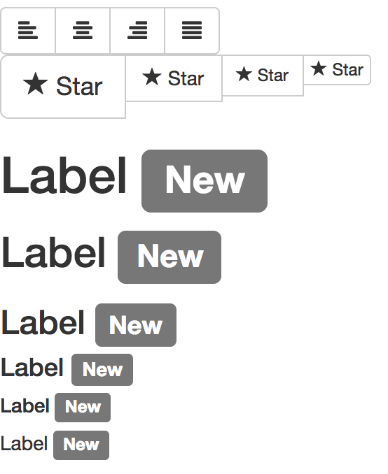
五、一些有用的图标
class MiscellaneousInstance extends React.Component {

    constructor(props) {

        super(props);

    }

    render() {

        return (

            <div>

                <div>

                    <ButtonToolbar>

                        <ButtonGroup>

                            <Button><Glyphicon glyph="align-left" /></Button>

                            <Button><Glyphicon glyph="align-center" /></Button>

                            <Button><Glyphicon glyph="align-right" /></Button>

                            <Button><Glyphicon glyph="align-justify" /></Button>

                        </ButtonGroup>

                    </ButtonToolbar>

                    <ButtonToolbar>

                        <ButtonGroup>

                            <Button bsSize="large"><Glyphicon glyph="star" /> Star</Button>

                            <Button><Glyphicon glyph="star" /> Star</Button>

                            <Button bsSize="small"><Glyphicon glyph="star" /> Star</Button>

                            <Button bsSize="xsmall"><Glyphicon glyph="star" /> Star</Button>

                        </ButtonGroup>

                    </ButtonToolbar>

                </div>

                <div>

                    <h1>Label <Label>New</Label></h1>

                    <h2>Label <Label>New</Label></h2>

                    <h3>Label <Label>New</Label></h3>

                    <h4>Label <Label>New</Label></h4>

                    <h5>Label <Label>New</Label></h5>

                    <p>Label <Label>New</Label></p>

                </div>

            </div>

        );

    }

}
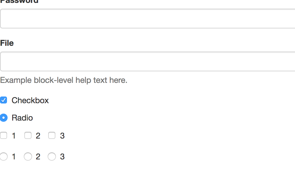
六、表单
表单基础的类函数为:
function FieldGroup({ id, label, help, props }) {

    return (

        <FormGroup controlId={id}>

            <ControlLabel>{label}</ControlLabel>

            <FormControl {...props} />

            {help && <HelpBlock>{help}</HelpBlock>}

        </FormGroup>

    );

}
然后使用FieldGroup包裹:
          <FieldGroup

                    id="formControlsText"

                    type="text"

                    label="Text"

                    placeholder="Enter text"

                />
便可以轻松实现表单!如果你对react有了解,便知道原生的表单是不能直接用的。这个组件简化了许多,但我没用实际用过,所以不知道效果如何。
我写的这些只是抛砖引玉,只是希望大家稍微了解到react-bootstrap大概能做的事
更详细的方法和属性请进入官方网址浏览文档,打开源代码自行研究
有些官方demo没有给完全,可以运行前面的我给的demo,再查看源代码理解(不过我也没有写全,而且结构比较乱)
如果有错误,谢谢各位指出!
如果有更好的资料,也请各位大神不吝赐教!
react入门之使用react-bootstrap当轮子造车(二)的更多相关文章
- arcgis api 4.x for js 结合 react 入门开发系列react全家桶实现加载天地图(附源码下载)
基于两篇react+arcgis的文章介绍,相信大家也能体会两者的开发区别了.在“初探篇”中作者也讲述了自己的选择,故废话不多说,本篇带大家体验在@arcgis/webpack-plugin环境下,使 ...
- React入门资源整理
另外,附上我搜集的一些比较实用的学习资料,建议先看这些撸起来,再看什么乱七八糟的awsome系列. React入门资源整理 React项目新手指南 http://www.w3ctech.com/top ...
- 推荐一个React 入门的教程
推荐一个React 入门的教程 react 入门实例教程 Github地址:https://github.com/ruanyf/react-demos
- React入门看这篇就够了
摘要: 很多值得了解的细节. 原文:React入门看这篇就够了 作者:Random Fundebug经授权转载,版权归原作者所有. React 背景介绍 React 入门实例教程 React 起源于 ...
- [转]React入门看这篇就够了
摘要: 很多值得了解的细节. 原文:React入门看这篇就够了 作者:Random Fundebug经授权转载,版权归原作者所有. React 背景介绍 React 入门实例教程 React 起源于 ...
- React入门学习
为了获得更好的阅读体验,请访问原地址:传送门 一.React 简介 React 是什么 React 是一个起源于 Facebook 的内部项目,因为当时 Facebook 对于市场上所有的 JavaS ...
- react入门(3)
在第一篇文章里我们介绍了jsx.组件.css写法 点击查看react入门(1) 第二篇文章里我们介绍了事件.this.props.children.props....other.map循环 点击查 ...
- react入门(1)
这篇文章也不能算教程咯,就算是自己学习整理的笔记把. 关于react一些相关的简介.优势之类的,随便百度一下一大堆,我就不多说了,可以去官网(http://reactjs.cn/)看一下. 这片主要讲 ...
- react入门(2)
接着上一次的讲,如果没有看过上一篇文章的小伙伴可以先看一下http://www.cnblogs.com/sakurayeah/p/5807821.html React事件 可以先看一下官网讲解的内容h ...
随机推荐
- Android recyclerView的空数据显示
直接分享链接:http://blog.csdn.net/whitley_gong/article/details/51244723
- LaTeX初识 新手入门 Texlive和Texmaker学习
转载自:http://blog.sina.com.cn/s/blog_90444ed201016iq6.html http://blog.csdn.net/zb1165048017/article/d ...
- java登录时数据库验证账户密码-mysql
一:连接数据库: package login; import java.sql.*; public class conmysql { String drivername="com.mysql ...
- JavaScript学习笔记(一)——初识js
这个周,开始了JavaScript的学习路程.虽然从高中开始就接触了网页设计的知识,大学里的学习也算回顾了Html和Css的知识,实习期间在牛盾科技也是做的网站建设,不过通过前段时间找工作才发现自己了 ...
- WPF:动态显示或隐藏Listview的某一列
这几天做项目,需要做个listview满足能够动态显示或隐藏某些列,由于自己是菜鸟水平,查了两天资料也没有想出解决办法.就在我山穷水尽的时候看到了Mgen的一篇博客,给了我很大启发,所以我也决定把自己 ...
- biz-NewsService
package com.pb.news.service; import java.util.List; import com.pb.news.entity.News; public interface ...
- npm的理解
一 概念方面 npm的全称是node package manger ,是一个nodejs包管理工具,已经成为非官方的发布node模块包的标准.有了npm可以很快速的找到特定服务器要使用的包,进行下载, ...
- .net core建站踩坑记录
系统:win10 VS版本:2017 .NET Core 版本: 1.1 零.读取配置文件 参考:http://www.tuicool.com/articles/QfYVBvi 此版本无需添加其他组件 ...
- Oracle索引批量重置笔记
---单个索引重置语句 alter index indexname rebuild; ---查询数据索引对象语句 select * from user_indexes; ------将数据库的索引 ...
- XML文件的创建和解析笔记
解析XML的四种方法 XML现在已经成为一种通用的数据交换格式,它的平台无关性,语言无关性,系统无关性,给数据集成与交互带来了极大的方便.对于XML本身的语法知识与技术细节,需要阅读相关的技术文献,这 ...