Flex布局【弹性布局】学习
先让我们看看在原来的学习中遇到的问题
之前在软件工程的大作业中,自己从零开始学习如何开发一个网站,从页面,到后台,当然数据库是大二的必修课
在学习如何编写一个静态页面的时候,完全是自学,自己摸索,所以遇到了很多问题,自己花费了太多时间去解决问题,今天就拿其中一个比较让我头疼的问题来引出今天的话题
当时在初识html、css的时候,遇到了水平排放的问题,当然这个一下子就查出来了,使用 float ,但是使用了 float 会使子元素脱离父元素的布局,父元素的高度会变成 0 ,从而根本展示不出来
这个问题我当时是意识不到的,只能发现“卧槽,父元素咋就不见了呢 ?”
然后知道了要用 clear 清除浮动具体解决过程如下:
1.一开始只能垂直排放
 <!DOCTYPE html>

 <html>

     <head>

         <meta charset="utf-8">

         <title>flex布局学习</title>

         <style media="screen">

             .father{

                 width: 500px;

                 height: 500px;

                 border: 2px solid black;

             }

             .d1{

                 width: 200px;

                 height: 200px;

                 background-color: red;

             }

             .d2{

                 width: 200px;

                 height: 200px;

                 background-color: green;

             }

         </style>

     </head>

     <body>

         <div class="father">

             <div class="d1"></div>

             <div class="d2"></div>

         </div>

     </body>

 </html>
2.1在css部分添加 float,并再添加一个粉色的且不需要浮动的d3
 <!DOCTYPE html>

 <html>

     <head>

         <meta charset="utf-8">

         <title>flex布局学习</title>

         <style media="screen">

             .father{

                 width: 500px;

                 height: 500px;

                 border: 2px solid black;

             }

             .d1{

                 width: 200px;

                 height: 200px;

                 background-color: red;

                 float: left;

             }

             .d2{

                 width: 200px;

                 height: 200px;

                 background-color: green;

                 float: left;

             }

             .d3{

                 width: 300px;

                 height: 300px;

                 background-color: pink;

                 /*float: left;*/

             }

         </style>

     </head>

     <body>

         <div class="father">

             <div class="d1"></div>

             <div class="d2"></div>

             <div class="d3"></div>

         </div>

     </body>

 </html>
会出现如下的bug:
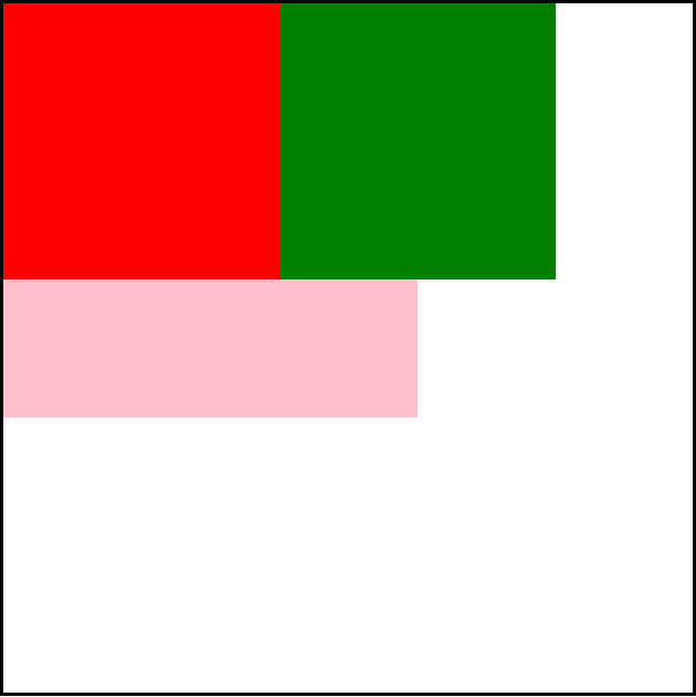
2.2如果我们删除d3,且把 father的高度设为默认会出现如下的 bug:
具体原因上面已经说过了这里不再赘述,反正很麻烦,很不好看就是了
我们要怎么解决呢 ?
3.给父元素加清浮动
 <!DOCTYPE html>

 <html>

     <head>

         <meta charset="utf-8">

         <title>flex布局学习</title>

         <style media="screen">

             .clear::after{

                 display: block;

                 content: '';

                 clear: both;

             }

             .father{

                 width: 500px;

                 /*height: 500px;*/

                 border: 2px solid black;

             }

             .d1{

                 width: 200px;

                 height: 200px;

                 background-color: red;

                 float: left;

             }

             .d2{

                 width: 200px;

                 height: 200px;

                 background-color: green;

                 float: left;

             }

             /*.d3{

                 width: 300px;

                 height: 300px;

                 background-color: pink;

             }*/

         </style>

     </head>

     <body>

         <div class="father clear">

             <div class="d1"></div>

             <div class="d2"></div>

             <!-- <div class="d3"></div> -->

         </div>

     </body>

 </html>
上次在一个公众号里看到了一篇文章介绍了 flex布局(弹性布局),今天打算学习一下
1.对应上面的问题我们从新写一个 display为 flex的 div
 <!DOCTYPE html>

 <html>

     <head>

         <meta charset="utf-8">

         <title>flex布局学习</title>

         <style media="screen">

             .clear::after{

                 display: block;

                 content: '';

                 clear: both;

             }

             .father{

                 width: 500px;

                 /*height: 500px;*/

                 border: 2px solid black;

             }

             .d1{

                 width: 200px;

                 height: 200px;

                 background-color: red;

                 float: left;

             }

             .d2{

                 width: 200px;

                 height: 200px;

                 background-color: green;

                 float: left;

             }

         </style>

         <style media="screen">

             .flex-father{

                 display: flex;

                 width: 500px;

                 /*height: 500px;*/

                 border: 2px solid black;

             }

             .f1{

                 width: 200px;

                 height: 200px;

                 background-color: red;

             }

             .f2{

                 width: 200px;

                 height: 200px;

                 background-color: green;

             }

         </style>

     </head>

     <body>

         <div class="father clear">

             <div class="d1"></div>

             <div class="d2"></div>

         </div>

         <div class="flex-father">

             <div class="f1"></div>

             <div class="f2"></div>

         </div>

     </body>

 </html>
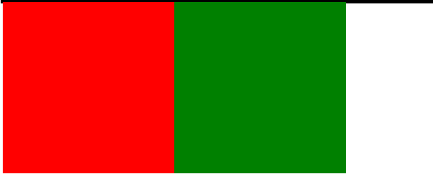
我们可以发现效果是一模一样的
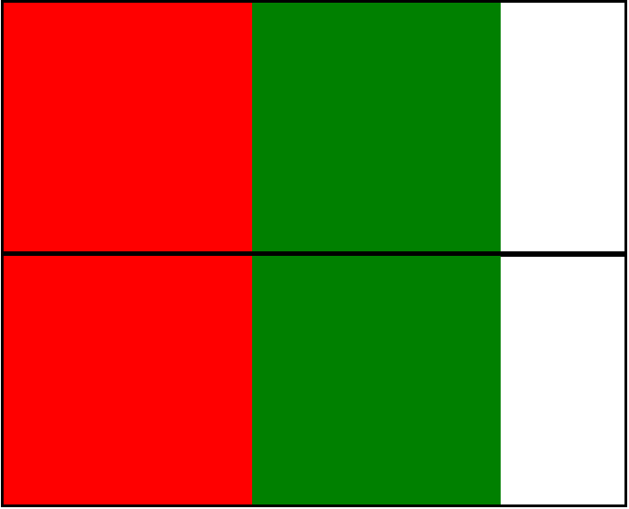
2.当子元素总宽度小于父元素时,是正常展示的,那我们再加几个子元素试试
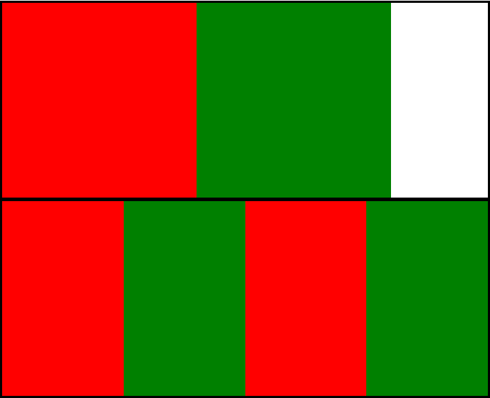
我们可以发现 flex布局中的子元素被自动压缩来适应父元素的大小
如果我们不想子元素被压缩,可以给子元素添加 flex-shrink:0;
.f1, .f2{

    flex-shrink:;

}
flex-shrink为1则默认收缩
flex-shirink为0则不收缩
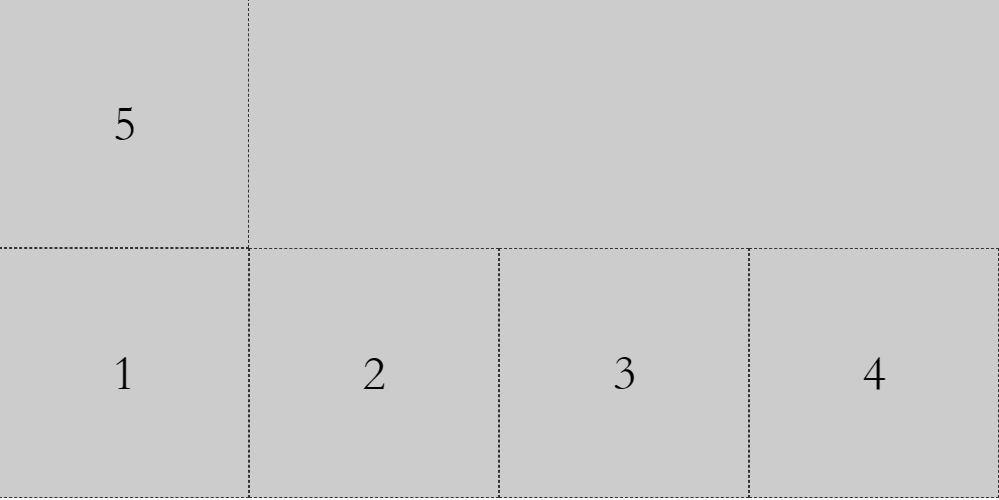
一、flex与主轴方向

 <!DOCTYPE html>

 <html>

 <head>

     <title>flex布局的主轴</title>

     <style>

         .father-flex{

             width: 800px;

             height: 200px;

             background-color: #cccccc;

             display: flex;

             /*主轴方向默认为 水平从左向右*/

             /* flex-direction: row;    */

             /* 主轴方向,水平从右往左 */

             /* flex-direction: row-reverse; */

             /* 主轴方向从上往下 */

             /* flex-direction: column; */

             /*主轴方向从下往上  */

             /* flex-direction: column-reverse; */

         }

         .item{

             width: 200px;

             height: 200px;

             border: 1px dashed #333333;

             box-sizing: border-box;

             font-size: 40px;

             text-align: center;

             line-height: 200px;

         }

     </style>

 </head>

 <body>

    <div class="father-flex">

        <div class="item">1</div>

        <div class="item">2</div>

        <div class="item">3</div>

        <div class="item">4</div>

    </div>

 </body>

 </html>
二、flex与换行
 <!DOCTYPE html>

 <html>

 <head>

     <title>flex换行</title>

     <style>

         .father-flex{

             width: 800px;

             /* height: 200px; */

             background-color: #cccccc;

             display: flex;

             /*主轴方向默认为 水平从左向右*/

             flex-direction: row;

             /* flex默认的里面的子元素是不换行,当超出时会压缩 */

             /* 换行 第一行在上方 */

             /* flex-wrap: wrap; */

             /* 换行 第一行在下方  */

             flex-wrap: wrap-reverse;

         }

         .item{

             width: 200px;

             height: 200px;

             border: 1px dashed #333333;

             box-sizing: border-box;

             font-size: 40px;

             text-align: center;

             line-height: 200px;

         }

     </style>

 </head>

 <body>

    <div class="father-flex">

        <div class="item">1</div>

        <div class="item">2</div>

        <div class="item">3</div>

        <div class="item">4</div>

        <div class="item">5</div>

    </div>

 </body>

 </html>
三、flex子元素在主轴上的对齐方式
 <!DOCTYPE html>

 <html>

 <head>

     <title>flex项目在主轴上的对齐方式</title>

     <style>

         .father-flex{

             width: 800px;

             /* height: 200px; */

             background-color: #cccccc;

             display: flex;

             /*主轴方向默认为 水平从左向右*/

             flex-direction: row;

             /* 项目在主轴上默认为 靠近起点 */

             /* justify-content: flex-start; */

             /* 项目在主轴上居中 */

             /* justify-content: center; */

             /* 项目在主轴上  靠近终点*/

             /* justify-content: flex-end; */

             /* 项目在主轴上 两端对齐(项目之间的间隔都相等) */

              justify-content: space-between;

             /* 每个项目两侧的间隔都相等 */

             /*justify-content: space-around;*/

         }

         .item{

             width: 200px;

             height: 200px;

             border: 1px dashed #333333;

             box-sizing: border-box;

             font-size: 40px;

             text-align: center;

             line-height: 200px;

         }

     </style>

 </head>

 <body>

    <div class="father-flex">

        <div class="item">1</div>

        <div class="item">2</div>

        <div class="item">3</div>

        <!-- <div class="item">4</div> -->

    </div>

 </body>

 </html>

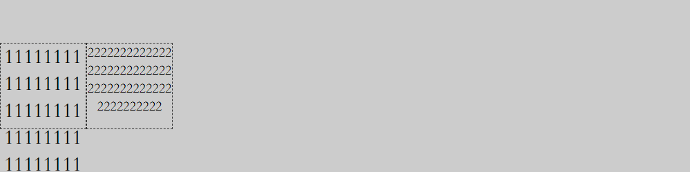
四、flex子元素在交叉轴上的对齐方式
 <!DOCTYPE html>

 <html>

 <head>

     <title>flex项目在交叉轴上的对齐方式</title>

     <style>

         .father-flex{

             width: 800px;

             height: 200px;

             background-color: #cccccc;

             display: flex;

             flex-direction: row;

             /* 项目(子元素)在交叉轴上默认是交叉轴的起点 */

             /* align-items:  flex-start; */

             /* 项目在交叉轴上 居中对齐 */

              /*align-items: center; */

             /* 项目在交叉轴的终点 */

             /* align-items: flex-end; */

             /* 项目在交叉轴上 占满容器的高度  项目高度为auto*/

             /* align-items: stretch; */

             /* 项目在交叉轴上 基于第一行文字的基线对齐 */

             align-items: baseline;

         }

         .item{

             width: 100px;

             height: 100px;

             border: 1px dashed #333333;

             box-sizing: border-box;

             font-size: 24px;

             text-align: center;

             /* line-height: 100px; */

             word-break: break-all;

         }

         .item2{

             font-size: 16px;

         }

     </style>

 </head>

 <body>

    <div class="father-flex">

        <div class="item">111111111111111111111111111111111111111111111111111111111111</div>

        <div class="item item2">2222222222222222222222222222222222222222222222222</div>

    </div>

 </body>

 </html>
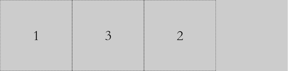
五、项目的排序
 <!DOCTYPE html>

 <html>

 <head>

     <title>flex项目的排序</title>

     <style>

         .father-flex{

             width: 800px;

             height: 200px;

             background-color: #cccccc;

             display: flex;

             /*主轴方向默认为 水平从左向右*/

             flex-direction: row;

         }

         .item{

             width: 200px;

             height: 200px;

             border: 1px dashed #333333;

             box-sizing: border-box;

             font-size: 40px;

             text-align: center;

             line-height: 200px;

         }

         .ff{

             /* 数值越小,排序越靠前,默认为0 */

             order: 1;

         }

     </style>

 </head>

 <body>

    <div class="father-flex">

        <div class="item">1</div>

        <div class="item ff">2</div>

        <div class="item">3</div>

    </div>

 </body>

 </html>
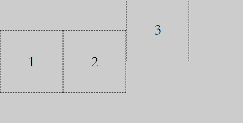
六、子元素在交叉轴独自的对齐方式
 <!DOCTYPE html>

 <html>

 <head>

     <title>flex项目单独在交叉轴上的对齐方式</title>

     <style>

         .father-flex{

             width: 800px;

             height: 200px;

             background-color: #cccccc;

             display: flex;

             flex-direction: row;

             /* 项目(子元素)在交叉轴上默认是交叉轴的起点 */

             /* align-items:  flex-start; */

             /* 项目在交叉轴上 居中对齐 */

             align-items: center;

             /* 项目在交叉轴的终点 */

             /* align-items: flex-end; */

             /* 项目在交叉轴上 占满容器的高度  项目高度为auto*/

             /* align-items: stretch; */

         }

         .item{

             width: 100px;

             height: 100px;

             border: 1px dashed #333333;

             box-sizing: border-box;

             font-size: 24px;

             text-align: center;

             line-height: 100px;

         }

         .item3{

             /* 项目与其他项目不一样的对齐方式 */

             /* align-self: flex-start; */

             /* align-self: flex-end; */

             /* align-self: stretch; */

             align-self: baseline;

         }

     </style>

 </head>

 <body>

    <div class="father-flex">

        <div class="item">1</div>

        <div class="item">2</div>

        <div class="item item3">3</div>

    </div>

 </body>

 </html>
七、flex与栅格化布局
 <!DOCTYPE html>

 <html>

 <head>

     <title>flex与栅格化布局</title>

     <style>

         .imgCnt {

             display: flex;

             width: 640px;

             flex-direction: row;

             background-color: #dddddd;

             flex-wrap: wrap;

         }

         .imgItem {

             width: 20%;

             border-bottom: 1px solid #dddddd;

             border-right: 1px solid #dddddd;

             box-sizing: border-box;

         }

         img{

             /* 这个还蛮重要的,因为图片的默认布局是行内布局 */

             display: block;

             width: 100%;

         }

     </style>

 </head>

 <body>

     <div class="imgCnt">

         <div class="imgItem">

             <img src="logo.png" />

         </div>

         <div class="imgItem">

             <img src="logo.png" />

         </div>

         <div class="imgItem">

             <img src="logo.png" />

         </div>

         <div class="imgItem">

             <img src="logo.png" />

         </div>

         <div class="imgItem">

             <img src="logo.png" />

         </div>

         <div class="imgItem">

             <img src="logo.png" />

         </div>

         <div class="imgItem">

             <img src="logo.png" />

         </div>

         <div class="imgItem">

             <img src="logo.png" />

         </div>

         <div class="imgItem">

             <img src="logo.png" />

         </div>

         <div class="imgItem">

             <img src="logo.png" />

         </div>

     </div>

 </body>

 </html>

八、flex布局图文列表
 <!DOCTYPE html>

 <html>

 <head>

     <title>flex布局图文列表</title>

     <style>

         .goodList{

             width: 640px;

             background-color: #dddddd;

             display: flex;

             flex-direction: column;

         }

         .listItem{

             display: flex;

             flex-direction: row;

             align-items: stretch;

         }

         .imgBox{

             flex: 3;

         }

         .imgBox img{

             display: block;

             width: 100%;

         }

         .goodInfoBox{

             flex: 7;

             padding: 10px 0;

             padding-left:10px;

             display: flex;

             flex-direction: column;

             justify-content: space-around;

         }

         .goodInfoBox p,

         .goodInfoBox h3{

             margin: 0;

         }

     </style>

 </head>

 <body>

     <div class="goodList">

         <div class="listItem">

             <div class="imgBox">

                 <img src="good.png"/>

             </div>

             <div class="goodInfoBox">

                 <h3>联想lenovo小新V4000 15.6英寸笔记本电脑</h3>

                 <p>月售542笔</p>

                 <p>售价:¥1999</p>

             </div>

         </div>

     </div>

 </body>

 </html>

今天的学习就告一段落
参考资料:http://www.ruanyifeng.com/blog/2015/07/flex-grammar.html
Flex布局【弹性布局】学习的更多相关文章
- Flex box弹性布局 及 响应式前端设计的优化
Flex box弹性布局 Flex box是CSS3新添加的一种模型属性,它的出现有力的打破了我们常常使用的浮动布局.实现垂直等高.水平均分.按比例划分,可以实现许多我们之前做不到的自适应布局.如果你 ...
- CSS3:布局display属性的flex(弹性布局)
CSS3:布局display属性的flex(弹性布局) 一.简介 Flex是Flexible Box的缩写,意为"弹性布局",用来为盒状模型提供最大的灵活性.设为Flex布局以后, ...
- Flutter布局----弹性布局 (Flex)
弹性布局(Flex) 弹性布局允许子组件按照一定比例来分配父容器空间.弹性布局的概念在其它UI系统中也都存在,如H5中的弹性盒子布局,Android中的FlexboxLayout等.Flutter中的 ...
- HTML-移动开发技巧 响应式布局 弹性布局
移动开发常用技巧 [viewport基本知识] 设置布局viewpoint的各种信息 1.width=device-width;设置viewport视口宽度等于设备宽度 2.initial-scale ...
- flex布局-弹性布局
弹性布局当前应用的非常广泛,特别是移动端,记得第一次用reactNative 写代码的时候是最开始真正接触Flex布局.1.首先最外层的容器需要指定为display:flex;由于flex的兼容版本还 ...
- css布局 弹性布局 和 网格布局
这里就不写这两种布局的内容了 弹性布局链接:http://www.ruanyifeng.com/blog/2015/07/flex-grammar.html 网格布局链接:https://www.ji ...
- flex (html弹性布局)
flex是什么? 任何容器都可以指定为flex布局: .box{ display: flex; /* 行内元素可以使用:inline-flex,webket内核浏览器必须 -webkit-flex ...
- Flex弹性布局在移动设备上的应用
引文 首先,我们有表格布局.当不考虑语义并且利用一些适当的嵌套和其他技巧,我们可以用table建立具有一定功能的布局. 然后是现在大多数人都在使用的浮动布局.我们可以使用任何我们想用的元素,但浮动并不 ...
- flex布局(弹性布局)
1. 传统布局与 flex 布局比较 传统布局 兼容性好 布局繁琐 局限性,不能在移动端很好的布局 flex 弹性布局 操作方便,布局极为简单,移动端应用很广泛 PC端浏览器支持较差 IE 11 或 ...
- 两点补充——CSS3新属性以及弹性布局
CSS3 新属性 一.[ CSS3新增属性前缀 ] 1.-webkit-:chrome/safari 2.-moz-:火狐 3.-mo-:IE 4.-o-: Opera 欧朋 二 .[CSS 长度单位 ...
随机推荐
- C# 曲线上的点(一) 获取指定横坐标对应的纵坐标值
获取直线上的点,很容易,那曲线呢?二阶贝塞尔.三阶贝塞尔.多段混合曲线,如何获取指定横坐标对应的纵坐标? 如下图形: 实现方案 曲线上的点集 Geometry提供了一个函数GetFlattenedPa ...
- netty的好处
netty作为一个高性能的异步通信框架,它到底有哪些好处了,又用到哪些基础技术呢? 1.使用ServerBootstrap 作为netty服务端的启动辅助类,并且在创建ServerBootstrap时 ...
- Ext.isIterable
Ext.isIterable用于判断传入的参数是否为可迭代的 在这4种情况下,函数返回true 1:数组2:函数参数arguments3:HTML collections : NodeList4:HT ...
- Servlet常用的接口和类
使用接口和类的作用:Servlet也是依靠继承父类和实现接口来实现的.使用Servlet必须要引入两个包:javax.servlet和javax.servlet.http.所有的Servlet应用都是 ...
- 华途软件受控XML转EXCEL
公司加密系统用的是华途的产品.最近公司高层想要重新梳理公司信息安全管理情况,华途加密系统的梳理和优化是重中之重. 今天公司领导要求IT导出目前系统中所有软件.后缀的受控情况,然后IT吭哧吭哧地把华途软 ...
- ARDC连接设备异常之ADB version mismatch的处理
如果ARDC提示ADB version mismatch,说明系统当前运行的adb server与client不匹配.此时如果在cmd.exe中运行adb devices命令则会出现类似如下的提示信息 ...
- C#中++i与i++的区别
日常编程中经常用到++i与i++,知识点虽然很小,但有时候会犯迷糊,在这里小小的记录一下. ++i 即前递增,顾名思义也就是先自增后传值: 举个栗子 int i=5; int j=++i; 此时i的值 ...
- 获取用户IP
public static string GetIP() { string ip; if (System.Web.HttpContext.Cu ...
- vtop工具使用分析
vtop工具可以为esxtop提供图形界面,并且可以显示实时统计数据,对于我们监控esxi主机的需求匹配度很高,同时,相对于vcenter中的数据统计选项实时性更高,操作简便,可作为工作使用 为便于我 ...
- eclipse java formater 配置详解
comment.insert_new_line_before_root_tags(insert/do_not_insert):在Javadoc根标记块前插入空行,默认为insert: insert_s ...