UWP 颜色选择器(ColorPicker) 和 自定义的Flyout(AdvancedFlyout)
ColorPicker
故事背景
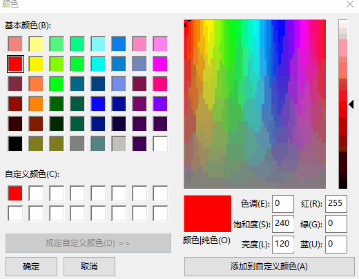
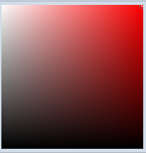
项目里面需要一个像Winfrom里面那样的颜色选择器,如下图所示:
在网上看了一下。没有现成的东东可以拿来使用。大概查看了一下关于颜色的一些知识,想着没人种树,那就由我自己来种树,大家来乘凉好了。
设计过程
由于要考虑到手机上的效果,所以说这种向右展开的方式,不是太合适手机,所以最外层我考虑使用Pivot来存放基本颜色和自定义颜色这2页。
第一页是基本颜色,第二页是自定义的颜色,如下图。
ColorPicker这个控件,主要是由一个Button以及FlyoutBase.AttachedFlyout中的Flyout来组成的。
由Button的点击来控制Flyout的打开或者是关闭。
<Button x:Name="ToggleButton" Padding="{TemplateBinding Padding}" BorderBrush="{TemplateBinding BorderBrush}" Background="{TemplateBinding Background}" BorderThickness="{TemplateBinding BorderThickness}">
<Grid Padding="{TemplateBinding Padding}" Background="#01010101">
<Grid.ColumnDefinitions>
<ColumnDefinition Width="*"/>
<ColumnDefinition Width="auto"/>
</Grid.ColumnDefinitions>
<Rectangle HorizontalAlignment="Stretch" VerticalAlignment="Stretch">
<Rectangle.Fill>
<!--failed to use TemplateBinding-->
<SolidColorBrush Color="{Binding SelectedColor,RelativeSource={RelativeSource TemplatedParent}}"/>
</Rectangle.Fill>
</Rectangle>
<TextBlock x:Name="ArrowPolygon" Foreground="{TemplateBinding Foreground}" Visibility="{TemplateBinding ArrowVisibility}" Grid.Column="" Text="" FontSize="{TemplateBinding FontSize}" FontFamily="Segoe UI Symbol" FontWeight="Normal" VerticalAlignment="Center" HorizontalAlignment="Center" Margin="5,0,5,0"/>
</Grid>
<FlyoutBase.AttachedFlyout>
<Flyout x:Name="Flyout">
<Flyout.FlyoutPresenterStyle>
<Style TargetType="FlyoutPresenter">
<Setter Property="ScrollViewer.VerticalScrollMode" Value="Disabled"/>
<Setter Property="ScrollViewer.HorizontalScrollMode" Value="Disabled"/>
<Setter Property="ScrollViewer.VerticalScrollBarVisibility" Value="Disabled"/>
<Setter Property="ScrollViewer.HorizontalScrollBarVisibility" Value="Disabled"/>
<!--<Setter Property="MaxHeight" Value="NaN"/>
<Setter Property="MaxWidth" Value="NaN"/>-->
<Setter Property="MinHeight" Value=""/>
<Setter Property="MinWidth" Value=""/>
<Setter Property="Padding" Value="0,0,0,0"/>
<Setter Property="Margin" Value="0,0,0,0"/>
<Setter Property="BorderThickness" Value=""/>
<Setter Property="Background" Value="White"/>
<!--<Setter Property="BorderBrush" Value="#A4AFBA"/>-->
<Setter Property="MaxWidth" Value="NaN"/>
<Setter Property="MaxHeight" Value="NaN"/>
<Setter Property="Background" Value="Transparent"/>
<Setter Property="VerticalContentAlignment" Value="Center"/>
<Setter Property="HorizontalContentAlignment" Value="Center"/>
</Style>
</Flyout.FlyoutPresenterStyle>
<Grid Background="#FFD1DCE8" RequestedTheme="Light" BorderBrush="#A4AFBA" BorderThickness="" Width="{TemplateBinding FlyoutWidth}" Height="{TemplateBinding FlyoutHeight}">
<Pivot x:Name="Pivot" Style="{StaticResource ColorPickerPivot}">
<Pivot.Resources>
<!--<Style TargetType="TextBlock">
<Setter Property="Foreground" Value="Black"/>
</Style>-->
<Style TargetType="PivotHeaderItem" BasedOn="{StaticResource ColorPickerPivotHeaderItem}"/>
<Style TargetType="PivotItem">
<Setter Property="HorizontalContentAlignment" Value="Stretch"/>
<Setter Property="Margin" Value=""/>
<Setter Property="Padding" Value=""/>
<Setter Property="MinWidth" Value=""/>
</Style>
</Pivot.Resources>
<PivotItem>
<PivotItem.Header>
<Grid HorizontalAlignment="Stretch" VerticalAlignment="Stretch" Padding="">
<Grid.ColumnDefinitions>
<ColumnDefinition Width=""/>
<ColumnDefinition/>
</Grid.ColumnDefinitions>
<Border Width="" Height="" Background="#FF97AEBF">
<Grid>
<Rectangle Height="" HorizontalAlignment="Left" VerticalAlignment="Top" Width="" Fill="#FFFF0000" Margin="1 1 0 0"/>
<Rectangle Height="" HorizontalAlignment="Left" VerticalAlignment="Top" Width="" Fill="#FFFFC000" Margin="5 1 0 0"/>
<Rectangle Height="" HorizontalAlignment="Left" VerticalAlignment="Top" Width="" Fill="#FFFFFF00" Margin="9 1 0 0"/>
<Rectangle Height="" HorizontalAlignment="Left" VerticalAlignment="Top" Width="" Fill="#FF92D050" Margin="1 5 0 0"/>
<Rectangle Height="" HorizontalAlignment="Left" VerticalAlignment="Top" Width="" Fill="#FF00B050" Margin="5 5 0 0"/>
<Rectangle Height="" HorizontalAlignment="Left" VerticalAlignment="Top" Width="" Fill="#FF0C8242" Margin="9 5 0 0"/>
<Rectangle Height="" HorizontalAlignment="Left" VerticalAlignment="Top" Width="" Fill="#FF0070C0" Margin="1 9 0 0"/>
<Rectangle Height="" HorizontalAlignment="Left" VerticalAlignment="Top" Width="" Fill="#FF002060" Margin="5 9 0 0"/>
<Rectangle Height="" HorizontalAlignment="Left" VerticalAlignment="Top" Width="" Fill="#FF7030A0" Margin="9 9 0 0"/>
</Grid>
</Border>
<TextBlock HorizontalAlignment="Left" VerticalAlignment="Center" Text="基本颜色" TextWrapping="Wrap" Grid.Column="">
</TextBlock>
</Grid>
</PivotItem.Header>
<StackPanel Orientation="Vertical">
<Border Margin="0,5,0,0" HorizontalAlignment="Stretch" BorderBrush="#A4AFBA" BorderThickness="0,0,0,1" Height="">
<TextBlock Margin="5,0" VerticalAlignment="Center">
<Run Text="{Binding Title,RelativeSource={RelativeSource TemplatedParent}}"/>
<Run Text=" - "/>
<Run Text="基本颜色"/>
</TextBlock>
</Border>
<local:ColorPickerItemsControl x:Name="BasicColorItems" MinHeight=""/>
<Border Margin="0,5,0,0" BorderBrush="#A4AFBA" BorderThickness="0,0,0,1" HorizontalAlignment="Stretch" Height="">
<TextBlock Margin="5,0" Text="最近使用颜色" VerticalAlignment="Center"/>
</Border>
<local:ColorPickerItemsControl x:Name="RecentColorItems" MinHeight=""/>
</StackPanel>
</PivotItem>
<PivotItem>
<PivotItem.Header>
<Grid HorizontalAlignment="Stretch" VerticalAlignment="Stretch" Padding="">
<Grid.ColumnDefinitions>
<ColumnDefinition Width=""/>
<ColumnDefinition/>
</Grid.ColumnDefinitions>
<Ellipse Height="" Margin="0.5,-1,3,-1" Fill="#FFFFFFFF" Width=""/>
<Ellipse Width="" Height="" Margin="0.5,-1,3,-1">
<Ellipse.Fill>
<LinearGradientBrush EndPoint="0.5,1" StartPoint="0.5,0">
<GradientStop Color="#FFFF0000" Offset="0.1"/>
<GradientStop Color="#00FF0000" Offset="0.5"/>
</LinearGradientBrush>
</Ellipse.Fill>
</Ellipse>
<Ellipse Height="" HorizontalAlignment="Stretch" Margin="0.5,-1,3,-1" VerticalAlignment="Stretch" Width="">
<Ellipse.Fill>
<LinearGradientBrush EndPoint="0.982999980449677,0.179000005125999" StartPoint="0.0879999995231628,0.753000020980835">
<GradientStop Color="#FF079BF0" Offset="0.1"/>
<GradientStop Color="#00079BF0" Offset="0.5"/>
</LinearGradientBrush>
</Ellipse.Fill>
</Ellipse>
<Ellipse Height="" HorizontalAlignment="Stretch" Margin="0.5,-1,3,-1" VerticalAlignment="Stretch" Width="">
<Ellipse.Fill>
<LinearGradientBrush EndPoint="0.136000007390976,0.174999997019768" StartPoint="0.843999981880188,0.822000026702881">
<GradientStop Color="#FFF2F413" Offset="0.1"/>
<GradientStop Color="#00F2F413" Offset="0.5"/>
</LinearGradientBrush>
</Ellipse.Fill>
</Ellipse>
<Ellipse Height="" HorizontalAlignment="Stretch" Margin="0.5,-1,3,-1" VerticalAlignment="Stretch" Width="" Visibility="Visible">
<Ellipse.Fill>
<LinearGradientBrush>
<GradientStop Color="#00000000" Offset="0.772"/>
<GradientStop Color="#4C000000" Offset=""/>
</LinearGradientBrush>
</Ellipse.Fill>
</Ellipse>
<Ellipse Height="" HorizontalAlignment="Stretch" Margin="-0.5,-1.5,2.5,-1.5" VerticalAlignment="Stretch" Width="" Stroke="#FF8AA3B5"/>
<TextBlock HorizontalAlignment="Left" VerticalAlignment="Center" Text="自定义颜色" TextWrapping="Wrap" Grid.Column="">
</TextBlock>
</Grid>
</PivotItem.Header>
<Grid HorizontalAlignment="Stretch" VerticalAlignment="Stretch">
<Grid.RowDefinitions>
<RowDefinition Height="auto"/>
<RowDefinition Height="*"/>
<RowDefinition Height="auto"/>
<RowDefinition Height="auto"/>
</Grid.RowDefinitions>
<Grid.Resources>
<Style TargetType="local:NumericTextBox">
<Setter Property="InputScope" Value="Number"/>
<Setter Property="ValueFormat" Value="F0"/>
<Setter Property="Minimum" Value=""/>
<Setter Property="Maximum" Value=""/>
<Setter Property="MinWidth" Value=""/>
<Setter Property="Margin" Value="5,0,0,0"/>
<Setter Property="HorizontalContentAlignment" Value="Center"/>
</Style>
</Grid.Resources>
<Border Margin="0,5,0,0" HorizontalAlignment="Stretch" BorderBrush="#A4AFBA" BorderThickness="0,0,0,1" Height="">
<TextBlock Margin="5,0" VerticalAlignment="Center">
<Run Text="{Binding Title,RelativeSource={RelativeSource TemplatedParent}}"/>
<Run Text=" - "/>
<Run Text="自定义颜色"/>
</TextBlock>
</Border>
<Grid HorizontalAlignment="Stretch" VerticalAlignment="Stretch" Grid.Row="" BorderBrush="#A4AFBA" BorderThickness="0,0,0,1">
<Grid.ColumnDefinitions>
<ColumnDefinition Width="*"/>
<ColumnDefinition Width="auto"/>
<ColumnDefinition Width="auto"/>
</Grid.ColumnDefinitions>
<ContentControl x:Name="ChoiceGridParent" Grid.Column="" HorizontalContentAlignment="Stretch" VerticalContentAlignment="Stretch">
<Grid x:Name="ChoiceGrid" HorizontalAlignment="Stretch" Margin="5,5,0,5" VerticalAlignment="Stretch" >
<!--<Grid.Background>
<LinearGradientBrush StartPoint="0,0" EndPoint="1,0">
<LinearGradientBrush.GradientStops>
<GradientStop Offset="0.0" Color="White"/>
<GradientStop Offset="" Color="#00FFFFFF"/>
</LinearGradientBrush.GradientStops>
</LinearGradientBrush>
</Grid.Background>-->
<Rectangle HorizontalAlignment="Stretch" VerticalAlignment="Stretch">
<Rectangle.Fill>
<LinearGradientBrush StartPoint="0,0" EndPoint="1,0">
<LinearGradientBrush.GradientStops>
<GradientStop Offset="0.0" Color="White"/>
<GradientStop Offset="" Color="#00FFFFFF"/>
</LinearGradientBrush.GradientStops>
</LinearGradientBrush>
</Rectangle.Fill>
</Rectangle>
<Rectangle HorizontalAlignment="Stretch" VerticalAlignment="Stretch">
<Rectangle.Fill>
<LinearGradientBrush StartPoint="0,0" EndPoint="0,1">
<LinearGradientBrush.GradientStops>
<GradientStop Offset="0.0" Color="#00000000"/>
<GradientStop Offset="" Color="Black"/>
</LinearGradientBrush.GradientStops>
</LinearGradientBrush>
</Rectangle.Fill>
</Rectangle>
<Canvas x:Name="PadCanvas">
<Canvas x:Name="Indicator">
<Ellipse Height="" Width="" Fill="Transparent" Stroke="#FFFFFFFF" StrokeThickness="" Margin="-3 -3 0 0" />
<Ellipse Height="" Width="" Fill="Transparent" Stroke="#FF737373" Margin="-6 -6 0 0" />
</Canvas>
</Canvas>
</Grid>
</ContentControl>
<Slider x:Name="Hue" Style="{StaticResource ColorPickerHueSlider}" Margin="5,5,0,5" Grid.Column="">
<Slider.Background>
<LinearGradientBrush StartPoint="0,0" EndPoint="0,1">
<GradientStop Offset="0.0" Color="#FFFF0000"/>
<GradientStop Offset="0.2" Color="#FFFFFF00"/>
<GradientStop Offset="0.4" Color="#FF00FF00"/>
<GradientStop Offset="0.6" Color="#FF0000FF"/>
<GradientStop Offset="0.8" Color="#FFFF00FF"/>
<GradientStop Offset="1.0" Color="#FFFF0000"/>
</LinearGradientBrush>
</Slider.Background>
</Slider>
<Slider x:Name="Alpha" Style="{StaticResource ColorPickerAlphaSlider}" Margin="" Grid.Column="">
<Slider.Background>
<LinearGradientBrush StartPoint="0,0" EndPoint="0,1">
<GradientStop Color="Black" Offset=""/>
<GradientStop Color="Transparent" Offset=""/>
</LinearGradientBrush>
</Slider.Background>
</Slider>
</Grid>
<Grid Margin="0,0,5,0" Padding="0,0,0,5" HorizontalAlignment="Stretch" VerticalAlignment="Stretch" Grid.Row="" BorderBrush="#A4AFBA" BorderThickness="0,0,0,1">
<Grid.ColumnDefinitions>
<ColumnDefinition Width="*"/>
<ColumnDefinition Width="*"/>
<ColumnDefinition Width="*"/>
<ColumnDefinition Width="*"/>
</Grid.ColumnDefinitions>
<local:NumericTextBox x:Name="AColor" Grid.Column="">
<local:NumericTextBox.Header>
<TextBlock Text="透明度(A)" HorizontalAlignment="Center"/>
</local:NumericTextBox.Header>
</local:NumericTextBox>
<local:NumericTextBox x:Name="RColor" Grid.Column="" >
<local:NumericTextBox.Header>
<TextBlock Text="红(R)" HorizontalAlignment="Center"/>
</local:NumericTextBox.Header>
</local:NumericTextBox>
<local:NumericTextBox x:Name="GColor" Grid.Column="" >
<local:NumericTextBox.Header>
<TextBlock Text="绿(G)" HorizontalAlignment="Center"/>
</local:NumericTextBox.Header>
</local:NumericTextBox>
<local:NumericTextBox x:Name="BColor" Grid.Column="" >
<local:NumericTextBox.Header>
<TextBlock Text="蓝(B)" HorizontalAlignment="Center"/>
</local:NumericTextBox.Header>
</local:NumericTextBox>
</Grid>
<Grid Grid.Row="" Margin="">
<Grid.ColumnDefinitions>
<ColumnDefinition Width="*"/>
<ColumnDefinition Width="auto"/>
</Grid.ColumnDefinitions>
<Grid HorizontalAlignment="Stretch" Margin="0,0,10,0">
<local:TransparentBackground/>
<Rectangle x:Name="CustomColorRectangle" HorizontalAlignment="Stretch" VerticalAlignment="Stretch">
<Rectangle.Fill>
<SolidColorBrush Color="{Binding CurrentCustomColor,RelativeSource={RelativeSource TemplatedParent}}"/>
</Rectangle.Fill>
<ToolTipService.ToolTip>
<ToolTip>
<Binding Converter="{StaticResource ColorToStringConverter}" Path="CurrentCustomColor" RelativeSource="{RelativeSource TemplatedParent}"/>
</ToolTip>
</ToolTipService.ToolTip>
</Rectangle>
</Grid>
<Button x:Name="CustomColorOkButton" Grid.Column="" Content="确定" VerticalAlignment="Center" HorizontalAlignment="Right"/>
</Grid>
</Grid>
</PivotItem>
</Pivot>
<Button x:Name="CloseButton" Content="关闭" HorizontalAlignment="Right" VerticalAlignment="Bottom" Margin=""/>
</Grid>
</Flyout>
</FlyoutBase.AttachedFlyout>
<ToolTipService.ToolTip>
<ToolTip>
<Binding Path="SelectedColor" RelativeSource="{RelativeSource TemplatedParent}" Converter="{StaticResource ColorToStringConverter}"/>
</ToolTip>
</ToolTipService.ToolTip>
</Button>
通过重写Pivot的模板我们可以轻松得到PiovtHeaderItem 在下面的效果(修改Header和PivotItemPresenter的行号)
Pivot部分模板代码如下,注意蓝色部分:
                 <Grid x:Name="PivotLayoutElement">

                                        <Grid.RowDefinitions>

                                            <RowDefinition Height="*" />

                                            <RowDefinition Height="Auto" />

                                        </Grid.RowDefinitions>

                                        <Grid.ColumnDefinitions>

                                            <ColumnDefinition Width="Auto" />

                                            <ColumnDefinition Width="*" />

                                            <ColumnDefinition Width="Auto" />

                                        </Grid.ColumnDefinitions>

                                        <Grid.RenderTransform>

                                            <CompositeTransform x:Name="PivotLayoutElementTranslateTransform" />

                                        </Grid.RenderTransform>

                                        <ContentPresenter Grid.Row="1"

                  x:Name="LeftHeaderPresenter"

                  Content="{TemplateBinding LeftHeader}"

                  ContentTemplate="{TemplateBinding LeftHeaderTemplate}"

                  HorizontalAlignment="Stretch"

                  VerticalAlignment="Stretch" />

                                        <ContentControl Grid.Row="1"

                  x:Name="HeaderClipper"

                  Grid.Column=""

                  UseSystemFocusVisuals="False"

                  HorizontalContentAlignment="Stretch">

                                            <ContentControl.Clip>

                                                <RectangleGeometry x:Name="HeaderClipperGeometry" />

                                            </ContentControl.Clip>

                                            <Grid Background="Transparent" BorderBrush="#A4AFBA" BorderThickness="0,1,0,0">

                                                <PivotHeaderPanel x:Name="StaticHeader" Visibility="Collapsed" />

                                                <PivotHeaderPanel x:Name="Header">

                                                    <PivotHeaderPanel.RenderTransform>

                                                        <TransformGroup>

                                                            <CompositeTransform x:Name="HeaderTranslateTransform" />

                                                            <CompositeTransform x:Name="HeaderOffsetTranslateTransform" />

                                                        </TransformGroup>

                                                    </PivotHeaderPanel.RenderTransform>

                                                </PivotHeaderPanel>

                                            </Grid>

                                        </ContentControl>

                                        <Button Grid.Row="1"

                    x:Name="PreviousButton"

                    Grid.Column=""

                    Template="{StaticResource PreviousTemplate}"

                    Width=""

                    Height=""

                    UseSystemFocusVisuals="False"

                    Margin="{ThemeResource PivotNavButtonMargin}"

                    IsTabStop="False"

                    IsEnabled="False"

                    HorizontalAlignment="Left"

                    VerticalAlignment="Top"

                    Opacity=""

                    Background="Transparent" />

                                        <Button Grid.Row="1"

                    x:Name="NextButton"

                    Grid.Column=""

                    Template="{StaticResource NextTemplate}"

                    Width=""

                    Height=""

                    UseSystemFocusVisuals="False"

                    Margin="{ThemeResource PivotNavButtonMargin}"

                    IsTabStop="False"

                    IsEnabled="False"

                    HorizontalAlignment="Right"

                    VerticalAlignment="Top"

                    Opacity=""

                    Background="Transparent" />

                                        <ContentPresenter Grid.Row="1"

                    x:Name="RightHeaderPresenter"

                    Grid.Column=""

                    Content="{TemplateBinding RightHeader}"

                    ContentTemplate="{TemplateBinding RightHeaderTemplate}"

                    HorizontalAlignment="Stretch"

                    VerticalAlignment="Stretch" />

                                        <ItemsPresenter x:Name="PivotItemPresenter" Grid.Row="0" Grid.ColumnSpan="">

                                            <ItemsPresenter.RenderTransform>

                                                <TransformGroup>

                                                    <TranslateTransform x:Name="ItemsPresenterTranslateTransform" />

                                                    <CompositeTransform x:Name="ItemsPresenterCompositeTransform" />

                                                </TransformGroup>

                                            </ItemsPresenter.RenderTransform>

                                        </ItemsPresenter>

                                    </Grid>
这个色块就比较简单了,通过Just Color Picker 把Winform 里面的颜色都给搞出来,通过ItemsControl把他们都布局在一块。
最近使用颜色,这个就是记录最近你点击修改的颜色,我这里用了一个帮助类来进行管理。
internal static class ColorPickerColorHelper

    {

        const string ColorPickerRecentColorsKey = "ColorPickerRecentColors.json";

        private static ObservableCollection<Color> RecentColors;

        //private static List<Color> systemColors;

        //private static List<Color> basicColors;

        private static bool hasLoadedRecentColors;

        //public static List<Color> BasicColors

        //{

        //    get

        //    {

        //        return basicColors;

        //    }

        //}

        static ColorPickerColorHelper()

        {

            //basicColors = new List<Color>();

            RecentColors = new ObservableCollection<Color>();

            //systemColors = new List<Color>();

            //foreach (var color in typeof(Colors).GetRuntimeProperties())

            //{

            //    basicColors.Add((Color)color.GetValue(null));

            //}

        }

        public static async Task<ObservableCollection<Color>> GetRecentColorsAsync()

        {

            if (!hasLoadedRecentColors)

            {

                hasLoadedRecentColors = true;

                RecentColors = await GetRecentColorsAsyncInternal();

                var temp = await GetRecentColorsAsyncInternal();

                if (temp != null)

                {

                    RecentColors = temp;

                }

            }

            return RecentColors;

        }

        public async static Task SetRecentColorsAsync(Color color)

        {

            if (RecentColors != null)

            {

                if (RecentColors.LastOrDefault() == color)

                {

                    return;

                }

                RecentColors.Add(color);

                if (RecentColors.Count > )

                {

                    RecentColors.RemoveAt();

                }

                await SaveRecentColorsAsync();

            }

        }

        private static async Task<ObservableCollection<Color>> GetRecentColorsAsyncInternal()

        {

            var jsonText = await StorageHelper.ReadFileAsync(ColorPickerRecentColorsKey);

            return JsonConvert.DeserializeObject<ObservableCollection<Color>>(jsonText);

        }

        private static async Task SaveRecentColorsAsync()

        {

            string jsonText = "";

            if (RecentColors.Count > )

            {

                jsonText = JsonConvert.SerializeObject(RecentColors);

            }

            await StorageHelper.WriteFileAsync(ColorPickerRecentColorsKey, jsonText);

        }

    }

}
第二页是自定义的色盘
这里用到HSL 色彩模式,之前不了解的小伙伴可以先去看一下,RGB→HSL 和 HSL→RGB转换的算法也有。
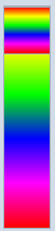 HSL通道
HSL通道 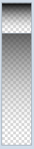 透明度通道 这个2个我用到了Slider控件,当然模板我重新写了一下
 你可以通过拖拽、点击、键盘上下左右来微调颜色数值,这个属于比较简单的拖拽实现,Ellipse通过计算得出它的位置。
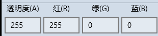 当然你可以通过直接设置ARGB来设置颜色。这个输入框,我设计成了NumericTextBox继承于TextBox控件,支持Format
public class NumericTextBox : TextBox

    {

        private bool _isChangingTextWithCode;

        private bool _isChangingValueWithCode;

        private const double Epsilon = .;

        public event EventHandler ValueChanged;

        public double Value

        {

            get { return (double)GetValue(ValueProperty); }

            set { SetValue(ValueProperty, value); }

        }

        // Using a DependencyProperty as the backing store for Value.  This enables animation, styling, binding, etc...

        public static readonly DependencyProperty ValueProperty =

            DependencyProperty.Register("Value", typeof(double), typeof(NumericTextBox), new PropertyMetadata(0.0, new PropertyChangedCallback(OnValueChanged)));

        private static void OnValueChanged(DependencyObject d, DependencyPropertyChangedEventArgs e)

        {

            (d as NumericTextBox).UpdateValueText();

            (d as NumericTextBox).OnValueChanged();

        }

        public string ValueFormat

        {

            get { return (string)GetValue(ValueFormatProperty); }

            set { SetValue(ValueFormatProperty, value); }

        }

        // Using a DependencyProperty as the backing store for ValueFormat.  This enables animation, styling, binding, etc...

        public static readonly DependencyProperty ValueFormatProperty =

            DependencyProperty.Register("ValueFormat", typeof(string), typeof(NumericTextBox), new PropertyMetadata("F0"));

        public double Minimum

        {

            get { return (double)GetValue(MinimumProperty); }

            set { SetValue(MinimumProperty, value); }

        }

        // Using a DependencyProperty as the backing store for Minimum.  This enables animation, styling, binding, etc...

        public static readonly DependencyProperty MinimumProperty =

            DependencyProperty.Register("Minimum", typeof(double), typeof(NumericTextBox), new PropertyMetadata(double.MinValue));

        public double Maximum

        {

            get { return (double)GetValue(MaximumProperty); }

            set { SetValue(MaximumProperty, value); }

        }

        // Using a DependencyProperty as the backing store for Maximum.  This enables animation, styling, binding, etc...

        public static readonly DependencyProperty MaximumProperty =

            DependencyProperty.Register("Maximum", typeof(double), typeof(NumericTextBox), new PropertyMetadata(double.MaxValue));

        public NumericTextBox()

        {

            Text = this.Value.ToString(CultureInfo.CurrentCulture);

            TextChanged += this.OnValueTextBoxTextChanged;

            KeyDown += this.OnValueTextBoxKeyDown;

            PointerExited += this.OnValueTextBoxPointerExited;

        }

        private void OnValueTextBoxPointerExited(object sender, PointerRoutedEventArgs e)

        {

        }

        private void OnValueTextBoxKeyDown(object sender, KeyRoutedEventArgs e)

        {

        }

        private void OnValueTextBoxTextChanged(object sender, TextChangedEventArgs e)

        {

            this.UpdateValueFromText();

        }

        protected override void OnGotFocus(RoutedEventArgs e)

        {

            base.OnGotFocus(e);

        }

        protected override void OnLostFocus(RoutedEventArgs e)

        {

            this.UpdateValueFromText();

            base.OnLostFocus(e);

        }

        private void UpdateValueText()

        {

            _isChangingTextWithCode = true;

            this.Text = this.Value.ToString(this.ValueFormat);

            this.SelectionStart = this.Text.Length;

            _isChangingTextWithCode = false;

        }

        private void OnValueChanged()

        {

            if (ValueChanged != null)

            {

                ValueChanged(null, null);

            }

        }

        private bool UpdateValueFromText()

        {

            if (_isChangingTextWithCode)

            {

                return false;

            }

            double val;

            if (double.TryParse(this.Text, NumberStyles.Any, CultureInfo.CurrentUICulture, out val) ||

                Calculator.TryCalculate(this.Text, out val))

            {

                _isChangingValueWithCode = true;

                if (val < Minimum)

                {

                    val = Minimum;

                }

                if (val > Maximum)

                {

                    val = Maximum;

                }

                this.Value = val;

                UpdateValueText();

                _isChangingValueWithCode = false;

                return true;

            }

            else

            {

                if (this.Text == "")

                {

                    this.Value = Minimum;

                }

                UpdateValueText();

            }

            return false;

        }

        private bool SetValueAndUpdateValidDirections(double value)

        {

            // Range coercion is handled by base class.

            var oldValue = this.Value;

            if (value < Minimum)

            {

                value = Minimum;

            }

            if (value > Maximum)

            {

                value = Maximum;

            }

            this.Value = value;

            if (value < Minimum || value > Maximum)

            {

                UpdateValueText();

            }

            //this.SetValidIncrementDirection();

            return Math.Abs(this.Value - oldValue) > Epsilon;

        }

    }
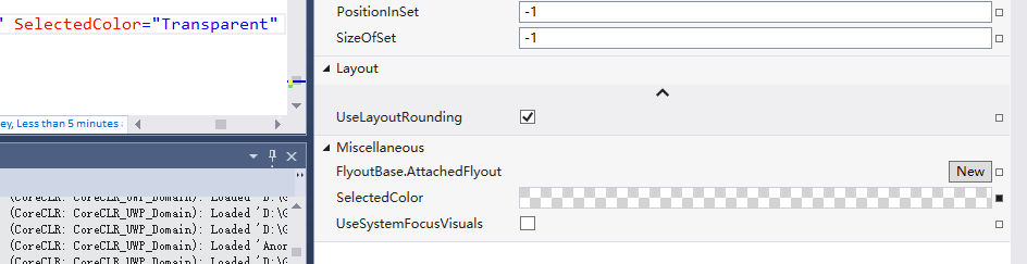
 最后这个色块就是显示的最终的颜色,点击确认会生产自定义的颜色。这里说一下透明色的效果是怎么做成的。
在我们VS里面当把颜色设置为Transparent的时候,效果是如下图
其实就是添加了些灰色的Rect,知道效果,怎么做就简单了,代码如下
     public class TransparentBackground : Grid

    {

        public double SquareWidth

        {

            get { return (double)GetValue(SquareWidthProperty); }

            set { SetValue(SquareWidthProperty, value); }

        }

        // Using a DependencyProperty as the backing store for SquareWidth.  This enables animation, styling, binding, etc...

        public static readonly DependencyProperty SquareWidthProperty =

            DependencyProperty.Register("SquareWidth", typeof(double), typeof(TransparentBackground), new PropertyMetadata(4.0, new PropertyChangedCallback(OnUpdateSquares)));

        private static void OnUpdateSquares(DependencyObject d, DependencyPropertyChangedEventArgs e)

        {

            (d as TransparentBackground).UpdateSquares();

        }

        public Brush SquareBrush

        {

            get { return (Brush)GetValue(SquareBrushProperty); }

            set { SetValue(SquareBrushProperty, value); }

        }

        // Using a DependencyProperty as the backing store for SquareBrush.  This enables animation, styling, binding, etc...

        public static readonly DependencyProperty SquareBrushProperty =

            DependencyProperty.Register("SquareBrush", typeof(Brush), typeof(TransparentBackground), new PropertyMetadata(new SolidColorBrush(Color.FromArgb(0xFF, 0xd7, 0xd7, 0xd7)), new PropertyChangedCallback(OnUpdateSquares)));

        public Brush AlternatingSquareBrush

        {

            get { return (Brush)GetValue(AlternatingSquareBrushProperty); }

            set { SetValue(AlternatingSquareBrushProperty, value); }

        }

        // Using a DependencyProperty as the backing store for AlternatingSquareBrush.  This enables animation, styling, binding, etc...

        public static readonly DependencyProperty AlternatingSquareBrushProperty =

            DependencyProperty.Register("AlternatingSquareBrush", typeof(Brush), typeof(TransparentBackground), new PropertyMetadata(new SolidColorBrush(Colors.White), new PropertyChangedCallback(OnUpdateSquares)));

        public TransparentBackground()

        {

            HorizontalAlignment = HorizontalAlignment.Stretch;

            VerticalAlignment = VerticalAlignment.Stretch;

            //this.SizeChanged += (s, e) =>

            //{

            //    if (e.NewSize != e.PreviousSize)

            //    {

            //        UpdateSquares();

            //    }

            //};

        }

        Size pre = Size.Empty;

        protected override Size ArrangeOverride(Size finalSize)

        {

            if (pre != finalSize)

            {

                UpdateSquares(finalSize);

                pre = finalSize;

            }

            return base.ArrangeOverride(finalSize);

        }

        private void UpdateSquares(Size? finalSize = null)

        {

            Size size = finalSize == null ? new Size(this.ActualWidth, this.ActualHeight) : finalSize.Value;

            //size = new Size(this.ActualWidth, this.ActualHeight);

            this.Children.Clear();

            for (int x = ; x < size.Width / SquareWidth; x++)

            {

                for (int y = ; y < size.Height / SquareWidth; y++)

                {

                    var rectangle = new Rectangle();

                    rectangle.Fill = ((x %  ==  && y %  == ) || (x %  ==  && y %  == )) ? SquareBrush : AlternatingSquareBrush;

                    rectangle.Width = Math.Max(, Math.Min(SquareWidth, size.Width - x * SquareWidth));

                    rectangle.Height = Math.Max(, Math.Min(SquareWidth, size.Height - y * SquareWidth));

                    rectangle.Margin = new Thickness(x * SquareWidth, y * SquareWidth, , );

                    rectangle.HorizontalAlignment = HorizontalAlignment.Left;

                    rectangle.VerticalAlignment = VerticalAlignment.Top;

                    this.Children.Add(rectangle);

                }

            }

        }

    }
这样子我们整个控件就差不多了。
扩展
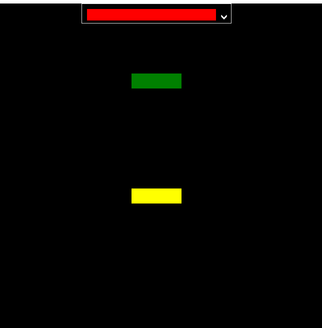
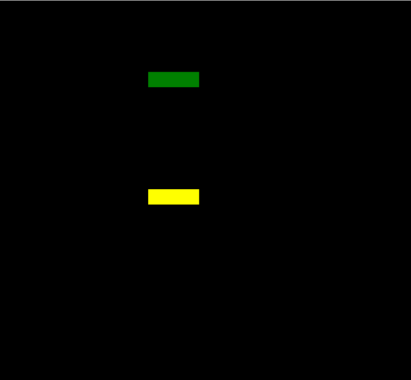
由于项目里面,一个页面上需要有很多个这样的控件,感觉如果有10个需要选择颜色的地方,就要有10个实例的话,比较傻,固做以下的扩展。
添加了
Owner 属性-作为ColorPicker 颜色改变的接受源
PlacementTarget 属性- 作为ColorPicker 弹出的Target
Show 方法- 能够使用代码显示ColorPicker
用法如下:
前台Xaml
<control:ColorPicker x:Name="colorPicker" Width="" Height="" Opacity="" Closed="colorPicker_Closed" SelectedColorChanged="colorPicker_SelectedColorChanged" Placement="BottomCenter" HorizontalAlignment="Center" VerticalAlignment="Top" SelectedColor="Transparent" ArrowVisibility="Visible"/>

            <Rectangle x:Name="rectangle1" Width="" Height="" Margin="" Fill="Green" Tapped="Rectangle_Tapped"/>

            <Rectangle x:Name="rectangle2" Width="" Height="" Margin="" Fill="Yellow" Tapped="Rectangle_Tapped"/>
后台cs
         private void Rectangle_Tapped(object sender, TappedRoutedEventArgs e)

        {

            colorPicker.Placement = AdvancedFlyoutPlacementMode.RightCenter;

            colorPicker.PlacementTarget = (sender as FrameworkElement);

            colorPicker.Owner = sender;

            colorPicker.Show();

        }

        private void colorPicker_SelectedColorChanged(object sender, EventArgs e)

        {

            if (colorPicker.Owner!=null)

            {

                (colorPicker.Owner as Rectangle).Fill = new SolidColorBrush(colorPicker.SelectedColor);

                colorPicker.Owner = null;

            }

        }

        private void colorPicker_Closed(object sender, object e)

        {

            colorPicker.PlacementTarget = null;

        }
总结
其实ColorPicker这个控件总体来说还是比较简单的,搞清楚UI 和HSL算法就ok。对了Colorpicker是固定了主题Light和大小的,黑色主题太丑了,而且会使色块看着及其不爽,所以背景和主题以及大小我都是写死了的。
AdvancedFlyout
背景
做这个东西,是被微软逼的。
10586 和 14393上面Flyout这个控件 行为上有很大区别。
主要问题是在10586上面,不能支持同时2个Flyout打开,就是说打开一个。再打开下一个的时候会关闭上一个。
没办法,只有自己搞一个。
AdvancedFlyoutBase/AdvancedFlyout
把微软的FlyoutBase/Floyout 属性方法都搞过来,我们自己用Popup来实现。
    /// <summary>

    /// to solve issue that can't open two flyouts in 10586.

    /// </summary>

    [ContentProperty(Name = nameof(Content))]

    public class AdvancedFlyout : AdvancedFlyoutBase

    {

        public UIElement Content { get; set; }

        /// <summary>

        /// FlyoutPresenter Style

        /// </summary>

        public Style FlyoutPresenterStyle { get; set; }

        protected override Control CreatePresenter()

        {

            var fp = base.CreatePresenter() as FlyoutPresenter;

            if (FlyoutPresenterStyle != null)

            {

                fp.Style = FlyoutPresenterStyle;

            }

            fp.Content = Content;

            return fp;

        }

    }
主要的实现在于控制Popup的位置。
AdvancedFlyoutBase 里面我添加了
FlyoutBase 没有的三个属性:
IsLightDismissEnabled
VerticalOffset
HorizontalOffset
这3个属性都是Popup的。主要是在Placement的基准上再给于用户微调的权利。PlacementMode是一个枚举,比微软的分的更细。
    public enum AdvancedFlyoutPlacementMode

    {

        TopLeft = ,

        TopCenter,

        TopRight,

        BottomLeft,

        BottomCenter,

        BottomRight,

        LeftTop,

        LeftCenter,

        LeftBottom,

        RightTop,

        RightCenter,

        RightBottom,

        FullScreen,

        CenterScreen,

    }
我们在ShowAt方法中来实现计算Popup的具体位置
        public void ShowAt(FrameworkElement placementTarget)

        {

            if (Opening != null)

            {

                Opening(this, null);

            }

            if (_popup == null)

            {

                _popup = new Popup();

                _popup.ChildTransitions = new TransitionCollection() { new PopupThemeTransition() };

                _popup.Opened += _popup_Opened;

                _popup.Closed += _popup_Closed;

                _popup.Child = CreatePresenter();

            }

            reCalculatePopupPosition = !CalculatePopupPosition(placementTarget);

            _popup.IsLightDismissEnabled = IsLightDismissEnabled;

            this.placementTarget = placementTarget;

            if (reCalculatePopupPosition || FlyoutPresenter.Style == null)

            {

                _popup.Opacity = ;

            }

            _popup.HorizontalOffset += HorizontalOffset;

            _popup.VerticalOffset += VerticalOffset;

            _popup.IsOpen = true;

        }
其中CalculatePopupPosition 是我们的重中之重。
我们计算Popup的位置需要参考下面几样:
1.PlacementTarget在页面上的位置
其实就是控件相对于Window的位置,由以下代码获得
var placementTargetRect = placementTarget.TransformToVisual(Window.Current.Content as FrameworkElement).TransformBounds(new Rect(, , placementTarget.ActualWidth, placementTarget.ActualHeight));
2.弹出页面的大小
FlyoutPresenter的实际大小,由以下代码获得
                var fp = FlyoutPresenter;

                fp.Width = double.NaN;

                fp.Height = double.NaN;

                if (fp.DesiredSize == fpSize)

                {

                    fp.Measure(new Size(double.PositiveInfinity, double.PositiveInfinity));

                }

                fpSize = fp.DesiredSize;
3.Window 的大小
var windowSize = new Size(Window.Current.Bounds.Width, Window.Current.Bounds.Height);
有了之上3个参考数据,那么我们就很容易来计算出Popup显示的位置,
下面以Top为例:
        private bool TryHandlePlacementTop(Rect placementTargetRect, Size fpSize, Size windowSize)

        {

            if (placementTargetRect.Y - fpSize.Height < )

            {

                return false;

            }

            double x = ;

            _popup.VerticalOffset = placementTargetRect.Y - fpSize.Height;

            if (fpSize.Width > windowSize.Width)

            {

                _popup.HorizontalOffset = ;

                return true;

            }

            switch (Placement)

            {

                case AdvancedFlyoutPlacementMode.TopLeft:

                    x = placementTargetRect.X;

                    break;

                case AdvancedFlyoutPlacementMode.TopCenter:

                    x = placementTargetRect.X + placementTargetRect.Width /  - fpSize.Width / ;

                    if (x < )

                    {

                        x = ;

                    }

                    break;

                case AdvancedFlyoutPlacementMode.TopRight:

                    x = placementTargetRect.X + placementTargetRect.Width - fpSize.Width;

                    if (x < )

                    {

                        x = ;

                    }

                    break;

                default:

                    goto case AdvancedFlyoutPlacementMode.TopCenter;

            }

            if (x + fpSize.Width > windowSize.Width)

            {

                x = windowSize.Width - fpSize.Width;

            }

            _popup.HorizontalOffset = x;

            return true;

        }
如果target控件上面的空间不够,那么肯定我们不能把Popup放上面,故return false,再尝试把Popup放在其他方位上。
如果可以放的话,我们再按照是Left,Center,Right的参考位置来计算,注意我们要考虑到Window的大小,不能超出Window。
最终Top的代码如下图
                        case AdvancedFlyoutPlacementMode.TopLeft:

                        case AdvancedFlyoutPlacementMode.TopCenter:

                        case AdvancedFlyoutPlacementMode.TopRight:

                            if (!TryHandlePlacementTop(placementTargetRect, fpSize, windowSize))

                            {

                                if (!TryHandlePlacementBottom(placementTargetRect, fpSize, windowSize))

                                {

                                    if (!TryHandlePlacementLeft(placementTargetRect, fpSize, windowSize))

                                    {

                                        if (!TryHandlePlacementRight(placementTargetRect, fpSize, windowSize))

                                        {

                                            TryHandlePlacementCenterScreen(fpSize, windowSize);

                                        }

                                    }

                                }

                            }

                            break;
在开发过程中发现
如果在Popup Open之前计算FlyoutPresenter的大小,
可能导致Size不正确,如果没有给FlyoutPresenter 赋Style,这个时候还不会使用默认FlyoutPresenter 的样式,Pading,Margin这些参数还没得到赋值。
或者抛异常,比如FlyoutPresenter内部是Pivot的时候会抛异常。
所以我增加了容错。
在计算出错或者FlyoutPresenter的Style 为Null的时候,讲Popup的Opacity设置为0,
并且在Popup Open之后 重写计算位置,然后把Popup Opacity设置1.
            if (reCalculatePopupPosition || FlyoutPresenter.Style == null)

            {

                _popup.Opacity = ;

            }

         private void _popup_Opened(object sender, object e)

        {

            //DesiredSize was not right when style was null before opened

            //we should re-calcuatePopupPosition after FlyoutPresenter get default values from default style or app resource style

            if (FlyoutPresenter.Style == null || reCalculatePopupPosition)

            {

                CalculatePopupPosition(placementTarget);

                _popup.HorizontalOffset += HorizontalOffset;

                _popup.VerticalOffset += VerticalOffset;

                _popup.Opacity = ;

            }

            if (Opened != null)

            {

                Opened(this, e);

            }

        }
这样就解决位置不对的问题。。其实我在使用Flyout的时候也遇到过显示的位置从左上角 跳到正确位置的情况,估计跟我这个原因一样。。估计微软也做了容错。不过没把Opacity设置一下。
总结
其实在开发中,有时间去抱怨微软版本控件有问题,不如静下心来想想其他办法,也需会比微软更好的版本,也更容易方便我们自定义。
开源有益,源码GitHub地址。
最后放上2个控件在项目里面的合体照。
UWP 颜色选择器(ColorPicker) 和 自定义的Flyout(AdvancedFlyout)的更多相关文章
- 基于vue的颜色选择器color-picker
项目中有用到颜色选择器的童鞋们可以看过来了 关于color-picker的jquery的插件是有蛮多,不过vue组件没有吧,反正我没有找到, 虽然element-ui里面有这个,但是你愿意为了一个小功 ...
- 自定义实现简单的Android颜色选择器(附带源码)
在写Android App过程中需要一个简单的颜色选择器,Android自带的ColorPicker和网上的一些ColorPicker都太高端了,都实现了颜色渐变功能,我要的不需要那么复杂,只想提供几 ...
- 【canvas系列】用canvas实现一个colorpicker(类似PS的颜色选择器)
每个浏览器都有自己的特点,比如今天要做的colorpicker就是,一千个浏览器,一千个哈姆雷特,一千个colorpicker.今天canvas系列就用canvas做一个colorpicker. ** ...
- HTML5的input color系统颜色选择器
前两天,我写了一篇<推荐两款jQuery色盘选择器>介绍,那是使用JavaScript实现的色盘,今天我给大家介绍HTML5的色盘选择器.HTML5有一个input类型为color,即颜色 ...
- Android 颜色渲染(一) 颜色选择器 ColorPickerDialog剖析
版权声明:本文为博主原创文章,未经博主允许不得转载. Android 颜色选择器之ColorPickerDialog剖析 有这样一个需求,可以让用户自定义背景颜色,这就需要提供一个颜色选择器给用户. ...
- Android圆环形颜色选择器:HoloColorPicker
HoloColorPicker实现圆环形颜色选择器,可以改变颜色饱和度来选择颜色.选择颜色时,可以用手指沿着圆环滑动一个滑块,从而选择颜色. 添加以下XML至你的布局中: ? 1 2 3 4 < ...
- 10个精选的颜色选择器Javascript脚本及其jQuery插件
Color picker即颜色选择器使我们在web开发中可能经常用到的组件,今天我们特意精选了10个超酷的颜色选择器实现,其中包括了javascript脚本 实现及其传说中的jQuery插件实现 ...
- 基于vue的颜色选择器vue-color-picker
项目中有用到颜色选择器的童鞋们可以看过来了 关于color-picker的jquery的插件是有蛮多,不过vue组件没有吧,反正我没有找到, 虽然element-ui里面有这个,但是你愿意为了一个小功 ...
- html 颜色选择器 亲测,很好用
@*以下 是测试html 颜色选择器的*@ @*<a href="#" mce_href="#" onclick="initColorPicke ...
随机推荐
- 如何获得Webapp的根项目路径 即ServletContext.getRealPath() 的输入参数要以"/"开头
ServletContext.getRealPath() 的输入参数要以"/"开头 2014-03-26 15:54 5738人阅读 评论(1) 收藏 举报 版权声明:本文为博主原 ...
- velocity中$springMacroRequestContext.getMessage($code)
在Java国际化(i18n)中, vm页面显示内容需要使用 #springMessage("title") 实际运行时发现页面输出$springMacroRequestContex ...
- kafka(logstash) + elasticsearch 构建日志分析处理系统
第一版:logstash + es 第二版:kafka 替换 logstash的方案
- Open xml 操作Excel 透视表(Pivot table)-- 实现Excel多语言报表
我的一个ERP项目中,客户希望使用Excel Pivot table 做分析报表. ERP 从数据库中读出数据,导出到Excel中的数据源表(统一命名为Data),刷新Pivot table! 客户还 ...
- js 中的快速排序算法简单实现
对于快速排序,最早是在c++中看到,它是利用指针来交换顺序,其实无论哪种语言,原理 和 思想都是一样,然而真正用起来的时候就特别容易忽略一些事实,导致实现失败.废话少说,下面用js实现一下快速排序: ...
- 1.44tft
https://item.taobao.com/item.htm?spm=a230r.1.14.107.pBOVu5&id=16660981098&ns=1&abbucket= ...
- PYTHON 随机验证码生成
# 生成一个六位随机验证码 import random # random 生成随机数 temp = '' for i in range(6): num = random.randrange(0,6) ...
- 一些VS2013下使用QT和MFC的错误解决方案
http://blog.csdn.net/lovejiayang/article/details/51853191
- Java字节流和字符流区别
1.字节流:直接操作文件本身. 2.字符流:通过缓冲区来操作文件. 所有的文件在硬盘或在传输时都是以字节的方式进行的,包括图片等都是按字节的方式存储的,而字符是只有在内存中才会形成,所以在开发中,字节 ...
- SAP 出库单新版
*&---------------------------------------------------------------------* *& Report ZSDR045 ...