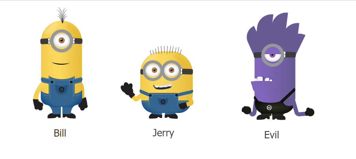
CSS3小黄人
CSS3实现小黄人
效果图:
代码如下,复制即可使用:
<!DOCTYPE HTML>

<HTML>

    <head>

    <title>CSS3实现小黄人</title>
<style>* { margin: 0; padding: 0;}
body {
position: relative;}
.container {width: 970px;margin: 0 auto;padding-top: 70px;transition: ease 0.3s all;
-webkit-transition: ease 0.3s all;}
.container h1, h6 {text-align: center;color: #696969; font-family: tahoma;}
h6 {color:#BDBDBD; margin-bottom: 30px}
h6 a {text-decoration: none;color:#95A4B8;}
h6 a:hover {color:#6180A8;}
.bill {background: #f1cb48;
background: -moz-linear-gradient(left, #f1cb48 0%, #f9d65c 24%, #f9d65c 48%, #e6bc3b 99%);
background: -webkit-gradient(linear, left top, right top, color-stop(0%,#f1cb48), color-stop(24%,#f9d65c), color-stop(48%,#f9d65c), color-stop(99%,#e6bc3b));
background: -webkit-linear-gradient(left, #f1cb48 0%,#f9d65c 24%,#f9d65c 48%,#e6bc3b 99%);
background: -o-linear-gradient(left, #f1cb48 0%,#f9d65c 24%,#f9d65c 48%,#e6bc3b 99%);
background: -ms-linear-gradient(left, #f1cb48 0%,#f9d65c 24%,#f9d65c 48%,#e6bc3b 99%);
background: linear-gradient(to right, #f1cb48 0%,#f9d65c 24%,#f9d65c 48%,#e6bc3b 99%);
filter: progid:DXImageTransform.Microsoft.gradient( startColorstr='#f1cb48', endColorstr='#e6bc3b',GradientType=1 );
; width: 140px;height: 290px;
border-radius: 70px;
float: left;
margin-left: 30px;
position: relative;
transition: ease 0.3s all;
-webkit-transition: ease 0.3s all;
}
.bill *, .jerry *, .evil * {position: absolute; box-sizing:content-box;
-moz-box-sizing:content-box;}
.glasses {background-color: rgba(0, 0, 0, 0);
border: #949699 solid 11px;
width: 57px;
height: 57px;
border-radius: 50%;
top: 30px;
left: 31px;
z-index: 99;}
.eye_animate { width: 57px;
height: 0px;
border-radius: 31%;
background-color: #F9D65C;
top: 41px;
left: 42px;
z-index: 9;
animation: eyes_animation 1.5s ease 2s infinite;
-o-animation: eyes_animation 1.5s ease 2s infinite;
-moz-animation: eyes_animation 1.5s ease 2s infinite;
-webkit-animation: eyes_animation 1.5s ease 2s infinite;
}
@-moz-keyframes eyes_animation
{
0% {height:0px;}
15% {height:57px;}
30% {height:0px;}
100% {height:0px;}
}
@-webkit-keyframes eyes_animation
{
0% {height:0px;}
15% {height:57px;}
30% {height:0px;}
100% {height:0px;}
}
@-o-keyframes eyes_animation
{
0% {height:0px;}
15% {height:57px;}
30% {height:0px;}
100% {height:0px;}
}
@keyframes eyes_animation
{
0% {height:0px;}
15% {height:57px;}
30% {height:0px;}
100% {height:0px;}
}
.yellow_part {width: 57px;
height: 57px;
background-color: #F9D65C;
top: 11px;
left: 11px;}
.white_part * {border-radius: 50%}
.white_part {width: 57px;
border-radius: 50%;
height: 48px;
background-color: #FFF;
top: 44px;
left: 42px;
box-shadow: 0 0 16px rgba(0, 0, 0, 0.3) inset;}
.brown_eye {background-color: #a87a51;width: 21px;
height: 21px;
top: 13px;
right: 18px;}
.black_part {background-color: black;width: 8px;
height: 8px;
top: 6px;
left: 6px;}
.black_part:after {background-color: #FFF;
width: 3px;
height: 3px;
left: 1px;
border-radius: 50%;
position: absolute;
content: '';
-webkit-filter: blur(1px);
-o-filter: blur(1px);
}
.black_part:before {background-color: #FFF;
width: 3px;
height: 3px;
left: 1px;
border-radius: 50%;
position: absolute;
content: '';
-webkit-filter: blur(1px);
-o-filter: blur(1px);
}
.black_tie {top: 61px;
right: 0px;}
.right_tie {-webkit-transform: rotate(2deg);
-o-transform: rotate(2deg);
-ms-transform: rotate(2deg);
-moz-transform: rotate(2deg);
transform: rotate(2deg)}
.right_tie * {right: -3px;}
.top_tie {background-color: #3E3E3C;
width: 28px;
height: 8px;
right: -2px;
border-top-right-radius: 6px;
border-bottom-right-radius: 2px;
border: 1px solid #30302E;
border-top-left-radius: 3px;}
.top_tie:after {background-color: #FFF;
width: 5px;
height: 10px;
right: 25px;
z-index: 9999;
position: absolute;
content: '';
border-radius: 36%;
border: 1px solid #30302E;
bottom: -1px;}
.down_tie {background-color: #3E3E3C;
width: 28px;
height: 8px;
right: -2px;
top: 9px;
border-top-right-radius: 2px;
border-bottom-right-radius: 6px;
border: 1px solid #30302E;
border-top-left-radius: 2px;}
.down_tie:after {background-color: #FFF;
width: 5px;
height: 10px;
right: 25px;
z-index: 9999;
position: absolute;
content: '';
border-radius: 36%;
border: 1px solid #30302E;
bottom: -2px;}
.left_tie {-webkit-transform: scaleX(-1) rotate(2deg);
-moz-transform: scaleX(-1) rotate(2deg);
-ms-transform: scaleX(-1) rotate(2deg);
-o-transform: scaleX(-1) rotate(2deg);
transform: scaleX(-1) rotate(2deg);
right: 116px;}
.left_tie * {left: -3px;}
.clothes .main {background-color: #35668F;
width: 80px;
height: 67px;
top: 193px;
left: 29px;
z-index: 99999;
border-left: 1px dotted #FFF;
border-right: 1px dotted #FFF;}
.clothes .main:before {content: '';
position: absolute;
background: #f1cb48;
background: -moz-linear-gradient(right, #F1CB48 -11%,#F9D65C 24%,#F9D65C 48%,#E6BC3B 109%);
background: -webkit-gradient(linear, right top, left top, color-stop(-11%,#F1CB48), color-stop(24%,#F9D65C), color-stop(48%,#F9D65C), color-stop(109%,#E6BC3B));
background: -webkit-linear-gradient(left, #F1CB48 -11%,#F9D65C 24%,#F9D65C 48%,#E6BC3B 109%);
background: -o-linear-gradient(right, #F1CB48 -11%,#F9D65C 24%,#F9D65C 48%,#E6BC3B 109%);
background: -ms-linear-gradient(right, #F1CB48 -11%,#F9D65C 24%,#F9D65C 48%,#E6BC3B 109%);
background: linear-gradient(to right, #F1CB48 -11%,#F9D65C 24%,#F9D65C 48%,#E6BC3B 109%);
filter: progid:DXImageTransform.Microsoft.gradient( startColorstr='#f1cb48', endColorstr='#e6bc3b',GradientType=1 );
width: 110px;
border-radius: 50%;
height: 57px;
left: -14px;
top: -49px;
}
.clothes .main:after {content: '';
position: absolute;
width: 100px;
background: #35668F;
background: -moz-radial-gradient(top, ellipse cover, #35668f 57%, #003e82 120%);
background: -webkit-gradient(radial, top center, 0px, top center, 100%, color-stop(57%,#35668f), color-stop(120%,#003e82));
background: -webkit-radial-gradient(top, ellipse cover, #35668F 57%,#003E82 120%);
background: -o-radial-gradient(top, ellipse cover, #35668f 57%,#003e82 120%);
background: -ms-radial-gradient(top, ellipse cover, #35668f 57%,#003e82 120%);
background: radial-gradient(ellipse at top, #35668F 57%,#003E82 120%);
filter: progid:DXImageTransform.Microsoft.gradient( startColorstr='#35668f', endColorstr='#003e82',GradientType=1 );
border-radius: 50%;
height: 30px;
left: -10px;
top: 73px;}
.right_shirt {background-color: #35668F;
width: 45px;
height: 10px;
top: 201px;
left: 96px;
border: 1px dotted #DDD;
-webkit-transform: rotate(-13deg);
-moz-transform: rotate(-13deg);
-ms-transform: rotate(-13deg);
-o-transform: rotate(-13deg);
transform: rotate(-13deg);
border-bottom-right-radius: 9px;
z-index: 99999;}
.right_shirt:before {background-color: #000;
height: 8px;
width: 8px;
left: 2px;
position: absolute;
content: '';
border-radius: 50%;
top: 1px;}
.right_shirt:after {background-color: #35668F;
height: 2px;
width: 2px;
left: 5px;
position: absolute;
content: '';
border-radius: 50%;
top: 4px;}
.make_it_left {left: -2px;
-webkit-transform: scaleX(-1) rotate(-13deg);
-moz-transform: scaleX(-1) rotate(-13deg);
-ms-transform: scaleX(-1) rotate(-13deg);
-o-transform: scaleX(-1) rotate(-13deg);
transform: scaleX(-1) rotate(-13deg);
}
.clothes {z-index: 9999;}
.clothes .bottom {width: 142px;
background: #35668F;
background: -moz-radial-gradient(top, ellipse cover, #35668f 61%, #003e82 100%);
background: -webkit-gradient(radial, top center, 0px, top center, 100%, color-stop(61%,#35668f), color-stop(100%,#003e82));
background: -webkit-radial-gradient(top, ellipse cover, #35668F 61%,#003E82 100%);
background: -o-radial-gradient(top, ellipse cover, #35668f 61%,#003e82 100%);
background: -ms-radial-gradient(top, ellipse cover, #35668f 61%,#003e82 100%);
background: radial-gradient(ellipse at top, #35668F 61%,#003E82 100%);
filter: progid:DXImageTransform.Microsoft.gradient( startColorstr='#35668f', endColorstr='#003e82',GradientType=1 );
filter: inherit;
height: 50px;
top: 240px;
left: -1px;
border-bottom-right-radius: 25px;
border-bottom-left-radius: 26px;}
.clothes .bottom:before {content: '';
position: absolute;
width: 140px;
border-radius: 50%;
height: 34px;
left: 0px;
top: -19px;
background: #f1cb48;
background: -moz-linear-gradient(right, #F1CB48 0%,#F9D65C 24%,#F9D65C 48%,#E6BC3B 99%);
background: -webkit-gradient(linear, left top, right top, color-stop(0%,#F1CB48), color-stop(24%,#F9D65C), color-stop(48%,#F9D65C), color-stop(99%,#E6BC3B));
background: linear-gradient(to right, #F1CB48 0%,#F9D65C 24%,#F9D65C 48%,#E6BC3B 99%);
background: -o-linear-gradient(right, #F1CB48 0%,#F9D65C 24%,#F9D65C 48%,#E6BC3B 99%);
background: -ms-linear-gradient(right, #F1CB48 0%,#F9D65C 24%,#F9D65C 48%,#E6BC3B 99%);
filter: progid:DXImageTransform.Microsoft.gradient( startColorstr='#f1cb48', endColorstr='#e6bc3b',GradientType=1 );
}
.smile {background-color: #000;
border-radius: 50%;
width: 79px;
height: 37px;
top: 114px;
z-index: 99999;
right: 31px;}
.smile:before {position: absolute;
content: '';
border-radius: 50%;
width: 100px;
height: 37px;
top: -3px;
right: -13px;
background: #f1cb48;
background: -moz-linear-gradient(right, #F1CB48 -40%,#F9D65C 24%,#F9D65C 48%,#E6BC3B 109%);
background: -webkit-gradient(linear, right top, left top, color-stop(-40%,#F1CB48), color-stop(24%,#F9D65C), color-stop(48%,#F9D65C), color-stop(109%,#E6BC3B));
background: -webkit-linear-gradient(left, #F1CB48 -40%,#F9D65C 24%,#F9D65C 48%,#E6BC3B 109%);
background: -o-linear-gradient(right, #F1CB48 -40%,#F9D65C 24%,#F9D65C 48%,#E6BC3B 109%);
background: -ms-linear-gradient(right, #F1CB48 -40%,#F9D65C 24%,#F9D65C 48%,#E6BC3B 109%);
background: linear-gradient(to right, #F1CB48 -40%,#F9D65C 24%,#F9D65C 48%,#E6BC3B 109%);
filter: progid:DXImageTransform.Microsoft.gradient( startColorstr='#f1cb48', endColorstr='#e6bc3b',GradientType=1 );}
.legs {top: 285px}
.right_leg {background: #003e82;
background: -moz-linear-gradient(top, #003e82 0%, #35668f 40%);
background: -webkit-gradient(linear, left top, left bottom, color-stop(0%,#003e82), color-stop(40%,#35668f));
background: -webkit-linear-gradient(top, #003e82 0%,#35668f 40%);
background: -o-linear-gradient(top, #003e82 0%,#35668f 40%);
background: -ms-linear-gradient(top, #003e82 0%,#35668f 40%);
background: linear-gradient(to bottom, #003e82 0%,#35668f 40%);
filter: progid:DXImageTransform.Microsoft.gradient( startColorstr='#003e82', endColorstr='#35668f',GradientType=0 );
width: 45px;
height: 38px;
left: 73px;
border-bottom-left-radius: 4px;}
.right_leg:before {position: absolute;
content: '';
border-radius: 50%;
width: 40px;
height: 73px;
left: 28px;
background-color: #FFF;
top: 5px;}
.make_it_left_leg {left: 23px;
-webkit-transform: scaleX(-1);
-moz-transform: scaleX(-1)}
.shoes {background-color: #231F20;
width: 45px;
height: 9px;
top: 36px;
left: 74px;
border-top-right-radius: 14px;
-webkit-transform: rotate(2deg);
-moz-transform: rotate(2deg);
-ms-transform: rotate(2deg);
-o-transform: rotate(2deg);
transform: rotate(2deg);
}
.shoes:after {position: absolute;
content: '';
border-top-right-radius: 30%;
width: 30px;
height: 6px;
background-color: #231F20;
top: 8px;
right: 0px;
border-bottom-right-radius: 31%;
border-bottom-left-radius: 50%;
-webkit-transform: rotate(2deg);
-moz-transform: rotate(2deg);
-ms-transform: rotate(2deg);
-o-transform: rotate(2deg);
transform: rotate(2deg);
}
.shoes:before {position: absolute;
content: '';
width: 9px;
height: 6px;
background-color: #231F20;
top: 6px;
left: 0px;
border-bottom-right-radius: 40%;
}
.small_shoes {
border-radius: 40%;
width: 30px;
height: 10px;
background-color: #231F20;
top: -4px;
right: 4px;
-webkit-transform: rotate(9deg);
-moz-transform: rotate(9deg);
-ms-transform: rotate(9deg);
-o-transform: rotate(9deg);
transform: rotate(9deg);
}
.small_shoes:before {position: absolute;
content: '';
width: 18px;
height: 6px;
background-color: #35668F;
top: -1px;
left: -1px;
-webkit-transform: rotate(-12deg) !important;
-moz-transform: rotate(-12deg) !important;
-ms-transform: rotate(-12deg) !important;
-o-transform: rotate(-12deg) !important;
transform: rotate(-12deg) !important;
border-bottom-right-radius: 4px;
}
.make_it_left_shoes {left: 22px;
-webkit-transform: scaleX(-1);
-moz-transform: scaleX(-1);
-ms-transform: scaleX(-1);
-o-transform: scaleX(-1);
transform: scaleX(-1)
}
.arm {width: 77px;
height: 89px;
background: #f1cb48;
background: -moz-linear-gradient(-45deg, #F1CB48 0%,#F9D65C 24%,#E6BC3B 99%);
background: -webkit-gradient(linear, left top, right bottom, color-stop(0%,#F1CB48), color-stop(24%,#F9D65C), color-stop(99%,#E6BC3B));
background: -webkit-linear-gradient(-45deg, #F1CB48 0%,#F9D65C 24%,#E6BC3B 99%);
background: -o-linear-gradient(-45deg, #F1CB48 0%,#F9D65C 24%,#E6BC3B 99%);
background: -ms-linear-gradient(-45deg, #F1CB48 0%,#F9D65C 24%,#E6BC3B 99%);
background: linear-gradient(135deg, #F1CB48 0%,#F9D65C 24%,#E6BC3B 99%);
filter: progid:DXImageTransform.Microsoft.gradient( startColorstr='#f1cb48', endColorstr='#e6bc3b',GradientType=1 );
top: 192px;
border-bottom-left-radius: 11px;
border-top-left-radius: 55px;
z-index: 5555;
-webkit-transform: rotate(27deg);
-moz-transform: rotate(27deg);
-ms-transform: rotate(27deg);
-o-transform: rotate(27deg);
transform: rotate(27deg);
left: -12px;}
.arm:before {position: absolute;
content: '';
width: 36px;
height: 19px;
background-color: #F3CF55;
top: 76px;
left: -7px;
-webkit-transform: rotate(69deg);
-moz-transform: rotate(69deg);
-ms-transform: rotate(69deg);
-o-transform: rotate(69deg);
transform: rotate(69deg);
border-bottom-left-radius: 19px;
border-bottom-right-radius: 9px;
}
.arm:after {position: absolute;
content: '';
width: 52px;
height: 16px;
background-color: #FFF;
top: 73px;
left: 0px;
-webkit-transform: rotate(72deg);
-moz-transform: rotate(72deg);
-ms-transform: rotate(72deg);
-o-transform: rotate(72deg);
transform: rotate(72deg);
border-radius: 50%;
}
.hand {width: 19px;
height: 11px;
background-color: #231F20;
left: -28px;
top: 270px;
z-index: 99999;
border-bottom-left-radius: 8px;
border-bottom-right-radius: 8px;
-webkit-transform: rotate(4deg);
-moz-transform: rotate(4deg);
-ms-transform: rotate(4deg);
-o-transform: rotate(4deg);
transform: rotate(4deg);
}
.hand:before {width: 27px;
position: absolute;
content: '';
height: 25px;
background-color: #231F20;
left: 4px;
top: 4px;
border-bottom-left-radius: 10px;
border-bottom-right-radius: 0px;
border-top-left-radius: 3px;
border-top-right-radius: 18px;
-webkit-transform: rotate(-17deg);
-moz-transform: rotate(-17deg);
-ms-transform: rotate(-17deg);
-o-transform: rotate(-17deg);
transform: rotate(-17deg);
}
.hand:after {width: 14px;
position: absolute;
content: '';
height: 14px;
background-color: #231F20;
left: 7px;
top: 21px;
border-radius: 50%;
}
.hand_parts {width: 16px;
height: 16px;
background-color: #231F20;
left: 19px;
top: 21px;
border-radius: 47%;}
.hand_parts:after {
position: absolute;
content: '';
width: 16px;
height: 16px;
background-color: #231F20;
left: 1px;
top: -11px;
border-radius: 47%;
}
.make_it_right_arm {left: 57px;
-webkit-transform: scaleX(-1);
-moz-transform: scaleX(-1);
-ms-transform: scaleX(-1);
-o-transform: scaleX(-1);
transform: scaleX(-1);
top: 186px;
height: 92px;
z-index: -1;
border-left: 14px #E6BC3B solid;}
.make_it_right_hand {left: 137px;
top: 266px;
z-index: 7777;
-webkit-transform: scaleX(-1) rotate(27deg);
-moz-transform: scaleX(-1) rotate(27deg);
-ms-transform: scaleX(-1) rotate(27deg);
-o-transform: scaleX(-1) rotate(27deg);
transform: scaleX(-1) rotate(27deg);}
.hair1 {background-color: rgba(0, 0, 0, 0);
width: 25px;
height: 48px;
top: -37px;
border-radius: 53%;
border-bottom-left-radius: 3px;
border-left: solid #000 1px;
left: 75px;
-webkit-transform: rotate(8deg);
-moz-transform: rotate(8deg);
-ms-transform: rotate(8deg);
-o-transform: rotate(8deg);
transform: rotate(8deg);
}
.hair1:after {background-color: rgba(0, 0, 0, 0);
position: absolute;
content: '';
width: 25px;
height: 35px;
top: 14px;
border-radius: 43%;
border-bottom-left-radius: 1px;
border-left: solid #000 1px;
left: 1px;
-webkit-transform: rotate(4deg);
-moz-transform: rotate(4deg);
-ms-transform: rotate(4deg);
-o-transform: rotate(4deg);
transform: rotate(4deg);}
.hair1:before {background-color: rgba(0, 0, 0, 0);
position: absolute;
content: '';
width: 25px;
height: 29px;
top: 21px;
border-radius: 43%;
border-bottom-left-radius: 1px;
border-left: solid #000 1px;
left: 3px;
-webkit-transform: rotate(11deg);
-moz-transform: rotate(11deg);
-ms-transform: rotate(11deg);
-o-transform: rotate(11deg);
transform: rotate(11deg);}
.make_it_left_hair1 {left: 44px;
-webkit-transform: scaleX(-1) rotate(13deg);
-moz-transform: scaleX(-1) rotate(13deg);
-ms-transform: scaleX(-1) rotate(13deg);
-o-transform: scaleX(-1) rotate(13deg);
transform: scaleX(-1) rotate(13deg);}
.hair2 {background-color: rgba(0, 0, 0, 0);
width: 25px;
height: 48px;
top: -43px;
border-radius: 43%;
border-bottom-left-radius: 3px;
border-left: solid #000 1px;
left: 73px;
-webkit-transform: rotate(5deg);
-moz-transform: rotate(5deg);
-ms-transform: rotate(5deg);
-o-transform: rotate(5deg);
transform: rotate(5deg);}
.hair2:before {background-color: rgba(0, 0, 0, 0);
width: 25px;
position: absolute;
content: '';
height: 48px;
border-radius: 43%;
border-bottom-left-radius: 3px;
border-left: solid #000 1px;
left: -29px;
-webkit-transform: scaleX(-1) rotate(15deg);
-moz-transform: scaleX(-1) rotate(15deg);
-ms-transform: scaleX(-1) rotate(15deg);
-o-transform: scaleX(-1) rotate(15deg);
transform: scaleX(-1) rotate(15deg);}
.blue_borders {background-color: #35668F;
width: 89px;
height: 79px;
top: 180px;
left: 26px;
z-index: 2;}
.blue_borders:before {position: absolute;
content: '';
background-color: #35668F;
width: 91px;
height: 17px;
border-bottom-right-radius: 9px;
-webkit-transform: rotate(-13deg);
-moz-transform: rotate(-13deg);
-ms-transform: rotate(-13deg);
-o-transform: rotate(-13deg);
transform: rotate(-13deg);
top: 24px;
left: 25px;
}
.blue_borders:after {position: absolute;
content: '';
background-color: #35668F;
width: 91px;
height: 17px;
border-bottom-left-radius: 9px;
-webkit-transform: rotate(13deg);
-moz-transform: rotate(13deg);
-ms-transform: rotate(13deg);
-o-transform: rotate(13deg);
transform: rotate(13deg);
top: 24px;
left: -27px;}
.white_light {width: 5px;
height: 43px;
left: 35px;
background-color: #FFFFFF;
opacity: 0.2;
top: 2px;
border-radius: 50%;
-moz-box-shadow: 0px 3px 9px 8px rgba(0,0,0,1);
box-shadow: 0px 3px 10px 8px #FFFFFF;
-webkit-transform: rotate(49deg);
-moz-transform: rotate(49deg);
-ms-transform: rotate(49deg);
-o-transform: rotate(49deg);
transform: rotate(49deg);
}
.dark_light {
width: 7px;
height: 50px;
top: 10px;
left: 105px;
background-color: #cd9f08;
opacity: 0.2;
border-radius: 50%;
-moz-box-shadow: 0px 3px 10px 8px rgba(0,0,0,1);
box-shadow: 0px 3px 10px 8px #cd9f08;
-webkit-transform:rotate(-42deg);
-moz-transform:rotate(-42deg);
-ms-transform:rotate(-42deg);
-o-transform:rotate(-42deg);
transform:rotate(-42deg);
}
.pocket {width: 40px;
height: 37px;
background-color: #245580;
top: 215px;
z-index: 99999;
left: 49px;
-moz-box-shadow: 0px 0px 3px 0px rgba(19,54,82,1);
box-shadow: 0px 0px 3px 0px #133652;
border-bottom-left-radius: 20px;
border-bottom-right-radius: 20px;
border: 1px dotted #B6B6B6;}
.pocket:after {width: 43px;
height: 15px;
position: absolute;
content: '';
top: -9px;
left: -1px;
border-radius: 50%;
background-color: #35668F;
border-bottom: 1px dotted #B6B6B6;}
.logo {background-color: #231F20;
width: 19px;
height: 19px;
border-radius: 50%;
top: 11px;
right: 10px;}
.logo:before {position: absolute;
content: '';
background-color: #245580;
width: 9px;
height: 9px;
top: 5px;
left: 5px;
-webkit-transform:rotate(-45deg);
-moz-transform:rotate(-45deg);
-ms-transform:rotate(-45deg);
-o-transform:rotate(-45deg);
transform:rotate(-45deg);
}
.logo:after {position: absolute;
content: '';
background-color: #231F20;
width: 5px;
height: 5px;
border-radius: 50%;
top: 7px;
left: 7px;
}
.lines {width: 5px;
height: 1px;
z-index: 9999;
background-color: #231F20;
top: 20px;
right: 12px;}
.lines:after {position: absolute;
content: '';
width: 11px;
height: 1px;
z-index: 9999;
background-color: #245580;
top: 1px;
right: -4px;}
.curve1 {width: 40px;
height: 29px;
background-color: rgba(0, 0, 0, 0);
top: 249px;
z-index: 99999;
left: 110px;
border-bottom-left-radius: 20px;
border-left: dotted 1px #FFF;
box-shadow: 1px 0px 0px 0px #133652 inset;}
.curve1:after {position: absolute;
content: '';
width: 32px;
top: -44px;
height: 50px;
border-bottom-right-radius: 20px;
border-bottom-left-radius: 5px;
border-bottom: dotted 1px #FFF;
background-color: rgba(0, 0, 0, 0); }
.make_it_left_curve {left: -11px;
-webkit-transform:scaleX(-1);
-moz-transform:scaleX(-1);
-ms-transform:scaleX(-1);
-o-transform:scaleX(-1);
transform:scaleX(-1);}
.curve2 {width: 91px;
height: 29px;
background-color: rgba(0, 0, 0, 0);
top: 175px;
z-index: 100000;
left: 25px;
border-bottom-left-radius: 50%;
border-bottom-right-radius: 50%;
border-bottom: dotted 1px #FFF;}
.bill h2 {top: 364px;
font-family: tahoma;
font-size: 34px;
font-weight: normal;
left: 43px;
color: #414141;}
/****************************************************/
.jerry {background: #f1cb48;
background: -moz-linear-gradient(left, #f1cb48 0%, #f9d65c 24%, #f9d65c 48%, #e6bc3b 99%);
background: -webkit-gradient(linear, left top, right top, color-stop(0%,#f1cb48), color-stop(24%,#f9d65c), color-stop(48%,#f9d65c), color-stop(99%,#e6bc3b));
background: -webkit-linear-gradient(left, #f1cb48 0%,#f9d65c 24%,#f9d65c 48%,#e6bc3b 99%);
background: -o-linear-gradient(left, #f1cb48 0%,#f9d65c 24%,#f9d65c 48%,#e6bc3b 99%);
background: -ms-linear-gradient(left, #f1cb48 0%,#f9d65c 24%,#f9d65c 48%,#e6bc3b 99%);
background: linear-gradient(to right, #f1cb48 0%,#f9d65c 24%,#f9d65c 48%,#e6bc3b 99%);
filter: progid:DXImageTransform.Microsoft.gradient( startColorstr='#f1cb48', endColorstr='#e6bc3b',GradientType=1 );
width: 180px;
height: 212px;
border-top-left-radius: 75px;
border-top-right-radius: 75px;
border-bottom-left-radius: 65px;
border-bottom-right-radius: 64px;
position: relative;
float: left;
top: 105px;
transition: ease 0.3s all;
-webkit-transition: ease 0.3s all;
left: 200px;}
.jerry .dark_light {left: 136px;}
.jerry .eyes1, .jerry .eyes2 {
top: 4px;
-webkit-transform:scale(0.9);
-moz-transform:scale(0.9);
-ms-transform:scale(0.9);
-o-transform:scale(0.9);
transform:scale(0.9);
}
.jerry .eyes1 .brown_eye {left: 24px;}
.jerry .eyes2 {left: 44px;}
.jerry .eyes1 {left: -20px;}
.jerry .right_tie {right: 1px;}
.jerry .right_tie .top_tie, .jerry .right_tie .down_tie {width: 38px;}
.jerry .right_tie .top_tie:after, .jerry .right_tie .down_tie:after {right: 35px;}
.jerry .left_tie {right: 174px;}
.jerry .left_tie .top_tie, .jerry .left_tie .down_tie {width: 7px;}
.jerry .left_tie .top_tie:after, .jerry .left_tie .down_tie:after {display: none;}
.clothes .main_jerry {background-color: #35668F;
width: 100px;
height: 43px;
top: 143px;
left: 29px;
z-index: 99999;
border-left: 1px dotted #FFF;
border-right: 1px dotted #FFF;}
.jerry .jerry_right_shirt{
width: 64px;
left: 117px;
top: 139px;}
.jerry_left_shirt {top: 139px;
width: 46px;
left: -5px;
-webkit-transform:scaleX(-1) rotate(-23deg);
-moz-transform:scaleX(-1) rotate(-23deg);
-ms-transform:scaleX(-1) rotate(-23deg);
-o-transform:scaleX(-1) rotate(-23deg);
transform:scaleX(-1) rotate(-23deg);
}
.jerry .pocket {-webkit-transform:scale(0.9);
-moz-transform:scale(0.9);
-ms-transform:scale(0.9);
-o-transform:scale(0.9);
transform:scale(0.9);
top: 152px;
left: 57px;}
.jerry_bottom {
background: #35668F;
background: -moz-radial-gradient(top, ellipse cover, #35668f 61%, #003e82 100%);
background: -webkit-gradient(radial, top center, 0px, top center, 100%, color-stop(61%,#35668f), color-stop(100%,#003e82));
background: -webkit-radial-gradient(top, ellipse cover, #35668F 61%,#003E82 100%);
background: -o-radial-gradient(top, ellipse cover, #35668f 61%,#003e82 100%);
background: -ms-radial-gradient(top, ellipse cover, #35668f 61%,#003e82 100%);
background: radial-gradient(ellipse at top, #35668F 61%,#003E82 100%);
filter: progid:DXImageTransform.Microsoft.gradient( startColorstr='#35668f', endColorstr='#003e82',GradientType=1 );
filter: inherit;
height: 43px;
width: 171px;
top: 169px;
left: 4px;
border-bottom-right-radius: 70px;
border-bottom-left-radius: 70px;}
.jerry_shoes {background-color: #231F20;
width: 45px;
height: 9px;
top: -68px;
left: 84px;
border-top-right-radius: 14px;
-webkit-transform:rotate(2deg);
-moz-transform:rotate(2deg);
-ms-transform:rotate(2deg);
-o-transform:rotate(2deg);
transform:rotate(2deg);
}
.jerry_shoes:after {position: absolute;
content: '';
border-top-right-radius: 30%;
width: 30px;
height: 6px;
background-color: #231F20;
top: 8px;
right: 0px;
border-bottom-right-radius: 31%;
border-bottom-left-radius: 50%;
-webkit-transform:rotate(2deg);
-moz-transform:rotate(2deg);
-ms-transform:rotate(2deg);
-o-transform:rotate(2deg);
transform:rotate(2deg);
}
.jerry_shoes:before {position: absolute;
content: '';
width: 9px;
height: 6px;
background-color: #231F20;
top: 6px;
left: 0px;
border-bottom-right-radius: 40%;
}
.jerry_small_shoes {
border-radius: 40%;
width: 30px;
height: 10px;
background-color: #231F20;
top: -5px;
right: 4px;
-webkit-transform:rotate(9deg);
-moz-transform:rotate(9deg);
-ms-transform:rotate(9deg);
-o-transform:rotate(9deg);
transform:rotate(9deg);
}
.jerry_small_shoes:before {position: absolute;
content: '';
width: 36px;
height: 8px;
background-color: #35668F;
top: -2px;
left: -11px;
-webkit-transform:rotate(-16deg) !important;
-moz-transform:rotate(-16deg) !important;
-ms-transform:rotate(-16deg) !important;
-o-transform:rotate(-16deg) !important;
transform:rotate(-16deg) !important;
border-bottom-right-radius: 4px;
}
.jerry_left_shoes {left: 30px;
-webkit-transform:scaleX(-1);
-moz-transform:scaleX(-1);
-ms-transform:scaleX(-1);
-o-transform:scaleX(-1);
transform:scaleX(-1);
}
.jerry_smile {width: 64px;
height: 17px;
background-color: #2B2B2B;
top: 112px;
left: 45px;
border-bottom-left-radius: 130px;
border-bottom-right-radius: 96px;
-webkit-transform:rotate(-5deg);
-moz-transform:rotate(-5deg);
-ms-transform:rotate(-5deg);
-o-transform:rotate(-5deg);
transform:rotate(-5deg);}
.jerry_smile:before {position: absolute;
content: '';
width: 54px;
height: 12px;
top: 7px;
left: 6px;
border-radius: 50%;
background-color: #2B2B2B;}
.jerry_smile:after {position: absolute;
content: '';
width: 62px;
height: 9px;
top: -5px;
left: 0px;
-webkit-transform:rotate(-1deg);
-moz-transform:rotate(-1deg);
-ms-transform:rotate(-1deg);
-o-transform:rotate(-1deg);
transform:rotate(-1deg);
border-radius: 50%;
background-color: #F9D65C;}
.teeth1 {width: 16px;
height: 11px;
border-bottom-right-radius: 8px;
border-bottom-left-radius: 3px;
right: -1px;
background-color: #F3F3F3;
box-shadow: 1px 3px 10px rgba(0, 0, 0, 0.2) inset}
.teeth1:after {width: 16px;
height: 11px;
position: absolute;
content: '';
border-bottom-right-radius: 5px;
border-bottom-left-radius: 3px;
right: 15px;
top: 1px;
background-color: #F3F3F3;
box-shadow: 1px 4px 7px rgba(0, 0, 0, 0.2) inset;}
.teeth2 {width: 18px;
height: 11px;
border-bottom-right-radius: 4px;
border-bottom-left-radius: 6px;
top: 1px;
right: 28px;
background-color: #F3F3F3;
box-shadow: 1px 4px 10px rgba(0, 0, 0, 0.2) inset;}
.teeth2:after {width: 16px;
height: 11px;
position: absolute;
content: '';
border-bottom-right-radius: 5px;
border-bottom-left-radius: 9px;
right: 17px;
top: -1px;
background-color: #F3F3F3;
box-shadow: 2px 3px 7px rgba(0, 0, 0, 0.2) inset;}
.jerry_hair ul {list-style: none}
.jerry_hair ul li {width: 1px;
background-color: #222;}
li.h1 {height: 27px;
left: 92px;
top: -18px;
-webkit-transform:rotate(5deg);
-moz-transform:rotate(5deg);
-ms-transform:rotate(5deg);
-o-transform:rotate(5deg);
transform:rotate(5deg);}
li.h2 {height: 25px;
left: 102px;
top: -18px;
-webkit-transform:rotate(8deg);
-moz-transform:rotate(8deg);
-ms-transform:rotate(8deg);
-o-transform:rotate(8deg);
transform:rotate(8deg);}
li.h3 {height: 23px;
left: 111px;
top: -17px;
-webkit-transform:rotate(10deg);
-moz-transform:rotate(10deg);
-ms-transform:rotate(10deg);
-o-transform:rotate(10deg);
transform:rotate(10deg);}
li.h4 {height: 18px;
left: 121px;
top: -13px;
-webkit-transform:rotate(11deg);
-moz-transform:rotate(11deg);
-ms-transform:rotate(11deg);
-o-transform:rotate(11deg);
transform:rotate(11deg);}
li.h5 {height: 23px;
left: 82px;
top: -17px;
-webkit-transform:rotate(-1deg);
-moz-transform:rotate(-1deg);
-ms-transform:rotate(-1deg);
-o-transform:rotate(-1deg);
transform:rotate(-1deg);}
li.h6 {height: 27px;
left: 72px;
top: -18px;
-webkit-transform:rotate(-6deg);
-moz-transform:rotate(-6deg);
-ms-transform:rotate(-6deg);
-o-transform:rotate(-6deg);
transform:rotate(-6deg);}
li.h7 {height: 24px;
left: 62px;
top: -16px;
-webkit-transform:rotate(-9deg);
-moz-transform:rotate(-9deg);
-ms-transform:rotate(-9deg);
-o-transform:rotate(-9deg);
transform:rotate(-9deg);}
li.h8 {height: 17px;
left: 53px;
top: -9px;
-webkit-transform:rotate(-10deg);
-moz-transform:rotate(-10deg);
-ms-transform:rotate(-10deg);
-o-transform:rotate(-10deg);
transform:rotate(-10deg);}
li.h9 {height: 12px;
left: 44px;
top: -3px;
-webkit-transform:rotate(-11deg);
-moz-transform:rotate(-11deg);
-ms-transform:rotate(-11deg);
-o-transform:rotate(-11deg);
transform:rotate(-11deg);}
li.h10 {height: 20px;
left: 130px;
top: -14px;
-webkit-transform:rotate(13deg);
-moz-transform:rotate(13deg);
-ms-transform:rotate(13deg);
-o-transform:rotate(13deg);
transform:rotate(13deg);}
li.h11 {height: 17px;
left: 138px;
top: -6px;
-webkit-transform:rotate(16deg);
-moz-transform:rotate(16deg);
-ms-transform:rotate(16deg);
-o-transform:rotate(16deg);
transform:rotate(16deg);}
li.h12 {height: 15px;
left: 35px;
top: -3px;
-webkit-transform:rotate(-13deg);
-moz-transform:rotate(-13deg);
-ms-transform:rotate(-13deg);
-o-transform:rotate(-13deg);
transform:rotate(-13deg);}
.jerry h2 {
top: 258px;
font-family: tahoma;
font-size: 34px;
font-weight: normal;
left: 43px;
color: #414141;}
.jerry_lh {width: 39px;
height: 15px;
background-color: #F1CC49;
top: 151px;
border-bottom-left-radius: 11px;
left: -25px;
-webkit-transform:rotate(-39deg);
-moz-transform:rotate(-39deg);
-ms-transform:rotate(-39deg);
-o-transform:rotate(-39deg);
transform:rotate(-39deg);}
.animated_lh {width: 27px;
height: 15px;
background-color: #F1CC49;
top: 150px;
border-bottom-right-radius: 11px;
left: -37px;
-webkit-transform:rotate(40deg);
-moz-transform:rotate(40deg);
-ms-transform:rotate(40deg);
-o-transform:rotate(40deg);
transform:rotate(40deg);
-moz-animation: hand_animate 2s ease 1s infinite;
-webkit-animation: hand_animate 2s ease 1s infinite;
-o-animation: hand_animate 2s ease 1s infinite;
animation: hand_animate 2s ease 1s infinite;
}
@-moz-keyframes hand_animate
{
0% {-moz-transform: rotate(40deg);}
50% {-moz-transform: rotate(70deg);}
100% {-moz-transform: rotate(40deg);}
}
@-webkit-keyframes hand_animate
{
0% {-webkit-transform: rotate(40deg);}
50% {-webkit-transform: rotate(70deg);}
100% {-webkit-transform: rotate(40deg);}
}
@-ms-keyframes hand_animate
{
0% {-ms-transform: rotate(40deg);}
50% {-ms-transform: rotate(70deg);}
100% {-ms-transform: rotate(40deg);}
}
@-o-keyframes hand_animate
{
0% {-o-transform: rotate(40deg);}
50% {-o-transform: rotate(70deg);}
100% {-o-transform: rotate(40deg);}
}
@keyframes hand_animate
{
0% {transform: rotate(40deg);}
50% {transform: rotate(70deg);}
100% {transform: rotate(40deg);}
}
.gloves_lh {width: 35px;
height: 30px;
top: -9px;
left: -32px;
background-color: #231F20;
border-radius: 50%;}
.gloves_lh:after {position: absolute;
content: '';
width: 23px;
left: -12px;
top: 1px;
background-color: #231F20;
border-radius: 50%;
height: 17px;
-webkit-transform:rotate(21deg);
-moz-transform:rotate(21deg);
-ms-transform:rotate(21deg);
-o-transform:rotate(21deg);
transform:rotate(21deg);}
.gloves_lh:before {position: absolute;
content: '';
width: 31px;
left: -11px;
background-color: #231F20;
border-radius: 50%;
top: 14px;
height: 18px;
-webkit-transform:rotate(-1deg);
-moz-transform:rotate(-1deg);
-ms-transform:rotate(-1deg);
-o-transform:rotate(-1deg);
transform:rotate(-1deg);}
.gloves_lh2 {width: 19px;
height: 37px;
-webkit-transform:rotate(-22deg);
-moz-transform:rotate(-22deg);
-ms-transform:rotate(-22deg);
-o-transform:rotate(-22deg);
transform:rotate(-22deg);
top: -19px;
left: -29px;
background-color: #231F20;
border-radius: 50%;}
.gloves_lh2:before {position: absolute;
content: '';
width: 14px;
left: 22px;
background-color: #231F20;
top: 25px;
height: 19px;
border-top-left-radius: 6px;
border-bottom-left-radius: 6px;
-webkit-transform:rotate(20deg) !important;
-moz-transform:rotate(20deg) !important;
-ms-transform:rotate(20deg) !important;
-o-transform:rotate(20deg) !important;
transform:rotate(20deg) !important;}
.jerry_curve1 {width: 40px;
height: 29px;
background-color: rgba(0, 0, 0, 0);
top: 173px;
z-index: 99999;
left: 129px;
border-bottom-left-radius: 20px;
border-left: dotted 1px #FFF;
box-shadow: 1px 0px 0px 0px #133652 inset;}
.jerry_curve1:after {position: absolute;
content: '';
width: 43px;
top: -50px;
height: 50px;
left: 2px;
border-bottom: dotted 1px #FFF;
background-color: rgba(0, 0, 0, 0); }
.jerry_left_curve {width: 12px;left: 17px;
-webkit-transform:scaleX(-1);
-moz-transform:scaleX(-1);
-ms-transform:scaleX(-1);
-o-transform:scaleX(-1);
transform:scaleX(-1);}
.jerry_left_curve .jerry_curve1:after {width: 21px;}
.jerry_curve2 {width: 71px;
height: 29px;
background-color: rgba(0, 0, 0, 0);
top: 118px;
z-index: 100000;
left: 43px;
border-bottom: dotted 1px #CACACA;}
.jerry .eye_animate { animation: eyes_animation 2s ease 3s infinite;
-moz-animation: eyes_animation 2s ease 3s infinite;
-o-animation: eyes_animation 2s ease 3s infinite;
-webkit-animation: eyes_animation 2s ease 3s infinite;}
.jerry_rh {width: 34px;
height: 15px;
background-color: #EBC03D;
top: 161px;
border-bottom-left-radius: 11px;
left: 156px;
z-index: 999999;
-webkit-transform:rotate(-109deg);
-moz-transform:rotate(-109deg);
-ms-transform:rotate(-109deg);
-o-transform:rotate(-109deg);
transform:rotate(-109deg);
box-shadow: 3px 1px 0px 2px #E2B836 inset;}
.gloves_rh {
width: 20px;
height: 15px;
background-color: #EBC03D;
top: 175px;
border-bottom-left-radius: 11px;
left: 152px;
z-index: 999999;
-webkit-transform:rotate(-19deg);
-moz-transform:rotate(-19deg);
-ms-transform:rotate(-19deg);
-o-transform:rotate(-19deg);
transform:rotate(-19deg);;
box-shadow: 3px 1px 0px 2px #E2B836 inset;}
.gloves_rh:before {position: absolute;
content: '';
width: 17px;
left: -19px;
background-color: #231F20;
top: -3px;
height: 22px;
border-top-left-radius: 5px;
border-bottom-left-radius: 16px;
border-top-right-radius: 5px;
border-bottom-right-radius: 5px;
-webkit-transform:rotate(-4deg) !important;
-moz-transform:rotate(-4deg) !important;
-ms-transform:rotate(-4deg) !important;
-o-transform:rotate(-4deg) !important;
transform:rotate(-4deg) !important;}
.gloves_rh:after {position: absolute;
content: '';
width: 13px;
left: -6px;
background-color: #231F20;
top: -2px;
height: 19px;
border-top-left-radius: 4px;
border-bottom-left-radius: 4px;
-webkit-transform:rotate(3deg) !important;
-moz-transform:rotate(3deg) !important;
-ms-transform:rotate(3deg) !important;
-o-transform:rotate(3deg) !important;
transform:rotate(3deg) !important;}
/********************************************************/
.evil {background: #8266bd;
background: -moz-linear-gradient(left, #8266bd 18%, #685a93 100%);
background: -webkit-gradient(linear, left top, right top, color-stop(18%,#8266bd), color-stop(100%,#685a93));
background: -webkit-linear-gradient(left, #8266bd 18%,#685a93 100%);
background: -o-linear-gradient(left, #8266bd 18%,#685a93 100%);
background: -ms-linear-gradient(left, #8266bd 18%,#685a93 100%);
background: linear-gradient(to right, #8266bd 18%,#685a93 100%);
filter: progid:DXImageTransform.Microsoft.gradient( startColorstr='#8266bd', endColorstr='#685a93',GradientType=1 );
width: 140px;
height: 270px;
border-radius: 54px;
border-top-left-radius: 70px;
border-top-right-radius: 70px;
float: left;
left: 412px;
top: 47px;
position: relative;
transition: ease 0.3s all;
-webkit-transition: ease 0.3s all;
}
.evil .eyes {left: -8px;
top: 2px;}
.evil .eyes .brown_eye {background-color: #9860bb;
left: 7px;
transition: all 0.5s ease;
animation: purble_eye 3s ease 3s infinite;
-o-animation: purble_eye 3s ease 3s infinite;
-moz-animation: purble_eye 3s ease 3s infinite;
-webkit-animation: purble_eye 3s ease 3s infinite;
}
@-webkit-keyframes purble_eye
{
0% {left:7px;}
20% {left:17px;}
55% {left:17px;}
100% {left:7px;}
}
@-moz-keyframes purble_eye
{
0% {left:7px;}
20% {left:17px;}
55% {left:17px;}
100% {left:7px;}
}
@-o-keyframes purble_eye
{
0% {left:7px;}
20% {left:17px;}
55% {left:17px;}
100% {left:7px;}
}
@keyframes purble_eye
{
0% {left:7px;}
20% {left:17px;}
55% {left:17px;}
100% {left:7px;}
}
.evil .eye_animate {background-color: #8266bd;
animation: evil_eye 3s ease 2s infinite;
-o-animation: evil_eye 3s ease 2s infinite;
-moz-animation: evil_eye 3s ease 2s infinite;
-webkit-animation: evil_eye 3s ease 2s infinite;
height: 25px;
border-radius: 0px
}
@-moz-keyframes evil_eye
{
0% {height:25px;}
20% {height:57px;}
45% {height:25px;}
100% {height:25px;}
}
@-o-keyframes evil_eye
{
0% {height:25px;}
20% {height:57px;}
45% {height:25px;}
100% {height:25px;}
}
@-webkit-keyframes evil_eye
{
0% {height:25px;}
20% {height:57px;}
45% {height:25px;}
100% {height:25px;}
}
@keyframes evil_eye
{
0% {height:25px;}
20% {height:57px;}
45% {height:25px;}
100% {height:25px;}
}
.evil .right_tie .top_tie, .evil .right_tie .down_tie {width: 40px;}
.evil .right_tie .top_tie:after, .evil .right_tie .down_tie:after {right: 34px;}
.evil .left_tie .top_tie:after, .evil .left_tie .down_tie:before {content:none;}
.clothes .main_evil {background-color: #303124;
width: 100px;
height: 43px;
top: 143px;
left: 29px;
z-index: 99999;
border-left: 1px dotted #FFF;
border-right: 1px dotted #FFF;}
.evil_right_shirt{
background-color: #151612;
width: 67px;
left: 82px;
top: 205px;
border: none;
-webkit-transform:rotate(-43deg);
-moz-transform:rotate(-43deg);
-ms-transform:rotate(-43deg);
-o-transform:rotate(-43deg);
transform:rotate(-43deg);
}
.evil_left_shirt {top: 219px;
background-color: #151612;
width: 23px;
height: 8px;
border: none;
left: -7px;
-webkit-transform:scaleX(-1) rotate(-55deg);
-moz-transform:scaleX(-1) rotate(-55deg);
-ms-transform:scaleX(-1) rotate(-55deg);
-o-transform:scaleX(-1) rotate(-55deg);
transform:scaleX(-1) rotate(-55deg);}
.evil_bottom {background: #303124;
background: -moz-radial-gradient(center, ellipse cover, #303124 0%, #090a07 99%);
background: -webkit-gradient(radial, center center, 0px, center center, 100%, color-stop(0%,#303124), color-stop(99%,#090a07));
background: -webkit-radial-gradient(center, ellipse cover, #303124 0%,#090a07 99%);
background: -o-radial-gradient(center, ellipse cover, #303124 0%,#090a07 99%);
background: -ms-radial-gradient(center, ellipse cover, #303124 0%,#090a07 99%);
background: radial-gradient(ellipse at center, #303124 0%,#090a07 99%);
filter: progid:DXImageTransform.Microsoft.gradient( startColorstr='#303124', endColorstr='#090a07',GradientType=1 );
height: 43px;
width: 138px;
top: 229px;
left: 1px;
border-bottom-right-radius: 50px;
border-bottom-left-radius: 40px;
}
.evil_bottom:after {position: absolute;
content: '';
background-color: #685A93;
height: 33px;
width: 41px;
left: 97px;
border-radius: 50%;
top: -16px;
}
.evil_bottom:before {position: absolute;
content: '';
background: #8266bd;
background: -moz-linear-gradient(left, #8266bd 28%, #685a93 130%);
background: -webkit-gradient(linear, left top, right top, color-stop(28%,#8266bd), color-stop(130%,#685a93));
background: -webkit-linear-gradient(left, #8266bd 28%,#685a93 130%);
background: -o-linear-gradient(left, #8266bd 28%,#685a93 130%);
background: -ms-linear-gradient(left, #8266bd 28%,#685a93 130%);
background: linear-gradient(to right, #8266bd 28%,#685a93 130%);
filter: progid:DXImageTransform.Microsoft.gradient( startColorstr='#8266bd', endColorstr='#685a93',GradientType=1 );
height: 33px;
width: 96px;
left: 4px;
border-radius: 50%;
top: -27px;
}
.evil_right_leg {background: #090a07;
background: -moz-linear-gradient(top, #090a07 0%, #303124 100%);
background: -webkit-gradient(linear, left top, left bottom, color-stop(0%,#090a07), color-stop(100%,#303124));
background: -webkit-linear-gradient(top, #090a07 0%,#303124 100%);
background: -o-linear-gradient(top, #090a07 0%,#303124 100%);
background: -ms-linear-gradient(top, #090a07 0%,#303124 100%);
background: linear-gradient(to bottom, #090a07 0%,#303124 100%);
filter: progid:DXImageTransform.Microsoft.gradient( startColorstr='#090a07', endColorstr='#303124',GradientType=0 );
width: 43px;
height: 16px;
left: 60px;
border-bottom-left-radius: 4px;
top: -20px;}
.evil_right_leg:before {position: absolute;
content: '';
border-radius: 50%;
width: 40px;
height: 73px;
left: 29px;
background-color: #FFF;
top: 5px;}
.evil_left_leg {left: 18px;
width: 40px;
height: 22px;
top: -27px;
-webkit-transform:scaleX(-1);
-moz-transform:scaleX(-1);
-ms-transform:scaleX(-1);
-o-transform:scaleX(-1);
transform:scaleX(-1);}
.evil_right_shoes {top: -5px;
left: 61px;
border-top-right-radius: 14px;
-webkit-transform:rotate(-2deg);
-moz-transform:rotate(-2deg);
-ms-transform:rotate(-2deg);
-o-transform:rotate(-2deg);
transform:rotate(-2deg);}
.evil_left_shoes {left: 7px;
top: -6px;
-webkit-transform:scaleX(-1);
-moz-transform:scaleX(-1);
-ms-transform:scaleX(-1);
-o-transform:scaleX(-1);
transform:scaleX(-1);}
.evil .small_shoes:before {background-color:#272722}
.evil_mouth {width: 90px;
height: 20px;
top: 161px;
-webkit-transform:rotate(0deg);
-moz-transform:rotate(0deg);
-ms-transform:rotate(0deg);
-o-transform:rotate(0deg);
transform:rotate(0deg);
left: -12px;
border-top-left-radius: 9px;
border-top-right-radius: 60px;
border-bottom-left-radius: 55px;
background: #8266BD;
background: -moz-linear-gradient(left, #8266bd 18%, #685a93 220%);
background: -webkit-gradient(linear, left top, right top, color-stop(18%,#8266BD), color-stop(220%,#685A93));
background: -webkit-linear-gradient(left, #8266BD 18%,#685A93 220%);
background: -o-linear-gradient(left, #8266bd 18%,#685a93 220%);
background: -ms-linear-gradient(left, #8266bd 18%,#685a93 220%);
background: linear-gradient(to right, #8266BD 18%,#685A93 220%);
filter: progid:DXImageTransform.Microsoft.gradient( startColorstr='#8266bd', endColorstr='#685a93',GradientType=1 );
animation: evilmouth 3s ease 2s infinite;
-o-animation: evilmouth 3s ease 2s infinite;
-moz-animation: evilmouth 3s ease 2s infinite;
-webkit-animation: evilmouth 3s ease 2s infinite;
}
@-moz-keyframes evilmouth
{
0% {-moz-transform: rotate(0deg);}
20% {-moz-transform: rotate(12deg);}
45% {-moz-transform: rotate(0deg);}
100% {-moz-transform: rotate(0deg);}
}
@-webkit-keyframes evilmouth
{
0% {-webkit-transform: rotate(0deg);}
20% {-webkit-transform: rotate(12deg);}
45% {-webkit-transform: rotate(0deg);}
100% {-webkit-transform: rotate(0deg);}
}
@-o-keyframes evilmouth
{
0% {-o-transform: rotate(0deg);}
20% {-o-transform: rotate(12deg);}
45% {-o-transform: rotate(0deg);}
100% {-o-transform: rotate(0deg);}
}
@keyframes evilmouth
{
0% {transform: rotate(0deg);}
20% {transform: rotate(12deg);}
45% {transform: rotate(0deg);}
100% {transform: rotate(0deg);}
}
.evil_mouth:after {position: absolute;
content: '';
height: 45px;
left: 5px;
top: -2px;
border-bottom-left-radius: 20px;
border-top-right-radius: 19px;
width: 23px;
-webkit-transform:rotate(-16deg);
-moz-transform:rotate(-16deg);
-ms-transform:rotate(-16deg);
-o-transform:rotate(-16deg);
transform:rotate(-16deg);
background-color: #8266BD;}
.evil_teeth {width: 20px;
height: 15px;
top: -16px;
border-top-left-radius: 8px;
left: 20px;
background-color: #F3F3F3;
box-shadow: 6px 0px 5px rgba(0, 0, 0, 0.2);
border-top-right-radius: 6px}
.evil_teeth:before {position: absolute;
content: '';
width: 11px;
height: 9px;
border-top-left-radius: 8px;
left: -11px;
top: 6px;
background-color: #F3F3F3;
box-shadow: 4px -3px 5px rgba(0, 0, 0, 0.1);
border-top-right-radius: 6px;}
.evil_teeth1 {width: 15px;
height: 11px;
top: -12px;
border-top-left-radius: 9px;
left: 47px;
background-color: #F3F3F3;
box-shadow: 1px -1px 5px rgba(0, 0, 0, 0.1);
border-top-right-radius: 4px;}
.evil_teeth1:before {position: absolute;
content: '';
width: 8px;
height: 6px;
border-top-left-radius: 8px;
left: 17px;
top: 6px;
background-color: #F3F3F3;
box-shadow: 4px -3px 5px rgba(0, 0, 0, 0.1);
border-top-right-radius: 6px;}
.evil_rh {width: 14px;
height: 66px;
top: 217px;
background-color: #685a93;
left: 132px;
border-bottom-left-radius: 20px;
z-index: 99999;
-webkit-transform:rotate(-16deg);
-moz-transform:rotate(-16deg);
-ms-transform:rotate(-16deg);
-o-transform:rotate(-16deg);
transform:rotate(-16deg);
}
.evil_rh:after {
position: absolute;
content: '';
width: 14px;
height: 44px;
background-color: #685A93;
left: 15px;
top: 40px;
border-top-left-radius: 20px;
-webkit-transform:rotate(-78deg);
-moz-transform:rotate(-78deg);
-ms-transform:rotate(-78deg);
-o-transform:rotate(-78deg);
transform:rotate(-78deg);
}
.evil_gloves_rh {width: 27px;
height: 27px;
top: 51px;
border-radius: 60%;
background-color: #1a1b14;
left: 39px;
z-index: 99999;}
.evil_gloves_rh:after {position: absolute;
content: '';
width: 13px;
height: 17px;
left: -5px;
top: 5px;
background-color: #1A1B14;
border-radius: 40%;}
.evil_gloves_rh:before {position: absolute;
content: '';
width: 13px;
height: 17px;
left: 2px;
top: -5px;
-webkit-transform:rotate(30deg);
-moz-transform:rotate(30deg);
-ms-transform:rotate(30deg);
-o-transform:rotate(30deg);
transform:rotate(30deg);
background-color: #1A1B14;
border-radius: 50%;}
.evil_lh {width: 14px;
height: 66px;
top: 217px;
background-color: #685A93;
left: -5px;
border-bottom-right-radius: 20px;
-webkit-transform:rotate(8deg);
-moz-transform:rotate(8deg);
-ms-transform:rotate(8deg);
-o-transform:rotate(8deg);
transform:rotate(8deg);
}
.evil_lh:after {
position: absolute;
content: '';
width: 14px;
height: 19px;
background-color: #685A93;
left: -12px;
top: 47px;
border-top-left-radius: 20px;
-webkit-transform:rotate(-68deg);
-moz-transform:rotate(-68deg);
-ms-transform:rotate(-68deg);
-o-transform:rotate(-68deg);
transform:rotate(-68deg);
}
.evil_gloves_lh
{width: 27px;
height: 27px;
top: 34px;
border-radius: 61%;
background-color: #1A1B14;
left: -32px;
z-index: 99999;}
.evil_gloves_lh:after {position: absolute;
content: '';
width: 13px;
height: 17px;
left: -5px;
top: 5px;
background-color: #1A1B14;
border-radius: 40%;}
.evil_gloves_lh:before {position: absolute;
content: '';
width: 13px;
height: 17px;
left: -1px;
top: 0px;
background-color: #1A1B14;
border-radius: 50%;}
ul.evil_hair {list-style: none;}
.eh1 {width: 50px;
height: 110px;
background-color: #685A93;
left: 97px;
top: -42px;
border-top-left-radius: 50px;
-webkit-transform:rotate(7deg);
-moz-transform:rotate(7deg);
-ms-transform:rotate(7deg);
-o-transform:rotate(7deg);
transform:rotate(7deg);}
.eh2 {width: 50px;
height: 164px;
background-color: #685A93;
left: 55px;
top: -78px;
border-top-left-radius: 50px;
-webkit-transform:rotate(7deg);
-moz-transform:rotate(7deg);
-ms-transform:rotate(7deg);
-o-transform:rotate(7deg);
transform:rotate(7deg);}
.eh3 {width: 50px;
height: 144px;
background-color: #685A93;
left: 6px;
top: -72px;
border-top-left-radius: 50px;
-webkit-transform:rotate(7deg);
-moz-transform:rotate(7deg);
-ms-transform:rotate(7deg);
-o-transform:rotate(7deg);
transform:rotate(7deg);}
.eh4 {width: 50px;
height: 74px;
background-color: #685A93;
left: 111px;
top: -12px;
border-top-left-radius: 50px;
-webkit-transform:rotate(26deg);
-moz-transform:rotate(26deg);
-ms-transform:rotate(26deg);
-o-transform:rotate(26deg);
transform:rotate(26deg);}
.eh5 {width: 42px;
height: 103px;
background-color: #685A93;
left: -21px;
top: -25px;
border-top-left-radius: 50px;
-webkit-transform:rotate(-24deg);
-moz-transform:rotate(-24deg);
-ms-transform:rotate(-24deg);
-o-transform:rotate(-24deg);
transform:rotate(-24deg);}
.evil h2 {top: 323px;
font-family: tahoma;
font-size: 34px;
font-weight: normal;
left: 33px;
color: #414141;}
.evil_logo {width: 13px;
height: 13px;
overflow: hidden;
top: 243px;
border-radius: 50%;
border: 2px solid #D5D5D5;
left: 42px;}
.evil_logo p {color: #D5D5D5;
font-size: 15px;
line-height: 17px;
font-family: tahoma;}
/*********************************************/
@media (min-width: 992px) and (max-width: 1199px) {
}
@media (min-width: 768px) and (max-width: 991px) {
.container {width: 790px;
-webkit-transform: scale(0.9);
-moz-transform: scale(0.9);
-ms-transform: scale(0.9);
-o-transform: scale(0.9);
transform: scale(0.9);
}
.jerry {left: 130px;}
.evil {left: 270px;}
.bill {margin-left: 10px;}
}
@media (max-width: 767px) {
.container {width:530px}
.bill {margin: 0 auto; float: none;}
.jerry {margin: 0 auto;
top: 195px;
float:none;
left:0px;}
.evil {margin: 0 auto;
top: 400px;
float:none;
left:0px;
}
h6 {margin-bottom: 70px;}
}
@media (max-width: 400px) {
.container {width: 370px;
-webkit-transform: scale(0.8);
-moz-transform: scale(0.8);
-ms-transform: scale(0.8);
-o-transform: scale(0.8);
transform: scale(0.8);
padding-top: 0px !important;
}
h6 {margin-bottom: 80px;}
}</style>
</head>
<body>
<div class="container">
<div class="bill">
<div class="lights">
<span class="white_light"></span>
<span class="dark_light"></span>
</div>
<div class="hair">
<span class="hair1"></span>
<span class="hair1 make_it_left_hair1"></span>
<span class="hair2"></span>
</div>
<div class="eyes">
<div class="eye_animate"></div>
<div class="glasses"></div>
<div class="white_part">
<div class="brown_eye">
<span class="black_part"></span>
</div>
</div>
</div>
<div class="black_tie">
<span class="right_tie">
<div class="top_tie"></div>
<div class="down_tie"></div>
</span>
<span class="left_tie">
<div class="top_tie"></div>
<div class="down_tie"></div>
</span>
</div>
<div class="smile"></div>
<div class="arm"></div>
<div class="hand"><span class="hand_parts"><span></div>
<div class="arm make_it_right_arm"></div>
<div class="hand make_it_right_hand"><span class="hand_parts"><span></div>
<div class="curves">
<span class="curve1"></span>
<span class="curve1 make_it_left_curve"></span>
<span class="curve2"></span>
</div>
<div class="clothes">
<div class="main"></div>
<div class="blue_borders"></div>
<div class="right_shirt"></div>
<div class="right_shirt make_it_left"></div>
<div class="bottom"></div>
</div>
<div class="pocket">
<div class="logo"></div>
<span class="lines"></span>
</div>
<div class="legs">
<div class="right_leg"></div>
<div class="right_leg make_it_left_leg"></div>
<div class="shoes"><span class="small_shoes"></span></div>
<div class="shoes make_it_left_shoes"><span class="small_shoes"></span></div>
</div>
<h2>Bill</h2>
</div>
<div class="jerry">
<div class="lights">
<span class="white_light"></span>
<span class="dark_light"></span>
</div>
<div class="jerry_hair">
<ul>
<li class="h1"></li>
<li class="h2"></li>
<li class="h3"></li>
<li class="h4"></li>
<li class="h5"></li>
<li class="h6"></li>
<li class="h7"></li>
<li class="h8"></li>
<li class="h9"></li>
<li class="h10"></li>
<li class="h11"></li>
<li class="h12"></li>
</ul>
</div>
<div class="eyes1">
<div class="eye_animate"></div>
<div class="glasses"></div>
<div class="white_part">
<div class="brown_eye">
<span class="black_part"></span>
</div>
</div>
</div>
<div class="eyes2">
<div class="eye_animate"></div>
<div class="glasses"></div>
<div class="white_part">
<div class="brown_eye">
<span class="black_part"></span>
</div>
</div>
</div>
<div class="jerry_hand">
<div class="jerry_lh"></div>
<div class="animated_lh">
<span class="gloves_lh"></span>
<span class="gloves_lh2"></span>
</div>
<div class="jerry_rh"></div>
<span class="gloves_rh"></span>
</div>
<div class="black_tie">
<span class="right_tie">
<div class="top_tie"></div>
<div class="down_tie"></div>
</span>
<span class="left_tie">
<div class="top_tie"></div>
<div class="down_tie"></div>
</span>
</div>
<div class="jerry_smile">
<span class="teeth1"></span>
<span class="teeth2"></span>
</div>
<div class="curves">
<span class="jerry_curve1"></span>
<span class="jerry_curve1 jerry_left_curve"></span>
<span class="jerry_curve2"></span>
</div>
<div class="clothes">
<div class="main_jerry"></div>
<div class="right_shirt jerry_right_shirt"></div>
<div class="right_shirt jerry_left_shirt"></div>
<div class="jerry_bottom"></div>
</div>
<div class="pocket">
<div class="logo"></div>
<span class="lines"></span>
</div>
<div class="legs">
<div class="jerry_shoes"><span class="jerry_small_shoes"></span></div>
<div class="jerry_shoes jerry_left_shoes"><span class="jerry_small_shoes"></span></div>
</div>
<h2>Jerry</h2>
</div>
<div class="evil">
<ul class="evil_hair">
<li class="eh1"></li>
<li class="eh2"></li>
<li class="eh3"></li>
<li class="eh4"></li>
<li class="eh5"></li>
</ul>
<div class="eyes">
<div class="eye_animate"></div>
<div class="glasses"></div>
<div class="white_part">
<div class="brown_eye">
<span class="black_part"></span>
</div>
</div>
</div>
<div class="black_tie">
<span class="right_tie">
<div class="top_tie"></div>
<div class="down_tie"></div>
</span>
<span class="left_tie">
<div class="top_tie"></div>
<div class="down_tie"></div>
</span>
</div>
<div class="evil_mouth">
<span class="evil_teeth"></span>
<span class="evil_teeth1"></span>
</div>
<div class="clothes">
<div class="right_shirt evil_right_shirt"></div>
<div class="right_shirt evil_left_shirt"></div>
<div class="evil_bottom"></div>
<div class="evil_logo"><p>M</p></div>
</div>
<div class="legs">
<div class="evil_right_leg"></div>
<div class="evil_right_leg evil_left_leg"></div>
<div class="shoes evil_right_shoes"><span class="small_shoes"></span></div>
<div class="shoes evil_left_shoes"><span class="small_shoes"></span></div>
</div>
<div class="evil_hand">
<div class="evil_rh">
<span class="evil_gloves_rh"></span>
</div>
<div class="evil_lh">
<span class="evil_gloves_lh"></span>
</div>
</div>
<h2>Evil</h2>
</div>
</div>
</body>
</HTML>
如有错误,欢迎联系我改正,非常感谢!!!
CSS3小黄人的更多相关文章
- CSS3 小黄人案例
使用 CSS3 和 HTML5 制作一个小黄人. 结构代码: <div class="wrap"> <!-- 头发 --> <div class=&q ...
- css3实现小黄人
效果就像这样: 不废话,直接上代码! hrml代码: <!DOCTYPE html> <html> <head lang="zh"> <m ...
- 纯CSS3画出小黄人并实现动画效果
前言 前两天我刚发布了一篇CSS3实现小黄人动画的博客,但是实现的CSS3动画是基于我在站酷网找到的一张小黄人的jpg格式图片,并自己用PS抠出需要实现动画的部分,最后才完成的动画效果.但是,其实我的 ...
- CSS3实现小黄人动画
转载请注明出处,谢谢! 每次看到CSS3动画就心痒痒想试一下,记得一个多月前看了白树哥哥的一篇博客,突然开窍,于是拿他提供的demo试了一下,感觉很棒!下图为demo提供的动画帧设计稿. 自己也想说搞 ...
- [置顶]
几行代码实现ofo首页小黄人眼睛加速感应转动
最新版的ofo 小黄车的首页小黄人眼睛随重力而转动,感觉有点炫酷,学习一下吧,以下代码是在xamarin android下实现 ofo首页效果图: xamarin android实现效果: 实现思路: ...
- Python turtle模块小黄人程序
讲解Python初级课程的turtle模块,简单粗暴的编写了小黄人的程序.程序还需要进一步优化.难点就是要搞清楚turtle在绘制图形过程中的方向变化. import turtle t = turtl ...
- 小黄人IP营销的四种玩法思维导图
小黄人IP营销的四种玩法思维导图 ------------------------------ 本人微信公众帐号: 心禅道(xinchandao) 本人微信公众帐号:双色球预测合买(ssqyuce)
- 静态分析第三发 so文件分析(小黄人快跑)
本文作者:i春秋作家——HAI_ 0×00 工具 1.IDA pro 2.Android Killer 0×01 环境 小黄人快跑 下载地址http://download.csdn.net/downl ...
- 音频算法之小黄人变声 附完整C代码
前面提及到<大话音频变声原理 附简单示例代码>与<声音变调算法PitchShift(模拟汤姆猫) 附完整C++算法实现代码> 都稍微讲过变声的原理和具体实现. 大家都知道,算法 ...
随机推荐
- Button 或 ImageButton 背景设为 透明 或半透明 (转)
半透明<Button android:background="#e0000000" ... /> 透明<Button android:background=&qu ...
- PHP 压缩图片质量
$imageFileName = './test2.jpg';$uploadfile_resize = $imageFileName;$pic_width_max = 1000;$pic_height ...
- CodeForces475
A. Splits #include <cstdio> #include <cstdlib> #include <cmath> #include <cstri ...
- 解决“mongoengine.fields.ImproperlyConfigured: PIL library was not found”报错
解决方案: pip install Pillow
- python学习(十九)常见的第三方库
原文链接:http://www.limerence2017.com/2017/12/28/python19/#more 介绍几个python中常见的第三方库. Pillow Pillow简称PIL,是 ...
- python---基础知识回顾(八)数据库基础操作(sqlite和mysql)
一:sqlite操作 SQLite是一种嵌入式数据库,它的数据库就是一个文件.由于SQLite本身是C写的,而且体积很小,所以,经常被集成到各种应用程序中,甚至在iOS和Android的App中都可以 ...
- Shell记录-Shell命令(其他)
top命令是Linux下常用的性能分析工具,能够实时显示系统中各个进程的资源占用状况,类似于Windows的任务管理器. .命令格式 top [参数] Shell 2.命令功能 显示当前系统正在执行的 ...
- Enumeration和Iterator
首先,Enumeration已经被Iterator取代了..... Enumeration是个接口,不是类,使用时需要具体的实现类. 里面只定义了两个方法: hasMoreElements()和nex ...
- 【leetcode 简单】 第九十八题 第三大的数
给定一个非空数组,返回此数组中第三大的数.如果不存在,则返回数组中最大的数.要求算法时间复杂度必须是O(n). 示例 1: 输入: [3, 2, 1] 输出: 1 解释: 第三大的数是 1. 示例 2 ...
- TIP协议
1. TIP是什么? CISCO给TIP的定义如下: The TIP protocol specifications describe how to multiplex multiple screen ...