CSS常用布局整理
固定宽度布局
1-2-1布局(浮动)
<html xmlns="http://www.w3.org/1999/xhtml">

<head>

<title>固定宽度-float</title>

<style type="text/css">

#header,#footer,#container{

    width: 760px;

    margin: 0 auto;

}

#content {

    float: left;

    width: 500px;

    background: #d5ddf3;

}

#side {

    float: left;

    width: 260px;

    background: #d2d8de;

}

#footer {

    clear: both;

    background: #d5ddf3;

}

</style>

</head>

<body>

    <h2>Page Header</h2>

</div>

<div id="container">

    <div id="content">

        <h2>Page Content 1</h2>

        <p>This is content.This is content.This is content.This is content.This is content.This is content.This is content.This is content.This is content.This is content.This is content.This is content.This is content.This is content.This is content.This is content.This is content.This is content.This is content.This is content.This is content.</p>

    </div>

    <div id="side">

        <h2>Side Bar 1</h2>

        <p>This is side.This is side.This is side.This is side.This is side.This is side.This is side.This is side.</p>

    </div>

</div>

<div id="footer">

        <h2>Page Footer</h2>

</div>

</body>

</html>
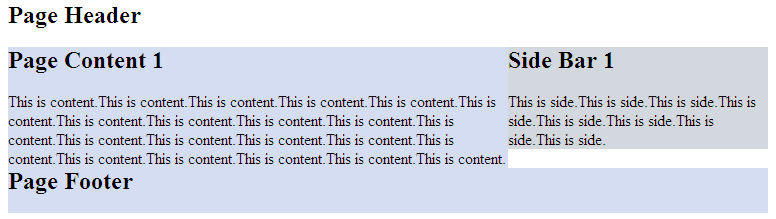
效果图:

正中间的两个div都浮动起来,且包含块的宽度是固定值。Footer清除浮动防止浮动块覆盖。
1-2-1布局(绝对定位)
<html xmlns="http://www.w3.org/1999/xhtml">

<head>

<title>固定宽度-absolute</title>

<style type="text/css">

#header,#footer,#container{

    width: 760px;

    margin: 0 auto;

}

#container{

    position:relative;

}

#content {

    width: 500px;

    margin-right:260px;

    background: #d5ddf3;

}

#side {

    position:absolute;

    top:0;

    right:0;

    width: 260px;

    background: #d2d8de;

}

#footer {

    background: #d5ddf3;

}

</style>

</head>

<body>

    <h2>Page Header</h2>

</div>

<div id="container">

    <div id="content">

        <h2>Page Content 1</h2>

        <p>This is content.This is content.This is content.This is content.This is content.This is content.This is content.This is content.This is content.This is content.This is content.This is content.This is content.This is content.This is content.This is content.This is content.This is content.This is content.This is content.This is content.</p>

    </div>

    <div id="side">

        <h2>Side Bar 1</h2>

        <p>This is side.This is side.This is side.This is side.This is side.This is side.This is side.This is side.</p>

    </div>

</div>

<div id="footer">

        <h2>Page Footer</h2>

</div>

</body>

</html>
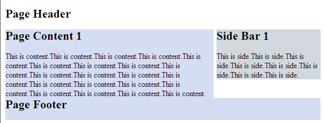
效果图:
但是有一点要注意,由于用绝对定位的块脱离的文档流,当绝对定位块高度小于旁边块高度的时候,会与其他块重叠。
流式布局
<html xmlns="http://www.w3.org/1999/xhtml">

<head>

<title>float</title>

<style type="text/css">

#header,#footer,#container{

    width: 85%;

    margin:0 auto;

}

#content {

    float:left;

    width: 66%;

    background: #d5ddf3;

}

#side {

    float:right;

    width: 33%;

    background: #d2d8de;

}

#footer {

    cleat:both;

    background: #d5ddf3;

}

</style>

</head>

<body>

<div id="header">

    <h2>Page Header</h2>

</div>

<div id="container">

    <div id="content">

        <h2>Page Content 1</h2>

        <p>This is content.This is content.This is content.This is content.This is content.This is content.This is content.This is content.This is content.This is content.This is content.This is content.This is content.This is content.This is content.This is content.This is content.This is content.This is content.This is content.This is content.</p>

    </div>

    <div id="side">

        <h2>Side Bar 1</h2>

        <p>This is side.This is side.This is side.This is side.This is side.This is side.This is side.This is side.</p>

    </div>

</div>

<div id="footer">

        <h2>Page Footer</h2>

</div>

</body>

</html>
效果图:
注意:确保不要使得某列的宽度太大。
另外,百分比布局经常会结合min-width和max-width使用。
CSS常用布局整理的更多相关文章
- CSS常用布局整理(二)
1-2-1单列变宽布局 side列定宽300px,content列变宽,尺寸是100%-300px.核心的问题就是浮动列的宽度应该等于“100% - 300px”,而CSS显然不支持这种带有减法运算的 ...
- CSS常用布局实现方法
CSS 布局对我来说,既熟悉又陌生.我既能实现它,又没有很好的了解它.所以想总结一下,梳理一下 CSS 中常用的一列,两列,三列布局等的实现方法.本文小白,仅供参考.但也要了解下浮动,定位等. 一.一 ...
- css常用布局
1.一列布局 html: <div class="header"></div> <div class="body">< ...
- css 常用布局
「前端那些事儿」③ CSS 布局方案 我们在日常开发中经常遇到布局问题,下面罗列几种常用的css布局方案 话不多说,上代码! 居中布局 以下居中布局均以不定宽为前提,定宽情况包含其中 1.水平居中 a ...
- HTML/CSS 常用单词整理
页面布局(layout) header 头部/页眉: index 首页/索引: logo 标志: nav/sub_nav 导航/子导航: banner 横幅广告: main/content 主体/内容 ...
- CSS常用布局方式-两列布局、三列布局
CSS基础 2.几种布局方式1)table布局 当年主流的布局方式,第一种是通过table tr td布局 示例: <style type="text/css"> ta ...
- html+css 常用布局
1.中间固定宽度,两侧自适应 1.1 flex布局 <!DOCTYPE html><html lang="en"> <head> <met ...
- CSS常用样式整理
元素边框显示圆角:-moz-border-radius适用于火狐浏览器,-webkit-border-radius适用于Safari和Chrome两种浏览器. 浏览器渐变背景颜色: FILTER: p ...
- CSS Flex布局整理
Flex布局 display: flex; 将对象作为弹性伸缩盒展示,用于块级元素 display: inline-flex; 将对象作为弹性伸缩盒展示,用于行内元素 注意兼容问题: webkit内核 ...
随机推荐
- 黄聪:mysql下使用update set from select
UPDATE friends INNER JOIN users ON friends.friendid=users.userid SET friends.friendname=users.userna ...
- MSSQL学习笔记
阅读目录 1.什么是SQL语句 2.使用sql语句创建数据库和表 3.创建数据表 4.数据完整性约束 5.四中基本字符类型说明 6.SQL基本语句 7.类型转换函数 8.日期函数 9.数学函数 10. ...
- UCOS-信号标志组(学习笔记)
信号标志组即根据各任务的信号进行逻辑运算,根据逻辑运算的结果决定是否进行.发送方指定向那个标志组的哪一位(响应位等于1表明向哪一位发)发1还是0.等待逻辑结果的任务指定等待那个标志组的哪几位.这几位按 ...
- Linux防火墙设置(转载)
From:http://www.lupaworld.com/article-219400-1.html (1) 重启后永久性生效: 开启:chkconfig iptables on 关闭:chkcon ...
- jquery validate.addMethod 正则表达式
$(document).ready(function () { /* 设置默认属性 */ $.validator.setDefaults( { submitHandler: function (for ...
- vmware虚拟机挂起后无法再恢复(转)
之前一直使用vmware调试程序,但有一天它被挂起后,就一直无法恢复. 提示: 无法获取该配置文件上的排他锁 另一个VMware进程可能正在使用此配置文件. 后来在google里查了一下,发现其实是一 ...
- 《一课经济学》书摘笔记II
假设有位制衣商了解到,有种机器可以用以往一半的人力生产男式和女式大衣.于是,他购置了这种机器,并且裁掉了一半的员工.这位制衣商由于节省开支而获得了以前没有的利润.他从制衣工人直接工资那里节省下来的每一 ...
- CRM AccessRightsMask
共享后, pincipalobjectaccess会添加一条记录, 共享的权限由AccessRightsMask这个数值决定(Read = 1, Write = 2, Append = 4, Appe ...
- svn: E175002: can not read HTTP status line
问题:eclipse连接svn:https://bdsvn-pc/svn/Project,报错svn: E175002: can not read HTTP status line 解决办法:将域名改 ...
- 查看django里所有的url
>>> from django.core.urlresolvers import get_resolver >>> get_resolver(None).rever ...