Python: 作图
在python中实现数据的可视化,也即作图,一般是依赖matplotlib宏包实现的。但常见的代码中都是加载pylab,是不是这里写错了呀?其实pylib只是matplotlib的一个模块,只是被做成了可以直接调用的形式,所以调用pylab实际上还是调用了matplotlib。pylab的绘图函数和参数名和matlab是非常类似的。鉴于输入法切换的麻烦,在例子源代码中的注释都使用了英文,这并不是从英文网站上拷贝过来的。
import pylab
基本设定
虽说pylab绘图和matlab很类似,但是也有不少的区别之处。
close all;clc;
在matlab作图中,开头最常见的一段就是这行命令,要在python中实现它,可以用下面的命令:
import os

# clc the terminal in ipython script, cls for windows, clear for linux/unix/mac

os.system('cls' if os.name == 'nt' else 'clear')

# close all existing figure windows

pylab.close('all')
如果要进一步实现类似matlab的与图的动态交互,可以添加如下的命令:
# display figures interectively, which will not have to close figures to let the code run. Just like the way matlab plot works!

pylab.ion()
linestyles parameters
pylab.figure(1)

pylab.plot(x, y, linestyle='', linewidth=1, color='red', marker='*')

pylab.show()

['', ' ', 'None', '--', '-.', '-', ':']
小例子:控制字体和坐标点尺寸
# set the fontsize and ticklabel size

import pylab

import numpy

pi=numpy.pi

x=numpy.linspace(0,1,100)

y=numpy.sin(2*pi*10*x)

ax0=pylab.figure()

ax1=pylab.subplot(111)

pylab.plot(x,y,'-*',linewidth=2)

pylab.xlabel('x axis',fontsize=10,color='blue')

pylab.ylabel('y axis',fontsize=20)

pylab.grid('on')

pylab.title('test',fontsize=30)

# set parameters of tick markers

pylab.tick_params(which='major',labelsize=15,width=2,length=10,color='red')

pylab.tick_params(axis='x',colors='red')

pylab.tick_params(which='minor',width=1,length=5)

# control to show the minor tick

pylab.minorticks_on()

# control the color of axis line

ax1.spines['bottom'].set_color('green')

# control the color of ticklabel

pylab.tick_params(axis='x',color='green')

pylab.show()
设定图的尺寸大小[1]
pylab.figure(figsize=(20,10))

#pylab.figure(num=None, figsize=(8, 6), dpi=80, facecolor='w', edgecolor='k')

plot(x,y)

pylab.show()

# use tight layout if the text or edges of the figure are covered

fig.tight_layout()
在图中添加文字标记[2]
import numpy as np

import matplotlib.pyplot as plt

fig = plt.figure()

ax = fig.add_subplot(111)

t = np.arange(0.0, 5.0, 0.01)

s = np.cos(2*np.pi*t)

line, = ax.plot(t, s, lw=2)

ax.annotate('local max', xy=(2, 1), xytext=(3, 1.5),arrowprops=dict(facecolor='black', shrink=0.05))

ax.set_ylim(-2,2)

plt.show()
隐藏legend的窗体[3]
#How to remove the box of the legend?

plt.legend(frameon=False)

#How to change the color of the border of the legend box?

leg = plt.legend()

leg.get_frame().set_edgecolor('b')

#How to remove only the border of the box of the legend?

leg = plt.legend()

leg.get_frame().set_linewidth(0.0)
控制legend位置[5]
legend( ('label1', 'label2', 'label3'), loc='upper left')
add xlim, ylim
pylab.xlim([x1,x2])

pylab.ylim([y1,y2])
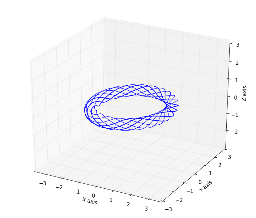
3D绘图并设置坐标轴等距
这里展示一个绘制三维空间曲线的例子,模型是托卡马克中的磁力线分布,其中matlabplotlib的equal axes设置在3D绘图中有缺陷,x,y轴等距离,但是z轴不会等距离,要实现相同的设置需要用到一些人为的设置,下面的代码中用的到设置函数set_axes_equal() 是在StackOverflow中的大神提供的[4]:
# this script will plot the magnetic field line with different q with circular cross section

import numpy

import pylab

from mpl_toolkits.mplot3d import Axes3D

def set_axes_equal(ax):

    '''Make axes of 3D plot have equal scale so that spheres appear as spheres,

    cubes as cubes, etc..  This is one possible solution to Matplotlib's

    ax.set_aspect('equal') and ax.axis('equal') not working for 3D.

    Input

      ax: a matplotlib axis, e.g., as output from plt.gca().

    '''

    x_limits = ax.get_xlim3d()

    y_limits = ax.get_ylim3d()

    z_limits = ax.get_zlim3d()

    x_range = abs(x_limits[1] - x_limits[0])

    x_middle = numpy.mean(x_limits)

    y_range = abs(y_limits[1] - y_limits[0])

    y_middle = numpy.mean(y_limits)

    z_range = abs(z_limits[1] - z_limits[0])

    z_middle = numpy.mean(z_limits)

    # The plot bounding box is a sphere in the sense of the infinity

    # norm, hence I call half the max range the plot radius.

    plot_radius = 0.5*max([x_range, y_range, z_range])

    ax.set_xlim3d([x_middle - plot_radius, x_middle + plot_radius])

    ax.set_ylim3d([y_middle - plot_radius, y_middle + plot_radius])

    ax.set_zlim3d([z_middle - plot_radius, z_middle + plot_radius])

pylab.close()

pylab.ion()

pi=numpy.pi

q=2

R0=2 # big radius unit=m

a=0.3  # small radius unit=m

q=pi    # safety factor

# the parameter function of helix field structure in big cylinder coordinates is:

psi=numpy.linspace(0,10*2*pi,2000)

x=(R0+a*numpy.sin(q*psi))*numpy.cos(psi)

y=(R0+a*numpy.sin(q*psi))*numpy.sin(psi)

z=a*numpy.cos(q*psi)

fig1=pylab.figure()

ax=Axes3D(fig1)

ax.plot3D(x,y,z)

ax.set_xlabel('X axis')

ax.set_ylabel('Y axis')

ax.set_zlabel('Z axis')

# set equal axes length unit

ax.axis('equal')

# apply the function to set equal axis on x,y,z axis

set_axes_equal(ax)

pylab.show()
模拟的结果:
- 变换坐标轴数字为科学计数显示
fig=pylab.figure()

ax1=fig.add_subplot(111)

ax1.plot(R_half,B_half)

pylab.legend(['possitive B(R) distribution'])

pylab.xlim([0,2.3])

pylab.minorticks_on()

pylab.xlabel('R')

pylab.ylabel('B(T)')

ax1.yaxis.set_major_formatter(mtick.FormatStrFormatter('%.1e'))

# 1e means how many rank is kept after decimal point.
注意,需要单独再定义一个subplot是因为ax=pylab.plot(x,y)得到的ax不是图形对象,而只是一个list,所以无法更改axis显示模式。因此需要再使用subplot获得一个对象。
- 对所有图的对象进行统一的字体设定
import matplotlib

import pylab

fig=pylab.figure()

ax1=fig.add_subplot(111)

ax1.plot(x,y)

pylab.legend(['test',])

pylab.title('test')

pylab.xlabel('X label')

pylab.ylabel('Y label')

matplotlib.rcParms.update({'font.size':15})
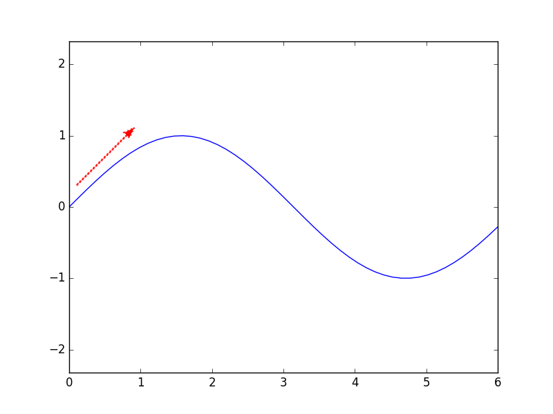
- 绘制箭头
# draw an arrow in the figure

import pylab

import numpy

pi=numpy.pi

x=numpy.linspace(0,6,50)

y=numpy.sin(x)

x0=0.1

y0=0.3

angle=45.0/180.0*pi

r0=1

pylab.figure()

pylab.plot(x,y)

pylab.hold('on')

pylab.arrow(x0,y0,r0*numpy.cos(angle),r0*numpy.sin(angle),r0,linewidth=2,width=0.005,color='red',linestyle=':')

pylab.axis('equal')

pylab.show()
其中width单独控制了箭头的大小
参考:
[1]: Stackoverflow: https://stackoverflow.com/questions/332289/how-do-you-change-the-size-of-figures-drawn-with-matplotlib
[2]: https://matplotlib.org/users/annotations_intro.html
[3]: Stackoverflow: https://stackoverflow.com/questions/25540259/remove-or-adapt-border-of-frame-of-legend-using-matplotlib
[4]: https://stackoverflow.com/questions/13685386/matplotlib-equal-unit-length-with-equal-aspect-ratio-z-axis-is-not-equal-to
[5]: https://stackoverflow.com/questions/10824156/matplotlib-legend-location-numbers
Python: 作图的更多相关文章
- Matlab vs Python 作图
-- Matlab 作图示例 x=-3:0.00003:3; y1=sin(x)./x; y2=x./sin(x); plot(x,y1,x,y2); -- Python 作图示例 import nu ...
- 揽货最短路径解决方案算法 - V2(增加了时间维度-客户允许的服务时间段,C#/JAVA同步实现,带python作图)
继上篇,这里改进增加了客户允许服务的时间范围这个维度,并且把C#版本翻译成java,加强了更加形象的图表展示路径(继续是用python的matplotlib作图). 这里的时间范围维度是指:每个客户都 ...
- Python作图笔记
感谢莫烦大神,附带他的个人网站链接:https://morvanzhou.github.io/ 再带上官方的文档,多看文档啊!不然参数忘了就没地方查了:https://matplotlib.org/a ...
- Python作图包含type3字体解决方案
1. 解决方案 matplotlib.rcParams[‘text.usetex’] = True
- Python中的高级turtle(海龟)作图(续)
四.填色 color 函数有三个参数.第一个参数指定有多少红色,第二个指定有多少绿色,第三个指定有多少蓝色.比如,要得到车子的亮红色,我们用 color(1,0,0),也就是让海龟用百分之百的红色画笔 ...
- 【python】Matplotlib作图常用marker类型、线型和颜色
python作图中常常会考虑用什么颜色.marker.线型,这个资料查了又查,所以自己总结在这个地方,以便常用. 一.常用marker表示 1.普通marker 这类普通marker直接marker ...
- python数据分析开发中的常用整理
Pandas操作 python使用pandas读取csv import pandas as pd #数据筛选 usetTable = pd.read_csv(filename,header = 0) ...
- DocNan博文目录
算法 时频分析:窗口傅立叶变换 数学误区:乘积的求和 MHD simulation with python Linux Linux: Bash基本命令 Linux: 安装和启用firefox浏览器的j ...
- BX谷 2019年最新所有人都能学会的数据分析课视频教程
第一章 数据分析师职业概览 1-1 数据分析师的职业概览免费试学 数据分析师的"钱"景如何 什么人适合学数据分析 数据分析师的临界知识 数据分析师的主要职责 第二章 数据分析和数据 ...
随机推荐
- 使用gnuplot对tpcc-mysql压测结果生成图表
tpcc-mysql的安装:http://www.cnblogs.com/lizhi221/p/6814003.html tpcc-mysql的使用:http://www.cnblogs.com/li ...
- MNIST机器学习
MNIST是一个入门级的计算机视觉数据集,它包含各种手写数字图片: 1. MNIST数据集 MNIST,是不是听起来特高端大气,不知道这个是什么东西? == 手写数字分类问题所要用到的(经典)MNIS ...
- UI—视图的生命周期
- Java IO详解(五)------包装流
File 类的介绍:http://www.cnblogs.com/ysocean/p/6851878.html Java IO 流的分类介绍:http://www.cnblogs.com/ysocea ...
- Windows下安装Nodejs步骤
最近打算把我们的微信端用Vue.js重构,为什么选择Vue.js,一是之前使用的是传统的asp.net mvc,多页面应用用户体验比单页面要差.二是使用过Angular.js,感觉对开发人员要求较 ...
- selenium+python环境的搭建的自动化测试
一.安装python: 我安装的是2.7.13版本的:可以在CMD下 运行python命令查看是否安装python,以及安装版本: 在https://www.python.org/getit/这个地址 ...
- OpenCV探索之路(九):模板匹配
模板匹配的作用在图像识别领域作用可大了.那什么是模板匹配? 模板匹配,就是在一幅图像中寻找另一幅模板图像最匹配(也就是最相似)的部分的技术. 说的有点抽象,下面给个例子说明就很明白了. 在上面这幅全明 ...
- VUE依赖webpack分别给开发环境和生产环境配置不同的常量值并在项目中动态引用
当在开发和产品上线的时候,我们经常会遇到在同一个地方由于环境的不同而地址也不同的情况,这时候如果在代码中将该地址写死,那势必会造成上线时手动改动,多人开发及多处使用该地址难以维护等一系列问题,为避免这 ...
- 【转】HTTP长连接与短连接(2)
一.什么是长连接 HTTP1.1规定了默认保持长连接(HTTP persistent connection ,也有翻译为持久连接),数据传输完成了保持TCP连接不断开(不发RST包.不四次握手),等待 ...
- Hibernate与Jpa的关系(2)
[转自:http://blog.163.com/hero_213/blog/static/398912142010312024809/ ] 近年来ORM(Object-Relational Mappi ...