[转]Android Shape渲染的使用(经典,学习研究不后悔)
感觉好久都没有写博文了,感觉自己变懒了,真对不起…-_-… 也有部分原因是因为我想写的东
西网上已经有了,再加上还有很多方面小马我也正在学习,所以….这段时间一直暂停更新我的博客文
章,看到博客的访问量一天天的增加,很开心 。。。O_O。。。这一阵子也看了各种各样的书籍,技
术类的、非技术类的,也找到了自身很多的不足之处,我会用更多的心思来弥补不足,希望大家一起
努力、加油!
以上是对自己讲的一点废话,现在开始今天的主题,控件渲染Shade(也可以叫着色器,但坏小
马不喜欢这么叫,着色器….怪怪的!)的使用,一直都有在关注这方面的东西,网上也有部分文章写
得不错,但是还是觉得不过瘾,往往都是写一点点自己在工作中使用过的,今天小马就用点心总结下
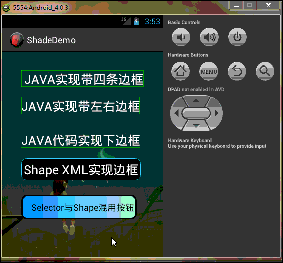
这方面的东西,希望对这块知识有兴趣的帅果、美驴们有所帮助或提高,果断先看效果再一步步看代
码!希望大家仔细看看我在XML及.java中添加的注释,相信你不会后悔花时间在这文章上的,今天的
DEMO效果图如下:
好了,效果看完了,下一步开始看代码吧,亲…….静下心….一步步来!!!
PS:模拟器与eclipse效果中预览的以下部分有点不一样,可能是eclipse与模拟器二者之前存在Bug吧…吼吼….
工程目录如下:

首先,先做个小小的铺垫:
Android提供的Shader类主要是渲染图像以及一些几何图形。
Shader有几个直接子类:
BitmapShader : 主要用来渲染图像
LinearGradient :用来进行线性渲染
RadialGradient : 用来进行环形渲染
SweepGradient : 扫描渐变---围绕一个中心点扫描渐变就像电影里那种雷达扫描,用来梯度渲染。
ComposeShader : 组合渲染,可以和其他几个子类组合起来使用。
小记:Android控件渲染Shade的实现方式有两种,(一、JAVA代码实现;二、XML配置来实现),
小马自己比较偏向XML实现,原因很简单:
1.你代码实现写得再经典,不跑起来效果看不到!
2.跑一遍Android模拟器,思路可以断一大节!(我很笨,经常这样 T_T)!
3.JAVA代码的每个函数参数你也得一个个去啃(老板管效率,不管怎么实现,等你啃完参数时,XML已经看到效果了 O_o ……走起…..)!
4,这是最主要的一点,Eclipse或者I/O大会刚推出的Android Studio,实时显示,我就特别 喜欢立竿见影 ^_^ !
5.二者各有利弊,JAVA代码实现可以动态且灵活滴,XML配置的统一但不杂乱 @_@!!
Now…….. Ladies and 乡亲们,看举一种JAVA代码excmple,其余类型的与之类似,亲们自己“度娘 、谷哥 ”:
LinearGradient是线性渐变,用法如下:
Gradient是基于Shader类,所以我们通过Paint的setShader方法来设置这个渐变,代码如下:
Paint p=new Paint();
LinearGradient lg=newLinearGradien(0,0,100,100,Color.RED,Color.BLUE,Shader.TileMode.MIRROR);
Gradient是基于Shader类,所以我们通过Paint的setShader方法来设置这个渐变,代码如下:
p.setShader(lg);
canvas.drawCicle(0,0,200,p); //参数3为画圆的半径,类型为float型。
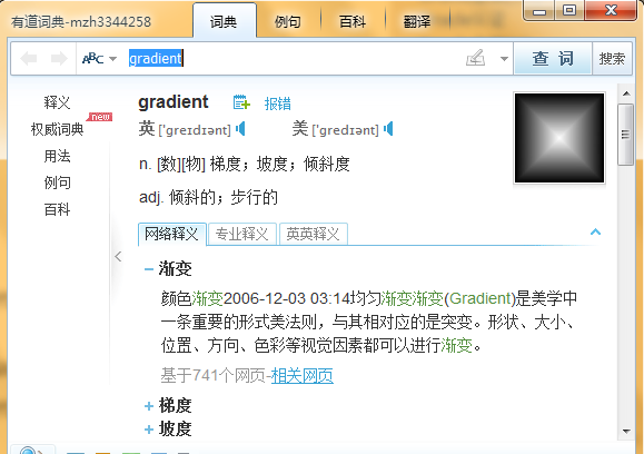
先不说效果了,PS:看着上面的代码,有没有想哭的冲动啊 ? ? ?感觉乱乱的,不知道是什么,然后单词gradient不懂,一查如下(晕),看着挺牛,还是只是个渲染!不管了,继续往下看…
再看XML配置代码,如下:
一:主布局文件代码如下(为了方便,布局是直接拖的,大家不用太关注):
|
1
2
3
4
5
6
7
8
9
10
11
12
13
14
15
16
17
18
19
20
21
22
23
24
25
26
27
28
29
30
31
32
33
34
35
36
37
38
39
40
41
42
43
44
45
46
47
48
49
50
51
52
53
54
55
56
57
58
59
60
61
62
63
|
<RelativeLayout xmlns:android="http://schemas.android.com/apk/res/android" xmlns:tools="http://schemas.android.com/tools" android:layout_width="match_parent" android:layout_height="match_parent" android:background="@drawable/background" android:paddingBottom="@dimen/activity_vertical_margin" android:paddingLeft="@dimen/activity_horizontal_margin" android:paddingRight="@dimen/activity_horizontal_margin" android:paddingTop="@dimen/activity_vertical_margin" tools:context=".MainActivity" > <com.xiaoma.shadedemo.TextViewBorder android:id="@+id/textView1" android:layout_width="wrap_content" android:layout_height="wrap_content" android:layout_alignParentLeft="true" android:layout_alignParentTop="true" android:layout_marginLeft="22dp" android:layout_marginTop="20dp" android:text=" JAVA实现带四条边框" android:textColor="@android:color/white" android:textSize="25sp" /> <com.xiaoma.shadedemo.TextViewBorderLeftRight android:id="@+id/TextViewBorder01" android:layout_width="wrap_content" android:layout_height="wrap_content" android:textColor="@android:color/white" android:layout_alignLeft="@+id/textView1" android:layout_below="@+id/textView1" android:layout_marginTop="20dp" android:text="JAVA实现带左右边框" android:textSize="25sp" /> <com.xiaoma.shadedemo.TextViewBorderUnder android:id="@+id/TextViewBorder02" android:layout_width="wrap_content" android:layout_height="wrap_content" android:layout_alignLeft="@+id/TextViewBorder01" android:textColor="@android:color/white" android:layout_below="@+id/TextViewBorder01" android:layout_marginTop="33dp" android:text="JAVA代码实现下边框" android:textSize="25sp" /> <TextView android:id="@+id/TextViewBorderUnder01" android:layout_width="wrap_content" android:layout_height="wrap_content" android:layout_alignLeft="@+id/button1" android:layout_below="@+id/TextViewBorder02" android:layout_marginTop="20dp" android:text="Shape XML实现边框" android:background="@drawable/shape_test" android:textColor="@android:color/white" android:textSize="25sp" /> <Button android:id="@+id/button1" android:layout_width="wrap_content" android:layout_height="wrap_content" android:layout_alignLeft="@+id/TextViewBorder02" android:layout_below="@+id/TextViewBorderUnder01" android:layout_marginTop="29dp" android:background="@drawable/shape_selector" android:text="Selector与Shape混用按钮" android:textColor="@android:color/black" /></RelativeLayout> |
二:上面布局中使用的自定义控件代码及Shape渲染代码分别如下:
2.1:JAVA实现带四条边框(自定义TextView JAVA代码一)
|
1
2
3
4
5
6
7
8
9
10
11
12
13
14
15
16
17
18
19
20
21
22
23
24
25
26
27
28
29
30
31
32
33
34
35
36
37
38
39
40
41
42
43
44
45
46
47
48
49
50
51
52
53
54
55
56
57
58
59
60
61
62
63
64
65
66
67
68
69
70
71
72
73
74
75
76
77
78
79
80
81
82
83
84
85
86
87
88
89
90
91
92
93
94
95
96
97
98
99
100
|
package com.xiaoma.shadedemo;import android.content.Context;import android.graphics.Canvas;import android.graphics.Color;import android.graphics.Paint;import android.util.AttributeSet;import android.widget.TextView;public class TextViewBorder extends TextView{ /** * 下面两个方法在构造时需注意: 一:如果是XML文件加载的方式使用自定义控件到布局中是用以下方式, 二:如果是用纯代码的方式加载自定义的控制到而已中时用第二种方式 */ // 方式一: public TextViewBorder(Context context, AttributeSet attrs) { super(context, attrs); } // 方式二: /* * public TextViewBorder(Context context) { // TODO Auto-generated constructor stub super(context); } */ /** * 1. Rect对象 一个区域对象Rect(left, top, right, bottom) , 是一个左闭右开的区域, 即是说使用 Rect.contains(left, top)为true, * Rect.contains(right, bottom)为false 2. drawLine方法 drawLine(float startX, float startY, float stopX, float stopY, * Paint paint) 也是一个左闭右开的区间,只会绘制到stopX-1,stopY-1 3. drawRect(Rect r, Paint paint) 当绘制空心矩形时,绘制的是一个左闭右闭的区域 * 验证方法:下面就是可以验证左闭右开的区间方法,现在知道为什么要-1 了 */ @Override protected void onDraw(Canvas canvas) { super.onDraw(canvas); Paint paint = new Paint(); paint.setAntiAlias(true); paint.setColor(Color.GREEN); canvas.drawLine(0, 0, this.getWidth() - 1, 0, paint);// 绘制上边框 canvas.drawLine(0, 0, 0, this.getHeight() - 1, paint); // 绘制左边框 canvas.drawLine(this.getWidth() - 1, 0, this.getWidth() - 1, this.getHeight() - 1, paint); // 绘制右边框 canvas.drawLine(0, this.getHeight() - 1, this.getWidth() - 1, this.getHeight() - 1, paint);// 绘制下边框 } /* * 1. Rect对象 * * 一个区域对象Rect(left, top, right, bottom) , 是一个左闭右开的区域,即是说使用 Rect.contains(left, top)为true, Rect.contains(right, * bottom)为false * * 2.drawLine方法 * * drawLine(float startX, float startY, float stopX, float stopY, Paint paint) 也是一个左闭右开的区间,只会绘制到stopX-1,stopY-1 * * 验证方法: * * Canvas c = canvas; paint.setColor(Color.RED); c.drawLine(x, y, x+c.getWidth()-1, y, paint); c.drawLine(x, * y+height-1, x+c.getWidth(), y+height-1, paint); paint.setColor(Color.BLUE); c.drawPoint(x+c.getWidth()-1, y, * paint); 说明drawLine是没有绘制到右边最后一个点的 * * 3.drawRect(Rect r, Paint paint) * * 当绘制空心矩形时,绘制的是一个左闭右闭的区域 * * 验证方法: * * rect.set(x, y, x+width, y+height); paint.setStyle(Style.STROKE); paint.setColor(Color.BLUE); c.drawRect(rect, * paint); paint.setColor(Color.RED); c.drawLine(x, y, x+width, y, paint); c.drawLine(x, y+height, x+width, * y+height, paint); c.drawLine(x, y, x, y+height, paint); c.drawLine(x+width, y, x+width, y+height, paint); * 当绘制实心矩形时,绘制的是一个左闭右开的区域 * * 验证方法: * * rect.set(x, y, x+width, y+height); paint.setColor(Color.RED); c.drawLine(x, y, x+width, y, paint); c.drawLine(x, * y+height, x+width, y+height, paint); c.drawLine(x, y, x, y+height, paint); c.drawLine(x+width, y, x+width, * y+height, paint); paint.setStyle(Style.FILL); paint.setColor(Color.BLUE); c.drawRect(rect, paint); * 这个规则跟j2me也是一样的,在j2me里,drawRect长宽会多画出1px。SDK的说明是: * * The resulting rectangle will cover an area (width + 1) pixels wide by (height + 1) pixels tall. If either width * or height is less than zero, nothing is drawn. * * 例如drawRect(10,10,100,1)绘制,结果是一个2px高的矩形,用fillRect(10,10,100,1),结果是一个1px高的矩形 * * 以上就是对Android绘图的具体介绍。 */ }/** * 在布局文件中引用 这样引用就行了..吼吼 <com.xiaoma.shadedemo.TextViewBorder android:id="@+id/a02_txtKSSJ" android:textColor="#000000" * android:layout_marginLeft="10dip" android:layout_width="100dip" android:layout_height="wrap_content" /> */ |
2.2:JAVA实现带左右边框(自定义TextView JAVA代码二)
|
1
2
3
4
5
6
7
8
9
10
11
12
13
14
15
16
17
18
19
20
21
22
23
24
25
26
27
28
29
30
31
32
33
34
35
36
37
38
39
40
41
42
43
44
45
46
47
48
49
50
51
52
53
54
55
56
57
58
59
60
61
62
63
64
65
66
67
68
69
70
71
72
73
74
75
76
77
78
79
80
81
82
83
84
85
86
87
88
89
90
91
92
93
94
95
96
97
98
99
100
101
102
|
package com.xiaoma.shadedemo;import android.content.Context;import android.graphics.Canvas;import android.graphics.Color;import android.graphics.Paint;import android.util.AttributeSet;import android.widget.TextView;public class TextViewBorderLeftRight extends TextView{ /** * 下面两个方法在构造时需注意: 一:如果是XML文件加载的方式使用自定义控件到布局中是用以下方式, 二:如果是用纯代码的方式加载自定义的控制到而已中时用第二种方式 */ // 方式一: public TextViewBorderLeftRight(Context context, AttributeSet attrs) { super(context, attrs); } // 方式二: /* * public TextViewBorder(Context context) { // TODO Auto-generated constructor stub super(context); } */ /** * 1. Rect对象 一个区域对象Rect(left, top, right, bottom) , 是一个左闭右开的区域, 即是说使用 Rect.contains(left, top)为true, * Rect.contains(right, bottom)为false 2. drawLine方法 drawLine(float startX, float startY, float stopX, float stopY, * Paint paint) 也是一个左闭右开的区间,只会绘制到stopX-1,stopY-1 3. drawRect(Rect r, Paint paint) 当绘制空心矩形时,绘制的是一个左闭右闭的区域 * 验证方法:下面就是可以验证左闭右开的区间方法,现在知道为什么要-1 了 */ @Override protected void onDraw(Canvas canvas) { super.onDraw(canvas); Paint paint = new Paint(); paint.setAntiAlias(true); paint.setColor(Color.GREEN); canvas.drawLine(0, 0, 0, getHeight(), paint); // canvas.drawLine(getWidth(), 0, getWidth() - 1, getHeight() - 1, paint); canvas.drawLine(this.getWidth() - 1, 0, this.getWidth() - 1, this.getHeight() - 1, paint); // canvas.drawLine(0, 0, 0, this.getHeight() - 1, paint); // canvas.drawLine(this.getWidth() - 1, 0, this.getWidth() - 1, this.getHeight() - 1, paint); // canvas.drawLine(0, this.getHeight() - 1, this.getWidth() - 1, this.getHeight() - 1, paint); } /* * 1. Rect对象 * * 一个区域对象Rect(left, top, right, bottom) , 是一个左闭右开的区域,即是说使用 Rect.contains(left, top)为true, Rect.contains(right, * bottom)为false * * 2.drawLine方法 * * drawLine(float startX, float startY, float stopX, float stopY, Paint paint) 也是一个左闭右开的区间,只会绘制到stopX-1,stopY-1 * * 验证方法: * * Canvas c = canvas; paint.setColor(Color.RED); c.drawLine(x, y, x+c.getWidth()-1, y, paint); c.drawLine(x, * y+height-1, x+c.getWidth(), y+height-1, paint); paint.setColor(Color.BLUE); c.drawPoint(x+c.getWidth()-1, y, * paint); 说明drawLine是没有绘制到右边最后一个点的 * * 3.drawRect(Rect r, Paint paint) * * 当绘制空心矩形时,绘制的是一个左闭右闭的区域 * * 验证方法: * * rect.set(x, y, x+width, y+height); paint.setStyle(Style.STROKE); paint.setColor(Color.BLUE); c.drawRect(rect, * paint); paint.setColor(Color.RED); c.drawLine(x, y, x+width, y, paint); c.drawLine(x, y+height, x+width, * y+height, paint); c.drawLine(x, y, x, y+height, paint); c.drawLine(x+width, y, x+width, y+height, paint); * 当绘制实心矩形时,绘制的是一个左闭右开的区域 * * 验证方法: * * rect.set(x, y, x+width, y+height); paint.setColor(Color.RED); c.drawLine(x, y, x+width, y, paint); c.drawLine(x, * y+height, x+width, y+height, paint); c.drawLine(x, y, x, y+height, paint); c.drawLine(x+width, y, x+width, * y+height, paint); paint.setStyle(Style.FILL); paint.setColor(Color.BLUE); c.drawRect(rect, paint); * 这个规则跟j2me也是一样的,在j2me里,drawRect长宽会多画出1px。SDK的说明是: * * The resulting rectangle will cover an area (width + 1) pixels wide by (height + 1) pixels tall. If either width * or height is less than zero, nothing is drawn. * * 例如drawRect(10,10,100,1)绘制,结果是一个2px高的矩形,用fillRect(10,10,100,1),结果是一个1px高的矩形 * * 以上就是对Android绘图的具体介绍。 */ }/** * 在布局文件中引用 这样引用就行了..吼吼 <com.xiaoma.shadedemo.TextViewBorder android:id="@+id/a02_txtKSSJ" android:textColor="#000000" * android:layout_marginLeft="10dip" android:layout_width="100dip" android:layout_height="wrap_content" /> */ |
2.3:JAVA代码实现下边框(自定义TextView JAVA代码三)
|
1
2
3
4
5
6
7
8
9
10
11
12
13
14
15
16
17
18
19
20
21
22
23
24
25
26
27
28
29
30
31
32
33
34
35
36
37
38
39
40
41
42
43
44
45
46
47
48
49
50
51
52
53
54
55
56
57
58
59
60
61
62
63
64
65
66
67
68
69
70
71
72
73
74
75
76
77
78
79
80
81
82
83
84
85
86
87
88
89
90
91
92
93
94
95
96
97
98
99
100
|
package com.xiaoma.shadedemo;import android.content.Context;import android.graphics.Canvas;import android.graphics.Color;import android.graphics.Paint;import android.util.AttributeSet;import android.widget.TextView;public class TextViewBorderUnder extends TextView{ /** * 下面两个方法在构造时需注意: 一:如果是XML文件加载的方式使用自定义控件到布局中是用以下方式, 二:如果是用纯代码的方式加载自定义的控制到而已中时用第二种方式 */ // 方式一: public TextViewBorderUnder(Context context, AttributeSet attrs) { super(context, attrs); } // 方式二: /* * public TextViewBorder(Context context) { // TODO Auto-generated constructor stub super(context); } */ /** * 1. Rect对象 一个区域对象Rect(left, top, right, bottom) , 是一个左闭右开的区域, 即是说使用 Rect.contains(left, top)为true, * Rect.contains(right, bottom)为false 2. drawLine方法 drawLine(float startX, float startY, float stopX, float stopY, * Paint paint) 也是一个左闭右开的区间,只会绘制到stopX-1,stopY-1 3. drawRect(Rect r, Paint paint) 当绘制空心矩形时,绘制的是一个左闭右闭的区域 * 验证方法:下面就是可以验证左闭右开的区间方法,现在知道为什么要-1 了 */ @Override protected void onDraw(Canvas canvas) { super.onDraw(canvas); Paint paint = new Paint(); paint.setAntiAlias(true); paint.setColor(Color.GREEN); // canvas.drawLine(0, 0, this.getWidth() - 1, 0, paint); // canvas.drawLine(0, getHeight(), getWidth() - 1, getHeight(), paint); // canvas.drawLine(this.getWidth() - 1, 0, this.getWidth() - 1, this.getHeight() - 1, paint); canvas.drawLine(0, getHeight() - 1, getWidth() - 1, getHeight() - 1, paint); } /* * 1. Rect对象 * * 一个区域对象Rect(left, top, right, bottom) , 是一个左闭右开的区域,即是说使用 Rect.contains(left, top)为true, Rect.contains(right, * bottom)为false * * 2.drawLine方法 * * drawLine(float startX, float startY, float stopX, float stopY, Paint paint) 也是一个左闭右开的区间,只会绘制到stopX-1,stopY-1 * * 验证方法: * * Canvas c = canvas; paint.setColor(Color.RED); c.drawLine(x, y, x+c.getWidth()-1, y, paint); c.drawLine(x, * y+height-1, x+c.getWidth(), y+height-1, paint); paint.setColor(Color.BLUE); c.drawPoint(x+c.getWidth()-1, y, * paint); 说明drawLine是没有绘制到右边最后一个点的 * * 3.drawRect(Rect r, Paint paint) * * 当绘制空心矩形时,绘制的是一个左闭右闭的区域 * * 验证方法: * * rect.set(x, y, x+width, y+height); paint.setStyle(Style.STROKE); paint.setColor(Color.BLUE); c.drawRect(rect, * paint); paint.setColor(Color.RED); c.drawLine(x, y, x+width, y, paint); c.drawLine(x, y+height, x+width, * y+height, paint); c.drawLine(x, y, x, y+height, paint); c.drawLine(x+width, y, x+width, y+height, paint); * 当绘制实心矩形时,绘制的是一个左闭右开的区域 * * 验证方法: * * rect.set(x, y, x+width, y+height); paint.setColor(Color.RED); c.drawLine(x, y, x+width, y, paint); c.drawLine(x, * y+height, x+width, y+height, paint); c.drawLine(x, y, x, y+height, paint); c.drawLine(x+width, y, x+width, * y+height, paint); paint.setStyle(Style.FILL); paint.setColor(Color.BLUE); c.drawRect(rect, paint); * 这个规则跟j2me也是一样的,在j2me里,drawRect长宽会多画出1px。SDK的说明是: * * The resulting rectangle will cover an area (width + 1) pixels wide by (height + 1) pixels tall. If either width * or height is less than zero, nothing is drawn. * * 例如drawRect(10,10,100,1)绘制,结果是一个2px高的矩形,用fillRect(10,10,100,1),结果是一个1px高的矩形 * * 以上就是对Android绘图的具体介绍。 */ }/** * 在布局文件中引用 这样引用就行了..吼吼 <com.xiaoma.shadedemo.TextViewBorder android:id="@+id/a02_txtKSSJ" android:textColor="#000000" * android:layout_marginLeft="10dip" android:layout_width="100dip" android:layout_height="wrap_content" /> */ |
2.4:Shape XML实现边框(XML代码)
|
1
2
3
4
5
6
7
8
9
10
11
12
13
14
15
16
17
|
<?xml version="1.0" encoding="utf-8"?><shape xmlns:android="http://schemas.android.com/apk/res/android" > <!-- <solid android:color="#cceeff"/> 直接写这个的话,可以给控制添加一个整体的背景哦 --> <stroke android:width="0.5dp" android:color="#22ccff" /> <padding android:left="5dp" android:top="5dp" android:right="5dp" android:bottom="5dp"/> <size android:height="0.5dp" android:width="5dp" /> <!-- 目前没有什么用,可删除,留在这个地方防止乱猜 --> <corners android:radius="10dp" /> <!-- 这个radius里面的值需要个整型,单位用dp,用其它单位亦无影响 --> </shape> |
2.5:Selector与Shape混用控件效果实现
|
1
2
3
4
5
6
7
8
9
10
11
12
13
14
15
16
17
18
19
20
21
22
23
24
25
26
27
28
29
30
31
32
33
34
35
36
37
38
39
40
41
42
43
44
45
46
47
48
49
50
51
52
|
<?xml version="1.0" encoding="utf-8"?><selector xmlns:android="http://schemas.android.com/apk/res/android"> <!-- 今天主要讲的是shape渲染,shape主要类型分四种,效果如下,我们常用rectangle,也就是矩形渲染,其它的都太丑了!! --> <item android:state_pressed="true"> <!--按钮按下时的渲染效果 --> <shape android:shape="oval"> <corners android:radius="10dp" /> <!-- 四个角的角度 --> <!--gradient就是梯度渲染,简单说就是颜色渐变,type为渐变方式,总共三种 linear sweep ridial,常用linear--> <gradient android:endColor="#eebbbb" android:startColor="#9900ee" android:type="linear" /> <!-- padding属性是指定内容与控件边距,这个地方小马专门将距左边距设置较大,方便观察 --> <padding android:bottom="5dp" android:left="20dp" android:right="5dp" android:top="5dp" /> <!-- solid填充整个区域,颜色为FFDDFF,如果使用整个区域填充的话,上面的gradient梯度会失效,即:覆盖 --> <!-- <solid android:color="#FFDDFF"/> --> <!-- stroke为需要填充的边框,指定颜色及边框宽度 --> <stroke android:width="3dp" android:color="#000000" /> </shape> <!-- <clip android:clipOrientation="vertical" android:gravity="right" android:drawable="@drawable/ic_launcher" /> --><!-- 试了下没用 --> <!-- <color android:color="#223344"/> --> <!-- <scale android:scaleWidth="15dp" android:scaleHeight=" 5dp" android:scaleGravity="center" /> --> </item> <item> <!-- 默认 --> <shape android:shape="rectangle"> <corners android:radius="10dp" /> <!-- 四个角的角度 --> <!--gradient就是梯度渲染,简单说就是颜色渐变,type为渐变方式,总共三种 linear sweep ridial,常用linear--> <!-- 这个地方一定注意,在使用gradient标签中使用android:type的前提是必须android:gradientRadius="20dp"已经设置,否则会报错 --> <gradient android:endColor="#acefda" android:startColor="#0099ff" android:type="linear" /> <!-- padding属性是指定内容与控件边距,这个地方小马专门将距左边距设置较大,方便观察 --> <padding android:bottom="5dp" android:left="20dp" android:right="5dp" android:top="5dp" /> <!-- solid填充整个区域,颜色为FFDDFF,如果使用整个区域填充的话,上面的gradient梯度会失效,即:覆盖 --> <!-- <solid android:color="#FFDDFF"/> --> <!-- stroke为需要填充的边框,指定颜色及边框宽度 --> <stroke android:width="3dp" android:color="#000000" /> </shape> </item> </selector> |
怎么样?看着JAVA自定义TextView代码是不是觉得特别的繁琐?今天的主题就是来解决这个问题的....…^_^.........下面着重来讲一下Selector与Shape混用控件效果Selector实现的细节,(请仔细看下XML里面的注释 O_O)
每个Item过是由Shape来进行渲染生成最终的效果,首先来看根Shape节点的常用属性<shape android:shape="rectangle">:
这个shape属性总共分三种 rectangle(矩形)、oval(椭圆) 、line(删除线)、ring(铃,这个存在不知道有什么意义),其效果分别如下:
1.rectangle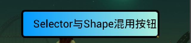
2.oval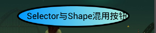
3.line
4.ring

其中,gradient标签中的type为渐变方式,总共三种 linear sweep ridial,常用linear,其效果分别为(注意:ridial试了无任何效果 T_T)
1.linear效果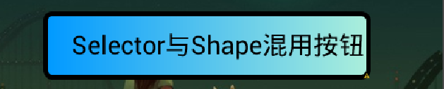
2.sweep效果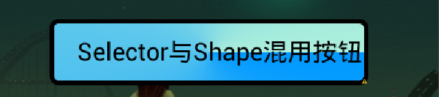
好了,代码及整体效果已经分解完毕了,如果认真从头到尾的看一边的话,肯定有所收获的,对了,以上的Shape渲染写好了,可以在任意控件上使用…不限于TextView,上面的例子只是拿TextView来开刀用的…大家别误会,呵呵….^_^…. ,最后,小马希望在文章中有什么不清楚或不明白或有错误的地方,请大家直接指出…有错必改的….这个源码小马已经上传到附件中,有兴趣或有用的朋友可以直接下载来跑跑改改看,有批评才有进步,希望有什么不好的,直接指出….在此先谢谢大家啦….
官网参考链接如下(只是没效果图,所以大家也懒得去看这个东西)
http://developer.android.com/guide/topics/resources/drawable-resource.html
这段时间也有在关注各种各样的东西,老听人说学这学那的人越来越多什么的,也希望大家不要随便听人家讲,我敢说….安卓虽然在很多人眼里看来简单、烂,但我觉得如果要深入的话,水还是很深的,如果用心,一定可以做的越来越好的,一步一步来,大家一起努力!做安卓的人越来越多,越有竞争!越有动力!!!这样才会进步!哈哈….加油加油加油! O_O
本文出自 “酷_莫名简单、KNothing” 博客,请务必保留此出处http://mzh3344258.blog.51cto.com/1823534/1215749
[转]Android Shape渲染的使用(经典,学习研究不后悔)的更多相关文章
- android shape总结 和控制的风格定制
1:shape总结 1):shape文件是放置在drawable文件下的.res/drawable/filename.xml. 2):shape类型:android:shape. 一共同拥有四种:re ...
- 转载_2012年的Android之旅:梦想、学习、坚持、自信、淡定
原文地址:http://blog.csdn.net/luoshengyang/article/details/8452527 2012年的Android之旅:梦想.学习.坚持.自信.淡定.. ---- ...
- android:shape属性详解
这一类的shape定义在xml中 file location: res/drawable/filename.xml The filename is used as the resource ID.(这 ...
- CSharpGL(34)以从零编写一个KleinBottle渲染器为例学习如何使用CSharpGL
CSharpGL(34)以从零编写一个KleinBottle渲染器为例学习如何使用CSharpGL +BIT祝威+悄悄在此留下版了个权的信息说: 开始 本文用step by step的方式,讲述如何使 ...
- Android M Permission 运行时权限 学习笔记
Android M Permission 运行时权限 学习笔记 从Android 6.0开始, 用户需要在运行时请求权限, 本文对运行时权限的申请和处理进行介绍, 并讨论了使用运行时权限时新老版本的一 ...
- android shape使用总结
今天使用到shape,这个里面有很多属性,在这里我记录一下各个属性的使用的情况以及所代表的意思 <?xml version="1.0" encoding="utf- ...
- android:shape
android:shape=["rectangle" | "oval" | "line" | "ring"] shape ...
- Android 服务类Service 的详细学习
http://blog.csdn.net/vipzjyno1/article/details/26004831 Android服务类Service学习四大组建 目录(?)[+] 什么是服务 服务有 ...
- Android shape的使用(圆角矩形)
<?xml version="1.0" encoding="utf-8"?> <shape xmlns:android="http: ...
随机推荐
- Linux vim编辑器
1.工作模式 命令模式(a,i,o等键)——>输入模式 输入模式(Esc键)——>命令模式 命令模式(:键)——>末行模式 末行模式(Esc键)——>命令模式 2.vim使用命 ...
- OAuth流程
简介 OAuth是一种协议,OAuth协议为用户资源的授权提供了一个安全的.开放而又简易的标准 第三方若想访问用户资源,就必须遵守服务提供商实现的OAuth协议 OAuth授权的步骤(新浪微博为例) ...
- Openjudge-计算概论(A)-求一元二次方程的根
描述: 利用公式x1 = (-b + sqrt(b*b-4*a*c))/(2*a), x2 = (-b - sqrt(b*b-4*a*c))/(2*a)求一元二次方程ax2 + bx + c =0的根 ...
- 【其他】MySql数据库的安装与卸载
一.安装 1.首先下载安装包,包含服务端和客户端 2.添加用户组.用户 secondary1:~ # groupadd mysql secondary1:~ # useradd -g mysql -d ...
- Python 邮件发送
python发送各类邮件的主要方法 python中email模块使得处理邮件变得比较简单,今天着重学习了一下发送邮件的具体做法,这里写写自己的的心得,也请高手给些指点. 一.相关模块介绍 ...
- 缓存HA的开源解决方案
1) Twitter的Redis/Memcached代理服务:Twemproxy 2) Facebook的Memcached协议路由器:McRouter 3) Youtube的Mysql中间件:Vit ...
- 1010 Robot Motion
Problem Description A robot has been programmed to follow the instructions in its path. Instructions ...
- 关于css的hack问题
<!--[if <keywords>? IE <version>?]> HTML代码块 <![endif]--> 取值: <keywords> ...
- wordpress建站过程3——header.php
header.php中包含了一个页面的页头,也就是其他页面中重复出现的部分,包括用户登陆/登陆后显示的文字,导航条,网页logo,有的还包括轮播图. 下面就简单的贴上一个文件吧. <!DOCTY ...
- jquery-图片轮播(新手请大神指教一下)
这是我刚学jquery写的,感觉效果不是很好. #scrollPics{ height: 330px; width: 980px; margin-bottom: 10px; overflow: hid ...