CSS3 笔记四(Transforms/Transition/Animations)
CSS3 2D Transforms Methods
translate()rotate()scale()skewX()skewY()matrix()
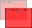
1> translate()
- The
translate()method moves an element from its current position (according to the parameters given for the X-axis and the Y-axis).
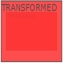
2> rotate()
- The
rotate()method rotates an element clockwise or counter-clockwise according to a given degree.
Example
 div {

     -ms-transform: rotate(20deg); /* IE 9 */

     -webkit-transform: rotate(20deg); /* Safari */

     transform: rotate(20deg);

 }
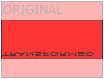
3> scale()
- The
scale()method increases or decreases the size of an element (according to the parameters given for the width and height).
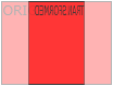
4> skewX(沿X轴形变)
- The
skewX()method skews an element along the X-axis by the given angle.
5> skewY(沿Y轴形变)
- The
skewY()method skews an element along the Y-axis by the given angle.
6> skew(沿X和Y轴形变)
- The
skew()method skews an element along the X and Y-axis by the given angles.
7> matrix()
- The
matrix()method combines all the 2D transform methods into one.
Example
 div {

     -ms-transform: matrix(1, -0.3, 0, 1, 0, 0); /* IE 9 */

     -webkit-transform: matrix(1, -0.3, 0, 1, 0, 0); /* Safari */

     transform: matrix(1, -0.3, 0, 1, 0, 0);

 }
CSS3 3D Transforms
rotateX()rotateY()rotateZ()
1> rotateX()
- The
rotateX()method rotates an element around its X-axis at a given degree.
2> rotateY()
- The
rotateY()method rotates an element around its Y-axis at a given degree.
3> rotateZ()
- The
rotateZ()method rotates an element around its Z-axis at a given degree:
Example
 div {

     -webkit-transform: rotateZ(90deg); /* Safari */

     transform: rotateZ(90deg);

 }
CSS3 Transitions
- Specify the CSS property you want to add an effect to.
- Specify the duration of the effect.
Note: If the duration part is not specified, the transition will have no effect, because the default value is 0.
syntax
transition: property duration timing-function delay|initial|inherit;
Example
 input[type=text] {

     width: 100px;

     -webkit-transition: ease-in-out, width .35s ease-in-out; /* Safari 3.1 to 6.0 */

     transition: width .35s ease-in-out;

 }

 input[type=text]:focus {

     width: 250px;

 }
1> transition-property
- Specify the name of the CSS property
syntax
transition-property: none|all|property|initial|inherit;
Example
 div {

     -webkit-transition-property: width, height; /* Safari */

     transition-property: width, height;

 }

 div:hover {

     width: 300px;

     height: 300px;

 }
2> transition-duration
- Specifies how many seconds (s) or milliseconds (ms) a transition effect takes to complete.
syntax
transition-duration: time|initial|inherit;
Example
 div {

     -webkit-transition-duration: 5s; /* Safari */

     transition-duration: 5s;

 }
3> transition-delay
- The transition-delay property specifies when the transition effect will start.
- The transition-delay value is defined in seconds (s) or milliseconds (ms).
syntax
transition-delay: time|initial|inherit;
Example
 div {

     -webkit-transition-delay: 2s; /* Safari */

     transition-delay: 2s;

 }
4> transition-timing-function
- The transition-timing-function property specifies the speed curve of the transition effect.
- This property allows a transition effect to change speed over its duration.
syntax
transition-timing-function: ease|linear|ease-in|ease-out|ease-in-out|cubic-bezier()|initial|inherit;
| Value | Description |
|---|---|
| ease | Default value. Specifies a transition effect with a slow start, then fast, then end slowly (equivalent to cubic-bezier(0.25,0.1,0.25,1)) |
| linear | Specifies a transition effect with the same speed from start to end (equivalent to cubic-bezier(0,0,1,1)) |
| ease-in | Specifies a transition effect with a slow start (equivalent to cubic-bezier(0.42,0,1,1)) |
| ease-out | Specifies a transition effect with a slow end (equivalent to cubic-bezier(0,0,0.58,1)) |
| ease-in-out | Specifies a transition effect with a slow start and end (equivalent to cubic-bezier(0.42,0,0.58,1)) |
| cubic-bezier(n,n,n,n) | Define your own values in the cubic-bezier function. Possible values are numeric values from 0 to 1 |
| initial | Sets this property to its default value. |
| inherit | Inherits this property from its parent element. |
Example
 /* For Safari 3.1 to 6.0 */

 #div1 {-webkit-transition-timing-function: linear;}

 #div2 {-webkit-transition-timing-function: ease;}

 #div3 {-webkit-transition-timing-function: ease-in;}

 #div4 {-webkit-transition-timing-function: ease-out;}

 #div5 {-webkit-transition-timing-function: ease-in-out;}

 /* Standard syntax */

 #div1 {transition-timing-function: linear;}

 #div2 {transition-timing-function: ease;}

 #div3 {transition-timing-function: ease-in;}

 #div4 {transition-timing-function: ease-out;}

 #div5 {transition-timing-function: ease-in-out;}
CSS3 Animations
1> animation
syntax
animation: name duration timing-function delay iteration-count direction fill-mode play-state;
Example
 div {

     -webkit-animation: mymove 5s infinite; /* Chrome, Safari, Opera */

     animation: mymove 5s infinite;

 }
2> animation-name
- The animation-name property specifies a name for the @keyframes animation.
syntax
animation-name: keyframename|none|initial|inherit;
Example
 /* The animation code */

 @keyframes mymove {

     from {background-color: red;}

     to {background-color: yellow;}

 }

 /* The element to apply the animation to */

 div {

     width: 100px;

     height: 100px;

     background-color: red;

     animation-name: mylove;

     animation-duration: 4s;

 }
3> animation-duration
syntax
animation-duration: time|initial|inherit;
4> animation-timing-function
syntax
animation-timing-function: linear|ease|ease-in|ease-out|cubic-bezier(n,n,n,n)|initial|inherit;
5> animation-delay
syntax
animation-delay: time|initial|inherit;
6> animation-iteration-count
- The animation-iteration-count property specifies the number of times an animation should be played.
syntax
animation-iteration-count: number|infinite|initial|inherit;
7> animation-direction
syntax
animation-direction: normal|reverse|alternate|alternate-reverse|initial|inherit;
?? 8> animation-fill-mode
- The animation-fill-mode property specifies a style for the element when the animation is not playing (when it is finished, or when it has a delay).
syntax
animation-fill-mode: none|forwards|backwards|both|initial|inherit;
9> animation-play-state
- The animation-play-state property specifies whether the animation is running or paused.
syntax
animation-play-state: paused|running|initial|inherit;
Example
 div {

     width: 100px;

     height: 100px;

     background: red;

     position: relative;

     -webkit-animation: mymove 5s infinite;  /* Chrome, Safari, Opera */

     animation: mymove 5s infinite;

 }

 div:hover {

     -webkit-animation-play-state: paused;  /* Chrome, Safari, Opera */

     animation-play-state: paused;

 }

 /* Chrome, Safari, Opera */

 @-webkit-keyframes mymove {

     from {left: 0px;}

     to {left: 200px;}

 }

 @keyframes mymove {

     from {left: 0px;}

     to {left: 200px;}

 }

 </style>
Animation example1
 div {

     animation: example 5s linear 2s infinite alternate;

 }
Animation example2
 <!DOCTYPE html>

 <html>

 <head>

 <style>

 div {

     width: 100px;

     height: 100px;

     background-color: red;

     position: relative;

     animation-name: example;

     animation-duration: 5s;

     animation-timing-function: linear;

     animation-delay: 2s;

     animation-iteration-count: infinite;

     animation-direction: alternate;

 }

 @keyframes example {

     0%   {background-color:red; left:0px; top:0px;}

     25%  {background-color:yellow; left:200px; top:0px;}

     50%  {background-color:blue; left:200px; top:200px;}

     75%  {background-color:green; left:0px; top:200px;}

     100% {background-color:red; left:0px; top:0px;}

 }

 </style>

 </head>

 <body>

 <p><b>Note:</b> This example does not work in Internet Explorer 9 and earlier versions.</p>

 <div></div>

 </body>

 </html>
CSS3 笔记四(Transforms/Transition/Animations)的更多相关文章
- IE10开始支持CSS3 Transitions, Transforms 和 Animations
这是一个好消息,微软公开说明IE10预览版已经支持CSS3属性 Transitions, Transforms 和 Animations,你可以直接写transitions,而不是加个恶心的前缀-ms ...
- css笔记——区分css3中的transform transition animation
出处:http://blog.csdn.net/dyllove98/article/details/8957232 CSS3中和动画有关的属性有三个 transform. transition ...
- C#可扩展编程之MEF学习笔记(四):见证奇迹的时刻
前面三篇讲了MEF的基础和基本到导入导出方法,下面就是见证MEF真正魅力所在的时刻.如果没有看过前面的文章,请到我的博客首页查看. 前面我们都是在一个项目中写了一个类来测试的,但实际开发中,我们往往要 ...
- 《MFC游戏开发》笔记四 键盘响应和鼠标响应:让人物动起来
本系列文章由七十一雾央编写,转载请注明出处. http://blog.csdn.net/u011371356/article/details/9327377 作者:七十一雾央 新浪微博:http:// ...
- IOS学习笔记(四)之UITextField和UITextView控件学习
IOS学习笔记(四)之UITextField和UITextView控件学习(博客地址:http://blog.csdn.net/developer_jiangqq) Author:hmjiangqq ...
- java之jvm学习笔记四(安全管理器)
java之jvm学习笔记四(安全管理器) 前面已经简述了java的安全模型的两个组成部分(类装载器,class文件校验器),接下来学习的是java安全模型的另外一个重要组成部分安全管理器. 安全管理器 ...
- Java学习笔记四---打包成双击可运行的jar文件
写笔记四前的脑回路是这样的: 前面的学习笔记二,提到3个环境变量,其中java_home好理解,就是jdk安装路径:classpath指向类文件的搜索路径:path指向可执行程序的搜索路径.这里的类文 ...
- Java加密与解密笔记(四) 高级应用
术语列表: CA:证书颁发认证机构(Certificate Authority) PEM:隐私增强邮件(Privacy Enhanced Mail),是OpenSSL使用的一种密钥文件. PKI:公钥 ...
- Learning ROS for Robotics Programming Second Edition学习笔记(四) indigo devices
中文译著已经出版,详情请参考:http://blog.csdn.net/ZhangRelay/article/category/6506865 Learning ROS for Robotics Pr ...
随机推荐
- 返回数据方法DeaCacheCommand,由CRL自动实现
越来越多的人学起了前端,或许部分的初衷仅是它简单易上手以及好找工作,毕竟几年前只会个html和css就能有工作,悄悄告诉泥萌,这也是博主一年前的初衷 还好numpy, scikit-learn都提供了 ...
- phpv6_css
global @charset "utf-8"; /* CSS Document */ /*格式化样式*/ body,div,dl,dt,dd,ul,ol,li,h1,h2,h3, ...
- C#中文件多选 批量下载
public class MyNameTransfom : ICSharpCode.SharpZipLib.Core.INameTransform { #region INameTransform 成 ...
- Execel(导出新方法):
#region 新方法 //var sbHtml = new StringBuilder(); //sbHtml.Append("<table border='1' cellspaci ...
- 论文笔记(1)——《Where's Wally?Precise User Discovery Attacks in Location Proximity Services》
Abstract: 位置相近服务在社交和移动网络的广泛使用是基于可用性和用户隐私的平衡,但引发了三角定位攻击的风险.文章系统化地讨论了此类攻击的防范,包括问题在不同临近模型下的形式化,针对不同模型的有 ...
- java文件来演示如何访问MySQL数据库
java文件来演示如何访问MySQL数据库. 注:在命令行或用一个SQL的前端软件创建Database. 先创建数据库: CREATE DATABASE SCUTCS; 接着,创建表: CREATE ...
- ajax请求成功后新窗口window.open()被拦截的解决方法
ajax 异步请求成功后需要新开窗口打开 url,使用的是 window.open() 方法,但是该操作并不是用户主动触发的,所以它认为这是不安全的就拦截了(不过如果是 _self 的话就不会有这个限 ...
- JQuery导航选择特效
一.实现效果 1.初始化效果:未添加样式和特效 2.添加CSS样式 3.最终效果 二.JQuery代码 <!--编写JQuery代码--> <script type="te ...
- 在shell下,用命令将U盘挂载到ubuntu上,并将文件copy到U盘里面
首先将鼠标定位到ubuntu上,然后插上U盘,这时候先用指令: fidsk -l 查看一下U盘,(这是应该有一个盘符了) 如果没有的话,就尽享下面的步骤: 首先使用命令查看是那个分区,在U盘插入前后, ...
- ExpandoObject动态类生成属性转json
using System; using System.Collections; using System.Collections.Generic; using System.Collections.O ...