Python图表数据可视化Seaborn:1. 风格| 分布数据可视化-直方图| 密度图| 散点图
conda install seaborn 是安装到jupyter那个环境的
1. 整体风格设置
对图表整体颜色、比例等进行风格设置,包括颜色色板等
调用系统风格进行数据可视化
set() / set_style() / axes_style() / despine() / set_context()
import numpy as np

import pandas as pd

import matplotlib.pyplot as plt

import seaborn as sns

% matplotlib inline
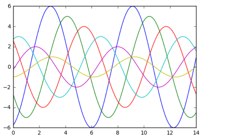
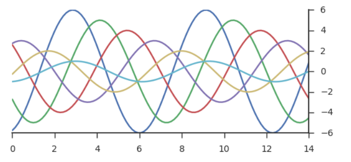
#创建正弦函数及图表
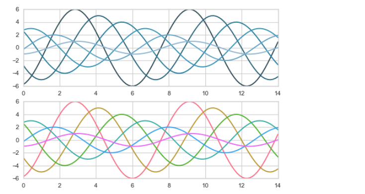
def sinplot(flip = 1):
x = np.linspace(0, 14, 100)
for i in range(1, 7):
plt.plot(x, np.sin(x + i * 5) * (7 - i) * flip)
sinplot()
1.1 set()
sns.set() #设置风格之后就会固定住,唯一办法就是刷新重新设置下

sinplot()

plt.grid(linestyle = '--')
1.2 set_style()
fig = plt.figure(figsize=(6,6))

ax1 = fig.add_subplot(2,1,1)
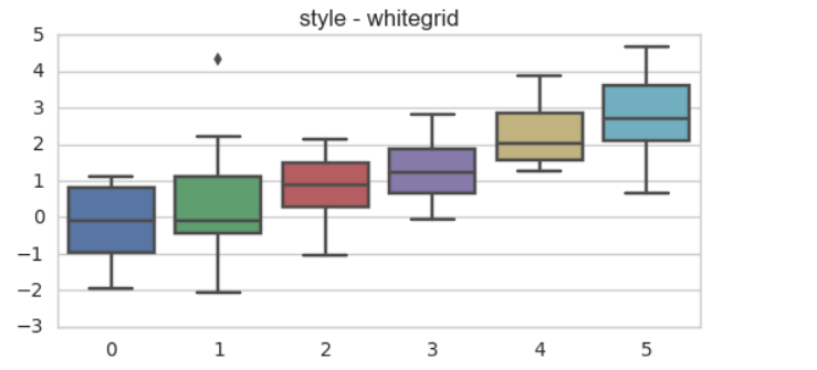
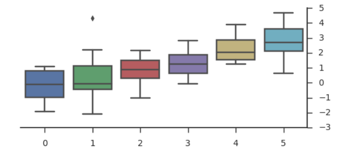
sns.set_style("whitegrid") sns.boxplot(data=data) 箱型图
# 2、set_style()

# 切换seaborn图表风格

# 风格选择包括:"white", "dark", "whitegrid", "darkgrid", "ticks"

fig = plt.figure(figsize=(6,6))

ax1 = fig.add_subplot(2,1,1)


sns.set_style("whitegrid")

data = np.random.normal(size=(20, 6)) + np.arange(6) / 2

sns.boxplot(data=data)

plt.title('style - whitegrid')

# 仍然可以使用matplotlib的参数

ax2 = fig.add_subplot(2,1,2)

#sns.set_style("dark")

sinplot()

# 子图显示
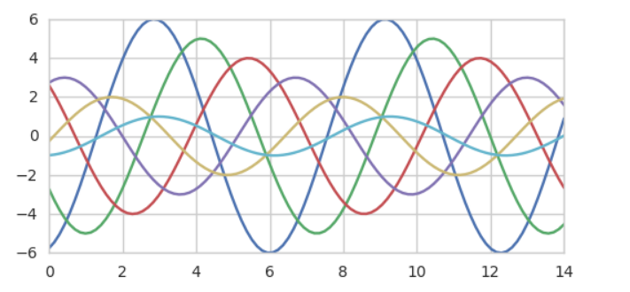
1.3 despine()
sns.despine()会删除上、右坐标轴; sns.despine(offset=10, trim=True) sns.despine(left=True, right = False) #left=True是左边不显示;right=False是显示
fig = plt.figure(figsize=(6,9))  plt.subplots_adjust(hspace=0.3) #创建图表   -->>  ax1 = fig.add_subplot(3,1,1)
sns.violinplot(data=data) 小提琴状    sns.boxplot(data=data, palette="deep")
# 3、despine()

# 设置图表坐标轴

# seaborn.despine(fig=None, ax=None, top=True, right=True, left=False,

# bottom=False, offset=None, trim=False)

sns.set_style("ticks")

# 设置风格

fig = plt.figure(figsize=(6,9))

plt.subplots_adjust(hspace=0.3)

# 创建图表

ax1 = fig.add_subplot(3,1,1)

sinplot()

sns.despine()

# 删除了上、右坐标轴

ax2 = fig.add_subplot(3,1,2)

sns.violinplot(data=data) #小提琴图

# sns.despine(offset=10, trim=True)  #offset坐标轴会偏移10; trim=False是坐标轴没有限制

# offset:与坐标轴之间的偏移

# trim:为True时,将坐标轴限制在数据最大最小值

ax3 = fig.add_subplot(3,1,3)

sns.boxplot(data=data, palette="deep")

sns.despine(left=True, right = False) #left=True是左边不显示;right=False是显示

# top, right, left, bottom:布尔型,为True时不显示

1.4 axes_style()
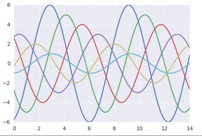
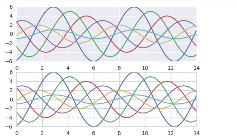
with sns.axes_style("darkgrid"):

    plt.subplot(211)

    sinplot()
# 4、axes_style() 设置局部图表风格,可学习和with配合的用法

with sns.axes_style("darkgrid"):        #只在sns这个图表,这个代码块里边设置风格,外边的风格还是whitegrid

    plt.subplot(211)

    sinplot()

# 设置局部图表风格,用with做代码块区分

sns.set_style("whitegrid")

plt.subplot(212)

sinplot()

# 外部表格风格
1.5 set_context()
sns.set_context("paper") ; 因为你在不同屏幕中看到的不一样这里就可以设置
# 5、set_context()

# 设置显示比例尺度

# 选择包括:'paper', 'notebook', 'talk', 'poster'

sns.set_context("paper")

sinplot()

# 默认为notebook

2. 调色盘
对图表整体颜色、比例等进行风格设置,包括颜色色板等
调用系统风格进行数据可视化
color_palette()
2.1 color_palette()
sns.color_palette()
# 默认6种颜色:deep, muted, pastel, bright, dark, colorblind
# 1、color_palette()

# 默认6种颜色:deep, muted, pastel, bright, dark, colorblind

# seaborn.color_palette(palette=None, n_colors=None, desat=None)

current_palette = sns.color_palette()

sns.palplot(current_palette)

# 一、其他颜色风格
# 风格内容:Accent, Accent_r, Blues, Blues_r, BrBG, BrBG_r, BuGn, BuGn_r, BuPu,
# BuPu_r, CMRmap, CMRmap_r, Dark2, Dark2_r, GnBu, GnBu_r, Greens, Greens_r, Greys, Greys_r, OrRd, OrRd_r, Oranges, Oranges_r, PRGn, PRGn_r,
# Paired, Paired_r, Pastel1, Pastel1_r, Pastel2, Pastel2_r, PiYG, PiYG_r, PuBu, PuBuGn, PuBuGn_r, PuBu_r, PuOr, PuOr_r, PuRd, PuRd_r, Purples,
# Purples_r, RdBu, RdBu_r, RdGy, RdGy_r, RdPu, RdPu_r, RdYlBu, RdYlBu_r, RdYlGn, RdYlGn_r, Reds, Reds_r, Set1, Set1_r, Set2, Set2_r, Set3,
# Set3_r, Spectral, Spectral_r, Wistia, Wistia_r, YlGn, YlGnBu, YlGnBu_r, YlGn_r, YlOrBr, YlOrBr_r, YlOrRd, YlOrRd_r, afmhot, afmhot_r,
# autumn, autumn_r, binary, binary_r, bone, bone_r, brg, brg_r, bwr, bwr_r, cool, cool_r, coolwarm, coolwarm_r, copper, copper_r, cubehelix,
# cubehelix_r, flag, flag_r, gist_earth, gist_earth_r, gist_gray, gist_gray_r, gist_heat, gist_heat_r, gist_ncar, gist_ncar_r, gist_rainbow,
# gist_rainbow_r, gist_stern, gist_stern_r, gist_yarg, gist_yarg_r, gnuplot, gnuplot2, gnuplot2_r, gnuplot_r, gray, gray_r, hot, hot_r, hsv,
# hsv_r, icefire, icefire_r, inferno, inferno_r, jet, jet_r, magma, magma_r, mako, mako_r, nipy_spectral, nipy_spectral_r, ocean, ocean_r,
# pink, pink_r, plasma, plasma_r, prism, prism_r, rainbow, rainbow_r, rocket, rocket_r, seismic, seismic_r, spectral, spectral_r, spring,
# spring_r, summer, summer_r, terrain, terrain_r, viridis, viridis_r, vlag, vlag_r, winter, winter_r
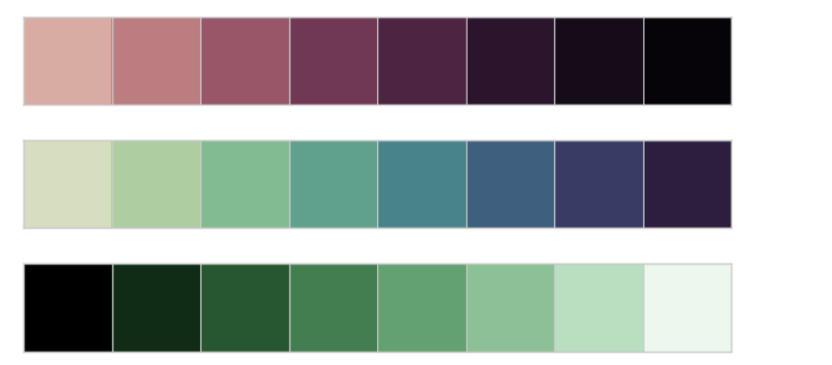
sns.palplot(sns.color_palette("inferno_r", 8)) #inferno 和 inferno_r 颜色反转了哦
# 这里颜色风格为 hls
# 颜色色块个数为8个
# 风格颜色反转(不是所有颜色都可以反转):Blues/Blues_r

#分组颜色设置 - “Paired”

sns.palplot(sns.color_palette("Paired", 10)) #color_palette默认颜色

2.2 sns.hls_palette(l= ,s= ) 亮度、饱和度
sns.palplot(sns.hls_palette(8, l=.3, s=.9)) #l--> 亮度;s--> 饱和度
# 2、设置亮度,饱和度  可用方法:

# ① husl_palette([n_colors, h, s, l])

# ② hls_palette([n_colors, h, l, s])

sns.palplot(sns.hls_palette(8, l=.3, s=.9)) #l--> 亮度;s--> 饱和度

2.3 cubehelix_palette()按线性增长计算,设置颜色
sns.palplot(sns.cubehelix_palette(8, start=2, rot=0, dark=0, light=.95, reverse=True))
# 3、cubehelix_palette()

# 按照线性增长计算,设置颜色

sns.palplot(sns.cubehelix_palette(8, gamma=2)) #gamma值越大越暗

sns.palplot(sns.cubehelix_palette(8, start=.5, rot=-.75)) #8个色带,从1.2颜色开始算,rot是旋转角度;start、rot起始终止颜色

sns.palplot(sns.cubehelix_palette(8, start=2, rot=0, dark=0, light=.95, reverse=True))

# n_colors → 颜色个数

# start → 值区间在0-3,开始颜色

# rot → 颜色旋转角度

# gamma → 颜色伽马值,越大颜色越暗

# dark,light → 值区间0-1,颜色深浅

# reverse → 布尔值,默认为False,由浅到深
2.4 dark_palette() light_palette()颜色深浅
sns.palplot(sns.light_palette("green"))
sns.palplot(sns.dark_palette("red", reverse=True))
 #4、dark_palette(color[, n_colors, reverse, ...]) / light_palette(color[, n_colors, reverse, ...])

# 颜色深浅

sns.palplot(sns.light_palette("green"))   # 按照green做浅色调色盘

#sns.palplot(sns.color_palette("Greens"))  # cmap为Greens风格

sns.palplot(sns.dark_palette("red", reverse=True))   # 按照blue做深色调色盘

# reverse → 转制颜色

2.5 diverging_palette()创建分散颜色
sns.palplot(sns.diverging_palette(145, 280, s=85, l=25, n=7)) 起始值、终止值、s为饱和度、l为亮度、n为个数
cmap = sns.diverging_palette(200, 20, sep=20, as_cmap=True) #调色盘

sns.heatmap(x, cmap=cmap)#创建热力图它就显示成热力图的效果了
# 5、diverging_palette() 创建分散颜色

# seaborn.diverging_palette(h_neg, h_pos, s=75, l=50, sep=10, n=6,

# center='light', as_cmap=False)¶

sns.palplot(sns.diverging_palette(145, 280, s=85, l=25, n=7)) #第一个起始值和末尾颜色值,s和l是饱和度、亮度,n个数

# h_neg, h_pos → 起始/终止颜色值

# s → 值区间0-100,饱和度

# l → 值区间0-100,亮度

# n → 颜色个数

# center → 中心颜色为浅色还是深色“light”,“dark”,默认为light

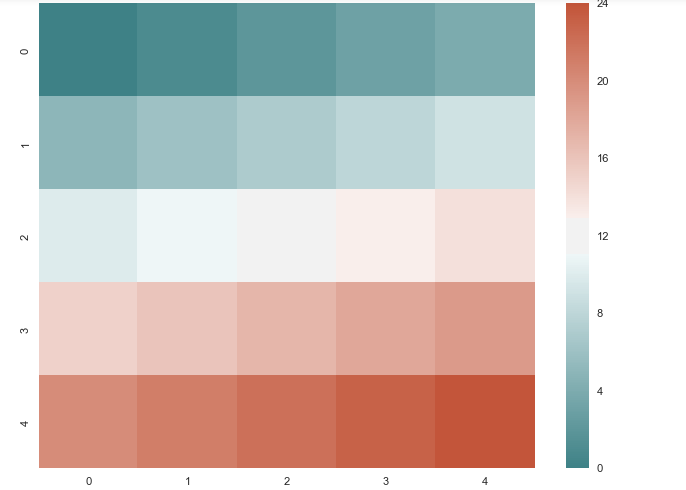
# 5、diverging_palette() 创建分散颜色

plt.figure(figsize = (8,6))

x = np.arange(25).reshape(5, 5) #二维的组

cmap = sns.diverging_palette(200, 20, sep=20, as_cmap=True) #调色盘

sns.heatmap(x, cmap=cmap)#创建热力图它就显示成热力图的效果了
# 设置调色板后,绘图创建图表

sns.set_style("whitegrid")

# 设置风格

with sns.color_palette("PuBuGn_d"): #设置调色盘

    plt.subplot(211)

    sinplot()

sns.set_palette("husl") #或者这样

plt.subplot(212)

sinplot()

# 绘制系列颜色
3. 分布数据可视化 - 直方图与密度图
distplot() / kdeplot() / rugplot()
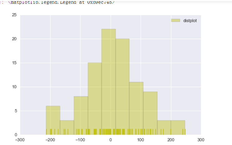
3.1直方图distplot( )
sns.distplot(s,bins = 10,hist = True,kde = False,norm_hist=False,

            rug = True,vertical = False,

            color = 'y',label = 'distplot',axlabel = 'x')
颜色设置:sns.distplot(s,rug = True,

            rug_kws = {'color':'g'} ,

            kde_kws={"color": "k", "lw": 1, "label": "KDE",'linestyle':'--'},

            hist_kws={"histtype": "step", "linewidth": 1,"alpha": 1, "color": "g"})
import numpy as np

import pandas as pd

import matplotlib.pyplot as plt

import seaborn as sns

% matplotlib inline

sns.set_style("darkgrid")

sns.set_context("paper")

# 设置风格、尺度

import warnings

warnings.filterwarnings('ignore')

# 不发出警告
rs = np.random.RandomState(10)  # 设定随机数种子

s = pd.Series(rs.randn(100) * 100)

sns.distplot(s,bins = 10,hist = True,kde = False,norm_hist=False,

            rug = True,vertical = False,

            color = 'y',label = 'distplot',axlabel = 'x')

plt.legend()

# bins → 箱数

# hist、ked → 是否显示箱数/显示密度曲线

# norm_hist → 直方图是否按照密度来显示

# rug → 是否显示数据分布情况

# vertical → 是否水平显示

# color → 设置颜色

# label → 图例

# axlabel → x轴标注
# 1、直方图 - distplot()
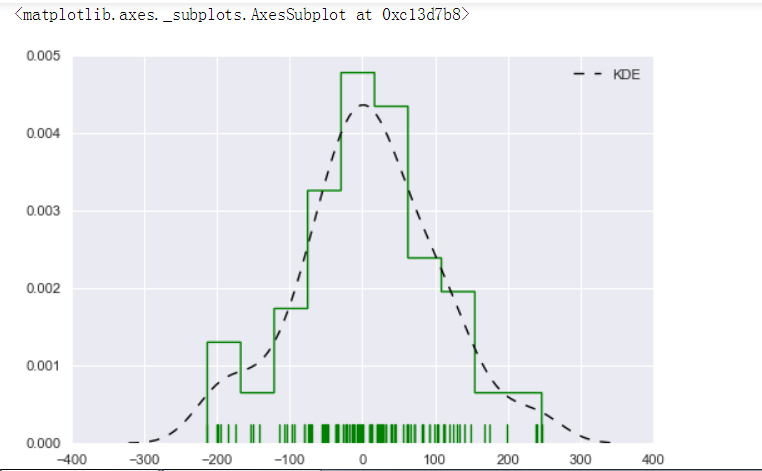
# 颜色详细设置 sns.distplot(s,rug = True,
rug_kws = {'color':'g'} ,
# 设置数据频率分布颜色
kde_kws={"color": "k", "lw": 1, "label": "KDE",'linestyle':'--'},
# 设置密度曲线颜色,线宽,标注、线形
hist_kws={"histtype": "step", "linewidth": 1,"alpha": 1, "color": "g"})
# 设置箱子的风格、线宽、透明度、颜色
# 风格包括:'bar', 'barstacked', 'step', 'stepfilled'
3.2密度图sns.kdeplot( ) sns.rugplot( )
单个样本:sns.kdeplot(s,
shade = False, # 是否填充
color = 'r', # 设置颜色
vertical = False # 设置是否水平
)
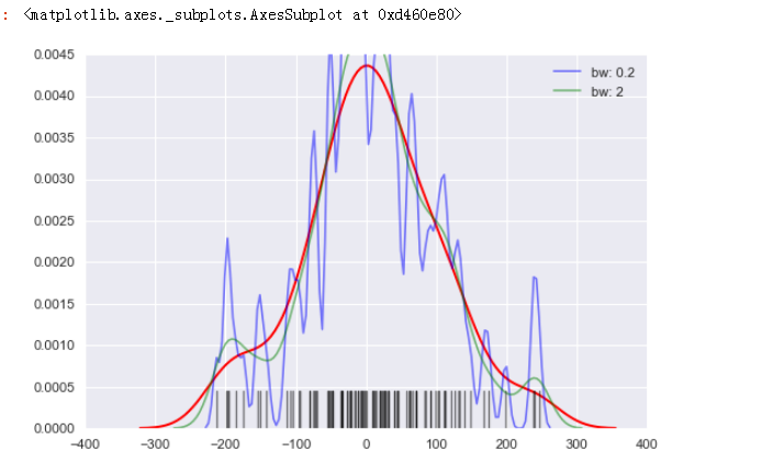
sns.kdeplot(s,bw=5, label="bw: 0.2",
linestyle = '-',linewidth = 1.2,alpha = 0.5)
sns.rugplot(s,height = 0.1,color = 'k',alpha = 0.5)数据频率分布
多个样本:
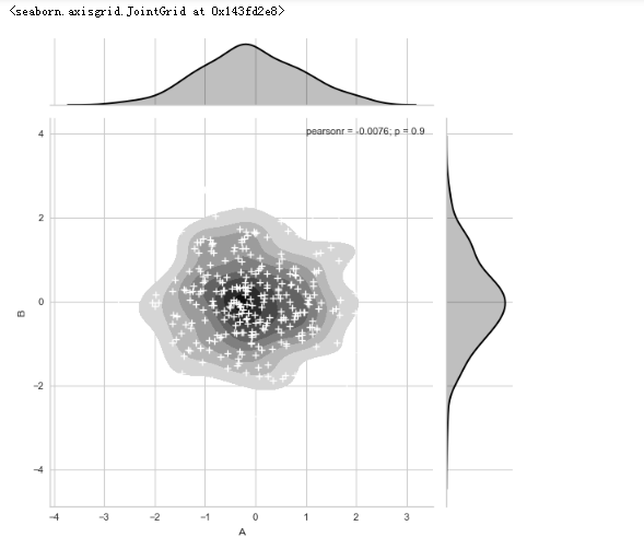
sns.kdeplot(df['A'],df['B'],cbar = True, shade = True, cmap = 'Reds', shade_lowest=False,n_levels = 10 )两个维度数据生成曲线密度图,以颜色作为密度衰减
plt.grid(linestyle = '--')

plt.scatter(df['A'], df['B'], s=5, alpha = 0.5, color = 'k') #散点

sns.rugplot(df['A'], color="g", axis='x',alpha = 0.5)

sns.rugplot(df['B'], color="r", axis='y',alpha = 0.5)
# 2、密度图 - kdeplot()

# 单个样本数据密度分布图

sns.kdeplot(s,

           shade = False,  # 是否填充

           color = 'r',   # 设置颜色

           vertical = False  # 设置是否水平

           )

sns.kdeplot(s,bw=5, label="bw: 0.2",

            linestyle = '-',linewidth = 1.2,alpha = 0.5)

sns.kdeplot(s,bw=20, label="bw: 2",

            linestyle = '-',linewidth = 1.2,alpha = 0.5)

# bw → 控制拟合的程度,类似直方图的箱数,设置的数量越大越平滑,越小越容易过度拟合

sns.rugplot(s,height = 0.1,color = 'k',alpha = 0.5)

# 数据频率分布图
# 2、密度图 - kdeplot()

# 两个样本数据密度分布图

rs = np.random.RandomState(2)  # 设定随机数种子

df = pd.DataFrame(rs.randn(100,2),

                 columns = ['A','B'])

sns.kdeplot(df['A'],df['B'], #两个样本的数据密度图

           cbar = True,    # 是否显示颜色图例

           shade = True,   # 是否填充

           cmap = 'Reds',  # 设置调色盘

           shade_lowest=False,  # 最外围颜色是否显示

           n_levels = 10   # 曲线个数(如果非常多,则会越平滑)

           )

# 两个维度数据生成曲线密度图,以颜色作为密度衰减显示

plt.grid(linestyle = '--')

plt.scatter(df['A'], df['B'], s=5, alpha = 0.5, color = 'k') #散点

sns.rugplot(df['A'], color="g", axis='x',alpha = 0.5)

sns.rugplot(df['B'], color="r", axis='y',alpha = 0.5)

# 注意设置x,y轴

# 2、密度图 - kdeplot()
# 两个样本数据密度分布图
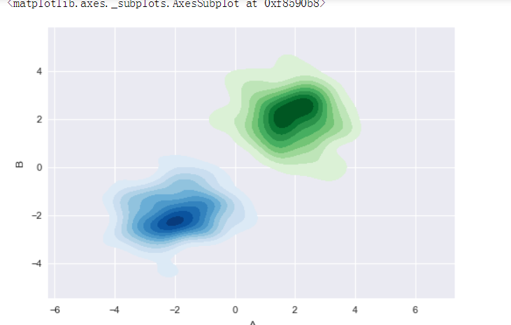
# 多个密度图 rs1 = np.random.RandomState(2)
rs2 = np.random.RandomState(5)
df1 = pd.DataFrame(rs1.randn(100,2)+2,columns = ['A','B'])
df2 = pd.DataFrame(rs2.randn(100,2)-2,columns = ['A','B'])
# 创建数据 sns.kdeplot(df1['A'],df1['B'],cmap = 'Greens',
shade = True,shade_lowest=False)
sns.kdeplot(df2['A'],df2['B'],cmap = 'Blues',
shade = True,shade_lowest=False)
# 创建图表
4. 分布数据可视化 - 散点图
分布数据可视化 - 散点图
jointplot( ) / pairplot( )
综合和矩阵散点图
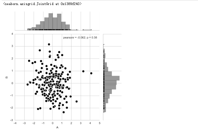
散点图+分布图(直方)sns.jointplot(x=df['A'], y=df['B'], data=df,color = 'k',s = 50, edgecolor="w",linewidth=1,kind = 'scatter',space = 0.2, size = 5,

              ratio = 4, marginal_kws=dict(bins=15, rug=True))
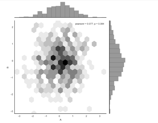
散点图+分布图(直方),点为六边形 sns.jointplot(x=df['A'], y=df['B'],data = df, kind="hex", color="k",

                         marginal_kws=dict(bins=20))
散点图+分布图(密度)g = sns.jointplot(x=df['A'], y=df['B'],data = df,

                  kind="kde", color="k",

                  shade_lowest=False)

g.plot_joint(plt.scatter,c="w", s=30, linewidth=1, marker="+") 在密度图上添加散点图
综合散点图(可拆分) plot_joint() + ax_marg_x.hist() + ax_marg_y.hist()
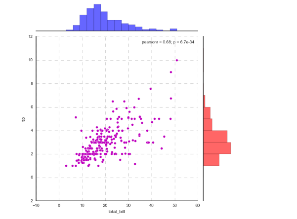
g = sns.JointGrid(x="total_bill", y="tip", data=tips)
g.plot_joint(plt.scatter, color ='m', edgecolor = 'white') # 设置框内图表,scatter,首先设置个内部的点图
g.ax_marg_x.hist(tips["total_bill"], color="b", alpha=.6,bins=np.arange(0, 60, 3))# 设置x轴直方图,注意bins是数组
g.ax_marg_y.hist(tips["tip"], color="r", alpha=.6,orientation="horizontal",bins=np.arange(0, 12, 1))
# plot_joint() + plot_marginals()

g = sns.JointGrid(x="total_bill", y="tip", data=tips)

g = g.plot_joint(sns.kdeplot,cmap = 'Reds_r') g.plot_marginals(sns.distplot, kde=True,color="g")
g.plot_marginals(sns.kdeplot, shade = True, color="r")
3.1综合散点图
import numpy as np

import pandas as pd

import matplotlib.pyplot as plt

import seaborn as sns

% matplotlib inline

sns.set_style("whitegrid")

sns.set_context("paper")

# 设置风格、尺度

import warnings

warnings.filterwarnings('ignore')

# 不发出警告
# 1、综合散点图 - jointplot()

# 散点图 + 分布图

rs = np.random.RandomState(2)

df = pd.DataFrame(rs.randn(200,2),columns = ['A','B'])

# 创建数据

sns.jointplot(x=df['A'], y=df['B'],  # 设置xy轴,显示columns名称

              data=df,   # 设置数据

              color = 'k',   # 设置颜色

              s = 50, edgecolor="w",linewidth=1,  # 设置散点大小、边缘线颜色及宽度(只针对scatter)

              kind = 'scatter',   # 设置类型:“scatter”、“reg”、“resid”、“kde”、“hex”

              space = 0.2,  # 设置散点图和布局图的间距

              size = 5,   # 图表大小(自动调整为正方形)

              ratio = 4,  # 散点图与布局图高度比,整型

              marginal_kws=dict(bins=15, rug=True)  # 设置柱状图箱数,是否设置rug

              )
# 1、综合散点图 - jointplot()

# 散点图 + 分布图

# 六边形图

df = pd.DataFrame(rs.randn(500,2),columns = ['A','B'])

# 创建数据

with sns.axes_style("white"):

    sns.jointplot(x=df['A'], y=df['B'],data = df, kind="hex", color="k",

                 marginal_kws=dict(bins=20))
# 1、综合散点图 - jointplot()

# 散点图 + 分布图

# 密度图

rs = np.random.RandomState(15)

df = pd.DataFrame(rs.randn(300,2),columns = ['A','B'])

# 创建数据

g = sns.jointplot(x=df['A'], y=df['B'],data = df,

                  kind="kde", color="k",

                  shade_lowest=False) #是否对外围做面积的覆盖

# 创建密度图

g.plot_joint(plt.scatter,c="w", s=30, linewidth=1, marker="+")

# 添加散点图
# 1、综合散点图 - JointGrid()

# 可拆分绘制的散点图

# plot_joint() + ax_marg_x.hist() + ax_marg_y.hist()

sns.set_style("white")

# 设置风格

tips = sns.load_dataset("tips")

print(tips.head())

# 导入数据

g = sns.JointGrid(x="total_bill", y="tip", data=tips)

# 创建一个绘图表格区域,设置好x、y对应数据

g.plot_joint(plt.scatter, color ='m', edgecolor = 'white')  # 设置框内图表,scatter,首先设置个内部的点图

g.ax_marg_x.hist(tips["total_bill"], color="b", alpha=.6,

                 bins=np.arange(0, 60, 3))            # 设置x轴直方图,注意bins是数组

g.ax_marg_y.hist(tips["tip"], color="r", alpha=.6,

                 orientation="horizontal",

                 bins=np.arange(0, 12, 1))            # 设置x轴直方图,注意需要orientation参数

from scipy import stats

g.annotate(stats.pearsonr)

# 设置标注,可以为pearsonr,spearmanr

plt.grid(linestyle = '--')

# 1、综合散点图 - JointGrid()
# 可拆分绘制的散点图
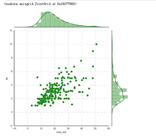
# plot_joint() + plot_marginals() g = sns.JointGrid(x="total_bill", y="tip", data=tips)
# 创建一个绘图表格区域,设置好x、y对应数据 g = g.plot_joint(plt.scatter,color="g", s=40, edgecolor="white") # 绘制散点图
plt.grid(linestyle = '--') g.plot_marginals(sns.distplot, kde=True, color="g") # 绘制x,y轴直方图
# 1、综合散点图 - JointGrid()
# 可拆分绘制的散点图
# plot_joint() + plot_marginals()
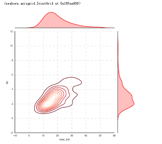
# kde - 密度图 g = sns.JointGrid(x="total_bill", y="tip", data=tips)
# 创建一个绘图表格区域,设置好x、y对应数据 g = g.plot_joint(sns.kdeplot,cmap = 'Reds_r') # 绘制密度图
plt.grid(linestyle = '--') g.plot_marginals(sns.kdeplot, shade = True, color="r") # 绘制x,y轴密度图
3.2矩阵散点图
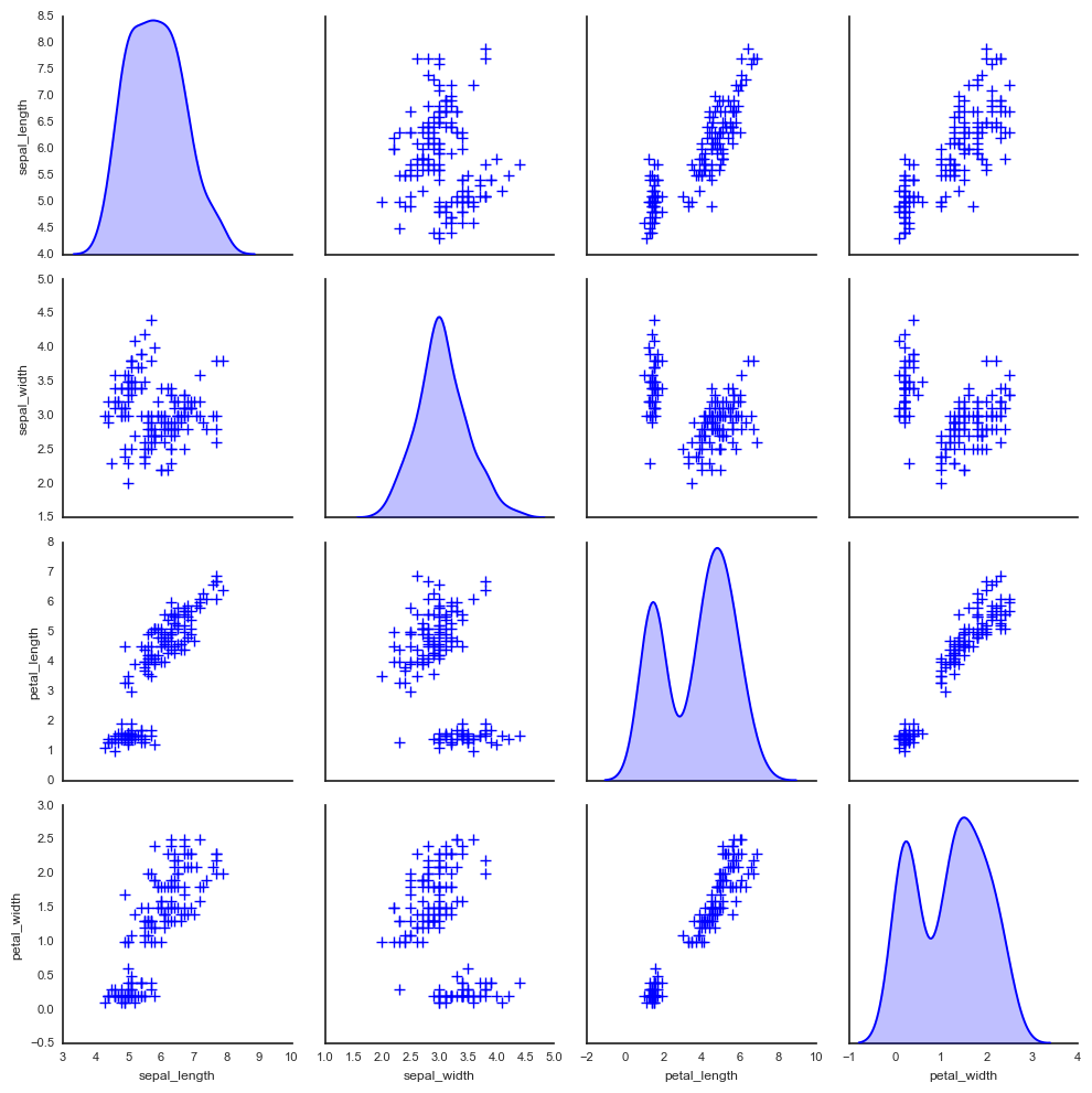
# 2、矩阵散点图 - pairplot()

sns.set_style("white")

# 设置风格

iris = sns.load_dataset("iris")

print(iris.head())

# 读取数据

sns.pairplot(iris,

            kind = 'scatter',  # 散点图/回归分布图 {‘scatter’, ‘reg’}

            diag_kind="hist",  # 直方图/密度图 {‘hist’, ‘kde’}

            hue="species",   # 按照某一字段进行分类

            palette="husl",  # 设置调色板

            markers=["o", "s", "D"],  # 设置不同系列的点样式(这里根据参考分类个数)

            size = 1,   # 图表大小

            )

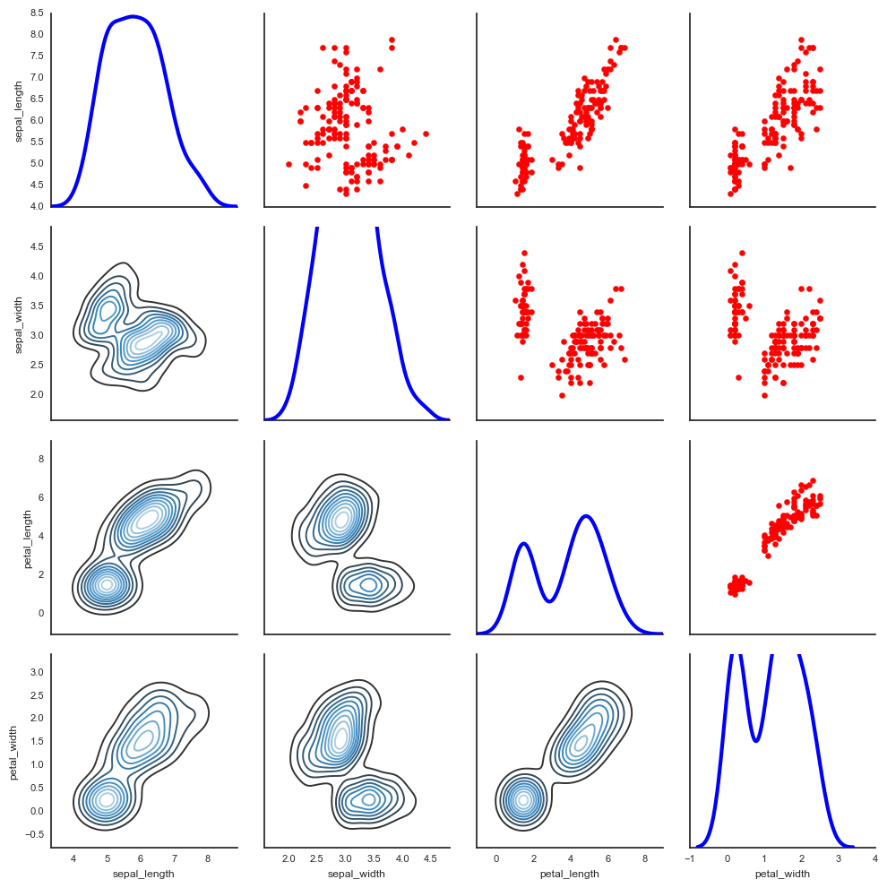
# 2、矩阵散点图 - pairplot()

# 只提取局部变量进行对比

sns.pairplot(iris,vars=["sepal_width", "sepal_length"],

             kind = 'reg', diag_kind="kde",

             hue="species", palette="husl")
# 2、矩阵散点图 - pairplot()

# 其他参数设置

sns.pairplot(iris, diag_kind="kde", markers="+",

             plot_kws=dict(s=50, edgecolor="b", linewidth=1),

             # 设置点样式

             diag_kws=dict(shade=True)

             # 设置密度图样式

            )
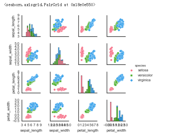
# 2、矩阵散点图 - PairGrid()

# 可拆分绘制的散点图

# map_diag() + map_offdiag()

g = sns.PairGrid(iris,hue="species",palette = 'hls',

                vars = ['sepal_length','sepal_width','petal_length','petal_width'],  # 可筛选

                )

# 创建一个绘图表格区域,设置好x、y对应数据,按照species分类

g.map_diag(plt.hist,

           histtype = 'barstacked',   # 可选:'bar', 'barstacked', 'step', 'stepfilled'

           linewidth = 1, edgecolor = 'w')

# 对角线图表,plt.hist/sns.kdeplot

g.map_offdiag(plt.scatter,

              edgecolor="w", s=40,linewidth = 1,   # 设置点颜色、大小、描边宽度

             )

# 其他图表,plt.scatter/plt.bar...

g.add_legend()

# 添加图例

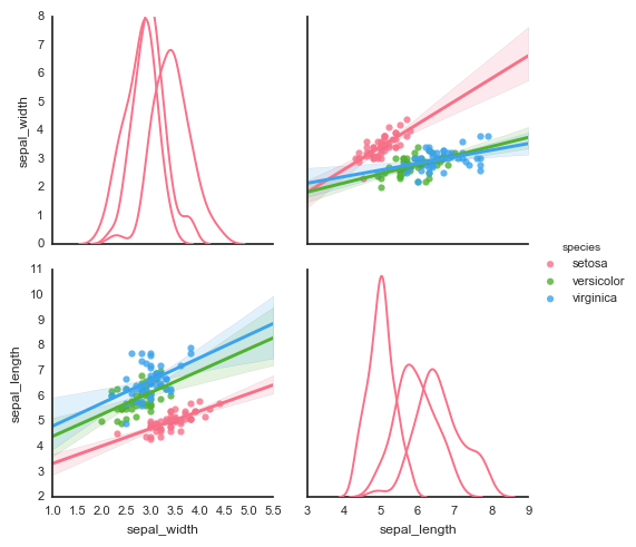
# 2、矩阵散点图 - PairGrid()

# 可拆分绘制的散点图

# map_diag() + map_lower() + map_upper()

g = sns.PairGrid(iris)

g.map_diag(sns.kdeplot, lw=3)   # 设置对角线图表

g.map_upper(plt.scatter, color = 'r')     # 设置对角线上端图表

g.map_lower(sns.kdeplot, cmap="Blues_d")      # 设置对角线下端图表
Python图表数据可视化Seaborn:1. 风格| 分布数据可视化-直方图| 密度图| 散点图的更多相关文章
- seaborn分布数据可视化:直方图|密度图|散点图
系统自带的数据表格(存放在github上https://github.com/mwaskom/seaborn-data),使用时通过sns.load_dataset('表名称')即可,结果为一个Dat ...
- Python图表数据可视化Seaborn:3. 线性关系数据| 时间线图表| 热图
1. 线性关系数据可视化 lmplot( ) import numpy as np import pandas as pd import matplotlib.pyplot as plt import ...
- Python图表数据可视化Seaborn:2. 分类数据可视化-分类散点图|分布图(箱型图|小提琴图|LV图表)|统计图(柱状图|折线图)
1. 分类数据可视化 - 分类散点图 stripplot( ) / swarmplot( ) sns.stripplot(x="day",y="total_bill&qu ...
- 全国气象数据/降雨量分布数据/太阳辐射数据/NPP净初级生产力数据/植被覆盖度数据
气象数据一直是一个价值较高的数据,它被广泛用于各个领域的研究当中.气象数据包括有气温.气压.相对湿度.降水.蒸发.风向风速.日照等多种指标,但是包含了这些全部指标的气象数据却较难获取 ...
- seaborn 数据可视化(一)连续型变量可视化
一.综述 Seaborn其实是在matplotlib的基础上进行了更高级的API封装,从而使得作图更加容易,图像也更加美观,本文基于seaborn官方API还有自己的一些理解. 1.1.样式控制: ...
- python学习笔记(2):科学计算及数据可视化入门
一.NumPy 1.NumPy:Numberical Python 2.高性能科学计算和数据分析的基础包 3.ndarray,多维数组(矩阵),具有矢量运算的能力,快速.节省空间 (1)ndarray ...
- seaborn教程4——分类数据可视化
https://segmentfault.com/a/1190000015310299 Seaborn学习大纲 seaborn的学习内容主要包含以下几个部分: 风格管理 绘图风格设置 颜色风格设置 绘 ...
- 用Python的Plotly画出炫酷的数据可视化(含各类图介绍,附代码)
前言 本文的文字及图片来源于网络,仅供学习.交流使用,不具有任何商业用途,版权归原作者所有,如有问题请及时联系我们以作处理. 作者: 我被狗咬了 在谈及数据可视化的时候,我们通常都会使用到matplo ...
- 数据可视化 seaborn绘图(1)
seaborn是基于matplotlib的数据可视化库.提供更高层的抽象接口.绘图效果也更好. 用seaborn探索数据分布 绘制单变量分布 绘制二变量分布 成对的数据关系可视化 绘制单变量分布 se ...
随机推荐
- gulp.基础
1.安装 全局安装 npm install --global gulp 作为项目的开发依赖安装 npm install gulp --save-dev 2.在根目录下创建一个名为gulpfile.js ...
- 软件测试作业 - fault error failure
给出的题目如下: 我的解答如下: For program 1:1. where i > 0 is the fault , it should be changed to i>= 0 to ...
- Confluence 6 配置时间和日期格式
你可以修改你 Confluence 为用户显示的时期和时间格式.设置的句法使用的是 SimpleDateFormat class,请参考 Java SimpleDateFormat 文档中的内容来设置 ...
- linux命令中的参数前的一横(-)和两横(--)的区别
在解释这些区别之前我们先了解一下有关linux的背景知识,这个需要大家先认真看完就会对这些区别有更深入的了解,对linux也有更深的了解. 关于System V和BSD风格以及他们与Linux的关系: ...
- 分布式Dubbo快速入门
目录 Dubbo入门 背景 zookeeper安装 发布Dubbo服务 Dubbo Admin管理 消费Dubbo服务 抽取与依赖版本管理 Dubbo入门 Editor:SimpleWu Dubbo是 ...
- kafka消息存储与partition副本原理
消息的存储原理: 消息的文件存储机制: 前面我们知道了一个 topic 的多个 partition 在物理磁盘上的保存路径,那么我们再来分析日志的存储方式.通过 ll /tmp/kafka-logs/ ...
- 【python】控制台输出颜色
来源:http://www.cnblogs.com/yinjia/p/5559702.html 在开发项目过程中,为了方便调试代码,经常会向stdout中输出一些日志,默认的这些日志就直接显示在了终端 ...
- 使用 declare 语句和strict_types 声明来启用严格模式:
使用 declare 语句和strict_types 声明来启用严格模式: Caution: 启用严格模式同时也会影响返回值类型声明. Note: 严格类型适用于在启用严格模式的文件内的函数调用,而不 ...
- swoole 使用异步redis的前置条件
redis安装 官网下载redis 下载完成之后解压: 进入redis目录执行make: 进入src目录启动redis 启动成功如下: 启动后连接redis 编译安装hiredis 下载:https: ...
- jvm(转)
原:https://blog.csdn.net/luomingkui1109/article/details/72820232 1.JVM简析: 作为一名Java使用者,掌握JVM的体系结构 ...