数据可视化基础专题(十二):Matplotlib 基础(四)常用图表(二)气泡图、堆叠图、雷达图、饼图、
1 气泡图
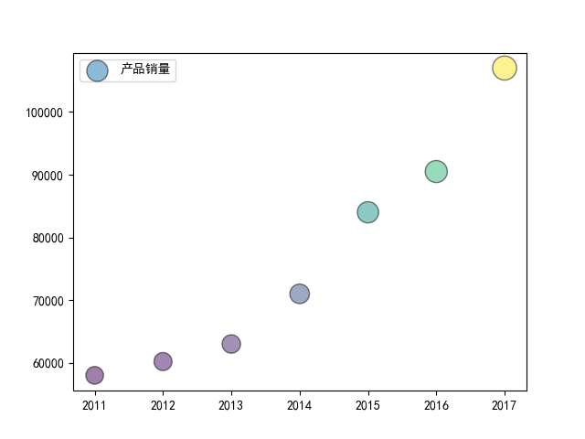
气泡图和上面的散点图非常类似,只是点的大小不一样,而且是通过参数 s 来进行控制的,多的不说,还是看个示例:
例子一:
import matplotlib.pyplot as plt

import numpy as np

# 处理中文乱码

plt.rcParams['font.sans-serif']=['SimHei']

x_data = np.array([2011,2012,2013,2014,2015,2016,2017])

y_data = np.array([58000,60200,63000,71000,84000,90500,107000])

# 根据 y 值的不同生成不同的颜色

colors = y_data * 10

# 根据 y 值的不同生成不同的大小

area = y_data / 300

plt.scatter(x_data, y_data, s = area, c = colors, marker='o', edgecolor='black', alpha=0.5, label = '产品销量')

plt.legend()

plt.savefig("scatter_demo1.png")
例子二:
import numpy as np

import matplotlib.pyplot as plt

import matplotlib.cbook as cbook

# Load a numpy record array from yahoo csv data with fields date, open, close,

# volume, adj_close from the mpl-data/example directory. The record array

# stores the date as an np.datetime64 with a day unit ('D') in the date column.

with cbook.get_sample_data('goog.npz') as datafile:

    price_data = np.load(datafile)['price_data'].view(np.recarray)

price_data = price_data[-250:]  # get the most recent 250 trading days

delta1 = np.diff(price_data.adj_close) / price_data.adj_close[:-1]

# Marker size in units of points^2

volume = (15 * price_data.volume[:-2] / price_data.volume[0])**2

close = 0.003 * price_data.close[:-2] / 0.003 * price_data.open[:-2]

fig, ax = plt.subplots()

ax.scatter(delta1[:-1], delta1[1:], c=close, s=volume, alpha=0.5)

ax.set_xlabel(r'$\Delta_i$', fontsize=15)

ax.set_ylabel(r'$\Delta_{i+1}$', fontsize=15)

ax.set_title('Volume and percent change')

ax.grid(True)

fig.tight_layout()

plt.show()

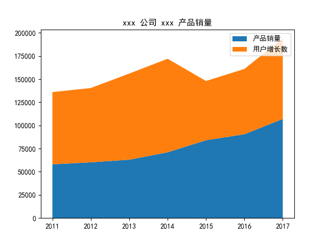
堆叠图
堆叠图的作用和折线图非常类似,它采用的是 stackplot() 方法。
plt.stackplot(x, y, labels, colors)
import matplotlib.pyplot as plt

# 处理中文乱码

plt.rcParams['font.sans-serif']=['SimHei']

x_data = [2011,2012,2013,2014,2015,2016,2017]

y_data = [58000,60200,63000,71000,84000,90500,107000]

y_data_1 = [78000,80200,93000,101000,64000,70500,87000]

plt.title(label='xxx 公司 xxx 产品销量')

plt.stackplot(x_data, y_data, y_data_1, labels=['产品销量', '用户增长数'])

plt.legend()

plt.savefig("stackplot_demo.png")
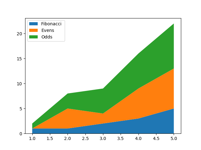
例子二:
import numpy as np

import matplotlib.pyplot as plt

x = [1, 2, 3, 4, 5]

y1 = [1, 1, 2, 3, 5]

y2 = [0, 4, 2, 6, 8]

y3 = [1, 3, 5, 7, 9]

y = np.vstack([y1, y2, y3])

labels = ["Fibonacci ", "Evens", "Odds"]

fig, ax = plt.subplots()

ax.stackplot(x, y1, y2, y3, labels=labels)

ax.legend(loc='upper left')

plt.show()
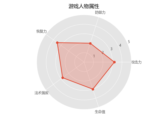
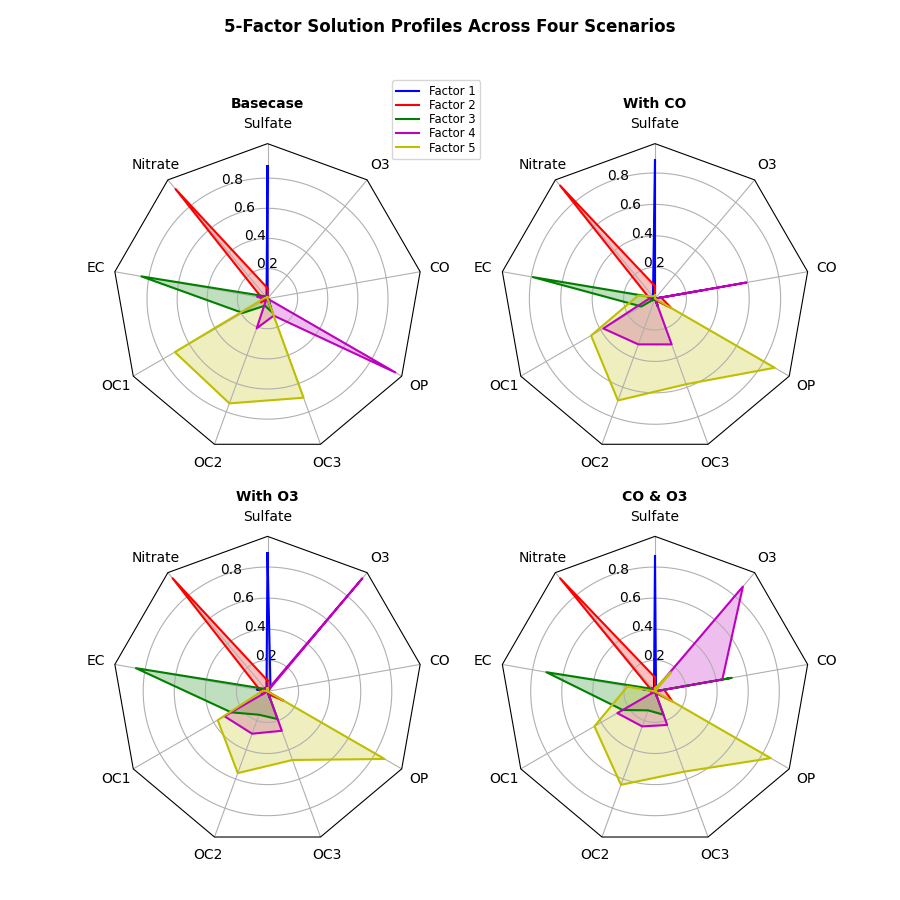
雷达图
它可以直观的看出来一个事物的优势与不足。
在 plt 中建立雷达图是用 polar() 方法的,这个方法其实是用来建立极坐标系的,而雷达图就是先在极坐标系中将各个点找出来,然后再将他们连线连起来。
plt.polar(theta, r, **kwargs)
- theta : 每一个点在极坐标系中的角度
- r : 每一个点在极坐标系中的半径
import numpy as np

import matplotlib.pyplot as plt

# 中文和负号的正常显示

plt.rcParams['font.sans-serif']=['SimHei']

plt.rcParams['axes.unicode_minus'] = False

# 使用ggplot的绘图风格

plt.style.use('ggplot')

# 构造数据

values = [3.2, 2.1, 3.5, 2.8, 3]

feature = ['攻击力', '防御力', '恢复力', '法术强度', '生命值']

N = len(values)

# 设置雷达图的角度,用于平分切开一个圆面

angles = np.linspace(0, 2 * np.pi, N, endpoint=False)

# 为了使雷达图一圈封闭起来,需要下面的步骤

values = np.concatenate((values, [values[0]]))

angles = np.concatenate((angles, [angles[0]]))

# 绘图

fig = plt.figure()

# 这里一定要设置为极坐标格式

ax = fig.add_subplot(111, polar=True)

# 绘制折线图

ax.plot(angles, values, 'o-', linewidth=2)

# 填充颜色

ax.fill(angles, values, alpha=0.25)

# 添加每个特征的标签

ax.set_thetagrids(angles * 180 / np.pi, feature)

# 设置雷达图的范围

ax.set_ylim(0, 5)

# 添加标题

plt.title('游戏人物属性')

# 添加网格线

ax.grid(True)

# 显示图形

plt.savefig('polar_demo.png')
例子二
import numpy as np

import matplotlib.pyplot as plt

from matplotlib.patches import Circle, RegularPolygon

from matplotlib.path import Path

from matplotlib.projections.polar import PolarAxes

from matplotlib.projections import register_projection

from matplotlib.spines import Spine

from matplotlib.transforms import Affine2D

def radar_factory(num_vars, frame='circle'):

    """Create a radar chart with `num_vars` axes.

    This function creates a RadarAxes projection and registers it.

    Parameters

    ----------

    num_vars : int

        Number of variables for radar chart.

    frame : {'circle', 'polygon'}

        Shape of frame surrounding axes.

    """

    # calculate evenly-spaced axis angles

    theta = np.linspace(0, 2*np.pi, num_vars, endpoint=False)

    class RadarAxes(PolarAxes):

        name = 'radar'

        # use 1 line segment to connect specified points

        RESOLUTION = 1

        def __init__(self, *args, **kwargs):

            super().__init__(*args, **kwargs)

            # rotate plot such that the first axis is at the top

            self.set_theta_zero_location('N')

        def fill(self, *args, closed=True, **kwargs):

            """Override fill so that line is closed by default"""

            return super().fill(closed=closed, *args, **kwargs)

        def plot(self, *args, **kwargs):

            """Override plot so that line is closed by default"""

            lines = super().plot(*args, **kwargs)

            for line in lines:

                self._close_line(line)

        def _close_line(self, line):

            x, y = line.get_data()

            # FIXME: markers at x[0], y[0] get doubled-up

            if x[0] != x[-1]:

                x = np.concatenate((x, [x[0]]))

                y = np.concatenate((y, [y[0]]))

                line.set_data(x, y)

        def set_varlabels(self, labels):

            self.set_thetagrids(np.degrees(theta), labels)

        def _gen_axes_patch(self):

            # The Axes patch must be centered at (0.5, 0.5) and of radius 0.5

            # in axes coordinates.

            if frame == 'circle':

                return Circle((0.5, 0.5), 0.5)

            elif frame == 'polygon':

                return RegularPolygon((0.5, 0.5), num_vars,

                                      radius=.5, edgecolor="k")

            else:

                raise ValueError("unknown value for 'frame': %s" % frame)

        def _gen_axes_spines(self):

            if frame == 'circle':

                return super()._gen_axes_spines()

            elif frame == 'polygon':

                # spine_type must be 'left'/'right'/'top'/'bottom'/'circle'.

                spine = Spine(axes=self,

                              spine_type='circle',

                              path=Path.unit_regular_polygon(num_vars))

                # unit_regular_polygon gives a polygon of radius 1 centered at

                # (0, 0) but we want a polygon of radius 0.5 centered at (0.5,

                # 0.5) in axes coordinates.

                spine.set_transform(Affine2D().scale(.5).translate(.5, .5)

                                    + self.transAxes)

                return {'polar': spine}

            else:

                raise ValueError("unknown value for 'frame': %s" % frame)

    register_projection(RadarAxes)

    return theta

def example_data():

    # The following data is from the Denver Aerosol Sources and Health study.

    # See doi:10.1016/j.atmosenv.2008.12.017

    #

    # The data are pollution source profile estimates for five modeled

    # pollution sources (e.g., cars, wood-burning, etc) that emit 7-9 chemical

    # species. The radar charts are experimented with here to see if we can

    # nicely visualize how the modeled source profiles change across four

    # scenarios:

    #  1) No gas-phase species present, just seven particulate counts on

    #     Sulfate

    #     Nitrate

    #     Elemental Carbon (EC)

    #     Organic Carbon fraction 1 (OC)

    #     Organic Carbon fraction 2 (OC2)

    #     Organic Carbon fraction 3 (OC3)

    #     Pyrolized Organic Carbon (OP)

    #  2)Inclusion of gas-phase specie carbon monoxide (CO)

    #  3)Inclusion of gas-phase specie ozone (O3).

    #  4)Inclusion of both gas-phase species is present...

    data = [

        ['Sulfate', 'Nitrate', 'EC', 'OC1', 'OC2', 'OC3', 'OP', 'CO', 'O3'],

        ('Basecase', [

            [0.88, 0.01, 0.03, 0.03, 0.00, 0.06, 0.01, 0.00, 0.00],

            [0.07, 0.95, 0.04, 0.05, 0.00, 0.02, 0.01, 0.00, 0.00],

            [0.01, 0.02, 0.85, 0.19, 0.05, 0.10, 0.00, 0.00, 0.00],

            [0.02, 0.01, 0.07, 0.01, 0.21, 0.12, 0.98, 0.00, 0.00],

            [0.01, 0.01, 0.02, 0.71, 0.74, 0.70, 0.00, 0.00, 0.00]]),

        ('With CO', [

            [0.88, 0.02, 0.02, 0.02, 0.00, 0.05, 0.00, 0.05, 0.00],

            [0.08, 0.94, 0.04, 0.02, 0.00, 0.01, 0.12, 0.04, 0.00],

            [0.01, 0.01, 0.79, 0.10, 0.00, 0.05, 0.00, 0.31, 0.00],

            [0.00, 0.02, 0.03, 0.38, 0.31, 0.31, 0.00, 0.59, 0.00],

            [0.02, 0.02, 0.11, 0.47, 0.69, 0.58, 0.88, 0.00, 0.00]]),

        ('With O3', [

            [0.89, 0.01, 0.07, 0.00, 0.00, 0.05, 0.00, 0.00, 0.03],

            [0.07, 0.95, 0.05, 0.04, 0.00, 0.02, 0.12, 0.00, 0.00],

            [0.01, 0.02, 0.86, 0.27, 0.16, 0.19, 0.00, 0.00, 0.00],

            [0.01, 0.03, 0.00, 0.32, 0.29, 0.27, 0.00, 0.00, 0.95],

            [0.02, 0.00, 0.03, 0.37, 0.56, 0.47, 0.87, 0.00, 0.00]]),

        ('CO & O3', [

            [0.87, 0.01, 0.08, 0.00, 0.00, 0.04, 0.00, 0.00, 0.01],

            [0.09, 0.95, 0.02, 0.03, 0.00, 0.01, 0.13, 0.06, 0.00],

            [0.01, 0.02, 0.71, 0.24, 0.13, 0.16, 0.00, 0.50, 0.00],

            [0.01, 0.03, 0.00, 0.28, 0.24, 0.23, 0.00, 0.44, 0.88],

            [0.02, 0.00, 0.18, 0.45, 0.64, 0.55, 0.86, 0.00, 0.16]])

    ]

    return data

if __name__ == '__main__':

    N = 9

    theta = radar_factory(N, frame='polygon')

    data = example_data()

    spoke_labels = data.pop(0)

    fig, axs = plt.subplots(figsize=(9, 9), nrows=2, ncols=2,

                            subplot_kw=dict(projection='radar'))

    fig.subplots_adjust(wspace=0.25, hspace=0.20, top=0.85, bottom=0.05)

    colors = ['b', 'r', 'g', 'm', 'y']

    # Plot the four cases from the example data on separate axes

    for ax, (title, case_data) in zip(axs.flat, data):

        ax.set_rgrids([0.2, 0.4, 0.6, 0.8])

        ax.set_title(title, weight='bold', size='medium', position=(0.5, 1.1),

                     horizontalalignment='center', verticalalignment='center')

        for d, color in zip(case_data, colors):

            ax.plot(theta, d, color=color)

            ax.fill(theta, d, facecolor=color, alpha=0.25)

        ax.set_varlabels(spoke_labels)

    # add legend relative to top-left plot

    labels = ('Factor 1', 'Factor 2', 'Factor 3', 'Factor 4', 'Factor 5')

    legend = axs[0, 0].legend(labels, loc=(0.9, .95),

                              labelspacing=0.1, fontsize='small')

    fig.text(0.5, 0.965, '5-Factor Solution Profiles Across Four Scenarios',

             horizontalalignment='center', color='black', weight='bold',

             size='large')

    plt.show()
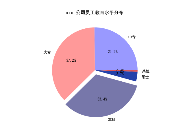
饼图
matplotlib.pyplot.pie(
x, explode=None, labels=None, colors=None,
autopct=None, pctdistance=0.6, shadow=False,
labeldistance=1.1, startangle=None, radius=None,
counterclock=True, wedgeprops=None, textprops=None,
center=(0, 0), frame=False, hold=None, data=None)
- x : array-like
- explode : array-like, optional, default: None(设置饼图偏离)
- labels : list, optional, default: None(标签)
- colors : array-like, optional, default: None(颜色设置)
- autopct : None (default), string, or function, optional(设置百分比显示)
- pctdistance : float, optional, default: 0.6(百分比距圆心的位置)
- shadow : bool, optional, default: False(设置阴影)
- labeldistance : float, optional, default: 1.1(标签距圆心的距离)
- startangle : float, optional, default: None(开始位置的旋转角度,第一个分类是在右45度位置)
- radius : float, optional, default: None(设置半径的大小)
- counterclock : bool, optional, default: True(是否逆时针)
- wedgeprops : dict, optional, default: None(内外边界设置)
- textprops : dict, optional, default: None(文本设置)
- center : list of float, optional, default: (0, 0)(设置中心位置)
- frame : bool, optional, default: False(是否显示饼图背后图框)
import matplotlib.pyplot as plt

# 中文和负号的正常显示

plt.rcParams['font.sans-serif']=['SimHei']

plt.rcParams['axes.unicode_minus'] = False

# 数据

edu = [0.2515,0.3724,0.3336,0.0368,0.0057]

labels = ['中专','大专','本科','硕士','其他']

# 让本科学历离圆心远一点

explode = [0,0,0.1,0,0]

# 将横、纵坐标轴标准化处理,保证饼图是一个正圆,否则为椭圆

plt.axes(aspect='equal')

# 自定义颜色

colors=['#9999ff','#ff9999','#7777aa','#2442aa','#dd5555'] # 自定义颜色

# 绘制饼图

plt.pie(x=edu,  # 绘图数据

    explode = explode,  # 突出显示大专人群

    labels = labels,  # 添加教育水平标签

    colors = colors,  # 设置饼图的自定义填充色

    autopct = '%.1f%%',  # 设置百分比的格式,这里保留一位小数

    )

# 添加图标题

plt.title('xxx 公司员工教育水平分布')

# 保存图形

plt.savefig('pie_demo.png')
例子二
import numpy as np

import matplotlib.pyplot as plt

fig, ax = plt.subplots(figsize=(6, 3), subplot_kw=dict(aspect="equal"))

recipe = ["375 g flour",

          "75 g sugar",

          "250 g butter",

          "300 g berries"]

data = [float(x.split()[0]) for x in recipe]

ingredients = [x.split()[-1] for x in recipe]

def func(pct, allvals):

    absolute = int(pct/100.*np.sum(allvals))

    return "{:.1f}%\n({:d} g)".format(pct, absolute)

wedges, texts, autotexts = ax.pie(data, autopct=lambda pct: func(pct, data),

                                  textprops=dict(color="w"))

ax.legend(wedges, ingredients,

          title="Ingredients",

          loc="center left",

          bbox_to_anchor=(1, 0, 0.5, 1))

plt.setp(autotexts, size=8, weight="bold")

ax.set_title("Matplotlib bakery: A pie")

plt.show()

数据可视化基础专题(十二):Matplotlib 基础(四)常用图表(二)气泡图、堆叠图、雷达图、饼图、的更多相关文章
- JavaScript数据可视化编程学习(一)Flotr2,包含简单的,柱状图,折线图,饼图,散点图
一.基础柱状图 二.基础的折线图 三.基础的饼图 四.基础的散点图 一.基础柱状图 如果你还没有想好你的数据用什么类型的图表来展示你的数据,你应该首先考虑是否可以做成柱状图.柱状图可以表示数据的变化过 ...
- python数据可视化、数据挖掘、机器学习、深度学习 常用库、IDE等
一.可视化方法 条形图 饼图 箱线图(箱型图) 气泡图 直方图 核密度估计(KDE)图 线面图 网络图 散点图 树状图 小提琴图 方形图 三维图 二.交互式工具 Ipython.Ipython not ...
- 比率(ratio)|帕雷托图|雷达图|轮廓图|条形图|茎叶图|直方图|线图|折线图|间隔数据|比例数据|标准分数|标准差系数|离散系数|平均差|异众比率|四分位差|切比雪夫|右偏分布|
比率是什么? 比率(ratio) :不同类别数值的比值 在中文里,比率这个词被用来代表两个数量的比值,这包括了两个相似却在用法上有所区分的概念:一个是比的值:另一是变化率,是一个数量相对于另一数量的变 ...
- 数据可视化实例(十二): 发散型条形图 (matplotlib,pandas)
https://datawhalechina.github.io/pms50/#/chapter10/chapter10 如果您想根据单个指标查看项目的变化情况,并可视化此差异的顺序和数量,那么散型条 ...
- 数据可视化实例(十四):带标记的发散型棒棒糖图 (matplotlib,pandas)
偏差 (Deviation) 带标记的发散型棒棒糖图 (Diverging Lollipop Chart with Markers) 带标记的棒棒糖图通过强调您想要引起注意的任何重要数据点并在图表中适 ...
- [原创.数据可视化系列之十二]使用 nodejs通过async await建立同步数据抓取
做数据分析和可视化工作,最重要的一点就是数据抓取工作,之前使用Java和python都做过简单的数据抓取,感觉用的很不顺手. 后来用nodejs发现非常不错,通过js就可以进行数据抓取工作,类似jqu ...
- 数据可视化实例(十六):有序条形图(matplotlib,pandas)
排序 (Ranking) 棒棒糖图 (Lollipop Chart) 棒棒糖图表以一种视觉上令人愉悦的方式提供与有序条形图类似的目的. https://datawhalechina.github.io ...
- 数据可视化实例(十五):有序条形图(matplotlib,pandas)
偏差 (Deviation) 有序条形图 (Ordered Bar Chart) 有序条形图有效地传达了项目的排名顺序. 但是,在图表上方添加度量标准的值,用户可以从图表本身获取精确信息. https ...
- 数据可视化实例(十四):面积图 (matplotlib,pandas)
偏差 (Deviation) 面积图 (Area Chart) 通过对轴和线之间的区域进行着色,面积图不仅强调峰和谷,而且还强调高点和低点的持续时间. 高点持续时间越长,线下面积越大. https:/ ...
- 数据可视化实例(十): 相关图(matplotlib,pandas)
相关图 https://datawhalechina.github.io/pms50/#/chapter8/chapter8 导入所需要的库 import numpy as np # 导入numpy库 ...
随机推荐
- Activiti6 学习日志(一):整合 SpringBoot2.1.3
本章节记录整合过程和部分问题,目前整合并不完美后续会继续更新... 文档链接: 5.2.1 activiti用户手册 activiti用户手册 activiti6 API 技术栈: springboo ...
- Shell语法规范
ver:1.0 博客:https://www.cnblogs.com/Rohn 本文介绍了Shell编程的一些语法规范,主要参考依据为谷歌的Shell语法风格. 目录 背景 使用哪一种Shell 什么 ...
- laravel向视图传递变量
向视图中传递变量 我们在开发web应用当中,通常都不是为了写静态页面而生的,我们需要跟数据打交道,那么这个时候,问题就来了,在一个MVC的框架中,怎么将数据传给视图呢?比如我们要在 ArticleCo ...
- 让apk可调试
一定是这个 <application android:debuggable="true" 不是这个玩意, debugaable, 也不是debugable这个玩意
- ViewPager2 学习
ViewPager2 延迟加载数据 ViewPager2 延迟加载数据 ViewPager 实现预加载的方案 ViewPager2 实现预加载的方案 总结 ViewPager 实现预加载的方案 背景 ...
- 说说TCP的三次握手和四次挥手
一.传输控制协议TCP简介 1.1 简介 TCP(Transmission Control Protocol) 传输控制协议,是一种 面向连接的.可靠的.基于字节流的传输层 通信协议. TCP是一种面 ...
- Python三大器之迭代器
Python三大器之迭代器 迭代器协议 迭代器协议规定:对象内部必须提供一个__next__方法,对其执行该方法要么返回迭代器中的下一项(可以暂时理解为下一个元素),要么就引起一个Stopiterat ...
- Python3-hashlib模块-加密算法之安全哈希
Python3中的hashlib模块提供了多个不同的安全哈希算法的通用接口 hashlib模块代替了Python2中的md5和sham模块,使用这个模块一般分为3步 1.创建一个哈希对象,使用哈希算法 ...
- 从 Tapable 中得到的启发
Tapable Why Tapable 前端开发中 Webpack 本质上是基于事件流的运行机制,它的工作流程是将特定的任务分发到指定的事件钩子中去完成.而实现这一切的核心就是 tapable,Web ...
- 宝贝,来,满足你,二哥告诉你学 Java 应该买什么书?
(这次的标题是不是有点皮,对模仿好朋友 guide 哥的,我也要皮一皮) 高尔基说过,对吧?宝贝们,"书籍是人类进步的阶梯",不管学什么,买几本心仪的书读一读,帮助还是非常大的.尽 ...