CSS动画实例:太极图在旋转
利用CSS可以构造出图形,然后可以对构造的图形添加动画效果。下面我们通过旋转的太极图、放大的五角星、跳“双人舞”的弯月等实例来体会纯CSS实现动画的方法。
1.旋转的太极图
设页面中有<div class="shape"></div>,若为. shape设置样式规则如下:
.shape
{
width: 192px;
height: 96px;
background: #fff;
border-color: #000;
border-style: solid;
border-width: 4px 4px 100px 4px;
border-radius: 50%;
}
可在页面中显示如图1所示的图形。
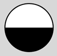
图1 上下两个半圆
若将. Shape的样式规则设置如下:
.shape
{
background: #000;
border: 36px solid #fff;
border-radius: 50%;
width: 24px;
height: 24px;
}
则可在页面中显示如图2所示的图形。

图2 黑心圆
如将黑心圆的背景填充色和边框填充色交换一下,则可在页面中显示如图3所示的图形。

图3 白心圆
将图2和图3适当地放入图1中,则可以绘制出一个太极图。
为这个太极图定义关键帧,使得它旋转起来。编写的HTML文件内容如下。


<!DOCTYPE html>

<html>

<head>

<title>旋转的太极图</title>

<style>

  .container

  {

    margin: 0 auto;

    width: 300px;

    height:300px;

    position: relative;

    display:flex;

    justify-content:center;

    align-items:center;

    background:#d8d8d8;

    border: 4px solid rgba(255, 0, 0, 0.9);

    border-radius: 10%;

  }

  .shape

  {

    width: 192px;

    height: 96px;

    background: #fff;

    border-color: #000;

    border-style: solid;

    border-width: 4px 4px 100px 4px;

    border-radius: 50%;

    position: relative;

    animation:rotate 2s linear infinite;

  }

  .shape:before

  {

    content: "";

    position: absolute;

    top: 50%;

    left: 0;

    background: #fff;

    border: 36px solid #000;

    border-radius: 50%;

    width: 24px;

    height: 24px;

  }

  .shape:after

  {

    content: "";

    position: absolute;

    top: 50%;

    left: 50%;

    background: #000;

    border: 36px solid #fff;

    border-radius:50%;

    width: 24px;

    height: 24px;

   }

   @keyframes rotate

   {

      0%   { transform: rotate(0deg); }

      100% { transform:rotate(360deg); }

   }

</style>

</head>

<body>

<div  class="container">

    <div class="shape"></div>

</div>

</body>

</html>
在浏览器中打开包含这段HTML代码的html文件,可以呈现出如图4所示的动画效果。
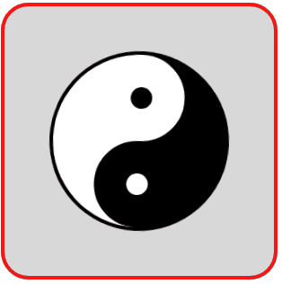
图4 旋转的太极图
2.由小到大的五角星
设页面中有<div class="shape"></div>,若为. shape设置样式规则如下:
.shape
{
position: relative;
display: block;
width:0px;
height:0px;
border-left: 100px solid transparent;
border-right: 100px solid transparent;
border-bottom:70px solid red;
transform:rotate(35deg);
}
.shape:before
{
content: '';
position: absolute;
width: 0px;
height: 0px;
top: -45px;
left: -62.5px;
border-left: 30px solid transparent;
border-right: 30px solid transparent;
border-bottom: 80px solid green;
transform: rotate(-35deg);
}
.shape:after
{
content: '';
position: absolute;
width: 0px;
height: 0px;
top: 3px;
left: -105px;
border-left: 100px solid transparent;
border-right: 100px solid transparent;
border-bottom: 70px solid blue;
transform:rotate(-70deg);
}
可在页面中显示如图5所示的五角星。这个五角星是由三个三角形拼成的,为了方便理解,将三个三角形设置成不同的颜色。
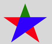
图5 由三个三角形拼成的五角星
将三个三角形的颜色都设置成红色,得到一个红色五角星,并为这个五角星定义关键帧,使得它由小慢慢放大。编写的HTML文件内容如下。
<!DOCTYPE html>

<html>

<head>

<title>放大的五角星</title>

<style>

  .container

  {

    margin: 0 auto;

    width: 300px;

    height:300px;

    position: relative;

    display:flex;

    justify-content:center;

    align-items:center;

    background:#d8d8d8;

    border: 4px solid rgba(255, 0, 0, 0.9);

    border-radius: 10%;

  }

  .shape

  {

    position: relative;

    display: block;

    width:0px;

    height:0px;

    border-left:  100px solid transparent;

    border-right: 100px solid transparent;

    border-bottom:70px  solid red;

    transform:rotate(35deg);

    animation:anim 2s linear infinite;

  }

  .shape:before

  {

    content: '';

    position: absolute;

    width: 0px;

    height: 0px;

    top: -45px;

    left: -62.5px;

    border-left:   30px solid transparent;

    border-right:  30px solid transparent;

    border-bottom: 80px solid red;

    transform: rotate(-35deg);

  }

  .shape:after

  {

    content: '';

    position: absolute;

    width: 0px;

    height: 0px;

    top: 3px;

    left: -105px;

    border-left: 100px solid transparent;

    border-right: 100px solid transparent;

    border-bottom: 70px solid red;

    transform:rotate(-70deg);

  }

  @keyframes anim

  {

     0%   { transform:  rotate(35deg) scale(0.2);  opacity: 0.1; }

     80%,100% { transform:  rotate(35deg) scale(1.2);  opacity: 1;  }

  }

</style>

</head>

<body>

<div  class="container">

    <div class="shape"></div>

</div>

</body>

</html>
在浏览器中打开包含这段HTML代码的html文件,可以呈现出如图6所示的动画效果。
图6 放大的五角星
3.弯月在跳舞
设页面中有<div class="shape"></div>,若为. shape设置样式规则如下:
.shape
{
display: block;
width: 160px;
height: 160px;
background:#ff0000;
border-radius: 50%;
transform: rotateZ(45deg) rotateX(70deg);
}
可在页面中显示如图7所示的图形。
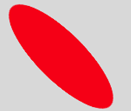
图7 红色斜椭圆
若在.shape样式定义中加上一句:box-shadow: 32px 0px 0 0px #ffffff;,则在页面中显示如图8所示的图形,红色斜椭圆带白色阴影。
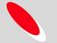
图8 带白色阴影的红色斜椭圆(1)
若再将rotateX(70deg)修改为rotateY(70deg),则在页面中显示如图9所示的图形。

图9 带白色阴影的红色斜椭圆(2)
若定义如下的关键帧,让红色椭圆带的白色阴影在给定的8个点循环运动,可呈现出如图10所示的动画效果。
@keyframes spin
{
0%,100% { box-shadow: 32px 0px 0 0px #ffffff; }
12% { box-shadow: 32px 32px 0 0 #ffffff; }
25% { box-shadow: 0 32px 0 0px #ffffff; }
37% { box-shadow: -32px 32px 0 0 #ffffff; }
50% { box-shadow: -32px 0 0 0 #ffffff; }
62% { box-shadow: -32px -32px 0 0 #ffffff;}
75% { box-shadow: 0px -32px 0 0 #ffffff; }
87% { box-shadow: 32px -32px 0 0 #ffffff; }
}

图10 白色阴影运动效果(1)
若将斜椭圆的填充色设置为背景色,只见到移动的白色阴影,则呈现出如图11所示的动画效果。
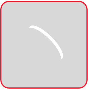
图11 白色阴影运动效果(2)
图9对应的白色阴影运动效果如图12所示。
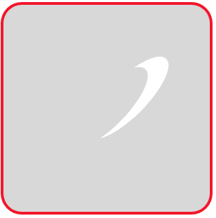
图12 白色阴影运动效果(3)
将图11和图12中运动的两个白色阴影组合起来,编写如下的HTML文件。
<!DOCTYPE html>

<html>

<head>

<title>跳舞的弯月</title>

<style>

  .container

  {

    margin: 0 auto;

    width: 300px;

    height:300px;

    position: relative;

    display:flex;

    justify-content:center;

    align-items:center;

    background:#d8d8d8;

    border: 4px solid rgba(255, 0, 0, 0.9);

    border-radius: 10%;

  }

  .shape

  {

    width: 160px;

    height: 160px;

    border-radius: 50%;

    transform: rotateZ(45deg);

  }

  .shape:before, .shape:after

  {

    content: '';

    display: block;

    position: absolute;

    top: 0;

    left: 0;

    width: 160px;

    height: 160px;

    border-radius: 50%;

    animation: 1s spin linear infinite;

  }

  .shape:before

  {

    transform: rotateX(70deg);

  }

  .shape:after

  {

    transform: rotateY(70deg);

    animation-delay: 0.5s;

  }

  @keyframes spin

  {

    0%,100%  { box-shadow: 32px 0px 0 0px #ffffff; }

    12%      { box-shadow: 32px 32px 0 0 #ffffff;  }

    25%      { box-shadow: 0 32px 0 0px #ffffff;   }

    37%      { box-shadow: -32px 32px 0 0 #ffffff; }

    50%      { box-shadow: -32px 0 0 0 #ffffff;    }

    62%      { box-shadow: -32px -32px 0 0 #ffffff;}

    75%      { box-shadow: 0px -32px 0 0 #ffffff;  }

    87%      { box-shadow: 32px -32px 0 0 #ffffff; }

  }

</style>

</head>

<body>

<div  class="container">

    <div class="shape"></div>

</div>

</body>

</html>
在浏览器中打开包含这段HTML代码的html文件,可以呈现出如图13所示的动画效果,好像两个弯月在跳“双人舞”。
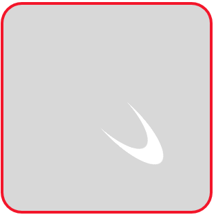
图13 跳“双人舞”的弯月
仿照上面的思想,我们还可以编写如下的HTML文件,实现以原子为中心的电子旋转的动画效果。
<!DOCTYPE html>

<html>

<head>

<title>旋转的电子</title>

<style>

  .container

  {

    margin: 0 auto;

    width: 300px;

    height:300px;

    position: relative;

    display:flex;

    justify-content:center;

    align-items:center;

    background:#d8d8d8;

    border: 4px solid rgba(255, 0, 0, 0.9);

    border-radius: 10%;

  }

  .shape

  {

    position: relative;

    width: 24px;

    height: 24px;

    background-color: #f00;

    border-radius: 50%;

    animation: anim1 20s infinite linear;

  }

  .shape:before, .shape:after

  {

    content: '';

    border-radius: 100%;

    position: absolute;

    top: 50%;

    left: 50%;

    transform: translate(-50%, -50%);

  }

  .shape:before

  {

    width: 60px;

    height: 200px;

    animation: anim2 .8s linear infinite;

  }

  .shape:after

  {

    width: 200px;

    height: 60px;

    animation: anim2 1.2s linear infinite;

  }

  @keyframes anim1

  {

     0%   { transform: rotate(0deg);   }

     100% { transform: rotate(360deg); }

  }

  @keyframes anim2

  {

     0%, 100%  { box-shadow: 2px -2px 0 1.5px #fff; }

     25%       { box-shadow: 2px 2px 0 1.5px #fff;  }

     50%       { box-shadow: -2px 2px 0 1.5px #fff; }

     75%       { box-shadow: -2px -2px 0 1.5px #fff;}

  }

</style>

</head>

<body>

<div  class="container">

    <div class="shape"></div>

</div>

</body>

</html>
在浏览器中打开包含这段HTML代码的html文件,可以呈现出如图14所示的动画效果,好像两个电子绕中心原子在各自轨道旋转。

图14 绕中心原子旋转的电子
CSS动画实例:太极图在旋转的更多相关文章
- CSS动画实例
上一篇讲过css动画transform transition的语法,这一节展示自己做的几个小例子加深印象 1. 线条动画效果 代码:最外层div包含2个小的div : a和b. a有左右边框(高度 ...
- CSS动画实例:旋转的圆角正方形
在页面中放置一个类名为container的层作为效果呈现容器,在该层中再定义十个名为shape的层层嵌套的子层,HTML代码描述如下: <div class="container&qu ...
- CSS动画实例:移动的眼珠子
适当地利用CSS的box-shadow可以构造图形,然后可以对构造的图形添加动画效果.下面我们通过移动的眼珠子.圆珠一二三.一分为四.四小圆旋转扩散等实例来体会box-shadow属性在动画制作中的使 ...
- CSS动画实例:小圆球的海洋
CSS背景属性用于定义HTML元素的背景,在CSS提供的背景属性中, background-image:指定要使用的一个或多个背景图像: background-color:指定要使用的背景颜色: ba ...
- CSS动画实例:一颗躁动的心
在页面中放置一个类名为container的层作为盛放心心的容器,在该层中再定义一个名为heart的子层,HTML代码描述如下: <div class="container"& ...
- CSS动画实例:Loading加载动画效果(三)
3.小圆型Loading 这类Loading动画的基本思想是:在呈现容器中定义1个或多个子层,再对每个子层进行样式定义,使得其均显示为一个实心圆形,最后编写关键帧动画控制,使得各个实心圆或者大小发生改 ...
- CSS动画实例:行星和卫星
设页面中有<div class=" planet "></div>,用来绘制一个行星和卫星图形.这个图形包括三部分:行星.卫星和卫星旋转的轨道.定义. pl ...
- CSS动画实例:跳跃的字符
1.翻转的字符 在页面中放置一个类名为container的层作为容器,在该层中放置5个字符区域,HTML代码描述如下: <div class="container"> ...
- CSS动画实例:Loading加载动画效果(一)
一些网站或者APP在加载新东西的时候,往往会给出一个好看有趣的Loading图,大部分的Loading样式都可以使用CSS3制作出来,它不仅比直接使用gif图简单方便,还能节省加载时间和空间.下面介绍 ...
随机推荐
- 如何查看预收录在arXiv上论文的LaTeX源文件并编译
arXiv 是一个收集物理学.数学.计算机科学与生物学论文预印本的网站. 对于理科生来说,经常需要在上面搜索下载一些论文,正常情况下,一般人下载的只是 pdf 文件,其实可以在 arXiv 上下载编译 ...
- .net 面试题 2020-2-26
2020-2-26 每日几道面试题1. .NET和C#有什么区别答:.NET一般指 .NET FrameWork框架,它是一种平台,一种技术.C#是一种编程语言,可以基于.NET平台的应用. 2.一列 ...
- 对‘sqrt’未定义的引用
首先, 引用数学库 #include<math.h> 引用数学库时,要在编译后加上-lm 是每一个都要加!! 如下: gcc su.c -o su.o -lm gcc -g su.c - ...
- 360随身WiFi3:纯净版无线网卡驱动下载及安装教程(Windows10版本)
对于不带无线网卡的台式机,买一个360随身WiFi当无线网卡是很省钱的方法.但是这个随身WiFi3用的芯片较为奇葩,Win10下不太好找驱动.什么,你问我为啥不用360官网上的驱动?那个“驱动”装了之 ...
- 7.9 NOI模拟赛 数列 交互 高精 字符串
这是交互题 也是一个防Ak的题目 4个\(subtask\) 需要写3个不尽相同的算法. 题目下发了交互程序 所以调试的时候比较方便 有效防止\(CE\). 题目还有迷糊选手的点 数字位数为a 范围是 ...
- dsu on tree详解
这个算法还是挺人性化的,没有什么难度 就是可能看起来有点晕什么的. 大体 思想是 利用重链刨分来优化子树内部的查询. 考虑一个问题要对每个子树都要询问一次.我们暴力显然是\(n^2\)的. 考虑一下优 ...
- luogu P2510 [HAOI2008]下落的圆盘
LINK:下落的圆盘 计算几何.n个圆在平面上编号大的圆将编号小的圆覆盖求最后所有没有被覆盖的圆的边缘的总长度. 在做这道题之前有几个前置知识. 极坐标系:在平面内 由极点 极轴 和 极径组成的坐标系 ...
- 如何优雅的设计 Spring Boot API 接口版本号
原文:https://blog.mariojd.cn/how-to-design-spring-boot-api-version-number-elegantly.html 一般来说,系统上线以后,需 ...
- iOS开发实战之搜索控制器UISearchController使用
当tableView中的数据过多的时候,在tableView上加一个搜索框就变的很必要了,本文就讨论搜索控制器的使用,以及谓词的简单实现. .m文件中代码如下 添加搜索控制器的各种协议 <UIS ...
- MySQL索引结构原理分析
我们在学习MySQL的时候经常会听到索引这个词,大概也知道这是什么,但是深究下去又说不出什么道道来.下面将会比较全面的介绍一下关于索引! 1 索引是什么? 这里用百度百科的一句话来说,在关系数据库中, ...