Python-matplotlib画图(莫烦笔记)
https://www.zhihu.com/collection/260736383
https://blog.csdn.net/gaotihong/article/details/80983937
链接:https://zhuanlan.zhihu.com/p/33270402
来源:知乎
著作权归作者所有,转载请联系作者获得授权。
1.前言
Matplotlib是一个python的 2D绘图库,它以各种硬拷贝格式和跨平台的交互式环境生成出版质量级别的图形。通过Matplotlib,开发者可以仅需要几行代码,便可以生成绘图,直方图,功率谱,条形图,错误图,散点图等。
2.简单的使用
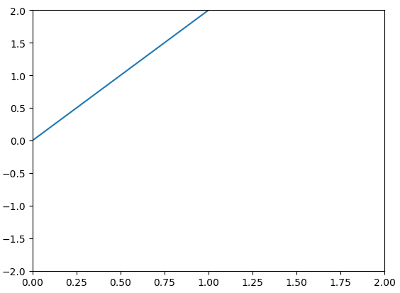
- import matplotlib.pyplot as plt
- import numpy as np
- x = np.linspace(-1,1,50)#从(-1,1)均匀取50个点
- y = 2 * x
- plt.plot(x,y)
- plt.show()
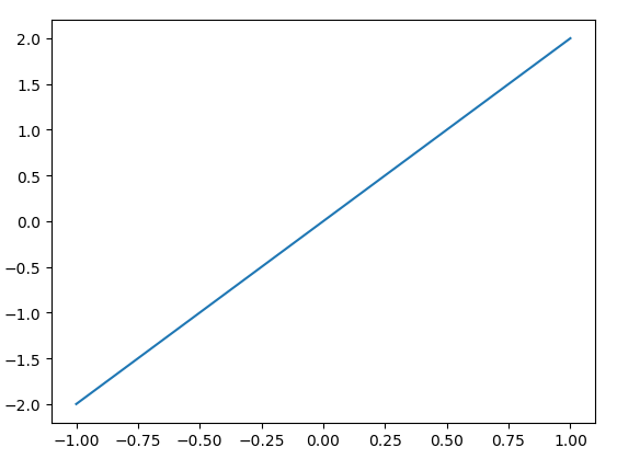 y = 2x图像
注意:
1.如果不使用plo.show()图表是显示不出来的,因为可能你要对图表进行多种的描述,所以通过显式的调用show()可以避免不必要的错误。
3.Figure对象
我这里单拿出一个一个的对象,然后后面在进行总结。在matplotlib中,整个图表为一个figure对象。其实对于每一个弹出的小窗口就是一个Figure对象,那么如何在一个代码中创建多个Figure对象,也就是多个小窗口呢?
- import matplotlib.pyplot as plt
- import numpy as np
- x = np.linspace(-1,1,50)
- y1 = x ** 2
- y2 = x * 2
- #这个是第一个figure对象,下面的内容都会在第一个figure中显示
- plt.figure()
- plt.plot(x,y1)
- #这里第二个figure对象
- plt.figure(num = 3,figsize = (10,5))
- plt.plot(x,y2)
- plt.show()
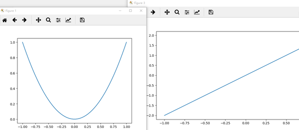
这里需要注意的是:
- 我们看上面的每个图像的窗口,可以看出figure并没有从1开始然后到2,这是因为我们在创建第二个figure对象的时候,指定了一个num = 3的参数,所以第二个窗口标题上显示的figure3。
- 对于每一个窗口,我们也可以对他们分别去指定窗口的大小。也就是figsize参数。
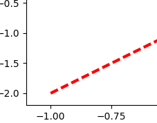
- 若我们想让他们的线有所区别,我们可以用下面语句进行修改
plt.plot(x,y2,color = 'red',linewidth = 3.0,linestyle = '--')
4.设置坐标轴
我们想更改在图表上显示x,y的取值范围:
- import matplotlib.pyplot as plt
- import numpy as np
- x = np.linspace(-1,1,50)
- y = x *2
- plt.plot(x,y)
- plt.show()
 默认的横纵坐标
- #在plt.show()之前添加
- plt.xlim((0,2))
- plt.ylim((-2,2))
 更改横纵坐标的取值范围之后
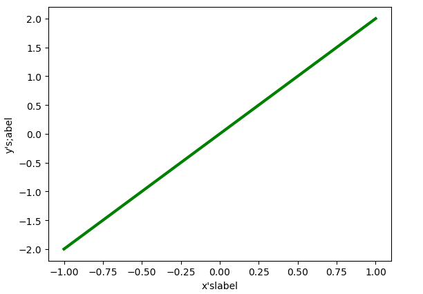
给横纵坐标设置名称:
- import matplotlib.pyplot as plt
- import numpy as np
- x = np.linspace(-1,1,50)
- y = x * 2
- plt.xlabel("x'slabel")#x轴上的名字
- plt.ylabel("y's;abel")#y轴上的名字
- plt.plot(x,y,color='green',linewidth = 3)
- plt.show()
把坐标轴换成不同的单位:
- new_ticks = np.linspace(-1,2,5)
- plt.xticks(new_ticks)
- #在对应坐标处更换名称
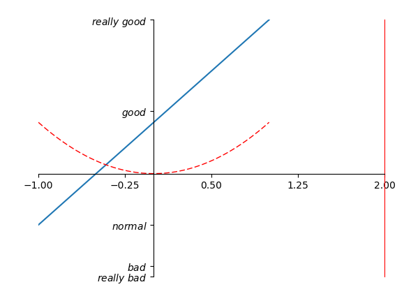
- plt.yticks([-2,-1,0,1,2],['really bad','b','c','d','good'])
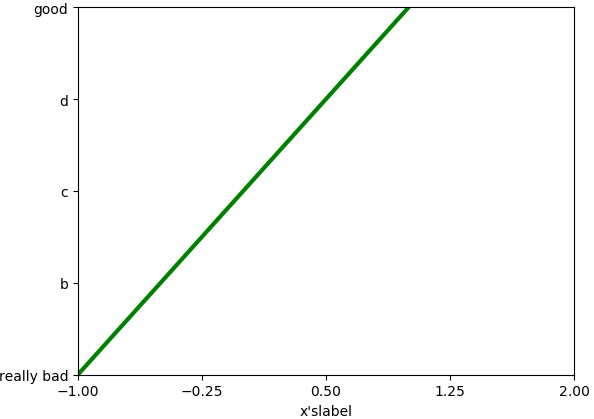 更换后的坐标名称
那么如果我想把坐标轴上的字体更改成数学的那种形式:
- #在对应坐标处更换名称
- plt.yticks([-2,-1,0,1,2],[r'$really\ bad$',r'$b$',r'$c\ \alpha$','d','good'])
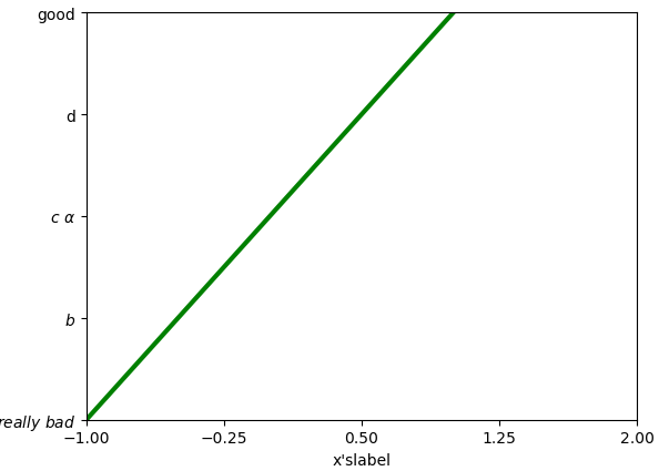 将单位改成数学的字体格式
注意:
- 我们如果要使用空格的话需要进行对空格的转义"\ "这种转义才能输出空格;
- 我们可以在里面加一些数学的公式,如"\alpha"来表示
。
如何去更换坐标原点,坐标轴呢?我们在plt.show()之前:
- #gca = 'get current axis'
- #获取当前的这四个轴
- ax = plt.gca()
- #设置脊梁(也就是包围在图标四周的默认黑线)
- #所以设置脊梁的时候,一共有四个方位
- ax.spines['right'].set_color('r')
- ax.spines['top'].set_color('none')
- #将底部脊梁作为x轴
- ax.xaxis.set_ticks_position('bottom')
- #ACCEPTS:['top' | 'bottom' | 'both'|'default'|'none']
- #设置x轴的位置(设置底的时候依据的是y轴)
- ax.spines['bottom'].set_position(('data',0))
- #the 1st is in 'outward' |'axes' | 'data'
- #axes : precentage of y axis
- #data : depend on y data
- ax.yaxis.set_ticks_position('left')
- # #ACCEPTS:['top' | 'bottom' | 'both'|'default'|'none']
- #设置左脊梁(y轴)依据的是x轴的0位置
- ax.spines['left'].set_position(('data',0))
 更改坐标轴位置
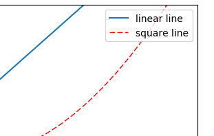
5.legend图例
我们很多时候会再一个figures中去添加多条线,那我们如何去区分多条线呢?这里就用到了legend。
- #简单的使用
- l1, = plt.plot(x, y1, label='linear line')
- l2, = plt.plot(x, y2, color='red', linewidth=1.0, linestyle='--', label='square line')
- #简单的设置legend(设置位置)
- #位置在右上角
- plt.legend(loc = 'upper right')
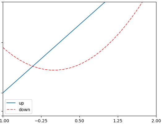
- l1, = plt.plot(x, y1, label='linear line')
- l2, = plt.plot(x, y2, color='red', linewidth=1.0, linestyle='--', label='square line')
- plt.legend(handles = [l1,l2],labels = ['up','down'],loc = 'best')
- #the ',' is very important in here l1, = plt...and l2, = plt...for this step
- """legend( handles=(line1, line2, line3),
- labels=('label1', 'label2', 'label3'),
- 'upper right')
- shadow = True 设置图例是否有阴影
- The *loc* location codes are::
- 'best' : 0,
- 'upper right' : 1,
- 'upper left' : 2,
- 'lower left' : 3,
- 'lower right' : 4,
- 'right' : 5,
- 'center left' : 6,
- 'center right' : 7,
- 'lower center' : 8,
- 'upper center' : 9,
- 'center' : 10,"""
这里需要注意的是:
- 如果我们没有在legend方法的参数中设置labels,那么就会使用画线的时候,也就是plot方法中的指定的label参数所指定的名称,当然如果都没有的话就会抛出异常;
- 其实我们plt.plot的时候返回的是一个线的对象,如果我们想在handle中使用这个对象,就必须在返回的名字的后面加一个","号;
- legend = plt.legend(handles = [l1,l2],labels = ['hu','tang'],loc = 'upper center',shadow = True)
- frame = legend.get_frame()
- frame.set_facecolor('r')#或者0.9...
 更改后的图例样式
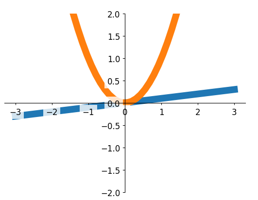
6.在图片上加一些标注annotation
在图片上加注解有两种方式:
- import matplotlib.pyplot as plt
- import numpy as np
- x = np.linspace(-3,3,50)
- y = 2*x + 1
- plt.figure(num = 1,figsize =(8,5))
- plt.plot(x,y)
- ax = plt.gca()
- ax.spines['right'].set_color('none')
- ax.spines['top'].set_color('none')
- #将底下的作为x轴
- ax.xaxis.set_ticks_position('bottom')
- #并且data,以y轴的数据为基本
- ax.spines['bottom'].set_position(('data',0))
- #将左边的作为y轴
- ax.yaxis.set_ticks_position('left')
- ax.spines['left'].set_position(('data',0))
- print("-----方式一-----")
- x0 = 1
- y0 = 2*x0 + 1
- plt.plot([x0,x0],[0,y0],'k--',linewidth = 2.5)
- plt.scatter([x0],[y0],s = 50,color='b')
- plt.annotate(r'$2x+1 = %s$'% y0,xy = (x0,y0),xycoords = 'data',
- xytext=(+30,-30),textcoords = 'offset points',fontsize = 16
- ,arrowprops = dict(arrowstyle='->',
- connectionstyle="arc3,rad=.2"))
- plt.show()
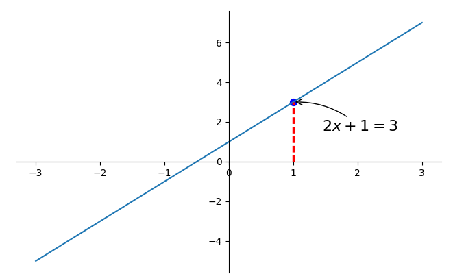 第一种annotation
- plt.annotate(r'$2x+1 = %s$'% y0,xy = (x0,y0),xycoords = 'data',
- xytext=(+30,-30),textcoords = 'offset points',fontsize = 16
- ,arrowprops = dict(arrowstyle='->',
- connectionstyle="arc3,rad=.2"))
注意:
- xy就是需要进行注释的点的横纵坐标;
- xycoords = 'data'说明的是要注释点的xy的坐标是以横纵坐标轴为基准的;
- xytext=(+30,-30)和textcoords='data'说明了这里的文字是基于标注的点的x坐标的偏移+30以及标注点y坐标-30位置,就是我们要进行注释文字的位置;
- fontsize = 16就说明字体的大小;
- arrowprops = dict()这个是对于这个箭头的描述,arrowstyle='->'这个是箭头的类型,connectionstyle="arc3,rad=.2"这两个是描述我们的箭头的弧度以及角度的。
- print("-----方式二-----")
- plt.text(-3.7,3,r'$this\ is\ the\ some\ text. \mu\ \sigma_i\ \alpha_t$',
- fontdict={'size':16,'color':'r'})
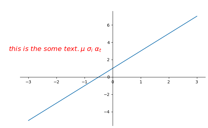 第二种标注方式
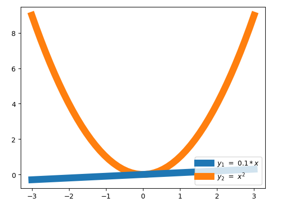
这里先介绍一下plot中的一个参数:
- import matplotlib.pyplot as plt
- import numpy as np
- x = np.linspace(-3,3,50)
- y1 = 0.1*x
- y2 = x**2
- plt.figure()
- #zorder控制绘图顺序
- plt.plot(x,y1,linewidth = 10,zorder = 2,label = r'$y_1\ =\ 0.1*x$')
- plt.plot(x,y2,linewidth = 10,zorder = 1,label = r'$y_2\ =\ x^{2}$')
- plt.legend(loc = 'lower right')
- plt.show()
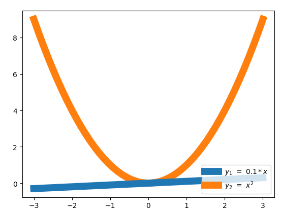
如果改成:
- #zorder控制绘图顺序
- plt.plot(x,y1,linewidth = 10,zorder = 1,label = r'$y_1\ =\ 0.1*x$')
- plt.plot(x,y2,linewidth = 10,zorder = 2,label = r'$y_2\ =\ x^{2}$')
下面我们看一下这个图:
- import matplotlib.pyplot as plt
- import numpy as np
- x = np.linspace(-3,3,50)
- y1 = 0.1*x
- y2 = x**2
- plt.figure()
- #zorder控制绘图顺序
- plt.plot(x,y1,linewidth = 10,zorder = 1,label = r'$y_1\ =\ 0.1*x$')
- plt.plot(x,y2,linewidth = 10,zorder = 2,label = r'$y_2\ =\ x^{2}$')
- plt.ylim(-2,2)
- ax = plt.gca()
- ax.spines['right'].set_color('none')
- ax.spines['top'].set_color('none')
- ax.xaxis.set_ticks_position('bottom')
- ax.spines['bottom'].set_position(('data',0))
- ax.yaxis.set_ticks_position('left')
- ax.spines['left'].set_position(('data',0))
- plt.show()
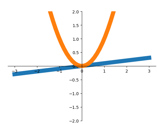 执行效果
执行效果
从上面看,我们可以看见我们轴上的坐标被掩盖住了,那么我们怎么去修改他呢?
- print(ax.get_xticklabels())
- print(ax.get_yticklabels())
- for label in ax.get_xticklabels() + ax.get_yticklabels():
- label.set_fontsize(12)
- label.set_bbox(dict(facecolor = 'white',edgecolor='none',alpha = 0.8,zorder = 2))
- <a list of 9 Text xticklabel objects>
- <a list of 9 Text yticklabel objects>
 让坐标轴显示出来
这里需要注意:
- ax.get_xticklabels()获取得到就是坐标轴上的数字;
- set_bbox()这个bbox就是那坐标轴上的数字的那一小块区域,从结果我们可以很明显的看出来;
- facecolor = 'white',edgecolor='none,第一个参数表示的这个box的前面的背景,边上的颜色。
7.画图的种类
1.scatter散点图
- import matplotlib.pyplot as plt
- import numpy as np
- n = 1024
- X = np.random.normal(0,1,n)
- Y = np.random.normal(0,1,n)
- T = np.arctan2(Y,X)#for color later on
- plt.scatter(X,Y,s = 75,c = T,alpha = .5)
- plt.xlim((-1.5,1.5))
- plt.xticks([])#ignore xticks
- plt.ylim((-1.5,1.5))
- plt.yticks([])#ignore yticks
- plt.show()
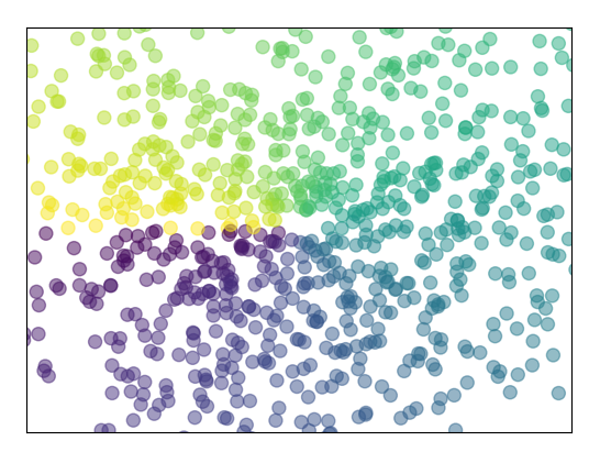 散点图
散点图
2.柱状图
- import matplotlib.pyplot as plt
- import numpy as np
- n = 12
- X = np.arange(n)
- Y1 = (1 - X/float(n)) * np.random.uniform(0.5,1.0,n)
- Y2 = (1 - X/float(n)) * np.random.uniform(0.5,1.0,n)
- #facecolor:表面的颜色;edgecolor:边框的颜色
- plt.bar(X,+Y1,facecolor = '#9999ff',edgecolor = 'white')
- plt.bar(X,-Y2,facecolor = '#ff9999',edgecolor = 'white')
- #描绘text在图表上
- # plt.text(0 + 0.4, 0 + 0.05,"huhu")
- for x,y in zip(X,Y1):
- #ha : horizontal alignment
- #va : vertical alignment
- plt.text(x + 0.01,y+0.05,'%.2f'%y,ha = 'center',va='bottom')
- for x,y in zip(X,Y2):
- # ha : horizontal alignment
- # va : vertical alignment
- plt.text(x+0.01,-y-0.05,'%.2f'%(-y),ha='center',va='top')
- plt.xlim(-.5,n)
- plt.yticks([])
- plt.ylim(-1.25,1.25)
- plt.yticks([])
- plt.show()
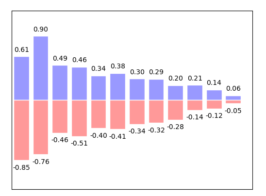 柱状图
柱状图
3.Contours等高线图
- import matplotlib.pyplot as plt
- import numpy as np
- def f(x,y):
- #the height function
- return (1-x/2 + x**5+y**3) * np.exp(-x **2 -y**2)
- n = 256
- x = np.linspace(-3,3,n)
- y = np.linspace(-3,3,n)
- #meshgrid函数用两个坐标轴上的点在平面上画网格。
- X,Y = np.meshgrid(x,y)
- #use plt.contourf to filling contours
- #X Y and value for (X,Y) point
- #这里的8就是说明等高线分成多少个部分,如果是0则分成2半
- #则8是分成10半
- #cmap找对应的颜色,如果高=0就找0对应的颜色值,
- plt.contourf(X,Y,f(X,Y),8,alpha = .75,cmap = plt.cm.hot)
- #use plt.contour to add contour lines
- C = plt.contour(X,Y,f(X,Y),8,colors = 'black',linewidth = .5)
- #adding label
- plt.clabel(C,inline = True,fontsize = 10)
- #ignore ticks
- plt.xticks([])
- plt.yticks([])
- plt.show()
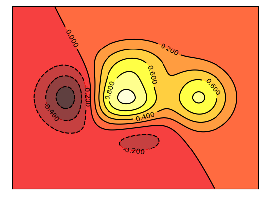 等高线
等高线
4.image图片
- import matplotlib.pyplot as plt
- import numpy as np
- #image data
- a = np.array([0.313660827978, 0.365348418405, 0.423733120134,
- 0.365348418405, 0.439599930621, 0.525083754405,
- 0.423733120134, 0.525083754405, 0.651536351379]).reshape(3,3)
- '''
- for the value of "interpolation",check this:
- http://matplotlib.org/examples/images_contours_and_fields/interpolation_methods.html
- for the value of "origin"= ['upper', 'lower'], check this:
- http://matplotlib.org/examples/pylab_examples/image_origin.html
- '''
- #显示图像
- #这里的cmap='bone'等价于plt.cm.bone
- plt.imshow(a,interpolation = 'nearest',cmap = 'bone' ,origin = 'up')
- #显示右边的栏
- plt.colorbar(shrink = .92)
- #ignore ticks
- plt.xticks([])
- plt.yticks([])
- plt.show()
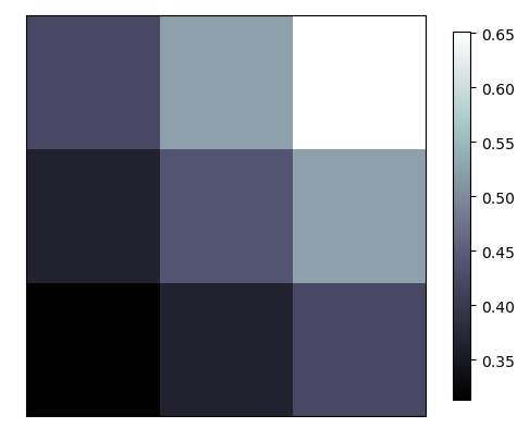 显示图片
显示图片
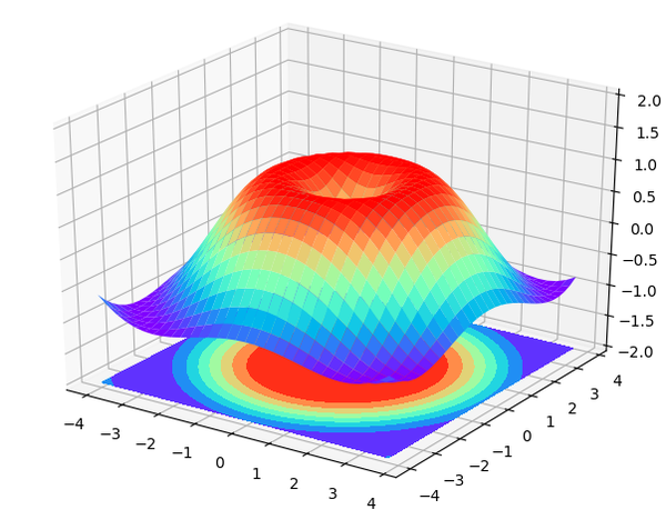
5.3D数据
- import numpy as np
- import matplotlib.pyplot as plt
- from mpl_toolkits.mplot3d import Axes3D
- fig = plt.figure()
- ax = Axes3D(fig)
- #X Y value
- X = np.arange(-4,4,0.25)
- Y = np.arange(-4,4,0.25)
- X,Y = np.meshgrid(X,Y)
- R = np.sqrt(X**2 + Y**2)
- #hight value
- Z = np.sin(R)
- ax.plot_surface(X, Y, Z, rstride=1, cstride=1, cmap=plt.get_cmap('rainbow'))
- """
- ============= ================================================
- Argument Description
- ============= ================================================
- *X*, *Y*, *Z* Data values as 2D arrays
- *rstride* Array row stride (step size), defaults to 10
- *cstride* Array column stride (step size), defaults to 10
- *color* Color of the surface patches
- *cmap* A colormap for the surface patches.
- *facecolors* Face colors for the individual patches
- *norm* An instance of Normalize to map values to colors
- *vmin* Minimum value to map
- *vmax* Maximum value to map
- *shade* Whether to shade the facecolors
- ============= ================================================
- """
- # I think this is different from plt12_contours
- ax.contourf(X, Y, Z, zdir='z', offset=-2, cmap=plt.get_cmap('rainbow'))
- """
- ========== ================================================
- Argument Description
- ========== ================================================
- *X*, *Y*, Data values as numpy.arrays
- *Z*
- *zdir* The direction to use: x, y or z (default)
- *offset* If specified plot a projection of the filled contour
- on this position in plane normal to zdir
- ========== ================================================
- """
- ax.set_zlim(-2, 2)
- plt.show()
8.多图合并展示
1.使用subplot函数
- import matplotlib.pyplot as plt
- plt.figure(figsize = (6,5))
- ax1 = plt.subplot(3,1,1)
- ax1.set_title("ax1 title")
- plt.plot([0,1],[0,1])
- #这种情况下如果再数的话以334为标准了,
- #把上面的第一行看成是3个列
- ax2 = plt.subplot(334)
- ax2.set_title("ax2 title")
- ax3 = plt.subplot(335)
- ax4 = plt.subplot(336)
- ax5 = plt.subplot(325)
- ax6 = plt.subplot(326)
- plt.show()
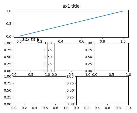 案例一
案例一
- import matplotlib.pyplot as plt
- plt.figure(figsize = (6,4))
- #plt.subplot(n_rows,n_cols,plot_num)
- plt.subplot(211)
- # figure splits into 2 rows, 1 col, plot to the 1st sub-fig
- plt.plot([0, 1], [0, 1])
- plt.subplot(234)
- # figure splits into 2 rows, 3 col, plot to the 4th sub-fig
- plt.plot([0, 1], [0, 2])
- plt.subplot(235)
- # figure splits into 2 rows, 3 col, plot to the 5th sub-fig
- plt.plot([0, 1], [0, 3])
- plt.subplot(236)
- # figure splits into 2 rows, 3 col, plot to the 6th sub-fig
- plt.plot([0, 1], [0, 4])
- plt.tight_layout()
- plt.show()
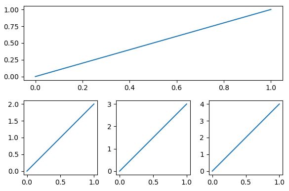 案例二
案例二
2.分格显示
- #method 1: subplot2grid
- import matplotlib.pyplot as plt
- plt.figure()
- #第一个参数shape也就是我们网格的形状
- #第二个参数loc,位置,这里需要注意位置是从0开始索引的
- #第三个参数colspan跨多少列,默认是1
- #第四个参数rowspan跨多少行,默认是1
- ax1 = plt.subplot2grid((3,3),(0,0),colspan = 3,rowspan = 1)
- #如果为他设置一些属性的话,如plt.title,则用ax1的话
- #ax1.set_title(),同理可设置其他属性
- ax1.set_title("ax1_title")
- ax2 = plt.subplot2grid((3,3),(1,0),colspan = 2,rowspan = 1)
- ax3 = plt.subplot2grid((3,3),(1,2),colspan = 1,rowspan = 2)
- ax4 = plt.subplot2grid((3,3),(2,0),colspan = 1,rowspan = 1)
- ax5 = plt.subplot2grid((3,3),(2,1),colspan = 1,rowspan = 1)
- plt.show()
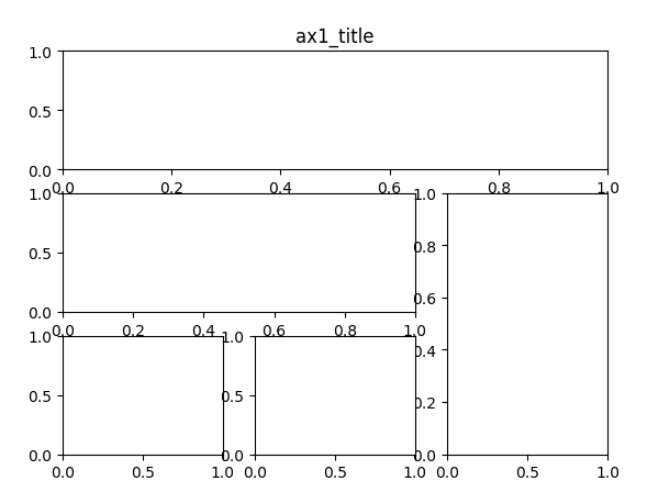 method1 result
- #method 2:gridspec
- import matplotlib.pyplot as plt
- import matplotlib.gridspec as gridspec
- plt.figure()
- gs = gridspec.GridSpec(3,3)
- #use index from 0
- ax1 = plt.subplot(gs[0,:])
- ax1.set_title("ax1 title")
- ax2 = plt.subplot(gs[1,:2])
- ax2.plot([1,2],[3,4],'r')
- ax3 = plt.subplot(gs[1:,2:])
- ax4 = plt.subplot(gs[-1,0])
- ax5 = plt.subplot(gs[-1,-2])
- plt.show()
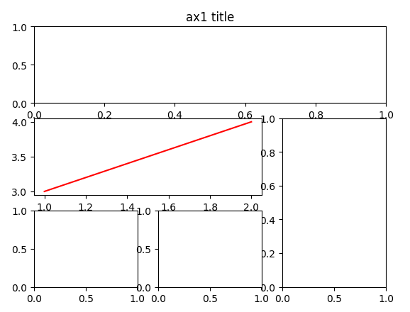 method2 result
- #method 3 :easy to define structure
- #这种方式不能生成指定跨行列的那种
- import matplotlib.pyplot as plt
- #(ax11,ax12),(ax13,ax14)代表了两行
- #f就是figure对象,
- #sharex:是否共享x轴
- #sharey:是否共享y轴
- f,((ax11,ax12),(ax13,ax14)) = plt.subplots(2,2,sharex = True,sharey = True)
- ax11.set_title("a11 title")
- ax12.scatter([1,2],[1,2])
- plt.show()
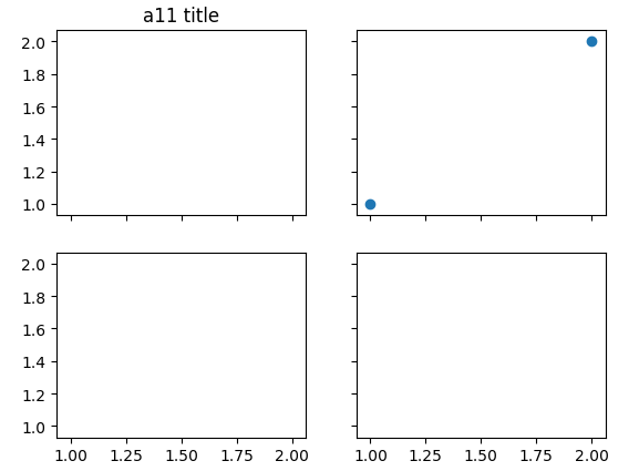 method3 result
3.图中图
- import matplotlib.pyplot as plt
- fig = plt.figure()
- x = [1,2,3,4,5,6,7]
- y = [1,3,4,2,5,8,6]
- #below are all percentage
- left, bottom, width, height = 0.1, 0.1, 0.8, 0.8
- #使用plt.figure()显示的是一个空的figure
- #如果使用fig.add_axes会添加轴
- ax1 = fig.add_axes([left, bottom, width, height])# main axes
- ax1.plot(x,y,'r')
- ax1.set_xlabel('x')
- ax1.set_ylabel('y')
- ax1.set_title('title')
- ax2 = fig.add_axes([0.2, 0.6, 0.25, 0.25]) # inside axes
- ax2.plot(y, x, 'b')
- ax2.set_xlabel('x')
- ax2.set_ylabel('y')
- ax2.set_title('title inside 1')
- # different method to add axes
- ####################################
- plt.axes([0.6, 0.2, 0.25, 0.25])
- plt.plot(y[::-1], x, 'g')
- plt.xlabel('x')
- plt.ylabel('y')
- plt.title('title inside 2')
- plt.show()
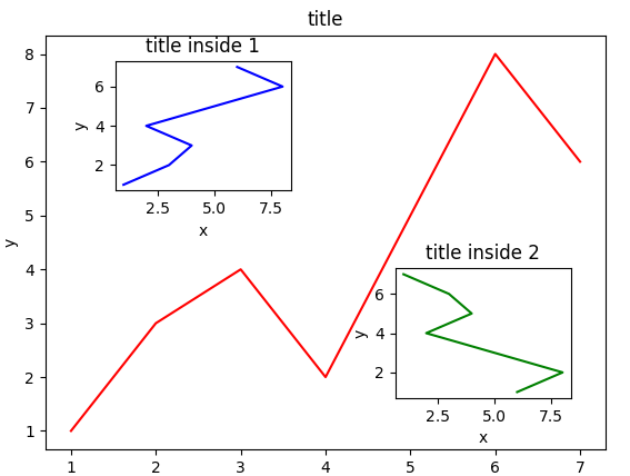 画中画
画中画
4.次坐标轴
- # 使用twinx是添加y轴的坐标轴
- # 使用twiny是添加x轴的坐标轴
- import matplotlib.pyplot as plt
- import numpy as np
- x = np.arange(0,10,0.1)
- y1 = 0.05 * x ** 2
- y2 = -1 * y1
- fig,ax1 = plt.subplots()
- ax2 = ax1.twinx()
- ax1.plot(x,y1,'g-')
- ax2.plot(x,y2,'b-')
- ax1.set_xlabel('X data')
- ax1.set_ylabel('Y1 data',color = 'g')
- ax2.set_ylabel('Y2 data',color = 'b')
- plt.show()
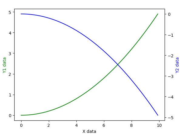 次坐标
次坐标
9.animation动画
- import numpy as np
- from matplotlib import pyplot as plt
- from matplotlib import animation
- fig,ax = plt.subplots()
- x = np.arange(0,2*np.pi,0.01)
- #因为这里返回的是一个列表,但是我们只想要第一个值
- #所以这里需要加,号
- line, = ax.plot(x,np.sin(x))
- def animate(i):
- line.set_ydata(np.sin(x + i/10.0))#updata the data
- return line,
- def init():
- line.set_ydata(np.sin(x))
- return line,
- # call the animator. blit=True means only re-draw the parts that have changed.
- # blit=True dose not work on Mac, set blit=False
- # interval= update frequency
- #frames帧数
- ani = animation.FuncAnimation(fig=fig, func=animate, frames=100, init_func=init,
- interval=20, blit=False)
- plt.show()
Python-matplotlib画图(莫烦笔记)的更多相关文章
- python matplotlib画图产生的Type 3 fonts字体没有嵌入问题
ScholarOne's 对python matplotlib画图产生的Type 3 fonts字体不兼容,更改措施: 在程序中添加如下语句 import matplotlib matplotlib. ...
- 用python matplotlib 画图
state-machine environment object-oriente interface figure and axes backend and frontend user interfa ...
- python matplotlib 画图
import numpy as np import matplotlib.pyplot as plt from pylab import * numpy 常用来组织源数据: 使用 plot 函数直接绘 ...
- tensorflow学习笔记-bili莫烦
bilibili莫烦tensorflow视频教程学习笔记 1.初次使用Tensorflow实现一元线性回归 # 屏蔽警告 import os os.environ[' import numpy as ...
- scikit-learn学习笔记-bili莫烦
bilibili莫烦scikit-learn视频学习笔记 1.使用KNN对iris数据分类 from sklearn import datasets from sklearn.model_select ...
- 稍稍乱入的CNN,本文依然是学习周莫烦视频的笔记。
稍稍乱入的CNN,本文依然是学习周莫烦视频的笔记. 还有 google 在 udacity 上的 CNN 教程. CNN(Convolutional Neural Networks) 卷积神经网络简单 ...
- 使用python中的matplotlib 画图,show后关闭窗口,继续运行命令
使用python中的matplotlib 画图,show后关闭窗口,继续运行命令 在用python中的matplotlib 画图时,show()函数总是要放在最后,且它阻止命令继续往下运行,直到1.0 ...
- 莫烦大大TensorFlow学习笔记(9)----可视化
一.Matplotlib[结果可视化] #import os #os.environ['TF_CPP_MIN_LOG_LEVEL'] = '2' import tensorflow as tf i ...
- python使用matplotlib画图
python使用matplotlib画图 matplotlib库是python最著名的画图库.它提供了一整套和matlab类似的命令API.十分适合交互式地进行制图. 先介绍了怎样使用matplotl ...
随机推荐
- [AIR] NativeExtension在IOS下的开发实例 --- Flex库项目的创建(二)
来源:http://bbs.9ria.com/thread-102038-1-1.html 上一章,我已经介绍了如果创建IOS库文件,并定义了两个方法ShowIconBadageNumber和Init ...
- centos7开启80端口及其他端口
首先centos7的防火墙由iptables改为了firewalld 1. 执行命令:firewall-cmd --zone=public --add-port=80/tcp --permanent ...
- MySQL Network--域名与VIP
VIP与域名1.域名能在多个IDC切换,而VIP通常在特定网段内切换.2.VIP切换可以立即生效,而域名切换存在一定时间延迟. DNS解析顺序:1.查询本地域名映射配置(/etc/hosts)2.查查 ...
- array_reduce() 与 array_map()
相似部分: 二者同为 处理数组函数,可遍历 数组中的每一个元素, 对其通过 function callback(){} 处理. 不同处: 参数: array_reduce( array, callba ...
- Python——元组
是为了满足,某些值当被定义以后就不可修改或删除而出现的元组形式. 特点: 元组中的元素不可被修改或删除 没有独立的功能 可以进行嵌套,当嵌套方可以修改删除时,可以对嵌套方进行. 元组可以进行公共功能中 ...
- 【Bug】MQ消息与事务提交
项目联调期间,遇到个bug,涉及MQ消息传递和事务提交时间问题,简单记录下. 背景 审核服务(审核创建项目),点击审核通过,后台代码会在提交事务前发送MQ消息(该消息由项目管理服务消费),发送成功后, ...
- Android笔记(四十九) Android中的资源访问——asset
1.文件读取方式 AssetManager.open(String filename),返回的是一个InputSteam类型的字节流,这里的filename必须是文件,而不能是文件夹, ...
- OpenCV和ffmpeg编码资料分享
本博也是在进行视频转码的学习道路上,也只是菜鸟一枚,收集了大量的资料,想在这和同路人分享一下 在博园里我发表一个JavaCV的随笔,里面介绍了JavaCV这个框架,它整合了OpenCV和ffmpeg等 ...
- Microsoft Edge设置socks代理
自已摸的,非官方: 直接修改注册表: REGEDIT4 [HKEY_CURRENT_USER\Software\Microsoft\Windows\CurrentVersion\Internet Se ...
- PHP SplQueue 实现队列
$que = new SplQueue(); $que->enqueue("a");//入队列 $que->enqueue("b"); $que-& ...