Codelab for Android Design Support Library used in I/O Rewind Bangkok session
At the moment I believe that there is no any Android Developer who doesn't know about Material Design anymore since it officially becomes a design philosophy by shaking the world of design in passed year.
Surprisingly that it was not easy to implement Material Design in android application because those Material Design's UI Component like Floating Action Button (FAB) wasn't available in Android pre-Lollipop. Only choice we had was to use 3rd party library published by indie android developer out there.
Here comes a good news. Last week during Google I/O 2015 event, Google announced the most excited support library within year named Android Design Support Library providing a bunch of useful Material Design UI Components in a single library. Let me use this chance to describe to you one by one how to use each of them through this article.
Please check the video below as the final of result of this tutorial.
And this is the starting point. A blank Activity with DrawerLayout equipped.
Activity is also already adjusted the theme in Material Design's way.
|
1
2
3
|
<item name="colorPrimary">#2196F3</item><item name="colorPrimaryDark">#1565C0</item><item name="colorAccent">#E91E63</item> |
OK, let's start !
Step 1: Clone Source Code from Github
I have prepared source code for this codelab. You could simply clone it from GitHub. MainActivity is the final result shown above. Please do your codelab in CodeLabActivity prepared in the same project.
First task that you have to do it yourself is ... to successfully run it which it supposes to be done by simply clicking on Run button.
Step 2: Add Android Design Support Library Dependency
First thing to do to include Android Design Support Library in our project is to add a line of dependency code in app's build.gradle file.
|
1
|
compile 'com.android.support:design:22.2.1' |
Please note that Design Support Library depends on Support v4 and AppCompat v7. Once you include this library in your project, you will also gain an access to those libraries' components.
By the way, source code cloned from Github has already been added above line of code. But if you create your own project, you need to add it by yourself.
Step 3: Add FAB
Floating Action Button (FAB) is simply a circle button with some drop shadow that unbelieveably could change the world of design. No surprise why it becomes a signature of Material Design. So let's start with this thing. Add FAB in layout file with FloatingActionButton and wrap it with FrameLayout since it needs some parent to make it aligned at bottom right position of the screen. Place those things as DrawerLayout's content by replacing an existed TextViewin activity_code_lab.xml file like below.
|
1
2
3
4
5
6
7
8
9
10
11
12
13
14
15
16
17
18
19
20
21
22
23
|
<android.support.v4.widget.DrawerLayout ... xmlns:app="http://schemas.android.com/apk/res-auto" ....> <FrameLayout android:id="@+id/rootLayout" android:layout_width="match_parent" android:layout_height="match_parent" > <android.support.design.widget.FloatingActionButton android:id="@+id/fabBtn" android:layout_width="wrap_content" android:layout_height="wrap_content" android:layout_gravity="bottom|right" android:src="@drawable/ic_plus" app:fabSize="normal" /> </FrameLayout> ...</android.support.v4.widget.DrawerLayout> |
android:src is used to define a Resource ID of icon you want (40dp transparent png file is recommended) while app:fabSize="normal" is used to define FAB's size. normal means the standard 56dp button used in most of the case but in case you want to use the smaller one, mini is an another choice that will change its width to 40dp.
That's all. FAB is now ready to use! Here is the result when we run the code on Android 4.4.
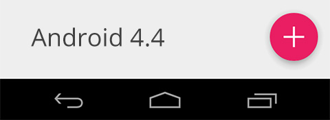
But when we run on Android 5.0, the result turn into this ...
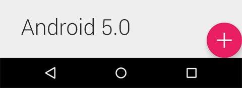
There is nothing fancy but just a bug. Fortunate that design library's developer team has already known the issue and will release a fixed version in the near future. But if you want to use it now, we could do some workaround by setting FAB's margin right and margin bottom to 16dp for API Level 21+ and to 0dp for Android pre-Lollipop. Thanks Configuration Qualifier that allows us to do it extremely easy.
res/values/dimens.xml
|
1
2
|
<dimen name="codelab_fab_margin_right">0dp</dimen><dimen name="codelab_fab_margin_bottom">0dp</dimen> |
res/values-v21/dimens.xml
|
1
2
|
<dimen name="codelab_fab_margin_right">16dp</dimen><dimen name="codelab_fab_margin_bottom">16dp</dimen> |
res/layout/activity_code_lab.xml
|
1
2
3
4
5
|
<android.support.design.widget.FloatingActionButton ... android:layout_marginBottom="@dimen/codelab_fab_margin_bottom" android:layout_marginRight="@dimen/codelab_fab_margin_right" .../> |
Hola !
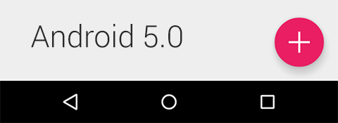
The shadow depth is automatically set to the best practices one, 6dp at idle state and 12dp at pressed state. Anyway you are allowed to override these values by defining app:elevation for idle state's shadow depth andapp:pressedTranslationZ for press state's.
Regard to button's color, basically FAB uses the accent color but you could override withapp:backgroundTint attribute.
Just like a traditional Button, you could handle click with setOnClickListener(). Add the following line of codes in initInstances in CodeLabActivity.java file.
|
1
2
3
4
5
6
7
8
9
10
11
12
13
14
15
|
FloatingActionButton fabBtn;...private void initInstances() { ... fabBtn = (FloatingActionButton) findViewById(R.id.fabBtn); fabBtn.setOnClickListener(new View.OnClickListener() { @Override public void onClick(View v) { } });} |
Done !
Step 4: Play with Snackbar
Snackbar, a tiny black bar showing a brief message at the bottom of the screen, is also available in this library. Snackbar shares the same concept as Toast but unlike Toast, it shows as a part of UI instead of overlaying on screen.

Not just a concept but also coding style that it is inspired from Toast. You could summon Snackbar by the code below.
|
1
2
3
4
5
6
7
8
|
Snackbar.make(someView, "Hello. I am Snackbar!", Snackbar.LENGTH_SHORT) .setAction("Undo", new View.OnClickListener() { @Override public void onClick(View v) { } }) .show(); |
The first parameter of make() is a View or Layout that you want to show a Snackbar at it's bottom position. In this example, a FrameLayout that wrapped a FAB is the one. setAction() method is used to set the action displayed on the right of Snackbar with a listener corresponded. This method is not required and could be removed.
Now let's give a try by adding the following code.
|
1
2
3
4
5
6
7
8
9
10
11
12
13
14
15
16
17
18
19
20
21
22
23
24
|
FrameLayout rootLayout;...private void initInstances() { ... rootLayout = (FrameLayout) findViewById(R.id.rootLayout); fabBtn = (FloatingActionButton) findViewById(R.id.fabBtn); fabBtn.setOnClickListener(new View.OnClickListener() { @Override public void onClick(View v) { Snackbar.make(rootLayout, "Hello. I am Snackbar!", Snackbar.LENGTH_SHORT) .setAction("Undo", new View.OnClickListener() { @Override public void onClick(View v) { } }) .show(); } });} |
Click at FAB and see the result.
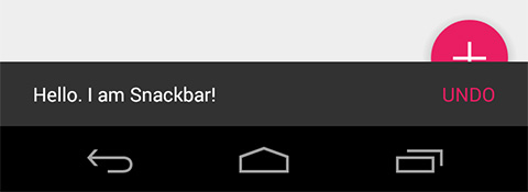
It works ! but ... not perfectly yet. It is appeared that Snackbar is placed on top of FAB which is totally bad in term of UX. Anyway the behavior is already correct since there is no any relation between Snackbar and FAB defined.
A special Layout is invented for this purpose especially, make child Views work coordinated. No surprise why its name is CoordinatorLayout
Step 5: Make them collaborated with CoordinatorLayout
CoordinatorLayout is a Layout let child Views work coordinated. Anyway there is no magic. Each View inside must be designed and implemented to work with CoordinatorLayout as well. FAB and Snackbar are two of those.
So ... let's change FrameLayout wrapped a FAB to CoordinatorLayout now.
res/layout/activity_code_lab.xml
|
1
2
3
4
5
6
7
8
|
<android.support.design.widget.CoordinatorLayout android:id="@+id/rootLayout" android:layout_width="match_parent" android:layout_height="match_parent" > <android.support.design.widget.FloatingActionButton ... /></android.support.design.widget.CoordinatorLayout> |
And don't forget to change rootLayout's variable type in CodeLabActivity.java to CoordinatorLayout as well or it will crash.
|
1
2
3
4
5
|
//FrameLayout rootLayout;CoordinatorLayout rootLayout;//rootLayout = (FrameLayout) findViewById(R.id.rootLayout);rootLayout = (CoordinatorLayout) findViewById(R.id.rootLayout); |
Another bug is here. On Android 4.4, FAB's margin has surprisingly been dropped to the zero which let its position moved to bottom-right as a result.
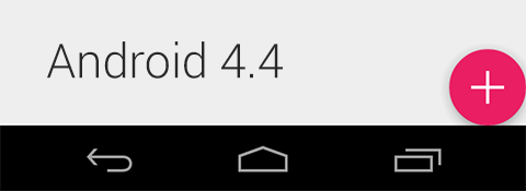
This bug just happens on Android Design Support Library 22.2.1 so let's wait for the official fix but for now in case you want to use FloatingActionButton inside CoordinatorLayout, please manually adjust FAB's margin right and margin bottom to 16dp.
res/values/dimens.xml
|
1
2
|
<dimen name="codelab_fab_margin_right">16dp</dimen><dimen name="codelab_fab_margin_bottom">16dp</dimen> |
Done
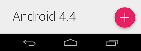
Result: FAB now moves along with Snackbar's appearance and disappearance. Some feature is also added. Snackbar is now able to Swipe-to-dismiss ! Here is the result.
Please note that FAB had ever moved back to the proper position with smoother animation on v22.2.0 but it turns to be worse in v22.2.1
From now on, if you plan to use Android Design Support Library. Please think about CoordinatorLayout first since it is something like a core of this library.
Step 6: Goodbye ActionBar, Hail Toolbar
Toolbar is not part of Android Design Support Library but is needed to be used together with the rest of components in this library.
Toolbar is a replacement of traditional Action Bar with far more flexible behavior. I encourage you guys to hiding an Action Bar and switch to Toolbar from now on since new libraries with wonderful features are all designed to work together with Toolbar not Action Bar including components in this Design Support Library.
It is easy to switch to Toolbar. Just start with hiding an Action Bar from an Activity by defining these attributes in AppTheme's style.
|
1
2
3
4
|
<style name="AppTheme" parent="Theme.AppCompat.Light.DarkActionBar"> <item name="windowActionBar">false</item> <item name="windowNoTitle">true</item></style> |
Then place a Toolbar component inside CoordinatorLayout right before where FAB is.
|
1
2
3
4
5
6
7
8
9
10
11
12
13
|
<android.support.design.widget.CoordinatorLayout ...> <android.support.v7.widget.Toolbar android:id="@+id/toolbar" android:layout_width="match_parent" android:layout_height="?attr/actionBarSize" android:background="?attr/colorPrimary" app:popupTheme="@style/ThemeOverlay.AppCompat.Light" app:theme="@style/ThemeOverlay.AppCompat.Dark.ActionBar" /> <android.support.design.widget.FloatingActionButton ...> </android.support.design.widget.FloatingActionButton></android.support.design.widget.CoordinatorLayout> |
Now write a code to tell system that we will use Toolbar as an Action Bar replacement with Java Code below.
|
1
2
3
4
5
6
7
|
Toolbar toolbar;private void initInstances() { toolbar = (Toolbar) findViewById(R.id.toolbar); setSupportActionBar(toolbar); ...} |
Although it could run fine by now but from I said previously. Things placed inside CoordinatorLayout must be designed and implemented to work with it or it will not coordinate with any other sibling views. But well ... Toolbar is not designed for that. Don't worry, there is no any new special Toolbar here, just an component that is prepared to make Toolbar works perfectly with CoordinatorLayout. An easy task, just simply wrap Toolbar with AppBarLayout. That's all !
|
1
2
3
4
5
6
7
8
9
10
11
12
13
14
|
<android.support.design.widget.CoordinatorLayout ...> <android.support.design.widget.AppBarLayout android:layout_width="match_parent" android:layout_height="wrap_content"> <android.support.v7.widget.Toolbar .../> </android.support.design.widget.AppBarLayout> <android.support.design.widget.FloatingActionButton ...> </android.support.design.widget.FloatingActionButton></android.support.design.widget.CoordinatorLayout> |
Now run and test. If you do it all right, you will see that Drawer Menu will overlay on top of the App Bar area.
This step is now done. From now on I suggest you to always wrap ToolBar element with AppBarLayout regards to making it works perfectly with CoordinatorLayout.
Step 7: Place something in content area
We got FAB, we got Toolbar. Now it's time to place something in content area of an Activity.
Umm. How about two simple buttons? Well, let's place them between AppBarLayout and FAB.
|
1
2
3
4
5
6
7
8
9
10
11
12
13
14
15
16
17
18
19
20
21
22
|
...</android.support.design.widget.AppBarLayout><LinearLayout android:layout_width="match_parent" android:layout_height="match_parent" android:orientation="vertical" > <Button android:layout_width="wrap_content" android:layout_height="wrap_content" android:text="Yo Yo" /> <Button android:layout_width="wrap_content" android:layout_height="wrap_content" android:text="Yo Yo" /></LinearLayout><android.support.design.widget.FloatingActionButton ...> |
Here is the result ...
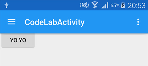
It is appeared that those buttons are unexpectedly placed under Toolbar. Guess why...
Yah, same old reason, LinearLayout is not designed to work with CoordinatorLayout. In this case, there is no any layout to wrap it like Toolbar's case. It is for more easy, you just need to add an attribute to the LinearLayout telling its scroll behavior like below.
|
1
2
3
4
5
|
<LinearLayout ... app:layout_behavior="@string/appbar_scrolling_view_behavior" ... > |
And now they are at the right place. Yah !
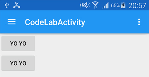
Done =)
Step 8: Play with TabLayout
Tab is a part of UX best practices in Android Application. Previously if we want to use new Material Design Tab, we need to download source code of SlidingTabLayout and SlidingTabStrip to our project ourselves. Right now we could just use TabLayout provided in this library, also with some more tweak options.
Where should we place this TabLayout? According to Android Application UX Guideline, Tab should be placed on top of the screen not the bottom. And well, it should be above the drop shadow part. So we will place it inside AppBarLayout along with Toolbar. It could be done like this becauseAppBarLayout is inherited from a vertical LinearLayout.
|
1
2
3
4
5
6
7
8
9
10
|
<android.support.design.widget.AppBarLayout ...> <android.support.v7.widget.Toolbar ... /> <android.support.design.widget.TabLayout android:id="@+id/tabLayout" android:layout_width="match_parent" android:layout_height="wrap_content"/></android.support.design.widget.AppBarLayout> |
Add some tabs with Java Code.
|
1
2
3
4
5
6
7
8
9
10
|
TabLayout tabLayout;private void initInstances() { tabLayout = (TabLayout) findViewById(R.id.tabLayout); tabLayout.addTab(tabLayout.newTab().setText("Tab 1")); tabLayout.addTab(tabLayout.newTab().setText("Tab 2")); tabLayout.addTab(tabLayout.newTab().setText("Tab 3")); ...} |
Here is the result.
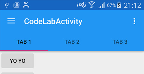
Background color is automatically set to primary color while the indicator line's color is the accent one. But you will notice that Tab's font is still black but we expect it to be white. This happens because we didn't provide it any theme yet. Simply define TabLayout a theme like this.
|
1
2
3
|
<android.support.design.widget.TabLayout ... app:theme="@style/ThemeOverlay.AppCompat.Dark.ActionBar" /> |
They are white now.
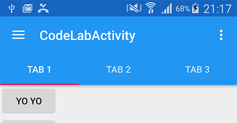
You have a choice to manually control TabLayout like above or let it work with ViewPager automatically by calling setupWithViewPager(...). I believe that it will be used quite frequent for this case.
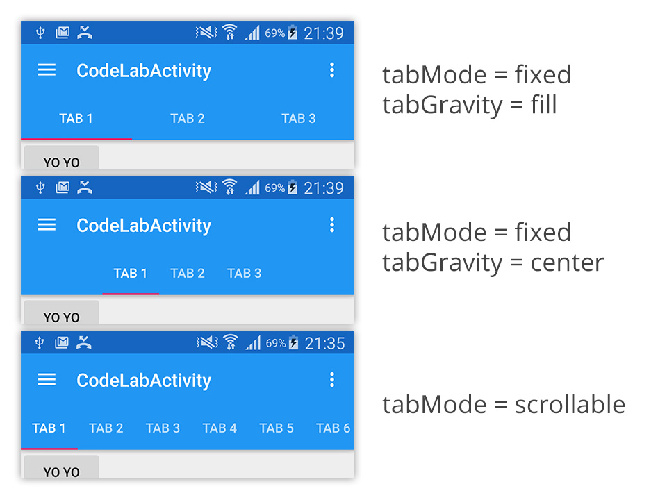
There are two attributes we could adjust the display in TabLayout.
app:tabMode - set it as fixed if you want to display every single tab on the screen. Good for a small number of tabs but totally a bad choice if there are so many tabs. In the case you are not sure that all of them could be displayed nicely at a time, you could set this attribute asscrollable to let user scroll through tabs instead just like Google Play Store's.
app:tabGravity - set it as fill if you want distribute all available space to each tab or set it as center if you want to place all of the tabs at the center of the screen. Please note that this attribute will be ignored if tabMode is set to scrollable.
Here is what it looks like in each mode.
Done with TabLayout =)
Step 9: Make AppBarLayout exit the screen along with content when scroll
One nice Android UX Guideline announced is the App Bar could be scrolled out of the screen along with content to get some more additional space to display content and it is already proved that this UX is good. Previously there were some application that was already implemented this behavior but developer had to do it by themselves. Right now it could be done easily with just a line of code.
First of all, we need to make the content scrollable first by adding some amount of Buttons to LinearLayout. How about 20?
|
1
2
3
4
5
6
7
8
9
10
11
12
13
|
<Button android:layout_width="wrap_content" android:layout_height="wrap_content" android:text="Yo Yo" />...<!-- Add 20 more buttons here -->...<Button android:layout_width="wrap_content" android:layout_height="wrap_content" android:text="Yo Yo" /> |
And then wrap the LinearLayout with ScrollView and don't forget to move layout_behavior from LinearLayout to ScrollView since ScrollView is now a direct child of CoordinatorLayout.
|
1
2
3
4
5
6
7
8
9
10
11
12
13
14
|
<ScrollView android:layout_width="match_parent" android:layout_height="match_parent" android:fillViewport="true" app:layout_behavior="@string/appbar_scrolling_view_behavior" > <LinearLayout android:layout_width="match_parent" android:layout_height="match_parent" android:orientation="vertical" > ... </LinearLayout></ScrollView> |
Then add a Scroll Flags to Toolbar like this.
|
1
2
3
|
<android.support.v7.widget.Toolbar ... app:layout_scrollFlags="scroll|enterAlways" /> |
Test it.
Hmm ... Toolbar supposes to scroll out of the screen along with the content but why it appears that nothing happened?
The same old reason ... ScrollView was not designed to work with CoordinatorLayout (again). You need to use the another one, NestedScrollView, provided in Android Support Library v4, which is designed to work with CoordinatorLayout since born.
|
1
2
3
4
5
|
<android.support.v4.widget.NestedScrollView ...> <LinearLayout ...> ... </LinearLayout></android.support.v4.widget.NestedScrollView> |
And with the same reason, please note that the classic ListView doesn't work with CoordinatorLayout as well. Only RecyclerView works. Time to change, may be?
Here is the result after changing ScrollView to NestedScrollView.
Works like a charm! You will notice that Toolbar scroll out of the screen but TabLayout still stay. This is because we didn't set any scroll flags to TabLayout. If you want TabLayout to disappear from the screen as well, just simply define the same attribute to TabLayout.
|
1
2
3
|
<android.support.design.widget.TabLayout ... app:layout_scrollFlags="scroll|enterAlways" /> |
Result
Now let's look at it in details. Curious what are the meaning of those flags actually: scroll andenterAlways? Actually there are 4 attribute values that we could set as.
scroll - If you want the view to scroll along the content. You need to apply this flag.
enterAlwaysCollapsed - This flag defines how View enter back into the screen. When your view has declared a minHeight and you use this flag, your View will only enter at its minimum height (i.e., ‘collapsed’), only re-expanding to its full height when the scrolling view has reached it’s top. Use it with scroll flag like this: scroll|enterAlwaysCollapsed
Anyway it seems like it doesn't work as described in minHeight part.
enterAlways - this flag ensures that any downward scroll will cause this view to become visible, enabling the ‘quick return’ pattern. Use it with scroll flag as well: scroll|enterAlways
exitUntilCollapsed - View will scroll off until it is collapsed (its minHeight) and stay like that, for example,
|
1
2
3
4
5
6
7
8
|
<android.support.v7.widget.Toolbar ... android:layout_height="192dp" android:gravity="bottom" android:paddingBottom="12dp" android:minHeight="?attr/actionBarSize" app:layout_scrollFlags="scroll|exitUntilCollapsed" /> |
Here is the result of code above.
This mode is frequently used in the component I will talk about in next part.
That's all for this step. Easy, huh?
Step 10: Remove TabLayout
In the next part, we are going to play more with Toolbar so I consider removing TabLayout from UI for the better visual result. To do that just simply comment all of those related codes.
|
1
|
<!--android.support.design.widget.TabLayout --> |
Also remove from Java Code.
|
1
2
3
4
|
//tabLayout = (TabLayout) findViewById(R.id.tabLayout);//tabLayout.addTab(tabLayout.newTab().setText("Tab 1"));//tabLayout.addTab(tabLayout.newTab().setText("Tab 2"));//tabLayout.addTab(tabLayout.newTab().setText("Tab 3")); |
OK. Let's go to the next step !
Step 11: Make Toolbar collapsable
Like an example shown in exitUntilCollapsed part, Toolbar could be expanded and collapsed but you will see that it isn't perfect yet. Toolbar still leave the screen in spite of the best practice that those icons (Hamburger, etc.) should stay on the screen.
Design Support Library has already been prepared for this as well. You could make Toolbar collapsable like a magic with CollapsingToolbarLayout which is very easy to use just like other components. Here are the steps:
- Wrap Toolbar with CollapsingToolbarLayout but still be under AppBarLayout
- Remove layout_scrollFlags from Toolbar
- Declare layout_scrollFlags for CollapsingToolbarLayout and change it to scroll|exitUntilCollapsed
- Change AppBarLayout's layout height to the size of expanded state. In this example, I use 256dp
Here is the final code.
|
1
2
3
4
5
6
7
8
9
10
11
12
13
14
15
16
17
18
19
20
21
22
|
<android.support.design.widget.AppBarLayout android:layout_width="match_parent" android:layout_height="256dp"> <android.support.design.widget.CollapsingToolbarLayout android:id="@+id/collapsingToolbarLayout" android:layout_width="match_parent" android:layout_height="match_parent" app:layout_scrollFlags="scroll|exitUntilCollapsed"> <android.support.v7.widget.Toolbar android:id="@+id/toolbar" android:layout_width="match_parent" android:layout_height="?attr/actionBarSize" android:background="?attr/colorPrimary" android:minHeight="?attr/actionBarSize" app:theme="@style/ThemeOverlay.AppCompat.Dark.ActionBar" app:popupTheme="@style/ThemeOverlay.AppCompat.Light" /> </android.support.design.widget.CollapsingToolbarLayout></android.support.design.widget.AppBarLayout> |
And the result is
Looks good but those Toolbar icons still scroll off the screen. We could pin it to let it be always on top of the screen by declare this attribute to Toolbar.
|
1
2
3
4
|
<android.support.v7.widget.Toolbar ... app:layout_collapseMode="pin" /> |
Toolbar is now pinned !
But wait ... where is the title text?! Unfornate that it's gone in the wind after wrapping Toolbar with CollapsingToolbarLayout. We have to set it manually through setTitle(String) in Java code.
|
1
2
3
4
5
6
7
|
CollapsingToolbarLayout collapsingToolbarLayout;private void initInstances() { ... collapsingToolbarLayout = (CollapsingToolbarLayout) findViewById(R.id.collapsingToolbarLayout); collapsingToolbarLayout.setTitle("Design Library");} |
Result:
Title's font color is still black. This is because we didn't set any theme to the App Bar yet. To do so, just simply declare android:theme for AppBarLayout like this.
|
1
2
3
|
<android.support.design.widget.AppBarLayout ... android:theme="@style/ThemeOverlay.AppCompat.Dark.ActionBar"> |
Title now turns into white !
With CollapsingToolbarLayout's feature, transition is automatically applied to the title text between collapsed and expanded state. In case you want to change the position of title text in expanded state, you could do so by apply margin through 4 attributes such as app:expandedTitleMargin, app:expandedTitleMarginBottom, app:expandedTitleMarginEnd and app:expandedTitleMarginStart
Or if you want to change text's appearance in collapsed and expanded state. You could simply do that by applying TextAppearance through app:collapsedTitleTextAppearance and app:expandedTitleTextAppearance respectively.
Let's try changing margin start to 64dp.
|
1
2
3
|
<android.support.design.widget.CollapsingToolbarLayout ... app:expandedTitleMarginStart="64dp"> |
Result
Awesome !
Step 12: Add background image to App Bar
In many cases, we want to have a beautiful image as an App Bar's background not just a plain color like currently is. Fortunate that CollapsingToolbarLayout is inherited from FrameLayout so we could simply add an ImageView as a background layer behind Toolbar like this.
|
1
2
3
4
5
6
7
8
|
<ImageView android:layout_width="match_parent" android:layout_height="match_parent" android:scaleType="centerCrop" android:src="@drawable/header" /><android.support.v7.widget.Toolbar ... |
Result
Image appears already but there is an unexpected blue bar appears as well. It is nothing fancy but just a Toolbar's background. Simply remove this line from Toolbar.
|
1
|
android:background="?attr/colorPrimary" |
Result
Image now just moves along with content scrolling which is a little bit too wooden. We could make it more elegant with parallax mode by declaring collapse mode like this.
|
1
2
3
|
<ImageView ... app:layout_collapseMode="parallax" /> |
Result
You also could apply a parallax multiplier between 0.0-1.0.
|
1
|
app:layout_collapseParallaxMultiplier="0.7" |
Please give a try yourself =)
Lastly you will notice that App Bar's background is always shown as image. You could let it automatically changed into plain color in collapsed mode by declaring attributeapp:contentScrim like below:
|
1
2
3
|
<android.support.design.widget.CollapsingToolbarLayout ... app:contentScrim="?attr/colorPrimary"> |
Result
App Bar is now beautiful with just some line of codes =)
Step 13: Play with Navigation Drawer
Right now Drawer Menu pulled from the left side is still just a blank white panel. Previously it is quite a hard task to implement this menu since we have to do it manually with LinearLayout or ListView.
With NavigationView provided in Android Design Support Library, things would be 15.84321 times easier !
First of all, create a header view layout file for Drawer Menu. (It is already there in Github project.)
res/layout/nav_header.xml
|
1
2
3
4
5
6
7
8
9
10
11
12
13
14
15
16
17
18
19
20
21
22
23
24
25
26
27
28
29
|
<?xml version="1.0" encoding="utf-8"?><FrameLayout xmlns:android="http://schemas.android.com/apk/res/android" android:layout_width="match_parent" android:layout_height="192dp" android:theme="@style/ThemeOverlay.AppCompat.Dark" > <ImageView android:layout_width="match_parent" android:layout_height="match_parent" android:src="@drawable/nav_header_bg" android:scaleType="centerCrop" /> <ImageView android:layout_width="wrap_content" android:layout_height="wrap_content" android:src="@drawable/nuuneoi" android:layout_gravity="bottom" android:layout_marginBottom="36dp" /> <TextView android:layout_width="match_parent" android:layout_height="wrap_content" android:layout_gravity="bottom" android:layout_margin="16dp" android:text="nuuneoi" android:textAppearance="@style/TextAppearance.AppCompat.Body1"/></FrameLayout> |
Now create a menu resource file.
res/menu/navigation_drawer_items.xml
|
1
2
3
4
5
6
7
8
9
10
11
12
13
14
15
16
17
18
19
20
21
22
23
24
25
|
<?xml version="1.0" encoding="utf-8"?><menu xmlns:android="http://schemas.android.com/apk/res/android"> <group android:checkableBehavior="all"> <item android:id="@+id/navItem1" android:icon="@drawable/ic_action_location_found_dark" android:title="Home"/> <item android:id="@+id/navItem2" android:icon="@drawable/ic_action_location_found_dark" android:title="Blog"/> <item android:id="@+id/navItem3" android:icon="@drawable/ic_action_location_found_dark" android:title="About"/> <item android:id="@+id/navItem4" android:icon="@drawable/ic_action_location_found_dark" android:title="Contact"/> </group></menu> |
Place NavigationView binding both resources above as Drawer Menu's menu area by replace an existed white LinearLayout with the following code.
|
1
2
3
4
5
6
7
8
9
10
11
12
13
14
|
... </android.support.design.widget.CoordinatorLayout> <android.support.design.widget.NavigationView android:id="@+id/navigation" android:layout_width="wrap_content" android:layout_height="match_parent" android:layout_gravity="start" app:headerLayout="@layout/nav_header" app:itemIconTint="#333" app:itemTextColor="#333" app:menu="@menu/navigation_drawer_items" /></android.support.v4.widget.DrawerLayout> |
Drawer Menu is now summoned ! Woo hooo
NavigationView is designed for Drawer Menu especially. So everything would be created and measured automatically including width of the menu which we have to define ourselves case by case with Configuration Qualifier previously.
To handle those menu items click event, you could simply declare a listener with setNavigationItemSelectedListener like below:
|
1
2
3
4
5
6
7
8
9
10
11
12
13
14
15
16
17
18
19
20
21
22
|
NavigationView navigation;private void initInstances() { ... navigation = (NavigationView) findViewById(R.id.navigation); navigation.setNavigationItemSelectedListener(new NavigationView.OnNavigationItemSelectedListener() { @Override public boolean onNavigationItemSelected(MenuItem menuItem) { int id = menuItem.getItemId(); switch (id) { case R.id.navItem1: break; case R.id.navItem2: break; case R.id.navItem3: break; } return false; } });} |
In the real use, please feel free to declare your own header view and modify menu items as you wanted.
Step 14: Modernize EditText with TextInputLayout
The last part of this Codelab is here. You could change an old style EditText to a modern one that always show Hint and Error Message.
To do so, just simply wrap an EditText with TextInputLayout. That's all !
|
1
2
3
4
5
6
7
8
9
|
<android.support.design.widget.TextInputLayout android:layout_width="match_parent" android:layout_height="wrap_content"> <EditText android:layout_width="match_parent" android:layout_height="wrap_content" android:hint="Username" /></android.support.design.widget.TextInputLayout> |
Put two of them inside NestedScrollView and see the result.
Incredibly easy, huh? =)
Conclusion
Android Design Support Library is a very promising support library. It is totally recommended for your production. Anyway it still contains with some bug, if you really want to use it now please be sure that you know about all of the issues.
Such a long tutorial. Hope you find it useful =)
Updated [24/07/2015]: From v22.2.0 to v22.2.1
Few days ago, Android team launched the new version of Android Support Library, v22.2.1, with many bug fixed and also with some new bug ... I have already given it a try and updated this codelab to match the result in v22.2.1.
And regards to the bug in the library, here is that list of that what I found:
Bug fixed
- TabLayout now works perfectly on AppBarLayout. UI is now fluid and there is no more rendering problem.
- FloatingActionButton on Android 5.0+ now comes with drop shadow. There is no need to manually set app:borderWidth anymore

- exitUntilCollapsed scrollMode works like described now
Bug that still persists
- FloatingActionButton on Android 5.0+ still doesn't come with margin right and margin bottom unlike in pre-Lollipop. Still needs to manually set the different margin for those configurations.


New bug or worse behavior
- On Android pre-Lollipop, when FAB is put inside CoordinatorLayout, its margin has been immediately set to zero although it has ever had some margin when it is put in another type of Layout. I am not sure which one is the expected behavior but I believe that it supposes to be only one ...

When placed inside FrameLayout

When placed inside CoordinatorLayout
- The animation of FAB to move back to the proper position when Snackbar is swipe-to-dismissed looks strange
Please be patient. I am strongly believe that team are working on these issues for the next release =)
Codelab for Android Design Support Library used in I/O Rewind Bangkok session的更多相关文章
- Android Design Support Library 的 代码实验——几行代码,让你的 APP 变得花俏
原文:Codelab for Android Design Support Library used in I/O Rewind Bangkok session--Make your app fanc ...
- 【转】【翻】Android Design Support Library 的 代码实验——几行代码,让你的 APP 变得花俏
转自:http://mrfufufu.github.io/android/2015/07/01/Codelab_Android_Design_Support_Library.html [翻]Andro ...
- Android Design Support Library使用详解
Android Design Support Library使用详解 Google在2015的IO大会上,给我们带来了更加详细的Material Design设计规范,同时,也给我们带来了全新的And ...
- Android开发学习之路-Android Design Support Library使用(CoordinatorLayout的使用)
效果图: 上面的这个图有两个效果是,一个是顶部的图片,在上滑之后会隐藏起来并且显示出一个ToolBar(ToolBar类似于ActionBar,但是只有ToolBar是兼容Material Desig ...
- Android Design Support Library: 学习CoordinatorLayout
简述 CoordinatorLayout字面意思是"协调器布局",它是Design Support Library中提供的一个超级帧布局,帮助我们实现Material Design ...
- Material Design 开发利器:Android Design Support Library 介绍
转自:https://blog.leancloud.cn/3306/ Android 5.0 Lollipop 是迄今为止最重大的一次发布,很大程度上是因为 material design —— 这是 ...
- Android Design Support Library使用详解——Snackbar
Google在2015 I/O大会上,给我们带来了更加详细的Material Design规范,同时也引入了Android Design Support Library,为我们提供了基于Materia ...
- Android Design Support Library——Navigation View
前沿 Android 从5.0开始引入了Material design元素的设计,这种新的设计语言让整个安卓的用户体验焕然一新,google在Android Design Support Librar ...
- Android Design Support Library(三)用CoordinatorLayout实现Toolbar隐藏和折叠
此文的代码在Android Design Support Library(一)用TabLayout实现类似网易选项卡动态滑动效果代码的基础上进行修改,如果你没有看过本系列的第一篇文章最好先看一看.Co ...
随机推荐
- ASP+MYSQL的配置及乱码解决
TempStr = "driver={MySQL ODBC 3.51 Driver};database="&strDB&";server="&a ...
- [转]关于java中的 sychronized 同步方法 与 同步块的理解
首先,需要说明一点,也是最重要的一点,无论是同步方法 还是 同步块 都是只针对同一个对象的多线程而言的,只有同一个对象产生的多线程,才会考虑到 同步方法 或者是 同步块,如果定义多个实例的同步,可以考 ...
- Linux系统swap已分区但无法挂载与cryptswap1问题
linux下察看swap分区大小的命令 top 或者fdisk -l 或者free -m SWAP分区一般大小为物理内存的2倍,但最大不超过2G; 增加SWAP空间的方法有两个:增加另外一个SWAP分 ...
- 关于UIScrollView属性和方法的总结
iOS中UIScollView的总结 在iOS开发中可以说UIScollView是所有滑动类视图的基础,包括UITableView,UIWebView,UICollectionView等等,UIScr ...
- iOS远程消息推送
iOS 推送基础知识 Apple 使用公共密钥数字证书对来自 iOS 应用程序的推送请求进行身份验证,所以您首先需要创建身份验证密钥,并向 Apple 注册它们.我将在下一节中花相当长的篇幅来直接介绍 ...
- mysqldump备份、还原数据库路径名含有空格的处理方法(如:Program Files)
虽然以下的方法也可以解决,不过最简单直接的,还是直接在路径前后加双引号-" ",这个方法简单有效. 首先要说明的是mysqldump.exe在哪里不重要,重要的是要处理好路径中的非 ...
- [转]Delphi中ShellExecute的妙用
Delphi中ShellExecute的妙用 ShellExecute的功能是运行一个外部程序(或者是打开一个已注册的文件.打开一个目录.打印一个文件等等),并对外部程序有一定的控制. ...
- Chess---->简单命令框象棋(人VS人)
简单粗暴,直接先上代码: ChessBoard.h: 1 #ifndef CHESBOARD_H 2 #include<iostream> 3 #include<string& ...
- Proxy 模式
在以下集中情况下可以用 Proxy模式解决问题: 1)创建开销大的对象时候,比如显示一幅大的图片,我们将这个创建的过程交给代理去完成,GoF 称之为虚代理(Virtual Proxy): 2)为网络上 ...
- chdir 改变当前目录为起始目录
<?php chdir(dirname(__FILE__));//把当前目录设置为当前目录?> 将 PHP 的当前目录改为 directory. 参数 directory 新的当前目录 返 ...
