20190906_matplotlib_学习与快速实现
20190906
Matplotlib 学习总结
第一部分:
参考连接:
Introduction to Matplotlib and basic line
https://www.jianshu.com/p/aa4150cf6c7f?winzoom=1 (简书)
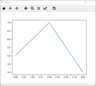
示例一:坐标单线
代码:
 """ first example """

 """ 坐标单线 """

 plt.plot([1,2,3], [5,7,4])  # 坐标(1,5) (2,7) (3,4)

 plt.show()
实现:
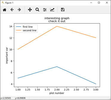
示例二:坐标双线
代码:
 """ second example """

 """ 坐标双线 """

 x = [1, 2, 3]   # x 轴坐标

 y = [5, 7, 4]   # y 轴对应坐标

 x2 = [1, 2, 3]      # x2 轴坐标

 y2 = [10, 14, 12]   # y2 轴对应坐标

 plt.plot(x, y, label = 'first line')    # label 为线条指定名称 在图相右上角小框

 plt.plot(x2, y2, label = 'second line')  # label 为线条指定名称 在图相右上角小框

 plt.xlabel('plot number')   # 创建 x 轴标签

 plt.ylabel('important var') # 创建 y 轴标签

 plt.title('interesting graph\ncheck it out')    # 创建标题

 plt.legend()    # 生成默认图例

 plt.show()
实现:
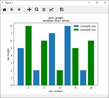
示例三:1. 条形图
代码:
 """ third example """

 """ 条形图 """

 plt.bar([1,3,5,7,9], [5,2,7,8,2], label = "example one")  # 颜色 绿-g,蓝-b,红-r, bar 创建条形图

 plt.bar([2,4,6,8,10], [8,6,2,5,6], label = "example two", color = 'g')

 plt.legend()

 plt.xlabel('bar number')

 plt.ylabel('bar height')

 plt.title('epic graph\nanother line! whoa')

 plt.show()
实现:
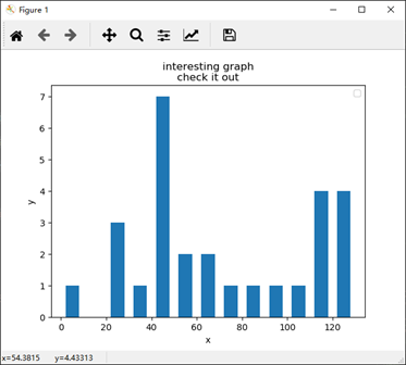
示例三:2. 直方图
代码:
 # """ 直方图 """

 population_ages = [22,55,62,45,21,22,34,42,42,4,99,102,110,120,121,122,130,111,115,112,80,75,65,54,44,43,42,48]

 bins = [0,10,20,30,40,50,60,70,80,90,100,110,120,130]

 plt.hist(population_ages, bins, histtype='bar', rwidth=0.6)   # 条状图的宽度

 plt.xlabel('x') # 创建 x 轴标签

 plt.ylabel('y') # 创建 y 轴标签

 plt.title('interesting graph\ncheck it out')    # 创建标题

 plt.legend()    # 生成默认图例

 plt.show()
实现:
示例四:散点图
代码:
 """ fifth example """

 """ 堆叠图

 堆叠图用于显示『部分对整体』随时间的关系。 堆叠图基本上类似于饼图,只是随时间而变化。

 让我们考虑一个情况,我们一天有 24 小时,我们想看看我们如何花费时间。 我们将我们的活动分为:睡觉,吃饭,工作和玩耍。

 我们假设我们要在 5 天的时间内跟踪它,因此我们的初始数据将如下所示:

 """

 days = [1,2,3,4,5]

 sleeping = [7,8,6,11,7] # 睡觉时间

 eating =   [2,3,4,3,2]  # 吃饭时间

 working =  [7,8,7,2,2]  # 工作时间

 playing =  [8,5,7,8,13] # 娱乐时间

 # 为填充区域添加标签

 plt.plot([], [], color='m', label='sleeping', linewidth=4)

 plt.plot([], [], color='c', label='eating'  , linewidth=4)

 plt.plot([], [], color='r', label='working' , linewidth=4)

 plt.plot([], [], color='k', label='playing' , linewidth=4)

 plt.stackplot(days, sleeping, eating, working, playing, colors=['m', 'c', 'r', 'k'])

 plt.xlabel('x axis') # 创建 x 轴标签

 plt.ylabel('y axis') # 创建 y 轴标签

 plt.title('interesting graph\ncheck it out')    # 创建标题

 plt.legend()    # 生成默认图例

 plt.show()
实现:
示例六:饼图
代码:
 """ sixth example """

 """ 饼图

 # 通常,饼图用于显示部分对于整体的情况,通常以%为单位。 幸运的是,Matplotlib 会处理切片大小以及一切事情,我们只需要提供数值。

 # """

 slices = [7, 2, 2, 13]      # 指定切片,即每个部分的相对大小。

 activities = ['sleeping', 'eating', 'working', 'playing']   # 指定相应切片颜色列表

 cols = ['c', 'm', 'r', 'b']

 plt.pie(slices,

     labels=activities,

     colors=cols,

     startangle=90,          # 指定图形的 起始角度 这意味着第一个部分是一个竖直线条

     shadow=True,

     explode=(0, 0.1, 0, 0), # eating 突出显示,突出距离 0.1,使用explode拉出一个切片

     autopct='%1.1f%%')      # autopct,选择将百分比放置到图表上面

 plt.title('interesting graph\ncheck it out')

 plt.show()
实现:
示例七:从文件加载数据
代码:
 """ seventh example """

 """ 从文件加载数据

 从文件中提取数据来图形化

 1.首先,我们将使用内置的csv模块加载CSV文件

 2.然后我们将展示如何使用 NumPy(第三方模块)加载文件

 """

 # failed execution !!!!

 # executed

 import csv

 x = []

 y = []

 with  open(r'C:\LeeSRSPrgoramFile\V_vsCode\.vscode\data.csv', 'r') as csvfile:

     plots = csv.reader(csvfile, delimiter = ',')

     for row in plots:

         x.append(int(row[0]))

         y.append(int(row[1]))

 plt.plot(x, y, label = 'loaded from file!')

 plt.xlabel('x axis') # 创建 x 轴标签

 plt.ylabel('y axis') # 创建 y 轴标签

 plt.title('interesting graph\ncheck it out')    # 创建标题

 plt.legend()         # 生成默认图例

 plt.show()

 # 从文件加载数据 numpy

 import matplotlib.pyplot as plt

 import numpy as np

 x, y = np.loadtxt(r'C:\LeeSRSPrgoramFile\V_vsCode\.vscode\data.csv', delimiter=',', unpack=True)

 plt.plot(x,y, label='Loaded from file!')

 plt.xlabel('x')

 plt.ylabel('y')

 plt.title('Interesting Graph\nCheck it out')

 plt.legend()

 plt.show()
实现:
(略过八~十五)
示例十六:
代码:
 """ sixteenth example """

 """ 实时图表 """

 import matplotlib.pyplot as plt

 import matplotlib.animation as animation

 from matplotlib import style

 """

 print(plt.style.available)

 我这里它提供了['bmh', 'dark_background', 'ggplot', 'fivethirtyeight', 'grayscale']。

 """

 style.use('fivethirtyeight')

 fig = plt.figure()

 ax1 = fig.add_subplot(1,1,1)

 def animate(i):

     graph_data = open(r'C:\LeeSRSPrgoramFile\V_vsCode\.vscode\example.txt','r').read()

     lines = graph_data.split('\n')

     xs = []

     ys = []

     for line in lines:

         if len(line) > 1:

             x, y = line.split(',')

             xs.append(x)

             ys.append(y)

     ax1.clear()

     ax1.plot(xs, ys)

 ani = animation.FuncAnimation(fig, animate, interval=1000)

 plt.show()
实现:
(略过 十七、十八)
示例十九:子图
代码:(数据不存在)
""" nineteenth example """
""" 子图 """
import random
import matplotlib.pyplot as plt
from matplotlib import style style.use('fivethirtyeight') # 数据不存在 fig = plt.figure() def create_plots():
xs = []
ys = [] for i in range(10):
x = i
y = random.randrange(10) xs.append(x)
ys.append(y)
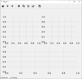
return xs, ys ax1 = fig.add_subplot(221)
ax2 = fig.add_subplot(222)
ax3 = fig.add_subplot(212) plt.show() ax1 = plt.subplot2grid((6,1), (0,0), rowspan=1, colspan=1)
ax2 = plt.subplot2grid((6,1), (1,0), rowspan=4, colspan=1)
ax3 = plt.subplot2grid((6,1), (5,0), rowspan=1, colspan=1) plt.show()
实现:
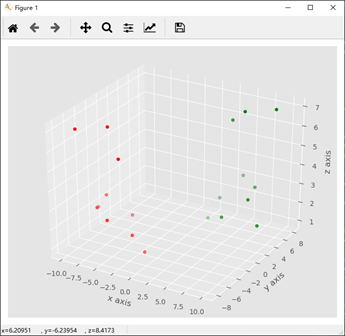
示例三十:3D散点图
代码:
 """ thritith example """

 """ 3D 散点图 """

 from mpl_toolkits.mplot3d import axes3d

 import matplotlib.pyplot as plt

 from matplotlib import style

 style.use('ggplot')

 fig = plt.figure()

 ax1 = fig.add_subplot(111, projection='3d')

 x = [1,2,3,4,5,6,7,8,9,10]

 y = [5,6,7,8,2,5,6,3,7,2]

 z = [1,2,6,3,2,7,3,3,7,2]

 x2 = [-1,-2,-3,-4,-5,-6,-7,-8,-9,-10]

 y2 = [-5,-6,-7,-8,-2,-5,-6,-3,-7,-2]

 z2 = [1,2,6,3,2,7,3,3,7,2]

 ax1.scatter(x, y, z, c='g', marker='o')

 ax1.scatter(x2, y2, z2, c ='r', marker='o')

 ax1.set_xlabel('x axis')

 ax1.set_ylabel('y axis')

 ax1.set_zlabel('z axis')

 plt.show()
实现:
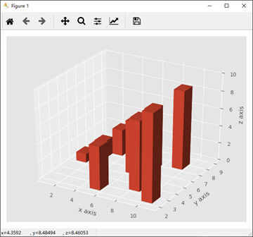
示例三十一:3D条状图
代码:
 """ thirtyfirst example """

 """ 3D 条状图 """

 from mpl_toolkits.mplot3d import axes3d

 import matplotlib.pyplot as plt

 import numpy as np

 from matplotlib import style

 style.use('ggplot')

 fig = plt.figure()

 ax1 = fig.add_subplot(111, projection='3d')

 x3 = [1,2,3,4,5,6,7,8,9,10]

 y3 = [5,6,7,8,2,5,6,3,7,2]

 z3 = np.zeros(10)

 dx = np.ones(10)

 dy = np.ones(10)

 dz = [1,2,3,4,5,6,7,8,9,10]

 ax1.bar3d(x3, y3, z3, dx, dy, dz)

 ax1.set_xlabel('x axis')

 ax1.set_ylabel('y axis')

 ax1.set_zlabel('z axis')

 plt.show()
实现:
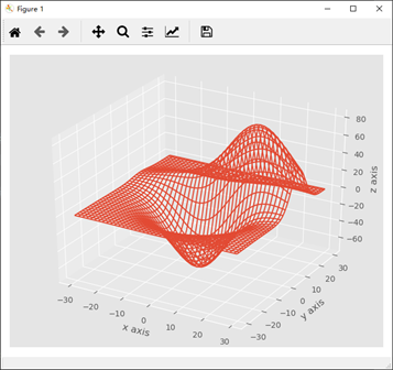
示例三十二:1. 3D线框图
代码:
 """ thirty-second example """

 """ 3D 线框图 """

 from mpl_toolkits.mplot3d import axes3d

 import matplotlib.pyplot as plt

 import numpy as np

 from matplotlib import style

 style.use('ggplot')

 fig = plt.figure()

 ax1 = fig.add_subplot(111, projection='3d')

 x, y, z = axes3d.get_test_data()

 print(axes3d.__file__)

 ax1.plot_wireframe(x,y,z, rstride = 3, cstride = 3)

 ax1.set_xlabel('x axis')

 ax1.set_ylabel('y axis')

 ax1.set_zlabel('z axis')

 plt.show()
实现:
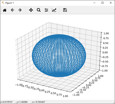
示例三十二:2. 半径为1的球
代码:
 """ 半径为 1 的球 """

 # 半径为 1 的球

 t = np.linspace(0, np.pi * 2, 100)

 s = np.linspace(0, np.pi, 100)

 t, s = np.meshgrid(t, s)

 x = np.cos(t) * np.sin(s)

 y = np.sin(t) * np.sin(s)

 z = np.cos(s)

 ax = plt.subplot(111, projection='3d')

 ax.plot_wireframe(x, y, z)

 plt.show()
实现:
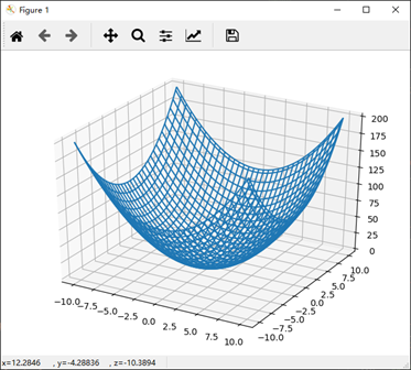
示例三十二:2. 二次抛物面
代码:
 """ 二次抛物面 """

 # failed

 # import numpy as np

 # # import matplotlib.pyplot as plt

 # # 二次抛物面 z = x^2 + y^2

 x = np.linspace(-10, 10, 101)

 y = x

 x, y = np.meshgrid(x, y)

 z = x ** 2 + y ** 2

 ax = plt.subplot(111, projection='3d')

 # ax = plt.subplot(111)

 ax.plot_wireframe(x, y, z)

 plt.show()
实现:
###############################################################################################################
第二部分:
参考连接:
https://www.matplotlib.org.cn/tutorials/introductory/pyplot.html (matplotlib.pyplot 中文教程)
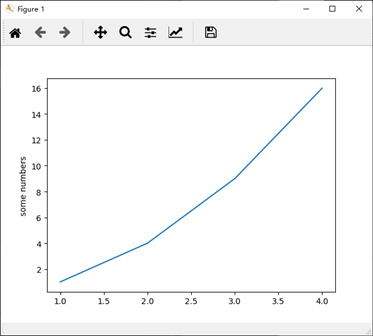
示例一:使用 pyplot 生成可视化图像
代码:
 """ 使用pyplot生成可视化非常快速:"""

 """

 您可能想知道为什么x轴的范围是0-3,y轴的范围是1-4。如果为plot()命令提供单个列表或数组,则matplotlib假定它是一系列y值,并自动为您生成x值。由于python范围以0开头,因此默认的x向量与y具有相同的长度,但从0开始。因此x数据为 [0,1,2,3]。

 """

 import matplotlib.pyplot as plt

 # plt.plot([1, 2, 3, 4])

 plt.plot([1, 2, 3, 4], [1, 4, 9, 16])

 plt.ylabel('some numbers')

 plt.show()
实现:
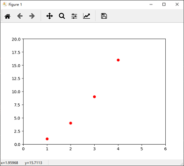
示例二:格式化绘图的样式
代码:
 """ 格式化绘图的样式 """

 """

 上例中的 axis() 命令采用 [xmin, xmax, ymin, ymax] 列表并指定轴的视口。

 """

 import matplotlib.pyplot as plt

 plt.plot([1, 2, 3, 4], [1, 4, 9, 16], 'ro') # 对于每对x,y对的参数,有一个可选的第三个参数,它是指示绘图的颜色和线型的格式字符串。

 plt.axis([0, 6, 0, 20]) # x 轴坐标 从 0 到 6, y 轴坐标 从 0 到 20

 plt.show()
实现:
示例三:常数,平方,立方,指数
代码:
 """

 如果matplotlib仅限于使用列表,那么数字处理将毫无用处。通常,您将使用numpy数组。实际上,所有序列都在内部转换为numpy数组。 下面的示例说明了使用数组在一个命令中绘制具有不同格式样式的多行。

 """

 import numpy as np

 # evenly sampled time at 200ms intervals

 t = np.arange(0., 5., 0.2)  # 从 浮点 0.0 到 浮点 5.0, 均匀区间 0.2

 # red dashes, blue squares and green triangles

 # plot 1: x = t, y = t; plot 2: x = t, y = t**2; plot 3: x = t, y = t**3

 plt.plot(t, t, 'r--', t, t**2, 'bs', t, t**3, 'g^', t, t**t, 'b-')

 plt.show()
实现:

示例四:使用关键字字符串绘图
代码:
""" 使用关键字字符串绘图 """
"""
在某些情况下,您可以使用允许您使用字符串访问特定变量的格式的数据
Matplotlib允许您使用data关键字参数提供此类对象。如果提供,那么您可以生成包含与这些变量对应的字符串的图。
""" """ numpy 有中文文档 """ import numpy as np data = {'a': np.arange(50), # 创建一个一维数组
'c': np.random.randint(0, 50, 50), # randint(low, high, size), low = 0, high = 50, size = 50
'd': np.random.randn(50)}
data['b'] = data['a'] + 10 * np.random.randn(50)
data['d'] = np.abs(data['d']) * 100 print("a")
print(data['a'])
"""
[ 0 1 2 3 4 5 6 7 8 9 10 11 12 13 14 15 16 17 18 19 20 21 22 23
24 25 26 27 28 29 30 31 32 33 34 35 36 37 38 39 40 41 42 43 44 45 46 47
48 49]
"""
print("b")
print(data['b'])
"""
[ 0.62943836 17.21409767 9.15333236 -6.20317351 -1.53888847
-12.0202326 -3.22548835 11.13534953 13.96745507 26.38984773
22.69409017 8.86419068 8.92888006 18.46790678 13.37504354
30.83445123 19.47090425 14.90291529 29.80642509 30.94512599
22.43131401 36.97826961 23.33682989 27.60329635 34.24190016
10.28576809 12.9561741 12.83961587 24.19653172 26.55497339
29.34636093 17.82606204 28.43073352 35.93952355 62.68590949
42.41798828 26.79822284 32.15448269 41.35891312 45.52420081
42.62409069 32.05603638 24.59618139 41.93496607 34.27653275
49.63741043 51.14985828 42.88654806 53.86970762 40.44677401]
"""
print("c")
print(data['c'])
"""
[32 5 20 43 20 20 16 5 28 17 17 31 39 41 38 34 48 20 41 4 25 12 30 36
19 12 11 6 4 6 12 37 40 35 35 22 24 38 49 1 43 48 25 42 17 34 43 42
3 15]
"""
print("d")
print(data['d'])
"""
d
[ 0.62273488 -0.02765768 0.04995371 -0.2198877 -0.8502098 -0.31262268
-0.51424326 0.41488156 0.835937 3.52370268 -0.43592109 -0.08318534
-0.06548334 0.70974706 -0.44578812 0.45146541 1.07836691 -2.7746048
0.17646141 1.51731861 -0.30110688 -1.70045242 1.1230105 -0.33502094
0.30202394 0.64661335 1.13310453 -0.43094864 -0.41110585 1.31525723
1.55391863 0.91273678 0.1616555 -0.90135308 -1.73413819 0.67115765
-1.28802326 -1.81656713 0.22535318 -1.82879701 0.12005613 -0.7980464
-0.87905583 0.02397982 0.55560746 0.35077361 -0.09589334 -0.15068644
-0.85855859 1.26179932]
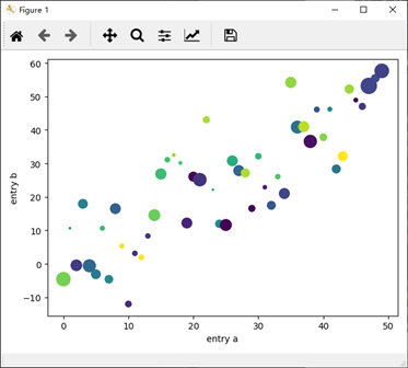
""" plt.scatter('a', 'b', c='c', s='d', data=data)
plt.xlabel('entry a')
plt.ylabel('entry b')
plt.show()
实现:
示例五:用分类变量绘图
代码:
""" 用分类变量绘图 """
"""
也可以使用分类变量创建绘图。Matplotlib允许您将分类变量直接传递给许多绘图函数。
"""
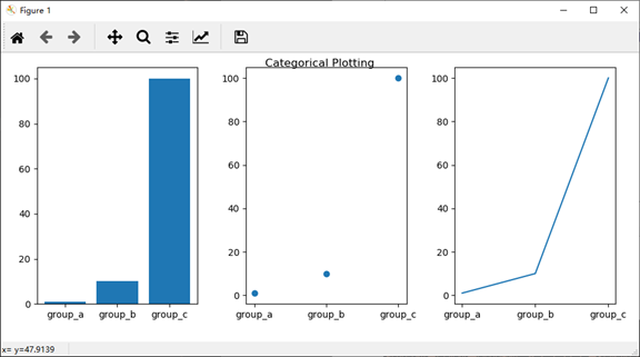
names = ['group_a', 'group_b', 'group_c']
values = [1, 10, 100] plt.figure(1, figsize=(9, 3)) plt.subplot(131) # 共一行三列,第一个
plt.bar(names, values) # group_a -> 1; group_b -> 10; group_c -> 100;柱形图
plt.subplot(132) # 共一行三列,第二个
plt.scatter(names, values) #散点图
plt.subplot(133) # 共一行三列,第三个
plt.plot(names, values) # 标准线性图 plt.suptitle('Categorical Plotting')
plt.show()
实现:
示例六:控制线的属性(。。)
代码:
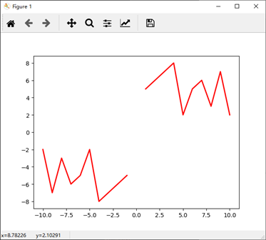
 """ 控制线的属性 """

 x = [1,2,3,4,5,6,7,8,9,10]

 y = [5,6,7,8,2,5,6,3,7,2]

 x1 = [1,2,3,4,5,6,7,8,9,10]

 y1 = [5,6,7,8,2,5,6,3,7,2]

 x2 = [-1,-2,-3,-4,-5,-6,-7,-8,-9,-10]

 y2 = [-5,-6,-7,-8,-2,-5,-6,-3,-7,-2]

 # plt.plot(x, y, linewidth=2.0)

 # line, = plt.plot(x, y, '-')

 # line.set_antialiased(False) # turn off antialising

 lines = plt.plot(x1, y1, x2, y2)

 # use keyword args

 plt.setp(lines, color='r', linewidth=2.0)

 # or MATLAB style string value pairs

 # plt.setp(lines, 'color', 'r', 'linewidth', 2.0)

 plt.show()
实现:
示例七:使用多个图形和轴
代码:
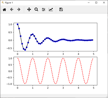
 """ 使用多个图形和轴 """

 """

 这里的 figure() 命令是可选的,因为默认情况下将创建 figure(1),就像默认情况下创建 subplot(111) 一样,如果不手动指定任何轴。subplot()命令指定numrows, numcols, plot_number,其中 plot_number 的范围 从1到numrows*numcols。如果 numrows * numcols <10,则subplot命令中的逗号是可选的。因此 subplot(211) 与 subplot(2, 1, 1) 相同。

 您可以创建任意数量的子图和轴。如果要手动放置轴,即不在矩形网格上,请使用 axes() 命令,该命令允许您将位置指定为axes([left,bottom,width,height]),其中所有值均为小数(0到1)坐标。有关手动放置轴的示例。

 """

 import matplotlib.pyplot as plt

 import numpy as np

 def f(t):

     return np.exp(-t) * np.cos(2*np.pi*t)

 t1 = np.arange(0.0, 5.0, 0.1)   # 开始 0.0, 结束 5.0, 区间 0.1

 t2 = np.arange(0.0, 5.0, 0.02)

 plt.figure(1)

 plt.subplot(211)

 plt.plot(t1, f(t1), 'bo', t2, f(t2), 'k')   # 在同一个画布上绘制两幅图,两幅图重叠,图一点,图二线

 plt.subplot(212)

 plt.plot(t2, np.cos(2*np.pi*t2), 'r--')

 plt.show()
实现:
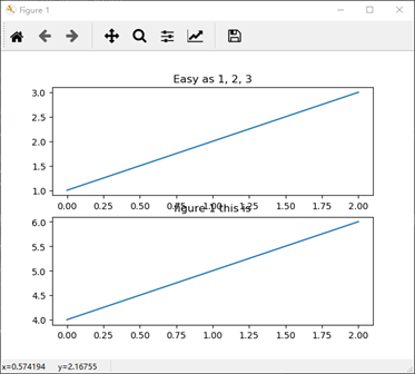
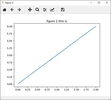
示例八:创建多个figure()
代码:
 """

 您可以使用具有增加的图号的多个figure() 调用来创建多个数字。当然,每个图形可以包含您心中所需的轴和子图:

 """

 import matplotlib.pyplot as plt

 plt.figure(1)                # the first figure

 plt.subplot(211)             # the first subplot in the first figure

 plt.plot([1, 2, 3])

 plt.subplot(212)             # the second subplot in the first figure

 plt.plot([4, 5, 6])

 plt.title('figure 1 this is')   # 这个写道 figure 1:212 图中了

 plt.figure(2)                # a second figure

 plt.plot([4, 5, 6])          # creates a subplot(111) by default

 plt.title('figure 2 this is')

 plt.figure(1)                # figure 1 current; subplot(212) still current

 plt.subplot(211)             # make subplot(211) in figure1 current

 plt.title('Easy as 1, 2, 3') # subplot 211 title

 plt.show()
实现:
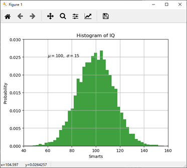
示例九:在图表中使用文本
代码:
 """ 使用文本 """

 """

 text() 命令可用于在任意位置添加文本,而xlabel(), ylabel() 和 title() 用于在指定位置添加文本(有关更详细的示例,请参见Matplotlib图中的文本)

 """

 import matplotlib.pyplot as plt

 import numpy as np

 mu, sigma = 100, 15

 x = mu + sigma * np.random.randn(10000)

 # the histogram of the data

 n, bins, patches = plt.hist(x, 50, density=1, facecolor='g', alpha=0.75)

 # t = plt.xlabel('my data', fontsize=14, color='red')

 plt.xlabel('Smarts')

 plt.ylabel('Probability')

 plt.title('Histogram of IQ')

 plt.text(60, .025, r'$\mu=100,\ \sigma=15$')    # x = 60, y = 0.025 处写 text

 plt.axis([40, 160, 0, 0.03])    # x = 40~160, y = 0~0.3

 plt.grid(True)

 plt.show()
实现:
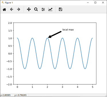
示例十:在文本中使用数学表达式
代码:
 """ 在文本中使用数学表达式 """

 """

 matplotlib在任何文本表达式中接受TeX方程表达式。 例如,要在标题中写入表达式σi= 15,您可以编写由美元符号包围的TeX表达式:

 plt.title(r'$\sigma_i=15$')

 标题字符串前面的r很重要 - 它表示该字符串是一个原始字符串,而不是将反斜杠视为python转义

 在此基本示例中,xy(箭头提示)和xytext位置(文本位置)都在数据坐标中。

 上面的基本text() 命令的使用将文本放在Axes上的任意位置。文本的常见用途是注释绘图的某些功能,而annotate()方法提供帮助功能以使注释变得容易。在注释中,有两点需要考虑:由参数xy表示的注释位置和文本xytext的位置。 这两个参数都是(x,y)元组。

 """

 import matplotlib.pyplot as plt

 import numpy as np

 ax = plt.subplot(111)

 t = np.arange(0.0, 5.0, 0.01)

 s = np.cos(2*np.pi*t)   # t 传入 s

 # line, = plt.plot(t, s, lw=2)

 plt.plot(t, s)

 plt.annotate('local max', xy=(2, 1), xytext=(3, 1.5),

              arrowprops=dict(facecolor='black', shrink=0.05),

              )

 plt.ylim(-2, 2)

 plt.show()
实现:
示例十一:对数和其他非线性轴
代码:
 """ 对数和其他非线性轴 """

 """

 matplotlib.pyplot 不仅支持线性轴刻度,还支持对数和logit刻度。 如果数据跨越许多数量级,则通常使用此方法。

 则通常使用此方法。 更改轴的比例很容易:

 plt.xscale('log')

 """

 from matplotlib.ticker import NullFormatter  # useful for `logit` scale

 # Fixing random state for reproducibility

 np.random.seed(19680801)

 # make up some data in the interval ]0, 1[

 y = np.random.normal(loc=0.5, scale=0.4, size=1000)

 y = y[(y > 0) & (y < 1)]

 y.sort()

 x = np.arange(len(y))

 # plot with various axes scales

 plt.figure(1)

 # linear

 plt.subplot(221)

 plt.plot(x, y)

 plt.yscale('linear')

 plt.title('linear')

 plt.grid(True)

 # log

 plt.subplot(222)

 plt.plot(x, y)

 plt.yscale('log')

 plt.title('log')

 plt.grid(True)

 # symmetric log

 plt.subplot(223)

 plt.plot(x, y - y.mean())

 plt.yscale('symlog', linthreshy=0.01)

 plt.title('symlog')
 plt.grid(True)

 # logit

 plt.subplot(224)

 plt.plot(x, y)

 plt.yscale('logit')

 plt.title('logit')

 plt.grid(True)

 # Format the minor tick labels of the y-axis into empty strings with

 # `NullFormatter`, to avoid cumbering the axis with too many labels.

 plt.gca().yaxis.set_minor_formatter(NullFormatter())

 # Adjust the subplot layout, because the logit one may take more space

 # than usual, due to y-tick labels like "1 - 10^{-3}"

 plt.subplots_adjust(top=0.92, bottom=0.08, left=0.10, right=0.95, hspace=0.25,

                     wspace=0.35)

 plt.show()
实现:
20190906_matplotlib_学习与快速实现的更多相关文章
- 学习笔记 - 快速傅里叶变换 / 大数A * B的另一种解法
转: 学习笔记 - 快速傅里叶变换 / 大数A * B的另一种解法 文章目录 前言 ~~Fast Fast TLE~~ 一.FFT是什么? 二.FFT可以干什么? 1.多项式乘法 2.大数乘法 三.F ...
- 前端学习 node 快速入门 系列 —— 初步认识 node
其他章节请看: 前端学习 node 快速入门 系列 初步认识 node node 是什么 node(或者称node.js)是 javaScript(以下简称js) 运行时的一个环境.不是一门语言. 以 ...
- 前端学习 node 快速入门 系列 —— npm
其他章节请看: 前端学习 node 快速入门 系列 npm npm 是什么 npm 是 node 的包管理器,绝大多数 javascript 相关的包都放在 npm 上. 所谓包,就是别人提供出来供他 ...
- 前端学习 node 快速入门 系列 —— 模块(module)
其他章节请看: 前端学习 node 快速入门 系列 模块(module) 模块的导入 核心模块 在 初步认识 node 这篇文章中,我们在读文件的例子中用到了 require('fs'),在写最简单的 ...
- 前端学习 node 快速入门 系列 —— 简易版 Apache
其他章节请看: 前端学习 node 快速入门 系列 简易版 Apache 我们用 node 来实现一个简易版的 Apache:提供静态资源访问的能力. 实现 直接上代码. - demo - stati ...
- 前端学习 node 快速入门 系列 —— 服务端渲染
其他章节请看: 前端学习 node 快速入门 系列 服务端渲染 在简易版 Apache一文中,我们用 node 做了一个简单的服务器,能提供静态资源访问的能力. 对于真正的网站,页面中的数据应该来自服 ...
- 前端学习 node 快速入门 系列 —— 报名系统 - [express]
其他章节请看: 前端学习 node 快速入门 系列 报名系统 - [express] 最简单的报名系统: 只有两个页面 人员信息列表页:展示已报名的人员信息列表.里面有一个报名按钮,点击按钮则会跳转到 ...
- MongoDB学习笔记:快速入门
MongoDB学习笔记:快速入门 一.MongoDB 简介 MongoDB 是由C++语言编写的,是一个基于分布式文件存储的开源数据库系统.在高负载的情况下,添加更多的节点,可以保证服务器性能.M ...
- 从0开始的Python学习001快速上手手册
假设大家已经安装好python的环境了. Windows检查是否可以运行python脚本 Ctrl+R 输入 cmd 在命令行中输入python 如果出现下面结果,我们就可以开始python的学习了. ...
随机推荐
- 机器学习回顾篇(6):KNN算法
1 引言 本文将从算法原理出发,展开介绍KNN算法,并结合机器学习中常用的Iris数据集通过代码实例演示KNN算法用法和实现. 2 算法原理 KNN(kNN,k-NearestNeighbor)算法, ...
- jQuery三级联动效果代码(省、市、区)
很长时间都不用jquery了,有人问我jquery写三级联动的插件我就写好了发出来吧,正好需要的人都可以看看. 一.html代码 <!DOCTYPE html> <html> ...
- python——成语接龙小游戏
小试牛刀的简易成语接龙. 思路—— 1.网上下载成语字典的txt版本 2.通过python进行处理得到格式化的成语,并整理成字典(python字典查找速度快) 3.python程序,查找 用户输入的最 ...
- UnicodeDecodeError: 'gbk' codec can't decode byte 0xae in position 357: illegal multibyte sequence 错误解决方法(已解决)
今天在搭建数据驱动测试框架的时候遇到这个错误: 好在我英语水平还不错(也就六级水平吧),根据英文提示说是多字节数据顺序是非法的 顺着错误往上找发现 File "C:\Users\Mr雷的电脑 ...
- kubernetes垃圾回收器GarbageCollector源码分析(一)
kubernetes版本:1.13.2 背景 由于operator创建的redis集群,在kubernetes apiserver重启后,redis集群被异常删除(包括redis exporter s ...
- C# 创建自定义配置节点1
转载:http://www.educity.cn/develop/495003.html 在.Net应用程序中我们经常看到VS为我们生成的项目工程中都会含有app.config或者web.connfi ...
- Python 爬虫 爬取 煎蛋网 图片
今天, 试着爬取了煎蛋网的图片. 用到的包: urllib.request os 分别使用几个函数,来控制下载的图片的页数,获取图片的网页,获取网页页数以及保存图片到本地.过程简单清晰明了 直接上源代 ...
- .Net Core3.0使用gRPC
gRPC是什么 gRPC是可以在任何环境中运行的现代开源高性能RPC框架.它可以通过可插拔的支持来有效地连接数据中心内和跨数据中心的服务,以实现负载平衡,跟踪,运行状况检查和身份验证.它也适用于分布式 ...
- 让你如“老”绅士般编写 Python 命令行工具的开源项目:docopt
作者:HelloGitHub-Prodesire HelloGitHub 的<讲解开源项目>系列,项目地址:https://github.com/HelloGitHub-Team/Arti ...
- Web前端助手-功能丰富的Chrome插件
整合优秀的前端实用工具.免费,可配置的强大工具集 示例 安装 github仓库: https://github.com/zxlie/FeHelper 官网地址:https://www.baidufe. ...