Jetpack Compose学习(7)——MD样式架构组件Scaffold及导航底部菜单
Jetpack Compose学习(7)——MD样式架构组件Scaffold及导航底部菜单 | Stars-One的杂货小窝
Compose给我们提供了一个Material Design样式的首页组件(Scaffold),我们可以直接套用从而完成一个APP的首页界面
本系列以往文章请查看此分类链接Jetpack compose学习
由于Scaffold中还包含有其他的组件,所以讲解Scaffold先讲解前置的一些组件
TopAppBar
首先,便是TopAppBar,其本质就是我们Android原生常见的Toolbar,不过其封装的比较好,可以快速构建,下面是其的参数列表
TopAppBar(

    title: @Composable () -> Unit,

    modifier: Modifier = Modifier,

    navigationIcon: @Composable (() -> Unit)? = null,

    actions: @Composable RowScope.() -> Unit = {},

    backgroundColor: Color = MaterialTheme.colors.primarySurface,

    contentColor: Color = contentColorFor(backgroundColor),

    elevation: Dp = AppBarDefaults.TopAppBarElevation

)
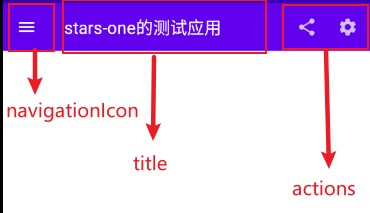
title标题,接收Compose组件,可以传个Text文本进去modifier修饰符,详情见上一章节navigationIcon导航图标actions动作组件backgroundColor背景色contentColor内容颜色elevation阴影
可能说的那么明确,我们直接上代码和效果图,各位就清晰了
TopAppBar(

    navigationIcon = {

        IconButton(

            onClick = {}

        ) {

            Icon(Icons.Filled.Menu, null)

        }

    },

    title = {

        Text("stars-one的测试应用")

    },actions = {

        IconButton(

            onClick = {}

        ) {

            Icon(Icons.Filled.Share, null)

        }

        IconButton(

            onClick = {}

        ) {

            Icon(Icons.Filled.Settings, null)

        }

    }

)
效果图如下
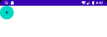
FloatingActionButton
比较常见的悬浮按钮,一般里面是个简单的按钮,参数与之前的Button一样,详情请参考Jetpack Compose学习(3)——图标(Icon) 按钮(Button) 输入框(TextField) 的使用 | Stars-One的杂货小窝
FloatingActionButton(

    onClick: () -> Unit,

    modifier: Modifier = Modifier,

    interactionSource: MutableInteractionSource = remember { MutableInteractionSource() },

    shape: Shape = MaterialTheme.shapes.small.copy(CornerSize(percent = 50)),

    backgroundColor: Color = MaterialTheme.colors.secondary,

    contentColor: Color = contentColorFor(backgroundColor),

    elevation: FloatingActionButtonElevation = FloatingActionButtonDefaults.elevation(),

    content: @Composable () -> Unit

)
使用:
FloatingActionButton(onClick = { /*TODO*/ }) {

    Icon(imageVector = Icons.Default.Add, contentDescription = null)

}
PS: 一般这个与
Scaffold连用,Scaffold里面可控制FloatingActionButton的位置
除此之外,还有个ExtendedFloatingActionButton,这种就是可以带图标和文字的,如下图
ExtendedFloatingActionButton(

    icon = { Icon(Icons.Filled.Favorite, contentDescription = null) },

    text = { Text("ADD TO BASKET") },

    onClick = { /*do something*/ }

)
ExtendedFloatingActionButton和FloatingActionButton区别是,ExtendedFloatingActionButton是以文字为主,图标是可选的,而FloatingActionButton只显示图标
BottomAppBar
这个与之前的TopAppBar参数有所不同,从名字看我们知道其实放在底部的一个Toolbar,但是其本身是不带有位置控制,也是得与Scaffold连用,如果单独使用,效果也是会和TopAppBar的一样放在页面的顶头
BottomAppBar(

    modifier: Modifier = Modifier,

    backgroundColor: Color = MaterialTheme.colors.primarySurface,

    contentColor: Color = contentColorFor(backgroundColor),

    cutoutShape: Shape? = null,

    elevation: Dp = AppBarDefaults.BottomAppBarElevation,

    contentPadding: PaddingValues = AppBarDefaults.ContentPadding,

    content: @Composable RowScope.() -> Unit

)
可以把这个布局看作是个Row布局,里面的参数从名字都能看到出来,设置背景色或者设置padding边距的,这里不再赘述
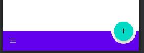
唯一值得注意的是cutoutShape属性,如果在Scaffold中,有BottomAppBar和FloatingActionButton,可以实现下面的效果
BottomNavigation
BottomNavigation里面会有N个BottomNavigationItem,这里就看你自己准备定义多少个菜单项了
BottomNavigation(

    modifier: Modifier = Modifier,

    backgroundColor: Color = MaterialTheme.colors.primarySurface,

    contentColor: Color = contentColorFor(backgroundColor),

    elevation: Dp = BottomNavigationDefaults.Elevation,

    content: @Composable RowScope.() -> Unit

)
BottomNavigation提供的一些参数也就是改变颜色或者阴影,重点是在BottomNavigationItem
BottomNavigationItem(

    selected: Boolean,

    onClick: () -> Unit,

    icon: @Composable () -> Unit,

    modifier: Modifier = Modifier,

    enabled: Boolean = true,

    label: @Composable (() -> Unit)? = null,

    alwaysShowLabel: Boolean = true,

    interactionSource: MutableInteractionSource = remember { MutableInteractionSource() },

    selectedContentColor: Color = LocalContentColor.current,

    unselectedContentColor: Color = selectedContentColor.copy(alpha = ContentAlpha.medium)

)
BottomNavigationItem有个selected参数,表示是否选中
icon则是图标的设置,label则是文字,这两个都是需要接收一个组件的
selectedContentColor选中颜色unselectedContentColor未选中颜色
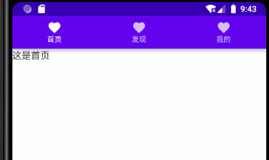
下面直接来个例子讲解
var selectIndex by remember {

    mutableStateOf(0)

}

val navList = listOf("首页","发现","我的")

BottomNavigation() {

    navList.forEachIndexed { index, str ->

        BottomNavigationItem(

            selected = index == selectIndex, onClick = { selectIndex = index },

            icon = {

                Icon(imageVector = Icons.Default.Favorite, contentDescription =null )

            },label = {Text(str)}

        )

    }

}

Text(text = "这是${navList[selectIndex]}")
效果如下所示
Scaffold
Scaffold(

    modifier: Modifier = Modifier,

    scaffoldState: ScaffoldState = rememberScaffoldState(),

    topBar: @Composable () -> Unit = {},

    bottomBar: @Composable () -> Unit = {},

    snackbarHost: @Composable (SnackbarHostState) -> Unit = { SnackbarHost(it) },

    floatingActionButton: @Composable () -> Unit = {},

    floatingActionButtonPosition: FabPosition = FabPosition.End,

    isFloatingActionButtonDocked: Boolean = false,

    drawerContent: @Composable (ColumnScope.() -> Unit)? = null,

    drawerGesturesEnabled: Boolean = true,

    drawerShape: Shape = MaterialTheme.shapes.large,

    drawerElevation: Dp = DrawerDefaults.Elevation,

    drawerBackgroundColor: Color = MaterialTheme.colors.surface,

    drawerContentColor: Color = contentColorFor(drawerBackgroundColor),

    drawerScrimColor: Color = DrawerDefaults.scrimColor,

    backgroundColor: Color = MaterialTheme.colors.background,

    contentColor: Color = contentColorFor(backgroundColor),

    content: @Composable (PaddingValues) -> Unit

)
属性说明
topBar顶部的布局bottomBar底部的布局floatingActionButton悬浮按钮布局floatingActionButtonPosition悬浮按钮位置,有FabPosition.End(默认)和FabPosition.Center可选isFloatingActionButtonDocked与BottomAppBar配合使用,可以实现底部导航条的裁剪效果,效果可以看下图drawerGesturesEnabled是否开启侧边抽屉手势(开启后可侧滑弹出抽屉)drawerShape抽屉的形状drawerContent侧边抽屉内容,是个Column布局,自己可以顺便排列drawerElevation侧边抽屉的阴影drawerBackgroundColor侧边抽屉的背景色drawerContentColor侧边抽屉内容颜色(似乎是覆盖字体颜色而已)drawerScrimColor侧边抽屉遮盖最底层的颜色
基本使用
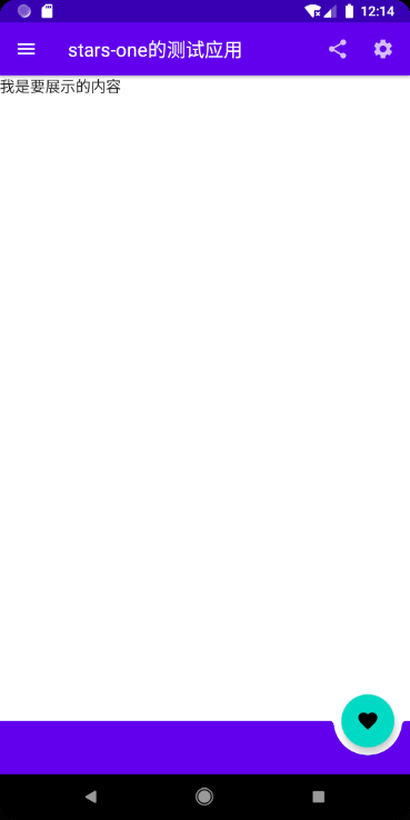
使用5个属性topBar bottomBar floatingActionButton floatingActionButtonPosition isFloatingActionButtonDocked,实现个简单架构效果
Scaffold(

    topBar = {

        TopAppBar(

            navigationIcon = {

                IconButton(

                    onClick = {}

                ) {

                    Icon(Icons.Filled.Menu, null)

                }

            },

            title = {

                Text("stars-one的测试应用")

            },actions = {

                IconButton(

                    onClick = {}

                ) {

                    Icon(Icons.Filled.Share, null)

                }

                IconButton(

                    onClick = {}

                ) {

                    Icon(Icons.Filled.Settings, null)

                }

            }

        )

    },

    floatingActionButton = {

        FloatingActionButton(onClick = { /*TODO*/ }) {

            Icon(imageVector = Icons.Default.Favorite, contentDescription = null)

        }

    },

    bottomBar = {

        BottomAppBar(cutoutShape = CircleShape) {

        }

    },

    //注意此参数,可以实现图中那种被裁剪的效果,前提是上面的cutoutShape也有设置

    isFloatingActionButtonDocked = true,

    floatingActionButtonPosition = FabPosition.End

) {

    //这里是主界面

    Text("我是要展示的内容")

}
效果如下图所示
底部导航条
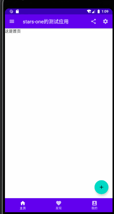
我们在上面的基础改下即可(主要是bottomAppBar这个参数),代码如下所示
//当前选择的NavItem

var selectIndex by remember { mutableStateOf(0) }

val navTextList = listOf("主页", "发现", "我的")

//图标

val iconList = listOf(Icons.Default.Home,Icons.Default.Favorite,Icons.Default.AccountBox)

Scaffold(

    topBar = {

        TopAppBar(

            navigationIcon = {

                IconButton(

                    onClick = {}

                ) {

                    Icon(Icons.Filled.Menu, null)

                }

            },

            title = {

                Text("stars-one的测试应用")

            },actions = {

                IconButton(

                    onClick = {}

                ) {

                    Icon(Icons.Filled.Share, null)

                }

                IconButton(

                    onClick = {}

                ) {

                    Icon(Icons.Filled.Settings, null)

                }

            }

        )

    },

    floatingActionButton = {

        FloatingActionButton(onClick = { /*TODO*/ }) {

            Icon(imageVector = Icons.Default.Add, contentDescription = null)

        }

    },

    bottomBar = {

        BottomNavigation() {

            navTextList.forEachIndexed { index, str ->

                BottomNavigationItem(label = {Text(str)},selected = index==selectIndex , onClick = {selectIndex = index },icon = {

                    Icon(imageVector = iconList[index], contentDescription = null)

                })

            }

        }

    },

    //注意此参数,可以实现图中那种被裁剪的效果,前提是上面的cutoutShape也有设置

    floatingActionButtonPosition = FabPosition.End

) {

    //这里是主界面

    //根据底部导航选中的下标改变展示的页面

    when(selectIndex){

        0 -> Text("这是首页")

        1 -> Text("这是发现")

        2 -> Text("这是我的")

    }

}
效果如下图所示

带侧边抽屉
这里需要注意的是,弹出侧边抽屉是个挂起操作(suspend),所以需要使用到Kotlin中的协程,不过不是涉及太深,我们先知道怎么用即可,后面有空我再补充协程的用法
这里主要是测试了带drawer开头的那几个参数,及点击左上角的菜单按钮弹出侧边抽屉功能(即对应的点击事件)
//状态

val scaffoldState = rememberScaffoldState()

//协程的作用域

val scope = rememberCoroutineScope()

//当前选择的NavItem

var selectIndex by remember { mutableStateOf(0) }

val navTextList = listOf("主页", "发现", "我的")

//图标

val iconList =

    listOf(Icons.Default.Home, Icons.Default.Favorite, Icons.Default.AccountBox)

Scaffold(

    scaffoldState = scaffoldState,

    topBar = {

        TopAppBar(

            navigationIcon = {

                IconButton(

                    onClick = {

                        //使用协程

                        scope.launch {

                            //改变状态,显示drawer抽屉

                            scaffoldState.drawerState.open()

                        }

                    }

                ) {

                    Icon(Icons.Filled.Menu, null)

                }

            },

            title = {

                Text("stars-one的测试应用")

            }, actions = {

                IconButton(

                    onClick = {}

                ) {

                    Icon(Icons.Filled.Share, null)

                }

                IconButton(

                    onClick = {}

                ) {

                    Icon(Icons.Filled.Settings, null)

                }

            }

        )

    },

    floatingActionButton = {

        FloatingActionButton(onClick = { /*TODO*/ }) {

            Icon(imageVector = Icons.Default.Add, contentDescription = null)

        }

    },

    bottomBar = {

        BottomNavigation() {

            navTextList.forEachIndexed { index, str ->

                BottomNavigationItem(

                    label = { Text(str) },

                    selected = index == selectIndex,

                    onClick = { selectIndex = index },

                    icon = {

                        Icon(

                            imageVector = iconList[index],

                            contentDescription = null

                        )

                    })

            }

        }

    },

    //注意此参数,可以实现图中那种被裁剪的效果,前提是上面的cutoutShape也有设置

    floatingActionButtonPosition = FabPosition.End,

    drawerContent = {

        Text("这是抽屉的内容")

    },

    drawerContentColor = Color.Black,

    drawerBackgroundColor = Color.Green,

    drawerGesturesEnabled = true,

    drawerScrimColor = Color.Red,

    drawerShape = RoundedCornerShape(20.dp)

) {

    //这里是主界面

    //根据底部导航选中的下标改变展示的页面

    when (selectIndex) {

        0 -> Text("这是首页")

        1 -> Text("这是发现")

        2 -> Text("这是我的")

    }

}

参考
Jetpack Compose学习(7)——MD样式架构组件Scaffold及导航底部菜单的更多相关文章
- Jetpack Compose学习(5)——从登录页美化开始学习布局组件使用
原文:Jetpack Compose学习(5)--从登录页美化开始学习布局组件使用 | Stars-One的杂货小窝 本篇主要讲解常用的布局,会与原生Android的布局控件进行对比说明,请确保了解A ...
- Jetpack Compose学习(2)——文本(Text)的使用
原文: Jetpack Compose学习(2)--文本(Text)的使用 | Stars-One的杂货小窝 对于开发来说,文字最为基础的组件,我们先从这两个使用开始吧 本篇涉及到Kotlin和DSL ...
- Jetpack Compose学习(3)——图标(Icon) 按钮(Button) 输入框(TextField) 的使用
原文地址: Jetpack Compose学习(3)--图标(Icon) 按钮(Button) 输入框(TextField) 的使用 | Stars-One的杂货小窝 本篇分别对常用的组件:图标(Ic ...
- Jetpack Compose学习(8)——State及remeber
原文地址: Jetpack Compose学习(8)--State状态及remeber关键字 - Stars-One的杂货小窝 之前我们使用TextField,使用到了两个关键字remember和mu ...
- Jetpack Compose学习(1)——从登录页开始入门
原文地址:Jetpack Compose学习(1)--从登录页开始入门 | Stars-One的杂货小窝 Jetpack Compose UI在前几天出了1.0正式版,之前一直还在观望,终于是出了正式 ...
- Jetpack Compose学习(6)——关于Modifier的妙用
原文: Jetpack Compose学习(6)--关于Modifier的妙用 | Stars-One的杂货小窝 之前学习记录中也是陆陆续续地将常用的Modifier的方法穿插进去了,本期就来详细的讲 ...
- Jetpack Compose学习(9)——Compose中的列表控件(LazyRow和LazyColumn)
原文:Jetpack Compose学习(9)--Compose中的列表控件(LazyRow和LazyColumn) - Stars-One的杂货小窝 经过前面的学习,大致上已掌握了compose的基 ...
- Jetpack Compose学习(4)——Image(图片)使用及Coil图片异步加载库使用
原文地址 Jetpack Compose学习(4)--Image(图片)使用及Coil图片异步加载库使用 | Stars-One的杂货小窝 本篇讲解下关于Image的使用及使用Coil开源库异步加载网 ...
- amazeui学习笔记--css(常用组件10)--导航条Topbar
amazeui学习笔记--css(常用组件10)--导航条Topbar 一.总结 1. 导航条:就是页面最顶端的导航条:在容器上添加 .am-topbar class,然后按照示例组织所需内容.< ...
随机推荐
- WPF 勾选划线
最近项目需要一个左右侧一对多的划线功能 我们先来看一下效果秃: 主要功能: 支持动态添加 支持复选 支持修改颜色 支持动态宽度 主要实现:事件的传递 应用场景:购物互选,食品搭配,角色互选 数据源 左 ...
- 区间k大数训练
问题描述 给定一个序列,每次询问序列中第l个数到第r个数中第K大的数是哪个. 输入格式 第一行包含一个数n,表示序列长度. 第二行包含n个正整数,表示给定的序列. 第三个包含一个正整数m,表示询问个数 ...
- MVVM框架三巨头之Vue的前世今生。
前端有三宝,Angular,Vue,React.目前这三大主流JS框架已经成三分之势.其中的React框架是由脸书开发的,今天我们就来聊一聊VueJS的前世今生. 前世 在2013年的js开发者大会上 ...
- jquery mobile cdn
<head> <link rel="stylesheet" href="http://code.jquery.com/mobile/1.3.2/jque ...
- MySQL 5.7新特性介绍
本文是基于MySQL-5.7.7-rc版本,未来可能 还会发生更多变化. 1.即将删除的特性1.1.InnoDB monitoring features,详见:WL#7377(访问地址:http:// ...
- AndroidJetpack Fragment之Navigation和ViewPager2
新的Fragment导航方式:Navigation 1.创建若干个fragment 2.添加导航 1)新建Navigation:右键res文件夹,New->Android Resource Fi ...
- pycharm 汉化
1.首先进入pycharm,点击file,找到setting. 2.点击 plugins 搜索Chinese,找到Chinese(simplified)Language Pack EAP,点击inst ...
- Codeforces 1365D Solve The Maze
### 题目大意: 在一个 $n * m$ 的矩阵中,有空地.坏人.好人和墙.你可以将空地变成墙来堵住坏人.$(n, m)$为出口,是否存在一个方案使得矩阵中所有好人能够走到出口,而所有坏人不能通过出 ...
- Mysql常用sql语句(4)- distinct 去重数据
测试必备的Mysql常用sql语句系列 https://www.cnblogs.com/poloyy/category/1683347.html 前言 我们使用select进行数据查询时是会返回所有匹 ...
- ElasticAlert基于聚合告警
背景 最近公司网站经常被漏洞扫描,虽然并没有什么漏洞给对方利用,但是每次扫描我们也必须要察觉到,如果扫描的量太大,可以考虑从公有云的安全组上禁用掉这个IP,所以需要统计指定时间内每个IP的访问次数,这 ...