关于css3的背景切割(background-clip)、背景原点(background-origin)的使用


<!doctype html>
<html lang="en">
<head>
<meta charset="UTF-8">
<title>Document</title>
<style type="text/css">
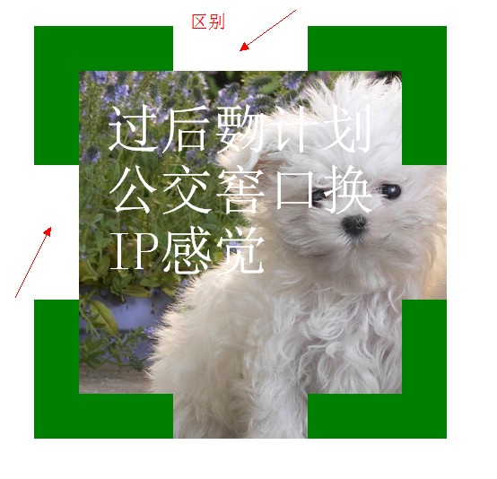
.div1{
width: 300px;
height: 300px;
border:50px dashed green;
font-size: 60px;
color: #fff;
padding: 30px;
margin: 30px;
background: #fff url(bac.jpg) 0 0 no-repeat;
background-clip: border-box;
/*background-clip: padding-box;*/
/*background-clip: content-box;*/
}
</style>
</head>
<body>
<div class="div1">过后覅计划公交窖口换IP感觉</div>
</body>
</html>

<!doctype html>
<html lang="en">
<head>
<meta charset="UTF-8">
<title>Document</title>
<style type="text/css">
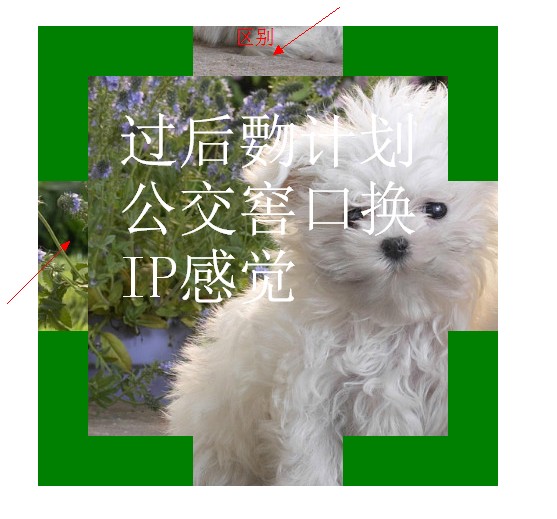
.div1{
width: 300px;
height: 300px;
border:50px dashed green;
font-size: 60px;
color: #fff;
padding: 30px;
margin: 30px;
background: #fff url(bac.jpg) 0 0 no-repeat;
background-clip: border-box;
/*background-clip: padding-box;*/
/*background-clip: content-box;*/
}
</style>
</head>
<body>
<div class="div1">过后覅计划公交窖口换IP感觉</div>
</body>
</html>

<!doctype html>
<html lang="en">
<head>
<meta charset="UTF-8">
<title>Document</title>
<style type="text/css">
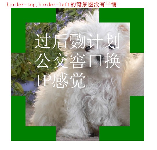
.div1{
width: 300px;
height: 300px;
border:50px dashed green;
font-size: 60px;
color: #fff;
padding: 30px;
margin: 30px;
background: #fff url(bac.jpg) 0 0 no-repeat;
background-clip: border-box;
/*background-clip: padding-box;*/
/*background-clip: content-box;*/
background-origin: border-box;
}
</style>
</head>
<body>
<div class="div1">过后覅计划公交窖口换IP感觉</div>
</body>
</html>


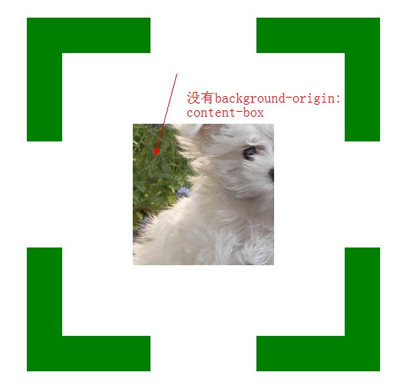
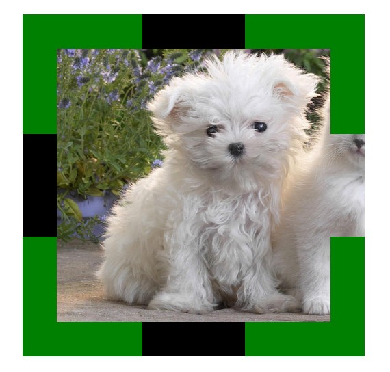
<!doctype html>
<html lang="en">
<head>
<meta charset="UTF-8">
<title>Document</title>
<style type="text/css">
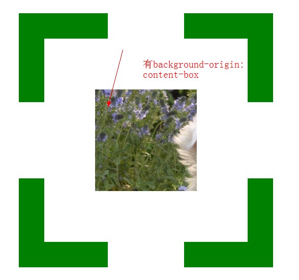
.div1{
width: 200px;
height: 200px;
border:50px dashed green;
font-size: 60px;
color: #fff;
padding: 100px;
margin: 30px;
background: #f00 url(bac.jpg) 0 0 no-repeat;
background-clip: content-box;
background-origin: content-box;
}
</style>
</head>
<body>
<div class="div1"></div>
</body>
</html>
 <!doctype html>

 <html lang="en">

 <head>

 <meta charset="UTF-8">

 <title>Document</title>

 <style type="text/css">

 .div1{

 width: 200px;

 height: 200px;

 border:50px dashed green;

 padding: 100px;

 margin: 30px;

 background: #000 url(bac.jpg) 0 0 no-repeat;

 /*background-size:400px 400px;*/

 /*background-size:100% 100%;*/

 /*background-size:auto;*/

 background-size:cover;

 /*background-size:contain;*/

 }

 </style>

 </head>

 <body>

 <div class="div1"></div>

 </body>

 </html>

 <!doctype html>

 <html lang="en">

 <head>

 <meta charset="UTF-8">

 <title>Document</title>

 <style type="text/css">

 body{

 color: #fff;

 background: #000;

 }

 div{

 color: #fff;

 font-size: 50px;

 font-weight: bold;

 background: rgba(255,255,255,0.5);

 position: absolute;

 }

 </style>

 </head>

 <body>

 <div>会后集合与交通</div>

 </body>

 </html>


 <!doctype html>

 <html lang="en">

 <head>

 <meta charset="UTF-8">

 <title>Document</title>

 <style type="text/css">

 div{

 height: 100px;

 width: 100px;

 background: -webkit-gradient(linear,left center,right center,from(yellow),color-stop(0.5,black),color-stop(0.5,#fff),to(blue));

 }

 </style>

 </head>

 <body>

 <div></div>

 </body>

 </html>


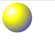
 <!doctype html>

 <html lang="en">

 <head>

 <meta charset="UTF-8">

 <title>Document</title>

 <style type="text/css">

 div{

 height: 100px;

 width: 100px;

 border-radius: 50px;

 background: -webkit-gradient(radial,30 30,1,30 30,100,from(#fff),color-stop(0.3,yellow),to(blue));

 }

 </style>

 </head>

 <body>

 <div></div>

 </body>

 </html>

关于css3的背景切割(background-clip)、背景原点(background-origin)的使用的更多相关文章
- CSS3总结二:(background)背景/渐变色函数
background-color(CSS2) background-image background-position background-size background-repeat backgr ...
- css3基础-选择器+边框与圆角+背景与渐变
Css3选择器相关: section > div直接子元素选择器 div + article相邻兄弟选择器(在元素之后出现) div ~ article通用兄弟选择器(在元素之后出现) 属性选择 ...
- CSS(九):background(背景属性)
通过CSS背景属性,可以给页面元素添加背景样式. 背景属性可以设置背景颜色.背景图片.背景平铺.背景图像固定等. background-color(背景颜色) background-color属性定义 ...
- css考核点整理(八)-在什么情况下通过img引入图片,什么情况用背景图引入?背景属性有哪些
在什么情况下通过img引入图片,什么情况用背景图引入?背景属性有哪些
- PDF如何去除背景,PDF去除背景颜色
PDF文件在使用的时候大多都是单调的白色背景,但是也有小伙伴再制作PDF文件的时候会给PDF文件添加背景颜色,会有影响文字阅读的情况,这个时候就需要把背景颜色去除了,那么该怎么做呢,不会的小伙们就跟小 ...
- CSS3动画设置后台登录页背景切换图片
CSS3的动画很实用很好用,简单几句话就可以做出一个好看而且过渡平滑的body背景图片,不多说,来来来,上代码 body{ animation:mybg 7s; -webkit-animation:m ...
- css3动画,点击圆形背景扩展整个页面效果
上次做项目的时候,要求点击链接,这个链接的圆形背景扩散充满整个页面,今天把这个效果整理一下,是简单的css3的动画特效,粘贴下面的代码看效果 <!DOCTYPE html> <htm ...
- CSS3:元素的边框、背景和大小
边框 和边框相关的属性例如以下. border-width 用于设置边框的宽度,可选择包含: 1)<长度值>:将边框宽度设为以CSS度量单位(如em.px.cm)表达的长度值. 2)< ...
- CSS3背景图片(多重背景、起始位置、裁剪、尺寸)
一.多重背景图片 ①CSS3允许我们在一个元素上添加多个图片 ②多重背景可以把多个图片资源添加到background属性上,用逗号隔开,然后用background-position把他们定位到你想要的 ...
随机推荐
- Lua编译
编译lua包含3部分内容:lua库文件(lua*.lib),lua解释器(lua.exe),lua编译器(luac.exe) 首先: 下载源代码,编译批处理(以5.2.3为例): cd srccl / ...
- study notes: high performance linux server programming
1:linux网络API分为:socker地址API,socker基础API,网络信息API 1,socker地址API:包含IP地址和端口(ip, port).表示TCP通信的一端. 2,socke ...
- IE8下的项目在IE11下某些功能无法实现的问题
在IE8和IE11 下获取数据的时间进行判断有些不同,也要根据浏览器的版本判断分别实现 $(".btndelete").children().children().click(fu ...
- http协议说明
今天公司有同事让我给他讲一讲http..然后自己写了一个示例代码,这如果都看不懂.那我也没办法了.... <?php //这里服务器以apache举例.nginx.iis.他们实际上处理方式的都 ...
- myEclipse + phonegap-2.9.0 总跳出3个脚本提示
环境:myEclipse + phonegap-2.9.0按照教程全部完毕后,浏览页面时,总会跳出3个脚本提示:1:gap:["Device","getDeviceInf ...
- Fragment与Activity
一个Fragment的实例总是和包含它的Activity直接相关. fragment可以通过getActivity() 方法来获得Activity的实例,然后就可以调用一些例如findViewById ...
- 一种全新的MEMS开关——高性能、快速、低能耗以及双稳态
这种开关最早由申军教授和研究生阮梅春发明,研究生埃里克·朗格卢瓦在简化结构和缩小尺寸上作了探索,黄志林用相同原理做出了MEMS光学镜子开关,曹志良改变设计.材料和工艺后制作出了能同步开关的矩阵.这种M ...
- 跨域(cross-domain)访问 cookie (读取和设置)
Passport 一方面意味着用一个帐号可以在不同服务里登录,另一方面就是在一个服务里面登录后可以无障碍的漫游到其他服务里面去.坦白说,目前 sohu passport 在这一点实现的很烂(不过俺的工 ...
- atomic_compare_exchange
atomic_compare_exchange 分为两个版本 atomic_compare_exchange_strong 和 atomic_compare_exchange_weak,语义如下 bo ...
- JIRA项目跟踪管理工具简介与安装
1.什么是JIRA JIRA是Atlassian公司出品的项目与事务跟踪工具,被广泛应用于缺陷跟踪.客户服务.需求收集.流程审批.任务跟踪.项目跟踪和敏捷管理等工作领域. Atlassian2002年 ...