安卓Design包之NavigationView结合DrawerLayout,toolbar的使用,FloatingActionButton
注意:使用前需要添加Design依赖包,使用toolbar时需要隐藏标题头
FloatingActionButton
悬浮按钮:FloatingActionButton是重写ImageView的,所有FloatingActionButton拥有ImageView的一切属性。
- app:backgroundTint - 设置FAB的背景颜色。
- app:rippleColor - 设置FAB点击时的背景颜色。
- app:borderWidth - 该属性尤为重要,如果不设置0dp,那么在4.1的sdk上FAB会显示为正方形,而且在5.0以后的sdk没有阴影效果。所以设置为borderWidth="0dp"。
- app:elevation - 默认状态下FAB的阴影大小。
- app:pressedTranslationZ - 点击时候FAB的阴影大小。
- app:fabSize - 设置FAB的大小,该属性有两个值,分别为normal和mini,对应的FAB大小分别为56dp和40dp。
- src - 设置FAB的图标,Google建议符合Design设计的该图标大小为24dp。
- app:layout_anchor - 设置FAB的锚点,即以哪个控件为参照点设置位置。
- app:layout_anchorGravity - 设置FAB相对锚点的位置,值有 bottom、center、right、left、top等。
    <android.support.design.widget.FloatingActionButton

            android:layout_width="wrap_content"

            android:layout_height="wrap_content"

            android:layout_alignParentBottom = "true"

            android:layout_alignParentRight = "true"

            android:layout_margin="20dp"

            android:src="@mipmap/ic_launcher"/>
效果:
:
NavigationView
通过提供抽屉导航所需的框架让实现更简单,同时它还能够直接通过菜单资源文件直接生成导航元素。把NavigationView作为DrawerLayout的内容视图来使用。NavigationView处理好了和状态栏的关系,可以确保NavigationView在API21+设备上正确的和状态栏交互。
xml文件:
利用drawerLayout作为父布局,可以实现侧滑的功能
<?xml version="1.0" encoding="utf-8"?>

<android.support.v4.widget.DrawerLayout xmlns:android="http://schemas.android.com/apk/res/android"

    xmlns:tools="http://schemas.android.com/tools"

    xmlns:app="http://schemas.android.com/apk/res-auto"

    android:id="@+id/drawer_layout"

    android:layout_width="match_parent"

    android:layout_height="match_parent"

    android:paddingBottom="@dimen/activity_vertical_margin"

    tools:context="fanggao.qf.toolbar_drawerlayout_navigationview_floactionbar_snackbar.MainActivity">

<!--主界面-->

    <RelativeLayout

        android:layout_width="match_parent"

        android:layout_height="match_parent">

        <android.support.v7.widget.Toolbar

            android:id="@+id/toolbar"

            android:layout_width="match_parent"

            android:layout_height="wrap_content">

            <!--自定义布局-->

        </android.support.v7.widget.Toolbar>

        <!--悬浮的圆-->

        <android.support.design.widget.FloatingActionButton

            android:layout_width="wrap_content"

            android:layout_height="wrap_content"

            android:layout_alignParentBottom = "true"

            android:layout_alignParentRight = "true"

            android:layout_margin="20dp"

            android:src="@mipmap/ic_launcher"/>

    </RelativeLayout>

<!--左侧菜单   android:layout_gravity = "start" 在布局的左侧-->

<android.support.design.widget.NavigationView

    android:layout_width="250dp"

    android:layout_height="match_parent"

    android:layout_gravity = "start"

    app:headerLayout = "@layout/layout_header"

    app:menu="@menu/menu"/>

</android.support.v4.widget.DrawerLayout>
layout_header.xml
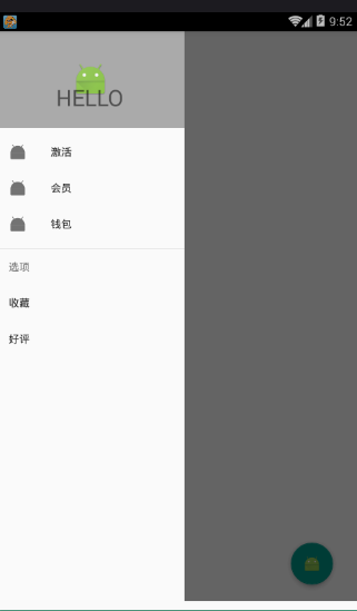
侧滑菜单中的标题头:
<?xml version="1.0" encoding="utf-8"?>

<RelativeLayout xmlns:android="http://schemas.android.com/apk/res/android"

    android:layout_width="match_parent"

    android:layout_height="match_parent"

    android:background="#aaaaaa">

    <ImageView

        android:id="@+id/img_icon"

        android:layout_width="wrap_content"

        android:layout_height="wrap_content"

        android:layout_centerInParent="true"

        android:src="@mipmap/ic_launcher"/>

    <TextView

        android:layout_width="wrap_content"

        android:layout_height="wrap_content"

        android:text="HELLO"

        android:layout_below="@id/img_icon"

        android:textSize="30sp"

        android:layout_margin="20dp"

        android:layout_centerHorizontal="true"/>

</RelativeLayout>
注意:
 <!--有group就会有分割线了

        android:checked="true" 在菜单项中图片就会显示为蓝色  false就会为灰色

        所以会导致图片全部为灰色,解决办法:

        方法1.在布局文件中添加app:itemIconTint="@color/blue"属性,表示设置图片的颜色全都为蓝色

        方法2.在java代码中:NavigationView navigationView = (NavigationView)findViewById(R.id.navigation_view);

             navigationView.setItemIconTintList(null);  -->
menu.xml菜单布局
<?xml version="1.0" encoding="utf-8"?>

<menu xmlns:android="http://schemas.android.com/apk/res/android">

    <!-- menu支持分组和子标题,但是子标题不支持icon-->

    <!--单选-->

    <group>

        <item

            android:title="激活"

            android:icon="@mipmap/ic_launcher">

        </item>

        <item

            android:title="会员"

            android:icon="@mipmap/ic_launcher">

        </item>

        <item

            android:title="钱包"

            android:icon="@mipmap/ic_launcher">

        </item>

    </group>

    <!--菜单-->

    <item

        android:title="选项"

        android:icon="@mipmap/ic_launcher">

        <menu>

            <item

            android:title="收藏"></item>

            <item

                android:title="好评"></item>

        </menu>

    </item>

</menu>
main:
public class MainActivity extends AppCompatActivity {

    private Toolbar toolbar;

    private DrawerLayout drawerLayout;

    @Override

    protected void onCreate(Bundle savedInstanceState) {

        super.onCreate(savedInstanceState);

        setContentView(R.layout.activity1_main);

        toolbar = (Toolbar) findViewById(R.id.toolbar);

        drawerLayout = (DrawerLayout) findViewById(R.id.drawer_layout);

        //设置主标题

        toolbar.setTitle("标题");

        //设置副标题

        toolbar.setSubtitle("标题的子类");

        //设置图标

        toolbar.setLogo(R.mipmap.ic_launcher);

        //设置Toolbar和DrawerLayout实现动画和联动

        this.setSupportActionBar(toolbar);

        //左侧菜单与toolbar联动

        // 给左上角图标的左边加上一个返回的图标

        getSupportActionBar().setDisplayHomeAsUpEnabled(true);

        getSupportActionBar().setHomeButtonEnabled(true); //设置返回键可用

        //ActionBarDrawerToggle可以监听抽屉开合事件,可以认为是DrawerListener的子类

        //声明mDrawerToggle对象,其中R.string.open和R.string.close简单可以用"open"和"close"替代

        ActionBarDrawerToggle actionBarDrawerToggle = new ActionBarDrawerToggle(MainActivity.this, drawerLayout,toolbar, R.string.open, R.string.close){

            @Override

            public void onDrawerOpened(View drawerView) {

                super.onDrawerOpened(drawerView);

                Log.i("tag", "onDrawerOpened: ");

            }

            @Override

            public void onDrawerClosed(View drawerView) {

                super.onDrawerClosed(drawerView);

                Log.i("tag", "onDrawerClosed: ");

            }

        };

        //使得图标和抽屉拉合保持同步

        actionBarDrawerToggle.syncState();

        //监听实现侧边栏的拉开和闭合,即抽屉drawer的闭合和打开

        drawerLayout.addDrawerListener(actionBarDrawerToggle);

    }

}
效果: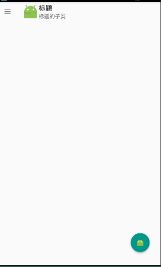
安卓Design包之NavigationView结合DrawerLayout,toolbar的使用,FloatingActionButton的更多相关文章
- 安卓Design包之CoordinatorLayout配合AppBarLayout,ToolBar,TabLaout的使用
转载: CoordinatorLayout配合AppBarLayout,Toolbar和TabLayout的使用 控件的简单介绍: AppBarLayout:它是继承LinerLayout实现的一个V ...
- 安卓Design包之Toolbar控件的使用
转自:ToolBar的使用 ToolBar的出现是为了替换之前的ActionBar的各种不灵活使用方式,相反,ToolBar的使用变得非常灵活,因为它可以让我们自由往里面添加子控件.低版本要使用的话, ...
- 安卓Design包之TabLayout控件的使用
转自: 安卓Design包之TabLayout控件的简单使用 Google在2015的IO大会上,给我们带来了更加详细的Material Design设计规范,同时,也给我们带来了全新的Android ...
- 安卓Design包之AppBar和Toolbar的联用
前面讲了Design包的的CoordinatorLayout和SnackBar的混用,现在继续理解Design包的AppBar; AppBarLayout跟它的名字一样,把容器类的组件全部作为AppB ...
- 安卓Design包之超强控件CoordinatorLayout与SnackBar的简单使用
在前面的Design中,学习使用了TabLayout,NavigationView与DrawerLayout实现的神奇效果,今天就带来本次Design包中我认为最有意义的控件CoordinatorLa ...
- 安卓Design包下的TextInputLayout和FloatingActionButton的简单使用
终于介绍到Design包的最后的东西了. 也很简单,一个是TextInputLayout. TextInputLayout作为一个父容器,包含一个新的EditText,可以给EditText添加意想不 ...
- 安卓Design包之TabLayout控件的简单使用
Google在2015的IO大会上,给我们带来了更加详细的Material Design设计规范,同时,也给我们带来了全新的Android Design Support Library,在这个supp ...
- 安卓Design包之CollapsingToolbarLayout(可折叠的工具栏布局)的简单使用
转自: CollapsingToolbarLayout的使用 注意:使用前需要添加Design依赖包,使用toolbar时需要隐藏标题头 CollapsingToolbarLayout作用是提供了一个 ...
- 安卓Design之NavigationView的使用
前面讲解了Design包下的TabLayout的使用,下面将带来NavagationView和DrawLayout以及toolbar的联动. 项目已经同步至:https://github.com/na ...
随机推荐
- 把JSON数据载入到页面表单的两种思路(对easyui自带方法进行改进)
#把JSON数据载入到页面表单的两种思路(对easyui自带方法进行改进) ##背景 项目中经常需要把JSON数据填充到页面表单,一开始我使用easyui自带的form load方法,觉得效率很低,经 ...
- node-mysql中的连接池代码学习
node-mysql是一个node.js下的mysql驱动,前段时间在处理连接池的问题上遇到了连接不释放的疑难杂症,虽已解决,但仍需总结经验避免下次重蹈覆辙.下面是node-mysql中的连接池的部分 ...
- 在NodeJS中配置aws ec2
获取access key和secret access key 自己账户下有security credentials的选项 然后点击Acce ...
- elasticsearch配置文件解析
配置es的集群名称 : cluster.name: fcz_es
- 优秀android开源项目与解决方案推荐
后来加上的,因为太强大了,android上百个可立即使用的开源库介绍:https://github.com/Trinea/android-open-project Android上的FTP服务器 S ...
- 【转】构建maven web项目
Maven Web应用 创建Web应用程序 要创建一个简单的java web应用程序,我们将使用Maven的原型 - web应用插件.因此,让我们打开命令控制台,进入到C: MVN目录并执行以下命令m ...
- HDU 5826 physics (积分推导)
physics 题目链接: http://acm.hdu.edu.cn/showproblem.php?pid=5826 Description There are n balls on a smoo ...
- POJ 1062 昂贵的聘礼 (最短路)
昂贵的聘礼 题目链接: http://acm.hust.edu.cn/vjudge/contest/122685#problem/M Description 年轻的探险家来到了一个印第安部落里.在那里 ...
- Java IO (5) - 总结
Java IO (5) - 总结 0. 目录 FileInputStream FileOutputStream FileReader FileWriter BufferedReader Buffere ...
- Android流量监控 思路,想法
1,开启一个服务,每5分钟跑动一次更新流量,用于能够准确记录流量 每一个小时,更新一次流量,用于清除非本月的流量 2,保存流量的时候,进行判断 a,若是数据库中保存的 ...