CSS3实现旋转的太极图(二):只用1个DIV
效果预览:
PS:
1、昨天用3个DIV实现了太极图(点击查看),,今天试着用1个Div来做。
2、公司刚忙过双10周年庆,最近空闲下来,闲着也是闲着,总得写点东西吧。
3、高手莫喷,小弟仅仅是没事折腾一下,做个的记录。
4、有网友反应旋转的时候会卡。
5、IE浏览器,出门左拐、走好不送 ~~~
实现步骤:
HTML:
<div class="box-taiji"></div>
步骤一:
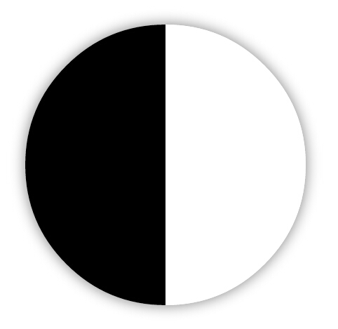
.box-taiji {width:;height:400px;position:relative;margin:50px auto;border-left:200px solid #;border-right:200px solid #fff;box-shadow: 30px rgba(,,,.);border-radius:400px;}
结合border实现左黑右白的正方形,加上圆角、阴影。 PS:刚开始的时候用background-image:linear-gradient(left, #000 50%, #fff 50%);来实现黑边圆形。IE10下测试不行。所以用了border。
步骤二:

.box-taiji {width:;height:400px;position:relative;margin:50px auto;border-left:200px solid #;border-right:200px solid #fff;box-shadow:  30px rgba(,,,.);border-radius:400px;}

.box-taiji:after {width:200px;height:200px;position:absolute;content:"";display:block;top:;left:-100px;z-index:;background-color:#fff;border-radius:%;}
加上伪类,实现一个一个白色的圆形,定位好位置。

.box-taiji {width:;height:400px;position:relative;margin:50px auto;border-left:200px solid #;border-right:200px solid #fff;box-shadow:  30px rgba(,,,.);border-radius:400px;}

.box-taiji:after {width:200px;height:200px;position:absolute;content:"";display:block;top:;left:-100px;z-index:;background-color:#fff;border-radius:%;box-shadow: 200px  #;}
利用box-shadow:0 200px 0 #000;实现同样大小的圆,放好。
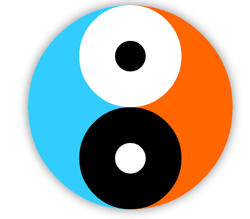
步骤三:

.box-taiji {width:;height:400px;position:relative;margin:50px auto;border-left:200px solid #;border-right:200px solid #fff;box-shadow:  30px rgba(,,,.);border-radius:400px;}

.box-taiji:before,

.box-taiji:after {position:absolute;content:"";display:block;}

.box-taiji:before {width:200px;height:200px;top:;left:-100px;z-index:;background-color:#fff;border-radius:%;box-shadow: 200px  #;}

.box-taiji:after {width:60px;height:60px;top:70px;left:-30px;z-index:;background-color:#;border-radius:%;box-shadow: 200px  #fff;}
同样步骤二一样的原理,再实现黑白两个圆,放到相关的位置。我们的太极图就画好了,下面的任务就是动起来~~
步骤四:

.box-taiji {width:;height:400px;position:relative;margin:50px auto;border-left:200px solid #;border-right:200px solid #fff;box-shadow:  30px rgba(,,,.);border-radius:400px;animation:rotation .5s linear infinite;-webkit-animation:rotation .5s linear infinite;-moz-animation:rotation .5s linear infinite;}

.box-taiji:before,

.box-taiji:after {position:absolute;content:"";display:block;}

.box-taiji:before {width:200px;height:200px;top:;left:-100px;z-index:;background-color:#fff;border-radius:%;box-shadow: 200px  #;}

.box-taiji:after {width:60px;height:60px;top:70px;left:-30px;z-index:;background-color:#;border-radius:%;box-shadow: 200px  #fff;}

@keyframes rotation {

    % {transform:rotate(0deg);}

    % {transform:rotate(-360deg);}

}

@-webkit-keyframes rotation {

    % {-webkit-transform:rotate(0deg);}

    % {-webkit-transform:rotate(-360deg);}

}

@-moz-keyframes rotation {

    % {-moz-transform:rotate(0deg);}

    % {-moz-transform:rotate(-360deg);}

}
加上@keyframes、animation等CSS3动画效果,OK,搞定。。
原理解析:
我们先把背景颜色调一下,原理一下子就清晰了。。其实就是:两个半圆在最下面,四个小圆利用定位叠加上去。
完整代码:
<!doctype html>

<html>

<head>

<meta charset="utf-8">

<title>CSS3实现旋转的太极图(二):只用1个DIV</title>

<style>

/* 利用background-image实现左黑右白的圆,IE下测试不太理想 */

/* .box-taiji {width:400px;height:400px;position:relative;margin:30px auto;border-radius:400px;box-shadow:0 0 30px rgba(0,0,0,.5);background-image:linear-gradient(left, #000 50%, #fff 50%);background-image:-webkit-linear-gradient(left, #000 50%, #fff 50%);background-image:-moz-linear-gradient(left, #000 50%, #fff 50%);}

.box-taiji:before,

.box-taiji:after {position:absolute;content:"";display:block;}

.box-taiji:before {width:200px;height:200px;top:0;left:100px;z-index:1;background-color:#fff;border-radius:50%;box-shadow:0 200px 0 #000;}

.box-taiji:after {width:60px;height:60px;top:70px;left:170px;z-index:2;background-color:#000;border-radius:50%;box-shadow:0 200px 0 #fff;}

 */

.box-taiji {width:;height:400px;position:relative;margin:50px auto;border-left:200px solid #;border-right:200px solid #fff;box-shadow:  30px rgba(,,,.);border-radius:400px;animation:rotation .5s linear infinite;-webkit-animation:rotation .5s linear infinite;-moz-animation:rotation .5s linear infinite;}

.box-taiji:before,

.box-taiji:after {position:absolute;content:"";display:block;}

.box-taiji:before {width:200px;height:200px;top:;left:-100px;z-index:;background-color:#fff;border-radius:%;box-shadow: 200px  #;}

.box-taiji:after {width:60px;height:60px;top:70px;left:-30px;z-index:;background-color:#;border-radius:%;box-shadow: 200px  #fff;}

@keyframes rotation {

    % {transform:rotate(0deg);}

    % {transform:rotate(-360deg);}

}

@-webkit-keyframes rotation {

    % {-webkit-transform:rotate(0deg);}

    % {-webkit-transform:rotate(-360deg);}

}

@-moz-keyframes rotation {

    % {-moz-transform:rotate(0deg);}

    % {-moz-transform:rotate(-360deg);}

}

</style>

</head>

<body>

<div class="box-taiji"></div>

</body>

</html>
CSS3实现旋转的太极图(二):只用1个DIV的更多相关文章
- 纯css3实现旋转的太极图
效果图: 代码如下: <!DOCTYPE html> <html> <head lang="zh"> <meta charset=&quo ...
- CSS3绘制旋转的太极图案(一)
实现步骤: 基础HTML: <div class="box-taiji"> <div class="circle-01">< ...
- 【微信支付】分享一个失败的案例 跨域405(Method Not Allowed)问题 关于IM的一些思考与实践 基于WebSocketSharp 的IM 简单实现 【css3】旋转倒计时 【Html5】-- 塔台管制 H5情景意识 --飞机 谈谈转行
[微信支付]分享一个失败的案例 2018-06-04 08:24 by stoneniqiu, 2744 阅读, 29 评论, 收藏, 编辑 这个项目是去年做的,开始客户还在推广,几个月后发现服务器已 ...
- CSS3 3D旋转下拉菜单--兼容性不太好
<!DOCTYPE html> <html xmlns="http://www.w3.org/1999/xhtml"> <head> <m ...
- css3制作旋转动画
现在的css3真是强大,之前很多动画都是用jq来实现,但是css3制作的动画要比jq实现起来简单很多,今天呢,我自己也写了一个css旋转动画和大家分享.效果如下面的图片 思路:1.制作之前呢,我们先来 ...
- Html5 绘制旋转的太极图
采用Html5+JavaScript在Canvas中绘制旋转的太极图,如下图所示: 具体思路和绘制逻辑,在上图中已有说明,代码如下: <script type="text/javasc ...
- 用css3制作旋转加载动画的几种方法
以WebKit为核心的浏览器,例如Safari和Chrome,对html5有着很好的支持,在移动平台中这两个浏览器对应的就是IOS和Android.最近在开发一个移动平台的web app,那么就有机会 ...
- 【Demo】CSS3元素旋转、缩放、移动或倾斜
CSS3元素旋转.缩放.移动或倾斜 代码: <!DOCTYPE html> <html lang="en"> <head> <meta c ...
- CSS3制作旋转导航
慕课网学习CSS3时,遇到个习题,觉得有必要总结学习下:CSS3制作旋转导航 慕课网习题地址:http://www.imooc.com/code/1883 示例及源码地址:http://codepen ...
随机推荐
- 利用扩展事件(Xevents)捕捉高消耗查询
生产环境中有时需要使用者抓取一些特定的语句分析,如超超长查询,或高IO查询等.一般来说大家对跟踪比较熟悉,主要因为其有完善的UI支持.由于扩展事件在sql2012才提供UI支持,所以虽然在08时就已经 ...
- 《Linux内核设计与实现》读书笔记(十八)- 内核调试
内核调试的难点在于它不能像用户态程序调试那样打断点,随时暂停查看各个变量的状态. 也不能像用户态程序那样崩溃后迅速的重启,恢复初始状态. 用户态程序和内核交互,用户态程序的各种状态,错误等可以由内核来 ...
- 对bootstrap modal的简单扩展封装
对bootstrap modal的简单扩展封装 参考自:http://www.muzilei.com/archives/677 注:原文不支持bootstrap新版本,并且居中等存在问题 此段时间 ...
- Nikola的5项依赖注入法则
本篇文章来自对 Nikola Malovic 博客文章 <Inversion Of Control, Single Responsibility Principle and Nikola’s l ...
- [计算机图形学] OpenGL读取obj文件并显示其3D效果
读取三维网格模型(Wavefront OBJ文件) 无法向立方体:cube.obj 有法向兔子模型:bunny.obj 有法向有纹理八字模型:Eight.obj OBJ文件的格式可参考:http: ...
- AngularJS应用页面切换优化方案
葡萄城的一款尚在研发中的产品,对外名称暂定为X项目.其中使用了已经上市的Wijmo中SpreadJS产品,另外,在研发过程中整理了一些研发总结分享给大家.如本篇的在页面切换的过程中优化方案,欢迎大家跟 ...
- JavaScript原生DOM操作API总结
最近面试的时候被这个问题给卡了,所以抽时间好好复习一下. 原文:http://www.cnblogs.com/liuxianan/p/javascript-dom-api.html 几种对象 Node ...
- [Python爬虫] Selenium实现自动登录163邮箱和Locating Elements介绍
前三篇文章介绍了安装过程和通过Selenium实现访问Firefox浏览器并自动搜索"Eastmount"关键字及截图的功能.而这篇文章主要简单介绍如何实现自动登录163邮箱,同时 ...
- LINQ-to-SQL那点事~LINQ-to-SQL中的并发冲突与应对
回到目录 在上一篇文章中提到了并发冲突,还说详细的说明在这讲来说,呵呵,那现在就说一下吧! 并发冲突产生的原因 事实上,linq to sql中的并发冲突是指记录在进行update操作时,客户端A1取 ...
- 【Android Studio】Android Studio 安装及设置
版权所有, 禁止转载, 如有需要, 请站内联系. 本文地址: http://blog.csdn.net/caroline_wendy/article/details/20845807 时间: 2014 ...