搞懂Xamarin.Forms布局,看这篇应该就够了吧
Xamarin.Forms 布局介绍
什么是布局?可以简单的理解为,我们通过将布局元素有效的组织起来,让屏幕变成我们想要的样子!
我们通过画图的方式来描述一下Xamarin.Forms的布局。

小节锚点:
布局控件之StackLayout
Xamarin.Forms 常用的有 6 种布局控件,我们先选一个最基础最常用的布局控件 StackLayout 来讲解布局。后面的内容再依次介绍其他布局控件。StackLayout 中文翻译又叫“堆栈布局”,意指在Xamarin.Forms中使用XAML代码或者是C#代码,通过一维排列的方式来完成布局。
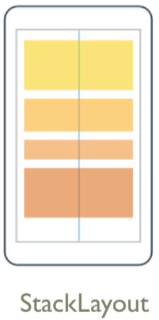
我们可以从图上看到 StackLayout 是从上到下依次排列的,StackLayout 并不复杂,它只是简单的线性方式排列。如果想创建更复杂的布局,我们可以使用 StackLayout 嵌套的方式来完成布局。
我们先来演练一个简单的 StackLayout :
XAML 代码:
<?xml version="1.0" encoding="utf-8" ?>
<ContentPage xmlns="http://xamarin.com/schemas/2014/forms"
xmlns:x="http://schemas.microsoft.com/winfx/2009/xaml"
xmlns:local="clr-namespace:Layout"
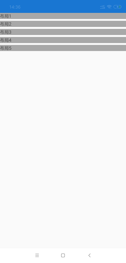
x:Class="Layout.MainPage"> <StackLayout>
<StackLayout BackgroundColor="#A8A8A8">
<Label Text="布局1"/>
</StackLayout>
<StackLayout BackgroundColor="#A8A8A8">
<Label Text="布局2"/>
</StackLayout>
<StackLayout BackgroundColor="#A8A8A8">
<Label Text="布局3"/>
</StackLayout>
<StackLayout BackgroundColor="#A8A8A8">
<Label Text="布局4"/>
</StackLayout>
<StackLayout BackgroundColor="#A8A8A8">
<Label Text="布局5"/>
</StackLayout>
</StackLayout> </ContentPage>
可以看到我们使用 XAML代码实现了一个简单的布局,我们将五个StackLayout 嵌套到一个 StackLayout,对每个内嵌的StackLayout设置背景颜色为 #A8A8A8,StackLayout 中再放入一个文本。代码写完直接运行就变成了图上的样子。因为本人没有使用Mac电脑,无法打包IOS应用,所以暂时只放 Android 的图。
Xamarin.Forms 中可以C#代码进行布局
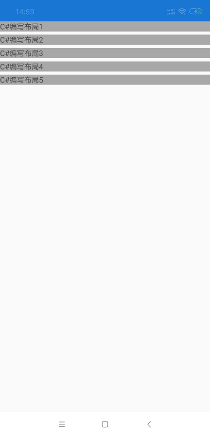
实际上在Xamarin.Forms中不止可以通过XAML代码的方式来布局,我们还可以使用C#代码来完成布局。
刚刚演示了XAML方式写一个简单的StackLayout布局,本轮演示一个C#代码布局。
C# 代码:
using System;

using System.Collections.Generic;

using System.Linq;

using System.Text;

using System.Threading.Tasks;

using Xamarin.Forms;

using Xamarin.Forms.Xaml;

namespace Layout

{

    [XamlCompilation(XamlCompilationOptions.Compile)]

    public partial class CSharpLayout : ContentPage

    {

        public CSharpLayout ()

        {

            InitializeComponent ();

            //最外面的StackLayout

            var stackLayout = new StackLayout();

            //嵌套StackLayout_1

            var stackLayout_1 = new StackLayout() { BackgroundColor = Color.FromHex("#A8A8A8") };

            stackLayout_1.Children.Add(new Label() { Text = "C#编写布局1" });

            stackLayout.Children.Add(stackLayout_1);

            //嵌套StackLayout_2

            var stackLayout_2 = new StackLayout() { BackgroundColor = Color.FromHex("#A8A8A8") };

            stackLayout_2.Children.Add(new Label() { Text = "C#编写布局2" });

            stackLayout.Children.Add(stackLayout_2);

            //嵌套StackLayout_3

            var stackLayout_3 = new StackLayout() { BackgroundColor = Color.FromHex("#A8A8A8") };

            stackLayout_3.Children.Add(new Label() { Text = "C#编写布局3" });

            stackLayout.Children.Add(stackLayout_3);

            //嵌套StackLayout_4

            var stackLayout_4 = new StackLayout() { BackgroundColor = Color.FromHex("#A8A8A8") };

            stackLayout_4.Children.Add(new Label() { Text = "C#编写布局4" });

            stackLayout.Children.Add(stackLayout_4);

            //嵌套StackLayout_5

            var stackLayout_5 = new StackLayout() { BackgroundColor = Color.FromHex("#A8A8A8") };

            stackLayout_5.Children.Add(new Label() { Text = "C#编写布局5" });

            stackLayout.Children.Add(stackLayout_5);

            //将StackLayout放入Content

            Content = stackLayout;

        }

    }

}
我们可以看到,前面用XAML实现的布局,我们用C#代码同样可以实现。只是使用C#代码我们可能会写更多的代码而已。从单纯布局来说,微软官方推荐我们使用 XAML 方式布局。那 C# 方式在什么场景下使用呢?我认为我们在实现动态数据绑定效果,或者是页面控件动态生成时,我们可以使用C#代码完成。如果你搞过Web开发,就可以理解为写XAML等于直接写HTML,写C#代码等于用Javascript来生成HTML。
总的来说,XAML方式布局更简洁,易读写,C#代码布局更灵活更动态。
Xamarin.Forms 的布局方向
在Xamarin.Forms中目前支持两种布局方向:
Horizontal(水平布局):从左到右布局
Vertical(垂直布局): 从上到下布局

XAML 代码:
<?xml version="1.0" encoding="utf-8" ?>

<ContentPage xmlns="http://xamarin.com/schemas/2014/forms"

             xmlns:x="http://schemas.microsoft.com/winfx/2009/xaml"

             x:Class="Layout.LayoutOrientation">

    <ContentPage.Content>

        <StackLayout>

            <StackLayout Orientation="Horizontal" BackgroundColor="#A8A8A8">

                <Label Text="水平"/>

                <Label Text="水平"/>

                <Label Text="水平"/>

            </StackLayout>

            <StackLayout Orientation="Vertical" BackgroundColor="#A8A8A8">

                <Label Text="垂直"/>

                <Label Text="垂直"/>

                <Label Text="垂直"/>

            </StackLayout>

            <StackLayout BackgroundColor="#A8A8A8">

                <Label Text="默认"/>

                <Label Text="默认"/>

                <Label Text="默认"/>

            </StackLayout>

        </StackLayout>

    </ContentPage.Content>

</ContentPage>
C# 代码:
using System;

using System.Collections.Generic;

using System.Linq;

using System.Text;

using System.Threading.Tasks;

using Xamarin.Forms;

using Xamarin.Forms.Xaml;

namespace Layout

{

    [XamlCompilation(XamlCompilationOptions.Compile)]

    public partial class CSharpLayoutOrientation : ContentPage

    {

        public CSharpLayoutOrientation ()

        {

            InitializeComponent ();

            var stackLayout = new StackLayout();

            //设置以水平方式布局

            var stackLayout_1 = new StackLayout()

            {

                Orientation = StackOrientation.Horizontal,

                BackgroundColor = Color.FromHex("#A8A8A8")

            };

            stackLayout_1.Children.Add(new Label() { Text = "水平" });

            stackLayout_1.Children.Add(new Label() { Text = "水平" });

            stackLayout_1.Children.Add(new Label() { Text = "水平" });

            //设置以垂直方式布局

            var stackLayout_2 = new StackLayout()

            {

                Orientation = StackOrientation.Vertical,

                BackgroundColor = Color.FromHex("#A8A8A8")

            };

            stackLayout_2.Children.Add(new Label() { Text = "垂直" });

            stackLayout_2.Children.Add(new Label() { Text = "垂直" });

            stackLayout_2.Children.Add(new Label() { Text = "垂直" });

            //默认的方式布局

            var stackLayout_3 = new StackLayout()

            {

                BackgroundColor = Color.FromHex("#A8A8A8")

            };

            stackLayout_3.Children.Add(new Label() { Text = "默认" });

            stackLayout_3.Children.Add(new Label() { Text = "默认" });

            stackLayout_3.Children.Add(new Label() { Text = "默认" });

            stackLayout.Children.Add(stackLayout_1);

            stackLayout.Children.Add(stackLayout_2);

            stackLayout.Children.Add(stackLayout_3);

            Content = stackLayout;

        }

    }

}
我们可以看到,我用水平,垂直,默认三种方式来展现了布局方向。
设置 StackLayout 的 Orientation 属性为 Horizontal 表示,系统将会以水平方式来布局。
设置 StackLayout 的 Orientation 属性为 Vertical 表示,系统将会以垂直方式来布局。
默认 StackLayout 的 Orientation 属性为 Horizontal。
边距和填充
我们在使用布局的时候,可以通过边距、填充属性来控制布局行为。
Margin:表示一个元素与它相邻的元素之间的距离。
Padding:表示一个元素与它的子元素之间的距离。
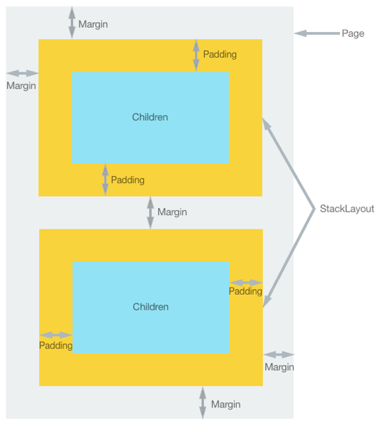
Margin 和 Padding 都有四个方位的值,分别是 上下左右。
特别要注意的是,Margin 的值是有累加性的。比如:我们把两个相邻元素的Margin值分别设置为 Margin 。
下面我们用代码来预览一下:

XAML 代码:
<?xml version="1.0" encoding="utf-8" ?>

<ContentPage xmlns="http://xamarin.com/schemas/2014/forms"

             xmlns:x="http://schemas.microsoft.com/winfx/2009/xaml"

             x:Class="Layout.MarginPadding">

    <ContentPage.Content>

        <StackLayout BackgroundColor="#A8A8A8">

            <StackLayout BackgroundColor="#f9d33c" Margin="60,60,60,60" Padding="30,30,30,30">

                <StackLayout BackgroundColor="#91e2f4" WidthRequest="200" HeightRequest="100">

                    <Label Text="Child"/>

                </StackLayout>

            </StackLayout>

            <StackLayout BackgroundColor="#f9d33c" Margin="60,60,60,60" Padding="30,30,30,30">

                <StackLayout BackgroundColor="#91e2f4" WidthRequest="200" HeightRequest="100">

                    <Label Text="Child"/>

                </StackLayout>

            </StackLayout>

        </StackLayout>

    </ContentPage.Content>

</ContentPage>
C# 代码:
using System;

using System.Collections.Generic;

using System.Linq;

using System.Text;

using System.Threading.Tasks;

using Xamarin.Forms;

using Xamarin.Forms.Xaml;

namespace Layout

{

    [XamlCompilation(XamlCompilationOptions.Compile)]

    public partial class CSharpMarginPadding : ContentPage

    {

        public CSharpMarginPadding()

        {

            InitializeComponent();

            var stackLayout = new StackLayout() {

                BackgroundColor = Color.FromHex("#A8A8A8")

            };

            var stackLayout_1 = new StackLayout()

            {

                BackgroundColor = Color.FromHex("#f9d33c"),

                Margin = new Thickness(, , , ),

                Padding = new Thickness(, , , )

            };

            var stackLayout_1_1 = new StackLayout()

            {

                BackgroundColor = Color.FromHex("#91e2f4"),

                WidthRequest = ,

                HeightRequest =

            };

            stackLayout_1_1.Children.Add(new Label() { Text = "Child" });

            stackLayout_1.Children.Add(stackLayout_1_1);

            stackLayout.Children.Add(stackLayout_1);

            var stackLayout_2 = new StackLayout()

            {

                BackgroundColor = Color.FromHex("#f9d33c"),

                Margin = new Thickness(, , , ),

                Padding = new Thickness(, , , )

            };

            var stackLayout_2_1 = new StackLayout()

            {

                BackgroundColor = Color.FromHex("#91e2f4"),

                WidthRequest = ,

                HeightRequest =

            };

            stackLayout_2_1.Children.Add(new Label() { Text = "Child" });

            stackLayout_2.Children.Add(stackLayout_2_1);

            stackLayout.Children.Add(stackLayout_2);

            Content = stackLayout;

        }

    }

}
我们可以看到 Margin 和 Padding 分别展现的效果。而两个相邻元素分别设置 Margin Bottom = 60 ,Margin Top = 60 ,让两个元素中间的间距为 120。
我们再进一步,我们来看看 Margin 和 Padding 是什么类型。
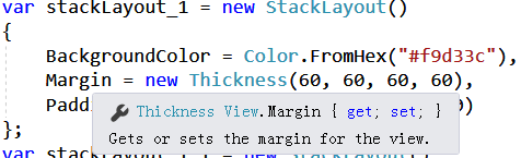
从图片上,我们可以看到,Margin 是属于 Xamarin.Forms.View 的一个属性,类型为 Xamarin.Forms.Thickness
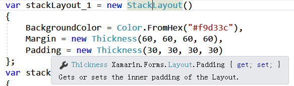
从图片上,我们可以看到,Padding 是属于 Xamarin.Forms.Layout 的一个属性,类型为 Xamarin.Forms.Thickness
小结:Xamarin.Forms.Thickness 是一个结构体,我们可以通过该结构体设置元素的上下左右的间距。
八种布局选项
Xamarin.Forms 中所有的 View 都具有类型为 Xamarin.Forms.LayoutOptions 的 HorizontalOptions 和 VerticalOptions 两个属性。
那么哪些控件是属于 Xamarin.Forms.View 类型的呢?诸如常用的布局控件 StackLayout,AbsoluteLayout,RelativeLayout ,Grid,FlexLayout,ScrollView 等控件都是直接或间接继承自 Xamarin.Forms.View 的。
总之, Xamarin.Forms.LayoutOptions 在 Xamarin.Forms 布局工作中是非常重要的!
Xamarin.Forms.LayoutOptions 说明:
HorizontalOptions:
Start:在父元素中以 水平方向靠左 排列
Center:在父元素中以 水平方向居中 排列
End:在父元素中以 水平方向靠右 排列
Fill:在父元素中以 填充方式 排列
StartAndExpand:在父元素中 将父元素剩余部分填充后 以 水平方向靠左 排列
CenterAndExpand:在父元素中 将父元素剩余部分填充后 以 水平方向居中 排列
EndAndExpand:在父元素中 将父元素剩余部分填充后 以 水平方向靠右 排列
FillAndExpand:在父元素中以 填充方式 排列
VerticalOptions :
Start:在父元素中以 垂直方向靠上 排列
Center:在父元素中以 垂直方向居中 排列
End:在父元素中以 垂直方向靠下 排列
Fill:在父元素中以 填充方式 排列
StartAndExpand:在父元素中 将父元素剩余部分填充后 以 水平方向靠上 排列
CenterAndExpand:在父元素中 将父元素剩余部分填充后 以 水平方向居中 排列
EndAndExpand:在父元素中 将父元素剩余部分填充后 以 水平方向靠下 排列
FillAndExpand:在父元素中以 填充方式 排列
接下来我们用代码和图片预览的方式分别来说明一下:
XAML 代码:
<?xml version="1.0" encoding="utf-8" ?>

<ContentPage xmlns="http://xamarin.com/schemas/2014/forms"

             xmlns:x="http://schemas.microsoft.com/winfx/2009/xaml"

             x:Class="Layout.LayoutOptions">

    <ContentPage.Content>

        <StackLayout BackgroundColor="#A8A8A8">

            <StackLayout BackgroundColor="#f9d33c">

                <!--Start_1在水平选项最左侧位置-->

                <StackLayout BackgroundColor="#91e2f4" HorizontalOptions="Start">

                    <Label Text="Start_1"/>

                </StackLayout>

                <!--Center_1在水平选项中间位置-->

                <StackLayout BackgroundColor="#91e2f4" HorizontalOptions="Center">

                    <Label Text="Center_1"/>

                </StackLayout>

                <!--End_1在水平选项中最右侧位置-->

                <StackLayout BackgroundColor="#91e2f4" HorizontalOptions="End">

                    <Label Text="End_1"/>

                </StackLayout>

                <!--Fill_1占满了整个水平选项-->

                <StackLayout BackgroundColor="#91e2f4" HorizontalOptions="Fill">

                    <Label Text="Fill_1"/>

                </StackLayout>

            </StackLayout>

            <StackLayout BackgroundColor="#f9d33c" Orientation="Horizontal">

                <!--Start_A在水平选项最左侧位置-->

                <StackLayout BackgroundColor="#91e2f4" HorizontalOptions="Start">

                    <Label Text="Start_A"/>

                </StackLayout>

                <!--Center_A依次排列-->

                <StackLayout BackgroundColor="#91e2f4" HorizontalOptions="Center">

                    <Label Text="Center_A"/>

                </StackLayout>

            </StackLayout>

            <StackLayout BackgroundColor="#f9d33c" Orientation="Horizontal">

                <!--Start_2在水平选项最左侧位置-->

                <StackLayout BackgroundColor="#91e2f4" HorizontalOptions="Start">

                    <Label Text="Start_2"/>

                </StackLayout>

                <!--EndAndExpand_2填充剩余区域后靠最右侧显示-->

                <StackLayout BackgroundColor="#91e2f4" HorizontalOptions="EndAndExpand">

                    <Label Text="EndAndExpand_2"/>

                </StackLayout>

            </StackLayout>

            <StackLayout BackgroundColor="#f9d33c" Orientation="Horizontal">

                <!--Start_3在水平选项最左侧位置-->

                <StackLayout BackgroundColor="#91e2f4" HorizontalOptions="Start">

                    <Label Text="Start_3"/>

                </StackLayout>

                <!--CenterAndExpand_3填充剩余区域后再居中显示-->

                <StackLayout BackgroundColor="#91e2f4" HorizontalOptions="CenterAndExpand">

                    <Label Text="CenterAndExpand_3"/>

                </StackLayout>

            </StackLayout>

            <StackLayout BackgroundColor="#f9d33c" Orientation="Horizontal">

                <!--StartAndExpand_4填充剩余区域后,在最左侧显示-->

                <StackLayout BackgroundColor="#91e2f4" HorizontalOptions="StartAndExpand">

                    <Label Text="StartAndExpand_4"/>

                </StackLayout>

                <!--CenterAndExpand_4填充剩余区域后,再居中显示-->

                <StackLayout BackgroundColor="#91e2f4" HorizontalOptions="CenterAndExpand">

                    <Label Text="CenterAndExpand_4"/>

                </StackLayout>

            </StackLayout>

            <StackLayout BackgroundColor="#f9d33c" Orientation="Horizontal">

                <!--CenterAndExpand_5_1填充剩余区域后,再居中显示-->

                <StackLayout BackgroundColor="#91e2f4" HorizontalOptions="CenterAndExpand">

                    <Label Text="CenterAndExpand_5_1"/>

                </StackLayout>

                <!--CenterAndExpand_5_2填充剩余区域后,再居中显示-->

                <StackLayout BackgroundColor="#91e2f4" HorizontalOptions="CenterAndExpand">

                    <Label Text="CenterAndExpand_5_2"/>

                </StackLayout>

            </StackLayout>

            <StackLayout BackgroundColor="#f9d33c" Orientation="Horizontal">

                <!--FillAndExpand_6填充整个剩余部分-->

                <StackLayout BackgroundColor="#91e2f4" HorizontalOptions="FillAndExpand">

                    <Label Text="FillAndExpand_6"/>

                </StackLayout>

            </StackLayout>

            <StackLayout BackgroundColor="#f9d33c" VerticalOptions="FillAndExpand">

                <!--VerticalOptions=CenterAndExpand垂直方向填充居中显示-->

                <StackLayout BackgroundColor="#91e2f4" VerticalOptions="CenterAndExpand">

                    <Label Text="VerticalOptions=CenterAndExpand"/>

                </StackLayout>

                <!--VerticalOptions=EndAndExpand垂直方向填充靠下显示-->

                <StackLayout BackgroundColor="#91e2f4" VerticalOptions="EndAndExpand">

                    <Label Text="VerticalOptions=EndAndExpand"/>

                </StackLayout>

            </StackLayout>

        </StackLayout>

    </ContentPage.Content>

</ContentPage>
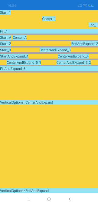
可以看到:
1. 在默认的布局方向(默认为垂直方向)中,加入 Start_1,Center_1,End_1,Fill_1。分别表现出 Start_1在水平选项最左侧位置,Center_1在水平选项中间位置,End_1在水平选项中最右侧位置,而Fill_1占满了整个水平选项。
2. 在布局方式为水平方向的布局中,加入 Start_A,Center_A。表现出 Start_A,Center_A 依次从左到右排列。
3. 在布局方式为水平方向的布局中,加入 Start_2,EndAndExpand_2。表现出,Start_2 在布局最左侧,而 EndAndExpand_2 将布局剩余部分填满后靠最右侧显示。
4. 在布局方式为水平方向的布局中,加入 Start_3,CenterAndExpand_3。表现出,Start_3 在布局最左侧,而 CenterAndExpand_3 将布局剩余部分填满后居中显示显示。
5. 在布局方式为水平方向的布局中,加入 StartAndExpand_4,CenterAndExpand_4。表现出,StartAndExpand_4 将布局余部分填满后在布局最左侧显示,而 CenterAndExpand_4 将布局剩余部分填满后居中显示。
6. 在布局方式为水平方向的布局中,加入 CenterAndExpand_5_1,CenterAndExpand_5_2。表现出,CenterAndExpand_5_1 和 CenterAndExpand_5_2 都将布局剩余部分填满后居中显示。
7. 在布局方式为水平方向的布局中,加入 FillAndExpand_6。表现出,FillAndExpand_6 都将布局剩余部分填满后填充显示(Fill后已经没有剩余部分了)。
8. 在布局方式为垂直方向的布局中,加入 VerticalOptions=CenterAndExpand 。表现出,VerticalOptions=CenterAndExpand垂直方向填充居中显示。
9. 在布局方式为垂直方向的布局中,加入 VerticalOptions=EndAndExpand。表现出,VerticalOptions=EndAndExpand垂直方向填充靠下显示。
布局控件之Grid
Grid 中文翻译又叫“网格布局”,意指在Xamarin.Forms中使用XAML代码或者是C#代码,通过网格的方式来完成布局。可以理解为 Excel 中 N行N列的方式来布局。
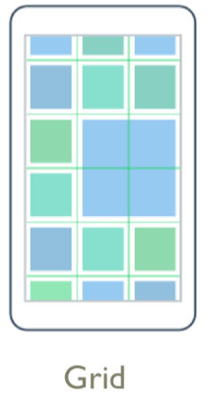
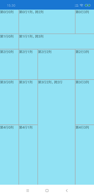
我们可以看到Grid布局,是以行和列,以单元格的方式进行布局。行和列的索引只从0开始,让我们先来演练一个简单的 Grid :
XAML 代码:
<?xml version="1.0" encoding="utf-8" ?>

<ContentPage xmlns="http://xamarin.com/schemas/2014/forms"

             xmlns:x="http://schemas.microsoft.com/winfx/2009/xaml"

             x:Class="Layout.Grid">

    <ContentPage.Content>

        <!--定义网格行间隙为2,列间隙为2-->

        <Grid RowSpacing="2" ColumnSpacing="2" BackgroundColor="#A8A8A8">

            <!--定义一个5行,4列的表格-->

            <Grid.RowDefinitions>

                <!--设置行高为100-->

                <RowDefinition Height="100"></RowDefinition>

                <!--减去行高100后,按照1/10高度(此网格定义了10)计算-->

                <RowDefinition Height="*"></RowDefinition>

                <RowDefinition Height="2*"></RowDefinition>

                <!--减去行高100后,按照3/10高度(此网格定义了10)计算-->

                <RowDefinition Height="3*"></RowDefinition>

                <!--减去行高100后,按照4/10高度(此网格定义了10)计算-->

                <RowDefinition Height="4*"></RowDefinition>

            </Grid.RowDefinitions>

            <Grid.ColumnDefinitions>

                <!--按照1/5宽度(此网格定义了5)计算-->

                <ColumnDefinition Width="*"></ColumnDefinition>

                <ColumnDefinition Width="*"></ColumnDefinition>

                <!--按照2/5宽度(此网格定义了5)计算-->

                <ColumnDefinition Width="2*"></ColumnDefinition>

                <ColumnDefinition Width="*"></ColumnDefinition>

            </Grid.ColumnDefinitions>

            <!--设置元素在网格的第0行0列-->

            <StackLayout BackgroundColor="#91e2f4" Grid.Row="0" Grid.Column="0">

                <Label Text="第0行0列"/>

            </StackLayout>

            <!--设置元素在网格的第0行1列,跨2列-->

            <StackLayout BackgroundColor="#91e2f4" Grid.Row="0" Grid.Column="1" Grid.ColumnSpan="2">

                <Label Text="第0行1列,跨2列"/>

            </StackLayout>

            <StackLayout BackgroundColor="#91e2f4" Grid.Row="0" Grid.Column="3">

                <Label Text="第0行3列"/>

            </StackLayout>

            <StackLayout BackgroundColor="#91e2f4" Grid.Row="1" Grid.Column="0">

                <Label Text="第1行0列"/>

            </StackLayout>

            <StackLayout BackgroundColor="#91e2f4" Grid.Row="1" Grid.Column="1" Grid.ColumnSpan="3">

                <Label Text="第1行1列,跨3列"/>

            </StackLayout>

            <StackLayout BackgroundColor="#91e2f4" Grid.Row="2" Grid.Column="0">

                <Label Text="第2行0列"/>

            </StackLayout>

            <StackLayout BackgroundColor="#91e2f4" Grid.Row="2" Grid.Column="1">

                <Label Text="第2行1列"/>

            </StackLayout>

            <StackLayout BackgroundColor="#91e2f4" Grid.Row="2" Grid.Column="2">

                <Label Text="第2行2列"/>

            </StackLayout>

            <StackLayout BackgroundColor="#91e2f4" Grid.Row="2" Grid.Column="3">

                <Label Text="第2行3列"/>

            </StackLayout>

            <StackLayout BackgroundColor="#91e2f4" Grid.Row="3" Grid.Column="0">

                <Label Text="第3行0列"/>

            </StackLayout>

            <StackLayout BackgroundColor="#91e2f4" Grid.Row="3" Grid.Column="1">

                <Label Text="第3行1列"/>

            </StackLayout>

            <!--设置元素在网格的第3行2列,跨2行-->

            <StackLayout BackgroundColor="#91e2f4" Grid.Row="3" Grid.Column="2" Grid.RowSpan="2">

                <Label Text="第3行2列,跨2行"/>

            </StackLayout>

            <StackLayout BackgroundColor="#91e2f4" Grid.Row="3" Grid.Column="3">

                <Label Text="第3行3列"/>

            </StackLayout>

            <StackLayout BackgroundColor="#91e2f4" Grid.Row="4" Grid.Column="0">

                <Label Text="第4行0列"/>

            </StackLayout>

            <StackLayout BackgroundColor="#91e2f4" Grid.Row="4" Grid.Column="1">

                <Label Text="第4行1列"/>

            </StackLayout>

            <StackLayout BackgroundColor="#91e2f4" Grid.Row="4" Grid.Column="3">

                <Label Text="第4行3列"/>

            </StackLayout>

        </Grid>

    </ContentPage.Content>

</ContentPage>
C# 代码:
using System;

using System.Collections.Generic;

using System.Linq;

using System.Text;

using System.Threading.Tasks;

using Xamarin.Forms;

using Xamarin.Forms.Xaml;

namespace Layout

{

    [XamlCompilation(XamlCompilationOptions.Compile)]

    public partial class CSharpGrid : ContentPage

    {

        public CSharpGrid ()

        {

            InitializeComponent ();

            //定义网格行间隙为2,列间隙为2

            var grid = new Xamarin.Forms.Grid()

            {

                RowSpacing = ,

                ColumnSpacing = ,

                BackgroundColor = Color.FromHex("#A8A8A8")

            };

            /*

             * 定义一个5行,4列的表格

             */

            //设置行高为100

            grid.RowDefinitions.Add(new RowDefinition() { Height =  });

            //减去行高100后,按照1/10高度(此网格定义了10)计算

            grid.RowDefinitions.Add(new RowDefinition() { Height = new GridLength(, GridUnitType.Star) });

            //减去行高100后,按照2/10高度(此网格定义了10)计算

            grid.RowDefinitions.Add(new RowDefinition() { Height = new GridLength(, GridUnitType.Star) });

            //减去行高100后,按照3/10高度(此网格定义了10)计算

            grid.RowDefinitions.Add(new RowDefinition() { Height = new GridLength(, GridUnitType.Star) });

            //减去行高100后,按照4/10高度(此网格定义了10)计算

            grid.RowDefinitions.Add(new RowDefinition() { Height = new GridLength(, GridUnitType.Star) });

            //按照1/5宽度(此网格定义了5)计算

            grid.ColumnDefinitions.Add(new ColumnDefinition() { Width = new GridLength(, GridUnitType.Star) });

            grid.ColumnDefinitions.Add(new ColumnDefinition() { Width = new GridLength(, GridUnitType.Star) });

            //按照2/5宽度(此网格定义了5)计算

            grid.ColumnDefinitions.Add(new ColumnDefinition() { Width = new GridLength(, GridUnitType.Star) });

            grid.ColumnDefinitions.Add(new ColumnDefinition() { Width = new GridLength(, GridUnitType.Star) });

            //设置元素在网格的第0行0列

            var s_0_0 = new StackLayout() { BackgroundColor = Color.FromHex("#91e2f4") };

            s_0_0.Children.Add(new Label() { Text = "第0行0列" });

            grid.Children.Add(s_0_0);

            Xamarin.Forms.Grid.SetRow(s_0_0, );

            Xamarin.Forms.Grid.SetColumn(s_0_0, );

            //设置元素在网格的第0行1列,跨2列

            var s_0_1 = new StackLayout() { BackgroundColor = Color.FromHex("#91e2f4") };

            s_0_1.Children.Add(new Label() { Text = "第0行1列,跨2列" });

            grid.Children.Add(s_0_1);

            Xamarin.Forms.Grid.SetRow(s_0_1, );

            Xamarin.Forms.Grid.SetColumn(s_0_1, );

            Xamarin.Forms.Grid.SetColumnSpan(s_0_1, );

            var s_0_3 = new StackLayout() { BackgroundColor = Color.FromHex("#91e2f4") };

            s_0_3.Children.Add(new Label() { Text = "第0行3列" });

            grid.Children.Add(s_0_3);

            Xamarin.Forms.Grid.SetRow(s_0_3, );

            Xamarin.Forms.Grid.SetColumn(s_0_3, );

            var s_1_0 = new StackLayout() { BackgroundColor = Color.FromHex("#91e2f4") };

            s_1_0.Children.Add(new Label() { Text = "第1行0列" });

            grid.Children.Add(s_1_0);

            Xamarin.Forms.Grid.SetRow(s_1_0, );

            Xamarin.Forms.Grid.SetColumn(s_1_0, );

            var s_1_1 = new StackLayout() { BackgroundColor = Color.FromHex("#91e2f4") };

            s_1_1.Children.Add(new Label() { Text = "第1行1列,跨3列" });

            grid.Children.Add(s_1_1);

            Xamarin.Forms.Grid.SetRow(s_1_1, );

            Xamarin.Forms.Grid.SetColumn(s_1_1, );

            Xamarin.Forms.Grid.SetColumnSpan(s_1_1, );

            var s_2_0 = new StackLayout() { BackgroundColor = Color.FromHex("#91e2f4") };

            s_2_0.Children.Add(new Label() { Text = "第2行0列" });

            grid.Children.Add(s_2_0);

            Xamarin.Forms.Grid.SetRow(s_2_0, );

            Xamarin.Forms.Grid.SetColumn(s_2_0, );

            var s_2_1 = new StackLayout() { BackgroundColor = Color.FromHex("#91e2f4") };

            s_2_1.Children.Add(new Label() { Text = "第2行1列" });

            grid.Children.Add(s_2_1);

            Xamarin.Forms.Grid.SetRow(s_2_1, );

            Xamarin.Forms.Grid.SetColumn(s_2_1, );

            var s_2_2 = new StackLayout() { BackgroundColor = Color.FromHex("#91e2f4") };

            s_2_2.Children.Add(new Label() { Text = "第2行2列" });

            grid.Children.Add(s_2_2);

            Xamarin.Forms.Grid.SetRow(s_2_2, );

            Xamarin.Forms.Grid.SetColumn(s_2_2, );

            var s_2_3 = new StackLayout() { BackgroundColor = Color.FromHex("#91e2f4") };

            s_2_3.Children.Add(new Label() { Text = "第2行2列" });

            grid.Children.Add(s_2_3);

            Xamarin.Forms.Grid.SetRow(s_2_3, );

            Xamarin.Forms.Grid.SetColumn(s_2_3, );

            var s_3_0 = new StackLayout() { BackgroundColor = Color.FromHex("#91e2f4") };

            s_3_0.Children.Add(new Label() { Text = "第3行0列" });

            grid.Children.Add(s_3_0);

            Xamarin.Forms.Grid.SetRow(s_3_0, );

            Xamarin.Forms.Grid.SetColumn(s_3_0, );

            var s_3_1 = new StackLayout() { BackgroundColor = Color.FromHex("#91e2f4") };

            s_3_1.Children.Add(new Label() { Text = "第3行1列" });

            grid.Children.Add(s_3_1);

            Xamarin.Forms.Grid.SetRow(s_3_1, );

            Xamarin.Forms.Grid.SetColumn(s_3_1, );

            //第3行2列,跨2行

            var s_3_2 = new StackLayout() { BackgroundColor = Color.FromHex("#91e2f4") };

            s_3_2.Children.Add(new Label() { Text = "第3行2列,跨2行" });

            grid.Children.Add(s_3_2);

            Xamarin.Forms.Grid.SetRow(s_3_2, );

            Xamarin.Forms.Grid.SetColumn(s_3_2, );

            Xamarin.Forms.Grid.SetRowSpan(s_3_2, );

            var s_3_3 = new StackLayout() { BackgroundColor = Color.FromHex("#91e2f4") };

            s_3_3.Children.Add(new Label() { Text = "第3行3列" });

            grid.Children.Add(s_3_3);

            Xamarin.Forms.Grid.SetRow(s_3_3, );

            Xamarin.Forms.Grid.SetColumn(s_3_3, );

            var s_4_0 = new StackLayout() { BackgroundColor = Color.FromHex("#91e2f4") };

            s_4_0.Children.Add(new Label() { Text = "第4行0列" });

            grid.Children.Add(s_4_0);

            Xamarin.Forms.Grid.SetRow(s_4_0, );

            Xamarin.Forms.Grid.SetColumn(s_4_0, );

            var s_4_1 = new StackLayout() { BackgroundColor = Color.FromHex("#91e2f4") };

            s_4_1.Children.Add(new Label() { Text = "第4行1列" });

            grid.Children.Add(s_4_1);

            Xamarin.Forms.Grid.SetRow(s_4_1, );

            Xamarin.Forms.Grid.SetColumn(s_4_1, );

            var s_4_3 = new StackLayout() { BackgroundColor = Color.FromHex("#91e2f4") };

            s_4_3.Children.Add(new Label() { Text = "第4行3列" });

            grid.Children.Add(s_4_3);

            Xamarin.Forms.Grid.SetRow(s_4_3, );

            Xamarin.Forms.Grid.SetColumn(s_4_3, );

            Content = grid;

        }

    }

}
可以看到:
1. RowSpacing 能设置网格 行间隙,ColumnSpacing 能设置网格 列间隙。
2. Grid 中定义行的方式为 Grid.RowDefinitions,具体定义行为 RowDefinition 。当设置 RowDefinition.Height 为一个数字时,该行高度为该数字,当设置 RowDefinition.Height 为 N*时,该行高度为 (总高度-指定数字高度) / 总星数 * N。
3. Grid 中定义列的方式为 Grid.ColumnDefinitions,具体定义行为 ColumnDefinition 。当设置 ColumnDefinition.WIdth 为一个数字时,该行宽度为该数字,当设置 ColumnDefinition.Width 为 N*时,该行宽度为 (总宽度-指定数字宽度) / 总星数 * N。
4. 我们可以通过设置 Height 或 Width 为 * 时 ,将 Height 或 Width 均等分布局。
5. 在元素上指定 Grid.Row 或 Grid.Column 时,能将元素对应到网格的具体位置。
6. 在元素上指定 Grid.ColumnSpan 或 Grid.RowSpan 时,能设置元素的是否跨行或跨列,跨列数。
布局控件之AbsoluteLayout
AbsoluteLayout 中文翻译又叫“绝对布局”,意指在Xamarin.Forms中我们通过 AbsoluteLayout 能在视图上直接指定 元素的坐标(X,Y)和高宽,并绘制成矩形的形状进行布局。

AbsoluteLayout 并不复杂,它是直接通过在视图上给定起始位置布局。如果这句话不太容易理解,我们马上用代码预览效果来理解一下:
XAML 代码:
<?xml version="1.0" encoding="utf-8" ?>

<ContentPage xmlns="http://xamarin.com/schemas/2014/forms"

             xmlns:x="http://schemas.microsoft.com/winfx/2009/xaml"

             x:Class="Layout.AbsoluteLayout">

    <ContentPage.Content>

        <AbsoluteLayout>

            <!--LayoutBounds X,Y,Width,Height 为比例(最大1)-->

            <StackLayout BackgroundColor="#f9d33c"

                         AbsoluteLayout.LayoutBounds="0,0,0.3,0.1"

                         AbsoluteLayout.LayoutFlags="All">

                <Label Text="0,0,0.3,0.1,All"/>

            </StackLayout>

            <!--LayoutBounds X,Y,Width,Height 为绝对值-->

            <StackLayout BackgroundColor="#f9d33c"

                         AbsoluteLayout.LayoutBounds="100,100,150,25"

                         AbsoluteLayout.LayoutFlags="None">

                <Label Text="100,100,150,25,None"/>

            </StackLayout>

            <!--LayoutBounds Width 为比例,X,Y,Height 为绝对值-->

            <StackLayout BackgroundColor="#f9d33c"

                         AbsoluteLayout.LayoutBounds="100,130,0.7,30"

                         AbsoluteLayout.LayoutFlags="WidthProportional">

                <Label Text="100,130,0.7,30,WidthProportional"/>

            </StackLayout>

            <!--LayoutBounds Height为比例,X,Y,Width 为绝对值-->

            <StackLayout BackgroundColor="#f9d33c"

                         AbsoluteLayout.LayoutBounds="20,180,260,0.05"

                         AbsoluteLayout.LayoutFlags="HeightProportional">

                <Label Text="20,180,260,0.05,HeightProportional"/>

            </StackLayout>

            <!--LayoutBounds X 为比例,Y,Width,Height 为绝对值-->

            <StackLayout BackgroundColor="#f9d33c"

                         AbsoluteLayout.LayoutBounds="0.6,250,330,30"

                         AbsoluteLayout.LayoutFlags="XProportional">

                <Label Text="0.6,250,330,30,XProportional"/>

            </StackLayout>

            <!--LayoutBounds Y 为比例,X,Width,Height 为绝对值-->

            <StackLayout BackgroundColor="#f9d33c"

                         AbsoluteLayout.LayoutBounds="0,0.45,260,30"

                         AbsoluteLayout.LayoutFlags="YProportional">

                <Label Text="0,0.45,260,30,YProportional"/>

            </StackLayout>

            <!--LayoutBounds X,Y 为比例,Width,Height 为绝对值-->

            <StackLayout BackgroundColor="#f9d33c"

                         AbsoluteLayout.LayoutBounds="0.01,0.5,260,30"

                         AbsoluteLayout.LayoutFlags="PositionProportional">

                <Label Text="0.01,0.5,260,30,PositionProportional"/>

            </StackLayout>

            <!--LayoutBounds Width,Height 为比例,X,Y 为绝对值-->

            <StackLayout BackgroundColor="#f9d33c"

                         AbsoluteLayout.LayoutBounds="10,400,0.5,0.05"

                         AbsoluteLayout.LayoutFlags="SizeProportional">

                <Label Text="10,400,0.5,0.05,SizeProportional"/>

            </StackLayout>

            <!--AbsoluteLayout可以重叠,先Render的被后Render的元素覆盖-->

            <StackLayout BackgroundColor="Red"

                         AbsoluteLayout.LayoutBounds="10,450,0.5,0.05"

                         AbsoluteLayout.LayoutFlags="SizeProportional">

                <Label Text="AbsoluteLayout可以重叠"/>

            </StackLayout>

            <StackLayout BackgroundColor="Blue"

                         AbsoluteLayout.LayoutBounds="10,460,0.5,0.05"

                         AbsoluteLayout.LayoutFlags="SizeProportional">

                <Label Text="AbsoluteLayout可以重叠"/>

            </StackLayout>

        </AbsoluteLayout>

    </ContentPage.Content>

</ContentPage>
C# 代码:
using System;

using System.Collections.Generic;

using System.Linq;

using System.Text;

using System.Threading.Tasks;

using Xamarin.Forms;

using Xamarin.Forms.Xaml;

namespace Layout

{

    [XamlCompilation(XamlCompilationOptions.Compile)]

    public partial class CSharpAbsoluteLayout : ContentPage

    {

        public CSharpAbsoluteLayout ()

        {

            InitializeComponent ();

            var absoluteLayout = new Xamarin.Forms.AbsoluteLayout();

            //LayoutBounds X,Y,Width,Height 为比例(最大1)

            var stackLayout_1 = new Xamarin.Forms.StackLayout();

            stackLayout_1.BackgroundColor = Color.FromHex("#f9d33c");

            stackLayout_1.Children.Add(new Label() { Text = "0,0,0.3,0.1,All" });

            Xamarin.Forms.AbsoluteLayout.SetLayoutBounds(stackLayout_1, new Rectangle(, , 0.3, 0.1));

            Xamarin.Forms.AbsoluteLayout.SetLayoutFlags(stackLayout_1, AbsoluteLayoutFlags.All);

            absoluteLayout.Children.Add(stackLayout_1);

            //LayoutBounds X,Y,Width,Height 为绝对值

            var stackLayout_2 = new Xamarin.Forms.StackLayout();

            stackLayout_2.BackgroundColor = Color.FromHex("#f9d33c");

            stackLayout_2.Children.Add(new Label() { Text = "100,100,150,25,None" });

            Xamarin.Forms.AbsoluteLayout.SetLayoutBounds(stackLayout_2, new Rectangle(, , , ));

            Xamarin.Forms.AbsoluteLayout.SetLayoutFlags(stackLayout_2, AbsoluteLayoutFlags.None);

            absoluteLayout.Children.Add(stackLayout_2);

            //LayoutBounds Width 为比例,X,Y,Height 为绝对值

            var stackLayout_3 = new Xamarin.Forms.StackLayout();

            stackLayout_3.BackgroundColor = Color.FromHex("#f9d33c");

            stackLayout_3.Children.Add(new Label() { Text = "100,130,0.7,30,WidthProportional" });

            Xamarin.Forms.AbsoluteLayout.SetLayoutBounds(stackLayout_3, new Rectangle(, , 0.7, ));

            Xamarin.Forms.AbsoluteLayout.SetLayoutFlags(stackLayout_3, AbsoluteLayoutFlags.WidthProportional);

            absoluteLayout.Children.Add(stackLayout_3);

            //LayoutBounds Height为比例,X,Y,Width 为绝对值

            var stackLayout_4 = new Xamarin.Forms.StackLayout();

            stackLayout_4.BackgroundColor = Color.FromHex("#f9d33c");

            stackLayout_4.Children.Add(new Label() { Text = "20,180,260,0.05,HeightProportional" });

            Xamarin.Forms.AbsoluteLayout.SetLayoutBounds(stackLayout_4, new Rectangle(, , , 0.05));

            Xamarin.Forms.AbsoluteLayout.SetLayoutFlags(stackLayout_4, AbsoluteLayoutFlags.HeightProportional);

            absoluteLayout.Children.Add(stackLayout_4);

            //LayoutBounds X 为比例,Y,Width,Height 为绝对值

            var stackLayout_5 = new Xamarin.Forms.StackLayout();

            stackLayout_5.BackgroundColor = Color.FromHex("#f9d33c");

            stackLayout_5.Children.Add(new Label() { Text = "0.6,250,330,30,XProportional" });

            Xamarin.Forms.AbsoluteLayout.SetLayoutBounds(stackLayout_5, new Rectangle(0.6, , , ));

            Xamarin.Forms.AbsoluteLayout.SetLayoutFlags(stackLayout_5, AbsoluteLayoutFlags.XProportional);

            absoluteLayout.Children.Add(stackLayout_5);

            //LayoutBounds Y 为比例,X,Width,Height 为绝对值

            var stackLayout_6 = new Xamarin.Forms.StackLayout();

            stackLayout_6.BackgroundColor = Color.FromHex("#f9d33c");

            stackLayout_6.Children.Add(new Label() { Text = "0,0.45,260,30,YProportional" });

            Xamarin.Forms.AbsoluteLayout.SetLayoutBounds(stackLayout_6, new Rectangle(, 0.45, , ));

            Xamarin.Forms.AbsoluteLayout.SetLayoutFlags(stackLayout_6, AbsoluteLayoutFlags.YProportional);

            absoluteLayout.Children.Add(stackLayout_6);

            //LayoutBounds X,Y 为比例,Width,Height 为绝对值

            var stackLayout_7 = new Xamarin.Forms.StackLayout();

            stackLayout_7.BackgroundColor = Color.FromHex("#f9d33c");

            stackLayout_7.Children.Add(new Label() { Text = "0.01,0.5,260,30,PositionProportional" });

            Xamarin.Forms.AbsoluteLayout.SetLayoutBounds(stackLayout_7, new Rectangle(0.01, 0.5, , ));

            Xamarin.Forms.AbsoluteLayout.SetLayoutFlags(stackLayout_7, AbsoluteLayoutFlags.PositionProportional);

            absoluteLayout.Children.Add(stackLayout_7);

            //LayoutBounds Width,Height 为比例,X,Y 为绝对值

            var stackLayout_8 = new Xamarin.Forms.StackLayout();

            stackLayout_8.BackgroundColor = Color.FromHex("#f9d33c");

            stackLayout_8.Children.Add(new Label() { Text = "10,400,0.5,0.05,SizeProportional" });

            Xamarin.Forms.AbsoluteLayout.SetLayoutBounds(stackLayout_8, new Rectangle(, , 0.5, 0.05));

            Xamarin.Forms.AbsoluteLayout.SetLayoutFlags(stackLayout_8, AbsoluteLayoutFlags.SizeProportional);

            absoluteLayout.Children.Add(stackLayout_8);

            //AbsoluteLayout可以重叠,先Render的被后Render的元素覆盖

            var stackLayout_9 = new Xamarin.Forms.StackLayout();

            stackLayout_9.BackgroundColor = Color.Red;

            stackLayout_9.Children.Add(new Label() { Text = "AbsoluteLayout可以重叠" });

            Xamarin.Forms.AbsoluteLayout.SetLayoutBounds(stackLayout_9, new Rectangle(, , 0.5, 0.05));

            Xamarin.Forms.AbsoluteLayout.SetLayoutFlags(stackLayout_9, AbsoluteLayoutFlags.SizeProportional);

            absoluteLayout.Children.Add(stackLayout_9);

            var stackLayout_10 = new Xamarin.Forms.StackLayout();

            stackLayout_10.BackgroundColor = Color.Blue;

            stackLayout_10.Children.Add(new Label() { Text = "AbsoluteLayout可以重叠" });

            Xamarin.Forms.AbsoluteLayout.SetLayoutBounds(stackLayout_10, new Rectangle(, , 0.5, 0.05));

            Xamarin.Forms.AbsoluteLayout.SetLayoutFlags(stackLayout_10, AbsoluteLayoutFlags.SizeProportional);

            absoluteLayout.Children.Add(stackLayout_10);

            Content = absoluteLayout;

        }

    }

}
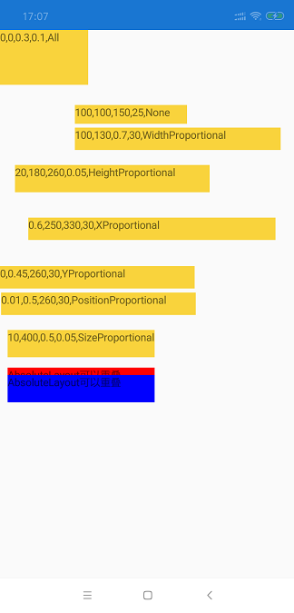
绝对布局有两个关键属性,分别是 AbsoluteLayout.LayoutBounds 和 AbsoluteLayout.LayoutFlags 。
AbsoluteLayout.LayoutBounds 返回的类型为 Xamarin.Forms.Rectangle ,那 Rectangle 是什么呢?翻译过来就是 “矩形”,意思是,我们要布局一个什么样的矩形。F12转到代码定义上看 Rectangle 4个重要的属性。
Rectangle 4个重要的属性:
X:绘制矩形的起始位置X坐标。(屏幕最左上角为 X = 0 , Y = 0)
Y:绘制矩形的起始位置Y坐标。
Width:需要绘制的矩形的宽度。
Height:需要绘制的矩形的高度。
来看看代码上 AbsoluteLayout.LayoutBounds="10,450,0.5,0.05" 是什么意思呢? 10为X的值,450为Y的值,0.5为Width的值,0.05为Height的值。构造函数为:
public Rectangle(double x, double y, double width, double height);
AbsoluteLayout.LayoutFlags 定义了 AbsoluteLayout.LayoutBounds 如何来解析,解析的方式分为 比例解析(比例最大为1) 和 绝对值解析。
AbsoluteLayout.LayoutFlags 是一个枚举,枚举的值分别是:
All:X,Y,Width,Height 都通过比例进行解析。
None:X,Y,Width,Height 都通过绝对值进行解析。
WidthProportional:Width 通过比例进行解析;X,Y,Height 通过绝对值解析。
HeightProportional:Height 通过比例进行解析;X,Y,Width 通过绝对值解析。
XProportional:X 通过比例进行解析;Y,Width,Height 通过绝对值解析。
YProportional:Y 通过比例进行解析;X,Width,Height 通过绝对值解析。
PositionProportional:X,Y 通过比例进行解析;Width,Height 通过绝对值解析。
SizeProportional:Width,Height 通过比例进行解析;X,Y 通过绝对值解析。
AbsoluteLayout可以重叠,先Render的被后Render的元素覆盖,我们可以通过Blue元素,覆盖Red元素观察到。
布局控件之ScrollView
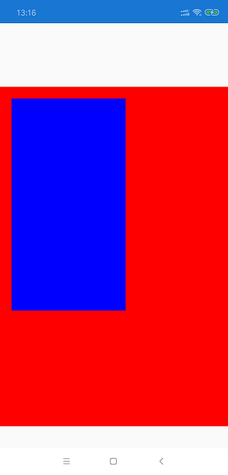
ScrollView 中文翻译又叫“滚动视图”,意指在Xamarin.Forms中我们通过 ScrollView 能创建滚动到屏幕外的视图,不好理解没关系,往下看就对了。
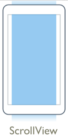
我们可以从图上看到 ScrollView 颜色范围超出了屏幕,类似于我们用App某个页面,一屏显示不完,需要上下滑动或左右滑动观看。
我们先来演练一个简单的 ScrollView :

XAML 代码:
<?xml version="1.0" encoding="utf-8" ?>

<ContentPage xmlns="http://xamarin.com/schemas/2014/forms"

             xmlns:x="http://schemas.microsoft.com/winfx/2009/xaml"

             x:Class="Layout.ScrollView">

    <ContentPage.Content>

        <ScrollView x:Name="scrollView" Orientation="Vertical" VerticalScrollBarVisibility="Never">

            <StackLayout>

                <StackLayout BackgroundColor="Red" HeightRequest="500"></StackLayout>

                <StackLayout BackgroundColor="Yellow" HeightRequest="500"></StackLayout>

                <StackLayout BackgroundColor="Blue" HeightRequest="500"></StackLayout>

                <StackLayout BackgroundColor="Green" HeightRequest="500">

                    <Button x:Name="button" Text="回到顶部(X,Y)" Clicked="Button_Clicked" VerticalOptions="EndAndExpand"/>

                </StackLayout>

            </StackLayout>

        </ScrollView>

    </ContentPage.Content>

</ContentPage>
C# 代码:
using System;

using System.Collections.Generic;

using System.Linq;

using System.Text;

using System.Threading.Tasks;

using Xamarin.Forms;

using Xamarin.Forms.Xaml;

namespace Layout

{

    [XamlCompilation(XamlCompilationOptions.Compile)]

    public partial class ScrollView : ContentPage

    {

        public ScrollView ()

        {

            InitializeComponent ();

            scrollView.Scrolled += (object sender, ScrolledEventArgs e) =>

            {

                button.Text = string.Format("回到顶部({0},{1})", e.ScrollX, e.ScrollY);

            };

        }

        private void Button_Clicked(object sender, EventArgs e)

        {

            scrollView.ScrollToAsync(, , true);

        }

    }

}
从代码运行起来后可以看到,我们定义了一个 ScrollView 在 ScrollView 中加入了 Red,Yellow,Blue,Green的总高度超出屏幕外的布局。通过手势往下拖动,我们可以看到 “回到顶部” 按钮的Text文本在不断的跟随当前滑动的位置变化。当我们点击 “回到顶部” 按钮,滚动视图又回到了顶部位置。。
接下来,我们来详细了解一下 ScrollView 的使用方式。
属性:
ScrollY:获取当前 ScrollView 滚动位置的坐标 Y 值。
ScrollX:获取当前 ScrollView 滚动位置的坐标 X 值。
Orientation:设置 ScrollView 滚动的方向。Orientation 的类型为枚举 Xamarin.Forms.ScrollOrientation;值 Vertical 表示只以垂直方式滚动,不允许以水平方式滚动。值 Horizontal 表示只以水平方式滚动,不允许以垂直方式滚动。值 Both 表示可以通过垂直和水平方式滚动。
VerticalScrollBarVisibility:设置 ScrollView 在垂直方向的滚动条是否可见。VerticalScrollBarVisibility 的类型为枚举 Xamarin.Forms.ScrollBarVisibility;值 Default 表示垂直滚动条是否显示,需要根据平台本身默认的设置而定;值 Always 表示垂直滚动条总是显示。值 Never 表示垂直滚动条总是不显示。
HorizontalScrollBarVisibility:设置 ScrollView 在水平方向的滚动条是否可见。HorizontalScrollBarVisibility 的类型同样也是 Xamarin.Forms.ScrollBarVisibility。
方法:
ScrollToAsync:将 ScrollView 直接定位到一个(x,y)的位置或定位到一个元素的位置。
ScrollToAsync(Element element, ScrollToPosition position, bool animated);

ScrollToAsync(double x, double y, bool animated);
事件:
Scrolled:滚动完成后引发的事件。该事件会传入一个类型为 Xamarin.Forms.ScrolledEventArgs 的参数。通过该参数我们可以得到 当前滚动正处于的 X,Y位置。
scrollView.Scrolled += (object sender, ScrolledEventArgs e) =>

{

        button.Text = string.Format("回到顶部({0},{1})", e.ScrollX, e.ScrollY);

};
小节:个人认为 ScrollView 在真实项目中会经常用到,比如 ScrollView 能实现 轮播图,实现产品预览图等。
布局控件之RelativeLayout
RelativeLayout 中文翻译又叫“相对布局”,意指在Xamarin.Forms中我们通过界面中的某个元素为基准,设置另外一个元素的位置和大小。通过这种布局方式可以实现动态布局,使得设计的界面可以在不同分辨率的屏幕中有更好的显示效果。
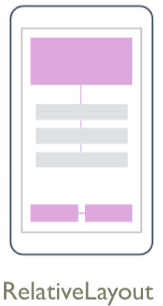
从图上可以看到,RelativeLayout 是以页面中某个元素为基准,来设置另外一个元素。因为 RelativeLayout 用的比较少,所以下面只简单了解一下。
<?xml version="1.0" encoding="utf-8" ?>

<ContentPage xmlns="http://xamarin.com/schemas/2014/forms"

             xmlns:x="http://schemas.microsoft.com/winfx/2009/xaml"

             x:Class="Layout.RelativeLayout">

    <ContentPage.Content>

        <StackLayout>

            <RelativeLayout>

                <BoxView Color="Red" x:Name="redBox"

        RelativeLayout.YConstraint="{ConstraintExpression Type=RelativeToParent,

            Property=Height,Factor=.15,Constant=0}"

        RelativeLayout.WidthConstraint="{ConstraintExpression

            Type=RelativeToParent,Property=Width,Factor=1,Constant=0}"

        RelativeLayout.HeightConstraint="{ConstraintExpression

            Type=RelativeToParent,Property=Height,Factor=.8,Constant=0}" />

                <BoxView Color="Blue"

        RelativeLayout.YConstraint="{ConstraintExpression Type=RelativeToView,

            ElementName=redBox,Property=Y,Factor=1,Constant=20}"

        RelativeLayout.XConstraint="{ConstraintExpression Type=RelativeToView,

            ElementName=redBox,Property=X,Factor=1,Constant=20}"

        RelativeLayout.WidthConstraint="{ConstraintExpression

            Type=RelativeToParent,Property=Width,Factor=.5,Constant=0}"

        RelativeLayout.HeightConstraint="{ConstraintExpression

            Type=RelativeToParent,Property=Height,Factor=.5,Constant=0}" />

            </RelativeLayout>

        </StackLayout>

    </ContentPage.Content>

</ContentPage>
布局控件之FlexLayout
FlexLayout 中文翻译又叫“弹性布局”,FlexLayout 布局 是Xamarin.Forms 版本 3.0 中新增功能,基于 CSS灵活布局思想。因为它包括许多灵活的选项来排列子级在布局,因此称为 Flex 布局或 弹性布局。
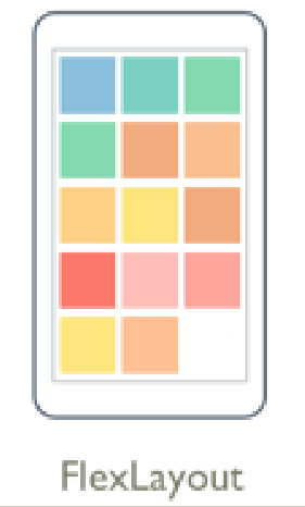
FlexLayout 非常灵活,让我们直接运行一个示例来说明:
XAML 代码:
<?xml version="1.0" encoding="utf-8" ?>
<ContentPage xmlns="http://xamarin.com/schemas/2014/forms"
xmlns:x="http://schemas.microsoft.com/winfx/2009/xaml"
x:Class="Layout.FlexLayout">
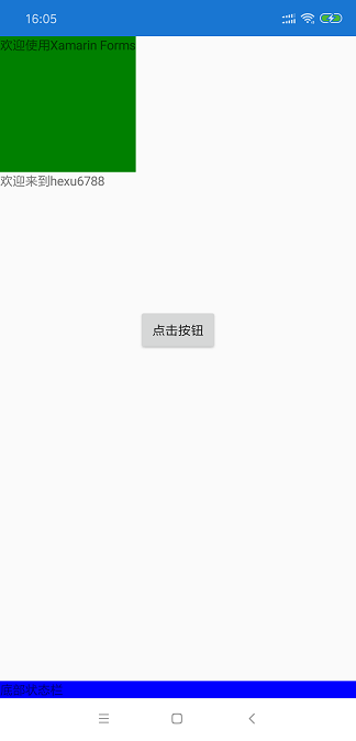
<ContentPage.Content> <FlexLayout Direction="Column" JustifyContent="Start" AlignItems="Start" > <StackLayout FlexLayout.Grow="1" BackgroundColor="Red" FlexLayout.Order="1"/>
<StackLayout FlexLayout.Grow="2" BackgroundColor="Green" FlexLayout.Order="2"/>
<StackLayout FlexLayout.Grow="3" BackgroundColor="Blue" FlexLayout.Order="3"/> <Label BackgroundColor="Blue" FlexLayout.AlignSelf="Stretch" FlexLayout.Order="4">底部状态栏</Label> <Label BackgroundColor="Green" FlexLayout.Basis="150" Text="欢迎使用Xamarin Forms"/>
<Label FlexLayout.Basis="150" Text="欢迎来到hexu6788"/>
<Button Text="点击按钮" FlexLayout.AlignSelf="Center" />
</FlexLayout> </ContentPage.Content>
</ContentPage>
FlexLayout 布局中包含了以下重要的概念。
属性:
Direction:指定 FlexLayout 布局的方向。类型为 Xamarin.Forms.FlexDirection,枚举 FlexDirection 包含4个值;
Row 指示子元素将以区域设置的默认行布局方向分布;
RowReverse 指示子元素将以区域设置默认行布局方向的反方向分布;
Column 指示子元素将以区域设置的默认列布局方向分布;
ColumnReverse 指示子元素将以区域设置默认列布局方向的反方向分布;
AlignItems:指定 FlexLayout 布局每一项的对齐方式。类型为 Xamarin.Forms.FlexAlignItems,枚举 FlexAlignItems 包含4个值;
Start 指示子元素将向父级的首端对齐;
Center 指示子元素将在父级内居中显示;
End 指示子元素将向父级的末端对齐;
Stretch 指示子元素将从父级的首端拉伸至末端;
JustifyContent:指定 FlexLayout 布局轴的对齐方式。跟 AlignItems 相似,AlignItems 指横轴,而 JustifyContent 指纵轴。JustifyContent 的 类型为 Xamarin.Forms.FlexJustify,枚举 FlexJustify 包含6个值;
Start 指示子元素将向该行首端对齐;
Center 指示子元素将聚集到父级中心;
End 指示子元素将向该行末端对齐;
SpaceBetween 指示子元素之间的间距相等,行的两端没有空格,以此形式在行中填充元素和空间;
SpaceEvenly 指示子元素之间的间隔和首尾两个子元素与其最接近的父级边缘之间的间距相同;
SpaceAround指示子元素在开头和结尾处将以一个空格单位隔开,并且各元素之间间隔两个单位,以此形式在行中填充元素和空间;
FlexLayout.AlignSelf:通过设置子元素的 FlexLayout.AlignSelf 属性,可以重写父元素的 AlignItems 设置。FlexLayout.AlignSelf 有5种选项;
Start 指示该元素将向父级的首端对齐;
Center 指示该元素将在父级内居中显示;
End 指示该元素将向父级的末端对齐;
Stretch 指示该元素将从父级的首端拉伸至末端;
Auto 指示该元素会采用供其父级使用的 FlexAlignItems 值提供的对齐方式;
FlexLayout.Order:此属性是一个整数,其默认值为 0。 此属性可用于更改在布局顺序。
FlexLayout.Grow:此属性的类型是 float 和默认值为 0。如果该轴还有剩余空间时,会将设置为正值的元素进行剩余空间分配。分配空间的比例则按照设置Grow的比例来,类似于 Grid 中的星型规范按比例分配空间。
FlexLayout.Base:此属性的类型是 float 型。 此属性定义一个绝对基本长度的值,FlexLayout.Base 支持百分比,写法如 Base = "80%",在 FlexLayout 自动 Render 的时候不受影响,比如 FlexLayout 方向为 Column 时 Base = 150 定义了一个高度为150的元素。
布局压缩LayoutCompression
再扩展一个概念,LayoutCompression(布局压缩)。布局压缩功能从可视化树中删除指定的布局,以试图提升页面呈现性能。
为什么需要布局压缩呢?因为在我们写 Xamarin.Forms 代码的时候,也许布局有很多重复的地方,也许还会有很多简写但是不影响功能的写法。因此,微乳提出了性能优化方式,布局压缩。

<StackLayout>

  <StackLayout ...>
    <Button ... />

    <Image ... />

    <Image ... />

    <BoxView ... />

    <Label ... />

   </StackLayout>
  <Label ... />

</StackLayout>
通过 Xamarin Inspector 工具, 在 Android 上,嵌套的视图层次结构包含 17 层视图:
在 XAML 中,可以在元素上设置 CompressedLayout.IsHeadless 属性设置为 true 来启用布局压缩 ,也可以通过 C# 代码来设置 布局压缩:
<StackLayout CompressedLayout.IsHeadless="true">

  ...

</StackLayout>
CompressedLayout.SetIsHeadless(元素, true);
通过压缩以后,嵌套的视图层次结构变成 14 层视图。与原始的嵌套的视图17 层相比有 17%的减少。 虽然减少不多,但这个性能对整个页面的性能影响也很大。设置过属性的元素不适合布局压缩,因为某些元素设置了 背景色,或者手势事件等。压缩了后这个节点就没有了,会影响软件功能。
结束语
实际上 Xamarin.Forms 还有其他的布局控件,因为文章已经很长了,所有就准备放到后面再写了。个人博客已经几年没写了,现在有点闲所以又继续写博客。
本次写这篇文章,我自己学到了很多东西,希望 Xamarin 在中国有更多的人用起来,感谢博客园提供平台,感谢各位大神提供支持。
以上所有示例代码都在 https://github.com/hexu6788/XamarinForms-Samples/tree/master/Code/XamarinLayout/Layout/Layout
参考资料:
[1] Xamarin官方英文文档 来源:https://docs.microsoft.com/en-us/xamarin/
如果你觉得本篇文章对您有帮助的话,感谢您的【推荐】。
如果你对 .NET 或 Xamarin 有兴趣的话可以关注我,我会定期的在博客分享我的学习心得。
本文地址:http://www.cnblogs.com/hexu6788/p/9916038.html
作者博客:何旭
欢迎转载,请在明显位置给出出处及链接
搞懂Xamarin.Forms布局,看这篇应该就够了吧的更多相关文章
- Java分布式锁,搞懂分布式锁实现看这篇文章就对了
随着微处理机技术的发展,人们只需花几百美元就能买到一个CPU芯片,这个芯片每秒钟执行的指令比80年代最大的大型机的处理机每秒钟所执行的指令还多.如果你愿意付出两倍的价钱,将得到同样的CPU,但它却以更 ...
- Elasticsearch Query DSL 整理总结(二)—— 要搞懂 Match Query,看这篇就够了
目录 引言 构建示例 match operator 参数 analyzer lenient 参数 Fuzziness fuzzniess 参数 什么是模糊搜索? Levenshtein Edit Di ...
- Vue开发入门看这篇文章就够了
摘要: 很多值得了解的细节. 原文:Vue开发看这篇文章就够了 作者:Random Fundebug经授权转载,版权归原作者所有. 介绍 Vue 中文网 Vue github Vue.js 是一套构建 ...
- C#使用Xamarin开发可移植移动应用(2.Xamarin.Forms布局,本篇很长,注意)附源码
前言 系列目录 C#使用Xamarin开发可移植移动应用目录 源码地址:https://github.com/l2999019/DemoApp 可以Star一下,随意 - - 一点感想 很意外的,第一 ...
- 想要彻底搞懂大厂是如何实现Redis高可用的?看这篇文章就够了!(1.2W字,建议收藏)
高可用HA(High Availability)是分布式系统架构设计中必须考虑的因素之一,它通常是指,通过设计减少系统不能提供服务的时间. 假设系统一直能够提供服务,我们说系统的可用性是100%.如果 ...
- 微信小程序获取手机号码看这篇文章就够了
前言 微信小程序获取手机号码,从官方文档到其他博主的文档 零零散散的 (我就是这样看过来 没有一篇满意的 也许是我搜索姿势不对) 依旧是前人栽树 后人乘凉 系列.保证看完 就可以实现获取手机号码功能 ...
- 数据可视化之PowerQuery篇(四)二维表转一维表,看这篇文章就够了
https://zhuanlan.zhihu.com/p/69187094 数据分析的源数据应该是规范的,而规范的其中一个标准就是数据源应该是一维表,它会让之后的数据分析工作变得简单高效. 在之前的文 ...
- 还不会Traefik?看这篇文章就够了!
文章转载自:https://mp.weixin.qq.com/s/ImZG0XANFOYsk9InOjQPVA 提到Traefik,有些人可能并不熟悉,但是提到Nginx,应该都耳熟能详. 暂且我们把 ...
- 想让安卓app不再卡顿?看这篇文章就够了
欢迎大家前往腾讯云+社区,获取更多腾讯海量技术实践干货哦~ 本文由likunhuang发表于云+社区专栏 实现背景 应用的使用流畅度,是衡量用户体验的重要标准之一.Android 由于机型配置和系统的 ...
随机推荐
- 玩转Python图片处理 (OpenCV-Python )
OpenCV是一个基于BSD许可(开源)发行的跨平台计算机视觉库,可以运行在Linux.Windows.Android和Mac OS操作系统上.它轻量级而且高效——由一系列 C 函数和少量 C++ 类 ...
- C++版 - 剑指offer 面试题31:连续子数组的最大和 题解
剑指offer:连续子数组的最大和 提交网址: http://www.nowcoder.com/practice/459bd355da1549fa8a49e350bf3df484?tpId=13&am ...
- C#生成MD5的方法
///C#生成MD5的方法 public static string GetMD5(string sDataIn) { MD5CryptoServiceProvider md5 = new MD5Cr ...
- leetcode — anagrams
import java.util.*; /** * * Source : https://oj.leetcode.com/problems/anagrams/ * * Created by lverp ...
- 我们来说一说TCP神奇的40ms
本文由云+社区发表 TCP是一个复杂的协议,每个机制在带来优势的同时也会引入其他的问题. Nagel算法和delay ack机制是减少发送端和接收端包量的两个机制, 可以有效减少网络包量,避免拥塞.但 ...
- 记录一下对swiper4.x.js在H5单页中的滑动优化
应用场景 仅仅应用于单页应用的滑动操作,用swiper4.x接管页面的滚动操作.用来支持顶部和尾部的回弹效果,进一步来支持常见那种下拉刷新动画效果.不适用于轮播图那种应用场景. 虽然只是针对swipe ...
- SHELL脚本--tr命令用法和特性全解
bash&shell系列文章:http://www.cnblogs.com/f-ck-need-u/p/7048359.html 1.1 简介 tr主要用于将从标准输入读取的数据进行结果集映射 ...
- python列表类型
列表类型简介 列表类型是一个容器,它里面可以存放任意数量.任意类型的数据. 例如下面的几个列表中,有存储数值的.字符串的.内嵌列表的.不仅如此,还可以存储其他任意类型. >>> L ...
- Spring DAO模块
Spring的DAO模块提供了对JDBC.Hibernate.Mybatis等DAO层支持,本节介绍DAO模块对JDBC的支持.DAO模块依赖ommons-dbcp.jar.commons-pool. ...
- μC/OS-II 中的任务管理
1. 任务的状态及其转换 睡眠状态: 任务在没有被配备任务控制块或被剥夺了任务控制块时的状态叫做任务的睡眠状态. 等待状态: 正在运行的任务,需要等待一段时间或需要等待一个事件发生再运行时,该任务就会 ...