Your data vis “Spidey-sense” & the need for a robust “utility belt”
@theboysmithy did a great piece on coming up with an alternate view for a timeline for an FT piece.
Here’s an excerpt (read the whole piece, though, it’s worth it):
Here is an example from a story recently featured in the FT: emerging- market populations are expected to age more rapidly than those in developed countries. The figures alone are compelling: France is expected to take 157 years (from 1865 to 2022) to triple the proportion of its population aged over 65, from 7 per cent to 21 per cent; for China, the equivalent period is likely to be just 34 years (from 2001 to 2035).
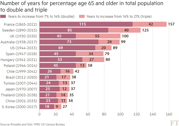
You may think that visualising this story is as simple as creating a bar chart of the durations ordered by length. In fact, we came across just such a chart from a research agency.
But, to me, this approach generates “the feeling” — and further scrutiny reveals specific problems. A reader must work hard to memorise the date information next to the country labels to work out if there is a relationship between the start date and the length of time taken for the population to age. The chart is clearly not ideal, but how do we improve it?
Alan went on to talk about the process of improving the vis, eventually turning to Joseph Priestly for inspiration. Here’s their makeover:
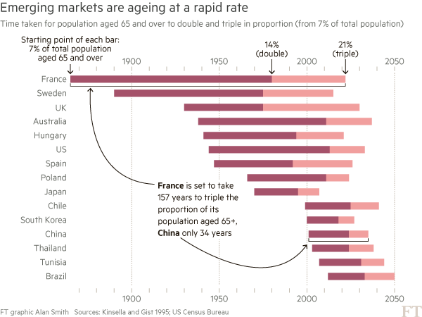
Alan used D3 to make this, which had me head scratching for a bit. Bostock is genius & I :heart: D3 immensely, but I never really thought of it as a “canvas” for doing general data visualization creation for something like a print publication (it’s geared towards making incredibly data-rich interactive visualizations). It’s 100% cool to do so, though. It has fine-grained control over every aspect of a visualization and you can easily turn SVGs into PDFs or use them in programs like Illustrator to make the final enhancements. However, D3 is not the only tool that can make a chart like this.
I made the following in R (of course):
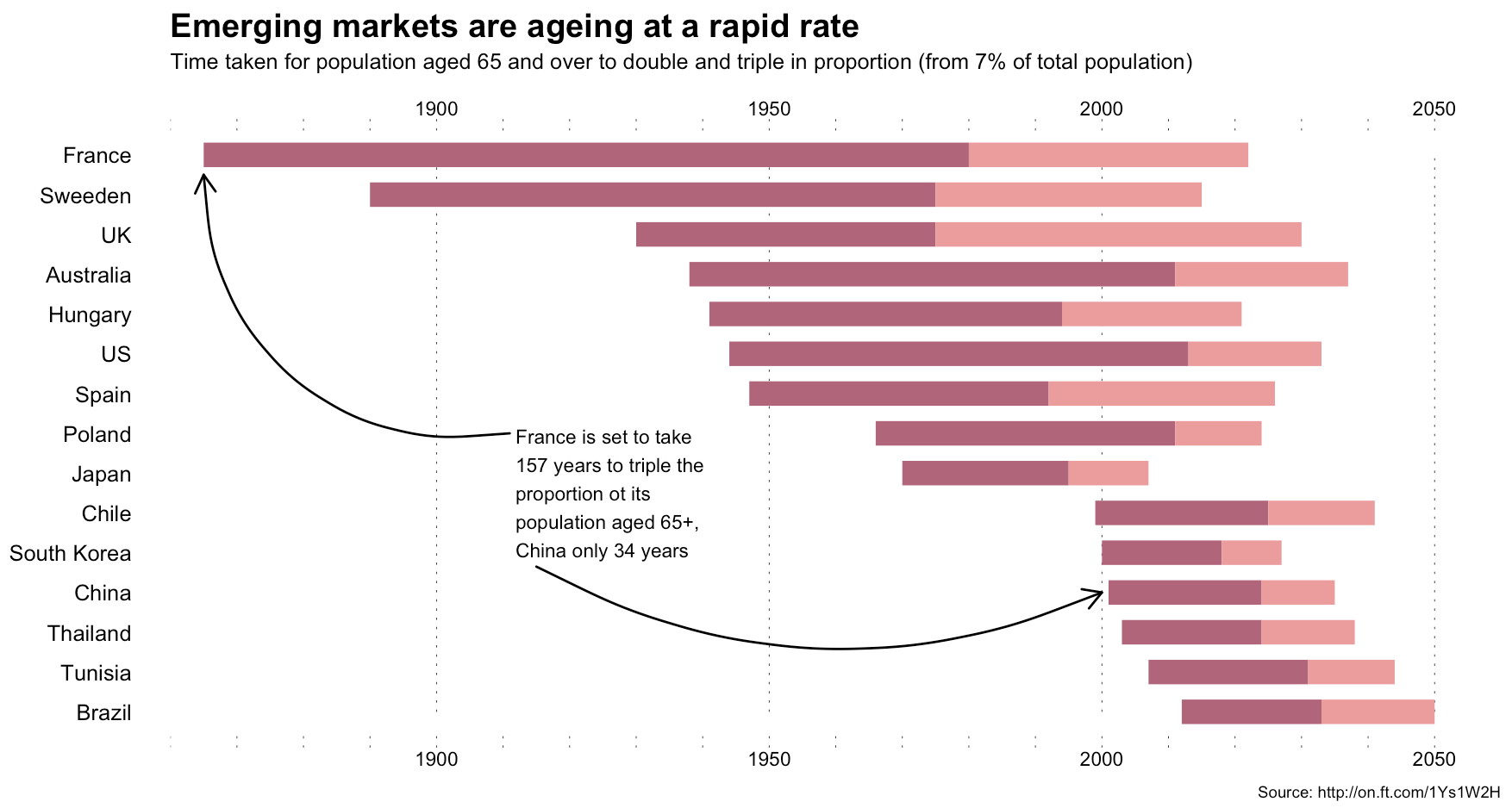
The annotations in Alan’s image were (99% most likely) made with something like Illustrator. I stopped short of fully reproducing the image (life is super-crazy, still), but could have done so (the entire image is one ggplot2 object).
This isn’t an “R > D3” post, though, since I use both. It’s about (a) reinforcing Alan’s posits that we should absolutely take inspiration from historical vis pioneers (so read more!) + need a diverse visualization “utility belt” (ref: Batman) to ensure you have the necessary tools to make a given visualization; (b) trusting your “Spidey-sense” when it comes to evaluating your creations/decisions; and, (c) showing that R is a great alternative to D3 for something like this :-)
Spider-man (you expected headier references from a dude with a shield avatar?) has this ability to sense danger right before it happens and if you’re making an effort to develop and share great visualizations, you definitely have this same sense in your DNA (though I would not recommend tossing pie charts at super-villains to stop them). When you’ve made something and it just doesn’t “feel right”, look to other sources of inspiration or reach out to your colleagues or the community for ideas or guidance. You can and do make awesome things, and you do have a “Spidey-sense”. You just need to listen to it more, add depth and breadth to your “utility belt” and keep improving with each creation you release into the wild.
R code for the ggplot vis reproduction is below, and it + the CSV file referenced are in this gist.
library(ggplot2)

library(dplyr)

ft <- read.csv("ftpop.csv", stringsAsFactors=FALSE)

arrange(ft, start_year) %>%

  mutate(country=factor(country, levels=c(" ", rev(country), "  "))) -> ft

ft_labs <- data_frame(

  x=c(1900, 1950, 2000, 2050, 1900, 1950, 2000, 2050),

  y=c(rep(" ", 4), rep("  ", 4)),

  hj=c(0.5, 0.5, 0.5, 0.5, 0.5, 0.5, 0.5, 0.5),

  vj=c(1, 1, 1, 1, 0, 0, 0, 0)

)

ft_lines <- data_frame(x=c(1900, 1950, 2000, 2050))

ft_ticks <- data_frame(x=seq(1860, 2050, 10))

gg <- ggplot()

# tick marks & gridlines

gg <- gg + geom_segment(data=ft_lines, aes(x=x, xend=x, y=2, yend=16),

                        linetype="dotted", size=0.15)

gg <- gg + geom_segment(data=ft_ticks, aes(x=x, xend=x, y=16.9, yend=16.6),

                        linetype="dotted", size=0.15)

gg <- gg + geom_segment(data=ft_ticks, aes(x=x, xend=x, y=1.1, yend=1.4),

                        linetype="dotted", size=0.15)

# double & triple bars

gg <- gg + geom_segment(data=ft, size=5, color="#b0657b",

                        aes(x=start_year, xend=start_year+double, y=country, yend=country))

gg <- gg + geom_segment(data=ft, size=5, color="#eb9c9d",

                        aes(x=start_year+double, xend=start_year+double+triple, y=country, yend=country))

# tick labels

gg <- gg + geom_text(data=ft_labs, aes(x, y, label=x, hjust=hj, vjust=vj), size=3)

# annotations

gg <- gg + geom_label(data=data.frame(), hjust=0, label.size=0, size=3,

                      aes(x=1911, y=7.5, label="France is set to take\n157 years to triple the\nproportion ot its\npopulation aged 65+,\nChina only 34 years"))

gg <- gg + geom_curve(data=data.frame(), aes(x=1911, xend=1865, y=9, yend=15.5),

                      curvature=-0.5, arrow=arrow(length=unit(0.03, "npc")))

gg <- gg + geom_curve(data=data.frame(), aes(x=1915, xend=2000, y=5.65, yend=5),

                      curvature=0.25, arrow=arrow(length=unit(0.03, "npc")))

# pretty standard stuff here

gg <- gg + scale_x_continuous(expand=c(0,0), limits=c(1860, 2060))

gg <- gg + scale_y_discrete(drop=FALSE)

gg <- gg + labs(x=NULL, y=NULL, title="Emerging markets are ageing at a rapid rate",

                subtitle="Time taken for population aged 65 and over to double and triple in proportion (from 7% of total population)",

                caption="Source: http://on.ft.com/1Ys1W2H")

gg <- gg + theme_minimal()

gg <- gg + theme(axis.text.x=element_blank())

gg <- gg + theme(panel.grid=element_blank())

gg <- gg + theme(plot.margin=margin(10,10,10,10))

gg <- gg + theme(plot.title=element_text(face="bold"))

gg <- gg + theme(plot.subtitle=element_text(size=9.5, margin=margin(b=10)))

gg <- gg + theme(plot.caption=element_text(size=7, margin=margin(t=-10)))

ggYour data vis “Spidey-sense” & the need for a robust “utility belt”的更多相关文章
- Fitting Bayesian Linear Mixed Models for continuous and binary data using Stan: A quick tutorial
I want to give a quick tutorial on fitting Linear Mixed Models (hierarchical models) with a full var ...
- Machine Learning and Data Mining(机器学习与数据挖掘)
Problems[show] Classification Clustering Regression Anomaly detection Association rules Reinforcemen ...
- JavaScript资源大全中文版(Awesome最新版)
Awesome系列的JavaScript资源整理.awesome-javascript是sorrycc发起维护的 JS 资源列表,内容包括:包管理器.加载器.测试框架.运行器.QA.MVC框架和库.模 ...
- PCI Express(四) - The transaction layer
原文出处:http://www.fpga4fun.com/PCI-Express4.html 感觉没什么好翻译的,都比较简单,主要讲了TLP的帧结构 In the transaction layer, ...
- Task schedule 分类: 比赛 HDU 查找 2015-08-08 16:00 2人阅读 评论(0) 收藏
Task schedule Time Limit: 2000/1000 MS (Java/Others) Memory Limit: 32768/32768 K (Java/Others) Total ...
- Doubles 分类: POJ 2015-06-12 18:24 11人阅读 评论(0) 收藏
Doubles Time Limit: 1000MS Memory Limit: 10000K Total Submissions: 19954 Accepted: 11536 Descrip ...
- codevs 3732 解方程
神题不可言会. f(x+p)=f(x)(mod p) #include<iostream> #include<cstdio> #include<cstring> # ...
- notes: the architecture of GDB
1. gdb structure at the largest scale,GDB can be said to have two sides to it:1. The "symbol si ...
- poj 2531 Network Saboteur(经典dfs)
题目大意:有n个点,把这些点分别放到两个集合里,在两个集合的每个点之间都会有权值,求可能形成的最大权值. 思路:1.把这两个集合标记为0和1,先默认所有点都在集合0里. 2 ...
随机推荐
- javascript的getter和setter(转)
显然这是一个无关IE(高级IE除外)的话题,尽管如此,有兴趣的同学还是一起来认识一下ECMAScript5标准中getter和setter的实现.在一个对象中,操作其中的属性或方法,通常运用最多的就是 ...
- php写流程管理
流程控制即某个人发起一个流程,通过一层一层审核,通过后,完成整个流程,若有一层审核未通过,中断整个流程.即结束! 比如请假流程: 某一员工发起一个请假流程,那么这个流程的节点人员即他的上级,上上级,上 ...
- 使用live555 在linux下搭建 rtsp server
系统环境 Debian 7 x64 / centos 7 x64 都可以 首先去下载源码 http://www.live555.com/liveMedia/public/live555-lates ...
- Elasticsearch - 快速入门
Elasticsearch是基于Apache 2.0开源的实时.分布式.分析搜索引擎,相比Lucene,Elasticsearch的上手比较容易,这篇文章主要纪录Elasticsearch的基本概念和 ...
- 04(1) 基于上下文相关的GMM-HMM声学模型1
1.上下文对音素发音的语谱轨迹的影响 受到上下文的影响,同一个音素的发音语谱轨迹不同 为提高识别准确率,对音素建模时应将这种上下文影响考虑在内 2.基于上下文相关的音素建模 注意,非单音素建模中,每个 ...
- jQuery常用代码片段
检测IE浏览器 在进行CSS设计时,IE浏览器对开发者及设计师而言无疑是个麻烦.尽管IE6的黑暗时代已经过去,IE浏览器家族的人气亦在不断下滑,但我们仍然有必要对其进行检测.当然,以下片段亦可用于检测 ...
- 极光的开源礼物「Aurora IMUI」
今日,奉上我们拙作,仅为开源世界献出绵薄之力. Aurora IMUI,一个通用的即时通讯(IM)UI 库.不局限于任何 IM SDK. 本 UI 库提供了消息列表.输入视图等常用组件. 初心 过去的 ...
- iOS关于Cookie验证登录状态
1.第一次进入应用,登录获取Cookie,此时如果用到的是AFN去获取接口数据,Cookie已经写入了,所以无需处理,每次请求的时候,会自动将该cookie传给后台去验证 2.将Cookie缓存到本地 ...
- IOS的自定义控件
这里做一个类似于下面界面的小案例 1.创建一个空的布局文件 .xib new File -->User Interface -->选择View 创建一个空的view ,会自动生成一个 .x ...
- 小谈ThinkPHP
ThinkPHP也是一个MVC框架,分视图.控制器和模型,和Yii框架相比相对较好理解,并且是轻量级的框架(相对于Yii来说),在使用Yii框架时候如果将框架放在项目文件中,用编辑器打开文件都比较慢, ...