CSS效果集锦(持续更新中)
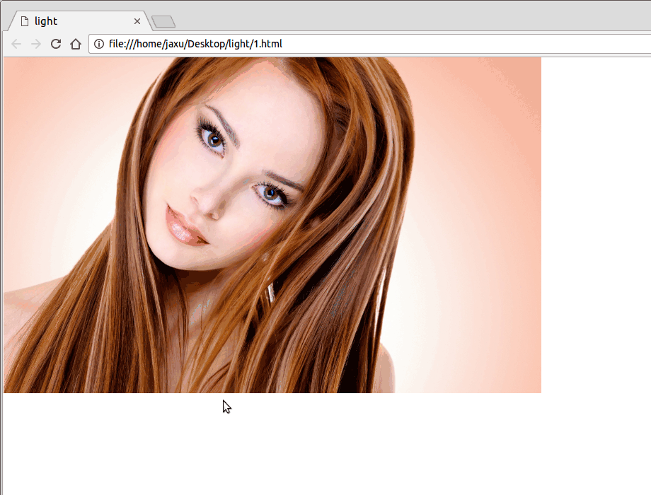
高亮光弧效果
使用CSS3实现的一个高亮光弧效果,当鼠标hover到某一个元素上时,一道光弧从左向右闪过,效果如下:
代码如下:
<!DOCTYPE html>

<html lang="en">

<head>

    <meta charset="UTF-8">

    <title>light</title>

    <style>

        body{

            margin: 0;

        }

        a.floor{

            display: block;

            height: 475px;

        }

        a.floor:hover:before{

            -webkit-transition: left 1.5s;

            -moz-transition: left 1.5s;

            transition: left 1.5s;

            left: 920px;

        }

        a.floor:before{

            content: "";

            position: absolute;

            width: 80px;

            height: 475px;

            top: 0;

            left: -150px;

            overflow: hidden;

            background: -moz-linear-gradient(left,rgba(255,255,255,0)0,rgba(255,255,255,.2)50%,rgba(255,255,255,0)100%);

            background: -webkit-gradient(linear,left top,right top,color-stop(0%,rgba(255,255,255,0)),color-stop(50%,rgba(255,255,255,.2)),color-stop(100%,rgba(255,255,255,0)));

            background: -webkit-linear-gradient(left,rgba(255,255,255,0)0,rgba(255,255,255,.2)50%,rgba(255,255,255,0)100%);

            background: -o-linear-gradient(left,rgba(255,255,255,0)0,rgba(255,255,255,.2)50%,rgba(255,255,255,0)100%);

            -webkit-transform: skewX(-25deg);

            -moz-transform: skewX(-25deg);

        }

    </style>

</head>

<body>

<a class="floor" href="javascript:;">

    <img src="./images/girl.jpg" height="475" width="760" alt="">

</a>

</body>

</html>
鼠标hover图片突出显示
类似于今日头条首页的图片,当鼠标hover到上面的时候会着重显示图片(放大效果):

代码如下:
<!DOCTYPE html>

<html lang="en">

<head>

    <meta charset="UTF-8">

    <title>hover</title>

    <style>

        body{

            margin: 0;

        }

        .img-wrap {

            width: 194px;

            height: 108px;

            float: left;

            margin-left: 6px;

            background: #e8e8e8;

            border: 1px solid #e8e8e8;

            overflow: hidden;

            cursor: pointer;

            -webkit-transform-style: preserve-3d;

            transform-style: preserve-3d;

        }

        .img-wrap img {

            width: 100%;

            height: 100%;

            border: 0;

            -webkit-transition: all .5s ease-out .1s;

            transition: all .5s ease-out .1s;

        }

        .img-wrap:hover img {

            -webkit-transform: matrix(1.04,0,0,1.04,0,0);

            -ms-transform: matrix(1.04,0,0,1.04,0,0);

            transform: matrix(1.04,0,0,1.04,0,0);

            -webkit-backface-visibility: hidden;

            backface-visibility: hidden;

        }

    </style>

</head>

<body>

<a class="img-wrap" target="_blank" href="/group/6347460154771013889/">

    <img alt="" src="http://p3.pstatp.com/list/640x360/e59000a6ecaab7d1535">

</a>

</body>

</html>
鼠标hover图片移动
向上移动:

代码:
<!DOCTYPE html>

<html lang="en">

<head>

    <meta charset="UTF-8">

    <title>hover</title>

    <style>

        body{

            padding: 4rem;

        }

        .img-wrap {

            width: 194px;

            height: 108px;

            display: block;

            cursor: pointer;

        }

        .img-wrap:hover img {

            -webkit-transform: translateY(-5px);

            -moz-transform: translateY(-5px);

            -ms-transform: translateY(-5px);

            transform: translateY(-5px);

        }

        .img-wrap img {

            width: 100%;

            height: 100%;

            border: 0;

             -webkit-transition: -webkit-transform .4s ease;

             transition: -webkit-transform .4s ease;

            -moz-transition: transform .4s ease,-moz-transform .4s ease;

             transition: transform .4s ease;

            transition: transform .4s ease,-webkit-transform .4s ease,-moz-transform .4s ease;

            -webkit-transform: translateY(0);

            -moz-transform: translateY(0);

            -ms-transform: translateY(0);

            transform: translateY(0);

        }

    </style>

</head>

<body>

<a class="img-wrap" href="javascript:;">

    <img alt="" src="http://p3.pstatp.com/list/640x360/11ff00027e781c4f7807">

</a>

</body>

</html>
向左移动:

将上面CSS样式改成下面即可:
body{

    padding: 4rem;

}

.img-wrap {

    width: 194px;

    height: 108px;

    display: block;

    cursor: pointer;

}

.img-wrap:hover img {

    -webkit-transform: translateX(-5px);

    -moz-transform: translateX(-5px);

    -ms-transform: translateX(-5px);

    transform: translateX(-5px);

}

.img-wrap img {

    width: 100%;

    height: 100%;

    border:;

     -webkit-transition: -webkit-transform .4s ease;

     transition: -webkit-transform .4s ease;

    -moz-transition: transform .4s ease,-moz-transform .4s ease;

     transition: transform .4s ease;

    transition: transform .4s ease,-webkit-transform .4s ease,-moz-transform .4s ease;

    -webkit-transform: translateX(0);

    -moz-transform: translateX(0);

    -ms-transform: translateX(0);

    transform: translateX(0);

}
晃动的计算器图标

代码如下:
<!DOCTYPE html>

<html lang="en">

<head>

    <meta charset="UTF-8">

    <title>animation</title>

    <style>

        body{

            padding: 4rem;

        }

       .calculator{

            margin: -35px auto 30px;

            width: 150px;

            line-height: 30px;

            text-align: center;

            border: 1px solid #ff7200;

            -webkit-border-radius: 30px;

            -moz-border-radius: 30px;

            border-radius: 30px;

            cursor: pointer;

            font-size: 0;

       }

       .calculator:hover{

            background-color: #fb7b14;

       }

       .calculator i{

            display: inline-block;

            width: 12px;

            height: 16px;

            line-height: 1;

            margin-right: 10px;

            vertical-align: middle;

            background: url("cal.png") no-repeat;

       }

       .calculator i.tada{

            -webkit-animation: tada 2s infinite linear;

            -moz-animation: tada 2s infinite linear;

            animation: tada 2s infinite linear;

       }

       .calculator .calculator-txt{

            line-height: 1;

            vertical-align: middle;

            color: #ff7200;

            font-size: 14px;

       }

       .calculator:hover .calculator-txt{

            color: #fff;

       }

       .calculator:hover i{

            background-position: 0 -16px;

       }

       .calculator:hover i.tada{

            -webkit-animation: ccc 2s infinite;

            -moz-animation: ccc 2s infinite;

            animation: ccc 2s infinite;

       }

       @keyframes tada{

            0% {

                -webkit-transform: none;

                -moz-transform: none;

                transform: none;

            }

            5% {

                -webkit-transform: translate3d(-25%,0,0) rotate3d(0,0,1,-5deg);

                -moz-transform: translate3d(-25%,0,0) rotate3d(0,0,1,-5deg);

                transform: translate3d(-25%,0,0) rotate3d(0,0,1,-5deg);

            }

            10% {

                -webkit-transform: translate3d(20%,0,0) rotate3d(0,0,1,3deg);

                -moz-transform: translate3d(20%,0,0) rotate3d(0,0,1,3deg);

                transform: translate3d(20%,0,0) rotate3d(0,0,1,3deg);

            }

            15% {

                -webkit-transform: translate3d(-15%,0,0) rotate3d(0,0,1,-3deg);

                -moz-transform: translate3d(-15%,0,0) rotate3d(0,0,1,-3deg);

                transform: translate3d(-15%,0,0) rotate3d(0,0,1,-3deg);

            }

            20% {

                -webkit-transform: translate3d(10%,0,0) rotate3d(0,0,1,2deg);

                -moz-transform: translate3d(10%,0,0) rotate3d(0,0,1,2deg);

                transform: translate3d(10%,0,0) rotate3d(0,0,1,2deg);

            }

            25%, 26% {

                -webkit-transform: translate3d(-5%,0,0) rotate3d(0,0,1,-1deg);

                -moz-transform: translate3d(-5%,0,0) rotate3d(0,0,1,-1deg);

                transform: translate3d(-5%,0,0) rotate3d(0,0,1,-1deg);

            }

            100% {

                -webkit-transform: none;

                -moz-transform: none;

                transform: none;

            }

       }

    </style>

</head>

<body>

<div class="calculator">

    <i class="tada"></i><span class="calculator-txt">省钱计算器</span>

</div>

</body>

</html>
转动的地球

代码如下:
<!DOCTYPE html>

<html lang="en">

<head>

    <meta charset="UTF-8">

    <title>Global</title>

    <style tyle="text/css">

        body {

            background-color: #111;

        }

        #earth {

            width: 300px;

            height: 300px;

            background: url(http://users.evtek.fi/~sampsara/3D/Earth-Spec4096.jpg);

            border-radius: 50%;

            background-size: 610px;

            box-shadow: inset 8px 36px 80px 36px rgb(0, 0, 0), inset -6px 0 12px 4px rgba(255, 255, 255, 0.3);

            animation-name: rotate;

            animation-duration: 12s;

            animation-iteration-count: infinite;

            animation-timing-function: linear;

            -webkit-animation-name: rotate;

            -webkit-animation-duration: 12s;

            -webkit-animation-iteration-count: infinite;

            -webkit-animation-timing-function: linear;

        }

        @keyframes rotate {

            from {

                background-position: 0px 0px;

            }

            to {

                background-position: 610px 0px;

            }

        }

        @-webkit-keyframes rotate {

            from {

                background-position: 0px 0px;

            }

            to {

                background-position: 610px 0px;

            }

        }

    </style>

</head>

<body>

    <div id="earth"></div>

</body>

</html>
点赞效果

代码如下:
<!DOCTYPE html>

<html lang="en">

<head>

    <meta charset="UTF-8">

    <title>like</title>

    <style type="text/css">

        img{

            /*width: 20px;

            height: 20px;*/

            position: absolute;

            bottom: 100px;

            left: 50%;

            margin-left: -12.5px;

        }

        .btn{ width: 100px; height: 30px; border:0; background: red; color: #fff; position: absolute; bottom: 100px; left: 50%; margin-left: -50px; }

    </style>

    <script src="jquery.min.js" type="text/javascript" charset="utf-8"></script>

    <script type="text/javascript">

        $(function(){

            $("#btn1").on('click', function(){

                $(".demo").append("<img src='love-r.png'>");

                $("img").animate({

                    bottom:"200px",

                    width: "50px",

                    marginLeft: "-25px",

                    opacity:"0"

                }, 1000, function(){

                    $(".demo").empty();

                });

            });

        });

    </script>

</head>

<body>

    <div class="demo"></div>

    <input id="btn1" type="button" class="btn" value="点赞">

</body>

</html>
CSS效果集锦(持续更新中)的更多相关文章
- JavaEE进阶集锦(持续更新中)
1.影响Servlet生命周期的注解:@PostConstruct和@PreDestroy @PostConstruct:被修饰的方法会在服务器加载Servlet的时候运行,并且只会被服务器调用一次, ...
- Linux 集锦(持续更新中)
// 获取文件夹下的代码总行数 find . -name "*.*" | xargs wc -l // ls 排序 ls -lt 按照最后修改时间降序 ls -lrt 按照时间升序 ...
- fastadmin 后台管理框架使用技巧(持续更新中)
fastadmin 后台管理框架使用技巧(持续更新中) FastAdmin是一款基于ThinkPHP5+Bootstrap的极速后台开发框架,具体介绍,请查看文档,文档地址为:https://doc. ...
- 前端面试题总结——HTML(持续更新中)
前端面试题总结--HTML(持续更新中) 1.什么是HTML? HTML:HyperText Markup Language超文本标记语言 2.XHTML和HTML有什么区别 HTML是一种基本的WE ...
- 【前端面试】Vue面试题总结(持续更新中)
Vue面试题总结(持续更新中) 题目参考链接 https://blog.csdn.net/weixin_45257157/article/details/106215158 由于已经有很多前辈深造VU ...
- Atom使用记录(持续更新中)
部分内容取自:http://www.jianshu.com/p/dd97cbb3c22d,我自己也在使用,持续更新中 Atom安装插件在窗口中File---Setting---install 在里面进 ...
- java视频教程 Java自学视频整理(持续更新中...)
视频教程,马士兵java视频教程,java视频 1.Java基础视频 <张孝祥JAVA视频教程>完整版[RMVB](东西网) 历经5年锤炼(史上最适合初学者入门的Java基础视频)(传智播 ...
- tp5 使用技巧(持续更新中...)
tp5 使用技巧(持续更新中...) 1.自动写入时间 create_time和update_time 使用save方法才行,insert方法不生效,不知为何 2.过滤字段 allowfield和st ...
- 史上最全的spark面试题——持续更新中
史上最全的spark面试题——持续更新中 2018年09月09日 16:34:10 为了九亿少女的期待 阅读数 13696更多 分类专栏: Spark 面试题 版权声明:本文为博主原创文章,遵循C ...
- git常用命令(持续更新中)
git常用命令(持续更新中) 本地仓库操作git int 初始化本地仓库git add . ...
随机推荐
- 关于淘宝店铺装修弹出层popup的记录
小龙最近做了一下下淘宝的店铺装修,里面封装的widget深不见底,刚刚整明白popup,也就是弹出层的使用方法,大神勿喷: <div class="area001">触 ...
- python调用c\c++
前言 python 这门语言,凭借着其极高的易学易用易读性和丰富的扩展带来的学习友好性和项目友好性,近年来迅速成为了越来越多的人们的首选.然而一旦拿python与传统的编程语言(C/C++)如来比较的 ...
- BFS_最短路径
已知若干个城市的地图,求从一个城市到另一个城市的路径,要求路径中经过的城市最少. #include<iostream> #include<cstring> using name ...
- Ubuntu14.04 64位机上安装cuda8.0 cudnn5.0操作步骤 - 网络资源是无限的
查看Ubuntu14.04 64位上显卡信息,执行: lspci | grep -i vga lspci -v -s 01:00.0 nvidia-smi 第一条此命令可以显示一些显卡的相关信息:如果 ...
- 在Sublime TEXT3中添加brogrammer-theme主题配色方案
喜欢用sublime text3的都知道原配的主题要么就是背景颜色太亮太累眼,要么就是配色太少不便于一眼看出哪有问题.所以在此推荐一个brogrammer-theme的主题,配色非常的全而且添加了扁平 ...
- 代码中使用StoryBoard和DoubleAnimation的方法
TranslateTransformを対象に.DoubleAnimation型のアニメーションを使用して.TranslateTransform.Xプロパティを ”-1 * Imageコントロールの幅” ...
- 【原】iOS学习之三种拨打电话方式的比较
拨打电话小编从网上找到三种,在这里做一些总结和比较 1.基本使用 NSString *str = [[NSMutableString alloc] initWithFormat:@"tel: ...
- unity 协程
StartCoroutine在unity3d的帮助中叫做协程,意思就是启动一个辅助的线程. 在C#中直接有Thread这个线程,但是在unity中有些元素是不能操作的.这个时候可以使用协程来完成. 使 ...
- 【Linux】Too many open files
ZA 的BOSS 最近出现Too many open files 异常,这个异常一般是由于打开文件数过多引起, 最常见原因是某些连接一致未关闭 记录一些排查用到的指令 查看每个用户最大允许打开文件数量 ...
- VS调式显示问题
调式时,发现与以前的显示不太一样,虽然也能看到结果,但不是很方便,后来网上查找到与VS中的一个文件被修改有关. 找个别人安装过的VS2005,替换Common7\Packages\Debugger\a ...