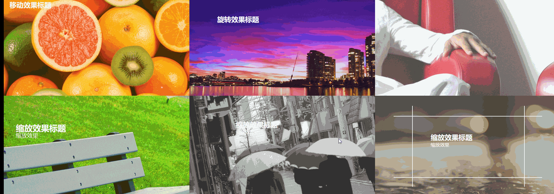
6种css3 transform图片悬停动态效果
html骨架代码
<!DOCTYPE html>

<html>

<head lang="en">

    <meta charset="UTF-8">

    <!--<meta name="viewport" content="width=device-width, initial-scale=1.0">-->

    <title></title>

    <link rel="stylesheet" href="css/css3.css"/>

</head>

<body>

<figure class="one">

    <img src="img/img01.jpg" />

    <figcaption>

        <h2>移动效果标题</h2>

        <p>移动效果一</p>

        <p>移动效果二</p>

        <p>移动效果三</p>

    </figcaption>

</figure>

<figure class="two">

    <img src="img/img02.jpg"/>

    <figcaption>

        <h2>旋转效果标题</h2>

        <p>旋转效果</p>

        <div></div>

    </figcaption>

</figure>

<figure class="three">

    <img src="img/img03.jpg"/>

    <figcaption>

        <h2>斜切效果标题</h2>

        <p>斜切效果</p>

    </figcaption>

</figure>

<figure class="four">

    <img src="img/img04.jpg"/>

    <figcaption>

        <h2>缩放效果标题</h2>

        <p>缩放效果</p>

        <div></div>

    </figcaption>

</figure>

<figure class="five">

    <img src="img/img05.jpg"/>

    <figcaption>

        <h2>缩放效果标题</h2>

        <p>缩放效果</p>

        <div><input type="button" value="button1"/></div>

    </figcaption>

</figure>

<figure class="six">

    <img src="img/img07.jpg"/>

    <figcaption>

        <h2>缩放效果标题</h2>

        <p>缩放效果</p>

        <div class="border1"></div>

        <div class="border2"></div>

    </figcaption>

</figure>

</body>

</html>
css
body,figure,figcaption,img,h2,p{padding: 0; margin: 0;}
body{width: 100%;}
figure{position:relative; float: left; overflow: hidden; height: 350px; width: 33.33%; }
figcaption{position: absolute; top: 0; left:0;color: #fff; font-family: "寰蒋闆呴粦"; }
figure img{opacity: 0.8;}
figure figcaption,figure figcaption p,figure img{transition:all 0.35s;}
figure figcaption,figure figcaption div{transition:all 0.35s;}
figure figcaption p,figure figcaption h2{transition:all 0.35s;}
figure:hover img{transform:translate(-150px,0); opacity: 0.5}
@media screen and ( max-width: 600px) {
figure{width: 100%}
}
@media screen and (min-width: 601px) and ( max-width: 1000px) {
figure{width: 50%}
}
@media screen and (min-width: 1001px) {
figure{width: 33.33%}
}
.one{background: #f9aa0f;}
.one figcaption{padding: 20px;}
.one figcaption p{ text-align: center; background:#fff; color: #333; margin-top: 3px; transform:translate(-200px,0);}
.one:hover figcaption p{transform:translate(0,0);}
.one:hover figcaption p:nth-of-type(1){transition-delay:0.15s;}
.one:hover figcaption p:nth-of-type(2){transition-delay:0.3s;}
.one:hover figcaption p:nth-of-type(3){transition-delay:0.35s;}
.two{background-color: #60299e;}
.two figcaption{width: 100%; height: 100%;}
.two figcaption div{width: 80%; height: 80%; border: 2px solid #fff; position: absolute; top:10%; left: 10% ; transform:translate(0,-350px) rotate(0deg) scale(0.5,0.5);}
.two figcaption h2{ margin-left: 15%; margin-top: 11%; }
.two figcaption p{margin-left: 15%; transform:translate(0,30px);opacity: 0;}
.two:hover figcaption div{transform:translate(0,0) rotate(360deg) scale(1,1);}
.two:hover figcaption p{opacity: 1; transform:translate(0,0)}
.three figcaption{margin-top: 20%; margin-left: 40%; transform:skew(90deg,0) }
.three:hover figcaption{transform:skew(0,0)}
.four{background-color: #89cf3f;}
.four figcaption{width: 100%; height: 100%;}
.four figcaption div{width: 100%; height: 100%; border: 2px solid #fff; position: absolute;top: 0;left: 0; opacity: 0;}
.four:hover figcaption div{transform:scale(0.8,0.8); opacity: 1;}
.four:hover img{transform:scale(1.2,1.2);}
.four figcaption h2{margin-left: 15%; margin-top: 15%; transform:scale(1.2,1.2)}
.four figcaption p{margin-left: 15%; transform:scale(1.2,1.2)}
.four:hover figcaption h2{transform:scale(1,1);}
.four:hover figcaption p{transform:scale(1,1);}
.five{ background-color: #b5b5b5;}
.five figcaption{padding: 10% 25%; width: 100%; height: 100%; transform:translate(0,20px)}
.five figcaption div{width:100%; height: 100%; background-color:rgba(250,250,250,0.8); position: absolute; top:350px; left:0;}
.five figcaption div input{transform:rotate(15deg); margin-left:40%; margin-top: 5%; }
.five:hover figcaption div{ transform-origin:0 0; transform:rotate(-15deg);}
.five:hover figcaption{ transform:translate(0,0)}
.six{background-color: #777569;}
.six figcaption{ width: 100%; height: 100%;}
.six figcaption h2{margin-left: 30%; margin-top: 10%;}
.six figcaption p{margin-left: 30%; }
.six figcaption div{position: absolute; border: 2px solid #fff; }
.six figcaption div.border1{width: 60%; height: 0%; top: 45%; left: 20%; border-top: none; border-bottom: none;}
.six figcaption div.border2{width: 0%; height: 60%; top: 20%; left: 50%; border-left: none; border-right: none;}
.six:hover figcaption div.border1{ height: 80%; top:10%;}
.six:hover figcaption div.border2{ width: 80%; left:10%;}
.six:hover figcaption h2{margin-top: 20%;}
6种css3 transform图片悬停动态效果的更多相关文章
- iHover – 30+ 纯 CSS3 实现的超炫的图片悬停特效
iHover 是一个令人印象深刻的图片悬停效果集合,完全基于 CSS3 实现,无依赖,能够搭配 Bootstrap 3 很好地工作.基于 SCSS 技术构建(包括文件),便于修改变量.有模块化的代码, ...
- 基于CSS3图片悬停放大特效
今天我们要来分享一款很酷的CSS3图片特效,这款图片特效可以利用鼠标滑过图片使其悬停放大,并使图片的周围出现发光的效果.配合黑色的背景,这款CSS3图片悬停放大效果显得更加立体大气,非常适合产品图片的 ...
- iHover – 30+ 纯 CSS 实现的超炫的图片悬停特效
iHover 是一个令人印象深刻的图片悬停效果集合,完全基于 CSS3 实现,无依赖,能够搭配 Bootstrap 3 很好地工作.基于 SCSS 技术构建,便于修改变量.有模块化的代码,无需包含整个 ...
- 【CSS3】 理解CSS3 transform中的Matrix(矩阵)
理解CSS3 transform中的Matrix(矩阵) by zhangxinxu from http://www.zhangxinxu.com 本文地址:http://www.zhangxinxu ...
- CSS3 transform rotate(旋转)锯齿的解决办法
-moz-transform: rotate(5deg);-webkit-transform: rotate(5deg); 把图片旋转了5度.本以为轻而易举,可遇到了问题.在Fireofx中显示正常, ...
- 理解CSS3 transform中的Matrix(矩阵)
一.哥,我被你吓住了 打架的时候会被块头大的吓住,学习的时候会被奇怪名字吓住(如“拉普拉斯不等式”).这与情感化设计本质一致:界面设计好会让人觉得这个软件好用! 所以,当看到上面“Matrix(矩阵) ...
- div 中图片溢出问题及 CSS3中图片翻转问题
如果设置一个div 装两张以上的图片,如果不设置好div的宽度和高度,就会使图片溢出. 我们知道,div是可以由图片撑开其宽高的,也就是说如果只放一张图片的情况下,不设置div的宽高,div的宽高会默 ...
- 理解CSS3 transform中的Matrix(矩阵)——张鑫旭
by zhangxinxu from http://www.zhangxinxu.com本文地址:http://www.zhangxinxu.com/wordpress/?p=2427 一.哥,我被你 ...
- css3 transform中的matrix矩阵
CSS3中的矩阵CSS3中的矩阵指的是一个方法,书写为matrix()和matrix3d(),前者是元素2D平面的移动变换(transform),后者则是3D变换.2D变换矩阵为3*3, 如上面矩阵示 ...
随机推荐
- 手动实现简单的tomcat服务器
手动实现tomcat服务器的流程: 分析具体的实现步骤: 1,浏览器和后端服务如何实现通信,首先传输的数据要遵循http协议,通过tcp也就是我们常说的套接字编程来实现,具体的底层数据传输肯定就是我们 ...
- Python_环境搭建_jupyterNotebook的使用
# @ Author : Collin_PXY # 虚拟环境的创建及Jupyter Notebook的基本使用 # Anaconda 和 Jupter Notebook的使用: # 首先得需要安装 A ...
- 某C++神作,就100句话而已
假设p是指针,当delete p;时,后面一定要p=NULL将p指向空 cin cout cerr 都是iostream类型的对象.cout<<"hello world" ...
- Python 中 'unicodeescape' codec can't decode bytes in position XXX: trun错误解决方案
window 读取文件可以用\,但是在字符串中\是被当作转义字符来使用,'C:\Users\FrankYuan\Pictures\Camera Roll\WIN_20161010_08_51_57_P ...
- transformer多头注意力的不同框架实现(tensorflow+pytorch)
多头注意力可以用以下一张图描述: 1.使用pytorch自带的库的实现 torch.nn.MultiheadAttention(embed_dim, num_heads, dropout=0.0, b ...
- sql实现通过父级id查询所有的子集
通过sql实现传入父级id查询出所有的子集 最近刚好有个业务需要这样实现个功能,就是在点击查询列表详情的时候只会传入父级id,而详情得渲染出所有子集,那么做法有很多,可以直接通过代码递归查询去实现, ...
- webug第十二关:我系统密码忘记了!
第十二关:我系统密码忘记了! 文件上传 直接上传php一句话, 菜刀链接
- 面试官:你说你精通源码,那你知道ArrayList 源码的设计思路吗?
Arraylist源码分析 ArrayList 我们几乎每天都会使用到,但是通常情况下我们只是知道如何去使用,至于其内部是怎么实现的我们不关心,但是有些时候面试官就喜欢问与ArrayList 的源码相 ...
- 凭借着这份面经,我拿下了字节,美团的offer!
最近经常有粉丝私信问我问了一些诸如秋招该怎么复习的问题,我就想顺便把回答整理发一发.我也是把之前面试的一些经历经验和身边的人面试的经验总结了一下放在下面. 前期准备规划: 如果秋招的话一般过年回来就可 ...
- 阿里面试官:小伙子,你给我说一下Spring Bean初始化的几种常规方式吧
前言 通过构造方法实例化通过静态工厂实例化通过实例工厂实例化通过FactoryBean实例化 RumenzA实体类 package com.rumenz; public class RumenzA { ...