CSS实现响应式布局
用CSS实现响应式布局
响应式布局感觉很高大上,很难,但实际上只用CSS也能实现响应式布局
要用的就是CSS中的没接查询,下面就介绍一下怎么运用:
使用@media 的三种方法
1.直接在CSS文件中使用:
@media 类型 and (条件1) and (条件二){

    css样式

}

@media screen and (max-width:1024px) {

    body{

        background-color: red;

    }

}
2.使用@import导入
@import url("css/moxie.css") all and (max-width:980px);
3.也是最常用的方法--直接使用link连接,media属性用于设置查询方法
<link rel="stylesheet" type="text/css" href="css/moxie.css" media=“all and (max-width=980px)”/>
下面是一个简单的响应式的布局HTMl代码:
<!doctype html>

<html>

<head>

    <meta charset="utf-8"/>

    <title>响应式</title>

    <link rel="stylesheet" type="text/css" href="index.css"/>

<link rel="stylesheet" type="text/css" href="index01.css" media="screen and (max-width:1024px) and (min-width:720px)"/>

    <link rel="stylesheet" type="text/css" href="index02.css" media="screen and (max-width:720px)"/>

</head>

<body>

    <div class="header">头部</div>

    <div class="main clearfix">

        <div class="left">左边</div>

        <div class="center">中间</div>

        <div class="right">右边</div>

    </div>

    <div class="footer">底部</div>

</body>

</html>
下面是CSS样式:
*{

    margin:0;

    padding:0;

    text-align:center;

    color:yellow;

}

.header{

    width:100%;

    height:100px;

    background:#ccc;

    line-height:100px;

}

.main{

    background:green;

    width:100%;

}

.clearfix:after{

    display:block;

    height:0;

    content:"";

    visibility:hidden;

    clear:both;

}

.left,.center,.right{

    float:left;

}

.left{

    width:20%;

    background:#112993;

    height:300px;

    font-size:50px;

    line-height:300px;

}

.center{

    width:60%;

    background:#ff0;

    height:400px;

    color:#fff;

    font-size:50px;

    line-height:400px;

}

.right{

    width:20%;

    background:#f0f;

    height:300px;

    font-size:50px;

    line-height:300px;

}

.footer{

    width:100%;

    height:50px;

    background:#000;

    line-height:50px;

}
<link rel="stylesheet" type="text/css" href="index01.css" media="screen and (max-width:1024px) and (min-width:720px)"/>样式代码
.right{

    float:none;

    width:100%;

    background:#f0f;

    clear:both;

}

.left{

    width:30%;

}

.center{

    width:70%;

}

.main{

    height:800px;

}
<link rel="stylesheet" type="text/css" href="index02.css" media="screen and (max-width:720px)"/>样式代码
.left,.center,.right{
float:none;
width:100%;
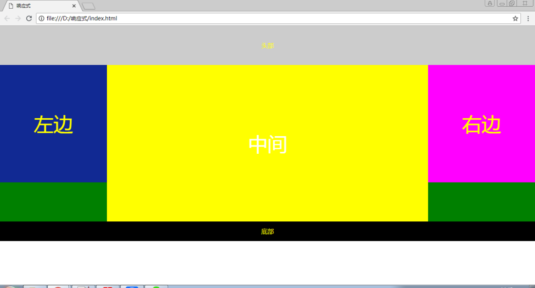
}当窗口大于1024px 时,指挥被压缩,并不会发生其他变化:
当窗口小于1024px,大于720px的时候,右侧栏取消浮动,在下边显示:

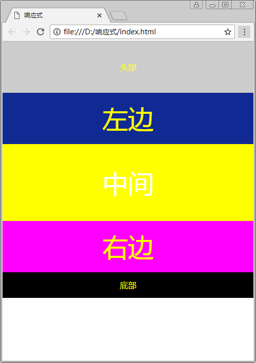
当窗口小于720px的时候,左中右三栏,全都取消浮动,宽度100%:
好了,布局就这么简单,细节的把握还靠不断地练习。
持续更新,欢迎大家指教
CSS实现响应式布局的更多相关文章
- Responsive Web CSS – 在线响应式布局创建器
如果您已经使用了 CSS 或前端框架,创建响应式布局应该不难. 然而,如果你刚涉足这类布局,Responsive Web CSS 可以帮助你快速上手. 这是一个基于 Web 的工具,使任何人都可以通过 ...
- 用CSS实现响应式布局
响应式网页看起来高大上,但实际上,不用JS只用CSS也能实现响应式网站的布局 要用到的就是CSS中的媒体查询下面来简单介绍一下怎么运用 使用@media 的三种方式 第一: 直接在CSS文件中使用 @ ...
- css实现响应式布局的相关内容
所以我就在做自适应的时候查了一些资料 首先我发现一个问题:有响应式布局和自适应布局两种布局效果 简单来说,响应式布局就是不同的设备无论大小 布局都自动调整大小 页面布局都一样 可以保证无论什么设备 用 ...
- 【css】响应式布局入门【转】
最近研究响应式设计框架的时候,发现网上很多相关的属性介绍,却很少有系统的入门级使用的文章,我自己整理了一篇入门知识,并没有什么高深的理论,也不牵扯到框架. 目前已经越来越多的站点以及wap站点使用响应 ...
- CSS的响应式布局
响应式布局是什么 它是相对于固定像素大小的网页而言的,顾名思义,响应式布局就是网页能够响应各种各样不同分辨率大小的设备,能够将网页很好的呈献给用户. 如何实现响应式布局? 1.CSS3@media查询 ...
- css的响应式布局和动画
把响应式布局和动画放在一起写是因为他们有个共同点@符号 先讲讲响应式布局@media 响应式布局==曾经==非常的流行,这种布局方式可以做出一也兼容一切设备的页面,但是当页面的功能越来越多,css文件 ...
- CSS实现响应式布局(自动拆分几列)
1.css代码 <style type="text/css"> .container{ margin-top: 10px; } .outerDiv{ float:lef ...
- css中响应式布局中样式的代码书写方法
代码示例:@media only screen and (min-width: 320px){ html { font-size: 8px !important; } .mulu-zi{ positi ...
- 关于bootstrap和响应式布局
bootstrap导入 首先需要安装好插件 然后就是在代码器写导入代码 代码如下 <html lang="zh-CN"> <head> <meta c ...
随机推荐
- Rx系列---响应式编程
Rx是ReactiveX的简称,翻译过来就是响应式编程 首先要先理清这么一个问题:Rxjava和我们平时写的程序有什么不同.相信稍微对Rxjava有点认知的朋友都会深深感受到用这种方式写的程序和我们一 ...
- github简单操作
配置用户名: git config --global user.name 名.姓 配置用户邮件:git config --global user.email 名.姓@avatarmind.com 查看 ...
- LabVIEW部分视觉函数中文解说
IMAQ Learn Pattern 2 VI 在匹配阶段创建您要搜索的图案匹配的模板图像的描述,此描述的数据被附加到输入模板图像中.在匹配阶段,从模板图像中提取模板描述符并且用于从检查图像中搜索模板 ...
- 解决scoped 下confirm 样式问题
- POJ2352 Stars [树状数组模板]
题意:输入一n颗星星的x,y坐标,给定判断level的标准,即某颗星星左下边(不高于它,不超过他,相当于以他为基准的第三象限)星星的数目为level, 输出level从0到n的星星个数. //poj2 ...
- 关于RFC
版权声明:本文为博主原创文章,未经博主允许不得转载. https://blog.csdn.net/byxdaz/article/details/557902关于RFC(Request For Comm ...
- 关于(int argc char **argv)
演示使用opencv显示一幅图片: #include <iostream> #include <core/core.hpp> #include <highgui/high ...
- Integer 中的缓存类 IntegerCache
我们先看一段代码: public class TestAutoBoxing { public static void main(String[] args) { //-128到127之间 Intege ...
- OpenCV 读取、修改、保存图像
代码如下: #include <cv.h> #include <highgui.h> using namespace cv; int main( int argc, char* ...
- JQueryUI Chosen插件
github地址:https://harvesthq.github.io/chosen/#change-update-events Using Chosen is easy as can be. Do ...