CSS3之动画相关
CSS3动画相关的属性:transform,transition,animation.
变形Transform
语法:
transform: rotate | scale | skew | translate |matrix;
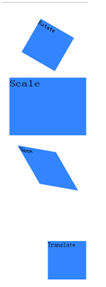
rotate:旋转,通过指定一个角度对原元素进行2D旋转,正值表示顺时针旋转,负值表示逆时针。默认原点是其中心位置,可以设置transform-origin.
scale:缩放,通过指定X和Y方向上的缩放倍数对原元素进行2D缩放。
skew:扭曲,通过指定X和Y方向上的斜切角度,对原元素进行斜切变换。
translate:移动,通过指定X和Y方向的移动长度对元素进行移动,正值是向右下移动的。
matrix:矩阵变换
例子:
<!DOCTYPE html>

<html>

<head>

    <meta charset="utf-8">

    <title>CSS3</title>

    <style  type="text/css">

        div{

            width:100px;

            height:100px;

            background:#3385ff;

            margin: 60px;

        }

        #rotate{

            transform:rotate(30deg);

        }

        #scale{

           transform:scale(2,1.5);

        }

        #skew{

           transform:skew(30deg,10deg);

        }

        #translate{

           transform:translate(50%,80%);

        }

    </style>

</head>

<body>

    <div id="rotate">Rotate</div>

    <div id="scale">Scale</div>

    <div id="skew">Skew</div>

    <div id="translate">Translate</div>

</body>

</html>
图:
过渡Transition
transition主要包含四个属性值:执行过渡的属性:transition-property,变换延续的时间:transition-duration,在延续时间段,变换的速率变化transition-timing-function,变换延迟时间transition-delay。
例子:
<!DOCTYPE html>

<html>

<head>

    <meta charset="utf-8">

    <title>CSS3</title>

    <style  type="text/css">

        div{

            width:100px;

            height:100px;

            background:#3385ff;

            margin: 60px;

        }

        #transition{

            transition:width 2s,height 2s;

        }

        div:hover{

            width:200px;

            height:200px;

            transform:rotate(180deg);

        }

</style>

</head>

<body>

    <div id="transition">Transition</div>

</body>

</html>
图1

图2(鼠标放上去)

动画Animation
animation类似transition,不同的是animation可以定义每个关键帧的效果,可以实现更为复杂的动画。
常用属性:
@keyframe:关键帧动画。
animation-name:定义@keyframes的动画名称。
animation-duration:定义动画一个周期的秒或毫秒数。
animation-timing-function:定义动画的速度变化。
animation-delay:定义动画何时开始。
animation-iteration-count:定义动画被播放的次数,可定义为循环播放。
animation-direction:定义动画是否在下一个周期循环播放。
例子
<!DOCTYPE html>

<html>

<head>

<style type="text/css">

@-webkit-keyframes move {

    0% {

        padding: 0;

    }

    50% {

        padding: 0 20px;

        background-color:rgba(190, 206, 235, 0.2);

    }

    100% {

        padding: 0 100px;

        background-color:rgba(190, 206, 235, 0.9);

    }

}

.anim_box:hover {

    -webkit-animation-name: move;

    -webkit-animation-duration: 1.5s;

    -webkit-animation-iteration-count: 4;

    -webkit-animation-direction: alternate;

    -webkit-animation-timing-function: ease-in-out;

}

</style>

</head>

<body>

<div class="anim_box">Animation</div>

</body>

</html>
可以用animation做简单的幻灯片效果,把背景色换成要轮播的图片就可以了
<!DOCTYPE html>

<html>

<head>

<style type="text/css">

@-webkit-keyframes loop {

    0% {

        background:blue;

    }

    25% {

        background:pink;

    }

    50% {

        background:yellow;

    }

    75% {

        background:purple;

    }

    100% {

        background:red;

    }

}

.anim {

    width:100px;

    height:100px;

    -webkit-animation-name: loop;

    -webkit-animation-duration: 10s;

    -webkit-animation-iteration-count: infinite;

    -webkit-animation-timing-function: linear;

}

</style>

</head>

<body>

<div class="anim">Animation</div>

</body>

</html>
CSS3之动画相关的更多相关文章
- CSS3制作动画的三个属性
CSS3属性中有关于制作动画的三个属性:Transform,Transition,Animation:我们一起学习完了Transform和Transition,让我们对元素实现了一些基本的动画效果,这 ...
- css3 操作动画要点
CSS3 有3种和动画相关的属性:transform, transition, animation. 不同点: 1. 触发条件不同.transition通常和hover等事件配合使用,由事件触发.a ...
- CSS3展现精彩的动画效果 css3的动画属性
热火朝天的css3无疑吸引了很多前端开发者的眼球,然而在css3中的动画属性则是新功能中的主打招牌,说到css3的动画属性不得不让人想起这三个属性:Transform﹑Transition﹑Anima ...
- Css3帧动画深入探寻,讲点项目中实际会碰到的问题
先加个副标题XD --如何解决background-size为100%下处理@keyframes 正是在项目中遇到副标题,才引起我更深入的探寻 先略带一下基本的css3动画 css3的动画实现是通过属 ...
- CSS3 制作魔方 - 相关立体样式
最好的实践,就是给定一个实践的目标去实践. 目标:利用 CSS3 的一些特性,绘制一个魔方,要可以玩转的那种,即上下左右每一层都可以独立旋转.效果如下: 为了完成此效果,将使用到以下相关概念和样式:坐 ...
- CSS3 @keyframes 动画
CSS3的@keyframes,它可以取代许多网页动画图像,Flash动画,和JAVAScripts. CSS3的动画属性 下面的表格列出了 @keyframes 规则和所有动画属性: 浏览器支持 表 ...
- 使用css3的动画模拟太阳系行星公转
本文介绍使用css3的animation画一个太阳系行星公转的动画,再加以改进,讨论如何画椭圆的运行轨迹.然后分析京东和人人网使用animation的实际案例,最后结合css3的clip-path做一 ...
- css3中动画(transition)和过渡(animation)详析
css3中动画(transition)和过渡(animation)详析
- css3 animation动画特效插件的巧用
这一个是css3 animation动画特效在线演示的网站 https://daneden.github.io/animate.css/ 下载 animate.css文件,文件的代码很多,不过要明白 ...
随机推荐
- Skip StyleCop Warnings.
[SuppressMessage("Microsoft.StyleCop.CSharp.MaintainabilityRules", "SA1401:FieldsMust ...
- RMQ问题(线段树+ST算法)
转载自:http://kmplayer.iteye.com/blog/575725 RMQ (Range Minimum/Maximum Query)问题是指:对于长度为n的数列A,回答若干询问RMQ ...
- SPOJ 694. Distinct Substrings (后缀数组不相同的子串的个数)转
694. Distinct Substrings Problem code: DISUBSTR Given a string, we need to find the total number o ...
- python 判断内网IP方法及实例应用
一.初衷: 一般在CMDB里会存储一台服务器的内网IP.管理IP.电信IP.联通IP,我们在使用的时候只需要拿到其中一个外网IP地址即可.那么我们就需要判断内网IP.管理IP并剔除掉,获取第一个外网I ...
- python(5)字符串处理 (sub,replace,find,index,upper,strip,split,sub翻页
一,sub和replace的用法 re.sub 函数进行以正则表达式为基础的替换工作 re.sub替换到目标字符串中的a,b或者c,并全部替换 另加上sub翻页操作: re.sub('start=\d ...
- 3.函数Function
所谓函数,本质上是一种代码的分组形式.我们可以通过这种形式赋予某组代码一个名字,便于日后重用是调用. function sum(a,b){ var c = a+b; return c; } 1.一个函 ...
- OAuth2.0_豆瓣登录_API错误返回码说明一览表[转]
转自: http://blog.unvs.cn/archives/douban-oauth-2.0-error_code.html 在遵循OAuth2.0协议,开始制作豆瓣过程中,经常会遇到以下两个错 ...
- eclipse的shell相关插件
1.Easy Shell a. 功能 可以在Eclipse IDE里选中一个文件或目录,利用Easy Sehll直接跳转到Sehll窗口,很方便 b. 安装 Help - Install New So ...
- Web Uploader文件上传&&使用webupload有感(黄色部分)
引入资源 使用Web Uploader文件上传需要引入三种资源:JS, CSS, SWF. <!--引入CSS--> <link rel="stylesheet" ...
- MemcacheQ 的安装与使用
1.安装libevent 官网:http://www.libevent.org/ 全选复制放进笔记 $ wget https://github.com/downloads/libevent/libev ...