Android5.0新控件CardView的介绍和使用

CardView也是5.0的新控件,这控件其实就是一个卡片啦,当然我们自己也完全可以定义这样一个卡片,从现在的微博等社App中可以看到各式各样的自定义卡片,所以这个控件意义不是很大。support中的view所以使用在布局里面的时候一下子看不到效果的,比较不好。CardView继承的是FrameLayout,所以摆放内部控件的时候需要注意一下啦。
建议:个人不是很建议用这个控件,因为我们完全可以自定义这样一个控件,这样既能在布局时直接看到效果又比较方便。
参数说明:
<resources>

    <declare-styleable name="CardView">

        <!-- Background color for CardView. -->

        <!-- 背景色 -->

        <attr name="cardBackgroundColor" format="color" />

        <!-- Corner radius for CardView. -->

        <!-- 边缘弧度数 -->

        <attr name="cardCornerRadius" format="dimension" />

        <!-- Elevation for CardView. -->

        <!-- 高度 -->

        <attr name="cardElevation" format="dimension" />

        <!-- Maximum Elevation for CardView. -->

        <!-- 最大高度 -->

        <attr name="cardMaxElevation" format="dimension" />

        <!-- Add padding in API v21+ as well to have the same measurements with previous versions. -->

        <!-- 设置内边距,v21+的版本和之前的版本仍旧具有一样的计算方式 -->

        <attr name="cardUseCompatPadding" format="boolean" />

        <!-- Add padding to CardView on v20 and before to prevent intersections between the Card content and rounded corners. -->

        <!-- 在v20和之前的版本中添加内边距,这个属性是为了防止卡片内容和边角的重叠 -->

        <attr name="cardPreventCornerOverlap" format="boolean" />

        <!-- 下面是卡片边界距离内部的距离-->

        <!-- Inner padding between the edges of the Card and children of the CardView. -->

        <attr name="contentPadding" format="dimension" />

        <!-- Inner padding between the left edge of the Card and children of the CardView. -->

        <attr name="contentPaddingLeft" format="dimension" />

        <!-- Inner padding between the right edge of the Card and children of the CardView. -->

        <attr name="contentPaddingRight" format="dimension" />

        <!-- Inner padding between the top edge of the Card and children of the CardView. -->

        <attr name="contentPaddingTop" format="dimension" />

        <!-- Inner padding between the bottom edge of the Card and children of the CardView. -->

        <attr name="contentPaddingBottom" format="dimension" />

    </declare-styleable>

</resources>
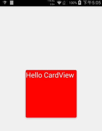
看完了参数,那么我们来看看布局文件中的用法。
<!-- A CardView that contains a TextView -->

<android.support.v7.widget.CardView xmlns:android="http://schemas.android.com/apk/res/android"

    xmlns:tools="http://schemas.android.com/tools"

    xmlns:app="http://schemas.android.com/apk/res-auto"

    android:id="@+id/card_view"

    android:layout_width="200dp"

    android:layout_height="200dp"

    android:layout_gravity="center"

    app:cardCornerRadius="4dp"

    app:cardBackgroundColor="#ff0000"

    app:cardElevation="5dp"

    app:cardMaxElevation="10dp"

    app:cardUseCompatPadding="true"

    app:cardPreventCornerOverlap="true">

    <TextView

        android:id="@+id/info_text"

        android:layout_width="match_parent"

        android:layout_height="match_parent"

        android:layout_gravity="center"

        android:textSize="25sp"

        android:textColor="#ffffff"

        android:text="Hello CardView"/>

</android.support.v7.widget.CardView>
这样我们就定义好了一个CardView了。本来这篇文章不需要给源码的,但因为有人的support-v7包中这个jar有点问题(比如我),所以还是放一个代码吧。
源码下载:http://download.csdn.net/detail/shark0017/8108835
参考自:
http://blog.csdn.net/a396901990/article/details/40187769
Android5.0新控件CardView的介绍和使用的更多相关文章
- Android5.0新控件RecyclerVIew的介绍和兼容使用的方法
第一部分 RecyclerVIew是一个可以替代listview和Gallery的有效空间而且在support-v7中有了低版本支持,具体使用方式还是规规矩矩的适配器加控件模式.我们先来看看官网的介绍 ...
- 一个Activity掌握Android5.0新控件 (转)
原文地址:http://blog.csdn.net/lavor_zl/article/details/51279386 谷歌在推出Android5.0的同时推出了一些新控件,Android5.0中最常 ...
- Android5.0新控件
谷歌在推出Android5.0的同时推出了一些新控件,Android5.0中最常用的新控件有下面5种. 1. CardView(卡片视图) CardView顾名思义是卡片视图,它继承FrameLay ...
- 一个Activity掌握Android4.0新控件 (转)
原文地址:http://blog.csdn.net/lavor_zl/article/details/51261380 谷歌在推出Android4.0的同时推出了一些新控件,Android4.0中最常 ...
- Android 5.0新控件——FloatingActionButton(悬浮按钮)
Android 5.0新控件--FloatingActionButton(悬浮按钮) FloatingActionButton是5.0以后的新控件,一个悬浮按钮,之所以叫做悬浮按钮,主要是因为自带阴影 ...
- 【Android】Anroid5.0+新控件---酷炫标题栏的简单学习
Android5.0+推出的新控件感觉特别酷,最近想模仿大神做个看图App出来,所以先把这些新控件用熟悉了. 新控件的介绍.使用等等网上相应的文章已经特别多了,题主也没那能力去写篇详解出来,本篇随笔记 ...
- Android 5.0新控件——TextInputLayout
Android 5.0(M)新控件--TextInputLayout 介绍之前,先直观的看一下效果 TextInputLayout其实是一个容器,他继承自LinearLayout,该容器是作用于Tex ...
- Android4.0新控件
谷歌在推出Android4.0的同时推出了一些新控件,Android4.0中最常用的新控件有下面5种. 1. Switch的使用 Switch顾名思义,就是开关的意思,有开和关两种状态. 当Swit ...
- 一个Activity掌握Design新控件 (转)
原文地址:http://blog.csdn.net/lavor_zl/article/details/51295364 谷歌在推出Android5.0的同时推出了全新的设计Material Desig ...
随机推荐
- LA 3704 Cellular Automaton
题意概述: 等价地,本题可以转化为下面的问题: 考虑$n \times n$的$0-1$矩阵$A$,在第$i$行上第$[-d+i, d+i]$(模$n$意义下)列对应的元素为$1$,其余为$0$.求$ ...
- Android activity界面跳转动画
实现activity界面跳转动画 1.在startActivity方法之后加入: overridePendingTransition(R.anim.pull_in_right, R.anim.pull ...
- Discuz! 6.x/7.x 全局变量防御绕过导致命令执行
https://www.secpulse.com/archives/2338.html 模拟register_globals功能的代码,在GPC为off时会调用addslashes()函数处理变量值, ...
- 基于PowerShell 3.0的web接口测试
对于web接口测试,做一下总结. 接口测试总结 1. 接口url格式:http://www.xxx.com/a/bbb.html: 2. 接口url后面接的参数格式:“?参数名=参数值&参数名 ...
- 链表——PowerShell版
链表是由一系列节点串连起来组成的,每一个节点包括数值部分和指针部分,上一节点的指针部分指向下一节点的数值部分所在的位置. 在C语言中我们有两种方式来定义链表—— 1.定义结构体:来表示链表中的节点,节 ...
- reactjs入门到实战(六)---- ReactJS组件API详解
全局的api 1.React.createClass 创建一个组件类,并作出定义.组件实现了 render() 方法,该方法返回一个子级.该子级可能包含很深的子级结构.组件与标准原型类的不同之处在于, ...
- 关于qquu8 的主页修改
1) 找到 这个文件夹 C:\Users\lidu\AppData\Roaming\Microsoft\Internet Explorer\Quick Launch\User Pinned\TaskB ...
- 3.linux man手册
(12) man作用:查询man手册,获得帮助信息man 1 ls 1表示查询的是linux命令man 2 xxx 2表示查询的是linux apiman 3 xxx 3表示查询的是C库函数注意:在m ...
- 异常详细信息: System.Web.Hosting.HostingEnvironmentException: 访问 IIS 元数据库失败 解决方法
访问IIS元数据库失败 同理,给操作系统的新建用户赋予IIS操作权限同样可以采用该命令来处理 说明: 执行当前 Web 请求期间,出现未处理的异常.请检查堆栈跟踪信息,以了解有关该错误以及代码中导致错 ...
- 在Quartus II中分配管脚的两种常用方法
在Quartus II中分配管脚的两种常用方法 示范程序 seg7_test.v 1 2 3 4 5 6 7 8 9 10 11 12 13 14 15 16 17 18 19 20 21 /* * ...