CSS弹性盒布局(display:flex)
CSS弹性布局(display:flex)
参考:
http://www.runoob.com/w3cnote/flex-grammar.html
https://www.jianshu.com/p/5856c4ae91f2
http://www.ruanyifeng.com/blog/2015/07/flex-grammar.html
https://www.cnblogs.com/xuyuntao/articles/6391728.html
主要内容:
父级:

    display:flex;

    (兼容绝大部分浏览器):-webkit-     真实工作下使用postCss插件-自动添加浏览器兼容

    display: -webkit-flex; /* Safari */

    display: flex;

    *如果使用了弹性布局,子元素不需要使用浮动float

    父级身上的常用属性:

        justify-content:    子元素水平排列

            flex-start(默认)    从左开始

            flex-end    从右开始

            center    居中!!

            space-between    两端对齐

            space-around    子元素张开手分布

        align-items        子元素垂直排列

            flex-start(默认)    从上开始

            flex-end    从下开始

            center    居中!!

            stretch(默认值):如果项目未设置高度或设为auto,将占满整个容器的高度

            baseline: 项目的第一行文字的基线对齐

        align-content        多行子元素垂直排列

            flex-start:        与交叉轴的起点对齐。

            flex-end:            与交叉轴的终点对齐。

            center:            与交叉轴的中点对齐。

            space-between:     与交叉轴两端对齐,轴线之间的间隔平均分布。

            space-around:        每根轴线两侧的间隔都相等。所以,轴线之间的间隔比轴线与边框的间隔大一倍。

            stretch(默认值):    轴线占满整个交叉轴。

        flex-flow(基本不用,面试可能会提到)

            flex-flow属性是flex-direction属性和flex-wrap属性的简写形式,默认值为row nowrap

            flex-flow: <flex-direction> <flex-wrap>;

            举例:flex-flow:column wrap;

        flex-direction    子元素排列方向

            row(默认值):主轴为水平方向,起点在左端。

            row-reverse:主轴为水平方向,起点在右端。

            column:主轴为垂直方向,起点在上沿。

            column-reverse:主轴为垂直方向,起点在下沿。

        flex-wrap        子元素一行排不下如何换行

            nowrap(默认):不换行

            wrap:换行,第一行在上方

            wrap-reverse:换行,第一行在下方

    子集身上的属性:

        flex    是flex-grow, flex-shrink 和 flex-basis的简写,默认值为0 1 auto。后两个属性可选

            将行分为定义比例的几份

            *子元素在划分父元素宽度,先刨除固定宽度

        align-self        允许单个子元素有与其他项目不一样的垂直对齐方式,可覆盖align-items属性

            .item {

                align-self: auto | flex-start | flex-end | center | baseline | stretch;

                    }

        flex-grow        定义子元素的放大比例,默认为0,即如果存在剩余空间,也不放大

            .item {

                flex-grow: <number>;     /* default 0 */        <number>只代表缩放系数

                    }

        order        定义子元素的排列顺序。数值越小,排列越靠前,默认为0

            .item {

                  order: <integer>;

                }
练习案例:

<!DOCTYPE html>

<html lang="en">

<head>

    <meta charset="UTF-8">

    <title>flex布局案例-淘宝底部导航栏</title>

    <link rel="stylesheet" href="bootstrap/css/bootstrap.css">

    <style>

        * {

            margin: 0;

            padding: 0;

            list-style: none;

        }

        .footer-nav{

            width: 100%;

            height: 60px;

            background-color: grey;

            display: flex;

            position: absolute;

            left: 0;

            bottom: 0;

        }

        .footer-nav .tab{

            width: 20%;

            box-sizing: border-box;

            border-left: 1px solid red;

            flex: 1;

            text-align: center;

            line-height: 30px;

            font-size: 16px;

            color: white;

        }

        .footer-nav .tab .tab-icon{

           height: 30%;

        }

    </style>

</head>

<body>

<div class="footer-box">

<div class="footer-nav">

    <span class="tab">

        <span class="tab-icon glyphicon glyphicon-home"></span>

        <p class="text">首页</p>

    </span>

    <span class="tab">

        <span class="tab-icon glyphicon glyphicon-shopping-cart"></span>

        <p class="text">购物车</p>

    </span>

    <span class="tab">

        <span class="tab-icon glyphicon glyphicon-list-alt"></span>

        <p class="text">订单列表</p>

    </span>

    <span class="tab">

        <span class="tab-icon glyphicon glyphicon-user"></span>

        <p class="text">我的淘宝</p>

    </span>

    <span class="tab">

        <span class="tab-icon glyphicon glyphicon-option-horizontal"></span>

        <p class="text">更多</p>

    </span>

    <span class="tab">

        <span class="tab-icon glyphicon glyphicon-grain"></span>

        <p class="text">欢度清明</p>

    </span>

</div>

</div>

</body>

</html>
<!DOCTYPE html>

<html lang="en">

<head>

    <meta charset="UTF-8">

    <title>Title</title>

    <link rel="stylesheet" href="style/flex-1.css">

</head>

<body>

    <div class="outer">

        <div class="item div1">1</div>

        <div class="item div2">2</div>

        <div class="item div3">3</div>

        <div class="item div4">4</div>

        <div class="item">5</div>

        <div class="item">6</div>

        <div class="item">7</div>

    </div>

</body>

</html>
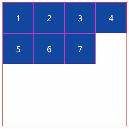
HTML代码
*{

    margin:;

    padding:;

    list-style: none;

}

.outer{

    width: 500px;

    height: 500px;

    border: 1px solid red;

    margin: 30px auto;

    display: flex;

    flex-wrap: wrap;

    align-content:flex-start;

}

.item{

    width: 125px;

    border: 1px solid #ff1bbe;

    background-color: #0D47A1;

    height: 125px;

    box-sizing: border-box;

    font-size: 32px;

    color: white;

    line-height: 125px;

    text-align: center;

    align-content: flex-start;

}
css代码
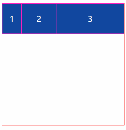
<!DOCTYPE html>

<html lang="en">

<head>

    <meta charset="UTF-8">

    <title>Title</title>

    <style>

        * {

            margin: 0;

            padding: 0;

            list-style: none;

        }

        .outer {

            width: 500px;

            height: 500px;

            border: 1px solid red;

            margin: 30px auto;

            display: flex;

            flex-wrap: wrap;

            align-content: flex-start;

        }

        .item {

            border: 1px solid #ff1bbe;

            background-color: #0D47A1;

            height: 125px;

            box-sizing: border-box;

            font-size: 32px;

            color: white;

            line-height: 125px;

            text-align: center;

        }

        .div1{width: 80px}

        .div2{flex: 1}

        .div3{flex: 2}

    </style>

</head>

<body>

    <div class="outer">

        <div class="item div1">1</div>

        <div class="item div2">2</div>

        <div class="item div3">3</div>

    </div>

</body>

</html>
<!DOCTYPE=html>
<html lang="zh-cn">
<head>
<meta charset="UTF-8">
<title>
关于文档元素测试
</title>
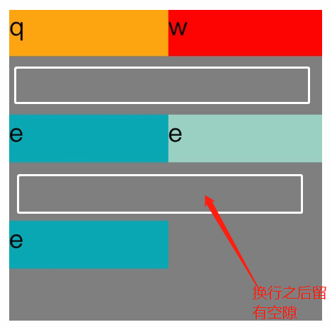
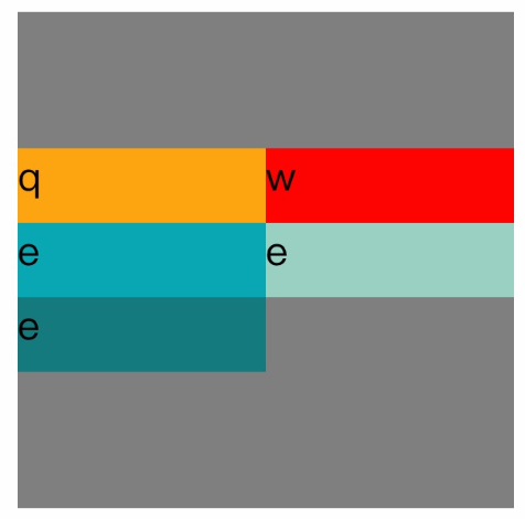
<style> #father{ width:200px;
display:flex;
flex-direction:row;
flex-wrap:wrap;
align-content:center;
height:200px;
background-color:grey;
}
.son1{ height:30px;
width:100px;
background-color:orange;
} .son2{ height:30px;
width:100px;
background-color:red;
} .son3{
height:30px;
width:100px;
background-color:#08a9b5;
} .son4{
height:30px;
width:100px;
background-color:#9ad1c3;
} .son5{ height:30px;
width:100px;
background-color:rgb(21,123,126);
}
</style>
</head>
<body> <div id="father">
<div class="son1">q</div>
<div class="son2">w</div>
<div class="son3">e</div>
<div class="son4">e</div>
<div class="son5">e</div>
</div> </body>
</html>
flex布局换行空白间隙之align-content
参考:https://blog.csdn.net/txfyteen/article/details/82663029
CSS弹性盒布局(display:flex)的更多相关文章
- 弹性盒布局display:flex详解
一:弹性盒子 随着响应式设计的流行,网站开发者在设计网页布局时往往要考虑到页面在适配不同分辨率的浏览器时其内部组件位置大小都会产生变化,因此需要设计者根据窗口尺寸来调整布局,从而改变组件的尺寸和位置, ...
- 弹性盒模型display:flex
Flex布局意为"弹性布局",用来为盒模型提供更多灵活性.此外,Flex定义的容器可以对块级元素(display: flex;)或行内元素(display: inline-flex ...
- 弹性盒布局(flex)
一.Flex 布局是什么? Flex 是 Flexible Box 的缩写,意为"弹性布局",用来为盒状模型提供最大的灵活性. 任何一个容器都可以指定为 Flex 布局. .box ...
- CSS弹性盒布局
<html> <head> <meta charset="utf-8"/> <title></title> <st ...
- 弹性盒布局详解(display: flex;)
弹性盒布局详解 弹性盒介绍 弹性盒的CSS属性 开启弹性盒 弹性容器的CSS属性 flex-direction设置弹性元素在弹性容器中的排列方向 主轴与侧轴(副轴) flex-wrap设置弹性容器空间 ...
- css怪异盒模型和弹性盒布局(flex)详解及其案例
一.怪异盒模型 怪异盒模型的属性是box-sizing,他有两个属性值: 1.content-box 这是由 CSS2.1 规定的宽度高度行为.宽度和高度分别应用到元素的内容框.在宽度和高度之外绘制元 ...
- css笔记 - flex弹性盒布局
flex: display:-webkit-box | -moz-box;盒布局 -webkit-box-flex | -moz-box-flex;弹性盒布局 -webkit-box-ordinal- ...
- CSS弹性盒模型(flex box)
本文介绍的是 CSS3 规范中引入的新布局模型:弹性盒模型(flex box).随着响应式用户界面的流行,Web 应用一般都要求适配不同的设备尺寸和浏览器分辨率. 浏览器支持: 弹性盒布局的容器(fl ...
- 弹性盒模型,flex布局
弹性盒模型 弹性盒子是css3的一种新布局模式,由容器(父元素)和项目(子元素)组成. 弹性盒子是一种当页面需要适应不同的屏幕大小以及设备类型时确保元素拥有恰当的行为的布局方式. 引入弹性盒模型的 ...
随机推荐
- IoC之AutoFac(一)——简单使用和组件注册
阅读目录 一.AutoFac简单使用 二.注册 2.1 注册方式 2.2 带参数注册 回到顶部 一.AutoFac简单使用 1 namespace AutofacDemo 2 { 3 class Pr ...
- 指令创建 Express Node.js 项目
1.安装 Express 1.1 安装 Express 框架 首先保证已经安装过了 Node.js,然后进入终端使用管理员身份来安装 Express 框架. # 安装 express $ sudo n ...
- 仅仅有五行的Floyd最短路算法
暑假,小哼准备去一些城市旅游.有些城市之间有公路,有些城市之间则没有,例如以下图.为了节省经费以及方便计划旅程,小哼希望在出发之前知道随意两个城市之前的最短路程. 上图中有4个城市8条公路,公路上的数 ...
- WWDC 17: 开发者的最初观感
WWDC 17: 开发者的最初观感 前言 每年的 WWDC 都是 iOS 开发者集体高潮的时刻.第一天的 WWDC 带来了全新的 iOS 11.MacOS.tvOS 和 watchOS,革命性的 AR ...
- 重新粗推了一下Master Theorem
主定理一般形式是T(n) = a T(n / b) + f(n), a >= 1, b > 1.递归项可以理解为一个高度为 logbn 的 a 叉树, 这样 total operation ...
- linux的挂载的问题,重启后就挂载就没有了
我用fdisk命令,分一个/dev/sda6出来,然后用mkfs格式化为ext3,然后挂载到根目录下的PPP文件夹中,挂载是成功了,但是用reboot和shutdown重启或关机后挂载就没有了 要修改 ...
- vscode打造最佳的markdown编辑器
参考:https://www.jianshu.com/p/18876655b452 在macos下也设置成功:
- Android 8 蓝牙打开过程
packages\apps\Settings\src\com\android\settings\bluetooth\BluetoothEnabler.java @Override public boo ...
- SpringMvc自动任务调度之task实现项目源码,@Scheduled
1.Xml配置 Spring-job.xml 并在 Spring-Application.xml中Import <?xml version="1.0" encoding=&q ...
- 异步任务神器 Celery-入门
一.Celery入门介绍 在程序的运行过程中,我们经常会碰到一些耗时耗资源的操作,为了避免它们阻塞主程序的运行,我们经常会采用多线程或异步任务.比如,在 Web 开发中,对新用户的注册,我们通常会给他 ...