CSS3_边框 border 详解_一个 div 的阴阳图
(面试题)
怎么样通过 CSS 画一个三角形:
1. 元素的 width 和 height 设置为 0
2. 边框 足够大
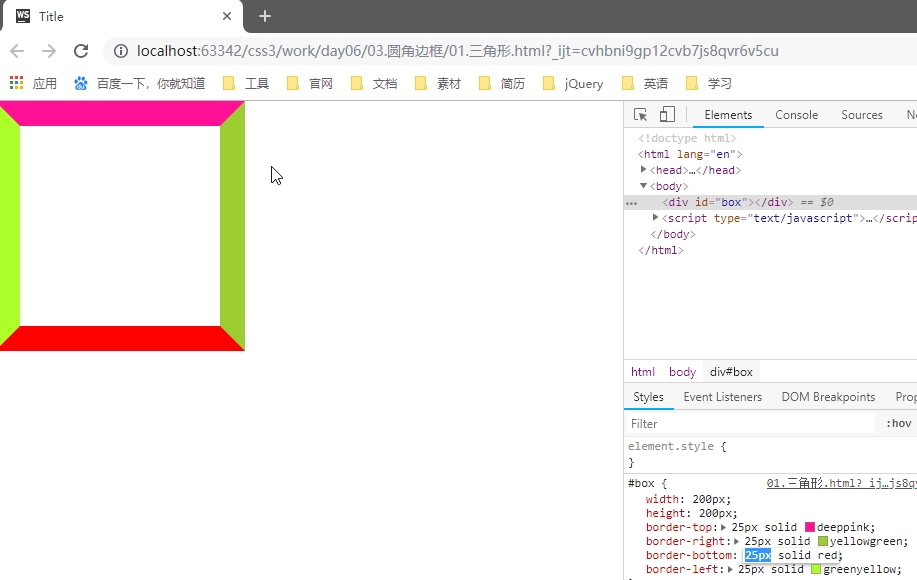
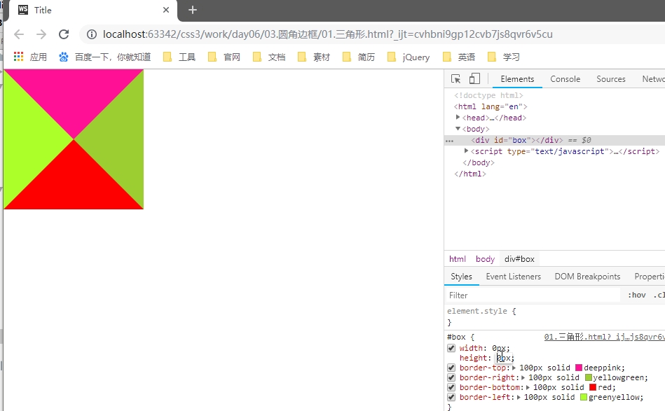
3. 需要的三角形的部分, border-top-color 设置为 有色
4. 不需要的部分 border-right-color,border-bottom-color,border-left-color,设置为 透明色
color: rgba(0,0,0,0);

// 或者

color: #0000;

// 或者

color: transparent;
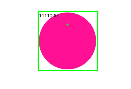
圆角边框(支持所有元素,无论块元素,还是行内元素)
- 尽管,border-radius 将 元素 变成了圆形,但是里面的文本子元素,仍旧沿着矩形盒子进行排列。
- CSS3 提供的特性: 尽管盒子的外形和位置发生了变换,但是元素在文档流中的位置是不变的
- border-radius: 50%; // 百分比参照盒子自身。
- 当 width = height 时,会画一个圆形。
- 当 width 不等于 height 时,会画一个椭圆形。
- 椭圆形
#box {

    width: 300px;

    height: 200px;

    border-radius: 150px/100px;    // x 轴半径 / y 轴半径

}
- 椭圆形
- 语法:
#box {

    border-radius: 30px 10px 50px 0;    // 左上 右上 右下 左下

    border-radius: 30px 10px 50px;

    border-radius: 30px 10px;

    border-radius: 30px;

}
- 用 CSS 画一个半圆
#box {

    width: 100px;

    hright: 200px;

    border-radius: 0  100% 100% 0;

    // border-radius: 100% 0 0 100%;

}

#box {

    width: 200px;

    hright: 100px;

    border-radius: 100% 100% 0 0 ;

    // border-radius: 0 0 100% 100%;

}
- 用 CSS 画一个扇形
#box {

    width: 100px;

    hright: 100px;

    border-radius: 100% 0 0 0;

    // border-radius: 0 100% 0 0 0;

    // border-radius: 0 0 100% 0;

    // border-radius: 0 0 0 100%;

}
- 用 CSS 画一个太极图
<!DOCTYPE html>

<html>

    <head>

        <meta charset="UTF-8" />

        <title>太极图</title>

        <style type="text/css">

            #test_box {

                width: 200px;

                height: 200px;

                border-radius: 50%;

                margin: 30px auto;

                background-color: red;

                position: relative;

            }

            #test_box #left_box,

            #test_box #right_box {

                width: 100px;

                height: 200px;

                float: left;

            }

            #test_box #left_box {

                background-color: #000;

                border-radius: 100px 0 0 100px;

            }

            #test_box #right_box {

                background-color: #fff;

                border-radius:  0 100px 100px 0;

            }

            #test_box #top_box,

            #test_box #bottom_box {

                width: 100px;

                height: 100px;

                border-radius: 50%;

                position: absolute;

                left: 50%;

                margin-left: -50px;

            }

            #test_box #top_box {

                top: 0;

                background-color: #000;

            }

            #test_box #bottom_box {

                bottom: 0;

                background-color: #fff;

            }

            #test_box #top_box #white_dot,

            #test_box #bottom_box #black_dot {

                width: 20px;

                height: 20px;

                border-radius: 50%;

                position: absolute;

                top: 0;

                left: 0;

                bottom: 0;

                right: 0;

                margin: auto;

            }

            #test_box #top_box #white_dot {

                background-color: #fff;

            }

            #test_box #bottom_box #black_dot {

                background-color: #000;

            }

        </style>

    </head>

    <body>

        <div id="test_box">

            <div id="left_box">

            </div>

            <div id="right_box">

            </div>

            <div id="top_box">

                <div id="white_dot"></div>

            </div>

            <div id="bottom_box">

                <div id="black_dot"></div>

            </div>

        </div>

    </body>

</html>
只用一个 <div> 画太极阴阳图
<!DOCTYPE html>

<html>

    <head>

        <meta charset="UTF-8" />

        <title>神分阴阳</title>

        <style type="text/css">

            body {

                width: 100%;

                color: #000;

                background: #96b377;

                font: 14px Helvetica, Arial, sans-serif;

            }

            #test_box {

                width: 100px;

                height: 200px;

                border-right: 100px solid #fff;

                border-radius: 50%;

                margin: 30px auto;

                background-color: #000;

                position: relative;

                top: 0px;

                left: 0px;

            }

            #test_box:before {

                content: "";

                width: 20px;

                height: 20px;

                border: 40px solid #000;

                border-radius: 50%;

                background-color: #fff;

                position: absolute;

                top: 0px;

                left: 100%;

                margin-left: -50px;

                        /* 左右 上下 模糊 颜色 */

                box-shadow: 4px 0px 4px #a66fe2;

            }

            #test_box:after {

                content: "";

                width: 20px;

                height: 20px;

                border: 40px solid #fff;

                border-radius: 50%;

                background-color: #000;

                        /* 左右 上下 模糊 颜色 */

                box-shadow: -5px 0px 4px #c4d0a7;

                position: absolute;

                bottom: 0px;

                left: 100%;

                margin-left: -50px;

            }

        </style>

    </head>

    <body>

        <div id="test_box">

        </div>

    </body>

</html>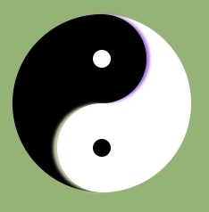
- 弧形凹陷 评论框
<!DOCTYPE html>

<html>

    <head>

        <meta charset="UTF-8" />

        <title>弧形凹陷 评论框</title>

        <style type="text/css">

            body {
               background-color: #96b377;
           }
            #test_box {

                width: 800px;

                height: 300px;

                margin: 300px auto 0px;

                border: 1px solid red;

                background-color: skyblue;

                position: relative;

                top: 0px;

                left: 0px;

            }

            #test_box #arc {

                width: 100px;

                height: 100px;

                border-radius: 50%;

                background-color: #96b377;

                border: 1px solid red;

                position: absolute;

                top: -70px;

                left: 70px;

            }

            #test_box #arc #mask {

                width: 102px;

                height: 100px;

                background-color: #96b377;

                position: absolute;

                top: -32px;

                left: -1px;

            }

            #test_box #arc #circle_login {

                width: 70px;

                height: 70px;

                border-radius: 50%;

                background-color: #ccc;

                text-align: center;

                line-height: 70px;

                font-size: 24px;

                position: absolute;

                z-index: 2;

                top: 0;

                left: 0;

                bottom: 0;

                right: 0;

                margin: auto;

            }

        </style>

    </head>

    <body>

        <div id="test_box">

            <div id="arc">

                <div id="mask"></div>

                <div id="circle_login">

                    登录

                </div>

            </div>

        </div>

    </body>

</html>
- 四叶草 旋转 初探 CSS3 动画
<!DOCTYPE html>

<html>

    <head>

        <meta charset="UTF-8" />

        <title>四叶草旋转 初探 CSS 动画</title>

        <style type="text/css">

            body {

                width: 100%;

                color: #000;

                background: #96b377;

                font: 14px Helvetica, Arial, sans-serif;

            }

            #test_box {

                width: 624px;

                height: 624px;

                margin: 60px auto;

                list-style: none;

animation: turnAround 1s linear infinite;

            }

@keyframes turnAround {

    from {transform: rotate(0deg)}

    to {transform: rotate(360deg)}

}

            #test_box li {

                float: left;

                width: 300px;

                height: 300px;

                margin: 5px;

                border: 1px solid red;

                background-color: #eee;

            }

            #test_box li:nth-child(1),

            #test_box li:nth-child(4) {

                border-radius: 0 230px 0 230px;

            }

            #test_box li:nth-child(2),

            #test_box li:nth-child(3) {

                border-radius: 230px 0 230px 0;

            }

        </style>

    </head>

    <body>

        <ul id="test_box">

            <li></li>

            <li></li>

            <li></li>

            <li></li>

        </ul>

    </body>

</html>
CSS3_边框 border 详解_一个 div 的阴阳图的更多相关文章
- css3(border-radius)边框圆角详解(转)
css3(border-radius)边框圆角详解 (2014-05-19 16:16:29) 转载▼ 标签: divcss html it css3 分类: 网页技术 传统的圆角生成方案,必须使用多 ...
- Java 正则表达式详解_正则表达式
body{ font-family: "Microsoft YaHei UI","Microsoft YaHei",SimSun,"Segoe UI& ...
- UML类图详解_关联关系_一对多
对于一对多的示例,可以想象一个账户可以多次申购.在申购的时候没有固定上限,下限为0,那么就可以使用容器类(container class)来搞,最常见的就是vector了. 下面我们来看一个“一对多” ...
- UML类图详解_关联关系_多对一
首先先来明确一个概念,即多重性.什么是多重性呢?多重性是指两个对象之间的链接数目,表示法是“下限...上限”,最小数据为零(0),最大数目为没有设限(*),如果仅标示一个数目级上下限相同. 实际在UM ...
- (5)ps详解 (每周一个linux命令系列)
(5)ps详解 (每周一个linux命令系列) linux命令 ps详解 引言:今天的命令是用来看进程状态的ps命令 ps 我们先看man ps ps - report a snapshot of t ...
- (4)top详解 (每周一个linux命令系列)
(4)top详解 (每周一个linux命令系列) linux命令 top详解 引言:今天的命令是用来看cpu信息的top top 我们先看man top top - display Linux pro ...
- (3)lscpu详解 (每周一个linux命令系列)
(3)lscpu详解 (每周一个linux命令系列) linux命令 lscpu详解 引言:今天的命令是用来看cpu信息的lscpu lscpu 我们先看man lscpu display infor ...
- (2)free详解 (每周一个linux命令系列)
(2)free详解 (每周一个linux命令系列) linux命令 free详解 引言:今天的命令是用来看内存的free free 换一个套路,我们先看man free中对free的描述: Displ ...
- css3(border-radius)边框圆角详解
传统的圆角生成方案,必须使用多张图片作为背景图案.CSS3的出现,使得我们再也不必浪费时间去制作这些图片了,只需要border-radius属性,支持浏览器IE 9.Opera 10.5.Safari ...
随机推荐
- CMDB服务器管理系统【s5day92】:定制表头
一.目录结构 二.获取数据,模板语言渲染 web\views.py import json from django.shortcuts import render,HttpResponse from ...
- Docker:企业级私有仓库harbor[十六]
一.安装配置 1.下载安装包 链接:https://pan.baidu.com/s/1Z9I7zYXSt-8ve3lFT2YCeg 提取码:iuqj 2.安装docker和docker-compose ...
- Maven 学习总结 (二) 之 生命周期与插件
五.生命周期与插件 1.Maven有三套独立的生命周期:clean.default和site. clean生命周期的目的是清理项目,default生命周期的目的是构建项目,site生命周期的目的是建立 ...
- Elasticsearch-基础介绍及索引原理分析(转载)
最近在参与一个基于Elasticsearch作为底层数据框架提供大数据量(亿级)的实时统计查询的方案设计工作,花了些时间学习Elasticsearch的基础理论知识,整理了一下,希望能对Elastic ...
- ElasticSearch 索引 剖析
ElasticSearch index 剖析 在看ElasticSearch权威指南基础入门中关于:分片内部原理这一小节内容后,大致对ElasticSearch的索引.搜索底层实现有了一个初步的认识. ...
- [译]Ocelot - Load Balancer
原文 可以对下游的服务进行负载均衡. 提供了下面几种负载均衡: LeastConnection - tracks which services are dealing with requests an ...
- dubbo线程模型
dubbo的provider有2种线程池: IO处理线程池.(直接通过netty等来配置) 服务调用线程池. 如果事件处理的逻辑能迅速完成,并且不会发起新的 IO 请求,比如只是在内存中记个标识,则直 ...
- 响应消息的内容类型 text/html; charset=utf-8 与绑定(application/soap+xml; charset=utf-8)的内容类型不匹配。
问题表述: 响应消息的内容类型 text/html; charset=utf-8 与绑定(application/soap+xml; charset=utf-8)的内容类型不匹配. 说明: 此类问题当 ...
- java 根据Url下载对应的文件到指定位置,读txt文件获取url
package test; import java.io.BufferedReader; import java.io.File; import java.io.FileInputStream; im ...
- Apache:SSLCertificateFile:文件不存在或为空(操作系统RHEL7)
配置参数及报错信息(配置了TLS加密后httpd服务无法启动) 我在httpd.conf文件中引用了上面创建的文件.但在那之后,当我尝试RESTART Apache时,我遇到以下错误: 错误:SSLC ...