CSS布局大全
前几天面试,问我某布局感觉回答不是很OK所以研究了一下各种布局。
一、单列布局
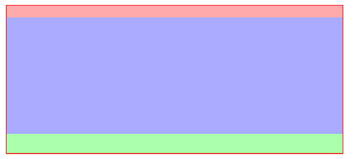
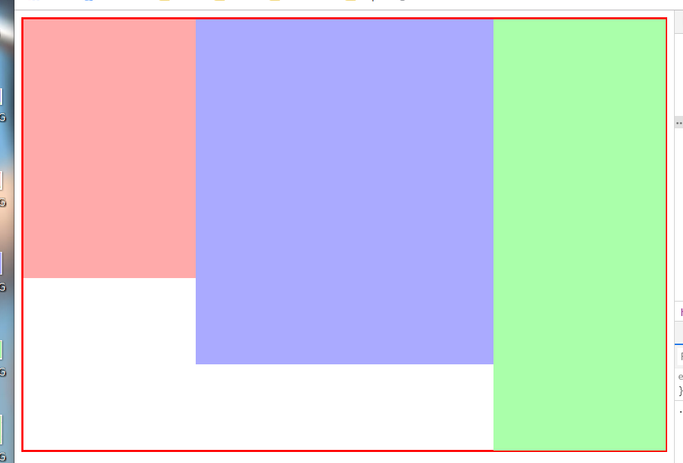
1.普通布局(头部、内容、底部)
    <div class="container">

        <header></header>

        <div class="content"></div>

        <footer></footer>

    </div>
.container {

            width: 80%;

            margin: 30px auto;

            border:2px solid red;

            box-sizing: border-box;

        }

        .container header {

            width: 100%;

            height: 30px;

            background: #faa;

        }

        .container .content {

            width: 100%;

            height: 300px;

            background: #aaf;

        }

        .container footer {

            height: 50px;

            background: #afa;

        }
2.内容居中(内容区域为80%宽度,采用margin:0 auto;实现水平居中)

<!DOCTYPE html>

<html lang="en">

<head>

    <meta charset="UTF-8">

    <title>Document</title>

    <style type="text/css">

        .container {

            width: 80%;

            margin: 30px auto;

            border:2px solid red;

            box-sizing: border-box;

        }

        .container header {

            width: 100%;

            height: 30px;

            background: #faa;

        }

        .container .content {

            width: 80%;

            height: 300px;

            margin: 0 auto;

            background: #aaf;

        }

        .container footer {

            height: 50px;

            background: #afa;

        }

    </style>

</head>

<body>

    <div class="container">

        <header></header>

        <div class="content"></div>

        <footer></footer>

    </div>

</body>

</html>
二、两栏布局
1.采用float 左边固定大小,右边自适应
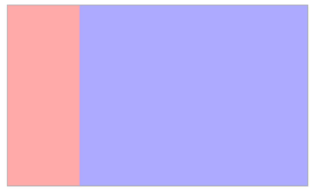
左侧采用float:left往左浮动,右侧margin-left:200px,留出左侧内容的空间。
<!DOCTYPE html>

<html lang="en">

<head>

    <meta charset="UTF-8">

    <title>Document</title>

    <style type="text/css">

        .wrapper {

            /* width:80%;和margin 是为了方便我截图*/

            width: 80%;

            margin: 50px auto;

            border:2px solid #aaa;

            box-sizing: border-box;

            /*采用bfc清除浮动*/

            overflow: hidden;

        }

        .nav {

            float: left;

            width: 200px;

            background: #faa;

            height: 500px;

        }

        .content {

            margin-left: 200px;

            height: 500px;

            background-color: #aaf;

        }

    </style>

</head>

<body>

    <div class="wrapper">

        <div class="nav"></div>

        <div class="content"></div>

    </div>

</body>

</html>
2.采用display: inline-block; 和 calc() 实现
由于inline-会把空格和回车算进去,所以我们在wrappper中设置font-size:0来清除影响。当然,打包出来的压缩格式可以忽略。
<!DOCTYPE html>

<html lang="en">

<head>

    <meta charset="UTF-8">

    <title>Document</title>

    <style type="text/css">

        .wrapper {

            /* width:80%;和margin 是为了方便我截图*/

            width: 80%;

            margin: 50px auto;

            border:2px solid red;

            box-sizing: border-box;

            font-size: 0;

        }

        .nav {

            display: inline-block;

            width: 200px;

            background: #faa;

            height: 500px;

        }

        .content {

            width: calc(100% - 200px);

            display: inline-block;

            height: 500px;

            background-color: #aaf;

        }

    </style>

</head>

<body>

    <div class="wrapper">

        <div class="nav"></div>

        <div class="content"></div>

    </div>

</body>

</html>
3.采用flex实现,左侧固定大小,右侧设置flex:1,即可实现自适应
HTML不变,css如下:
.wrapper {

            /* width:80%;和margin 是为了方便我截图*/

            width: 80%;

            margin: 50px auto;

            border:2px solid red;

            box-sizing: border-box;

                        /*flex布局*/

            display: flex;

        }

        .nav {

            width: 200px;

            background: #faa;

            height: 500px;

        }

        .content {

            flex:;

            height: 500px;

            background-color: #aaf;

        }
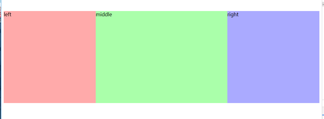
三、三栏布局
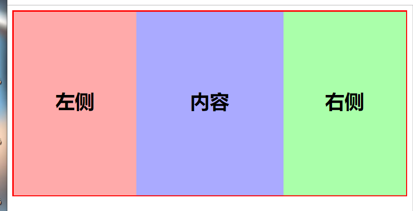
1.采用float浮动,左右大小固定,中间自适应
<!DOCTYPE html>

<html lang="en">

<head>

    <meta charset="UTF-8">

    <title>Document</title>

    <style type="text/css">

        .wrapper {

            width: 100%;

            margin-bottom: 30px;

            border:2px solid red;

            box-sizing: border-box;

        }

        .wrapper .left {

            width: 200px;

            height: 300px;

            background: #faa;

            float: left;

        }

        .wrapper .right {

            width: 200px;

            height: 300px;

            background: #afa;

            float: right;

        }

        .wrapper .content {

            height: 300px;

            background-color: #aaf;

            margin:0 200px;

        }

    </style>

</head>

<body>

    <!-- 三栏-浮动布局 -->

    <div class="wrapper">

        <div class="left"></div>

        <div class="right"></div>

        <div class="content"></div>

    </div>

</body>

</html>
采用inline-block 与两栏布局类似
.wrapper {

            width: 100%;

            margin-bottom: 30px;

            border:2px solid red;

            box-sizing: border-box;

            font-size:;

        }

        .wrapper .left {

            display: inline-block;

            width: 200px;

            height: 300px;

            background: #faa;

        }

        .wrapper .right {

            display: inline-block;

            width: 200px;

            height: 500px;

            background: #afa;

        }

        .wrapper .content {

            width: calc(100% - 400px);

            display: inline-block;

            height: 400px;

            background-color: #aaf;

        }
这里我们给每个容器的高度不同,结果:
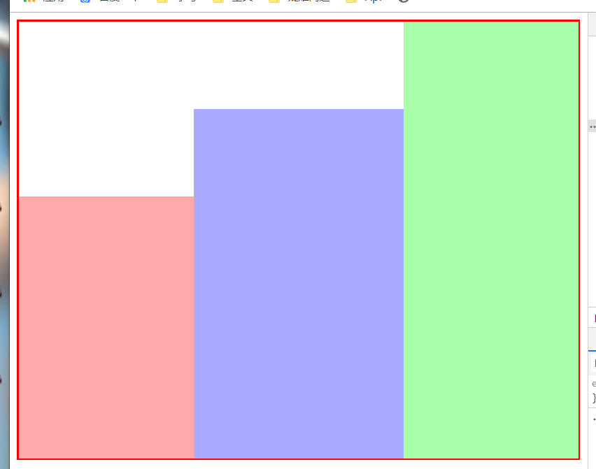
我们可以发现他是底部对齐的,只需改变他的对其方式即可。vertical-align: top;
.wrapper .left {

            display: inline-block;

            width: 200px;

            height: 300px;

            background: #faa;

            vertical-align: top;/*添加*/

        }

        .wrapper .right {

            display: inline-block;

            width: 200px;

            height: 500px;

            background: #afa;

            vertical-align: top;

        }

        .wrapper .content {

            width: calc(100% - 400px);

            display: inline-block;

            height: 400px;

            background-color: #aaf;

            vertical-align: top;

        }
结果:
3.采用flex布局
.wrapper {

            width: 100%;

            margin-bottom: 30px;

            border:2px solid red;

            box-sizing: border-box;

            display: flex;

        }

        .wrapper .left {

            width: 200px;

            height: 300px;

            background: #faa;

        }

        .wrapper .right {

            width: 200px;

            height: 500px;

            background: #afa;

        }

        .wrapper .content {

            flex:;

            height: 400px;

            background-color: #aaf;

        }
接下来就是大名鼎鼎的 圣杯布局 和 双飞翼布局了。
这两个布局非常重要,性能什么的都要比上面好很多,主要是为了让content内容区域优先加载。
1.圣杯布局
<!-- 圣杯布局 -->

    <div class="container">

        <div class="middle"></div>

        <div class="left"></div>

        <div class="right"></div>

    </div>
上面是html,发现了吧,middle写在最前面,这样网页在载入时,就会优先加载。
具体实现思路,通过给 container 左右固定的padding来预留出left和right的空间
看一下css部分:
.container {

            position: relative;;

            height: 300px;

            background: #ddd;

            padding: 0 300px 0;

        }

        .container .middle{

            float: left;

            width: 100%;

            height: 300px;

        }

        .container .left{

            float: left;

            position: relative;

            height: 300px;

            width: 300px;

            margin-left: -100%;

            left: -300px;

        }

        .container .right {

            float: left;

            position: relative;

            width: 300px;

            height: 300px;

            margin-left: -300px;

            left: 300px;

        }
所以内部元素都是左浮动的,主要区域宽度100%;
左侧区域通过margin-left:100%;使它浮动到左方,然后更具自身定位 left:-300px;将之移动到父容器的padding中
右侧同理,只不过只需要margin自己本身的宽度。
结果:左右固定宽度300px,中间自适应
2.双飞翼布局
双飞翼布局和圣杯差不多,主要是将padding换成了margin而且只需要包裹middle即可,
    <div class="container">

        <div class="middle"></div>

    </div>

    <div class="left"></div>

    <div class="right"></div>
css:
       .container{

            float: left;

            width: 100%;

            height: 300px;

            background: #ddd;

        }

        .container .middle{

            height: 300px;

            margin: 0 300px;

        }

        .left{

            float: left;

            position: relative;

            width: 300px;

            height: 300px;

            margin-left: -100%;

        }

        .right{

            float: left;

            position: relative;

            width: 300px;

            height: 300px;

            margin-left: -300px;

        }
差距不大,看代码就完事了。
最后,我们就可以自嗨了!
<!DOCTYPE html>
<html lang="en">
<head>
<meta charset="UTF-8">
<title>Document</title>
<style type="text/css">
* {
margin:0;
padding: 0;
}
.wrapper {
width: 100%;
display: flex;
}
.wrapper .left {
width: 200px;
height: 90vh;
background: #faa;
}
.wrapper .left .left-box {
width: 90%;
height: 120px;
margin: 30px auto;
background: #ff4;
}
.wrapper .left .left-box2 {
height: 50%;
}
.wrapper .right {
width: 200px;
height: 90vh;
background: #afa;
}
.wrapper .right .card {
width: 80%;
margin: 20px auto;
background-color: #f42
}
.wrapper .content {
flex: 1;
min-height: 90vh;
background: #aaf;
column-count: 3;
column-gap: 10px;
}
.wrapper .card {
width: 100%;
height: 100px;
background: #c44;
font-size: 18px;
text-align: center;
line-height: 100px;
margin:5px 0;
break-inside: avoid;
}
header,footer {
height: 5vh;
background: #424242;
}
h2 {
text-align: center;
color: #f8f8f8;
} @media screen and (max-width: 800px) {
.wrapper .content {
column-count: 2;
}
}
</style> </head>
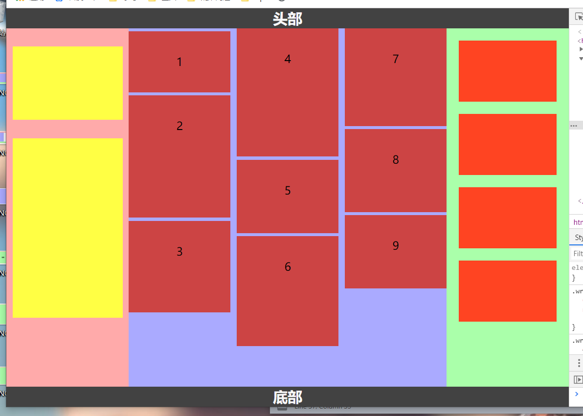
<body>
<!-- 头部 -->
<header><h2>头部</h2></header>
<div class="wrapper">
<div class="left">
<div class="left-box"></div>
<div class="left-box left-box2"></div>
</div>
<div class="content">
<div class="card" style="height: 100px">1</div>
<div class="card" style="height: 200px">2</div>
<div class="card" style="height: 150px">3</div>
<div class="card" style="height: 210px">4</div>
<div class="card" style="height: 120px">5</div>
<div class="card" style="height: 180px">6</div>
<div class="card" style="height: 160px">7</div>
<div class="card" style="height: 136px">8</div>
<div class="card" style="height: 120px">9</div>
</div>
<div class="right">
<div class="card"></div>
<div class="card"></div>
<div class="card"></div>
<div class="card"></div>
</div>
</div>
<footer><h2>底部</h2></footer>
</body>
</html>
CSS布局大全的更多相关文章
- [转]CSS hack大全&详解
转自:CSS hack大全&详解 1.什么是CSS hack? CSS hack是通过在CSS样式中加入一些特殊的符号,让不同的浏览器识别不同的符号(什么样的浏览器识别什么样的符号是有标准的, ...
- Html 之div+css布局之css基础
Css是什么 CSS即层叠样式表(Cascading StyleSheet). 在网页制作时采用层叠样式表技术,可以有效地对页面的布局.字体.颜色.背景和其它效果实现更加精确的控制. 只要对相应的代码 ...
- CSS Hack大全-教你如何区分出IE6-IE10、FireFox、Chrome、Opera
CSS Hack大全-教你如何区分出IE6-IE10.FireFox.Chrome.Opera 转载自:http://www.jb51.net/article/50116.htm 现在的浏览器IE6- ...
- HTML CSS 属性大全
CSS 属性大全 文字属性 「字体族科」(font-family),设定时,需考虑浏览器中有无该字体. 「字体大小」(font-size),注意度量单位.<绝对大小>|<相对大小&g ...
- CSS布局秘籍(2)-6脉神剑
HTML系列: 人人都懂的HTML基础知识-HTML教程(1) HTML元素大全(1) HTML元素大全(2)-表单 CSS系列: CSS基础知识筑基 常用CSS样式属性 CSS选择器大全48式 CS ...
- 界面设计技法之css布局
css布局之于页面就如同ECMAScript之于JS一般,细想一番,html就如同语文,css就如同数学,js呢,就是物理,有些扯远,这里就先不展开了. 回到主题,从最开始的css到如今的sass(l ...
- CSS布局 - 三栏布局
CSS布局技术可谓是前端技术中最基础的技术,就是因为基础,所以我认为要更加熟练,深入的去掌握,去梳理. 一. 传统 ---> 浮动实现的三栏布局 采用浮动实现的三栏布局有以下特点及注意事项: · ...
- DIV+CSS布局中主要CSS属性介绍
Float: Float属性是DIV+CSS布局中最基本也是最常用的属性,用于实现多列功能,我们知道<div>标签默认一行只能显示一个,而使用Float属性可以实现一行显示多个div的功能 ...
- CSS 布局
近日开发中,总感觉页面布局方面力不从心.以前也曾学过这方面的内容,但是不够系统,因此我打算整理一下. 在web 页面中一般有 table 和 css+div 两种布局方式. 其中css+div 又分为 ...
随机推荐
- Linux下汇编语言学习笔记47 ---
这是17年暑假学习Linux汇编语言的笔记记录,参考书目为清华大学出版社 Jeff Duntemann著 梁晓辉译<汇编语言基于Linux环境>的书,喜欢看原版书的同学可以看<Ass ...
- js数组转换成json串 (JSON.stringify)
例如: var giftlist[1490011777] = []; giftlist[1490011777]['id'] = 1490011777; giftlist[1490011777]['na ...
- JSP中HTTP状态码
以下内容引用自http://wiki.jikexueyuan.com/project/jsp/http-status-codes.html: HTTP请求格式和HTTP响应消息的格式一样,都有以下结构 ...
- 使用spark 计算netflow数据初探
spark是一个高性能的并发的计算平台,而netflow是一种一般来说数量级很大的数据.本文记录初步使用spark 计算netflow数据的大致过程. 本文包括以下过程: 1. spark环境的搭建 ...
- pydevd 一次trouble shooting
只是一次小的trouble shooting. 關於python的遠程調試功能.但是由於思路混亂.浪費了許多時間,記錄一下整個過程.作爲改進的參考. 问题背景: 我之前一直在ubuntu上用pycha ...
- angularJS 系列(七)
In AngularJS 1.3+, there is One-time binding built-in: The main purpose of one-time binding expressi ...
- Hadoop 执行过程中出现 name node is in safe mode 问题
解决方法: 1.进入hadoop安装根目录 如 :我的hadoop 安装在/usr/local/hadoop 执行 cd /usr/local/hadoop bin/hadoop dfsadmin - ...
- activiti自己定义流程之Spring整合activiti-modeler5.16实例(四):部署流程定义
注:(1)环境搭建:activiti自己定义流程之Spring整合activiti-modeler5.16实例(一):环境搭建 (2)创建流程模型:activiti自己定义流程之Spr ...
- ATM取款机模拟——数据结构课设
今天帮人写的第二篇课设 . ;-) 机智的窝 要求:大概说一下吧,就是要创建一个用户(初始化一账户),模拟ATM的业务(取款,100的整数倍,改密 码,查剩余金额.等等,各 ...
- redis 事务 及发布于订阅功能
事务: Redis事务可以一次执行多个命令,事务具有以下特征: 1.隔离操作:事务中的所有命令都会序列化.按顺序地执行,不会被其他命令打扰. 2.原子操作:事务中的命令要么全部被执行,要么全部都不执行 ...