Css3案例
<!DOCTYPE html>
<html>
<meta charset=utf->
<head>
<style>
body{
backgound:#f9f9f9;
}
.img{
position: absolute;
width: 300px;
height: 200px;
border:10px solid #ccc;
overflow:hidden; }
.img img{
width:%;
height:%;
transition:all .3s ease;
}
.img:hover img{
-webkit-transform:scale(1.5);
}
.back{
z-index:;
background-color: rgba(,,, );
position: absolute;
top: ;
left: ;
height:%;
text-align: center;
color: #;
-webkit-transition:all .5s ease; }
.back h2{
text-align:center;
color:#;
-webkit-transition:all .5s ease;
background-color: rgba(,,, 0.5);
height:30px;
position: relative;
top: -55px;
}
.back p{
position: relative;
bottom: -130px;
-webkit-transition:all .5s ease;
} .back:hover h2{
text-align:center;
color:#fff;
top:;
} .back:hover p{
text-align:center;
color:#fff;
bottom:;
} .info{
background-color: rgba(,,,.);
padding:5px;
color:#fff;
text-decoration: none;
-ms-filter: "progid: DXImageTransform.Microsoft.Alpha(Opacity=0)";
filter: alpha(opacity=);
opacity: ; -webkit-transition: all .2s ease-in-out;
-moz-transition: all .2s ease-in-out;
-o-transition: all .2s ease-in-out;
-ms-transition: all .2s ease-in-out;
transition: all .2s ease-in-out;
}
.back:hover a{
-ms-filter: "progid: DXImageTransform.Microsoft.Alpha(Opacity=100)";
filter: alpha(opacity=);
opacity: ;
-webkit-transform: translateY(0px);
-moz-transform: translateY(0px);
-o-transform: translateY(0px);
-ms-transform: translateY(0px);
transform: translateY(0px);
} .back:hover{
background-color: rgba(,,,.);
} </style>
</head>
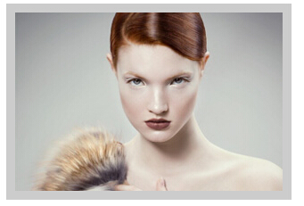
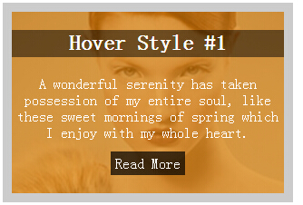
<body> <div class="img"> <img src="1.jpg">
<div class="back">
<h2>Hover Style #</h2>
<p>A wonderful serenity has taken possession of my entire soul, like these sweet mornings of spring which I enjoy with my whole heart.</p>
<a href="#" class="info">Read More</a>
</div> </div> </body>
</html>
<!DOCTYPE html>
<html>
<meta charset=utf->
<head>
<style>
body{
backgound:#f9f9f9;
}
.view {
width: 300px;
height: 200px;
margin: 10px;
float: left;
border: 10px solid #fff;
overflow: hidden;
position: relative;
text-align: center;
-webkit-box-shadow: 2px 1px 5px #ccc;
-moz-box-shadow: 2px 1px 5px #ccc;
box-shadow: 2px 1px 5px #ccc;
cursor: default;
background: #fff;
} .mask{
width: 360px;
height: 470px;
background: rgba(,,, 0.7);
position: absolute;
top: 0px;
left: 0px;
-webkit-transition: all .2s ease-in-out;
-moz-transition: all .2s ease-in-out;
-o-transition: all .2s ease-in-out;
-ms-transition: all .2s ease-in-out;
transition: all .2s ease-in-out;
transform: translate(265px, 145px) rotate(45deg); } .view:hover .mask{ left: -249px;
top: -313px; }
.content{
position:absolute;
top:;
left:;
width:%;
height:%;
z-index:;
}
.content h2{
position: absolute;
top: -80px;
width: %;
right: -310px;
color:#fff;
transition: all .2s ease-in-out;
} .content:hover h2{
top:;
left:;
}
.content p{
position: absolute;
width: %;
bottom: -100px;
color:#fff;
right: -319px;
transition: all .5s ease-in-out;
} .content:hover p{
bottom:;
left:;
}
.info{
text-decoration: none;
color:#fff;
background: rgba(, , , 0.8);
padding:10px;
position: relative;
top: -40px;
transition: all .9s ease-in-out;
} .vide:hover a{
top:60px; } </style>
</head>
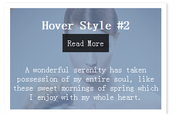
<body> <div class="view view-second">
<img src="1.jpg"> <div class="mask"></div> <div class="content vide">
<h2>Hover Style #</h2>
<p>A wonderful serenity has taken possession of my entire soul, like these sweet mornings of spring which I enjoy with my whole heart.</p>
<a href="#" class="info">Read More</a>
</div> </div> </body>
</html>
Css3案例的更多相关文章
- 15款HTML5/CSS3案例展示,导航,日历,钟表。
对于前端开发者来说,分享一些优秀的HTML5应用可以直接拿来用,更重要的是可以激发创作的灵感.今天我们要分享9款精挑细选的HTML5应用,个个都是干货. 1.HTML5/CSS3滑块动画菜单 图标动画 ...
- CSS3实战开发 表单发光特效实战开发
首先,我们先准备好html代码: <!doctype html> <html> <head> <meta charset="utf-8"& ...
- css3 鼠标悬浮动画效果
CSS3案例 <!DOCTYPE html> <html> <head> <meta charset="UTF-8"> <ti ...
- 纯CSS仿windows系统loading效果
今天分享的css3案例模仿了window系统下的loading效果里面最关键的地方使用了css3 animation的delay属性以及贝塞尔曲线(cubic-bezier)的过渡效果,如下所示 sp ...
- Web前端业界氛围极好的群——鬼懿IT
鬼群简介 鬼懿IT主群号:,鬼懿IT-成长群:181368696 , 创建于2005年12月 ,聚集的业内人事包括:阿当,大漠,辣妈,崔凯,Rei,周裕波,司徒正美,丸子,鬼森林,寒冬,franky, ...
- JS 经验总结
1.IE中div的高度是content+padding+border之和,其它的是content的高度 2.一个标签里面只有一个属性,class='cls1 cls2' 3.同一页面不能出现相同的id ...
- 国外优秀的UI设计资源库收集
国外优秀的UI设计资源库 网站设计或者说UI设计对于Web上的运用是非常的关键,一个站做得好不好,能不能吸引人的眼球,设计占了不低的地位,但话又说回来,Web前端人员又有多少人是设计专业毕业,具有这方 ...
- CSS3选择器的研究,案例
在上一篇CSS3选择器的研究中列出了几乎所有的CSS3选择器,和伪类选择器,当是并没有做案例的研究,本想在那篇文章里面写,但想想如果把案例都写在那篇文章里面,对于查找来说就不是很方便,所有另开一篇来讲 ...
- 12个学习 CSS3 网站布局设计的优秀案例
网络上有很多的 CSS 画廊站点供大家对各类网站作品进行打分和评论,每天有数以百计的优秀网站被推荐上面,这对于网页设计师来说是很好的灵感来源.今天,我们选择了15赢得 CSS 设计大奖的优秀作品,帮助 ...
随机推荐
- (step5.1.2)hdu 2473(Junk-Mail Filter——并查集)
题目大意:输入两个整数n,m(n表示点的个数,m表示操作数).在接下来的m行中,对点的操作有两种 1)M a b . 表示将a.b并到一个集合中 2)S a .表示将a从原来的集合中去除,而成为一个单 ...
- HBase HTablePool
Instead of creating an HTable instance for every request from your client application, it makes much ...
- java排序算法-归并排序
public class MergeSort { private static void mergeSortTest() { int[] in = { 2, 5, 3, 8, 6, 7, 1, 4, ...
- oracle for update和for update nowait
原文地址:http://www.cnblogs.com/quanweiru/archive/2012/11/09/2762223.html 1.for update 和 for update nowa ...
- web前端面试试题总结---javascript篇
JavaScript 介绍js的基本数据类型. Undefined.Null.Boolean.Number.String. ECMAScript 2015 新增:Symbol(创建后独一无二且不可变的 ...
- UVa 10617 Again Palindromes / 记忆化搜索
删除若干个字母后 剩下的是回文串 求有多少个 记忆化搜索 dp[i][j]表示i j 之间有多少个 其实递推也可以的 long long #include <stdio.h> #inclu ...
- myeclipse 于 否update software 解
In some situations you may not be able to install or update software using the menu commands in the ...
- Ubuntu安装分区设置
我的Ubuntu 安装分区 /boot 200M / 2000M /home 6000M swap 1000M /boot分区,它包含了操作系统的内核和在启动系统过程中所 ...
- ANDROID内存优化(大汇总——上)
转载请注明本文出自大苞米的博客(http://blog.csdn.net/a396901990),谢谢支持! 写在最前: 本文的思路主要借鉴了2014年AnDevCon开发者大会的一个演讲PPT,加上 ...
- Java基础知识强化90:Date类之Data类中日期和毫秒相互转换
1.Date两个方法: public long getTime():获取时间,以毫秒为单位 public void setTime(long time):设置时间 2. 代码示例: package c ...