32、详解Android shape的使用方法(转载)
0、java绘制shape
在官方API介绍中:
ShapeDrawable:This object can be defined in an XML file with the <shape> element(这个对象可以用<shape>元素在xml文件中定义)
GradientDrawable:This object can be defined in an XML file with the <shape> element(这个对象可以用<shape>元素在xml文件中定义)
[父节点] shape -- ShapeDrawable
[子节点] gradient --
[子节点] padding --
[子节点] corners -- setCornerRadius 、setCornerRadii
[子节点] solid --
[子节点] stroke -- setStroke
[子节点] size -- setSize
1、概述
gradient -- 对应颜色渐变。 startcolor、endcolor就不多说了。 android:angle 是指从哪个角度开始变。
solid -- 填充。
stroke -- 描边。
corners -- 圆角。
padding -- 定义内容离边界的距离。 与android:padding_left、android:padding_right这些是一个道理。
 <?xml version="1.0" encoding="utf-8"?>

 <shape

     xmlns:android="http://schemas.android.com/apk/res/android"

     android:shape=["rectangle" | "oval" | "line" | "ring"]      //共有4种类型,矩形(默认)/椭圆形/直线形/环形

     // 以下4个属性只有当类型为环形时才有效

     android:innerRadius="dimension"     //内环半径

     android:innerRadiusRatio="float"    //内环半径相对于环的宽度的比例,比如环的宽度为50,比例为2.5,那么内环半径为20

     android:thickness="dimension"   //环的厚度

     android:thicknessRatio="float"     //环的厚度相对于环的宽度的比例

     android:useLevel="boolean">    //如果当做是LevelListDrawable使用时值为true,否则为false.

     <corners    //定义圆角

         android:radius="dimension"      //全部的圆角半径

         android:topLeftRadius="dimension"   //左上角的圆角半径

         android:topRightRadius="dimension"  //右上角的圆角半径

         android:bottomLeftRadius="dimension"    //左下角的圆角半径

         android:bottomRightRadius="dimension" />    //右下角的圆角半径

     <gradient   //定义渐变效果

         android:type=["linear" | "radial" | "sweep"]    //共有3中渐变类型,线性渐变(默认)/放射渐变/扫描式渐变

         android:angle="integer"     //渐变角度,必须为45的倍数,0为从左到右,90为从上到下

         android:centerX="float"     //渐变中心X的相当位置,范围为0~1

         android:centerY="float"     //渐变中心Y的相当位置,范围为0~1

         android:startColor="color"      //渐变开始点的颜色

         android:centerColor="color"     //渐变中间点的颜色,在开始与结束点之间

         android:endColor="color"    //渐变结束点的颜色

         android:gradientRadius="float"  //渐变的半径,只有当渐变类型为radial时才能使用

         android:useLevel=["true" | "false"] />  //使用LevelListDrawable时就要设置为true。设为false时才有渐变效果

     <padding    //内部边距

         android:left="dimension"

         android:top="dimension"

         android:right="dimension"

         android:bottom="dimension" />

     <size   //自定义的图形大小

         android:width="dimension"

         android:height="dimension" />

     <solid  //内部填充颜色

         android:color="color" />

     <stroke     //描边

         android:width="dimension"   //描边的宽度

         android:color="color"   //描边的颜色

         // 以下两个属性设置虚线

         android:dashWidth="dimension"   //虚线的宽度,值为0时是实线

         android:dashGap="dimension" />      //虚线的间隔

 </shape>
2、圆角矩形,扫描式渐变
 <?xml version="1.0" encoding="utf-8"?>

 <shape

     xmlns:android="http://schemas.android.com/apk/res/android"

     android:shape="rectangle"

     android:useLevel="false" >

     <corners

         android:topLeftRadius="10dp"

         android:topRightRadius="10dp"

         android:bottomLeftRadius="10dp"

         android:bottomRightRadius="10dp" />

     <gradient

         android:type="sweep"

         android:endColor="@android:color/holo_blue_bright"

         android:startColor="@android:color/holo_green_dark"

         android:centerColor="@android:color/holo_blue_dark"

         android:useLevel="false" />

     <size android:width="60dp" android:height="60dp" />

 </shape>

2、 圆形,线性渐变
 <?xml version="1.0" encoding="utf-8"?>

 <shape

     xmlns:android="http://schemas.android.com/apk/res/android"

     android:shape="oval"

     android:useLevel="false" >

     <gradient

         android:type="linear"

         android:angle="45"

         android:startColor="@android:color/holo_green_dark"

         android:centerColor="@android:color/holo_blue_dark"

         android:endColor="@android:color/holo_red_dark"

         android:useLevel="false" />

     <size android:width="60dp" android:height="60dp" />

     <stroke android:width="1dp"

         android:color="@android:color/white" />

 </shape>

3、虚线
 <?xml version="1.0" encoding="utf-8"?>

 <shape

     xmlns:android="http://schemas.android.com/apk/res/android"

     android:shape="line" >

     <size android:width="60dp"

         android:height="60dp" />

     <stroke android:width="2dp"

         android:color="@android:color/holo_purple"

         android:dashWidth="10dp"

         android:dashGap="5dp" />

 </shape>

4、 环形,放射型渐变
 <?xml version="1.0" encoding="utf-8"?>

 <shape

     xmlns:android="http://schemas.android.com/apk/res/android"

     android:shape="ring"

     android:useLevel="false"

     android:innerRadius="40dp"

     android:thickness="3dp">

     <gradient android:type="radial"

         android:gradientRadius="150"

         android:centerY="0.1"

         android:centerX="0.2"

         android:startColor="@android:color/holo_red_dark"

         android:centerColor="@android:color/holo_green_dark"

         android:endColor="@android:color/white" />

     <size android:width="90dp"

         android:height="90dp" />

 </shape>

5、demo
- <Button
- android:layout_width="wrap_content"
- android:layout_height="wrap_content"
- android:text="TestShapeButton"
- android:background="@drawable/button_selector"
- />
button_selector.xml:
- <?xml version="1.0" encoding="utf-8"?>
- <selector
- xmlns:android="http://schemas.android.com/apk/res/android">
- <item android:state_pressed="true" >
- <shape>
- <!-- 渐变 -->
- <gradient
- android:startColor="#ff8c00"
- android:endColor="#FFFFFF"
- android:type="radial"
- android:gradientRadius="50" />
- <!-- 描边 -->
- <stroke
- android:width="2dp"
- android:color="#dcdcdc"
- android:dashWidth="5dp"
- android:dashGap="3dp" />
- <!-- 圆角 -->
- <corners
- android:radius="2dp" />
- <padding
- android:left="10dp"
- android:top="10dp"
- android:right="10dp"
- android:bottom="10dp" />
- </shape>
- </item>
- <item android:state_focused="true" >
- <shape>
- <gradient
- android:startColor="#ffc2b7"
- android:endColor="#ffc2b7"
- android:angle="270" />
- <stroke
- android:width="2dp"
- android:color="#dcdcdc" />
- <corners
- android:radius="2dp" />
- <padding
- android:left="10dp"
- android:top="10dp"
- android:right="10dp"
- android:bottom="10dp" />
- </shape>
- </item>
- <item>
- <shape>
- <solid android:color="#ff9d77"/>
- <stroke
- android:width="2dp"
- android:color="#fad3cf" />
- <corners
- android:topRightRadius="5dp"
- android:bottomLeftRadius="5dp"
- android:topLeftRadius="0dp"
- android:bottomRightRadius="0dp"
- />
- <padding
- android:left="10dp"
- android:top="10dp"
- android:right="10dp"
- android:bottom="10dp" />
- </shape>
- </item>
- </selector>
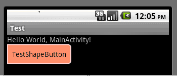
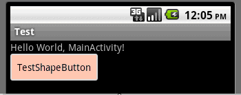
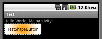
运行效果如下图:
一般状态:
获得焦点状态:
按下状态:
6、官方资料
<shape>
Basic method for drawing shapes via XML.
Attributes
| Name | Type | Default | Description |
|---|---|---|---|
| visible | boolean | parent|true | Determines if drawable is visible. |
| shape | enum (rectangle, oval, line, ring) | rectangle | Determines the shape: rectangle (shape is a rectangle, possibly with rounded corners); oval (shape is an ellipse); line (shape is a line); ring (shape is a ring). |
| innerRadiusRatio | float | 3.0 | Only valid if shape == 'ring'. Inner radius of the ring expressed as a ratio of the ring's width. For instance, if innerRadiusRatio=3, then the inner radius equals the ring's width divided by 3. This value is ignored if innerRadius is defined. |
| innerRadius | float | -1 | Only valid if shape == 'ring'. Inner radius of the ring. When defined, innerRadiusRatio is ignored. When undefined, innerRadiusRatio's default is used. |
| thicknessRatio | float | 9.0 | Only valid if shape == 'ring'. Thickness of the ring expressed as a ratio of the ring's width. For instance, if thicknessRatio=9, then the thickness equals the ring's width divided by 9. This value is ignored if thickness is defined. Default value is 9. |
| thickness | float | -1 | Only valid if shape == 'ring'. Thickness of the ring. When defined, thicknessRatio is ignored. When undefined, thicknessRatio's default is used. |
| useLevel | boolean | true | Only valid if shape == 'ring'. Allows one to draw only part of the ring (arc-wise), by modifying the drawable's level. This setting only makes sense in context of a <level-list> (LevelListDrawable). |
Children
| Element | Description |
|---|---|
| <size> | Determines the size of the shape. |
| <gradient> | Adds a background gradient to the shape. |
| <solid> | Adds a solid background color to the shape. Overides gradient element. |
| <stroke> | Adds a border to the shape. |
| <corners> | Adds rounded corners to the shape. |
| <padding> | The padding for the content within this drawable. (Does not pad graphics in any way.) |
<size>
Determines the size of the shape.
Attributes
| Name | Type | Default | Description |
|---|---|---|---|
| width | dimension | -1 | Width of the shape. |
| height | dimension | -1 | Height of the shape. |
<gradient>
Adds a background gradient to the shape.
Attributes
| Name | Type | Default | Description |
|---|---|---|---|
| startColor | color | 0 | The color at the start of the gradient. |
| centerColor | color | 0 | The color in the center of the gradient. Optional; if not included, there is no center color. |
| endColor | color | 0 | The color at the end of the gradient. |
| type | enum (linear, radial, sweep) | linear | Determines the type of gradient. |
| centerX | float|fraction | .5 | Determines the location of the centerColor. Ranges from 0 to 1. Ignored if centerColor is undefined. |
| centerY | float|fraction | .5 | Determines the location of the centerColor. Ranges from 0 to 1. Ignored if centerColor is undefined. |
| angle | float | 0 | Only valid if type == 'linear'. Determines the angle of a linear gradient. Must be a multiple of 45 degrees. |
| gradientRadius | float|fraction | N/A | Only valid if type == 'radial' or 'sweep'. Required if type == 'radial'. Determines the radius of the gradient. |
| useLevel | boolean | false | Determines the amount of the gradient to be drawn, based on the level of the shape. Affects all three gradient types. |
<solid>
Adds a solid background color to the shape. Overides gradient element.
Attributes
| Name | Type | Default | Description |
|---|---|---|---|
| color | color | 0 | The color of the background. |
<stroke>
Adds a border to the shape.
Attributes
| Name | Type | Default | Description |
|---|---|---|---|
| width | dimension | 0 | The width of the stroke. |
| color | color | 0 | The color of the stroke. |
| dashWidth | dimension | 0 | The width of each dash. Ignored unless dashGap is also defined. |
| dashGap | dimension | 0 | The width of gaps between eahc dash. Ignored unless dashWidth is also defined. |
<corners>
Adds rounded corners to the shape.
Attributes
| Name | Type | Default | Description |
|---|---|---|---|
| radius | dimension | 0 | The radius of every corner. |
| topLeftRadius | dimension | radius | Determines the radius of the top left corner. Ignored unless radius for all corners is defined, either through 'radius' or the other corners' attributes. |
| topRightRadius | dimension | radius | Determines the radius of the top right corner. Ignored unless radius for all corners is defined, either through 'radius' or the other corners' attributes. |
| bottomLeftRadius | dimension | radius | Determines the radius of the bottom left corner (buggy; is actually bottom right corner). Ignored unless radius for all corners is defined, either through 'radius' or the other corners' attributes. |
| bottomRightRadius | dimension | radius | Determines the radius of the bottom right corner (buggy; is actually bottom left corner). Ignored unless radius for all corners is defined, either through 'radius' or the other corners' attributes. |
<padding>
The padding for the content within this drawable. (Does not pad graphics in any way.)
Attributes
| Name | Type | Default | Description |
|---|---|---|---|
| left | dimension | 0 | Left padding. |
| top | dimension | 0 | Top padding. |
| right | dimension | 0 | Right padding. |
| bottom | dimension | 0 | Bottom padding. |
32、详解Android shape的使用方法(转载)的更多相关文章
- (转载)实例详解Android快速开发工具类总结
实例详解Android快速开发工具类总结 作者:LiJinlun 字体:[增加 减小] 类型:转载 时间:2016-01-24我要评论 这篇文章主要介绍了实例详解Android快速开发工具类总结的相关 ...
- 详解Android首选项框架ListPreference
详解Android首选项框架ListPreference 原文地址 探索首选项框架 在深入探讨Android的首选项框架之前,首先构想一个需要使用首选项的场景,然后分析如何实现这一场景.假设你正在编写 ...
- 详解Android Activity---启动模式
相关的基本概念: 1.任务栈(Task) 若干个Activity的集合的栈表示一个Task. 栈不仅仅只包含自身程序的Activity,它也可以跨应用包含其他应用的Activity,这样有利于 ...
- Android Binder IPC详解-Android学习之旅(96)
linux内存空间与BInder Driver Android进程和linux进程一样,他们只运行在进程固有的虚拟空间中.一个4GB的虚拟地址空间,其中3GB是用户空间,1GB是内核空间 ,用户空间是 ...
- 分区工具parted的详解及常用分区使用方法【转】
来源:http://blog.51cto.com/zhangmingqian/1068779 分区工具parted的详解及常用分区使用方法 一. parted的用途及说明 概括使用说明 ...
- 图文详解 Android Binder跨进程通信机制 原理
图文详解 Android Binder跨进程通信机制 原理 目录 目录 1. Binder到底是什么? 中文即 粘合剂,意思为粘合了两个不同的进程 网上有很多对Binder的定义,但都说不清楚:Bin ...
- 详解Android Activity启动模式
相关的基本概念: 1.任务栈(Task) 若干个Activity的集合的栈表示一个Task. 栈不仅仅只包含自身程序的Activity,它也可以跨应用包含其他应用的Activity,这样有利于 ...
- 个人用户永久免费,可自动升级版Excel插件,使用VSTO开发,Excel催化剂安装过程详解及安装失败解决方法
因Excel催化剂用了VSTO的开发技术,并且为了最好的用户体验,用了Clickonce的布署方式(无需人工干预自动更新,让用户使用如浏览器访问网站一般,永远是最新的内容和功能).对安装过程有一定的难 ...
- 详解android:scaleType属性
详解android:scaleType属性 转自:http://blog.csdn.net/encienqi/article/details/7913262 http://juliaailse. ...
随机推荐
- 开发环境中快速部署Oracle Essbase(Rapid deployment of oracle essbase in development envrioments)
版本:Oracle Enterprise Performance Management System Release11.1.2.4 快速部署自动安装组件: Essbase Oracle Essbas ...
- Linux、命令ps 各字段意思
参数: -A :所有的进程均显示出来,与 -e 具有同样的效用: -a : 显示现行终端机下的所有进程,包括其他用户的进程: -u :以用户为主的进程状态 : x :通常与 a 这个参数一起使用,可列 ...
- 如何修改HDFS上文件
如果只想append操作: . echo "<Text to append>" | hdfs dfs -appendToFile - yourHdfsPath/test ...
- Sqlserver列出所有数据库名,表名,字段名【转】
1.获取所有数据库名: SELECT Name FROM Master..SysDatabases ORDER BY Name 注意: 表Master与SysDatabases之间有两个点 2.获取所 ...
- iphone开发笔记
1.uiimage图片拉伸 - (void)stretchBackgroundImage { //UIImage *originalImage = [[self backgroundImageForS ...
- scrum敏捷开发☞
scrum是什么?说白了就是自带一些规则的工具,团队成员按照scrum的规则计划项目,执行项目,完成项目..可以让团队提高工作效率 当前除了scrum还有其他很多类似的像Kanban,XP,RUP(规 ...
- innobackupex备份脚本
#!/bin/bash # 10 23 * * * /bin/bash /data/script/backup.sh BDATE=`date +%Y%m%d%H%M%S`BPATH=/data/bac ...
- bzoj3312: [Usaco2013 Nov]No Change
题意: K个硬币,要买N个物品.K<=16,N<=1e5 给定买的顺序,即按顺序必须是一路买过去,当选定买的东西物品序列后,付出钱后,货主是不会找零钱的.现希望买完所需要的东西后,留下的钱 ...
- 关于SIGSEGV错误及处理方法
http://blog.csdn.net/brace/article/details/1102422 今天编程遇到了SIGSEGV错误,比较困惑,所以找了些资料,总结一下: (1)官方说法是: SIG ...
- python_43_移动文件指针补充
#移动文件指针补充 ''' 文件对象.seek((offset,where)) offset:移动的偏移量,单位为字节.等于正数时向文件尾方向移动,等于负数时向文件头方向移动文件指针 where:指针 ...