ggplot2绘制概率密度图
以下绘图以Weibull分布(韦伯分布、威布尔分布)为例
关于Weibull分布(韦伯分布、威布尔分布),请参考本人博客http://www.cnblogs.com/wwxbi/p/6141501.html
library(ggplot2)

# 这里的d和y都有大小顺序

d<- seq(0, 5, length.out=10000)

y<-dweibull(d, shape=5, scale=1, log = FALSE)

df<-data.frame(x=d,y)

ggplot(df,aes(x=d,y))+

  geom_line(colour="green")+

  ggtitle("Weibull distribution \n 概率密度图")

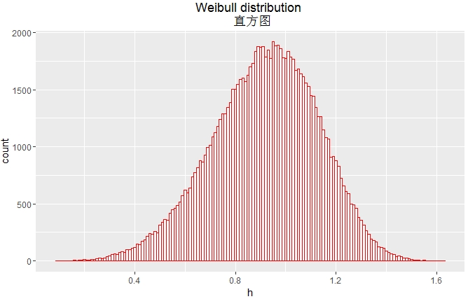
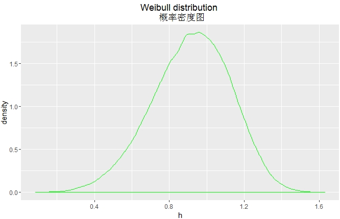
# 这里的h没有大小顺序

h <- rweibull(100000, shape=5, scale=1)

ggplot(NULL,aes(x=h))+

  geom_histogram(binwidth = 0.01,fill="white",colour="red")+

  ggtitle("Weibull distribution \n 直方图")
ggplot(NULL,aes(x=h))+

  geom_density(colour="green")+

  ggtitle("Weibull distribution \n 概率密度图")

ggplot(NULL,aes(x=h))+

  geom_line(stat="density",colour="green")+

  ggtitle("Weibull distribution \n 概率密度图")
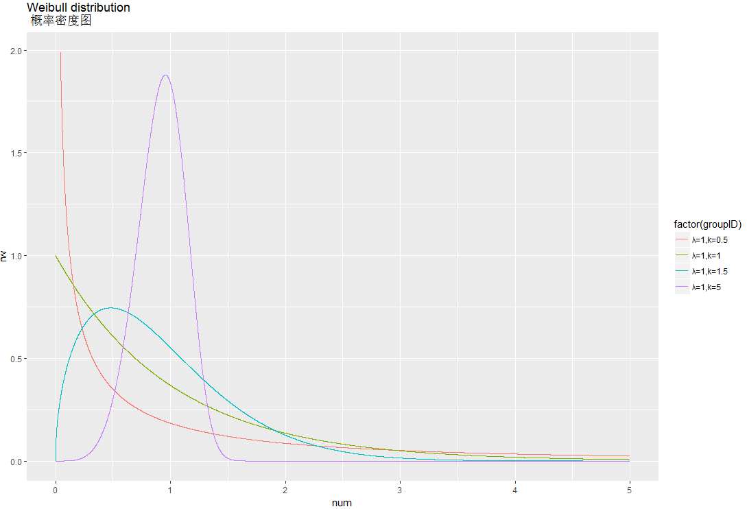
library(sqldf)

library(ggplot2)

d<- seq(0, 5, length.out=10000)

df1<-data.frame(num=seq(0,5,length=10000),groupID="λ=1,k=0.5",rw=dweibull(d, scale=1,shape=0.5 ))

df2<-data.frame(num=seq(0,5,length=10000),groupID="λ=1,k=1",rw=dweibull(d, scale=1,shape=1 ))

df3<-data.frame(num=seq(0,5,length=10000),groupID="λ=1,k=1.5",rw=dweibull(d, scale=1,shape=1.5 ))

df4<-data.frame(num=seq(0,5,length=10000),groupID="λ=1,k=5",rw=dweibull(d, scale=1,shape=5 ))

df5<-sqldf("

           select num,groupID,rw from df1

           union all

           select num,groupID,rw from df2

           union all

           select num,groupID,rw from df3

           union all

           select num,groupID,rw from df4 ")

df<-subset(df5, rw <2 )

ggplot(df,aes(x=num,y=rw,group=factor(groupID),colour=factor(groupID)))+

  geom_line()+

  ggtitle("Weibull distribution \n 概率密度图")
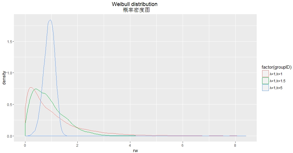
library(sqldf)

library(ggplot2)

df2<-data.frame(num=seq(0,5,length=10000),groupID="λ=1,k=1",rw=rweibull(10000, scale=1,shape=1 ))

df3<-data.frame(num=seq(0,5,length=10000),groupID="λ=1,k=1.5",rw=rweibull(10000, scale=1,shape=1.5 ))

df4<-data.frame(num=seq(0,5,length=10000),groupID="λ=1,k=5",rw=rweibull(10000, scale=1,shape=5 ))

df<-sqldf("

          select num,groupID,rw from df2

          union all

          select num,groupID,rw from df3

          union all

          select num,groupID,rw from df4 ")

ggplot(df,aes(x=rw,group=factor(groupID),colour=factor(groupID)))+

  geom_density()+

  ggtitle("Weibull distribution \n 概率密度图")
library(sqldf)
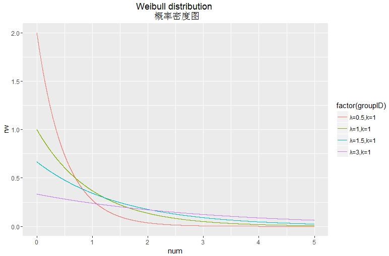
library(ggplot2) d<- seq(0, 5, length.out=10000)
df1<-data.frame(num=seq(0,5,length=10000),groupID="λ=0.5,k=1",rw=dweibull(d, scale=0.5,shape=1 ))
df2<-data.frame(num=seq(0,5,length=10000),groupID="λ=1,k=1",rw=dweibull(d, scale=1,shape=1 ))
df3<-data.frame(num=seq(0,5,length=10000),groupID="λ=1.5,k=1",rw=dweibull(d, scale=1.5,shape=1 ))
df4<-data.frame(num=seq(0,5,length=10000),groupID="λ=3,k=1",rw=dweibull(d, scale=3,shape=1 )) df5<-sqldf("
select num,groupID,rw from df1
union all
select num,groupID,rw from df2
union all
select num,groupID,rw from df3
union all
select num,groupID,rw from df4 ") df<-df5 ggplot(df,aes(x=num,y=rw,group=factor(groupID),colour=factor(groupID)))+
geom_line()+
ggtitle("Weibull distribution \n 概率密度图")
ggplot2绘制概率密度图的更多相关文章
- ggplot2绘制多图
参考链接:http://www.cnblogs.com/nxld/p/6065237.html ggplot2.multiplot是一个易于使用的功能,将多个图形在同一页面上使用R统计软件和GGPLO ...
- R绘图 第六篇:绘制线图(ggplot2)
线图是由折线构成的图形,线图是把散点从左向右用直线连接起来而构成的图形,在以时间序列为x轴的线图中,可以看到数据增长的趋势. geom_line(mapping = NULL, data = NULL ...
- R-forestplot包| HR结果绘制森林图
本文首发于“生信补给站”微信公众号,https://mp.weixin.qq.com/s/2W1W-8JKTM4S4nml3VF51w 更多关于R语言,ggplot2绘图,生信分析的内容,敬请关注小号 ...
- R绘制韦恩图 | Venn图
解决方案有好几种: 网页版,无脑绘图,就是麻烦,没有写代码方便 极简版,gplots::venn 文艺版,venneuler,不好安装rJava,参见Y叔 酷炫版,VennDiagram 特别注意: ...
- 用canvas绘制折线图
<!DOCTYPE html> <html lang="en"> <head> <meta charset="UTF-8&quo ...
- php中用GD绘制折线图
php中用GD绘制折线图,代码如下: Class Chart{ private $image; // 定义图像 private $title; // 定义标题 private $ydata; // 定 ...
- 使用Canvas绘制背景图
原文 http://www.imququ.com/post/use-canvas-as-background-image.html 最近iCloud Web的Beta版换了UI,整体风格变得和iOS ...
- Excel应该这么玩——7、我是预言家:绘制趋势图
让我们先看一个场景:你是公司销售部的员工,你手里有公司最近几年的销售额相关的数据,经理希望你预测下个月的销售额.盯着一堆数据,你或许会想到画一张XY坐标图,然后将每个月份的销售额标定为一个坐标.但是下 ...
- 使用Excel 2007绘制甘特图
本文将教大家如何使用Excel 2007制作甘特图.Excel并未提供甘特图类型,但还是可以绘制甘特图的,方法就是通过对堆积条形图类型进行自定义,使之显示任务.任务工期和层次结构. 下面的过程可帮助创 ...
随机推荐
- Lua基础语法讲解
Lua 是什么? Lua 是一种轻量小巧的脚本语言,用标准C语言编写并以源代码形式开放, 其设计目的是为了嵌入应用程序中,从而为应用程序提供灵活的扩展和定制功能. Lua 是巴西里约热内卢天主教大学( ...
- windows 下为Python安装redis
最近在看<redis实战>,里面的redis示例都是Python写的,先将环境整好 启动redis redis-server.exe redis.conf 安装了python2.7 安装 ...
- 针对降质模型中的模糊SR
(PDF) Deep Plug-and-Play Super-Resolution for Arbitrary Blur Kernels https://www.researchgate.net/pu ...
- Apache伪静态配置,支持.htaccess配置方法
第一.编辑httpd.conf文件 A - 在etc/httpd/conf/目录下的httpd.conf 文件,找到: LoadModule rewrite_module modules/mod_re ...
- Extended VM Disk In VirtualBox or VMware (虚拟机磁盘扩容)
First, Clean VM all snapshot, and poweroff your VM. vmdk: vmware-vdiskmanager -x 16GB myDisk.vmdk vd ...
- hadoop的Map阶段的四大步骤
深入理解map的几个阶段是怎样执行的.
- Burp Post、Get数据包转为上传multipart/form-data格式数据包
方法一: 新建一个网页进行上传,代码代码如下: <html> <head></head> <body> <form method="po ...
- 利用Python爆破数据库备份文件
某次测试过程中,发现PHP备份功能代码如下: // 根据时间生成备份文件名 $file_name = 'D' . date('Ymd') . 'T' . date('His'); $sql_file_ ...
- FTP匿名访问修复方法
window2003 window2008
- httpClient创建对象、设置超时
从老版本和新版本进行比较说明: 1.创建HttpClient对象 3.X: HttpClient httpClient = new DefaultHttpClient(); 4.3: Closeabl ...