WPF自定义控件 使用阿里巴巴图标
上一篇介绍了 WPF自定义控件
按钮 的初步使用,在进一步介绍WPF自定义控件
按钮之前,先介绍一下如何在WPF项目中使用阿里巴巴图标,方便以后做示例。
1.还是在上一篇项目基础上,在WPF自定义控件类库项目 Controls 文件夹下,新建一个资源字典(WPF)文件,取名: MyIcon.xaml ,并且添加如下代码:
<ResourceDictionary xmlns="http://schemas.microsoft.com/winfx/2006/xaml/presentation"

                    xmlns:x="http://schemas.microsoft.com/winfx/2006/xaml"

                    xmlns:local="clr-namespace:WpfCustomControlLibrary.Controls">

    <Style x:Key="MyIcon" TargetType="TextBlock">

        <Setter Property="FontFamily" Value="/WpfCustomControlLibrary;component/Resources/#iconfont"></Setter>

        <Setter Property="Foreground" Value="White"/>

        <Setter Property="TextAlignment" Value="Center"/>

        <Setter Property="HorizontalAlignment" Value="Center"/>

        <Setter Property="VerticalAlignment" Value="Center"/>

        <Setter Property="FontSize" Value="20"/>

    </Style>

</ResourceDictionary>
2.在项目下新建一个 Resources 文件夹,去阿里巴巴图标网站 http://www.iconfont.cn/ 下载 ttf 文件,放到该文件夹下,注意将此ttf文件的生成操作设置成 Resource ;

3.在Generic.xaml文件中,添加对MyIcon.xaml的引用:
<ResourceDictionary

    xmlns="http://schemas.microsoft.com/winfx/2006/xaml/presentation"

    xmlns:x="http://schemas.microsoft.com/winfx/2006/xaml"

    xmlns:local="clr-namespace:WpfCustomControlLibrary">

    <ResourceDictionary.MergedDictionaries>

            <ResourceDictionary Source="pack://application:,,,/WpfCustomControlLibrary;component/Controls/MyButton1.xaml"/>

            <ResourceDictionary Source="pack://application:,,,/WpfCustomControlLibrary;component/Controls/MyIcon.xaml" />

    </ResourceDictionary.MergedDictionaries>

</ResourceDictionary>
4.在测试项目的 app.xaml 文件中加入MyIcon.xaml的引用:
<Application x:Class="WpfApplication1.App"

             xmlns="http://schemas.microsoft.com/winfx/2006/xaml/presentation"

             xmlns:x="http://schemas.microsoft.com/winfx/2006/xaml"

             xmlns:local="clr-namespace:WpfApplication1"

             StartupUri="MainWindow.xaml">

    <Application.Resources>

        <ResourceDictionary>

            <ResourceDictionary.MergedDictionaries>

                <ResourceDictionary Source="pack://application:,,,/WpfCustomControlLibrary;component/Controls/MyIcon.xaml"/>

            </ResourceDictionary.MergedDictionaries>

        </ResourceDictionary>

    </Application.Resources>

</Application>
5.在测试项目中加入一个textblock用以测试:
<Window x:Class="WpfApplication1.MainWindow"
xmlns="http://schemas.microsoft.com/winfx/2006/xaml/presentation"
xmlns:x="http://schemas.microsoft.com/winfx/2006/xaml"
xmlns:d="http://schemas.microsoft.com/expression/blend/2008"
xmlns:mc="http://schemas.openxmlformats.org/markup-compatibility/2006"
xmlns:local="clr-namespace:WpfApplication1"
xmlns:controls="clr-namespace:WpfCustomControlLibrary.Controls;assembly=WpfCustomControlLibrary"
mc:Ignorable="d"
Title="MainWindow" Height="350" Width="525">
<Grid>
<Grid.RowDefinitions>
<RowDefinition></RowDefinition>
<RowDefinition></RowDefinition>
<RowDefinition></RowDefinition>
</Grid.RowDefinitions>
<Grid.ColumnDefinitions>
<ColumnDefinition></ColumnDefinition>
<ColumnDefinition></ColumnDefinition>
</Grid.ColumnDefinitions>
<Button Grid.Row="0" Grid.Column="0" Content="Default Button" Width="100" Height="50"></Button>
<controls:MyButton1 Grid.Row="0" Grid.Column="1" Width="80" Height="80" >
<controls:MyButton1.Content>
<TextBlock Text="MyButton1" Margin="10,30,10,10"></TextBlock>
</controls:MyButton1.Content>
</controls:MyButton1>
<TextBlock Grid.Row="1" Grid.Column="0" Text="" FontSize="50" Foreground="Green" Style="{StaticResource MyIcon}" ></TextBlock>
</Grid>
</Window>
最终效果就是显示一个微信图标:

将这个icon图标和上一篇介绍的 MyButton1 结合起来使用,可以达到 图标按钮的效果,如:
1)将 MyButton1.xaml 改成:
<ResourceDictionary xmlns="http://schemas.microsoft.com/winfx/2006/xaml/presentation"
xmlns:x="http://schemas.microsoft.com/winfx/2006/xaml"
xmlns:local="clr-namespace:WpfCustomControlLibrary.Controls">
<ResourceDictionary.MergedDictionaries>
<ResourceDictionary Source="pack://application:,,,/WpfCustomControlLibrary;component/Controls/MyIcon.xaml" />
</ResourceDictionary.MergedDictionaries>
<ControlTemplate x:Key="MyButton1_Template" TargetType="{x:Type local:MyButton1}">
<Border x:Name="border" Background="{Binding RelativeSource={RelativeSource Mode=TemplatedParent}, Path= Background}"
Height="{Binding RelativeSource={RelativeSource Mode=TemplatedParent}, Path=Height}"
CornerRadius="2"
BorderBrush="{TemplateBinding BorderBrush}" BorderThickness="{TemplateBinding BorderThickness}"
Width="{Binding RelativeSource={RelativeSource Mode=TemplatedParent}, Path=Width}">
<!--Icon/Text-->
<StackPanel Orientation="Horizontal" VerticalAlignment="Center"
Margin="{TemplateBinding Padding}"
HorizontalAlignment="{TemplateBinding HorizontalContentAlignment}">
<TextBlock x:Name="icon" Margin="3"
RenderTransformOrigin="0.5,0.5" Style="{StaticResource MyIcon}"
Text=""
FontSize="30"
Foreground="Green">
<TextBlock.RenderTransform>
<RotateTransform x:Name="transIcon" Angle="0"/>
</TextBlock.RenderTransform>
</TextBlock>
<TextBlock VerticalAlignment="Center" x:Name="txt"
TextDecorations="{Binding RelativeSource={RelativeSource Mode=TemplatedParent}, Path=ContentDecorations}"
Text="{Binding RelativeSource={RelativeSource Mode=TemplatedParent}, Path=Content}" />
</StackPanel>
</Border>
</ControlTemplate>
<Style TargetType="{x:Type local:MyButton1}">
<Setter Property="Template" Value="{StaticResource MyButton1_Template}"/>
</Style>
</ResourceDictionary>2)测试代码改成:
<Window x:Class="WpfApplication1.MainWindow"
xmlns="http://schemas.microsoft.com/winfx/2006/xaml/presentation"
xmlns:x="http://schemas.microsoft.com/winfx/2006/xaml"
xmlns:d="http://schemas.microsoft.com/expression/blend/2008"
xmlns:mc="http://schemas.openxmlformats.org/markup-compatibility/2006"
xmlns:local="clr-namespace:WpfApplication1"
xmlns:controls="clr-namespace:WpfCustomControlLibrary.Controls;assembly=WpfCustomControlLibrary"
mc:Ignorable="d"
Title="MainWindow" Height="350" Width="525">
<Grid>
<Grid.RowDefinitions>
<RowDefinition></RowDefinition>
<RowDefinition></RowDefinition>
<RowDefinition></RowDefinition>
</Grid.RowDefinitions>
<Grid.ColumnDefinitions>
<ColumnDefinition></ColumnDefinition>
<ColumnDefinition></ColumnDefinition>
</Grid.ColumnDefinitions>
<Button Grid.Row="0" Grid.Column="0" Content="Default Button" Width="100" Height="50"></Button>
<controls:MyButton1 Grid.Row="0" Grid.Column="1" Width="100" Height="50" Content="MyButton1" Background="Orange" />
<TextBlock Grid.Row="1" Grid.Column="0" Text="" FontSize="50" Foreground="Green" Style="{StaticResource MyIcon}" ></TextBlock>
</Grid>
</Window>
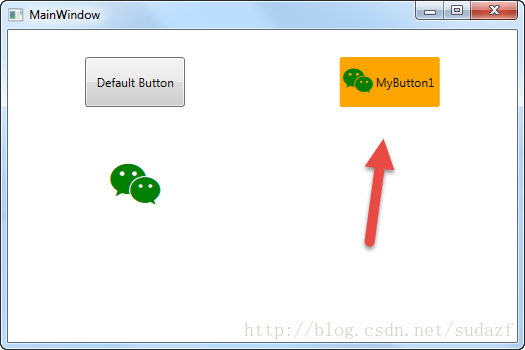
那么 按钮将变成图标+文字的组合,如图:
WPF自定义控件 使用阿里巴巴图标的更多相关文章
- WPF自定义控件与样式(1)-矢量字体图标(iconfont)
一.图标字体 图标字体在网页开发上运用非常广泛,具体可以网络搜索了解,网页上的运用有很多例子,如Bootstrap.但在C/S程序中使用还不多,字体图标其实就是把矢量图形打包到字体文件里,就像使用一般 ...
- WPF使用矢量字体图标(阿里巴巴iconfont)
原文:WPF使用矢量字体图标(阿里巴巴iconfont) 版权声明:本文为博主原创文章,转载请注明出处. https://blog.csdn.net/lwwl12/article/details/78 ...
- WPF自定义控件与样式(3)-TextBox & RichTextBox & PasswordBox样式、水印、Label标签、功能扩展
一.前言.预览 申明:WPF自定义控件与样式是一个系列文章,前后是有些关联的,但大多是按照由简到繁的顺序逐步发布的等,若有不明白的地方可以参考本系列前面的文章,文末附有部分文章链接. 本文主要是对文本 ...
- WPF自定义控件与样式(2)-自定义按钮FButton
一.前言.效果图 申明:WPF自定义控件与样式是一个系列文章,前后是有些关联的,但大多是按照由简到繁的顺序逐步发布的等,若有不明白的地方可以参考本系列前面的文章,文末附有部分文章链接. 还是先看看效果 ...
- WPF自定义控件与样式(15)-终结篇 & 系列文章索引 & 源码共享
系列文章目录 WPF自定义控件与样式(1)-矢量字体图标(iconfont) WPF自定义控件与样式(2)-自定义按钮FButton WPF自定义控件与样式(3)-TextBox & Ric ...
- WPF自定义控件与样式(4)-CheckBox/RadioButton自定义样式
一.前言 申明:WPF自定义控件与样式是一个系列文章,前后是有些关联的,但大多是按照由简到繁的顺序逐步发布的等,若有不明白的地方可以参考本系列前面的文章,文末附有部分文章链接. 本文主要内容: Che ...
- WPF自定义控件与样式(5)-Calendar/DatePicker日期控件自定义样式及扩展
一.前言 申明:WPF自定义控件与样式是一个系列文章,前后是有些关联的,但大多是按照由简到繁的顺序逐步发布的等,若有不明白的地方可以参考本系列前面的文章,文末附有部分文章链接. 本文主要内容: 日历控 ...
- WPF自定义控件与样式(6)-ScrollViewer与ListBox自定义样式
一.前言 申明:WPF自定义控件与样式是一个系列文章,前后是有些关联的,但大多是按照由简到繁的顺序逐步发布的等,若有不明白的地方可以参考本系列前面的文章,文末附有部分文章链接. 本文主要内容: Scr ...
- WPF自定义控件与样式(7)-列表控件DataGrid与ListView自定义样式
一.前言 申明:WPF自定义控件与样式是一个系列文章,前后是有些关联的,但大多是按照由简到繁的顺序逐步发布的等,若有不明白的地方可以参考本系列前面的文章,文末附有部分文章链接. 本文主要内容: Dat ...
随机推荐
- 7 Best jQuery & JavaScript PDF Viewer plugin with examples
In this Post we are providing best jQuery PDF viewer plugin & tutorial with examples.Due to popu ...
- 【26.34%】【codeforces 722A】Broken Clock
time limit per test1 second memory limit per test256 megabytes inputstandard input outputstandard ou ...
- GitHub项目协作基本步骤 分类: C_OHTERS 2013-09-23 21:31 690人阅读 评论(0) 收藏
1.查找某个项目,然后Fork 2.打开GitHub For Windows,发现刚才Fork的项目 3.对着项目点击Clone,将之复制至本地 4.使用Eclipse等进行开发,如新增一个文件 5. ...
- [SCSS] Organize SCSS into Multiple Files with Partials
Tired of dealing with monolithic CSS files? Are requests for multiple CSS files hurting your perform ...
- [RxJSv& Javascript] forkJoin (reactive Promise.all) & Map
forkJoin: When all observables complete emit the last value from each. productMap: Map<number, IP ...
- 【t058】拜年
Time Limit: 1 second Memory Limit: 128 MB [问题描述] 拜年是中国人少不了的风俗.还没过年呢,刚上小学的妮妮已经等不及要给她的小伙伴去拜年了,但是她不知道如何 ...
- 静态编译ltrace
ltrace可以跟踪进程的库函数调用,它会显现出哪个库函数被调用,而strace则是跟踪程序的每一个系统调用. 有时候只使用strace还是不够的,须要ltrace配合才干找出问题出在哪里. 假设在b ...
- 关系型数据库工作原理-快速缓存(翻译自Coding-Geek文章)
本文翻译自Coding-Geek文章:< How does a relational database work>. 原文链接:http://coding-geek.com/how-dat ...
- cordova 生成发行版apk,并添加证书 – 畅玩Coding
原文:cordova 生成发行版apk,并添加证书 – 畅玩Coding 首先jdk生成证书. 1.进入jdk安装目录 D:\Java\jdk1.7.0\bin 2.执行命令 keytool -gen ...
- 查询系统状态 内存大小 cpu信息 设备负载情况
1.1 查看内存状态 /proc/meminfo里面存放着内存的信息 查看内存命令(包括虚拟内存swap): free -h (低版本系统可能不支持-h) 或者 free -m (以mb单位显示) a ...