基于element-ui封装一个Table模板组件
大家在做后台管理系统的时候,写的最多的可能就是表格页面了,一般分三部分:搜索功能区、表格内容区和分页器区。一般这些功能都是使用第三方组件库实现,比如说element-ui,或者vuetify。这两个组件库都各有各的优点,但就table组件来说,我还是比较喜欢vuetify的实现,不用手写一个个column,只要传入headers的配置数组就行,甚至分页器都内置在了table组件里,用起来十分方便。有兴趣可以看看:vuetify data table。
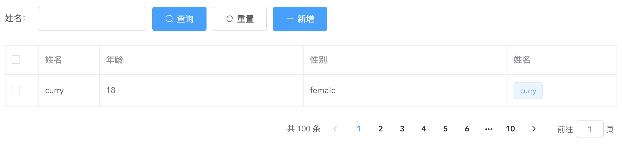
上面是一个经典的用element-ui开发的table页面,而且实际工作中如果每个table页面都写一遍,重复代码太多了,所以不妨写一个table模板组件,减少重复代码。我的思路是这样的:
搜索功能区:
提供
searchBar插槽,可以自定义搜索输入框,搜索、重置按钮必有,新增按钮通过props控制显隐。这里对应的代码如下:genSearchBar() {
if (this.noSearchBar || !this.$scopedSlots.searchBar) return '';
return (
<el-form class="seatch-form" inline={true} label-width="100">
{this.$scopedSlots.searchBar()}
<el-button
class="filter-item"
icon="el-icon-search"
type="primary"
onClick={this.handleSearchBtnClick}
>
查询
</el-button>
<el-button
class="filter-item"
icon="el-icon-refresh"
onClick={this.handleResetBtnClick}
>
重置
</el-button>
<el-button
class="filter-item"
icon="el-icon-plus"
type="primary"
v-show={this.showAddBtn}
onClick={this.handleAddBtnClick}
>
新增
</el-button>
</el-form>
);
}表格内容区:
通过传入
headers自动生成columns,参数如下:{
label: '性别',
prop: 'sex',
width: '180',
filter: 'sexFilter'
}
可对应如下代码:
<el-table-column
prop="sex"
label="性别"
width="180">
<template slot-scope="scope">{{scope.row.sex | sexFilter}}</template>
</el-table-column>
注意,只支持全局
filter。如果你想自定义
column,也提供tableColumn插槽,支持自定义column,可以如下配置:{
prop: 'action'
}
<el-table-column
prop="action"
label="操作"
width="180">
<template slot-scope="scope">
<el-button>编辑</el-button>
<el-button>删除</el-button>
</template>
</el-table-column>
这样,就会按传入的
prop匹配对应的column,十分方便。实现代码如下:
genTableSlot(h) {
let customeColumns = this.$scopedSlots.tableColumn
? this.$scopedSlots.tableColumn()
: [];
return this.headers.map((item) => {
// 根据item.prop判断是否使用传入的插槽内容
let foundItem = customeColumns.find(
(ele) =>
ele.componentOptions &&
ele.componentOptions.propsData.prop === item.prop
);
return foundItem
? foundItem
: h('el-table-column', {
props: {
...item,
},
scopedSlots: {
default: (props) => {
// 根据传入的全局filter处理column数据
let filter = this.$options.filters[
item.filter
];
let itemValue = props.row[item.prop];
return h(
'span',
filter ? filter(itemValue) : itemValue
);
},
},
});
});
}
genTable(h) {
return h(
'el-table',
{
ref: 'tableRef',
props: {
...this.$attrs,
data: this.data,
},
on: {
'selection-change': (val) => {
this.$emit('selection-change', val);
},
},
},
[...this.genTableSlot(h)]
);
}
分页器区:
如无特殊需求,分页器功能一致,所以直接内置。
实现代码如下:
genPagination() {
return (
<div class="pagination-wrap">
<el-pagination
layout="total,prev,pager,next,jumper"
current-page={this.current}
page-size={this.pageSize}
total={this.total}
{...{
on: { 'current-change': this.handleCurrentChange },
}}
></el-pagination>
</div>
);
}
最后附完整代码和demo:
<script>
export default {
name: 'TableTemplate',
props: {
data: {
type: Array,
default: () => [],
required: true,
},
headers: {
type: Array,
default: () => [],
required: true,
},
current: {
type: Number,
default: 1,
},
pageSize: {
type: Number,
default: 10,
},
total: {
type: Number,
default: 0,
},
noSearchBar: Boolean,
showAddBtn: Boolean,
},
mounted() {
this.$nextTick(() => {
this.$emit('search');
});
},
methods: {
genSearchBar() {

    if (this.noSearchBar || !this.$scopedSlots.searchBar) return '';

    return (

        <el-form class="seatch-form" inline={true} label-width="100">

            {this.$scopedSlots.searchBar()}

            <el-button

                class="filter-item"

                icon="el-icon-search"

                type="primary"

                onClick={this.handleSearchBtnClick}

            >

                查询

            </el-button>

            <el-button

                class="filter-item"

                icon="el-icon-refresh"

                onClick={this.handleResetBtnClick}

            >

                重置

            </el-button>

            <el-button

                class="filter-item"

                icon="el-icon-plus"

                type="primary"

                v-show={this.showAddBtn}

                onClick={this.handleAddBtnClick}

            >

                新增

            </el-button>

        </el-form>

    );

},
genTableSlot(h) {
let customeColumns = this.$scopedSlots.tableColumn
? this.$scopedSlots.tableColumn()
: [];
return this.headers.map((item) => {
// 根据item.prop判断是否使用传入的插槽内容
let foundItem = customeColumns.find(
(ele) =>
ele.componentOptions &&
ele.componentOptions.propsData.prop === item.prop
);
return foundItem
? foundItem
: h('el-table-column', {
props: {
...item,
},
scopedSlots: {
default: (props) => {
let filter = this.$options.filters[
item.filter
];
let itemValue = props.row[item.prop];
return h(
'span',
filter ? filter(itemValue) : itemValue
);
},
},
});
});
},
genTable(h) {

    return h(

        'el-table',

        {

            ref: 'tableRef',

            props: {

                ...this.$attrs,

                data: this.data,

            },

            on: {

                'selection-change': (val) => {

                    this.$emit('selection-change', val);

                },

            },

        },

        [...this.genTableSlot(h)]

    );

},
genPagination() {

    return (

        <div class="pagination-wrap">

            <el-pagination

                layout="total,prev,pager,next,jumper"

                current-page={this.current}

                page-size={this.pageSize}

                total={this.total}

                {...{

                    on: { 'current-change': this.handleCurrentChange },

                }}

            ></el-pagination>

        </div>

    );

},
resetPagination() {
this.$emit('update:current', 1);
},
handleCurrentChange(val) {
this.$emit('update:current', val);
this.$emit('search');
},
handleSearchBtnClick() {
this.$emit('search');
},
handleResetBtnClick() {
this.resetPagination();
this.$emit('reset');
},
handleAddBtnClick() {
this.$emit('add');
},
getTableRef() {
return this.$refs.tableRef;
},
},
render(h) {
return (
<div>
{this.genSearchBar()}
{this.genTable(h)}
{this.genPagination()}
</div>
);
},
};
</script> <style scoped>
.seatch-form {
text-align: left;
}
.pagination-wrap {
margin-top: 20px;
text-align: right;
}
</style>Demo:
<template>

    <div>

        <table-template

            border

            :headers="headers"

            :data="tableData"

            :current.sync="current"

            :total="total"

            ref="tableTemplate"

            showAddBtn

            @search="handleSearch"

            @reset="handleReset"

            @add="handleAdd"

            @selection-change="handleSelectionChange"

        >

            <template #searchBar>

                <el-form-item label="姓名:" prop="title">

                    <el-input class="filter-item" v-model="searchForm.title" ></el-input>

                </el-form-item>

            </template>

            <template #tableColumn>

                <el-table-column

                    prop="selection"

                    type="selection"

                    width="55"

                ></el-table-column>

                <el-table-column prop="test" label="姓名" width="180">

                    <template slot-scope="scope">

                        <el-popover trigger="hover" placement="top">

                            <p>姓名:{{ scope.row.name }}</p>

                            <p>住址:{{ scope.row.address }}</p>

                            <div slot="reference" class="name-wrapper">

                                <el-tag size="medium">{{scope.row.name}}</el-tag>

                            </div>

                        </el-popover>

                    </template>

                </el-table-column>

            </template>

        </table-template>

    </div>

</template>

<script>

import TableTemplate from './TableTemplate';

export default {

    name: 'Demo',

    components: {

        TableTemplate,

    },

    data() {

        return {

            current: 1,

            total: 100,

            headers: [

                {

                    prop: 'selection',

                },

                {

                    label: '姓名',

                    prop: 'name',

                    width: '100',

                },

                {

                    label: '年龄',

                    prop: 'year',

                },

                {

                    label: '性别',

                    prop: 'sex',

                    width: 'sexFilter',

                },

                {

                    prop: 'test',

                },

            ],

            tableData: [

                {

                    name: 'curry',

                    year: 18,

                    sex: 'female',

                    address: '天安门',

                },

            ],

            searchForm: {

                title: '',

            },

        };

    },

    methods: {

        handleSearch() {

            console.log(this.current);

        },

        handleReset() {

            this.searchForm = {

                title: '',

            };

        },

        handleAdd() {

            console.log('添加');

        },

        handleSelectionChange(val) {

            console.log(val);

        },

        getTableRef() {

            console.log(this.$refs.tableTemplate.getTableRef());

        },

    },

};

</script>
基于element-ui封装一个Table模板组件的更多相关文章
- 基于element UI 的上传插件
为了不再重复的上传文件,做了一个统一选择文件和上传文件的 基于 element UI :http://element-cn.eleme.io 前端实现文件下载和拖拽上传 演示 用法 <uploa ...
- 封装Vue Element的可编辑table表格组件
前一段时间,有博友在我那篇封装Vue Element的table表格组件的博文下边留言说有没有那种"表格行内编辑"的封装组件,我当时说我没有封装过这样的组件,因为一直以来在实际开发 ...
- vue+element ui 的表格列使用组件
前言:工作中用到 vue+element ui 的前端框架,有这个场景:很多表格的列有许多一样的,所以考虑将列封装为组件.转载请注明出处:https://www.cnblogs.com/yuxiaol ...
- 基于ionic框架封装一个图片轮播指令的几点
在这里我想在项目中封装一个图片轮播的指令 (本项目使用的是ionic框架) 1)定义指令 define(['app'],function(myapp){ myapp.directive('myslid ...
- 基于element ui的图片预览插件
写插件很简单,满足两个条件即可,一.基本的逻辑思路,二.熟悉插件语法要求.本次Vue插件也比较简单,点击“查看图片”用轮播的方式限制用户上传的图片,如图: 项目采用的是vue-element-admi ...
- vue封装一个弹框组件
这是一个提示框和对话框,例: 这是一个组件 eject.vue <template> <div class='kz-cont' v-show='showstate'> &l ...
- 基于element ui的级联选择器组件实现的分类后台接口
今天在做资产管理系统的时候遇到一个分类的级联选择器,前端是用的element的组件,需要后台提供接口支持. 这个组件需要传入的数据结构大概是这样的,详细的可参考官方案例: [{ value: ...
- Element ui 中使用table组件实现分页记忆选中
我们再用vue和element-ui,或者其他的表格的时候,可能需要能记忆翻页勾选,那么实现以下几个方法就ok了 示例如下 <el-table :data="tableData&quo ...
- element ui 里面的table怎么弹出一个框让表中数据点击出现弹框
<el-table-column label="团队" prop="name" min-width="120px" align=&qu ...
随机推荐
- 【xml】Button背景色无法修改
由于新版本的主题问题,导致Android Studio的Button背景无法修改,一直呈现亮紫色. 解决方法:将app/res/values目录下的themes代码加上.Bridge即可 修改前: & ...
- PHP基础之与MySQL那些事
前言 这篇文章会对PHP的MySQL扩展库,MySQLI的扩展库,SQL批量执行,事务控制等等进行一些简单的讲解. MySQL扩展 PHP中MySQL扩展,虽然因为安全的原因,在PHP5.6及往上不在 ...
- 【BFS】hdu 1973 Prime Path
题目描述: http://poj.org/problem?id=3414 中文大意: 使用两个锅,盛取定量水. 两个锅的容量和目标水量由用户输入. 允许的操作有:灌满锅.倒光锅内的水.一个锅中的水倒入 ...
- ACM-ICPC 2017 Asia Xi'an
ACM-ICPC 2017 Asia Xi'an Solved A B C D E F G H I J K 7/11 O O Ø O O ? O O O for passing during the ...
- Luogu4168 蒲公英 (分块)
题目传送门 题意 长度为n的序列,有m次询问,每次询问求\([l,r]\) 间的众数,如果有多个,输出最小的那个 \(n\le 4\times 10^4,m\le 5\times 10^5,a_i\l ...
- AtCoder Beginner Contest 173
比赛链接:https://atcoder.jp/contests/abc173/tasks A - Payment 题意 计算只用 $1000$ 元支付某个价格 $n$ 的找零是多少. 代码 #inc ...
- 【POJ 2411】【Mondriaans Dream】 状压dp+dfs枚举状态
题意: 给你一个高为h,宽为w的矩阵,你需要用1*2或者2*1的矩阵填充它 问你能有多少种填充方式 题解: 如果一个1*2的矩形横着放,那么两个位置都用二进制1来表示,如果是竖着放,那么会对下一层造成 ...
- [IOI1998] Polygon (区间dp,和石子合并很相似)
题意: 给你一个多边形(可以看作n个顶点,n-1条边的图),每一条边上有一个符号(+号或者*号),这个多边形有n个顶点,每一个顶点有一个值 最初你可以把一条边删除掉,这个时候这就是一个n个顶点,n-2 ...
- CS144学习(1)Lab 0: networking warmup
CS144的实验就是要实现一个用户态TCP协议,对于提升C++的水平以及更加深入学习计算机网络还是有很大帮助的. 第一个Lab是环境配置和热身,环境按照文档里的配置就行了,前面两个小实验就是按照步骤来 ...
- docker的网络-单主机(三种原生网络)none、host、bridge
docker的网络分为:单主机.跨主机 这篇先说:单主机 我们先说一下docker的原生网络模式 网络模式 简介 优点 使用场景 none 空网络,没有网络 此网络与外界隔离,安全度非常高 适合公司内 ...