你知道BFC、IFC、FFC、GFC及多栏自适应布局吗?
FC(Formatting Context)格式化内容,常见的FC有BFC、IFC、FFC、GFC四种类型,BFC和IFC是W3C CSS2.1规范提出的概念,FFC和GFC是W3C CSS3规范提出的概念,其实就是定义了一套页面渲染的规则,决定了盒子以什么样的方式渲染从而占据什么样的位置区域,本文只是简单的学习笔记以供参考。
想要弄懂FC,首先得弄清楚盒子模型,常见的两种盒子模型为:
IE盒子模型(怪异模式):
width = content-width + padding-width + border-width;
height = content-height + padding-height + border-height;
W3C盒子模型(标准):
width = content-width;
height = content-height;
IE总是与众不同,让人精疲力尽,好在IE8开始支持CSS3的属性box-sizing:border-box/content-box/inherit;有了这个属性,我们在布局时就游刃有余了,其实这些都是基于BFC的,下面开始进入正文:
BFC(Block formatting contexts):
Floats, absolutely positioned elements, block containers (such as inline-blocks, table-cells, and table-captions) that are not block boxes, and block boxes with 'overflow' other than 'visible' (except when that value has been propagated to the viewport) establish new block formatting contexts for their contents.
总结要点如下:
float 的值不为 none
position 的值不为 static 或 relative
display 的值为 table-cell、table-caption、inline-block、flex 或 inline-flex
overflow 的值不为 visibility
特点:
块盒子垂直排列,垂直方向上在外边距上会进行塌陷,以大的外边距为二者之间的距离
浮动的块盒子左右外边距也会发生同样的塌陷,以大的外边距为二者之间的距离
IFC(Ininle formatting contexts):
In an inline formatting context, boxes are laid out horizontally, one after the other, beginning at the top of a containing block. Horizontal margins, borders, and padding are respected between these boxes. The boxes may be aligned vertically in different ways: their bottoms or tops may be aligned, or the baselines of text within them may be aligned. The rectangular area that contains the boxes that form a line is called a line box.
总结要点如下:
水平方向上排列
行盒子以不同的方式水平对齐,文字的话一般以文字的基线对齐
- 还有一种特殊的类型是在块盒子里包含着行盒子称作inline-block
特点:
没有宽度和高度
FFC(Flex formatting contexts):
Made up of telescopic containers and telescopic items. You can get a telescopic container by setting the display attribute of the element to flex or inline-flex. Containers set to flex are rendered as a block level element, while containers that are set to inline-flex are rendered as inline elements.
总结要点如下:
自适应上下文,俗称弹性盒模型
display属性值为flex或inline-flex时即可实现块盒子和行盒子
特点:
可伸缩性的盒子,盒子内外都不受影响,任意实现复杂布局
GFC(Gird formatting contexts):
When set to a display element value of grid, this element will get an independent rendering area, we can in the grid container (grid container) defined on the grid definition line (grid definition rows) and grid (grid definition columns) as defined in the attributes of each grid project (grid item) on the definition the grid line (grid row) and grid column (grid columns) for each grid project (grid item) defines the location and space.
总结要点如下:
网络式布局,真正的二维空间布局
display属性值为gird时即可实现网络布局,在网格容器的行列上再次进行行列布局
特点:
二维布局,适用于超级复杂的两个维度布局
常用的四种布局方式,要知其然并知其所以然,CSS规范博大精深,前端路上还需不断学习巩固加深!
谈到了FC,必然会提到多栏自适应布局,下面简单介绍常用的几种方法:
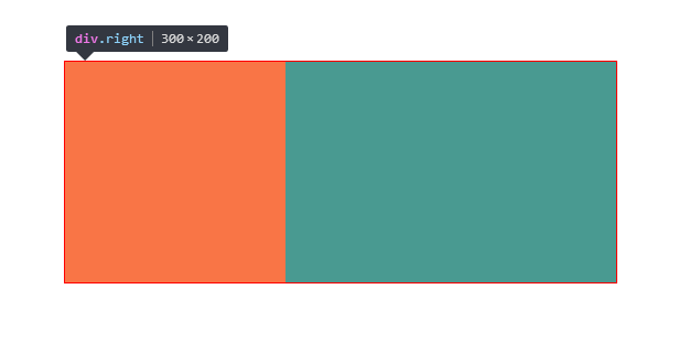
1.float+margin实现两栏布局:
样式:

.box {

    width: 500px;

    height: 200px;

    margin: 100px auto;

    border: 1px solid red;

}

.left {

    width: 200px;

    height: 200px;

    float: left;

    background-color: red;

}

.right {

    margin-left: 200px;

    background-color: green;

    height: 200px;

}

布局:

<div class="box">

    <div class="left"></div>

    <div class="right"></div>

</div>
效果如下:
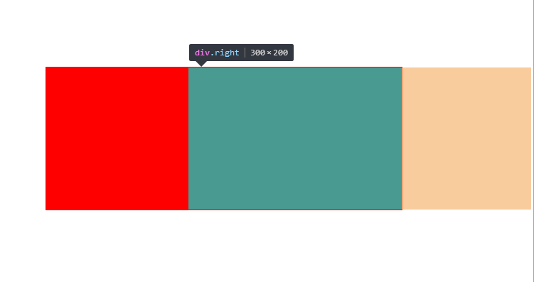
2.float+overflow实现两栏布局:
样式:

.box {

    width: 500px;

    height: 200px;

    margin: 100px auto;

    border: 1px solid red;

}

.left {

    width: 200px;

    height: 200px;

    float: left;

    background-color: red;

}

.right {

    overflow: hidden;

    background-color: green;

    height: 200px;

}

布局:

<div class="box">

    <div class="left"></div>

    <div class="right"></div>

</div>
效果如下:
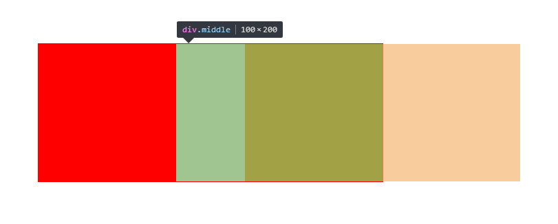
3. float+overflow实现三栏布局:
样式:

.box {

    width: 500px;

    height: 200px;

    margin: 100px auto;

    border: 1px solid red;

}

.left {

    width: 200px;

    height: 200px;

    float: left;

    background-color: red;

}

.middle {

    height: 200px;

    overflow: hidden;

    background-color: yellow;

}

.right {

    width: 200px;

    height: 200px;

    float: right;

    background-color: green;

}

布局:

<div class="box">

    <div class="left"></div>

    <div class="right"></div>

    <div class="middle"></div>

</div>
效果如下:

有了这些认识之后,你应该对多栏自适应布局游刃有余了吧,下次面试官问你BFC、IFC时,千万别说没听过哦!
你知道BFC、IFC、FFC、GFC及多栏自适应布局吗?的更多相关文章
- 【转】CSS深入理解流体特性和BFC特性下多栏自适应布局
这篇文章发布于 2015年02月12日,星期四,23:36,归类于 css相关. 阅读 30873 次, 今日 63 次 by zhangxinxu from http://www.zhangxinx ...
- CSS深入理解流体特性和BFC特性下多栏自适应布局
一.块状元素的流体特性与自适应布局 块状元素像放在容器中的水流一样,内容区域会随着margin, padding, border的出现自动填满剩余空间,这就是块状元素的流体特性. 来一个小实验: di ...
- BFC特性下多栏自适应布局
BFC 已经是一个耳听熟闻的词语了,网上有许多关于 BFC 的文章,介绍了如何触发 BFC 以及 BFC 的一些用处(如清浮动,防止 margin 重叠等).虽然我知道如何利用 BFC 解决这些问题, ...
- BFC之宽度自适应布局篇
说到自适应布局,我们曾在“抛砖引玉之宽度自适应布局”一文中学习过.当时的核心思想主要是利用float+margin的形式.利用块状元素的流体特性,然后计算出float元素的宽度,并赋予到块状元素的相应 ...
- BFC,IFC,GFC,FFC的定义及功能
What's FC?一定不是KFC,FC的全称是:Formatting Contexts,是W3C CSS2.1规范中的一个概念.它是页面中的一块渲染区域,并且有一套渲染规则,它决定了其子元素将如何定 ...
- 初识 BFC、 IFC、GFC、FFC
首先本文中介绍的 BFC. IFC.GFC.FFC 均为 CSS 中常见问题的解读,如没兴趣,可以绕道了. 然后在介绍这么多的 *FC 之前,我们得了解 一下 Box 和 Formatting Con ...
- 【转】前端的BFC、IFC、GFC和FFC
什么是BFC.IFC.GFC和FFC CSS2.1中只有BFC和IFC, CSS3中才有GFC和FFC. FC的全称是:Formatting Contexts,是W3C CSS2.1规范中的一个概念. ...
- 什么是BFC、IFC、GFC和FFC
什么是BFC.IFC.GFC和FFC CSS2.1中只有BFC和IFC, CSS3中才有GFC和FFC. FC的全称是:Formatting Contexts,是W3C CSS2.1规范中的一个概念. ...
- css3中的BFC,IFC,GFC和FFC
出处:https://www.jianshu.com/p/e75f351e11f8 表格比较: 名称 英文全称 含义 BFC Block Formatting Contexts 块级格式化上下文 IF ...
随机推荐
- 设计模式 - 装饰者模式(Decorator Pattern) 具体解释
装饰者模式(Decorator Pattern) 具体解释 本文地址: http://blog.csdn.net/caroline_wendy/article/details/26707033 装饰者 ...
- java.lang.IllegalStateException: attempt to re-open an already-closed object
attempt to re-open an already-closed object 字面理解,试图再次打开已经关闭的对象.这是我在操作sqlited的时候出现的错误, 我在一个activity里面 ...
- Parcel.js + Vue 2.x 极速零配置打包体验
继 Browserify.Webpack 之后,又一款打包工具 Parcel 横空出世 Parcel.js 的官网有这样的自我介绍 “极速零配置Web应用打包工具” 简单接触了一下,单从效率上来说,确 ...
- 用node.js实现mvc相册资源管理器
摘要:通过前两天的学习我大概学了了,用formidable模块文件上传,express框架,以及利用fs模块进行文件读取,今天我学习了如何用这些知识来制作相册,暂没有数据库,所以做的也是本地的资源管理 ...
- 盘点selenium phantomJS使用的坑
参考:http://www.jianshu.com/p/9d408e21dc3a http://www.cnblogs.com/luxiaojun/p/6144748.html 豆瓣应该是ip被封 ...
- IDEA热部署(三)---jetty插件调试(转)
我们在开发的时候习惯对于项目的框架进行分层,在idea中对于不同的层,我们使用module来进行划分,不同的module之间是通过maven来进行依赖的. 我们的项目结构是这样的,admin是我们的w ...
- presto
presto中文站:http://prestodb-china.com/ 进入hadoop机器,进入presto所在bin目录:presto --server localhost:9090 --cat ...
- .Net6种成员的可访问性
CLR术语 C#术语 描述 Private private 成员只能由定义类型或任何嵌套类型访问 Family protected 成员只能由定义类型,任何嵌套类型或者不管在任何程序集中声明的派生类型 ...
- 微信小程序教学第三章第四节(含视频):小程序中级实战教程:下拉更新、分享、阅读标识
下拉更新.分享.阅读标识 本文配套视频地址: https://v.qq.com/x/page/h0554i4u5ob.html 开始前请把 ch3-4 分支中的 code/ 目录导入微信开发工具 这一 ...
- iOS 轮播中遇到的问题(暂停、重新启动)
一. 轮播的优化或者用Collection来实现 二.Timer 问题 我们可以这样来使用一个Timer [NSTimer scheduledTimerWithTimeInterval:1.0 ta ...